|
| Group |
Round |
C/R |
Comment |
Date |
Image |
| 34 |
May 25 |
Reply |
Thanks Candy for your helpful suggestions. I always tend to place my center of interest in the center - and i think I need to break myself of that habit. I also agree that the eagle needs a larger presence. |
May 26th |
| 34 |
May 25 |
Reply |
Thanks Candy. That's good to know. I just signed up for a free 12 pack of textures from Meredith! |
May 26th |
| 34 |
May 25 |
Reply |
Thanks Jan! |
May 21st |
| 34 |
May 25 |
Reply |
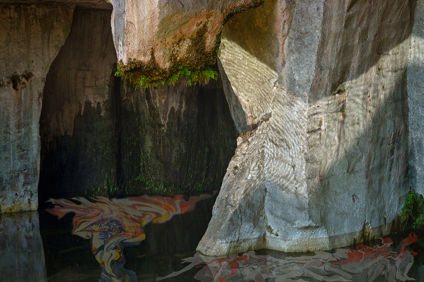
Thanks Steve. I viewed the original reflections as a hindrance to my composition, so I spent a lot of time eliminating the original reflections from the bird's eye. I agree that the blue circle's (the iris?) edge is too hard. I need to learn some of the finer points of treating edges in PS (among many other things!) |
May 15th |
| 34 |
May 25 |
Reply |
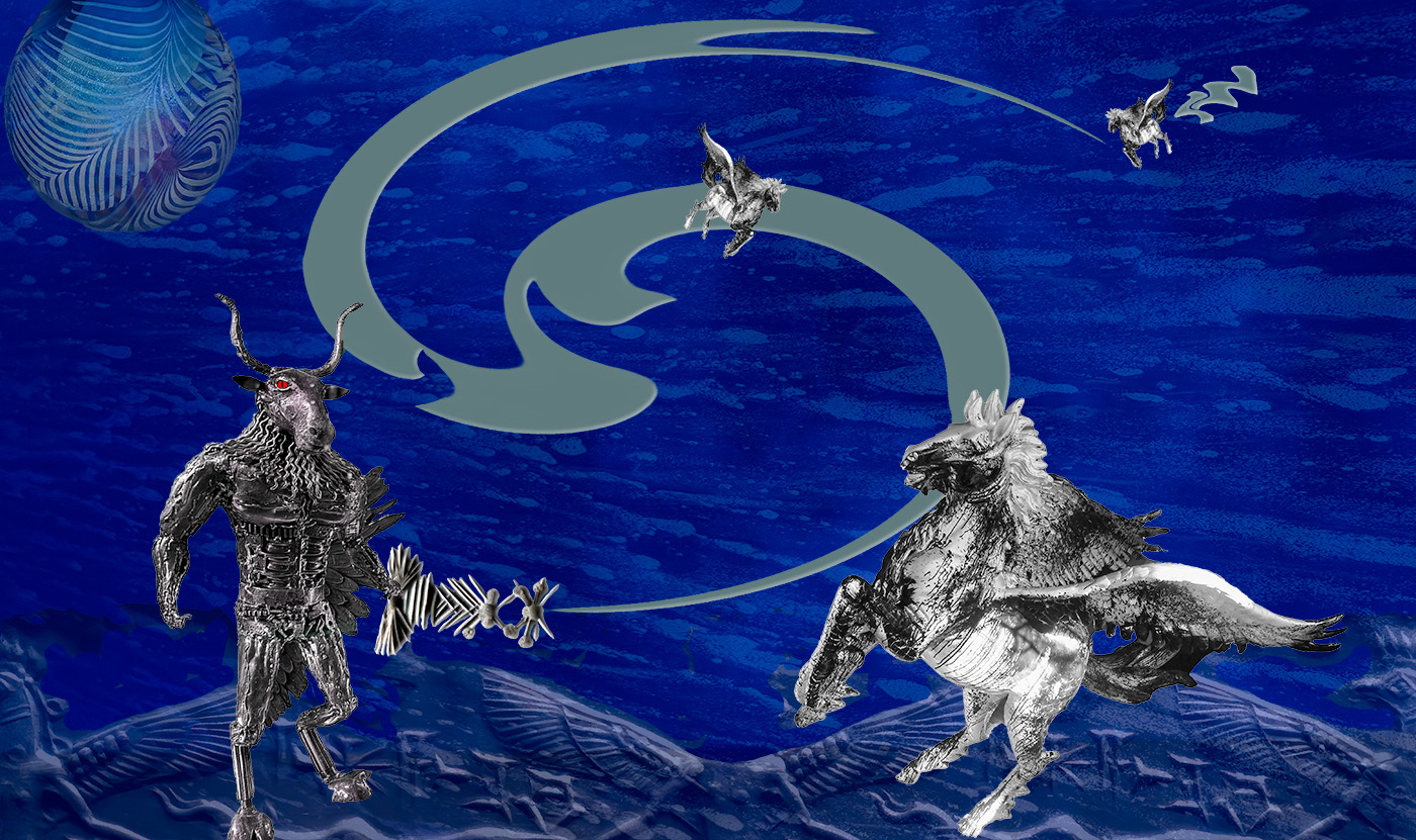
Thanks Jan. I really like your treatment of the eagle flying out of the eye as well as its talons framing the moon. I don't know why I thought that reflections in the eye would be limited to the pupil. I had wanted to refine placement of the eagle, but Photoshop crashed, and when I opened the psd I found that all the layers were gone. |
May 15th |
| 34 |
May 25 |
Comment |
Jan, this image is altogether enchanting. Replacing the front yard with the selection from Original 2 works great - were the cottage and garden from the Cotswolds in England, by any chance? The way you integrated those two images already gives the piece a fairy tale feel - even before the addition of the girl and the duck. Regarding the girl, starting with an out of focus photo limits her sharpness in the composite image - which contrasts against the relative sharpness of the cottage. I used your final image and reduced saturation and vibrance of the girl and duck which makes them blend in more with the surroundings and de-emphasizes the soft focus on the girl. I like how you managed to change the position of her hand from the original to allow for her to hold the umbrella upright - very nice! |
May 7th |
 |
| 34 |
May 25 |
Comment |
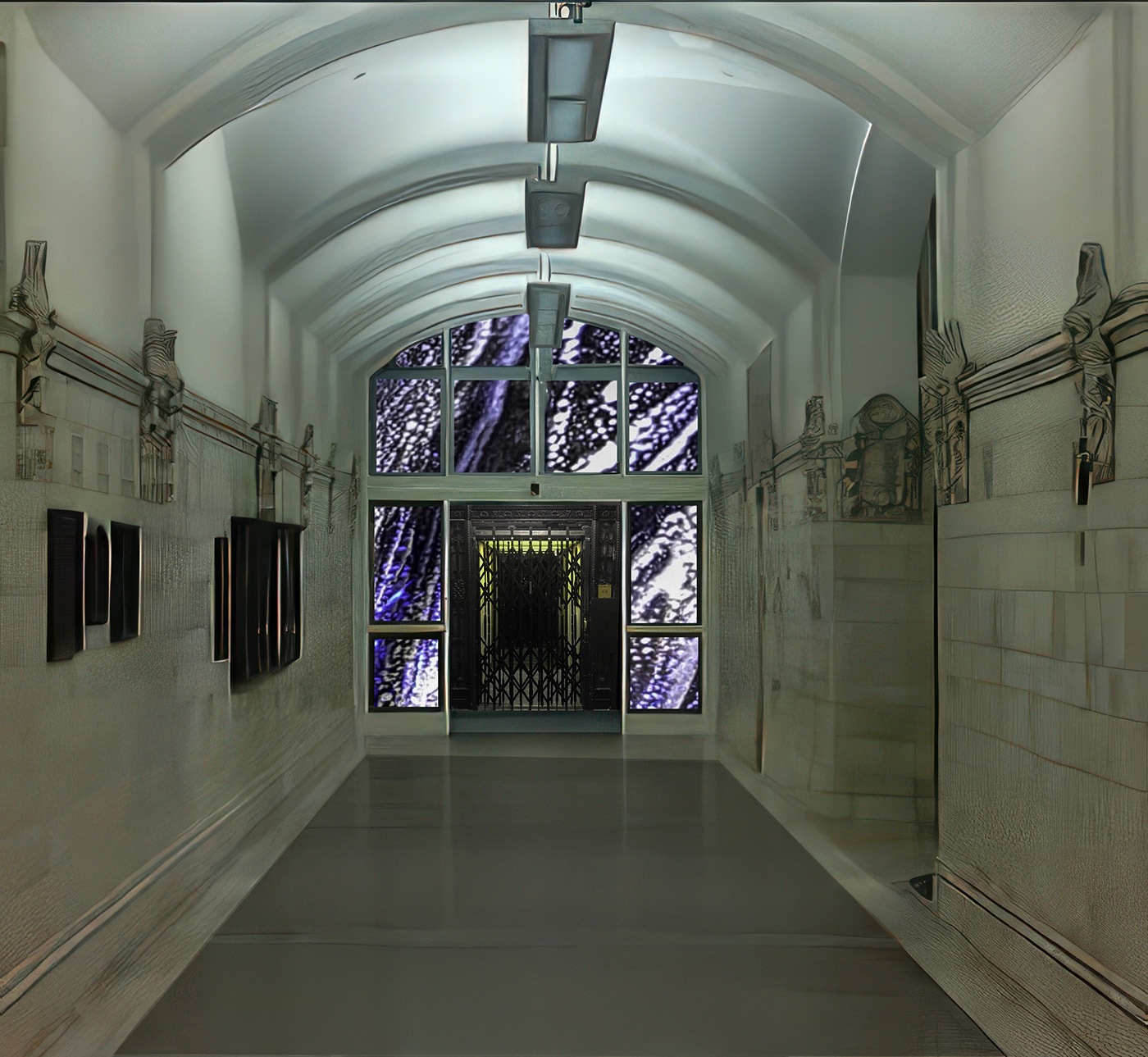
Wow Steve! This is an awfully cool image. What was the source for the original? |
May 7th |
| 34 |
May 25 |
Comment |
Beautiful image, Frans! Regarding traffic - I didn't see any in the original. Had you already removed it, or am I just not seeing it? Beautiful juxtaposition of the human figure in motion against the hulking angular structures in the background. The figure also works beautifully with the illuminated arched fountains in the background. What did you mean by the "slayer layer"? |
May 7th |
| 34 |
May 25 |
Comment |
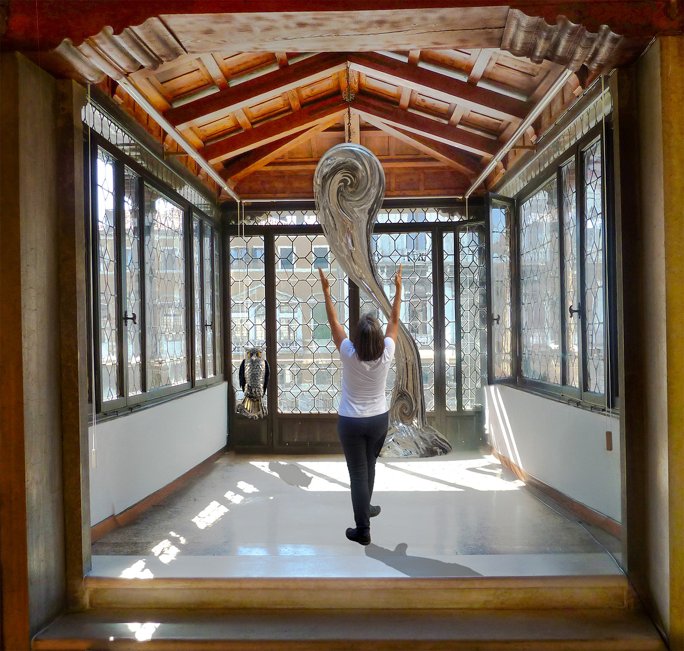
I love it! All the effects you added contribute to the cosmic feel. Was this done in Photoshop - are Cosmos and Studio 2 separate editing programs? |
May 1st |
4 comments - 5 replies for Group 34
|
4 comments - 5 replies Total
|