|
| Group |
Round |
C/R |
Comment |
Date |
Image |
| 60 |
Feb 25 |
Reply |
Thank you, Peggy- you know I always apprecite your insights! |
Feb 24th |
| 60 |
Feb 25 |
Comment |
Wow! An in your face image of a beautiful car-it screams "Look at Me"! As mentioned by others, the perspective makes the image and I like the reflections in the mirror backs. I wonder if a slight vignette would work with this to take away the distraction of the white sign and fence on the right. I don't know that cropping it out work-might be too close to the car.
I like the sky replacement but agree about whichever competition you might enter and the rules. |
Feb 24th |
| 60 |
Feb 25 |
Comment |
I love the creative approach you took with this, Anne.
Seeing the different is a great talent. Taking out the pink squiggles did make a difference, as Rita suggested.
I would also try to remove the dark diagonal in the upper right-another adventure with photoshop (which scares me, too) or the remove tool in Lightroom.
I thought it was a composite image until I saw the first one.
Good eye, Anne! |
Feb 24th |
| 60 |
Feb 25 |
Comment |
Another thought, Diana-perhaps a slight vignette or (an inverted radial) around the whole bodies to set them off from the background. |
Feb 24th |
| 60 |
Feb 25 |
Comment |
What a terrific shot,Denny! I can't imagine any more adjustments to make it better. The light and placement of the rocket tail combined with the beauty of the sunrise and silhouetted trees make speak to what must have been an awe inspiring moment. |
Feb 24th |
| 60 |
Feb 25 |
Reply |
I agree with all the above, Kyle. Great capture and timing. Good catch light in the eye, too. You got all the important traits of the subject. |
Feb 24th |
| 60 |
Feb 25 |
Comment |
It's a great environmental portrait, Dean. You did well with taking down the lighting and putting the focus on his face.
I might even crop a bit more (amazing how differently we look at images) while keeping just enough of the table to keep the environment obvious but the crop you have is fine. |
Feb 24th |
| 60 |
Feb 25 |
Reply |
I applaud your intention with this Diana. It's a good story and I find the uncropped image more compelling although it might help to crop it in a bit tighter without losing the whole bodies. Good job getting rid of the white stake.
Although I'm not bothered by the blending of front seal's face into the other's body, perhaps you could just lighten the dark part of her face a tad with the brush to see if that brings out the face a bit better. |
Feb 24th |
| 60 |
Feb 25 |
Reply |
Thank you, Denny.
I really appreciate your comments.
|
Feb 11th |
| 60 |
Feb 25 |
Reply |
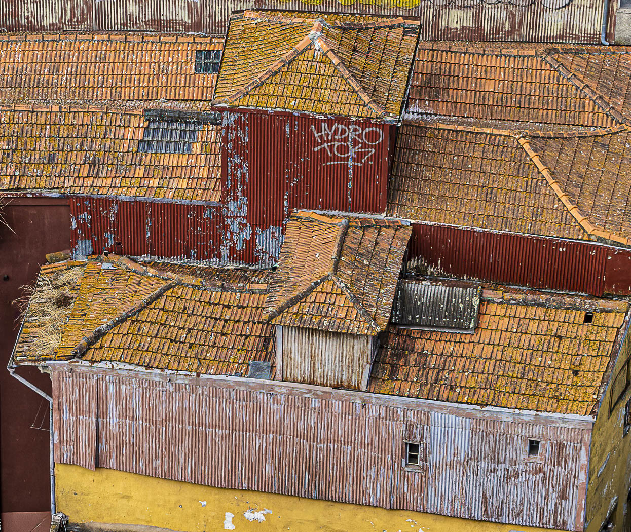
Thanks, Dean. It's interesting to get 2 different takes on the lettering. |
Feb 7th |
| 60 |
Feb 25 |
Reply |
Good idea, thanks, Diana. |
Feb 5th |
| 60 |
Feb 25 |
Reply |
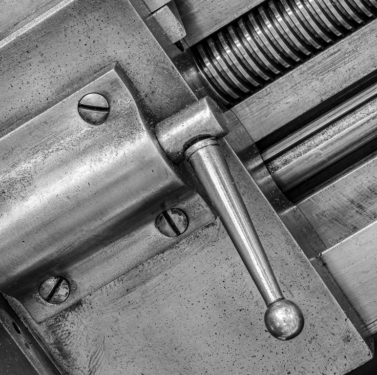
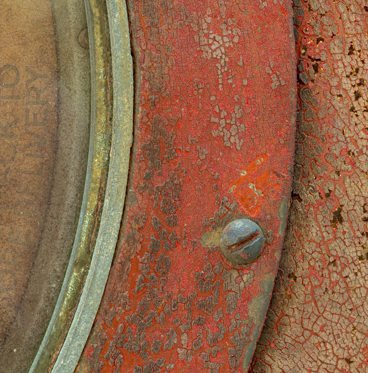
I interesting thought, Diana, about the writing taking away from the abstract.I will play with that as well as moving the image around. I was keeping the screw in the sweet spot on grid but maybe I'll find a better place.
Thanks for your insights! |
Feb 5th |
5 comments - 7 replies for Group 60
|
5 comments - 7 replies Total
|