|
| Group |
Round |
C/R |
Comment |
Date |
Image |
| 15 |
Mar 25 |
Comment |
Hi Kathy - Your ducks are lovely - and I believe Isaac has made the most of your three with his tighter cropping and lightening suggestions. This is a knockout shot! |
Mar 25th |
| 15 |
Mar 25 |
Comment |
Sarita - This image does indeed tell a wonderful story of these Great blue Herons. Nicely done - I love it! For your consideration, in the attached image, I played with tightening the crop a bit so the dark upper left doesn't detract from your main subject, then just slightly lightened the remaining pine cones which I think strengthens the focus on your birds. |
Mar 24th |
 |
| 15 |
Mar 25 |
Comment |
Hi Jerry - I would have been nervous to have this massive powerhouse glaring at me that way - even at 200mm, but you held fast and got this nice, sharp shot. I agree with all that cropping will make your capture more dramatic, and suggest that you play with cropping options to see which you find most impactful. If you are not entering in a PSA Nature competition, you might consider removing the white spots (water drops). |
Mar 24th |
| 15 |
Mar 25 |
Comment |
Gloria - This is a lovely image of your snake bird which I know as Anhinga. Nicely cropped and balanced to define the drying feather ends- their texture sharply in contrast to its fuzzy/furry-looking neck - all offset by your soft background. One suggestion would be to slightly lighten the stump and the bird's feet - although too much lightening might draw attention from the overall bird body. See my suggested image edit - I did have to spot erase a bright spot at the bottom of the stump to retain your crop. But otherwise I just used the brush tool in Lightroom Classic to do a very gentle lift of exposure + shadows for your consideration. |
Mar 24th |
 |
| 15 |
Mar 25 |
Comment |
Hi Gerhard - A picture is worth a thousand words - and your image is a perfect example. You've cropped this nicely to frame this hamerkop with its fresh catch... and the shadow of feet from the bird that missed this morsel. Light is lovely, focal area is sharp. You didn't mention shutter speed, but you might consider a high shutter speed setting to more sharply capture all of the detail in this unique bird. One other minor suggestion is to crop out the rock or debris in lower right - but only if this image won't be entered in PSA Nature category. |
Mar 24th |
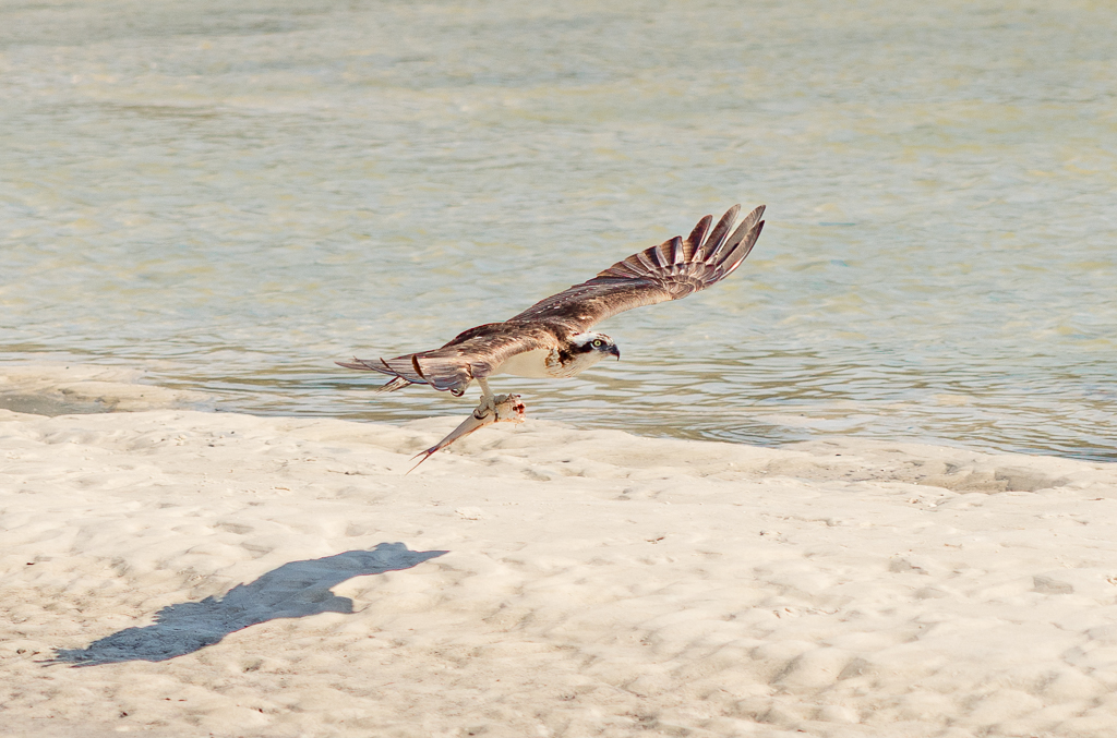
| 15 |
Mar 25 |
Comment |
Wow - a this image is a standout - in all of the osprey images I've seen and/or shot, I've never seen osprey talons so prominent, steely, and menacing as what you've captured here. Your choice of crop seems to accentuate the power of this fierce hunter. Hard to find a thing to change here, unless lightening the dark fish fin just a bit might keep eyes focused more on the bird and its talons. |
Mar 8th |
6 comments - 0 replies for Group 15
|
| 36 |
Mar 25 |
Comment |
Larry - this image is breathtaking - I can almost hear the waves and feel the morning's damp sea air on my face. I also get the sensation that the water surface is not quite even but I suspect this is may be from the fog on the distant water. However, if you were to enter this image in competition, it might be worth playing with the warp and distortion to see if a very subtle adjustment might neutralize the slight (real or perceived) unevenness of horizon. |
Mar 21st |
| 36 |
Mar 25 |
Comment |
Adi - Not sure if you set this shot up in your viewfinder or cropped in post, but this image is framed so effectively. I suspect the sun flares might lower a score in competition but my primary attention is drawn to focus in on the juxtaposition of tree, water and sunrise reflections - which are well balanced. Just above the water surface, I see a bit of whitish/lightish color around the tree trunk - hinting of an edited sky - could that color aberration be touched up?
Your color looks natural and not over saturated. To me, this image softly shouts "serene" ... Nice work! |
Mar 21st |
| 36 |
Mar 25 |
Comment |
Michael - I went back and studied your sunset scene and compared it with this sunrise scene - balancing chaos at sunset against a soft serene sunrise scene. To me, the sunrise scene has more impact. I love the sunset scene's golden hour color so pleasing, but feel find the scene's waves (snowdrifts??) distracting on lower left that keeps drawing my attention away from the leading line and the central subject lighthouse.
Last month's dramatic image has beautiful golden light and is sharp and crisp. But then seeing your peaceful sunrise scene with its soft morning pastels and brighter red and green highlights on the leading line add dimension and purpose. And the angle of this month's sunrise crop is more effective as the leading line stands nicely in front of the low horizon gray color.
Nice images - both! |
Mar 21st |
| 36 |
Mar 25 |
Comment |
Bill - I like this image for what it says - the warm and cool contrasts and the contrast of the expanse of mankind against the vastness of nature and where they come together. Folks seem not to like the small moon - perhaps crop the sky down and insert your moon lower and larger ... Although this may not be a 'photographer's photo', it has a lot of editorial value. I've shot the opposite view from the distant peaks of Mt Tamalpais looking back at SF. |
Mar 20th |
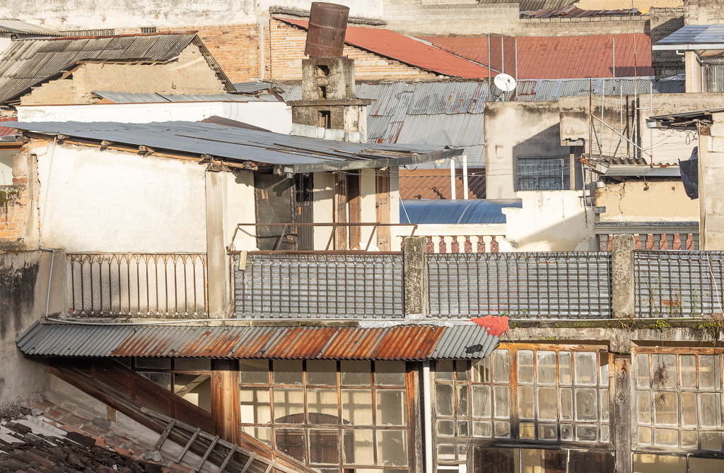
| 36 |
Mar 25 |
Comment |
Hi Gokul - You've really captured the dramatic angles and diagonal cascade of the buildings across this scenic hillside. I wonder if the sun was shining through some fog or haze to create the overall green/yellowish cast ...? I created a sky mask in Lightroom Classic and adjusted the sky tone a little. I then created a feathered radial brush mask over the bright window reflection and toned down highlights & exposure a bit. I also lightened the overall exposure just a little and cropped the edges on both sides to focus more on the angles and diagonal cascade of the buildings across this scenic hillside in the early morning light. |
Mar 20th |
 |
| 36 |
Mar 25 |
Comment |
Barbara - the B&W treatment is so compelling - I think you've done a nice job. If you want to darken the sky as suggested by other folks, if you use Lightroom Classic, you can create a linear mask (type M, then draw down on the + symbol to position and lengthen or shorten your mask. Playing with contrast and shadows instead of exposure can bring more depth and foreboding to the upper sky. I find that technique helpful in adding drama to skies. I like the edge stroke too! |
Mar 20th |
| 36 |
Mar 25 |
Reply |
Thank you, Adi. Where I live - New England - we are known for our brilliantly bright fall foliage. The state is Utah in the west is not considered a place for viewing foliage, which I why I took this image - and many others - showing how bright and brilliant Utah's maple and aspen trees are during the fall. Folks in New England have a hard time believing this is a western scene. |
Mar 20th |
| 36 |
Mar 25 |
Reply |
Thanks for your suggestions, Barbara - much appreciated! I hope to get back this coming fall to take advantage of the group's suggestions to improve my Utah landscapes. |
Mar 20th |
| 36 |
Mar 25 |
Reply |
Thank you for suggesting I check out PhotoPills for hyperfocal distance.
|
Mar 20th |
| 36 |
Mar 25 |
Reply |
Thank you Larry for ALL of your feedback - Much appreciated! I re-cropped and added the updated image here and see that it does add more impact. While I'm traveling, it's hard to ignore a midday view I won't see again, but agree this would have been much more impactful with early or late-day light. |
Mar 20th |
 |
| 36 |
Mar 25 |
Reply |
Thank you Larry for ALL of your feedback - Much appreciated! I re-cropped and added the updated image here and see that it does add more impact. While I'm traveling, it's hard to ignore a midday view I won't see again, but agree this would have been much more impactful with early or late-day light. |
Mar 20th |
6 comments - 5 replies for Group 36
|
12 comments - 5 replies Total
|