|
| Group |
Round |
C/R |
Comment |
Date |
Image |
| 60 |
May 25 |
Comment |
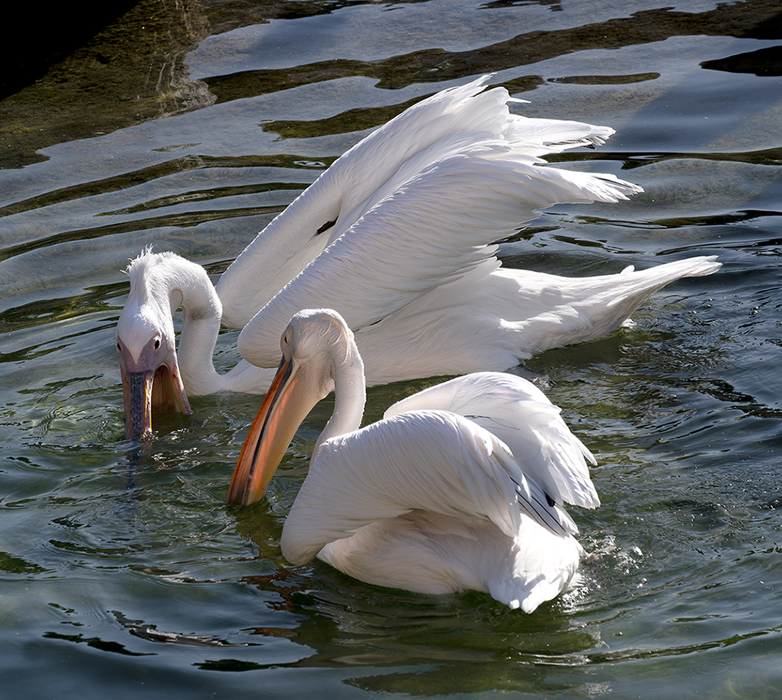
Great shot! The pose and branch tell us that the egret has just taken flight, which adds energy to the image. The vignette works well. I agree with the comments about a tighter crop, but be sure to keep enough of the branches for the viewer to see them as an important and intentional part of the composition. |
May 29th |
| 60 |
May 25 |
Comment |
|
May 29th |
 |
| 60 |
May 25 |
Comment |
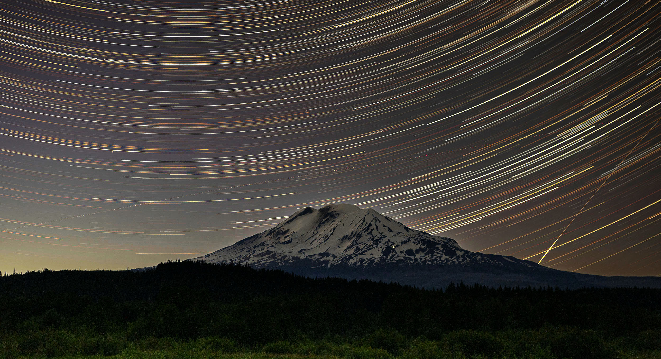
Denny, I'm impressed that you know how to do this. I've never tried astrophotography, but I love the result. The curves in the gold and white lines are lovely. Here's a possible variation with increased brightness and contrast to make it pop a bit more and a crop to put more emphasis on the sky. |
May 29th |
| 60 |
May 25 |
Reply |
It is in Puerto Rico. I looked it up on Google Lens - it's the Plaza of Castillo San Cristobel in Old San Juan. |
May 29th |
| 60 |
May 25 |
Comment |
Diana, Nice catch. I like the black and white, and flipping it works very well. I think my brain is a bit idiosyncratic on this. In its original orientation, I enter the picture from the left and run completely off the right side without anything of interest to hold my attention. Flipped, the large empty area on the left allows me to start there despite the more interesting subject matter on the right, then brake and hold over the boat and home. Nice. |
May 29th |
| 60 |
May 25 |
Comment |
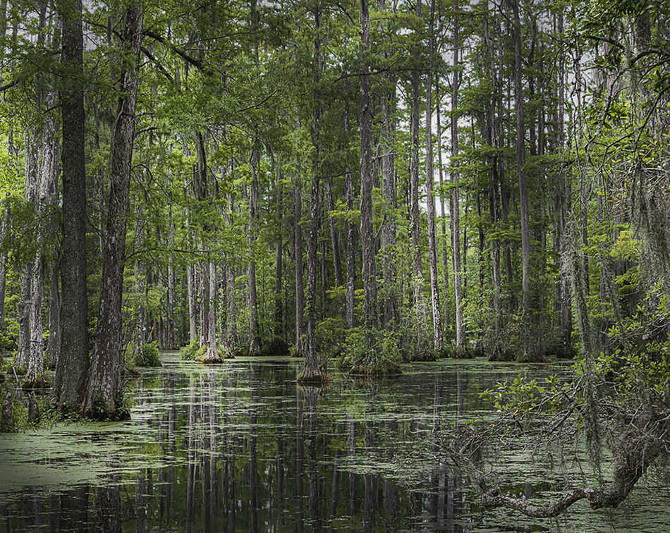
Erin, I need to travel more in NC! Your photo is beautiful. I suggest introducing some darker areas, then adding highlights to create a sense of depth. In the attached example, I intentionally created three dark areas. This creates a central dark area to attract the viewer's initial focus. |
May 27th |
 |
| 60 |
May 25 |
Comment |
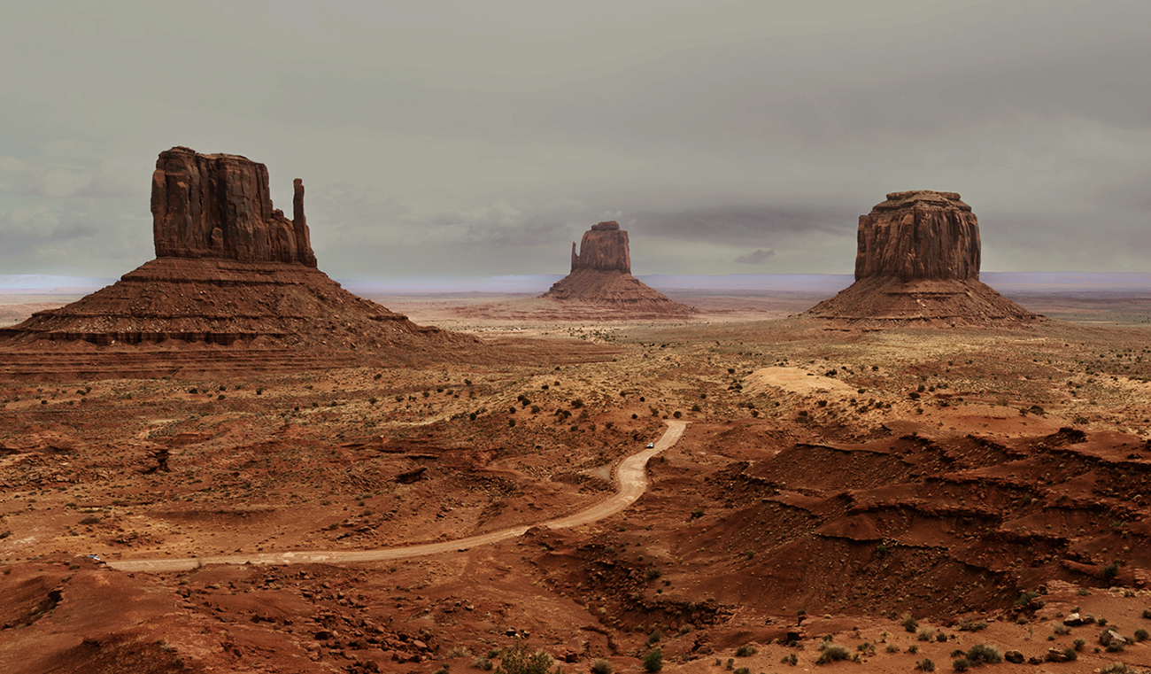
Dean, What a wonderful subject! I like your edits, but want to offer an alternative.
First, I think sticking with the color version is a reasonable choice. The rich red tones are eye-catching. Also, I suggest cropping down to focus on the three monuments. This makes it easier for the eye to know where to go first - the center monument. Removing the plateau on the right makes the scene less busy. Also, since viewers tend to focus longer on odd numbers of primary elements, highlighting the three monuments adds viewer engagement.
I've attached a quickly edited example with contrast in the sky increased to show more detail. |
May 25th |
 |
| 60 |
May 25 |
Comment |
Rita, the mask is stunning, and your edits are awesome.
I agree with Dean that your next step might be to crop in. The curtain (or whatever it is) on the right side is distracting, and it isn't necessary to include all of the edges of the mask. Your audience will fill in the missing information on their own, and as a result, they will be more involved in viewing the photo. In addition, the crop will make it more "your" photo rather than a documentary capture. Once again, kudos on the transformation from a dull through-the-window shot to capturing an elegant piece of art.
There are many possibilities for the exact crop, but I've attached one possibility. |
May 25th |
 |
| 60 |
May 25 |
Comment |
|
May 25th |
8 comments - 1 reply for Group 60
|
8 comments - 1 reply Total
|
