|
| Group |
Round |
C/R |
Comment |
Date |
Image |
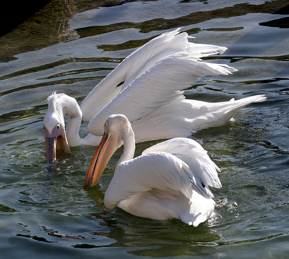
| 60 |
Jan 25 |
Comment |
Anne, Sounds like an enjoyable and challenging photo shot! Birds in flight are difficult and getting a pleasing arrangement of two is even harder. My biggest suggestion: Keep trying. Magic can happen. Yes, your photo isn't sharp. Handheld shoots at long distances require fast shutter speeds. The row of items (other birds?) in the back could be softer, but they would still be distracting. Since you couldn't shoot from a higher angle to get them out of the frame, your only choice is to crop them out, and fortunately, that's doable. The sky isn't contribution any contextual information to your photo, so you could use a tighter crop. The rest of my comments are for post-processing. (I don't know if you are using this tool, but it's fun.) The photo would benefit from stronger subject-to-background separation, which can be done by lightening the white areas of the birds or darkening the sky. If you apply a tighter crop, the large open area in the upper right puts too much emphasis on the single-color sky, detracting from the delicate birds. This can be corrected by adding subtle tone changes to break up the single color. I'm looking forward to seeing more of your pictures. |
Jan 20th |
 |
| 60 |
Jan 25 |
Comment |
Rita, I love the tack-sharp front-to-back focus,the silver and gold tones against the blue sky, and the wonderful reflections. A tighter crop is a viable option, but I'd suggest something closer to the original uncropped version, except for trimming the top to make it appear that the skyscraper in the back continues upward. Leaving more detail on the sides would increase the wonderful variety of textures and patterns that enhance this shot. More importantly, leaving more space at the bottom will make the car on the right less of a focal point, helping the eye to move up where the real action is and giving the picture a more solid base to support the vertical structures. If you are willing to add elements, I suggest continuing the top white cloud so that it also appears on the left side of the rear skyscraper It currently looks a bit oddly truncated. I would also straighten the building on the right to match the other perfect verticals. Nice picture! |
Jan 20th |
| 60 |
Jan 25 |
Comment |
Diana, This is an excellent capture. You did a good job cropping the image to retain the right amount of context for her craft. I might have toned down the red in her complexion and hand. But the saturated colors in her jackets, headband, and skin tones make for an eye-catching, vibrant picture. You did a good job with noise reduction, which helped smooth out her skin tones and the uncut tins in the foreground are a nice touch. |
Jan 20th |
| 60 |
Jan 25 |
Comment |
Thank you for your insights! I like the added drama of your edit. And thank you for your warm, helpful welcome to the group. I greatly appreciate this opportunity to learn. |
Jan 8th |
4 comments - 0 replies for Group 60
|
4 comments - 0 replies Total
|