|
| Group |
Round |
C/R |
Comment |
Date |
Image |
| 60 |
Oct 25 |
Comment |
I would not have guessed this is three images blended together in LR.
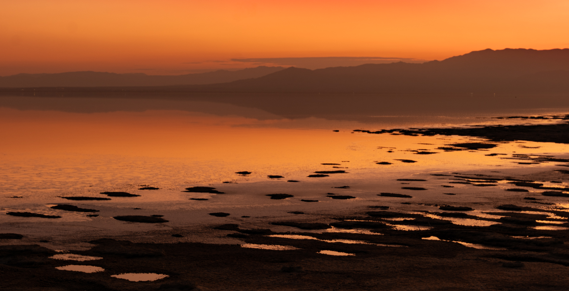
The composition works well, with the house and shed in the left third of the image. You have managed to warm up the image from the original, but I think you may have to give up on converting this, with all the clouds, to a beautiful sunrise. You would need radiating sun rays through the clouds for that. Moving the temperate slider a little more to the right, as Erin suggests, is not going to give you what you want in the end. Why not abandon the beautiful sunrise thought and accept the image you caught as equally dramatic? It was taken mid-morning, after all, and is a moody, overcast scene, which has its own appeal. |
Oct 10th |
| 60 |
Oct 25 |
Comment |
A scenic, calming shot, for sure, with nice composition, as pointed out by Erin. I think more could be cropped from the bottom of the image to create slightly better overall balance between the sky and the watery reflection. The angle of the pine trees on the left and their reflections seems distorted by the lens. It is unlikely they all grew at such an angle. Straightening those and their reflections might be worth considering, unless you feel viewer would expect such distortion and not be b othered by it. |
Oct 10th |
| 60 |
Oct 25 |
Comment |
I do not think you have overworked it at all. You have made it pop much more with your editing. The darkened rock in the foreground sends the eye to the stacked rocks, the main focal point, which are better brightened, as you have done. They are in the right third power point. The colors in the background foliage have been boosted slightly, adding drama. I respond more positively to the edited version than the original. Nice image. |
Oct 10th |
| 60 |
Oct 25 |
Comment |
Rita,
This is an attention-capturing image, so yes, I would say it has impact. I would not have guessed this person was dancing from the position you captured, however, so perhaps a different title would be better. You have done a nice job lightening the original and bringing out the colorful nature of the hat, shirt, and tattoos. The skin tones look realistic as well. I agree the color of the background is not quite right yet. Perhaps a complementary color to the pink or purple, which would be or some shade of muted green or yellow? |
Oct 10th |
4 comments - 0 replies for Group 60
|
4 comments - 0 replies Total
|