|
| Group |
Round |
C/R |
Comment |
Date |
Image |
| 60 |
Aug 25 |
Reply |
Thanks, Erin. This is another thing I will investigate for future reference, along with my comments to Rita. |
Aug 20th |
| 60 |
Aug 25 |
Reply |
Thanks for this suggestion. I am trying to learn various ways to troubleshoot after the fact but also realize it might be best to start from the beginning and watch carefully in each step to see whether it is over sharpening or a bad masking border or what.
|
Aug 20th |
| 60 |
Aug 25 |
Comment |
Dean,
A nice variation on the spider web theme this month. Clearly you and Erin have webs made by two different varieties of spiders.
Yours looks almost like a piece of lace: the small dark droplets create a different pattern from the radiant droplets. Erin's lab slide analogy is also apropos. The coloring is subtle, with the mulch or soil adding warmer tones to the grays and whites in the web.
For the heck of it, you might try converting it to black and white and playing with it in NIK Silver Efex, if you own it. Some of the very fine, almost vertical filaments might become more visible, adding even more interest, or they might prove to be too distracting with everything else going on. But it could be a useful experiment. |
Aug 10th |
| 60 |
Aug 25 |
Comment |
Erin,
The B&W adds so much more drama! On my screen, I can still see shading and individual grass elements in the background, which gives a fuller range than just black and just white. The water beads on the web filament look like little baby pearls!
If you are going to use this for competition, I would suggest you duplicate the image and then play with the crop on the right side. I am a bit bothered by the current one, where there is a short amount of the two branches after they criss-cross. I would try seeing what it looks like if you crop at where they cross: perhaps you already did and did not like it. It also might look like a merge, which is frowned upon. I also would try extending the original photo to the right a little more, if you have not done so yet. Somehow, the balance there seems off to me with the current crop, but perhaps it does not bother others. I was going to recommend you remove the lower of the two branches altogether, but on closer inspection, the web is using it for support, so you need to keep it. The arc on the top one is nice and frames the top of the web, so you probably want to keep that one, but perhaps you could see what it would look like to remove it, for the sake of experimentation, to determine which crop and content you think works best. |
Aug 10th |
| 60 |
Aug 25 |
Comment |
Anne,
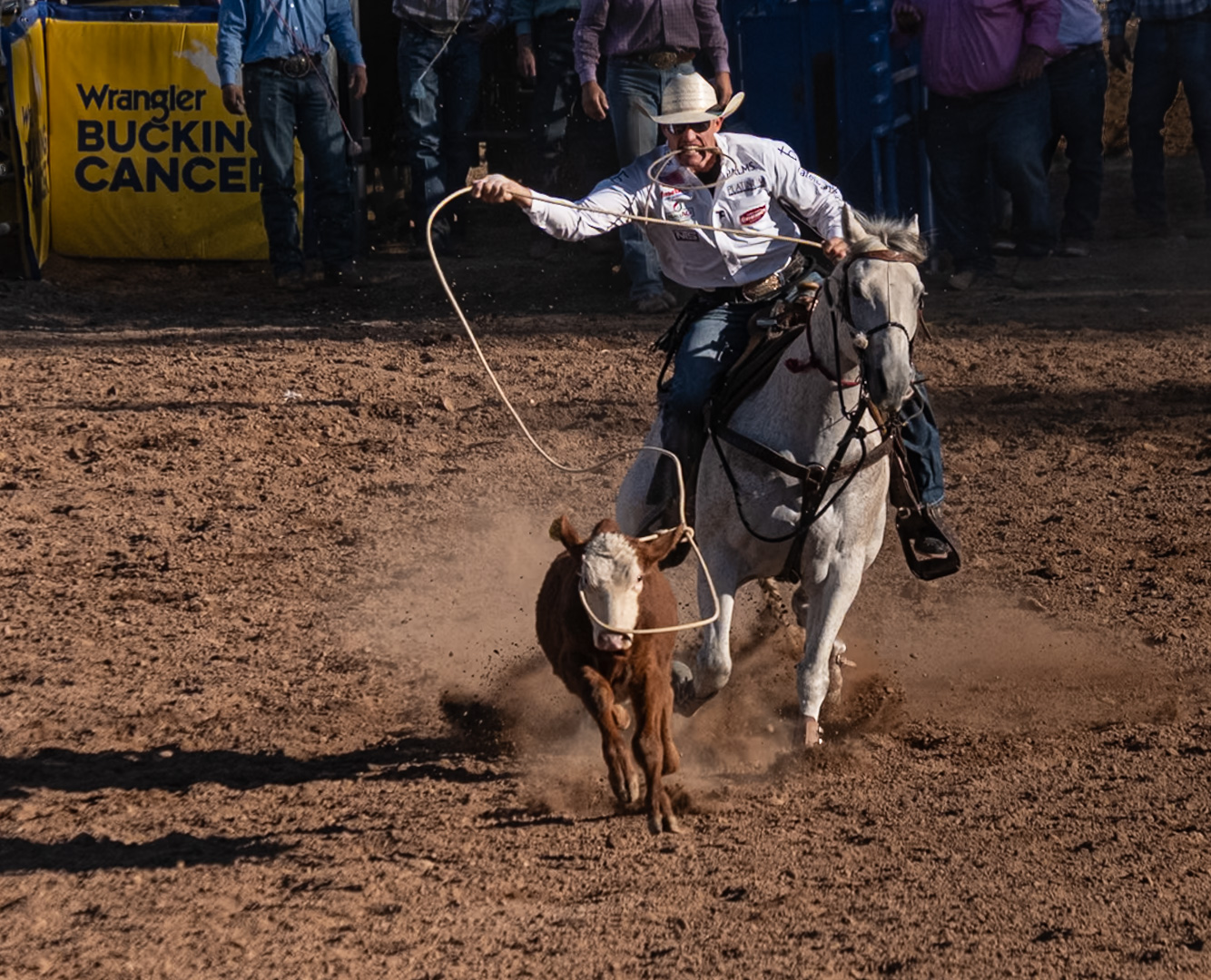
What an interesting story! Have you cropped this image or was this more or less all you focused on? Did you do any editing yet or is this the original? It helps to have both for purposes of commenting. Finally, did you take just this one image or did you wait and try multiple images? Ideally, it would have been nice if you had been able to catch the eye on one or both giraffes open fully, but sometimes in spite of patience, it is impossible.
It took me a while to understand that the mother was sitting: at first I thought you must have confused the mother and child, but then the child was the sucking one, so the mother logically had to be sitting down to be shorter than the daughter. I suppose there was no way to get the rest of the bodies or more of the bodies so that the viewer could understand that intuitively? Zoo shots are always challenging.
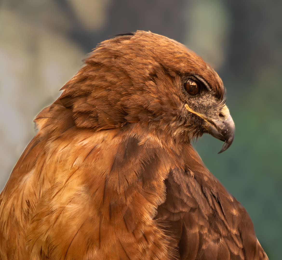
I think the speed is correct: the image is a little soft. You might try to sharpen the two giraffes a bit, either with Topaz or even the sharpening slider in Lightroom, once you mask them. I would remove the circular metal object just under the mother's mouth since it is rather distracting, using the removal tool you prefer in Lightroom or an equivalent program. I would also try to blur the fence in the background even more, or the entire background, to have the giraffes stand out more. I did that in my hawk photo: you can see the difference and decide which you prefer and then try it on your photo. I think most programs would have a tool for blurring. |
Aug 10th |
| 60 |
Aug 25 |
Comment |
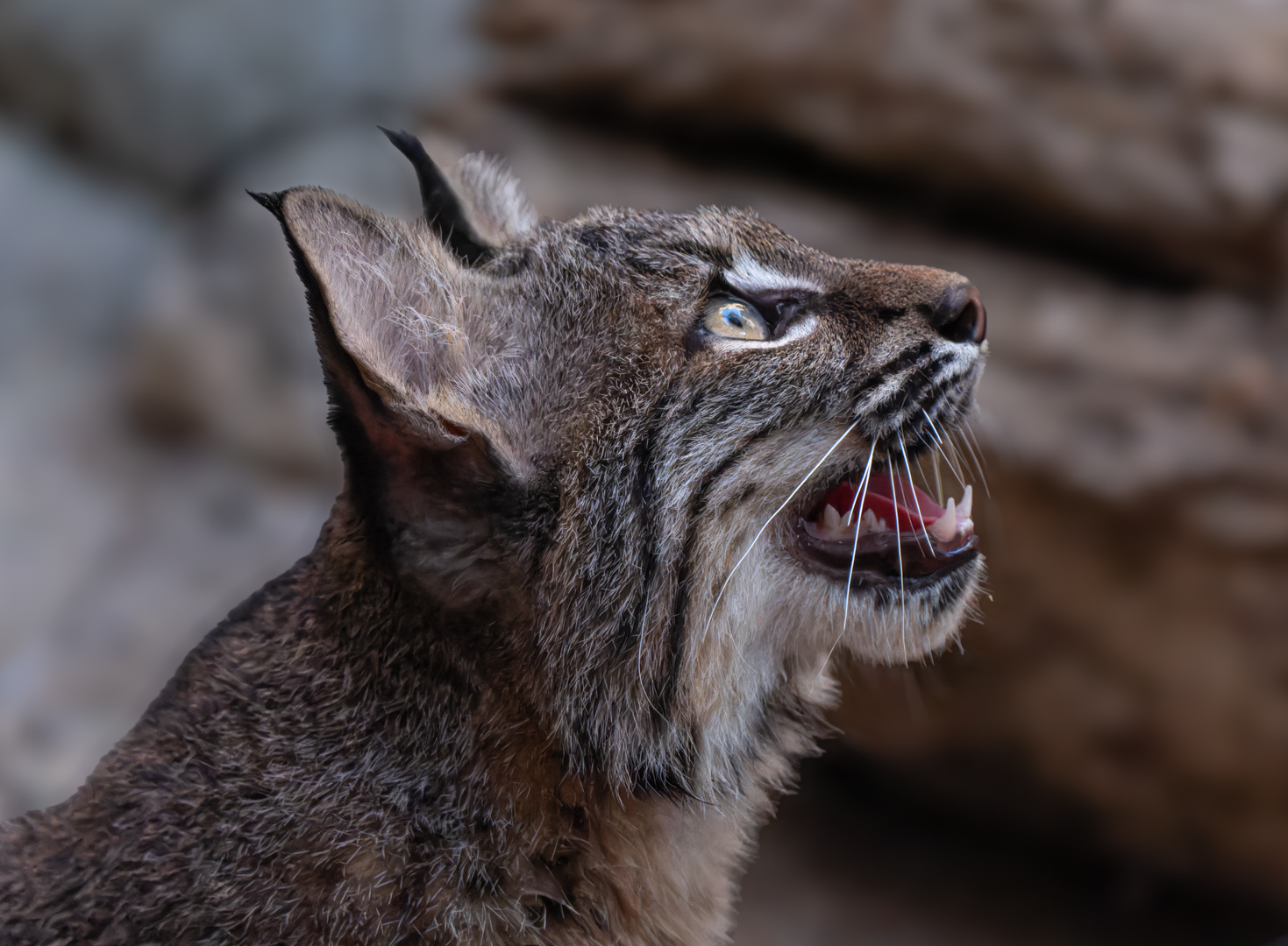
Definitely better cropped, and definitely better in black and white, since more of the details of the bison's face and body are visible and the effect of the light you liked is highlighted even more. I find Silver Efex great for that feature. Not over sharpened, but nice definition. The only other thing I might have tried myself would have been to mask the left side of the face and lighten it slightly and then work with the left eye to make it more visible. It also has light capture. I like the contrast otherwise and do not think this little extra step would make the image less dramatic overall but might enhance it since it is a frontal view, so we want to see both eyes. |
Aug 10th |
4 comments - 2 replies for Group 60
|
4 comments - 2 replies Total
|