|
| Group |
Round |
C/R |
Comment |
Date |
Image |
| 60 |
Jan 25 |
Reply |
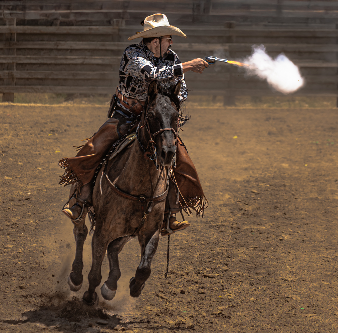
Thanks, Erin. I have played with this photo again this morning since I am submitting it to a local competition and did lighten the face a tad. |
Jan 20th |
| 60 |
Jan 25 |
Reply |
Thanks, Kyle. She is native Amercian so I am trying to preserve a more authentic brownish skin tone that matches her hand, but I can try toning down the red somewhat. |
Jan 20th |
| 60 |
Jan 25 |
Comment |
Thanks, Rita. I am not sure what you are referring to; is it in Lightroom? For competition, I do not think filters are allowed unless I enter the photo into color photo open. But I would like out find out what you have mentioned and try it out if you can steer me to where I will find it. I also have the NIK 7 collection and photoshop at my disposal. |
Jan 20th |
| 60 |
Jan 25 |
Comment |
You did a nice job toning down the upper parts of buildings and opening the shadows in the lowers buildings. |
Jan 10th |
| 60 |
Jan 25 |
Comment |
An interesting capture with the open beak on the back bird and the angles of the legs on both. Yes, the background needs more blurring; it looks a little like old Germanic . My eyes tried to read/decipher three words there and distracted me from the birds. Yes, they are not sharp. I know how hard it can be to capture birds in flight from a recent club trip to a bird sanctuary! |
Jan 10th |
| 60 |
Jan 25 |
Comment |
Thanks for the suggestion. Is LR short for light room? If so, you are suggesting a mask on the face created using a brush then? |
Jan 10th |
| 60 |
Jan 25 |
Comment |
Both the edited version and Dean's suggested darker version are well-composed and each sets a different mood. The sky is better in Kyle's version but that could be adjusted in the darker version by her; with some further toning down by Kyle, Dean's version would produce what looks like a desert forest scene. Living in the desert, I can confirm that Kyle's edited version is closer to the quality of light that I am used to experiencing when visiting Sunnylands. It does not have the golden quality of the early morning light, but does portray the filtered light and highlighted areas nicely. |
Jan 10th |
| 60 |
Jan 25 |
Comment |
The cropped version has the feel of an abstract and provides a much more interesting image than the original, and the deliberate choice of slow shutter speed for softness is effective. The colors are fairly muted for a sunset or even golden hour before sunset. I wonder what enhancing them more might produce in terms of something more vibrant and abstract, even though that would move the photo away from its original coloring in nature, if that is a desired aspect to maintain. I also wonder if a different crop might be played with. The second set of stones at the left edge are redundant, and odd numbers of items are better than even ones as a general rule of thumb. The vertical reflection line is right on the right third line but cropping in from the left to remove that group of stones would still leave the vertical off-center. The disadvantage in cropping further would be the loss of what looks almost like a hand on the left part of the horizontal reflection, above the stones. The reflection resembles a human stick figure, so if that is what is to be emphasized, maybe the "hand" should stay fully, although the suggested crop would still leave the feel of three fingers. |
Jan 3rd |
6 comments - 2 replies for Group 60
|
6 comments - 2 replies Total
|

