|
| Group |
Round |
C/R |
Comment |
Date |
Image |
| 90 |
Apr 26 |
Comment |
Great texture in the feathers, good lighting. I agree with getting rid of the distractions around the face. I would also add some more room on the top. It is too close to the top of his head. |
Apr 2nd |
| 90 |
Apr 26 |
Comment |
I also agree with cropping and removing the white distractions. Otherwise a great picture, the textures in the fur are beautifully defined and sharp. Depending on what you are doing with it, I would also add a small catchlight in the baby's eye. (Some competitions don't allow that type of edit.) |
Apr 2nd |
| 90 |
Apr 26 |
Comment |
I agree with Deborah about the crop and texture. I would also try bringing out his eyes by whitening the white and darkening the black. Maybe even darken around the eyes with a very thin black line. He's gorgeous, it looks like he is walking right towards you. Great shot! |
Apr 2nd |
| 90 |
Apr 26 |
Comment |
I don't think it blends too much, but maybe slightly darken some of the highlights in the green. Below his hand, on the left and on top of his head. The eyes and pose are great. |
Apr 2nd |
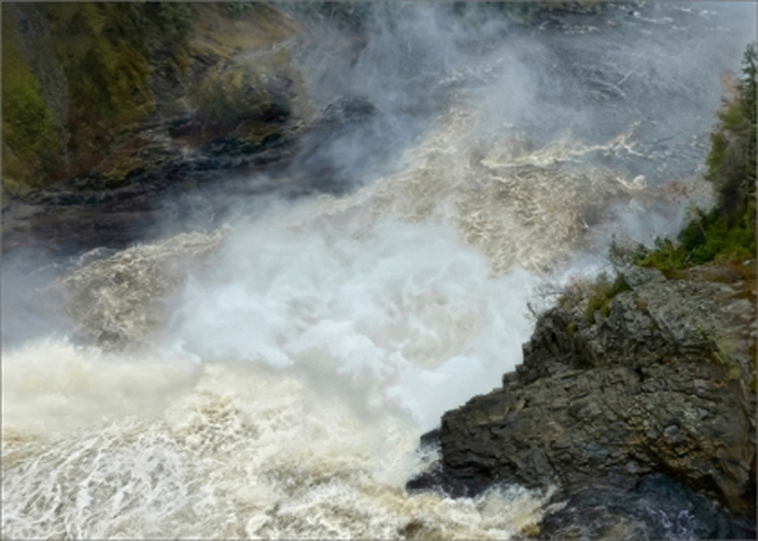
| 90 |
Apr 26 |
Comment |
I darkened the rocks on the right, and added some contrast to the water. Did I do too much? |
Apr 2nd |
 |
5 comments - 0 replies for Group 90
|
5 comments - 0 replies Total
|