|
| Group |
Round |
C/R |
Comment |
Date |
Image |
| 64 |
Mar 26 |
Reply |
No problem. Now I understand what Stan meant by "hand of man", the road on the lower edge. |
Mar 19th |
| 64 |
Mar 26 |
Comment |
I like the mood this image echoes. Nicely framed image. The downward loose branch on the left tree is a bit distracting; I would considered clone it out. |
Mar 18th |
| 64 |
Mar 26 |
Comment |
Very nice mono subject. I like the dramatic sky, kind of goes with the main subject, the canon. A lot of details on the foreground too. I think blurring that out a little bit would focus your eyes more on the canon. |
Mar 18th |
| 64 |
Mar 26 |
Comment |
You cropped to just what matters in the image. Converting to BW eliminated a lot of the distraction from the background. The dark pattern between the couple's face is still very distracting and drawing my eyes. I wonder if you could dodge it and decrease its dominance. |
Mar 18th |
| 64 |
Mar 26 |
Comment |
Very sharpe image, nice details throughout, I especially like the texture of the the petals on the lower half of the image. |
Mar 18th |
| 64 |
Mar 26 |
Comment |
I also like the cropped version better eliminating the distracting diagonal line on the top. Nice leading lines that take you to the subject. This might be nit-picking, the black line going through your daughter's head is a bit distracting. Waiting for a second or two as she was going down the stairs and then snap the photo will have her head in between the two lines and having a framing effect. This is of course an after-thought and just my two cents. |
Mar 18th |
| 64 |
Mar 26 |
Comment |
Staircases usually make interesting photos, color or BW. This is a nice capture, nice tonal range. to make the photo more balanced, my preference would be to crop the right side, because the zig-zag pattern on the right edge draws my eyes from center of the photo. |
Mar 17th |
| 64 |
Mar 26 |
Reply |
Thank you for your comment. |
Mar 17th |
| 64 |
Mar 26 |
Reply |
Thank you for your critique. Sorry I am a little confused though, did you mean to say I "might NOT want to crop the bottom" if I want to enter it in Nature someday? It looks like you were suggesting me to crop the bottom as suggested? Are entries in Nature not allowed to crop? Thank you. |
Mar 17th |
| 64 |
Mar 26 |
Reply |
Thank you for your comment and suggestions. |
Mar 16th |
| 64 |
Mar 26 |
Reply |
I see. Thanks for the tip! I will give it a try. |
Mar 16th |
| 64 |
Mar 26 |
Reply |
Thank you! |
Mar 14th |
| 64 |
Mar 26 |
Reply |
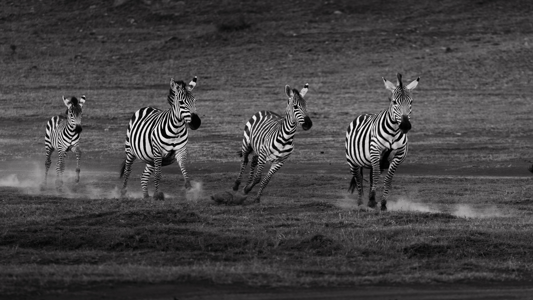
Thank you for your suggestions. I agree cropping the very bottom of the image will make some improvements. I tried cropping off the last zebra, but feel the image is a bit tight that way. There's also quite a bit of dust under the last zebra, I feel cropping out that zebra will lessen the impact of the sense of motion. I know you can create dust in photoshop, but until I learn how to do it.... |
Mar 14th |
| 64 |
Mar 26 |
Reply |
Thank you for your kind comments. |
Mar 14th |
6 comments - 8 replies for Group 64
|
| 71 |
Mar 26 |
Reply |
Thank you for your suggestions. Yes, I will go explore it some. |
Mar 18th |
| 71 |
Mar 26 |
Reply |
Thank you. Yes, it was a phenomenal sight. |
Mar 18th |
| 71 |
Mar 26 |
Reply |
Thank you. |
Mar 18th |
| 71 |
Mar 26 |
Reply |
Thank you for your comments. Yes, we were lucky that it was a beautiful evening. |
Mar 18th |
| 71 |
Mar 26 |
Reply |
Thank you for your comments. |
Mar 18th |
| 71 |
Mar 26 |
Comment |
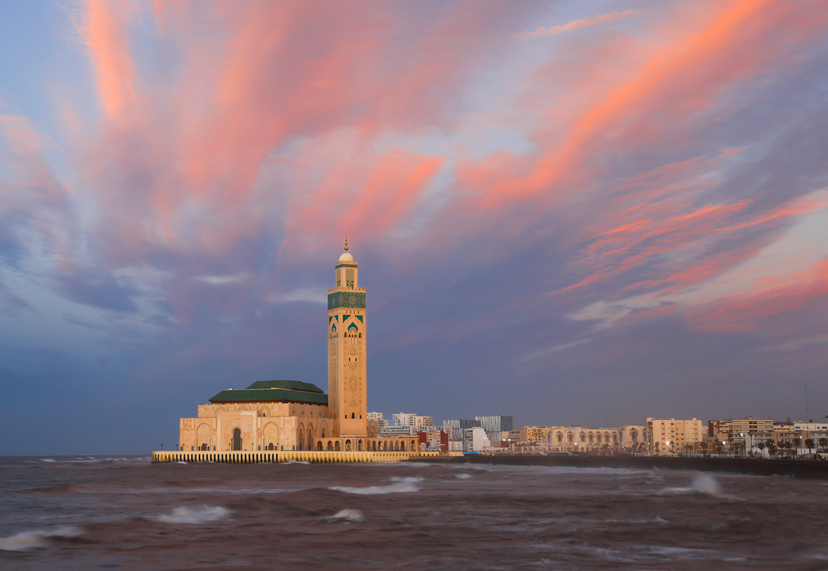
I like the pretty pastel sunset colors. You captured well the pattern of the receding waves. I like the uncropped version better with the sky echoing the color on the beach and it feels like the image has some breathing room. |
Mar 14th |
| 71 |
Mar 26 |
Comment |
I love these old winding European streets. I find my eye drawn to the darker colors on the right side, the dark brown on the upper wall and the dark shadow on the lower left. I wonder how the image would look like with the right side slightly brightened. |
Mar 14th |
| 71 |
Mar 26 |
Comment |
Lovely image, I like the soft pastel color |
Mar 14th |
| 71 |
Mar 26 |
Comment |
I like both versions. The color version has a nice warm/cool color contract, the temple looks brilliant. In the BW version, the temple looks imposing and majestic. |
Mar 14th |
| 71 |
Mar 26 |
Comment |
Nice travel image. I don't know if it's my OCD, but I'm itching to see the image with the canal dead in the center and not off to the side like this, feels a bit unbalanced. You might have composed it this way intentionally. |
Mar 14th |
| 71 |
Mar 26 |
Comment |
This is a sharp and balanced image. The warm brick color and the cool sky color work well together. The shadows on the foreground grass are bit distracting to me, I wonder if you could clone them out or make them bit less lighter. |
Mar 14th |
6 comments - 5 replies for Group 71
|
12 comments - 13 replies Total
|