|
| Group |
Round |
C/R |
Comment |
Date |
Image |
| 16 |
Jun 25 |
Reply |
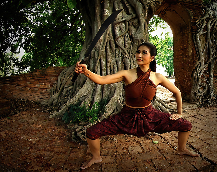
Thank you for the explanation about burning the sword. Attached is a version where I subtly lightened around the sword to give you an idea of what I meant, hopefully drawing attention to where the model is looking without ruining the black of the sword. |
Jun 26th |
 |
| 16 |
Jun 25 |
Reply |
Terry, I am on a PC using an ProArt display monitor which is supposed to be good for photo editing. The calibration system I use in the SpyderPro. After I calibrate, I can see differences in the lightness/darkness on my monitor as the Spyder takes into account the ambient light in the room. All my friends that use Mac systems swear that you do not need to calibrate the monitors so quite possibly this is something you do not need to do. |
Jun 6th |
| 16 |
Jun 25 |
Reply |
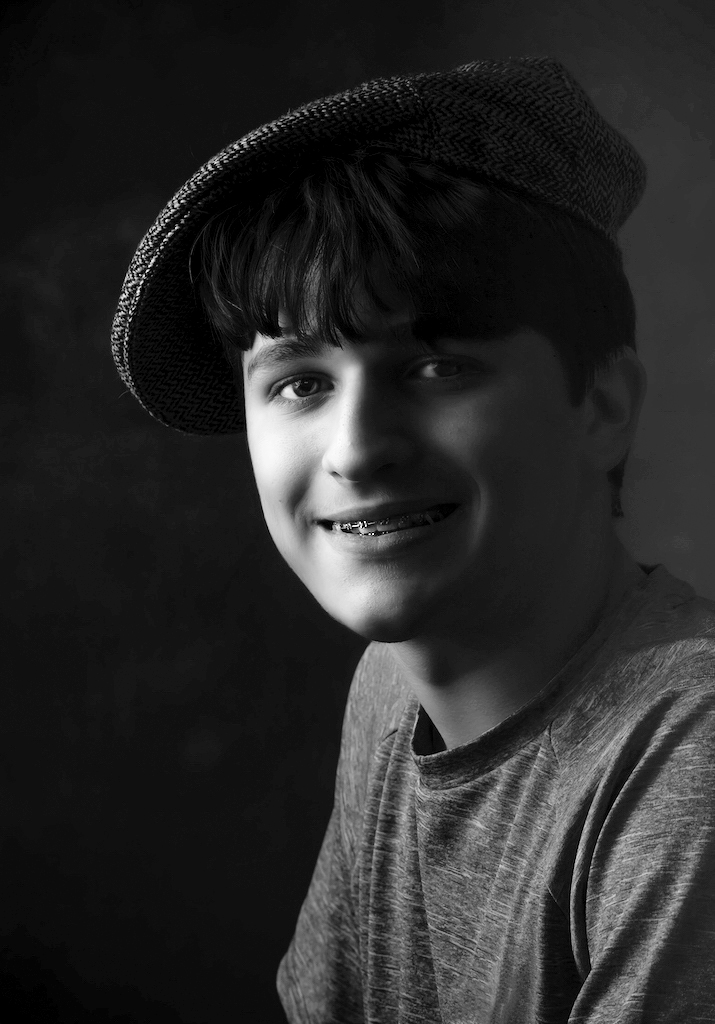
Hi Terry! On my monitor, the B+W image still appears dark...I believe it is time to calibrate! It is a lovely portrait of the young man :) |
Jun 5th |
| 16 |
Jun 25 |
Reply |
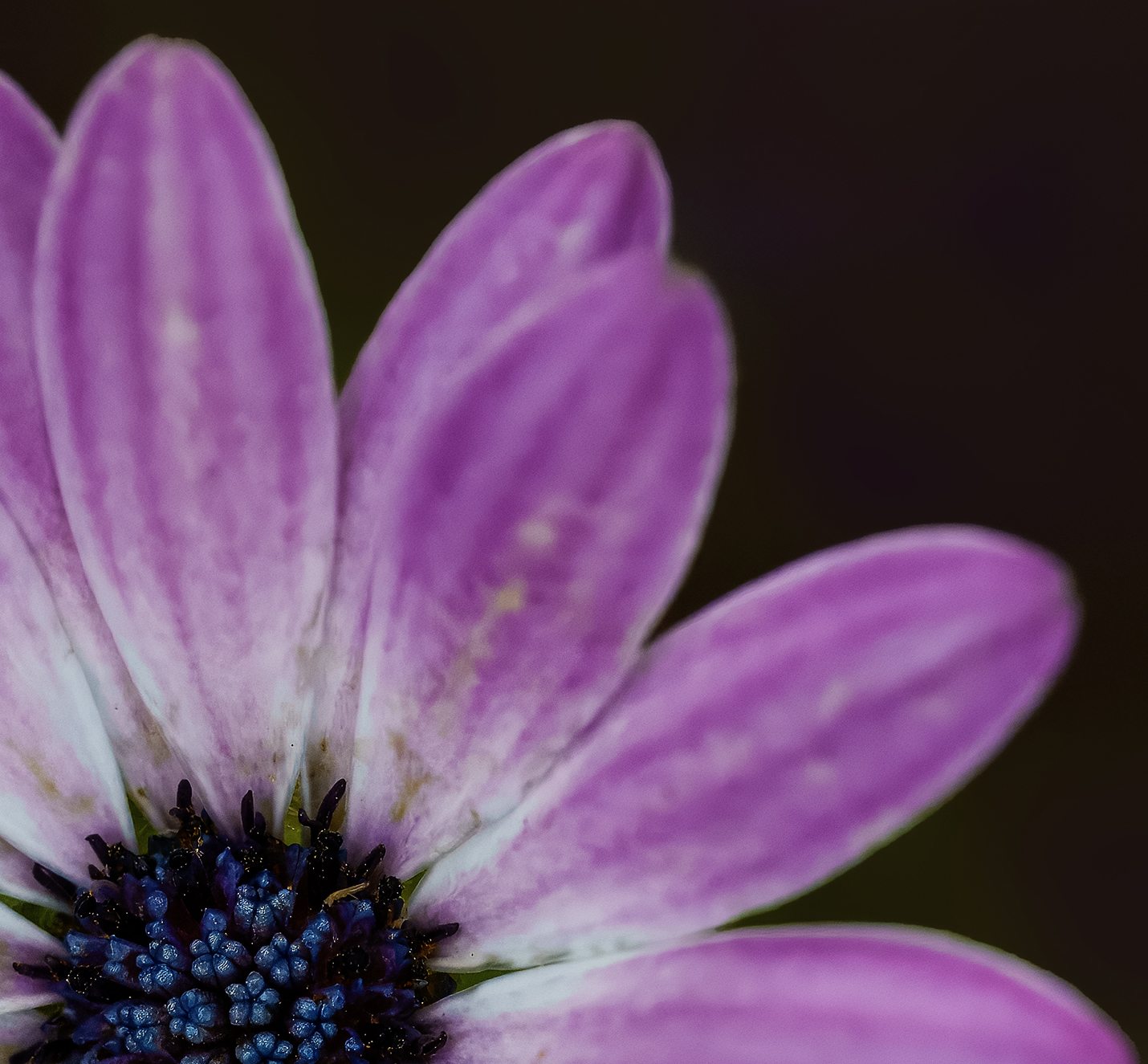
Hi Terry!
Thank you-I'm excited to be here and really appreciate the warm welcome! I really enjoyed seeing your creative take on the image. It's always fun to experiment with different techniques and see where they lead us.
You're absolutely right-the center of the flower is the focal point, and keeping it in color while converting the rest to black and white really draws attention to it. Shifting it closer to a rule-of-thirds position strengthens the composition even more. Nicely done! |
Jun 5th |
| 16 |
Jun 25 |
Comment |
To answer your questions: I think the cropping works well, and personally, the blue shirt doesn't feel distracting to me. I really admire that you experimented with Rembrandt lighting-it's a technique I've always found challenging myself, so kudos for giving it a go!
The original image does appear quite dark, and while I can tell you've made some adjustments to lighten it, it still reads a bit underexposed on my monitor. Out of curiosity (especially since you mentioned concern about the shirt color), I converted the image to black and white and made some slight level adjustments to brighten it up. I'd love to hear your thoughts on that version! |
Jun 4th |
 |
| 16 |
Jun 25 |
Comment |
You've captured a beautiful portrait of a striking model. Both eyes are sharp, which can be a challenge with this kind of pose-nicely done!
That said, I do find myself wishing her right eye wasn't quite so obscured by her arm and hair. A slight turn of her face toward the camera or a small adjustment to the pose might have opened up that side a bit more.
Still, it's a lovely and well-executed portrait, and I'm sure the model will be very happy with the result! |
Jun 4th |
| 16 |
Jun 25 |
Comment |
The art exhibit sounds fascinating-what a great setting to photograph! I really enjoy the vibrant colors in your image and how the three silhouetted figures stand out so clearly against them. The structures in the background with lights draped from their "arms" create appealing diagonal lines that guide the viewer's eye through the scene.
As for the white spots or lights in the foreground, while some of them add a nice touch of atmosphere, not all feel essential to the composition. You might consider cropping a little of the bottom off of your image to help keep the focus more on the figures and the dynamic background.
Overall, a colorful and engaging image-well seen! |
Jun 4th |
| 16 |
Jun 25 |
Comment |
Hi Mohanan,
Thank you for the warm welcome-I'm excited to be part of the group and look forward to connecting with everyone!
You've photographed a stunning model in a truly beautiful setting-there's so much to admire in this image. The sharpness throughout is excellent, and I really appreciate your choice of perspective. Shooting from a lower angle works well here, especially since the model is in a crouched position-it creates a strong composition.
One area that caught my eye is the bright background and sky over the model's left shoulder. Because it's so bright, it tends to draw attention away from your subject.
Also, since the model is gazing at her sword, that element becomes an important part of the story. On my screen, the blade appears quite dark-almost black-so you might try lifting the exposure or contrast on the sword just a bit to bring out its detail and reinforce its role in the image.
Overall, a powerful and well-executed shot-nicely done! |
Jun 4th |
5 comments - 4 replies for Group 16
|
5 comments - 4 replies Total
|