|
| Group |
Round |
C/R |
Comment |
Date |
Image |
| 62 |
Mar 25 |
Reply |
Thank you Mark - I have taken into account all your suggestions in the attached revised file. |
Mar 30th |
 |
| 62 |
Mar 25 |
Reply |
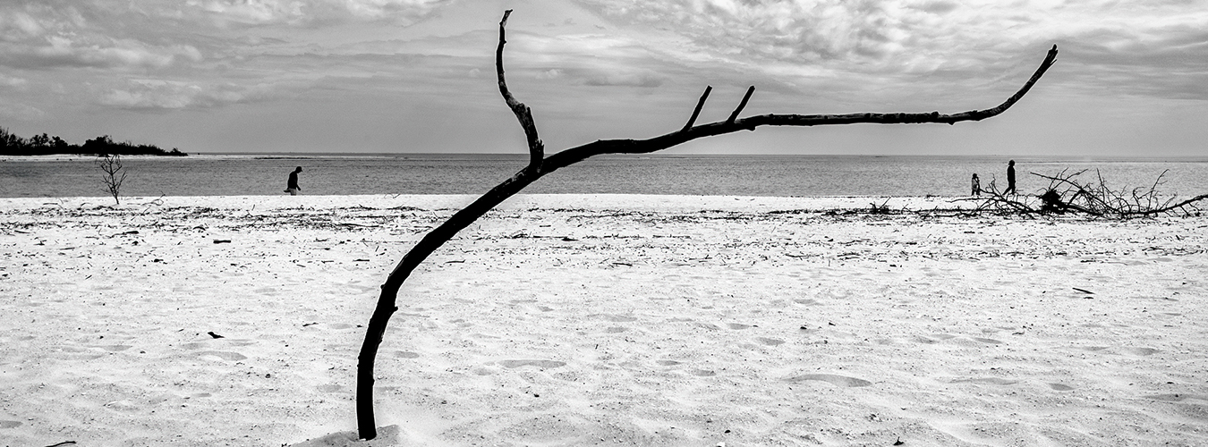
Adrian - thank you that was a great suggestion. The panoramic crop does open up the scene and fits this image perfectly. I did want to show the base of the branch so I had to clone out a bit of the left arm of the branch to fit into the frame. |
Mar 30th |
 |
| 62 |
Mar 25 |
Reply |
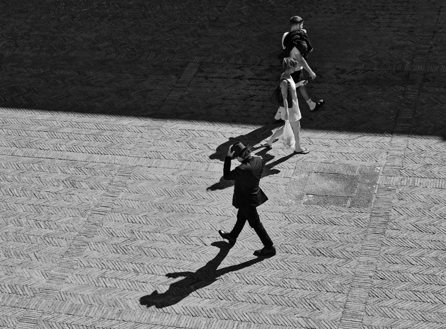
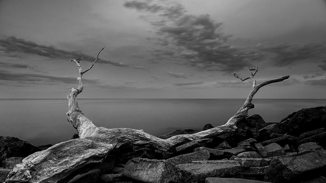
Pete - thank you for your edit. Both you and Chris suggested a very viable and creative alternate representation showing a lone tree and no human presence. I will also modify my original with a tighter crop on the left and the elimination of all people except one on the right at the end of the leading line caused by the branch. |
Mar 21st |
| 62 |
Mar 25 |
Reply |
Chris - thank you for your input. Interestingly the leading line is basically a branch ( probably no longer than six feet ) that someone had stuck in the sand. I will probably end up with a slight crop to the left as you suggested and eliminate all but the one person on the right. |
Mar 21st |
| 62 |
Mar 25 |
Comment |
Chris - well executed focus stacking technique. I am looking at a new camera and I will definitely buy a camera that has built-in focus stacking capabilities. The B&W treatment is very effective - I played a bit with your B&W image to do a bit of dodging and burning to try to give a more 3-dimensional look to the flower. I am not sure though I succeeded.
Mike |
Mar 12th |
 |
| 62 |
Mar 25 |
Comment |
Adrian - Excellent image - it evokes the high fashion sense and the love of gastronomy that people from Bologna display. I too found that the bright bananas, the light strip and the sign occupy too much of the image and draw the attention ( either too bright or the need to read and translate the text ) away from the hat and the interaction with the vendor.
Perhaps you have more pixels in the original image to maintain a square crop.
Mike |
Mar 10th |
 |
| 62 |
Mar 25 |
Comment |
Mark - definitely an image with tremendous potential. The setting and the interaction of the people in the restaurant provides an amazing setting for a powerful street scene. While it is difficult to view the scene properly because of the reduced pixel size I agree with Pete's suggestions to focus on the diners ( or perhaps the cook in a different version )
Mike |
Mar 10th |
| 62 |
Mar 25 |
Comment |
Emil - I like the fact that your B&W treatment renders the brick to a very deep gray - almost black and the contrast is provided by the windows. I felt the wires on the top left were drawing the attention out of the picture - so I removed a bit - being careful to make sure the rest was simply not floating out in the air.
Mike |
Mar 10th |
 |
| 62 |
Mar 25 |
Reply |
here is the image |
Mar 10th |
 |
| 62 |
Mar 25 |
Comment |
Pete - Your great effort to get the picture was well rewarded. And certainly the B&W conversion achieves the impact you were going for. Excellent.
I recently came across a technique to boost contrast quickly in one step and I apply it to every B&W conversion just to see what the results will be. In photoshop I apply a Gradient Map layer and play with the sliders ( many videos on line ). It tends to blow out the highlights in some cases but generally very quick for some first concepts. I applied it to your image just to illustrate the effects
Mike
Mike |
Mar 10th |
5 comments - 5 replies for Group 62
|
5 comments - 5 replies Total
|