|
| Group |
Round |
C/R |
Comment |
Date |
Image |
| 27 |
Dec 17 |
Comment |
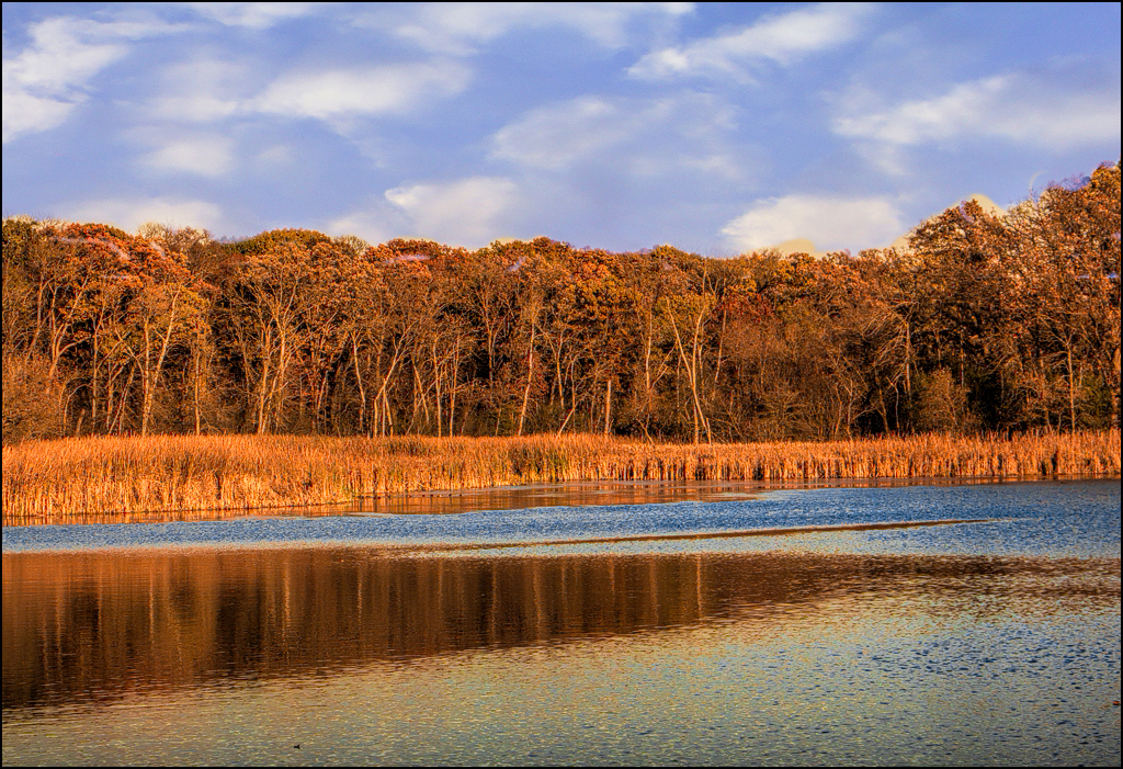
nice image... Good job of replacing the sky. Your trees have very little color and low contrast so I suggest trying a Topaz - clarity - color and contrast boost II to increase saturation in the trees and also reflection. |
Dec 16th |
 |
| 27 |
Dec 17 |
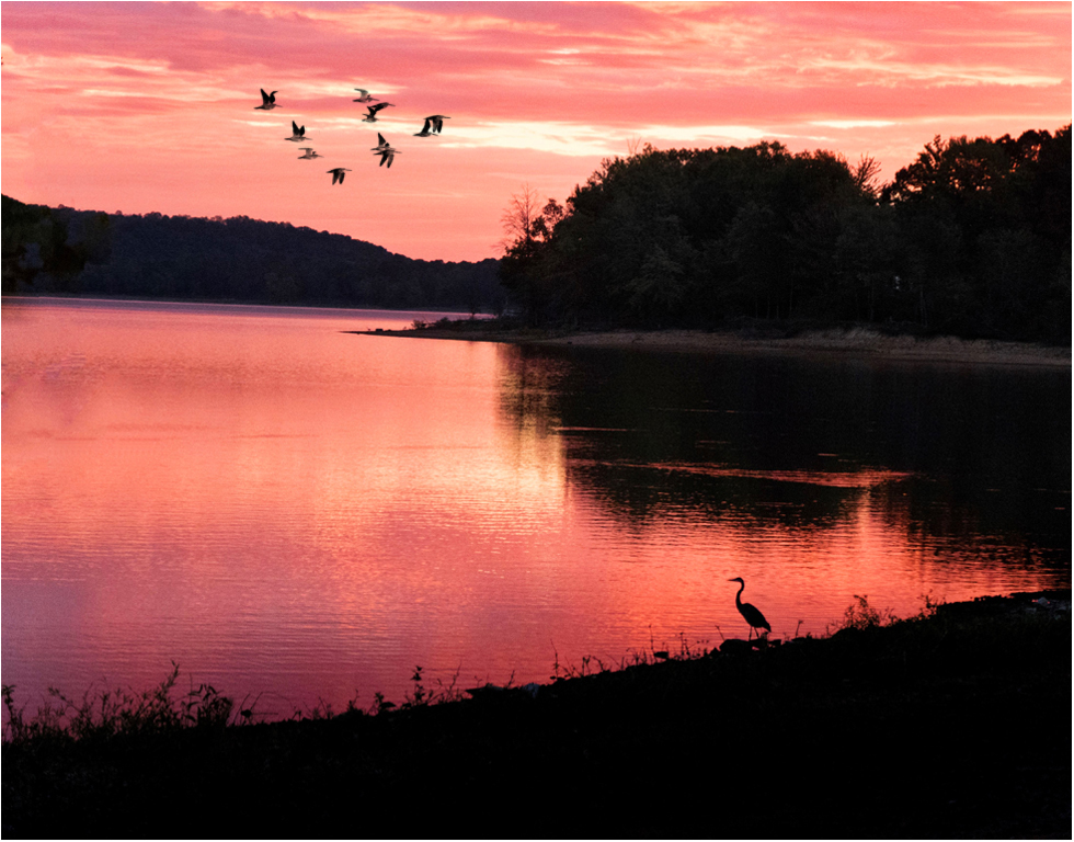
Comment |
Very good sunrise image. Good composition of placing the main bird. Good job of removing the tree leaves. Have your thought about buying an older version of photoshop off ebay to use it instead of lightroom. The layers will afford you the ability to change many things in your image and even adjust them later. Such as using Photoshop CS5 on my internet computer, I used a Hue/Saturation layer to increase the saturation and darken slightly the sky color and reflection. Also, you can find free brushes at the website for Brusheezy - one is bird groups. I used it add the birds in the sky. If you add things like the birds always add them on a new layer so you can use an eraser if you want to remove a few. Very good image. |
Dec 16th |
 |
| 27 |
Dec 17 |
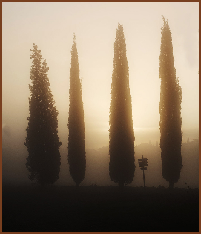
Comment |
Very nice mist picture... I just don't do early early morning pics - glad that someone does them. I would suggest using Curves - medium contrast to make the light part of your image pop more. Good job on cropping. |
Dec 16th |
 |
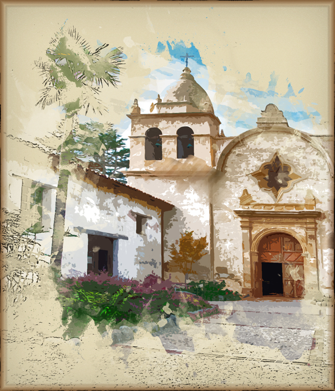
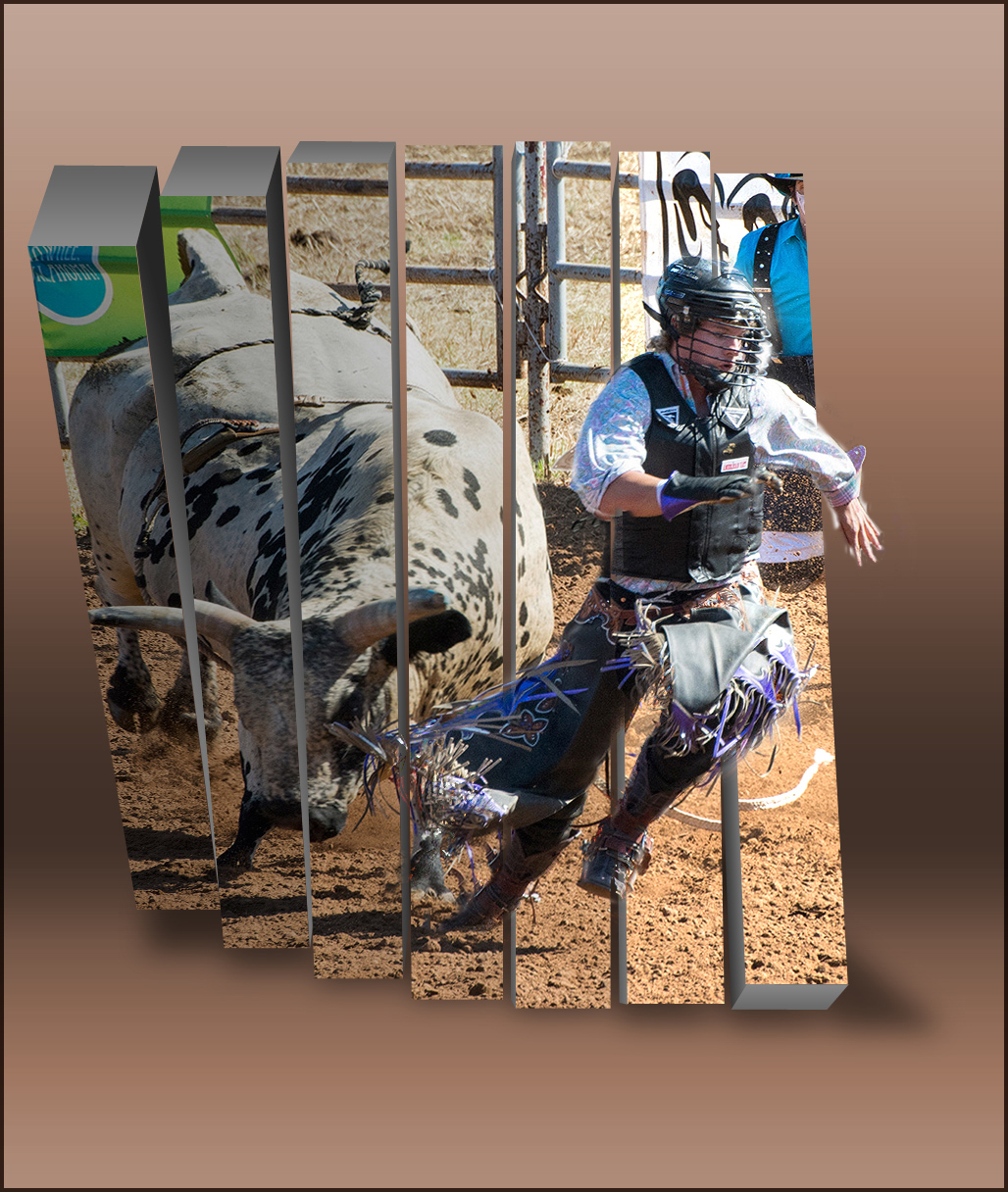
| 27 |
Dec 17 |
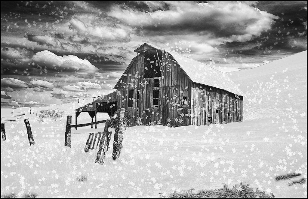
Comment |
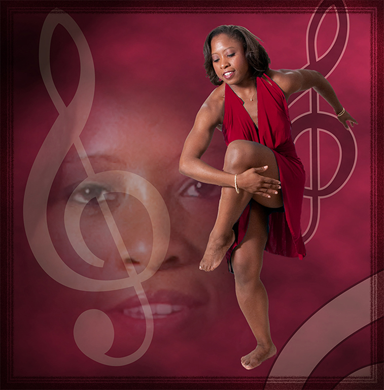
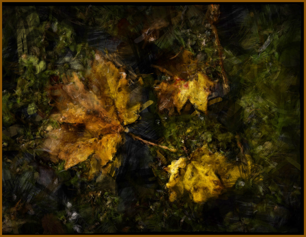
Very artsy image... My creative DD group turned me on to filter forge several years ago. I really like some of their alterations. The art brush effect is effective but I feel the overall levels should be for a lighter image. I love their effect that makes the bottom part of the image look shredded.
Good job. |
Dec 16th |
 |
| 27 |
Dec 17 |
Comment |
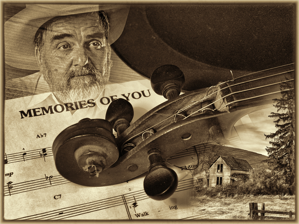
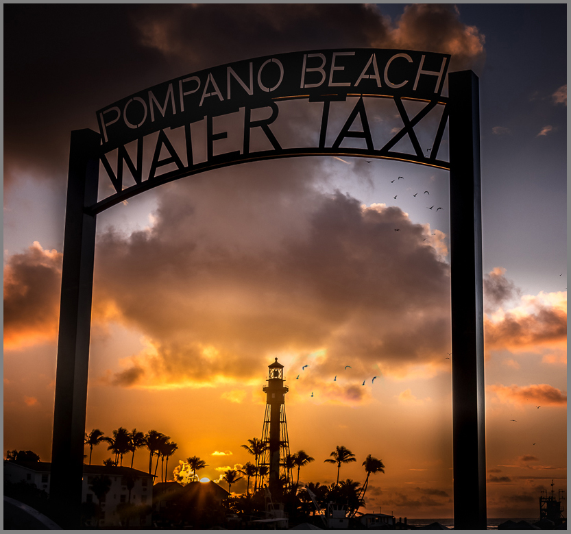
Very good image... You did a great job of processing and using the framing to your picture's advantage. Excellent crop and composition, especially the sun's placement. You could use bird brushes on the bottom of the big cloud or just copy the birds you have in your image and put on a separate layer and move them around until you like the placement - use a " pin light" blending mode so only the dark birds will come through. You could use transform to enlarge or rotate the pasted birds also. I will email you a psd file so you can see the extra layer where I copied the birds from your image and did this. Just a suggestion. Good job. |
Dec 16th |
 |
5 comments - 0 replies for Group 27
|
| 32 |
Dec 17 |
Reply |
Yes, you are supposed to keep the same name but you can do anything to it in Pictorial. Of course, PJ is like nature with very strict rules about changing things. Entering the same or altered image in the same Salon (same year) isn't a no-no since they have different judges usually but some Salons are picky. I do a lot more to all my pictorial image - especially if they come from a PJ image. |
Dec 22nd |
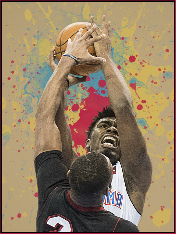
| 32 |
Dec 17 |
Comment |
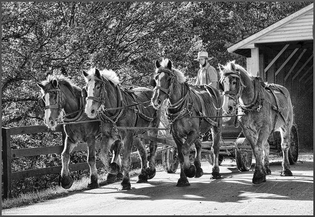
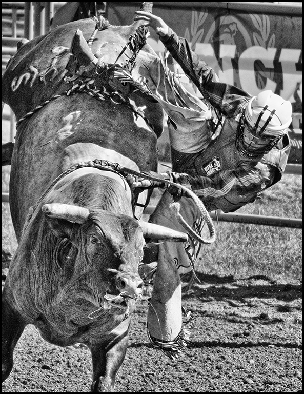
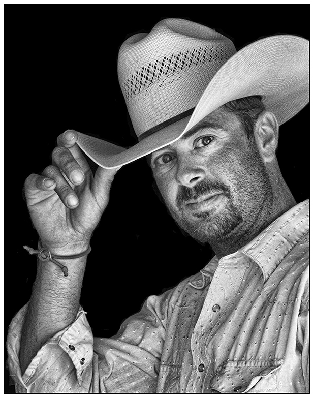
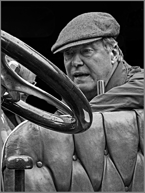
Welcome to our group, Michael. Good grab shot of your driver. Sometimes, you have to take the pics you have instead of maybe the shot you would really like to take. You will find that I like to take images and play with them (the groups as well as my own). So your subject's placement is good and the surrounding is storytelling but I would work on clarity and background. Adding a curve's layer to increase your contrast as well as dodging his face. Also, I suggest you select the background and use brightness contrast or just paint it black to darken the background. Finally I would also add some sharpness and detail by using Topaz - detail - overall medium II. These are just suggestions to improve your image. Overall a good image. |
Dec 17th |
 |
| 32 |
Dec 17 |
Comment |
Good PJ image... Sometimes we don't appreciate how easy our life is in the USA. Good crop that shows the main activity. Of course, my grandmother didn't have running water in her home but a cistern and rain water barrels; also she had an outhouse and a slop jar at night. Good image.
|
Dec 11th |
| 32 |
Dec 17 |
Comment |
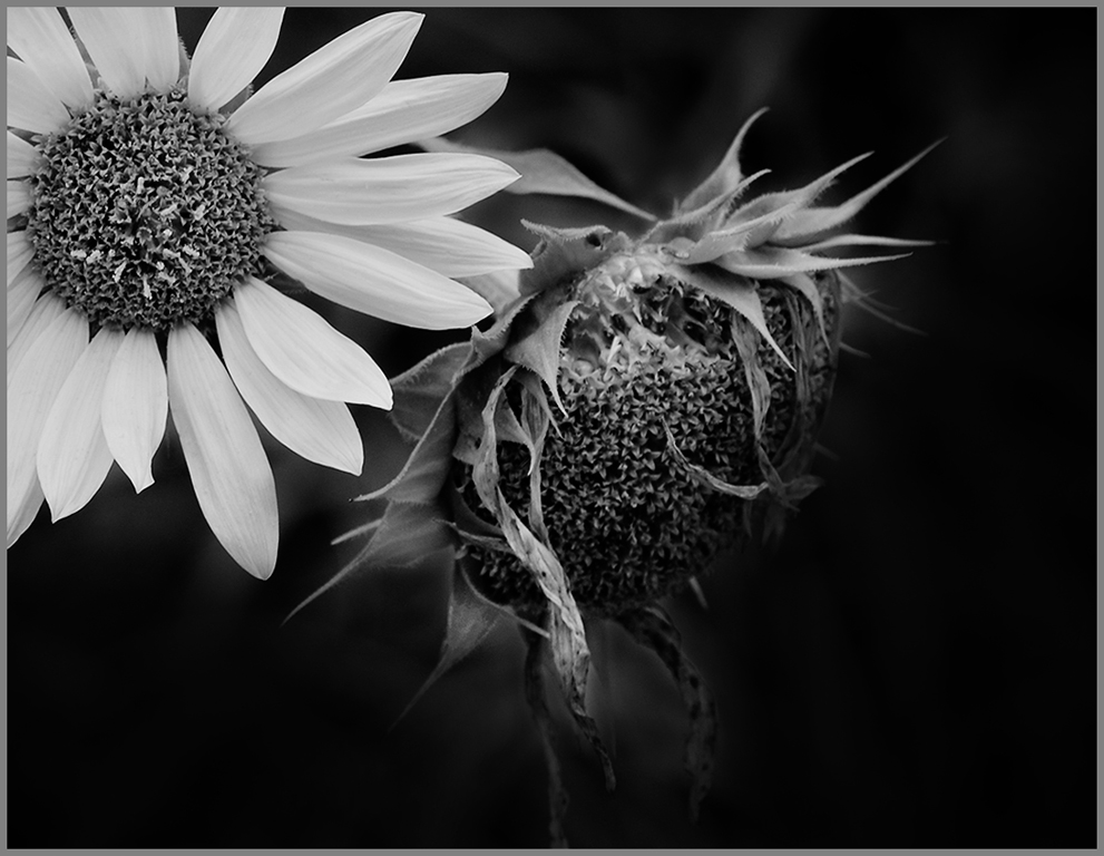
Good floral image... Your crop is fine. A mono image usually needs a good dark black and good white, so I suggest that you use the curves layers and start with "medium contrast" to darken your black and lighten your whites. Also, use the finger dropper and select the gray in the background of the image to know where it appear on the curve, then pull that dot down to darken your background some more. Good job.
|
Dec 11th |
 |
| 32 |
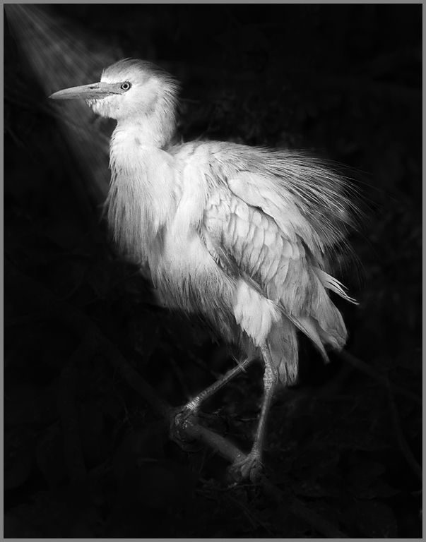
Dec 17 |
Comment |
Very good image... Nature competition is quite often a lot about habitat as well as the bird so that is probably why it scored well with no change to the background. Our club is heavy into nature and they consider the surrounding of an image as important as the main subject. Just like with PJ - an image telling a story is important. Anyway, If you stay with the mono, your background needs to be darker and also you need a reason for the bird being lighter so create a sunray which could naturally occur. I created one to show you what I mean - you can use curves to lighten the bird after adding the ray and also to darken your background - just find the spots on the curves and change it. I do agree that in pictorial, the background would be too distracting. Back to your computer and photoshop !!
|
Dec 11th |
 |
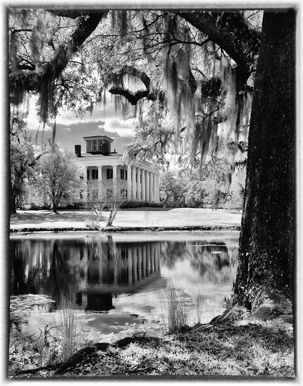
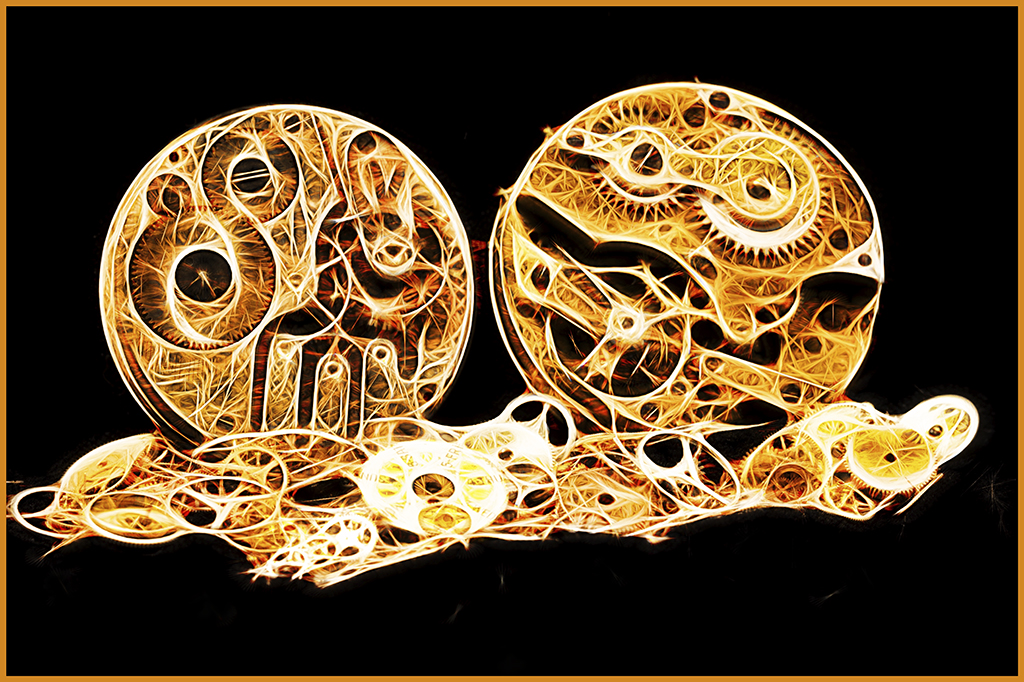
| 32 |
Dec 17 |
Comment |
Beautiful architecture... Only a wide angle lens could do this creation justice. You have a great image.
|
Dec 11th |
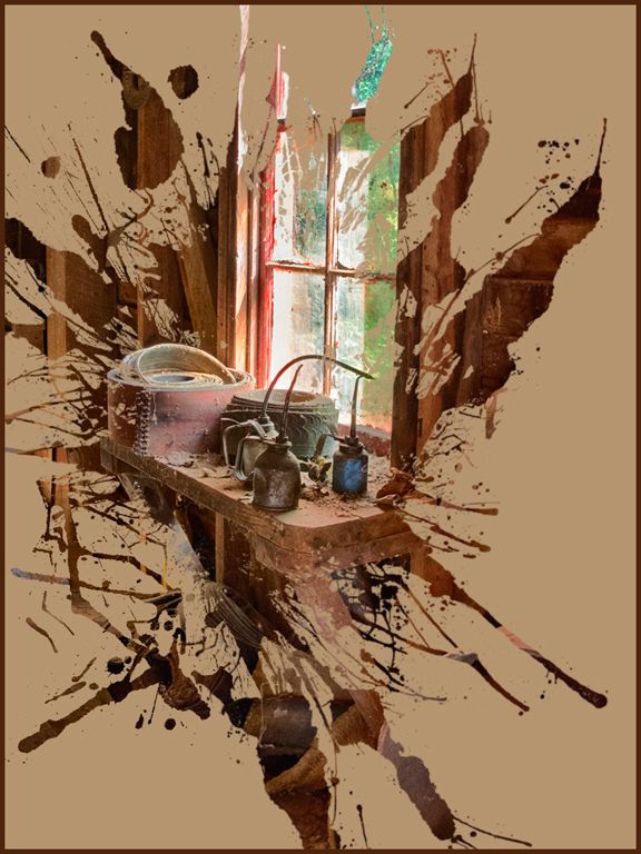
| 32 |
Dec 17 |
Comment |
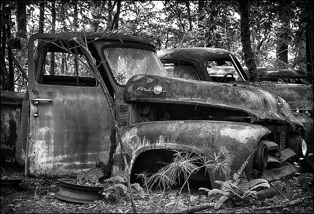
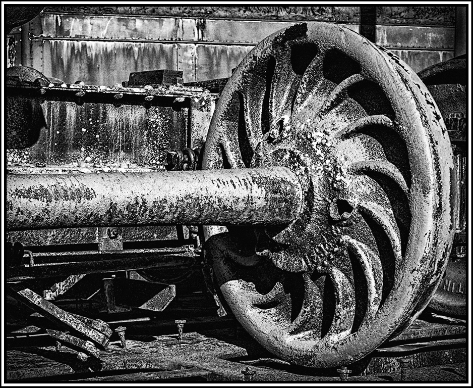
I think the mono is better than the color. If you use the color, change the hue slightly in the image. I do suggest using Topaz - detail to bring out the edge of your old machinery more and then use the NIK wet rocks again with a dark vignette edge. This will increase the contrast and provide dark blacks and the grunge on the machinery be more impactful. Can't believe we missed this in our flickr search.
Good fine. Good job. |
Dec 11th |
 |
6 comments - 1 reply for Group 32
|
| 41 |
Dec 17 |
Comment |
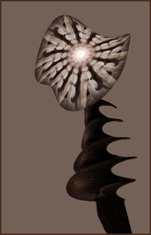
Very intricate work in creating this image. Maybe use the plain auger as the flower stem which would be interesting. Also use transform - warp on both the flower and the stem to make it interesting. Just my crazy thinking. Good job. |
Dec 21st |
 |
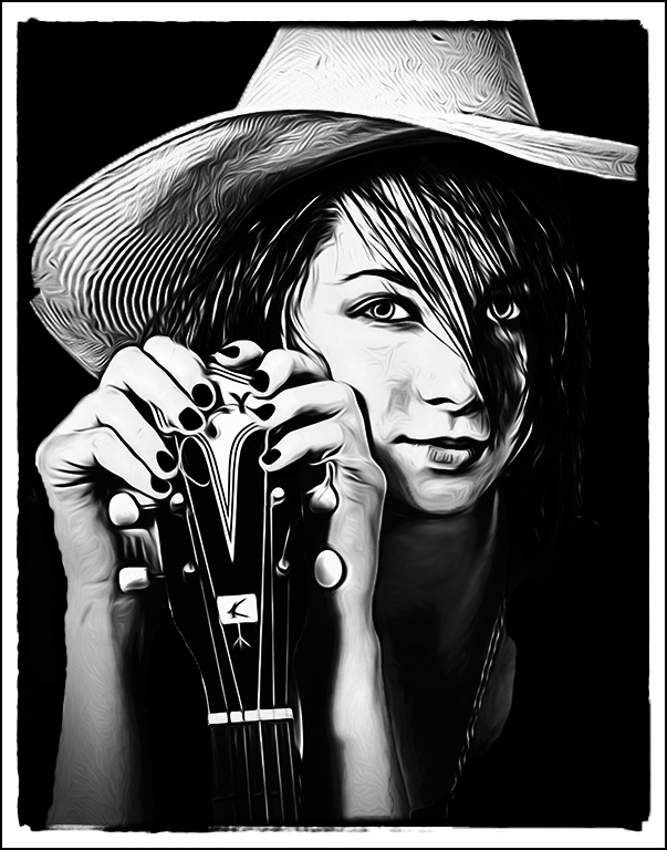
| 41 |
Dec 17 |
Comment |
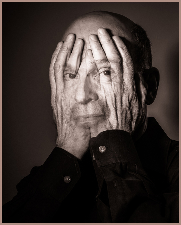
Good merging of the two images... One of our members created one of these and did well at club and Gulf State Camera Club competitions. I like the sepia better than the regular monochrome image. I would suggest getting ride of the one ridge of the hands together across the nose and lips - just makes the face image be a little more dominant but still have the hands be important too. Good job. |
Dec 21st |
 |
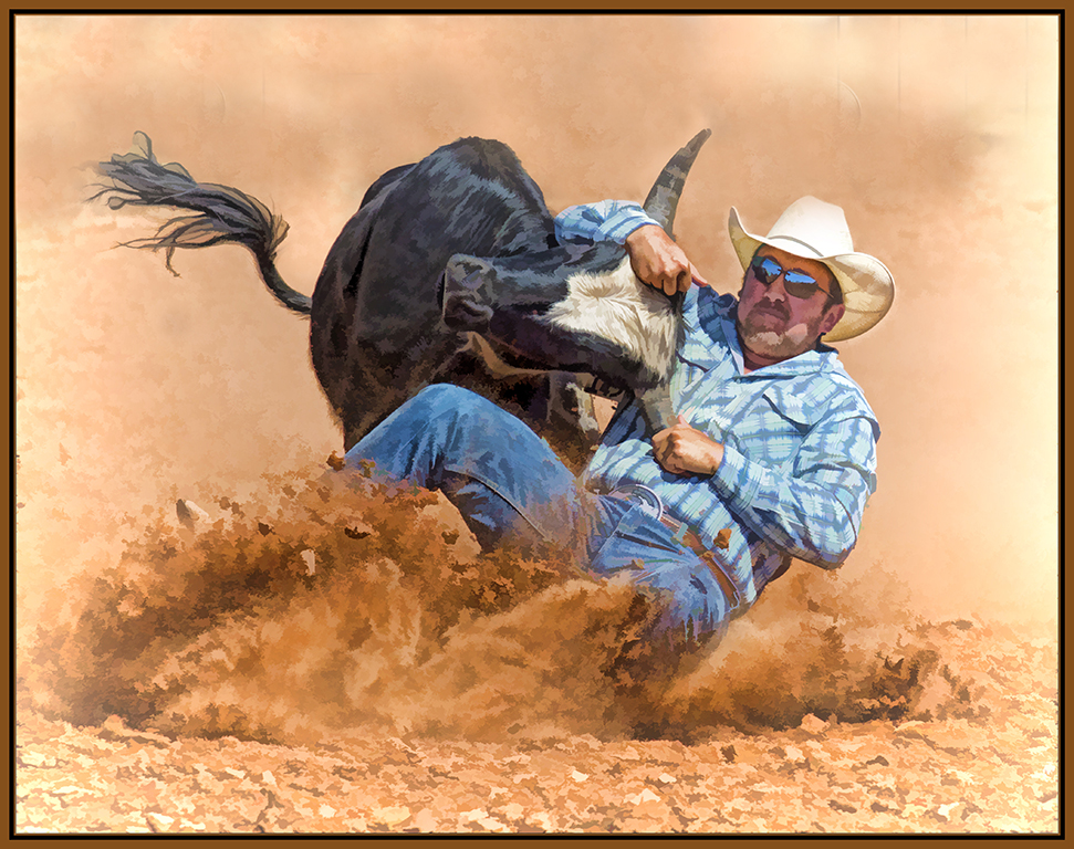
| 41 |
Dec 17 |
Comment |
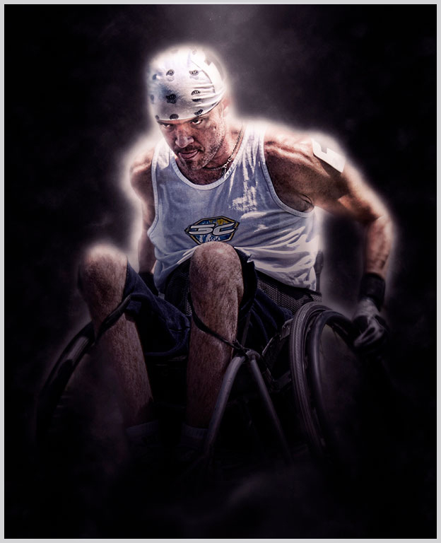
Beautiful car scene... You have turned the scene into a very smoky car image - you can smell the rubber burning !! Wouldn't change a thing. Great job. |
Dec 21st |
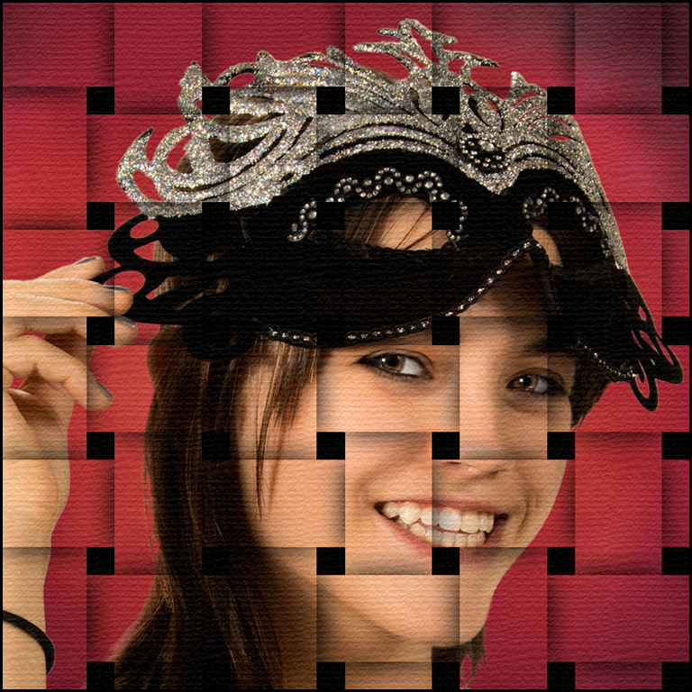
| 41 |
Dec 17 |
Comment |
Beautiful creation... You have given me an idea for my granddaughter who loves to dress up as a princess. Excellent choice of background - where did you get it ? Your granddaughter are very lovely and the addition of the wings is perfect. I am sure they will love this. Did you create a large printable version. Great job. |
Dec 21st |
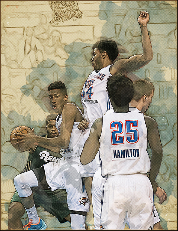
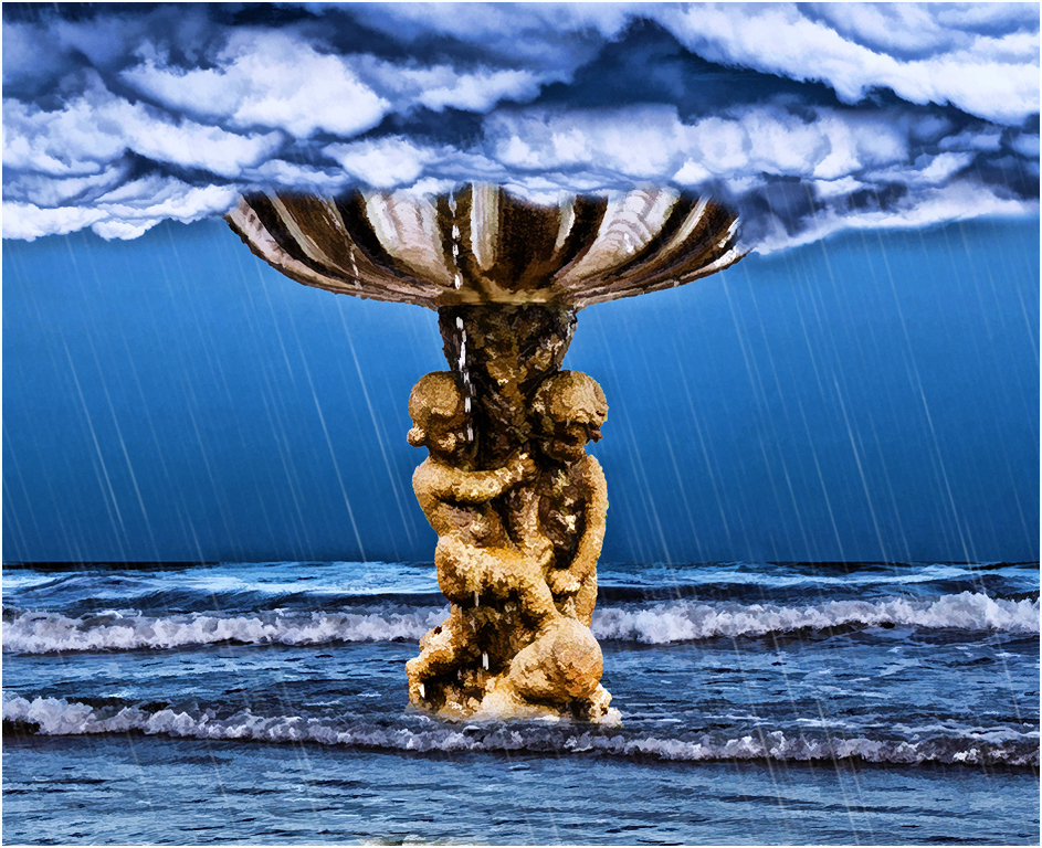
| 41 |
Dec 17 |
Comment |
Very good creation... I like the arrangement of the components that you have used for your final image. I do like the smoothing that Lisa did. I suggest that you add a rain effect to your image since the clouds look like rain. Just a suggestion. Very good job. |
Dec 21st |
 |
5 comments - 0 replies for Group 41
|
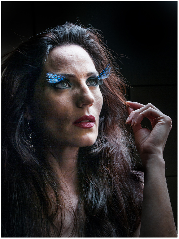
| 61 |
Dec 17 |
Comment |
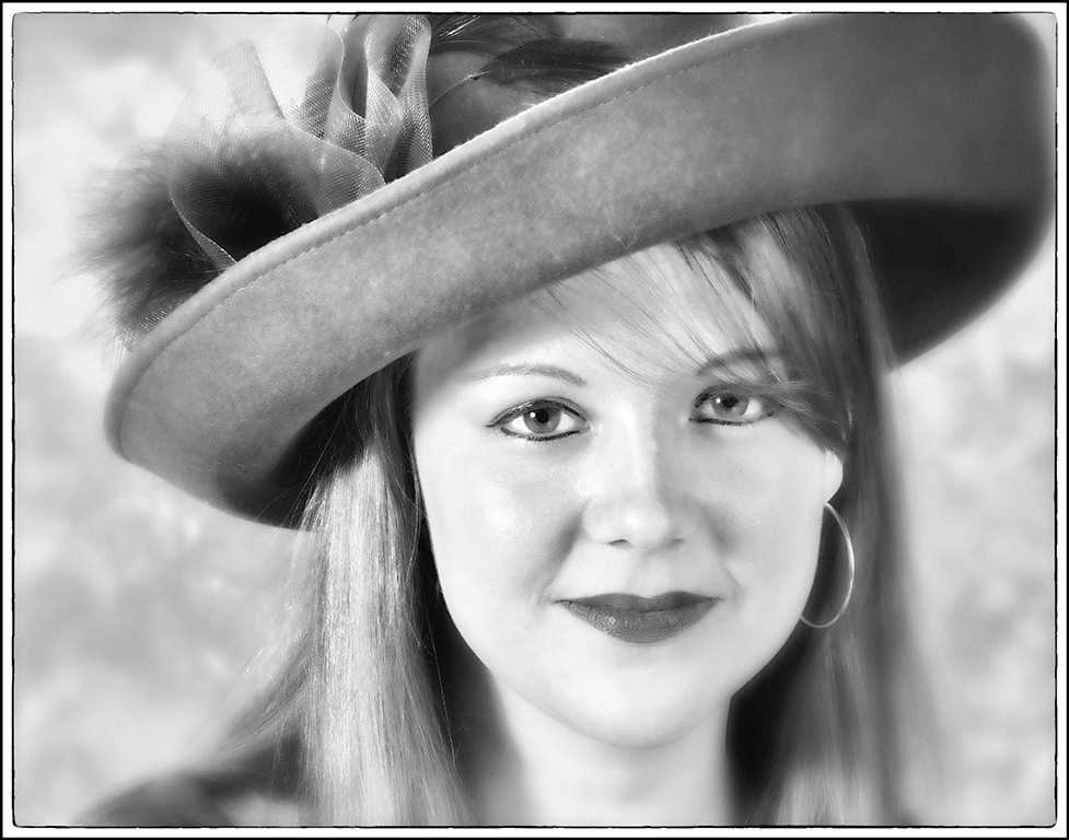
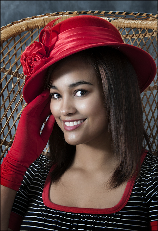
Interesting eyelash or eyebrow attachments... The lighting is too harsh for me - suggest dodging parts of the face and hair to improve the portrait. Also her left shoulder is too bright - burn it loads. Also, burn the hand so your attention is on the face area. Interesting portrait. |
Dec 22nd |
 |
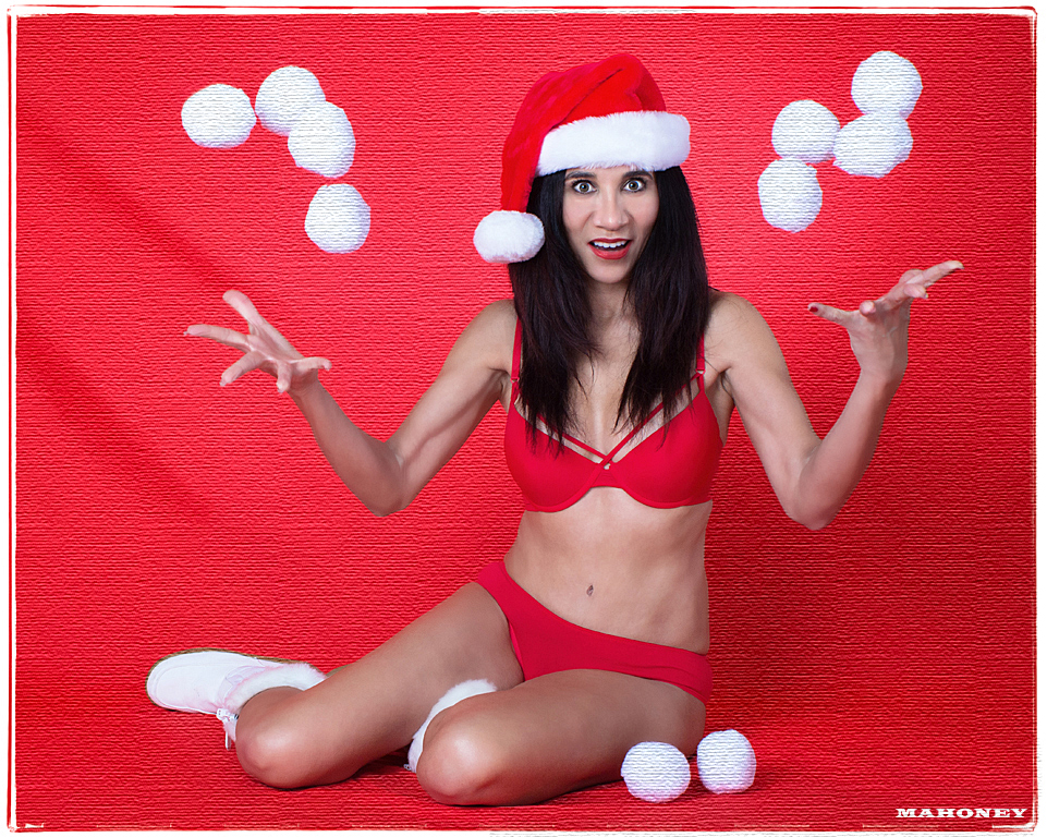
| 61 |
Dec 17 |
Comment |
Welcome to our group.
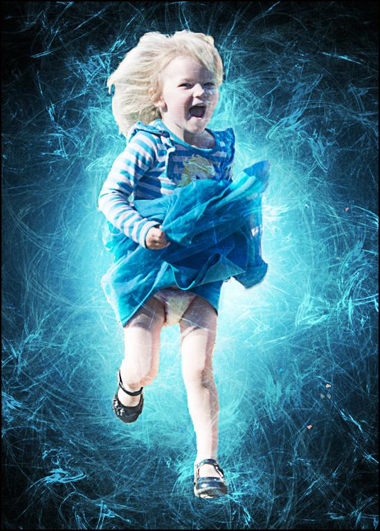
Your photo shoot sounded like fun... Good exposure and composition and great action shot !! I like your edge effect. I would suggest doing something to the background to make it not blend with the model's bikini. I used the filter texture on it and the snowballs to give you an idea. You could select and do something more artsy. Good idea and good job accomplishing it. |
Dec 22nd |
 |
| 61 |
Dec 17 |
Comment |
Very nice pose and lovely blue tint... I agree with Jim about cropping in and filling the frame mainly with mother and child. Then suggest use that blue tint to vignette and add stars in the vignette. Just suggestions. I will get to take some more pics of my daughter and her new 2 month old son while they are here this weekend. Good job. |
Dec 22nd |
 |
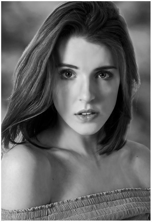
| 61 |
Dec 17 |
Comment |
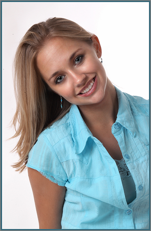
Another very good portrait... Very good pose. I suggest using dodging to lighten the facial areas and also chest area slightly. Also, the specks at the top of her hair - use stamp or healing tool. Do you charge or was this a freebee ? Good job. |
Dec 22nd |
 |
4 comments - 0 replies for Group 61
|
20 comments - 1 reply Total
|