|
| Group |
Round |
C/R |
Comment |
Date |
Image |
| 27 |
Oct 17 |
Comment |
If I had taken the original, I wouldn't have thought to try to turn it into a painting impressions style image. Very good color in your final image. Very Good job. |
Oct 29th |
| 27 |
Oct 17 |
Comment |
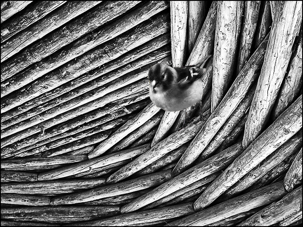
Very good improvement over the original... Just to give you another idea for your image, I got a bird from flickr, converted to B&W, selected and placed at a place in your image. You can take an object from another image, select it and place it your image. Good job on your photo. |
Oct 29th |
 |
| 27 |
Oct 17 |
Comment |
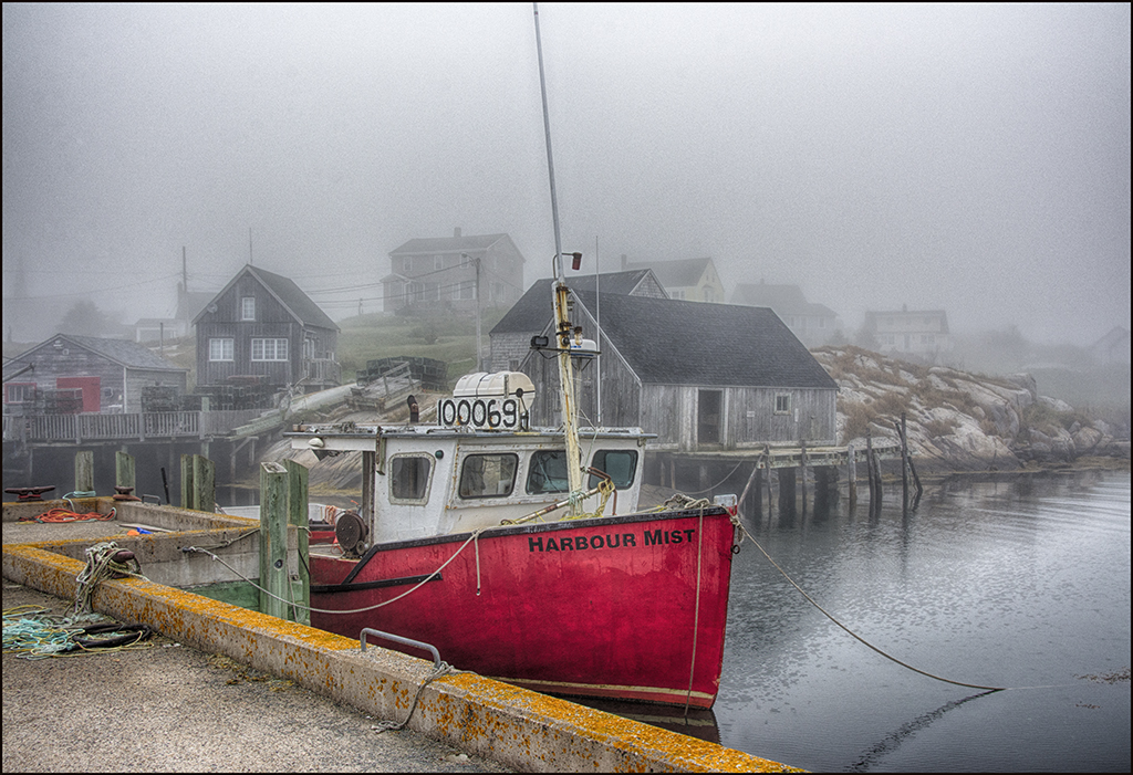
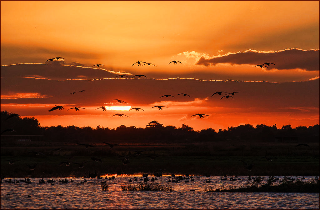
Very good sunset image... I like your layered sunset and the birds are seperated enough for a good center of interest. I do suggest using Topaz-adjust 5 - boost to make your sunset have some more impact. Also, use the stamp or healing tool to remove some of the birds in middle right and one at the top.
Very good job. |
Oct 29th |
 |
| 27 |
Oct 17 |
Comment |
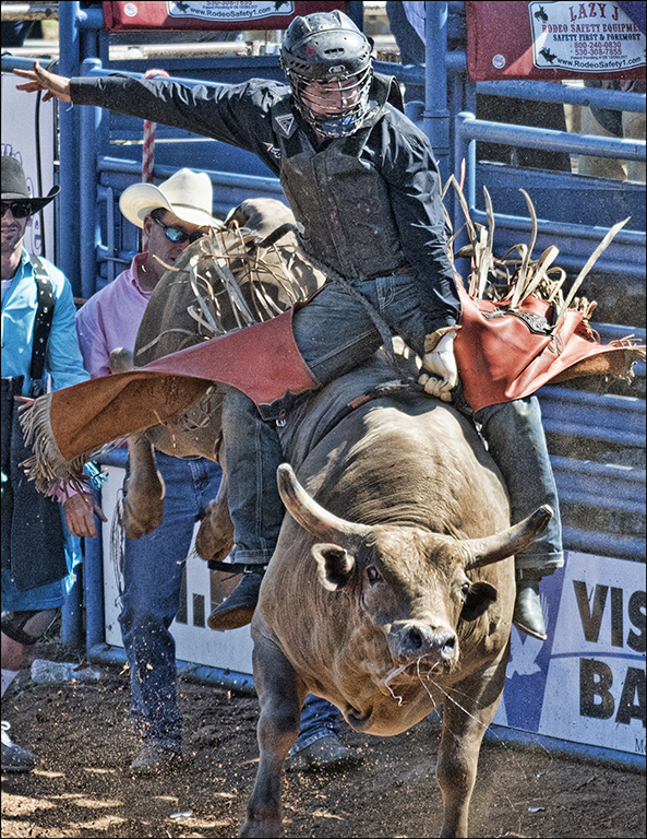
Good dog image... I like toned images and not showing the legs doesn't bother me. I would use curves to increase the contrast (medium contrast) and also add an edge. Overall a good image of your dog. This is just different from normal images to have some impact. Good job. |
Oct 29th |
 |
| 27 |
Oct 17 |
Comment |
Very good sunflower image... I have used impressions some but not as much as the other preset packages from Topaz. Wish we had the original to see what effect was created. Having the background out of focus is good in this image but I would like to darken the background a little more. Good job. |
Oct 29th |
| 27 |
Oct 17 |
Reply |
Please look at image below - is this change what you need ? |
Oct 18th |
| 27 |
Oct 17 |
Reply |
Please look at image below - is this change what you need ? |
Oct 18th |
| 27 |
Oct 17 |
Reply |
Please look at image below - is this change what you need ? |
Oct 18th |
| 27 |
Oct 17 |
Comment |
Thanks for the input... What do think of the changes ??
|
Oct 18th |
 |
6 comments - 3 replies for Group 27
|
| 32 |
Oct 17 |
Comment |
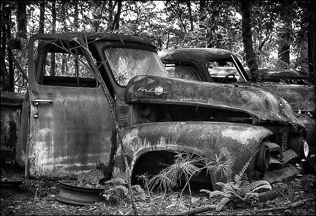
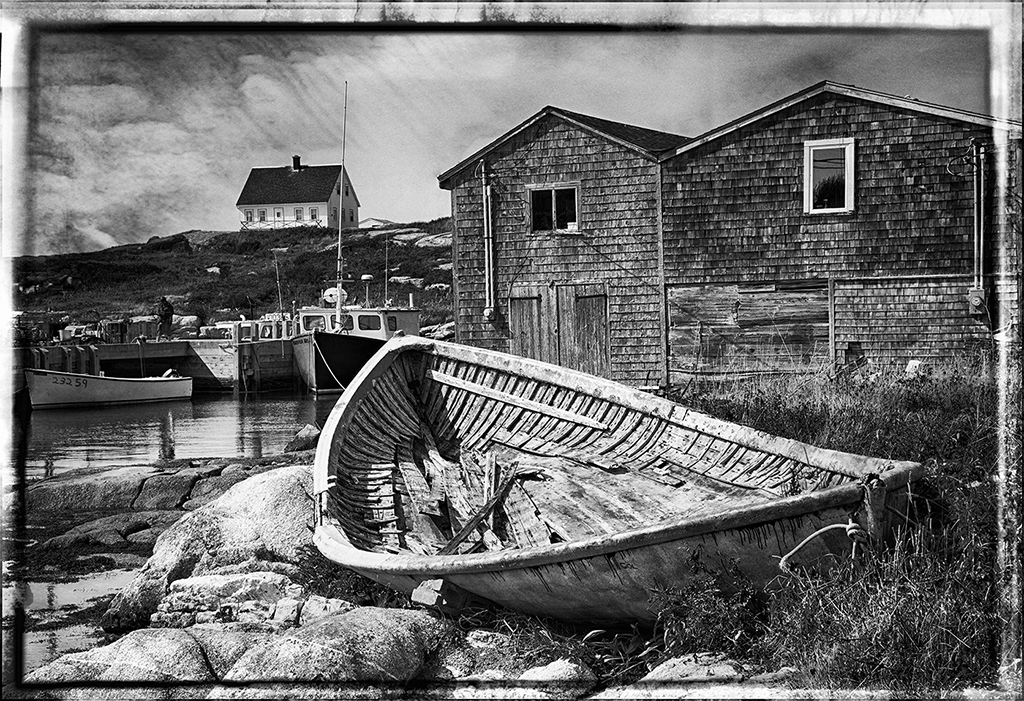
You have done a great job on the antique look for this image. There are two areas that I suggest working on - light area, left middle edge - darken that area and the second area is the little bright spots in the dark fence on the right edge middle - darken those spots. Congrats on your HM. |
Oct 29th |
| 32 |
Oct 17 |
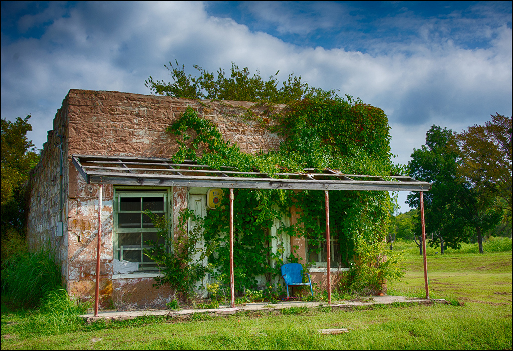
Comment |
Stephen, I understand your frustration. With our rural pics, the problem is can we find a place to park or a ditch not too deep or muddy to pull into. Just think, if you had a pic that showed your missing part of the building, you can knit it together NOW !! Scaffolding and repairs are needed but sometimes they can even provide interesting pics, especially if there are workers around. Good luck next trip. |
Oct 29th |
| 32 |
Oct 17 |
Comment |
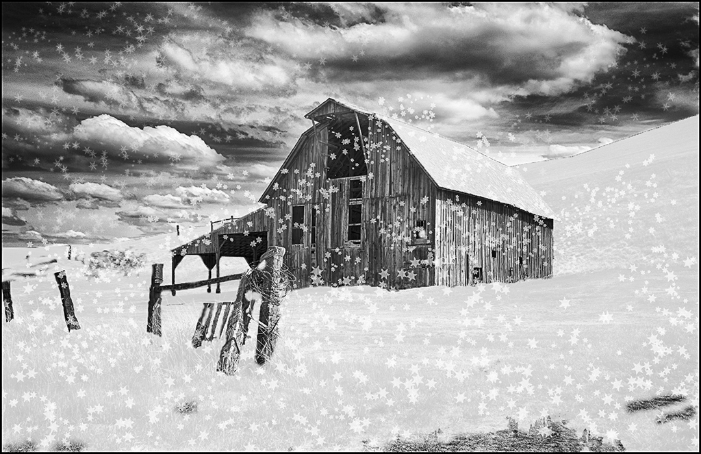
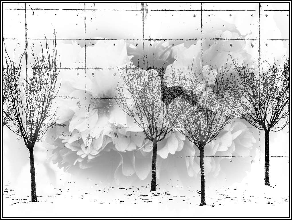
Lynne, tress and snow can create some high contrast images. Have you ever thought of using these high contrast subjects in a blending of images. If you cropped to the four trees on the left and used curves to create black and white with very little gray and then blended this with a soft contrast BW bloom, this would had a mood to the stark trees and new life blooms. What do you think ? Just another use for your image. Good work on your image. |
Oct 29th |
 |
| 32 |
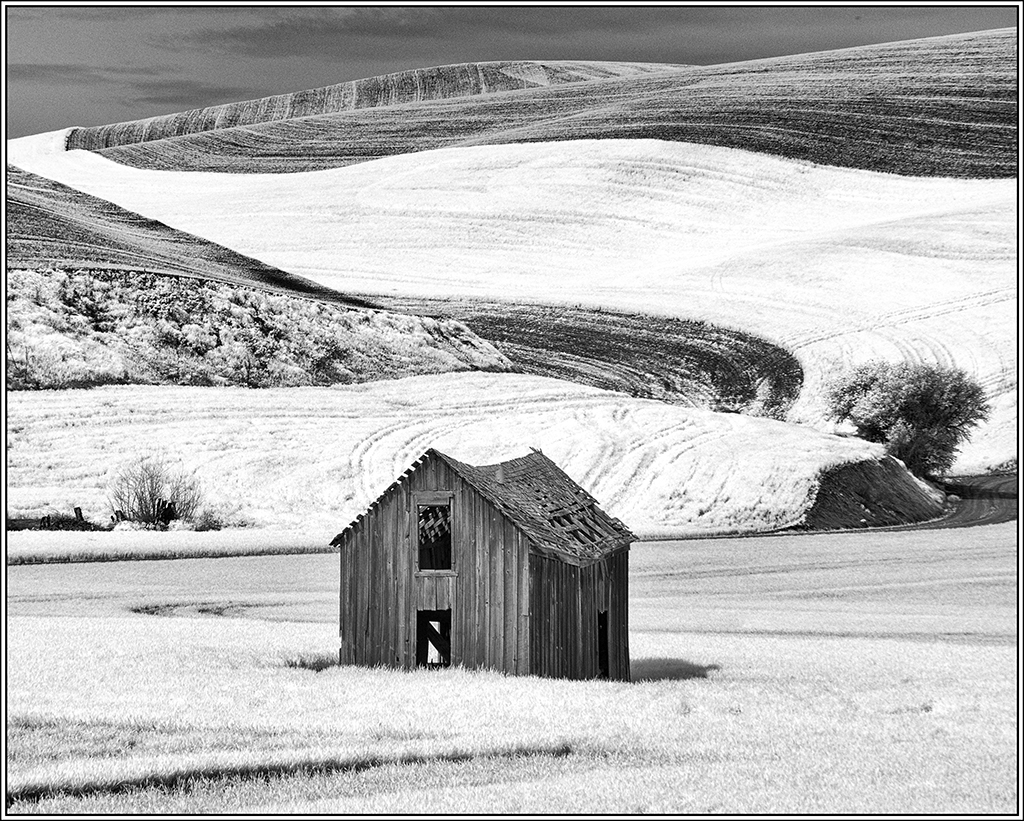
Oct 17 |
Comment |
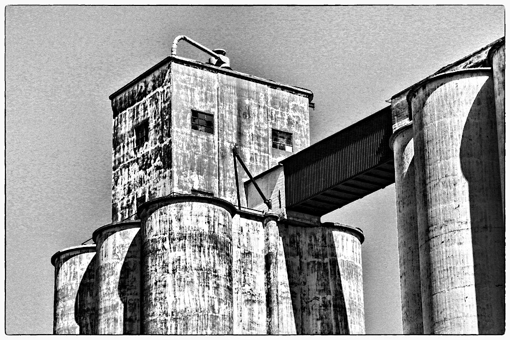
Good silo image... I have many like this so I suggest adding darker contrast and grunge to make the silos have more interest and impact. I used Topaz adjust 5-high contrast and Topaz-detail overall med detail II. Good job. |
Oct 29th |
 |
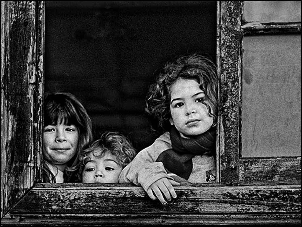
| 32 |
Oct 17 |
Comment |
Jose, I love your image !! Your three girls are the picture, so crop in on them and don't worry about the building or window. I also add a HP-denoise layer. Great image. |
Oct 29th |
 |
| 32 |
Oct 17 |
Comment |
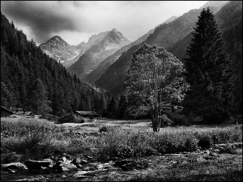
I do suggest cropping bottom and right. Your main center of interest is the meadow area, house and tree so lighten them, add more contrast and darken the sky and parts of the mountain. The foreground needs to be darken - the stream isn't strong enough to be your center of interest. See what you think. |
Oct 29th |
 |
| 32 |
Oct 17 |
Reply |
The comic effect does so weird stuff sometimes... |
Oct 26th |
| 32 |
Oct 17 |
Comment |
I goofed in my explanation - the original 3 images are both after the AKVIS-airbrush-comics was used on the original 2 image. I know this is not a normal portrait BUT I like the strong black of the hair, fingers, etc in this portrait. Thanks for commenting on my weird creation... |
Oct 4th |
7 comments - 1 reply for Group 32
|
| 41 |
Oct 17 |
Comment |
Great image... The creation of the dark background and the flare at the end of the sword was super !! Overall great job in finding or creating texture to your background. Excellent job !! |
Oct 29th |
| 41 |
Oct 17 |
Comment |
Great job of putting together... Love the title !! Good BW image. |
Oct 29th |
| 41 |
Oct 17 |
Comment |
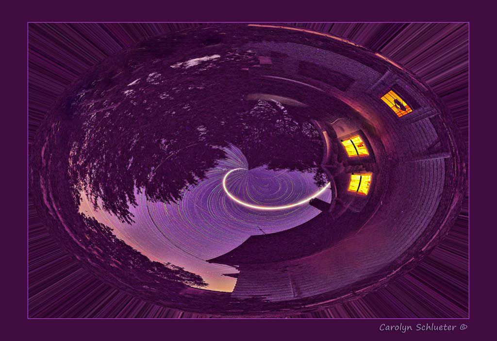
I have tried a couple of these polar coordinates creations with success and failure... Your's is unique - the purple really makes it snap. I would cover up two of the windows before you do the twirl... I removed it in your final to show you that it will help place the final three windows at a good spot. Great job !! |
Oct 29th |
 |
| 41 |
Oct 17 |
Comment |
Interesting combination... I would drop the layers multi-colored layer but not sure what to use instead. I like the bird concept but it is too busy. Good job - just give it another try. |
Oct 29th |
| 41 |
Oct 17 |
Comment |
I like everything about this image I added the edge so you could distinguish the black vignette and the black web background. Great job. |
Oct 29th |
5 comments - 0 replies for Group 41
|
| 61 |
Oct 17 |
Reply |
It is the leg of one of your lights - look at your original and then look at your final..... |
Oct 29th |
| 61 |
Oct 17 |
Reply |
It is middle left.... |
Oct 29th |
| 61 |
Oct 17 |
Comment |
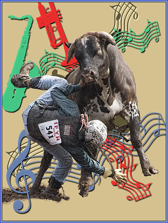
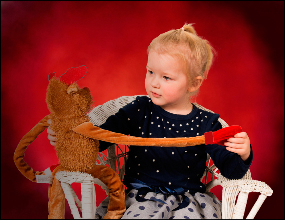
So what were the monkeys for ?? Was there music involved ? Good processing... |
Oct 29th |
| 61 |
Oct 17 |
Comment |
Salvatore, you have such interesting projects for your recreations... Don't forget an old ashtray for her cigar !!
Didn't know women smoked cigars back then ? Adding the painting to the wall helps. Her hair and clothing is certain not from today's fashions... Also, earrings were very popular during the long skirt period. Great job. |
Oct 29th |
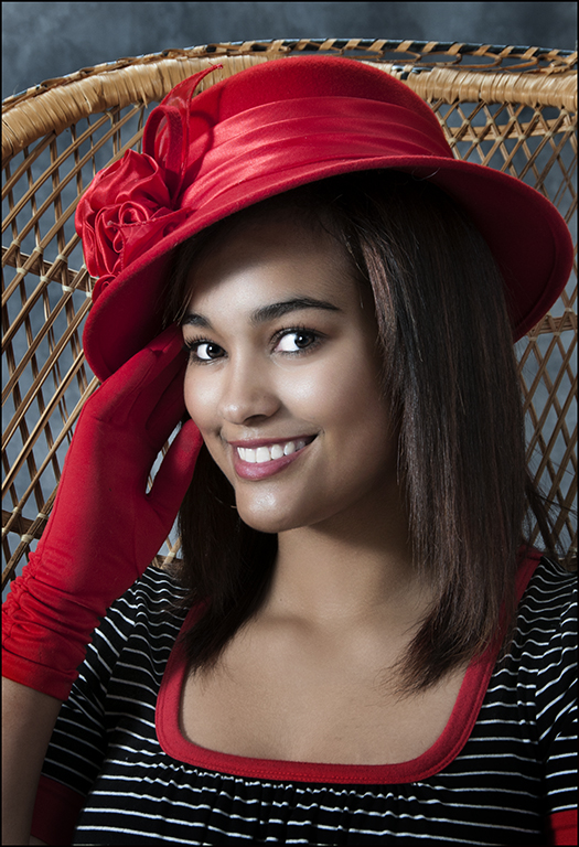
| 61 |
Oct 17 |
Comment |
Your lighting just needs some dodging and burning to create your lighting like old movies. Good job. |
Oct 29th |
 |
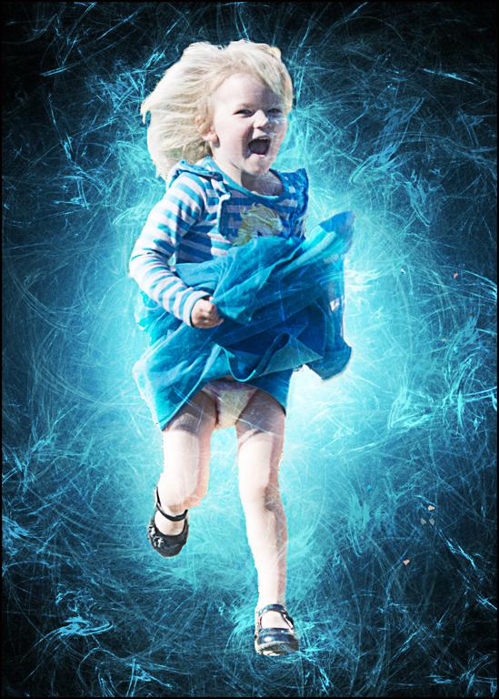
| 61 |
Oct 17 |
Comment |
Beautiful image... I would add more saturation - like Topaz adjust 5 - boost. Composition is very good. Very good job. |
Oct 29th |
 |
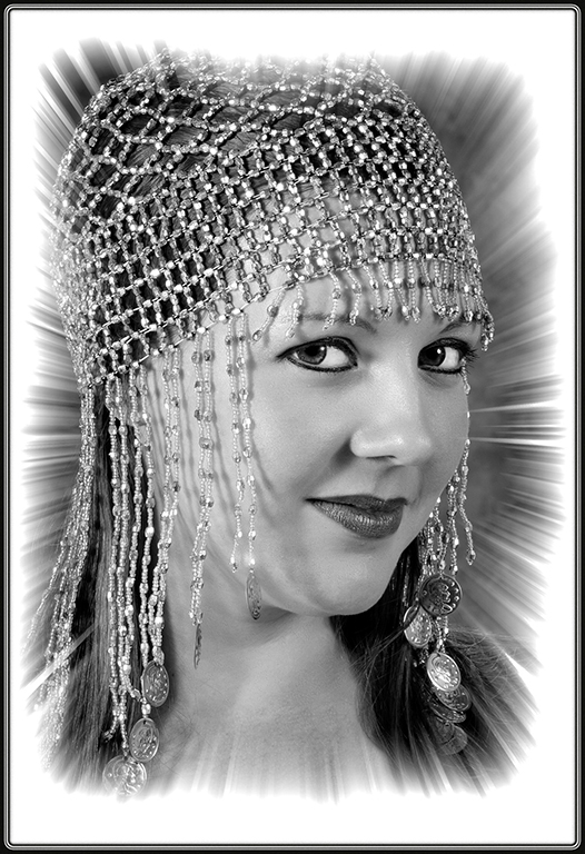
| 61 |
Oct 17 |
Comment |
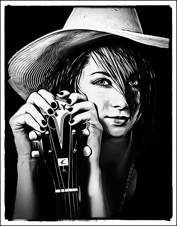
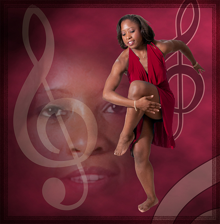
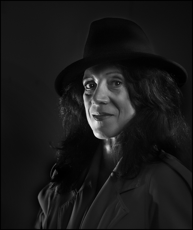
Very effective lighting. Good processing as usual. Is there a reason you didn't remove the object in the top left corner ?? I like the blowing hair. Suggest removing her earring on the left side of face. Great portrait... |
Oct 29th |
5 comments - 2 replies for Group 61
|
23 comments - 6 replies Total
|