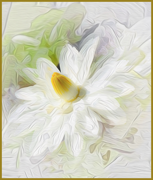
|
| Group |
Round |
C/R |
Comment |
Date |
Image |
| 24 |
Feb 17 |
Comment |
Marie, you have created a super painted lily...
I just had to play with it - so suggest you bring back the flower center (completely) and the white petals (slightly). I agree that the bottom should be cropped. Added a gold edge stroke. Just a suggestion. Thought it would add more white to the lily. You have super ideas. |
Feb 19th |
 |
1 comment - 0 replies for Group 24
|
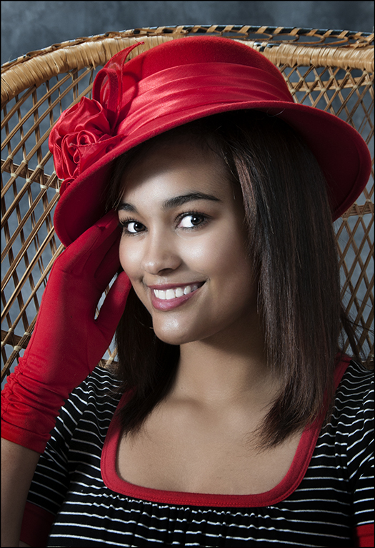
| 27 |
Feb 17 |
Comment |
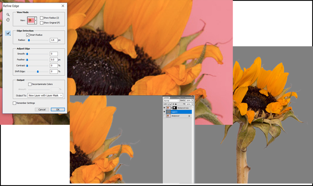
Very good job of putting the two images together. Good exposure and composition for your final image. Selecting the flower just needs some more work on the "refine edge" by using the smart radius with 1 - 3 pixels to lose the white line or more the shift edge slider to the right to go slightly into the flower selected to lose the white line. My example hopefully shows some suggestions to improve that in your image. Very good image.
|
Feb 26th |
 |
| 27 |
Feb 17 |
Comment |
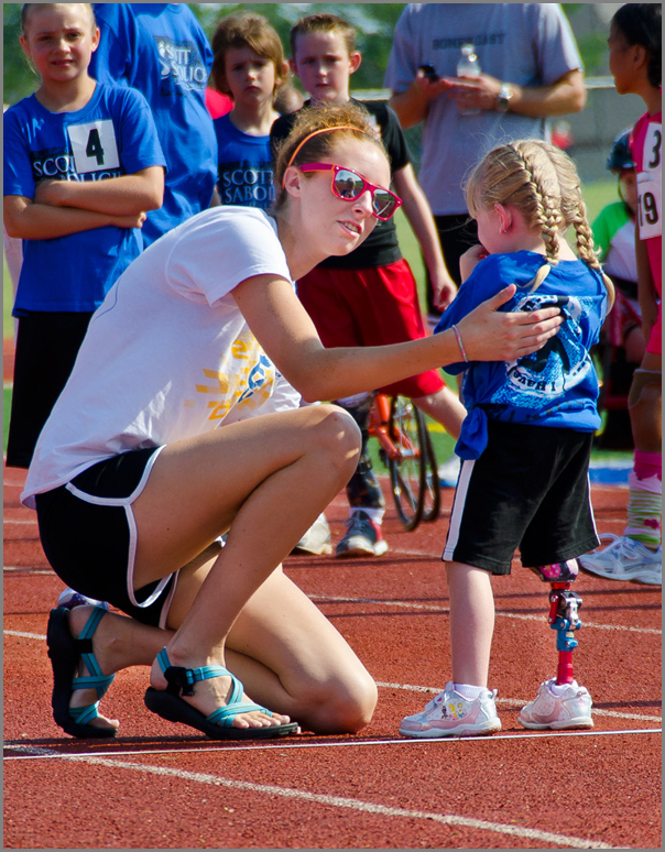
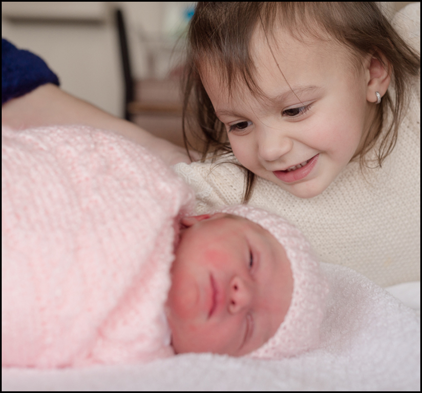
You have a wonderful image for their parents... I have a similar image of my two daughters a few days after we brought Tammy home from the hospital and Cheryl was a 2 1/2 yrs old. You did a good job of correction the color in your image. Glad you were able to learn something in lightroom about color correction. Necessity can make for learning when it is needed !! There is a red area by the arm on the left - use clone tool to remove it. Also, suggest cropping left and right to eliminate hand top right and most of arm top left. Great job.
|
Feb 26th |
 |
| 27 |
Feb 17 |
Comment |
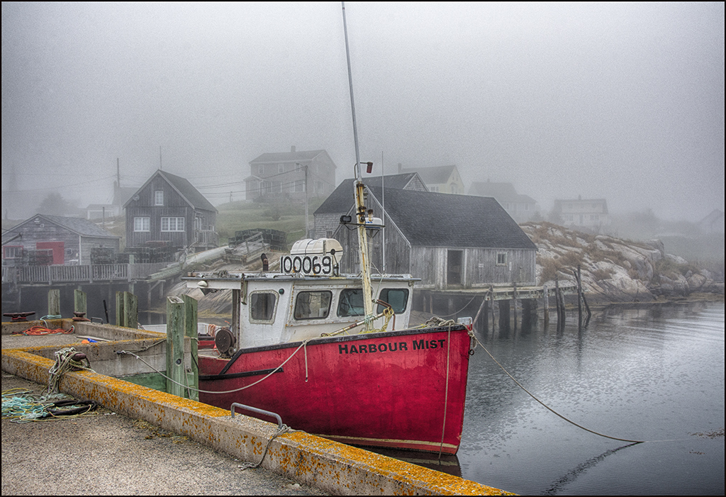
Is it always hazy in Venice ?? Very well done image as usual... very good composition with the building at 1/3 spot and gondola at 1/3 spot. Suggest cropping off 2/3 inch off top to eliminate the darker sky. Good job removing boat and smoke in sky. Mono is better than color to me. Very good image.
|
Feb 26th |
3 comments - 0 replies for Group 27
|
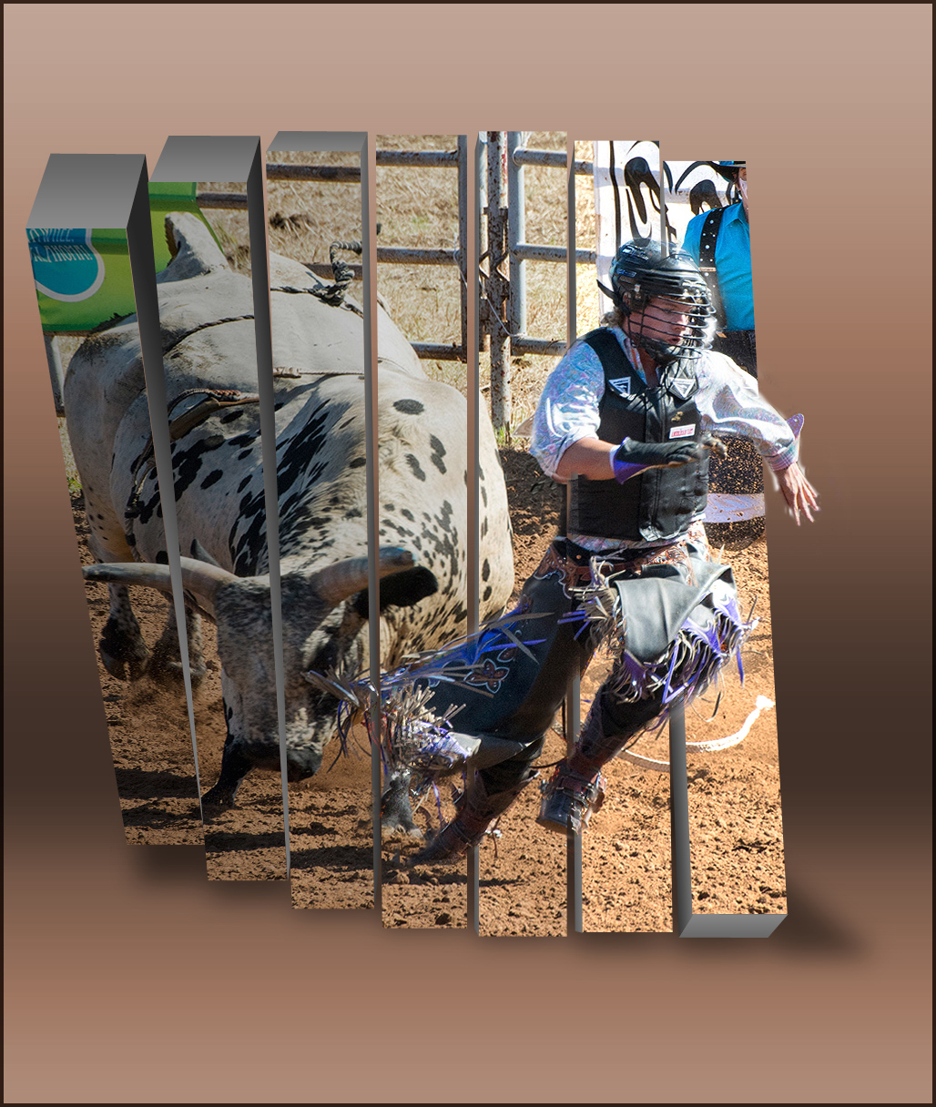
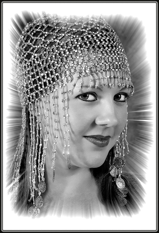
| 32 |
Feb 17 |
Reply |
Stephen, the theory is that your eye will travel bottom left to top right automatically. So, you want the lead-in to appear at the bottom left. |
Feb 20th |
| 32 |
Feb 17 |
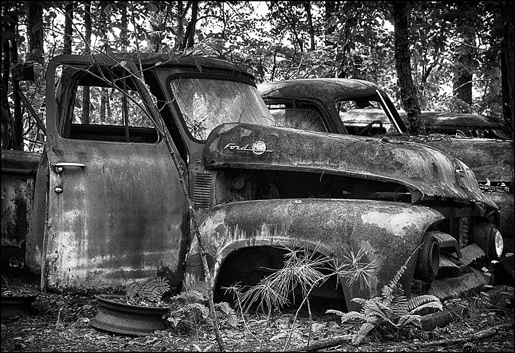
Comment |
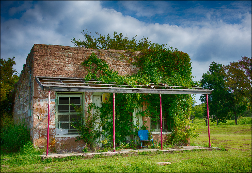
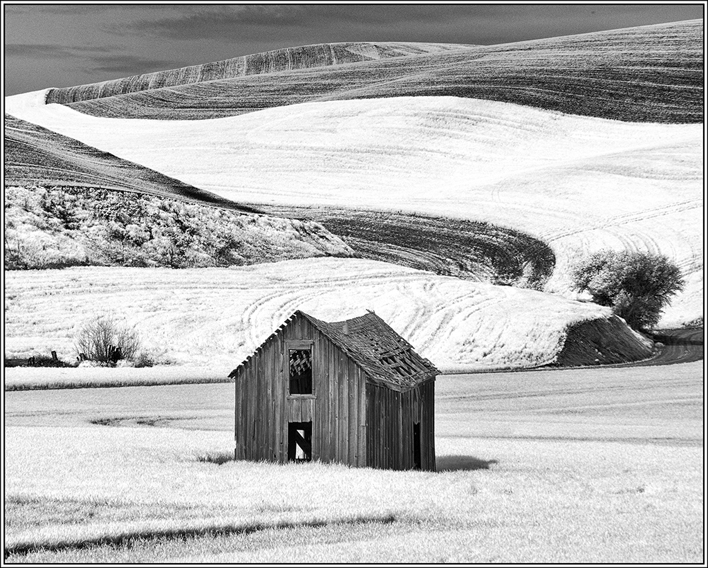
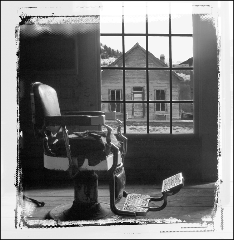
Great ghost town image... I love ghost towns - we have gone to a few here in Oklahoma but not as good as the Western ghost towns. May get to this ghost town next year - we are headed ghost towns in Wisconsin this year. I suggest selecting the window and use darken/contrast to help the image. I love the edge effect - my club doesn't appreciate some of my edge effects - glad someone else uses them. Good job. |
Feb 18th |
 |
| 32 |
Feb 17 |
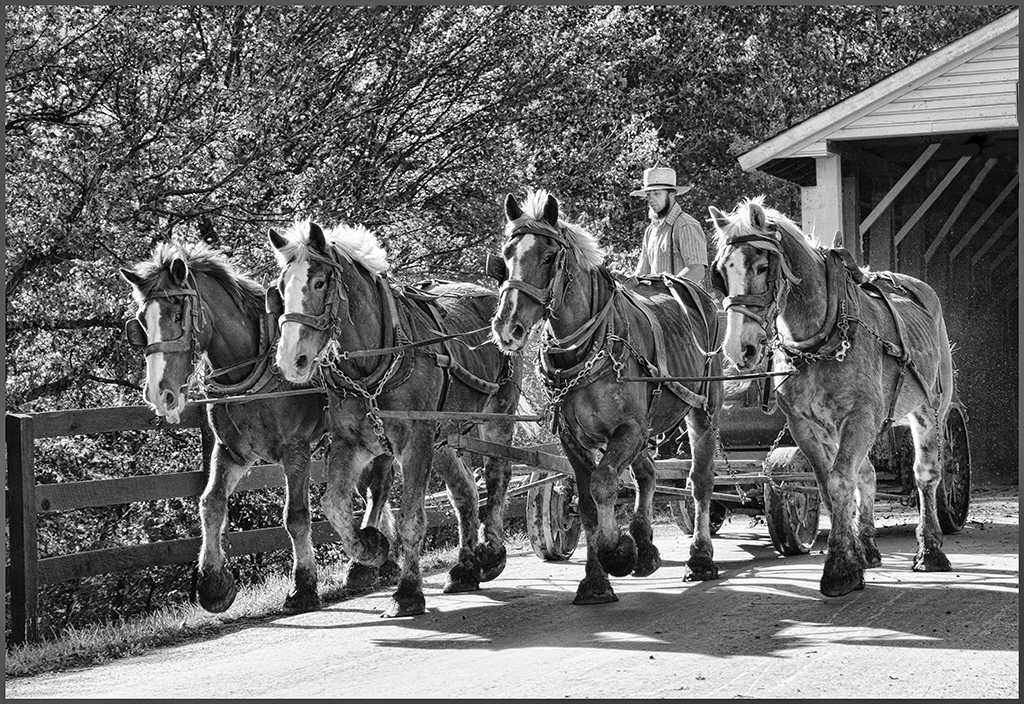
Comment |
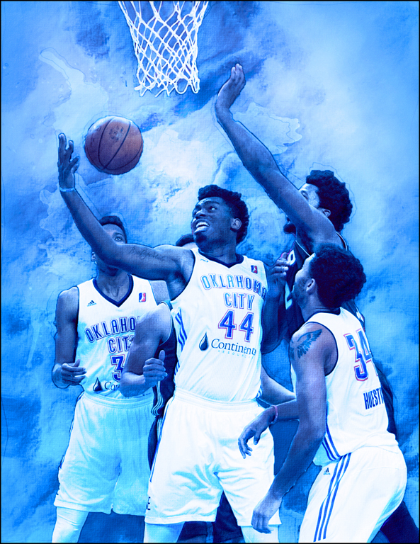
Wonderful PJ image... Quite a parade. My daughter and her wife, who are living in DC currently, took part and selfied themselves. I suggest putting all the pink only back into your mono for a memento image. She said they weren't going to let them be on the mall areas but then changed their minds due to the volume of people. As long as we citizens don't stop expressing our opinions when our government does something again rights and laws, we will survive this President too. Glad you were able to use your new phone.
|
Feb 18th |
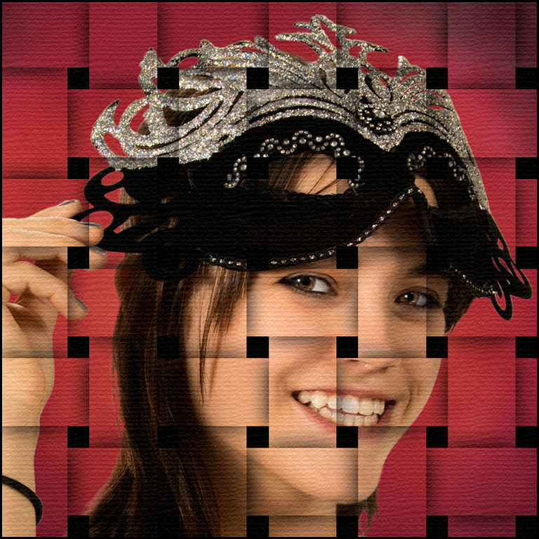
| 32 |
Feb 17 |
Comment |
Great poster edge image... You sound like me some days - start out with reality photos and end up with creative images that my husband doesn't understand. He is more a realist and I like all types. This probably won't do good in competition because of the poster edge effect - a few of my color poster edge effects have been accepted in "creative" salons. Looks like very good bird portrait - wish could see the original. At least the work got you mind off things you can't control like our current President !!
|
Feb 18th |
| 32 |
Feb 17 |
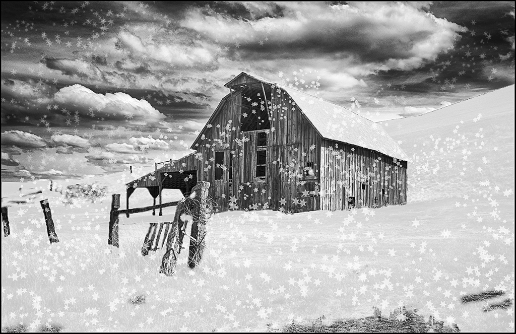
Comment |
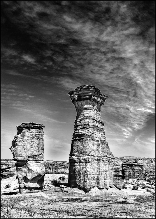
Wonderful scenic... The image and the work done is good but I agree that the sky needs more impact. The tower and totem will still be the dominant subject but using Curves on the full image and darken/contrast on the sky would really help. I may never get to Argentina but your wonderful photography has made me very envious !! I also used the stamp and brush tool to eliminate the white of the sky down by the ground. Great image. |
Feb 18th |
 |
| 32 |
Feb 17 |
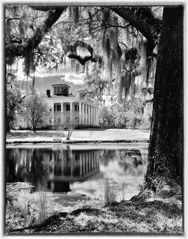
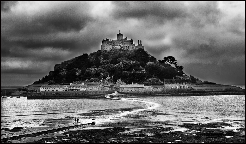
Comment |
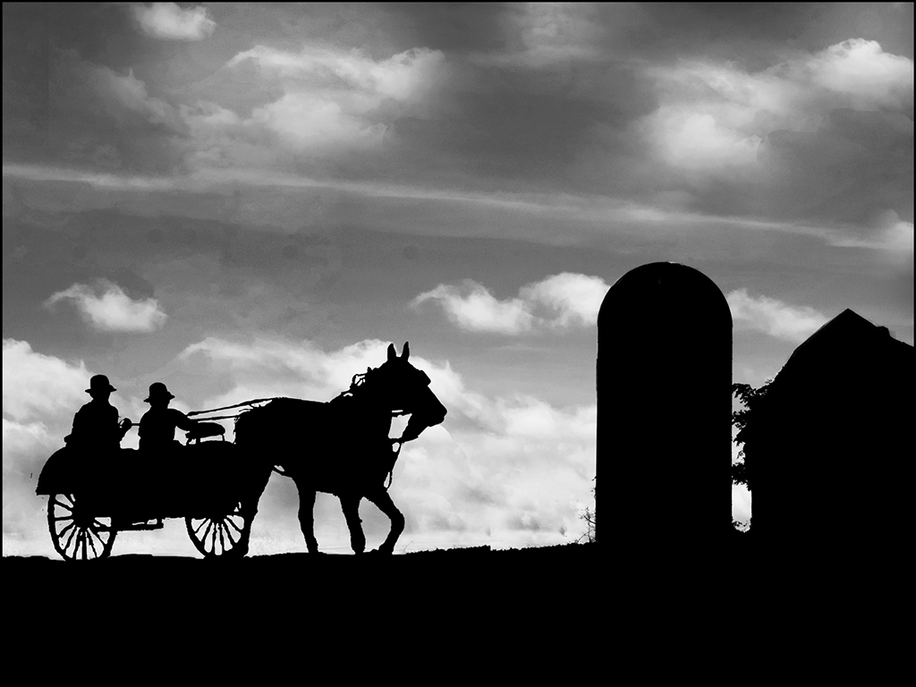
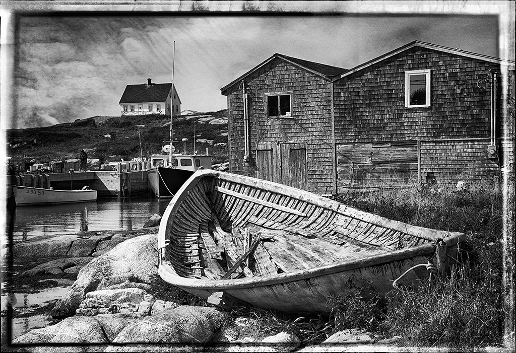
Beautiful Mount... Very good lead-in with dock and water area. Good mono conversion. Suggest lightening the building, castle and parts of the sky; darkening the foreground and water. Also, have you considered flipping it horizontally. With some minor changes, it is definitely good enough for competition. |
Feb 18th |
 |
| 32 |
Feb 17 |
Reply |
In competition lately, (our club and salons) most judges are looking for good and saturated. Maybe they are just in love with photoshop or over saturation. I really like the saturated too but I don't like the over-sharpened or over-structured. What do you think ? |
Feb 9th |
| 32 |
Feb 17 |
Reply |
Wes, I think the sky isn't as overpowering in the color version - what do you think ? |
Feb 9th |
| 32 |
Feb 17 |
Reply |
Original 1 is added by the software. Original 1 is my finished color image. Original 2 is my middle HDR image and the first HDR preset creation before I completed the perspective change. |
Feb 8th |
5 comments - 4 replies for Group 32
|
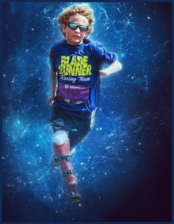
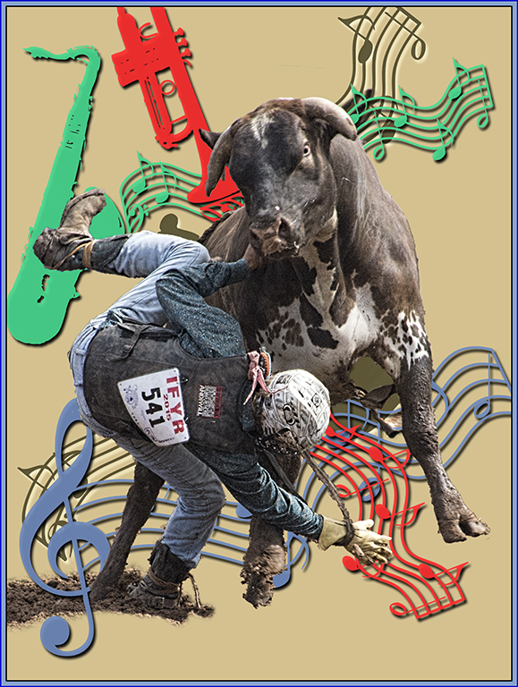
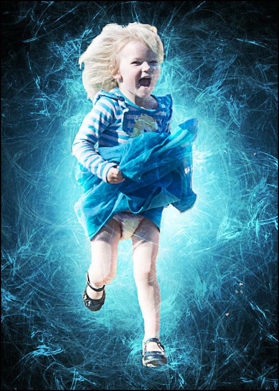
| 61 |
Feb 17 |
Reply |
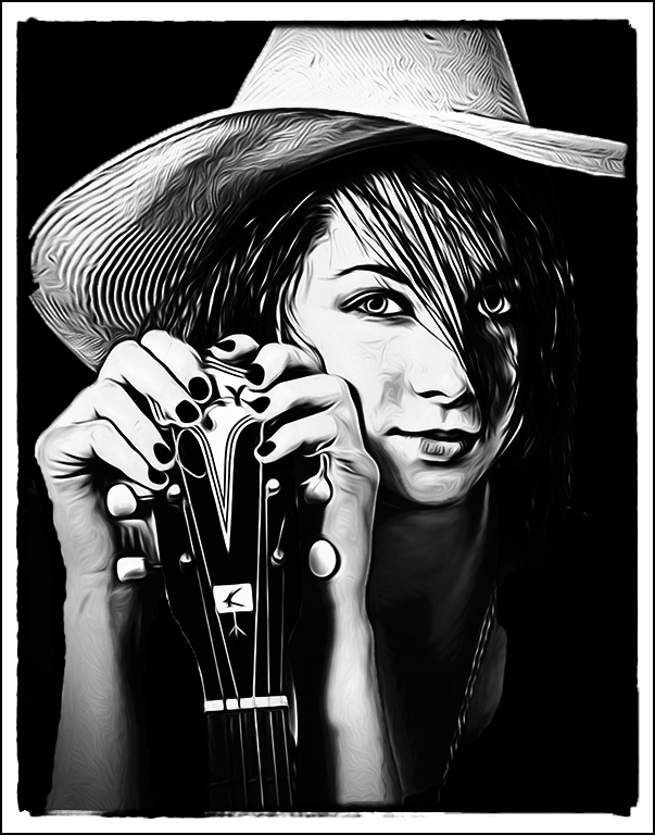
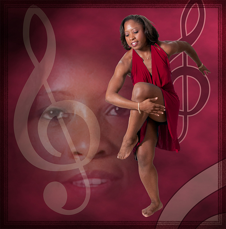
Maybe I will just change it to blue so it looks like bloomers !! |
Feb 21st |
| 61 |
Feb 17 |
Reply |
Darrell, I thought the crazy active background suited her !! |
Feb 9th |
0 comments - 2 replies for Group 61
|
9 comments - 6 replies Total
|