|
| Group |
Round |
C/R |
Comment |
Date |
Image |
| 27 |
Jan 17 |
Reply |
Marsha, I will email you a tutorial on using mask. You just use paint black (to block), white (to allow), and shades of gray to (slightly block) what you layer is supposed to do. Isn't as hard as people say.
|
Jan 26th |
| 27 |
Jan 17 |
Reply |
Marsha, yes you can darken and lighten areas but you can't totally remove something or add something. |
Jan 21st |
| 27 |
Jan 17 |
Comment |
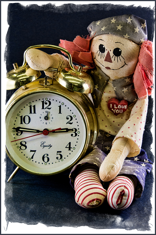
Interesting image... How large was the doll ? Would like to see what a normal lens image would look like. Your lensbaby does produce blurry areas with very small focused area. The image created was interesting. |
Jan 18th |
| 27 |
Jan 17 |
Comment |
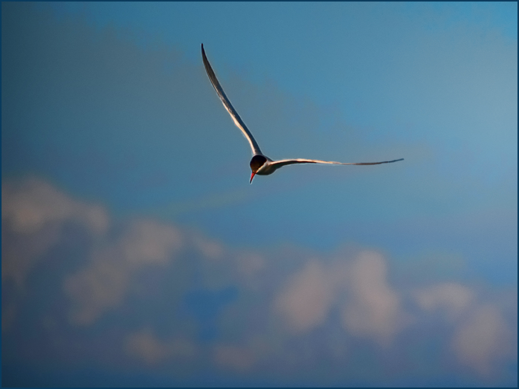
Very nice image... I understand your desire to make the clouds for effective in the image. It is okay to select the bird and use transform to enlarge it to make it occupy more of the image and move it closer to the clouds. Adding saturation and definition to the clouds will make them appear more fluffy and stand out more. Topaz adjust plug-in has several choices for this - one is "exposure color stretch" which I suggest. Good image.
|
Jan 18th |
 |
| 27 |
Jan 17 |
Comment |
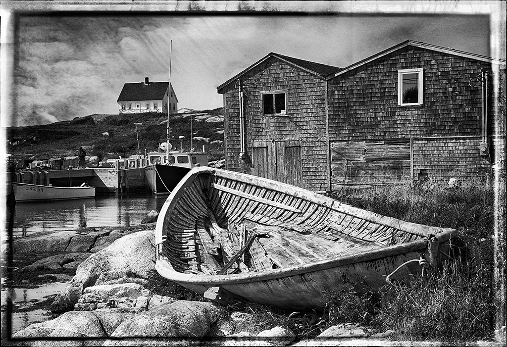
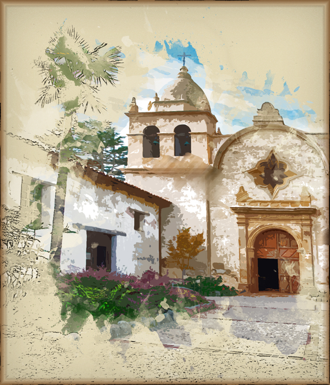
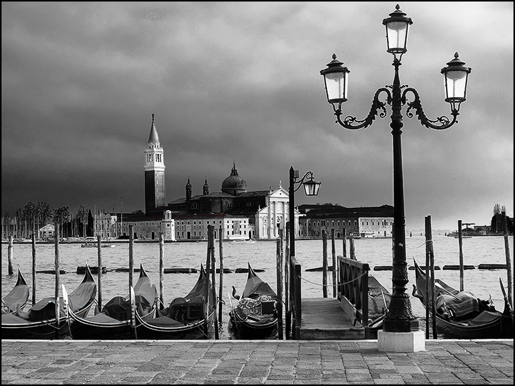
Great Venice image... Nice composition of building, boats and light but too panoramic for me. Suggest cropping to maximize the major light structure and building, then use curves to work on sky, buildings and blacks. Great image.
|
Jan 18th |
 |
| 27 |
Jan 17 |
Comment |
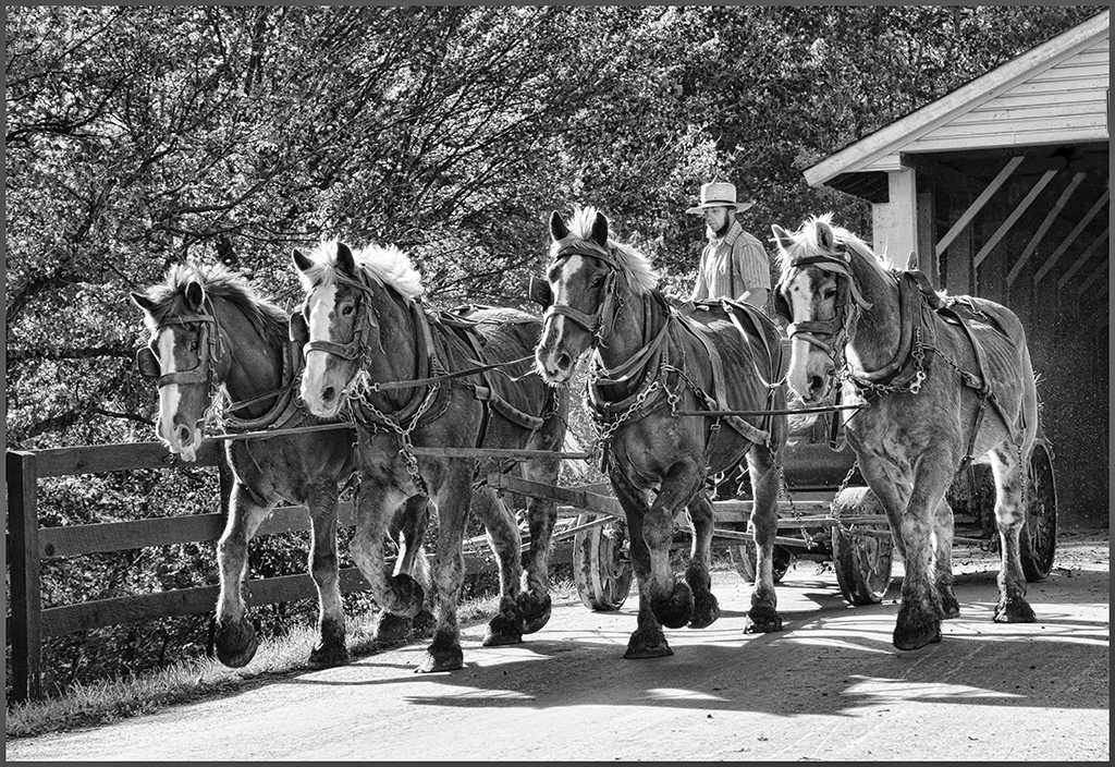
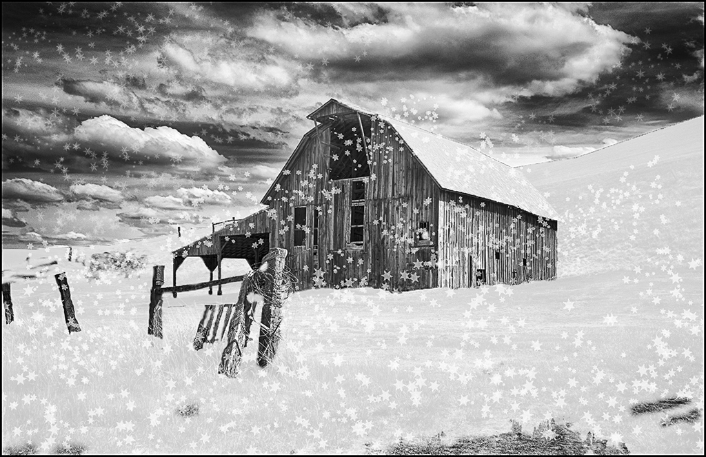
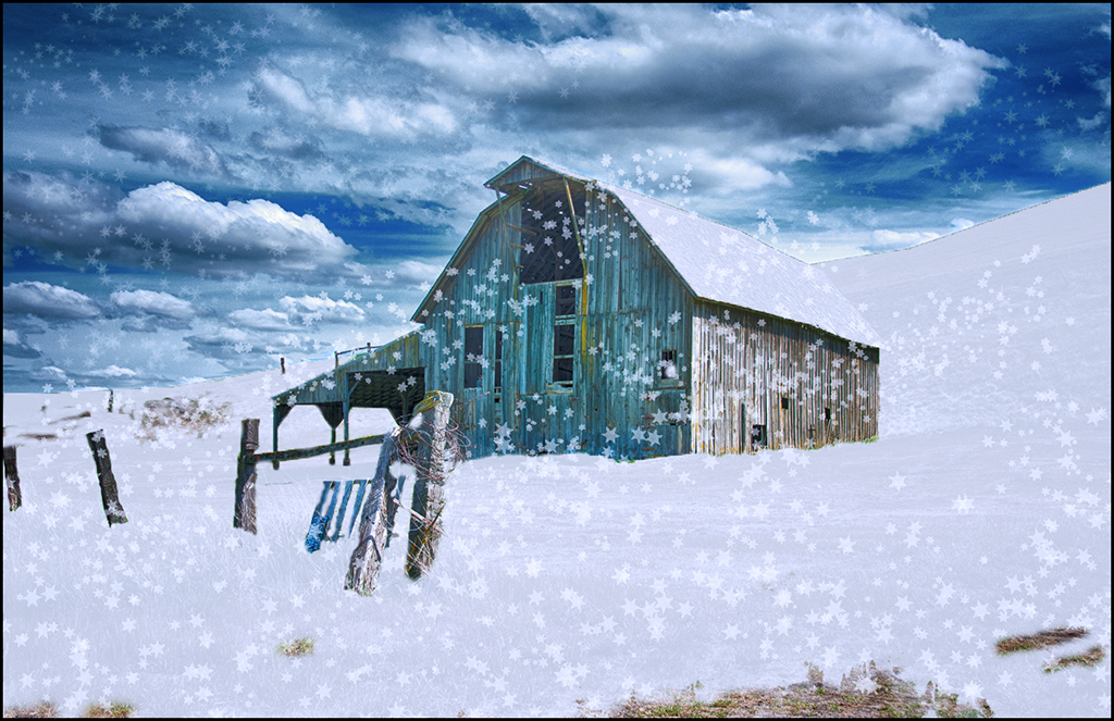
Excellent light painting image... How many images did you take of the barn ? The freezing cold would have keep me away but looks like you have a very good image. Very good job of combining two images to create this. The combination of yellow light and blue/green structure has good impact.
Well done. Great image. |
Jan 18th |
| 27 |
Jan 17 |
Comment |
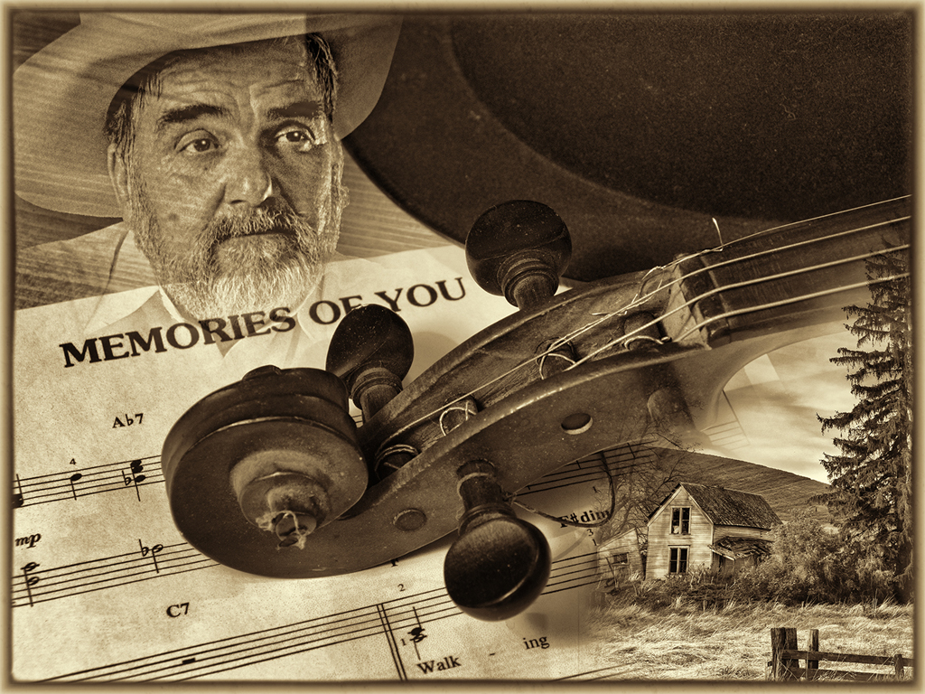
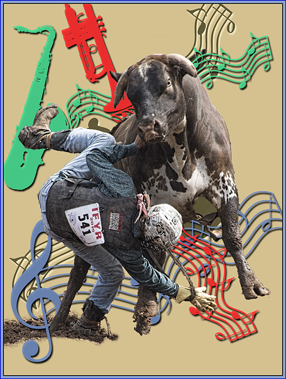
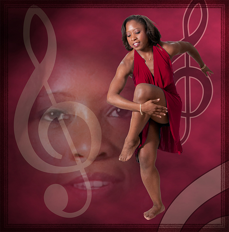
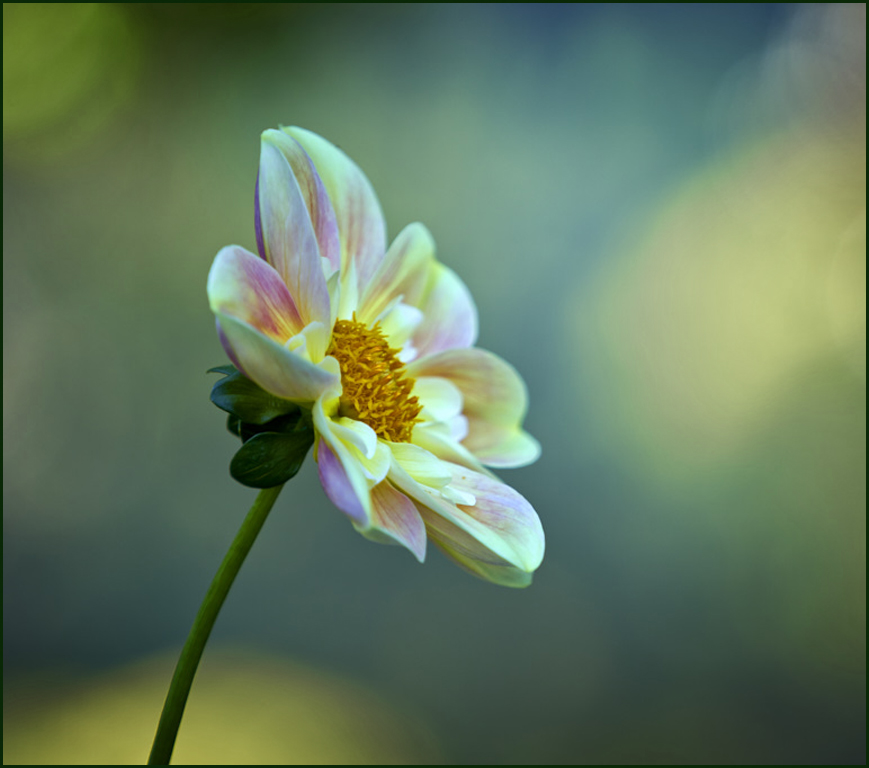
Very creative image... You do have a creative bone in your body, Brad. Beautiful flower image and soft focus. Your bright yellow spots are a little distracting so suggest use Hue-Saturation layer to reduce saturation ( can't believe I am saying reduce saturation !! ) because I want your flower to draw more attention. Also using a slight square cropping. Very good image. |
Jan 16th |
 |
| 27 |
Jan 17 |
Comment |
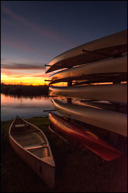
Pleasant sunset image... Interesting foreground with the canoes. Do suggest using a levels layer to lighten the canoe and basic sunset area but mask the levels from the sky area to keep it dark. Bringing out a little of the canoes helps the subjects. Very good image.
|
Jan 16th |
 |
| 27 |
Jan 17 |
Reply |
Brad,
In PJ competition, you aren't permitted to clone anything out in your images. In pictorial competition, I can change that person and a lot more.. |
Jan 16th |
6 comments - 3 replies for Group 27
|
| 32 |
Jan 17 |
Comment |
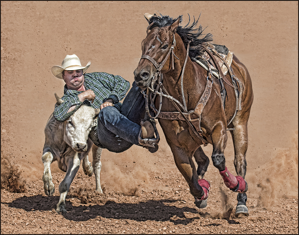
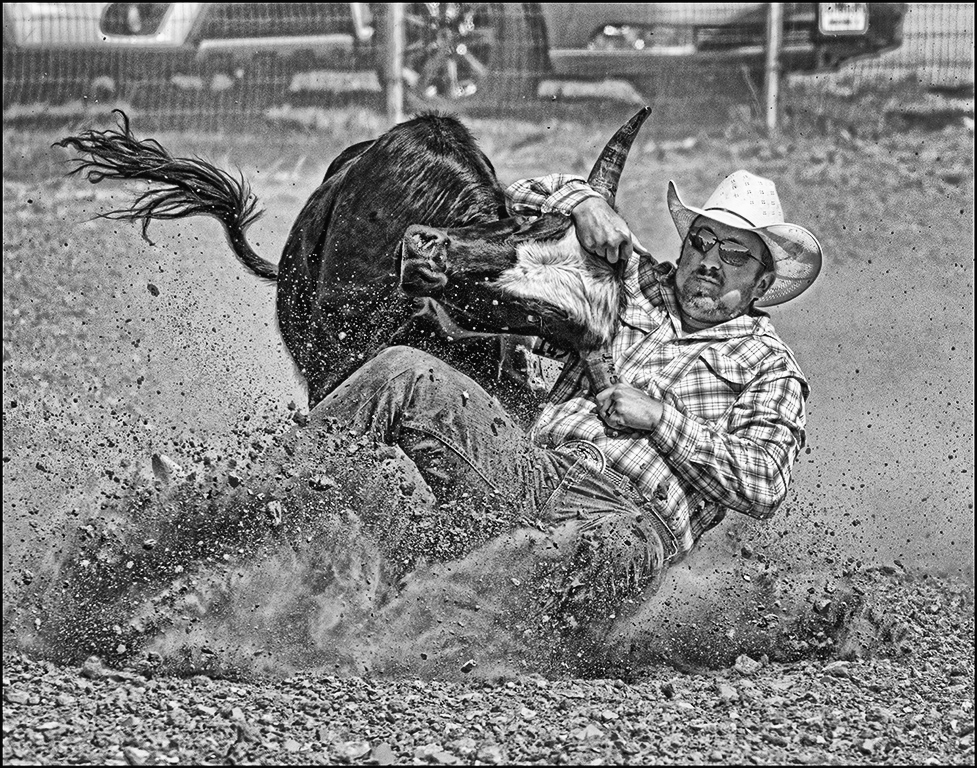
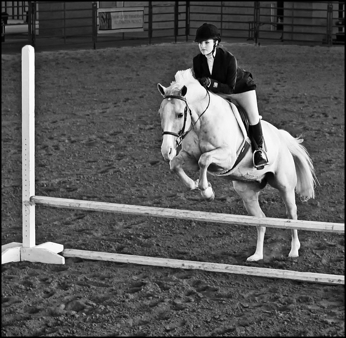
Very good image... Their are some local out door horse jumping competitions that we need to take pics of again. Your's is a very good image considering the ISO. I suggest cropping in more to make your subject occupying more of the image. Also, darkening the lighter background area and used stamp tool ot get rid of some white spots in it. Good job. |
Jan 25th |
 |
| 32 |
Jan 17 |
Comment |
Nice image... I like your idea but you need a little more light in the image. Moonlight will create a lighter water area. Just use levels layer on the entire image and use a curves layer on the sky. Darken the bottom slightly. You have some very good travel images. |
Jan 25th |
 |
| 32 |
Jan 17 |
Comment |
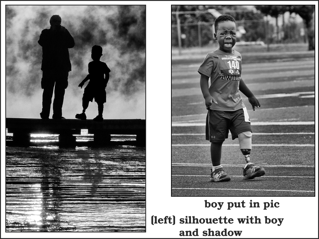
Nice silhouette... Silhouettes need a subject usually that are unique or are doing an activity (biking, side view of photographer, children walking or running, etc.). To give you an idea, I took one of my child runners and turned it into a silhouette (select subject - fill with black, select background fill with white), then put the new silhouette in the image (darken layer modifier) and the use transform to size it. Mine was a great choice but it does show how to add more to a silhouette. Also, don't forget the shadow(s). Great eye for turning this into a good image - just need to find the right extra subject or replace with a side silhouette of another photographer. Also, suggest cropping. Good image. |
Jan 25th |
 |
| 32 |
Jan 17 |
Comment |
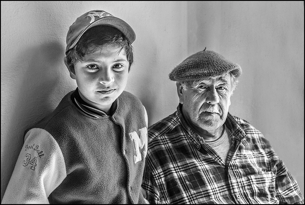
Great portrait... As usual, your portraits show such facial character. I prefer the mono as compared to the color - portraits of older people always look and do better in competition in mono. My only suggestion is to use the stamp tool to remove the wooden area on the right and the wall seams behind them. Great duo image. |
Jan 25th |
 |
| 32 |
Jan 17 |
Comment |
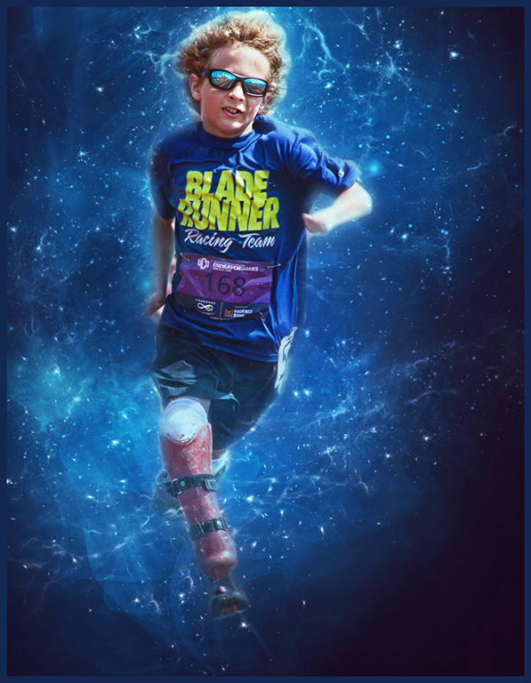
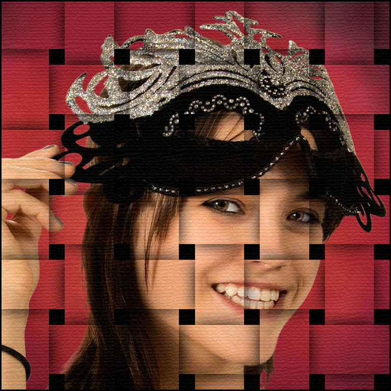
Cute creative image... Trying to do creative images can be a major challenge. I understand about forgetting to note what all you do to an image. When I started in photoshop, I spent many nights just exploring each filter. Seeing other creative images on flickr, smugmug, 500px, etc. can sometimes help with ideas !! Your sepia choice is good and grain doesn't bother me. Since titles aren't read, your creation might have problem in competition. Good creation. |
Jan 25th |
| 32 |
Jan 17 |
Reply |
I didn't have to do anything about the grain. Tom needed to use Topaz denoise on his images but I didn't do anything with my images - there were great !! The focus was very fast too. |
Jan 14th |
5 comments - 1 reply for Group 32
|
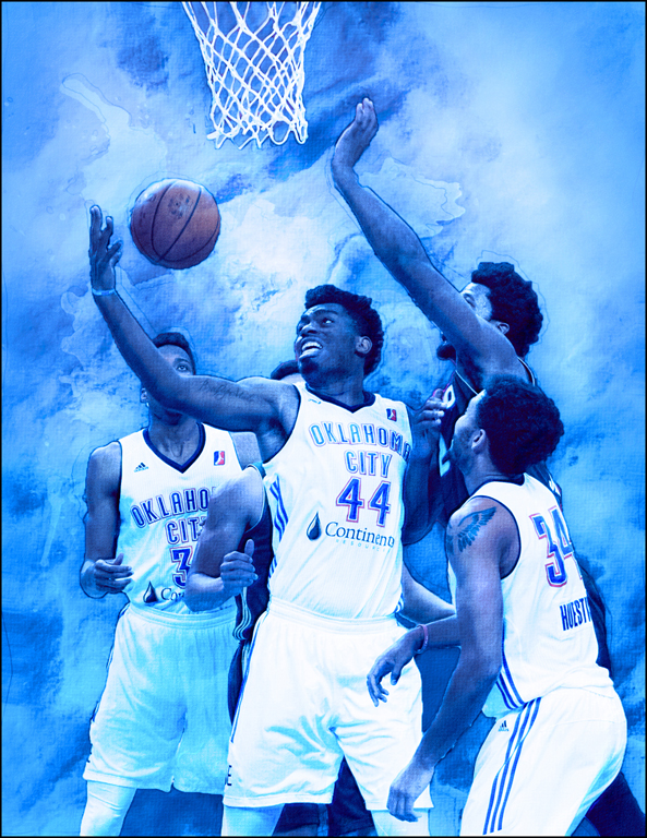
| 41 |
Jan 17 |
Comment |
These comments are from Carolyn who will rejoin our group next month....
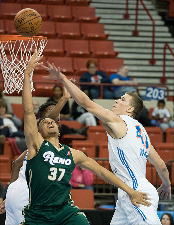
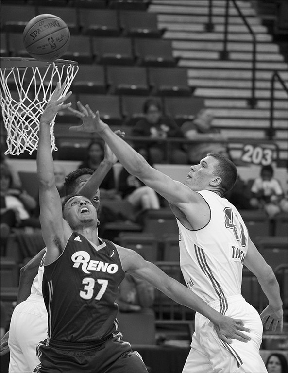
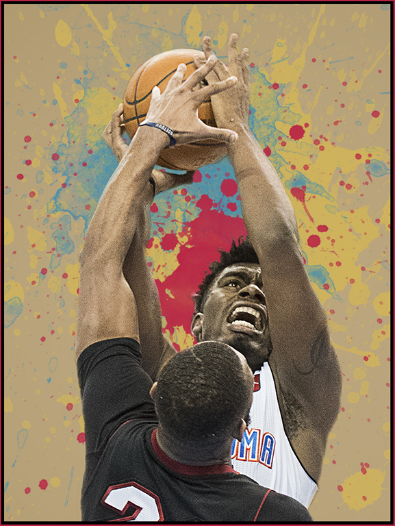
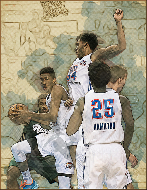
Great shot and I love what you have done to it and also the shades of blue just make everything pop Carol! I agree and would definitely take out the halos around the players bodies and also take out the wrist band on player 44’s wrist. And also fix the ‘indentation’ in the player’s arm on the far left. And smooth out the area between player 44’s hand and the ball so it blends more. Great action shot! And glad you’re loving that new Nikon and lens. That is a super lens!
|
Jan 29th |
| 41 |
Jan 17 |
Comment |
These comments are from Carolyn who will rejoin our group next month....
What a delightful image you have created!! Love everything you did and the tones all blend together and the moon and tree and grass in the front all combine to make a great image! Love that protective look with her feathers all fluffed and ever watchful eye. Might take some of the ‘shadowing effect’ off the right side of her upper today though as it’s a little distracting going into the second layer of feathers. You’ve taken a mundane picture and made it into a lovely piece of art!
|
Jan 29th |
| 41 |
Jan 17 |
Comment |
These comments are from Carolyn who will rejoin our group next month....
Love your Tiny Dancer concept! Very clever and beautiful job extracting the dancer and creating her overall shadow. The shadow around her feet doesn’t quite work for me though .. looks a little on the ‘muddy’ side for lack of a better term at the moment. Would definitely clone out the blur showing from under the cuff of your sweater as that is distracting and make it the blue of your sweater. I think she blends in well but you might try darkening her dress just a tad. Might want to clone in the background on the lower right so your sweater covers everything. Hey, it’s nice to see a handsome portrait of you in the picture too!!
|
Jan 29th |
| 41 |
Jan 17 |
Comment |
These comments are from Carolyn who will rejoin our group next month....
What a great capture and love how you have turned it into a beautiful painting! Rider’s expression and posture is great and I do agree about perhaps sprucing up the horse’s mane and tail for a little more flair, but overall, a great job of blurring out that busy background and love the blue outside stroke!
|
Jan 29th |
| 41 |
Jan 17 |
Comment |
These comments are from Carolyn who will rejoin our group next month....
Ha! Ha! So clever and love it! I do agree with Lisa’s last image and think it really makes the picture pop more. The piece of wood coming up from the bottom into the poster is distracting to me and I would remove that and also the top part over the ‘ted’ part of the poster. Very unique!!
|
Jan 29th |
| 41 |
Jan 17 |
Comment |
Great image... The coloring, moon and tree elements, and the texture really sell this image. Almost missed the little owl... Great job in this creation.
|
Jan 25th |
| 41 |
Jan 17 |
Comment |
Nice idea... Good job of bring all the elements together in this image. I would have liked the man to be posed slightly turned with his head turned to left side and hands raised to his left side. Then you could have add a beam of light coming in from the top right corner to highlight the dancer - would help the composition with this pose. The man could be slightly darkened which would also help spotlight your dancer. With the slight side pose, you want see the man looking at the dancer. Hope suggestions help to improve your image. |
Jan 25th |
| 41 |
Jan 17 |
Comment |
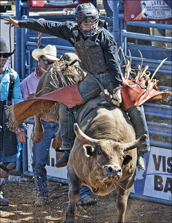
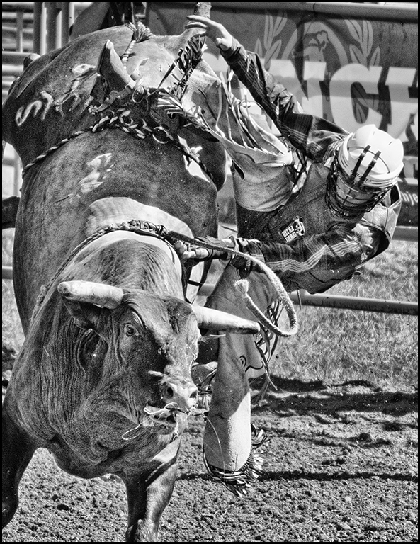
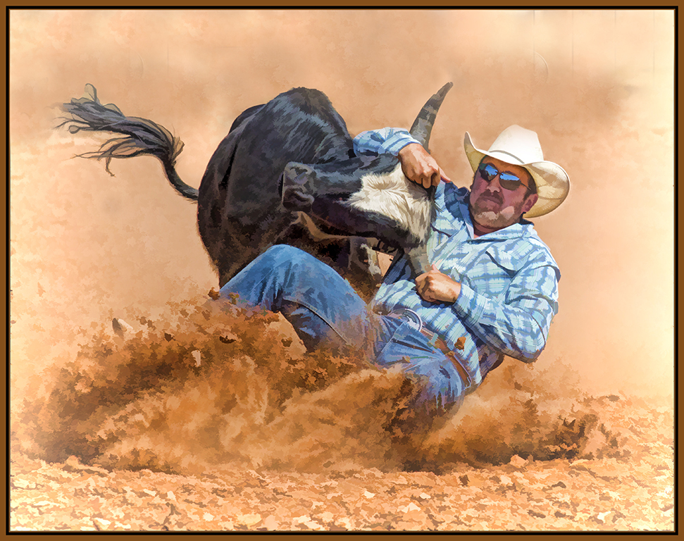
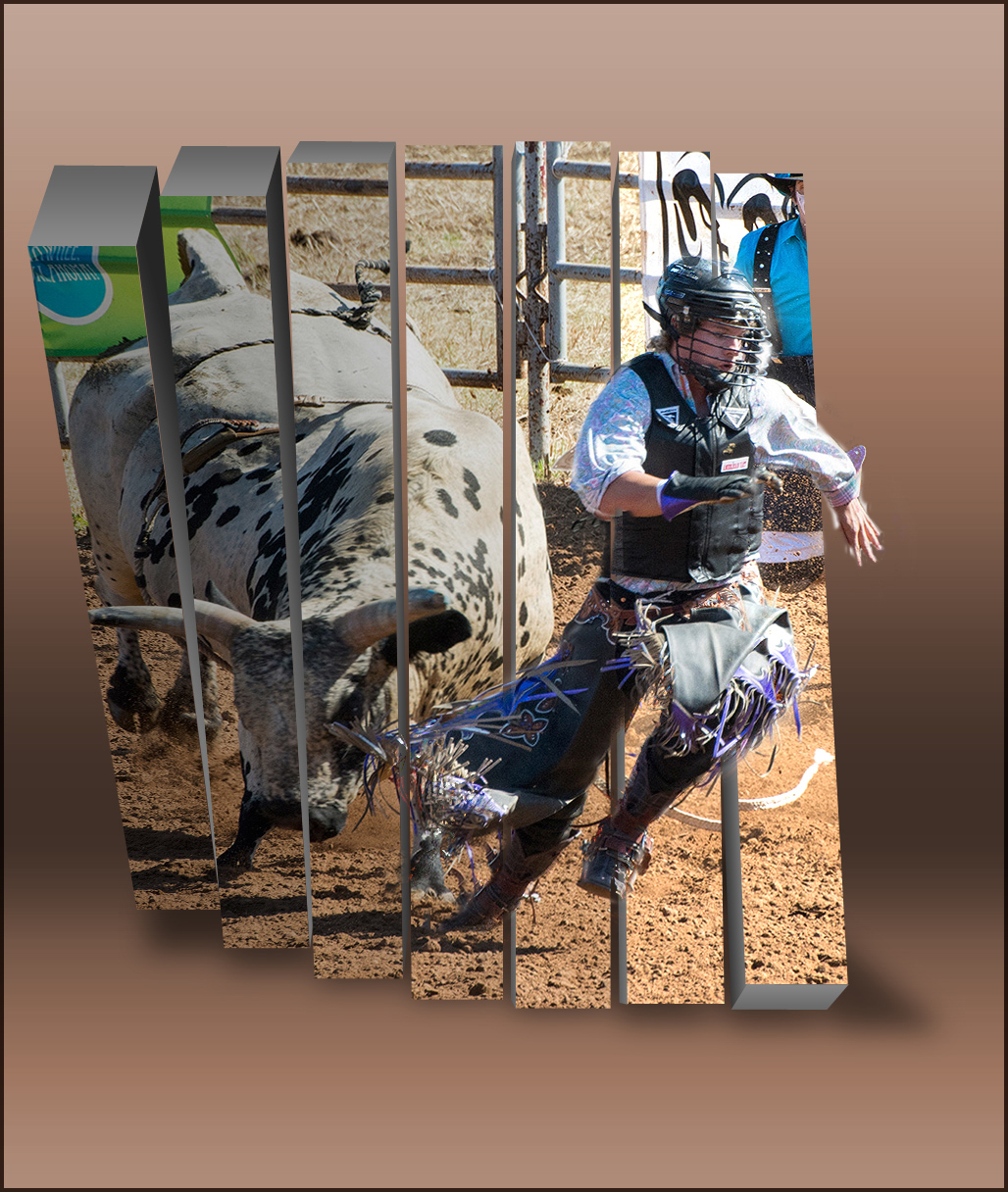
Very good job of extracting the horse and rider. Your background is artistic and makes your subject stand out. Would like to see the dirt dust at the back legs in the image to give more detail to the main image. Good image. |
Jan 25th |
| 41 |
Jan 17 |
Reply |
I chose blue because the team is " Thunder Blue ".
|
Jan 10th |
8 comments - 1 reply for Group 41
|
| 61 |
Jan 17 |
Comment |
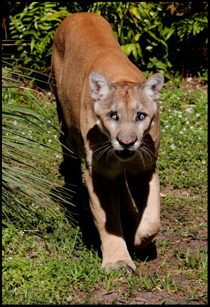
Nice zoo picture... Good processing but please correct the red eyes. Suggest you create a vertical and get rid of extra space around the panther. Good job. |
Jan 26th |
 |
| 61 |
Jan 17 |
Comment |
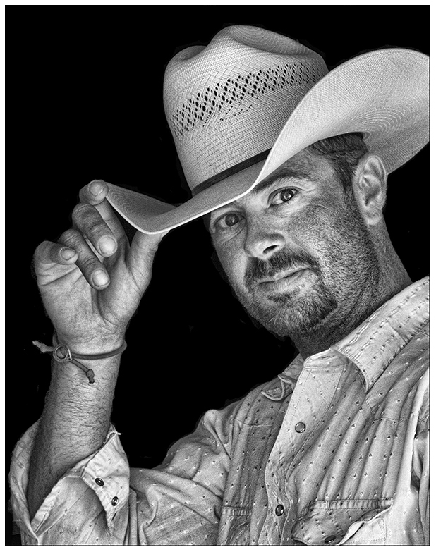
Your processing is always superb !! Your subject has a very friendly nice smile and making it sepia really improved the portrait. Great job. |
Jan 26th |
| 61 |
Jan 17 |
Comment |
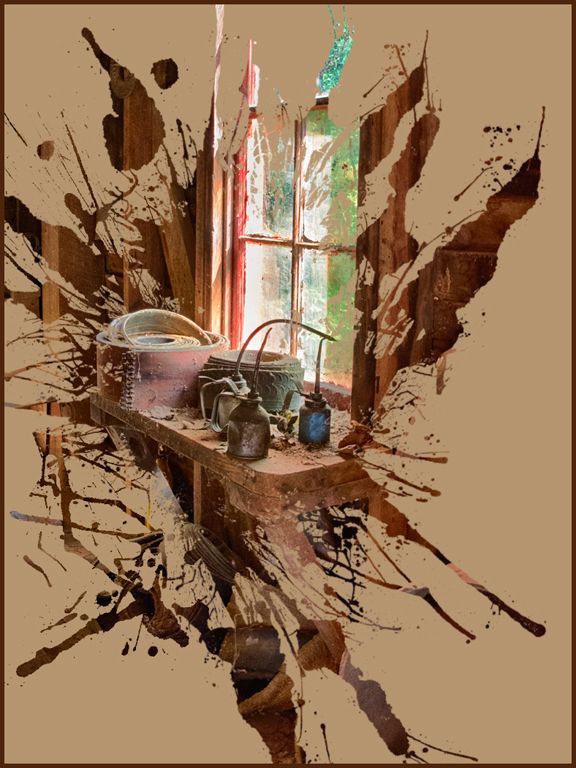
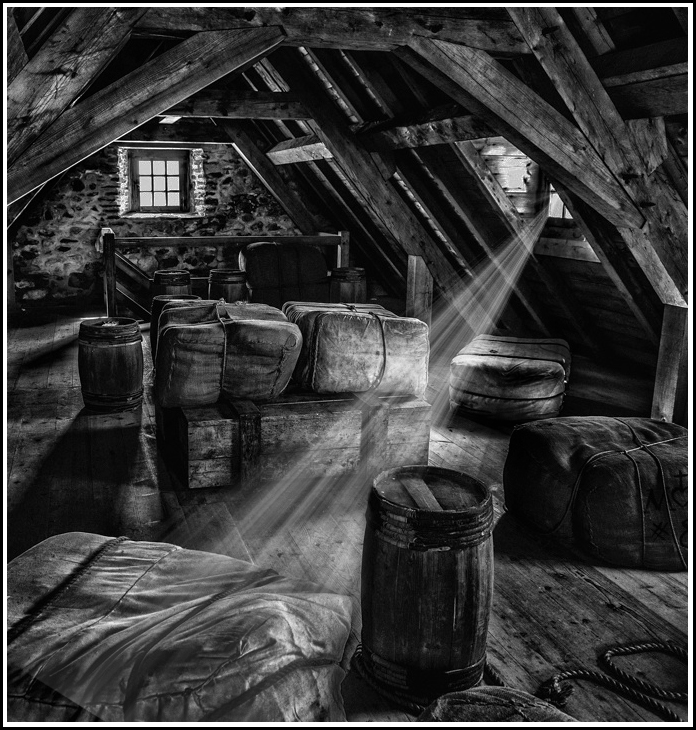
Very good mono creation of an interesting subject. Good post processing. Since there are several light areas in the image, you might want to concentrate on one area by adding a ray of light from the right window. Burn the other window and its light area below, crop to remove light area on left, and then create and play with the light ray. Just another viewpoint. Good image. |
Jan 26th |
 |
| 61 |
Jan 17 |
Comment |
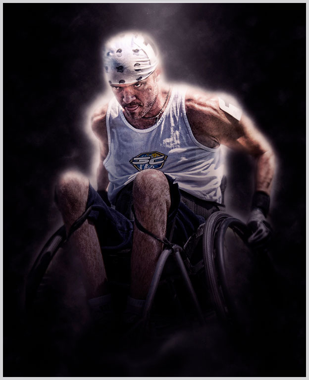
Very good motion creation... Nice use of motion blur. I agree with other comments about making it a vertical to reduce the structure around her. Good image.
|
Jan 26th |
| 61 |
Jan 17 |
Comment |
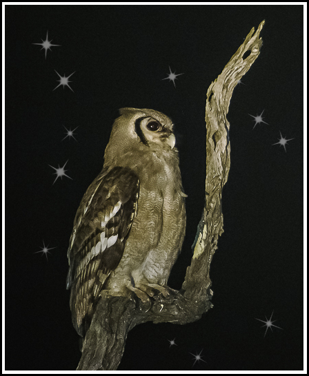
Very nice owl... Good post processing. Suggest you crop into your subject and add a few stars for impact. Of course if it is for nature competition, you can't add the stars. You can get stars, etc. in photoshop brushes - free ones at brusheezy; then load them into photoshop or elements. Always paint them on seperate layer (black with white stars) and then use a mask to eliminate the ones you don't want. Good image.
|
Jan 26th |
 |
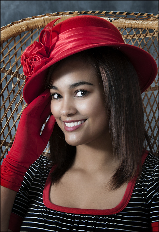
| 61 |
Jan 17 |
Comment |
Very beautiful mono nude image. Very good pose and beautiful model. The chair really helps in the image. I agree with Jim's suggestion on closing the white hole of the chair. Great image.
|
Jan 25th |
| 61 |
Jan 17 |
Reply |
I have another pose of her in the chair and I replaced the background. Like the simplify effect to the background. Thanks... |
Jan 18th |
6 comments - 1 reply for Group 61
|
25 comments - 6 replies Total
|