|
| Group |
Round |
C/R |
Comment |
Date |
Image |
| 9 |
Mar 26 |
Reply |
I like Sabine's idea for cropping the image. As I mentioned in my reply to her, an earlier iteration of the photo was cropped like that. Using different software and starting from scratch, I came up with this crop this time. I didn't even realize that until I came across the earlier iteration. |
Mar 20th |
| 9 |
Mar 26 |
Reply |
Thank you, Sabine. I recently came across an earlier iteration of this photo and I cropped it similar to what you are suggesting with a little more sky visible. With this new iteration, using different software, I decided to keep the base of the trees and the ground as more of a "base" to the image. Plus, with this software, I was able to remove distracting elements that were visible in this lower portion that I was unable to with the other software.
I will play around with the colors and the crop a bit more. The colors of my uploaded version seem a bit faded than was my intention. |
Mar 20th |
| 9 |
Mar 26 |
Reply |
My adjustments were primarily global and I included a vignette, though I darkened the upper two corners a bit more than the vignette. |
Mar 20th |
| 9 |
Mar 26 |
Comment |
Linda, this is an interesting capture of two men in conversation. I like the conversion to a high contrast black and white making the subjects silhouettes. The position of the hanging sphere between the two men adds interest to the photo. It looks like there may be a third person in the image whose fingers are coming out of the man on the left's chest, which is a little distracting to me. You might consider removing them if not part of the scene. Nice shot. |
Mar 17th |
| 9 |
Mar 26 |
Comment |
Sabine, this looks like a fun event and I think you have captured the start of the race well. These types of starts can be quite chaotic and that is part of the fun capturing them. While I do like the color version because of the unique and interesting colors of the town and riders, your conversion to black and white is well done.
The B&W conversion gives it a timeless feel to the photo and the addition of the white border adds to that timelessness. I like the contrast in the photos, especially of the buildings, but agree the riders could be brightened just a little bit, especially the lead rider. |
Mar 17th |
| 9 |
Mar 26 |
Comment |
Yvonne, I like the contrast between the bright yellow building and the dark sky. I think I like the moon in the image, though it could be darkened a bit to be less dominant. My suggestion, beyond what others in the group have suggested, is to reduce the brightness of the yellow in the bottom portion of the building. I think that may balance the overall brightness of the photo. Just a thought. |
Mar 13th |
| 9 |
Mar 26 |
Comment |
Douglas, I think this is a great photo. What a great scene to come upon! Someone sure has a good sense of humor to put this together. I don't know that I would do anything else to this photo, it works as is and tells a fun story. One that brought a smile to my face. |
Mar 12th |
| 9 |
Mar 26 |
Reply |
Thank you, Yvonne. I appreciate your feedback. As I mentioned in my response to Douglas, I'm not sure I agree with your crop, but your colors do look more vibrant than mine, which I like. For whatever reason, my image is less vibrant than the file on my computer even though I am looking at them from the same monitor (which has been calibrated recently). I am not sure what is causing this.
I may have used my tripod, but don't remember on this specific shot. I know I was using it earlier in the day quite a bit. This shot was not bracketed, it is just one image. |
Mar 8th |
| 9 |
Mar 26 |
Reply |
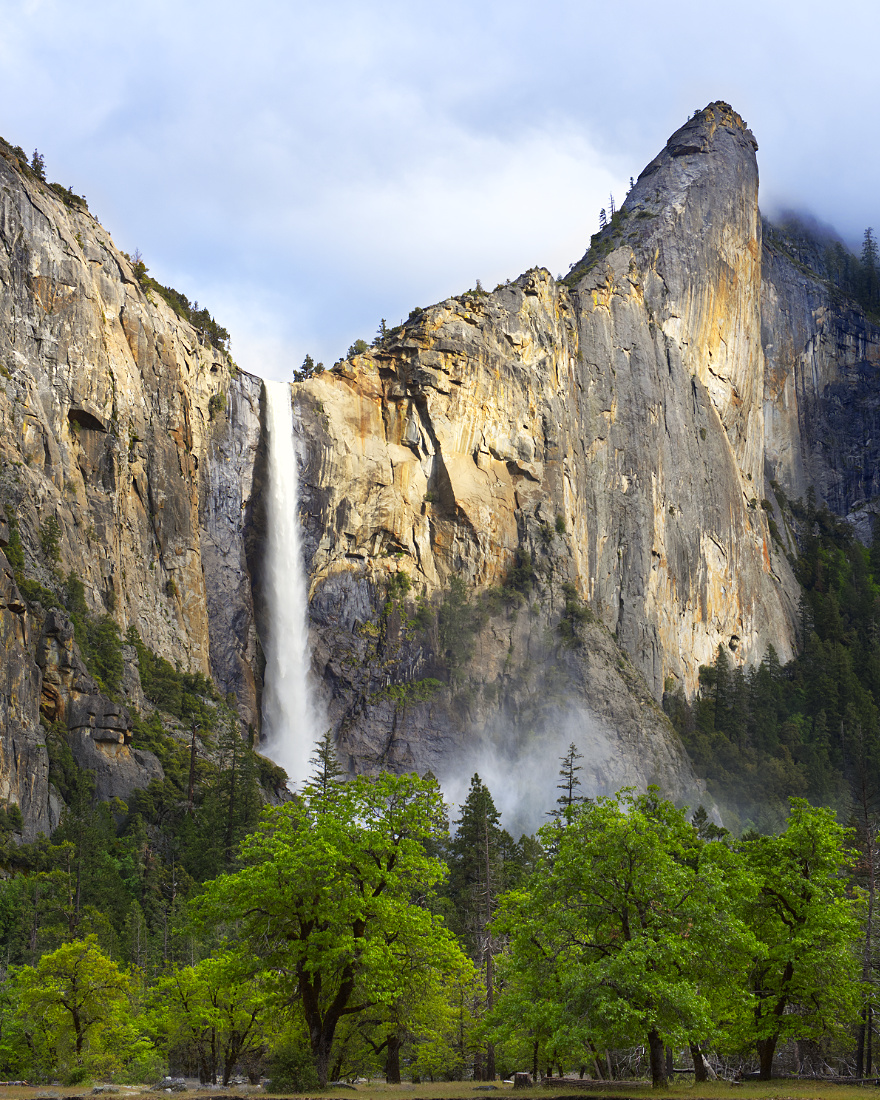
I appreciate your feedback, Douglas. With your changes, I may look at adjusting the sky a little more. I'm not sure I agree with your crop. Though I didn't say it, this photo is of Bridalveil Falls in Yosemite valley and the rock outcrop is called the Leaning Tower, and together I think it adds to the overall image of the falls. It seems Yvonne agreed with your crop, though. |
Mar 8th |
| 9 |
Mar 26 |
Reply |
Sylvia, thank you for your comments. I appreciate them. |
Mar 8th |
| 9 |
Mar 26 |
Reply |
Thank you for your feedback, Jim. I appreciate what you've said. Timing is often everything with landscape photography and this was a great day for photos. I was able to get many keepers that I am happy with. |
Mar 8th |
| 9 |
Mar 26 |
Comment |
Sylvia, it's too bad developers feel they must demolish buildings rather than remodeling them. From your image, it looks like a modern mall with interesting architecture. 1999 was not that long ago, but maybe everyone shops online these days.
I do like your image, though with Yvonne's crop. I don't notice any noise from the high ISO, so that does not seem to be a problem for you. Have fun with your new lens! With prices falling for used F-mount lenses, this is a focal length I have considered getting. |
Mar 8th |
| 9 |
Mar 26 |
Comment |
For whatever reason, the blacks do not look as black when I uploaded my image to this site. Not sure what happened. |
Mar 8th |
| 9 |
Mar 26 |
Comment |
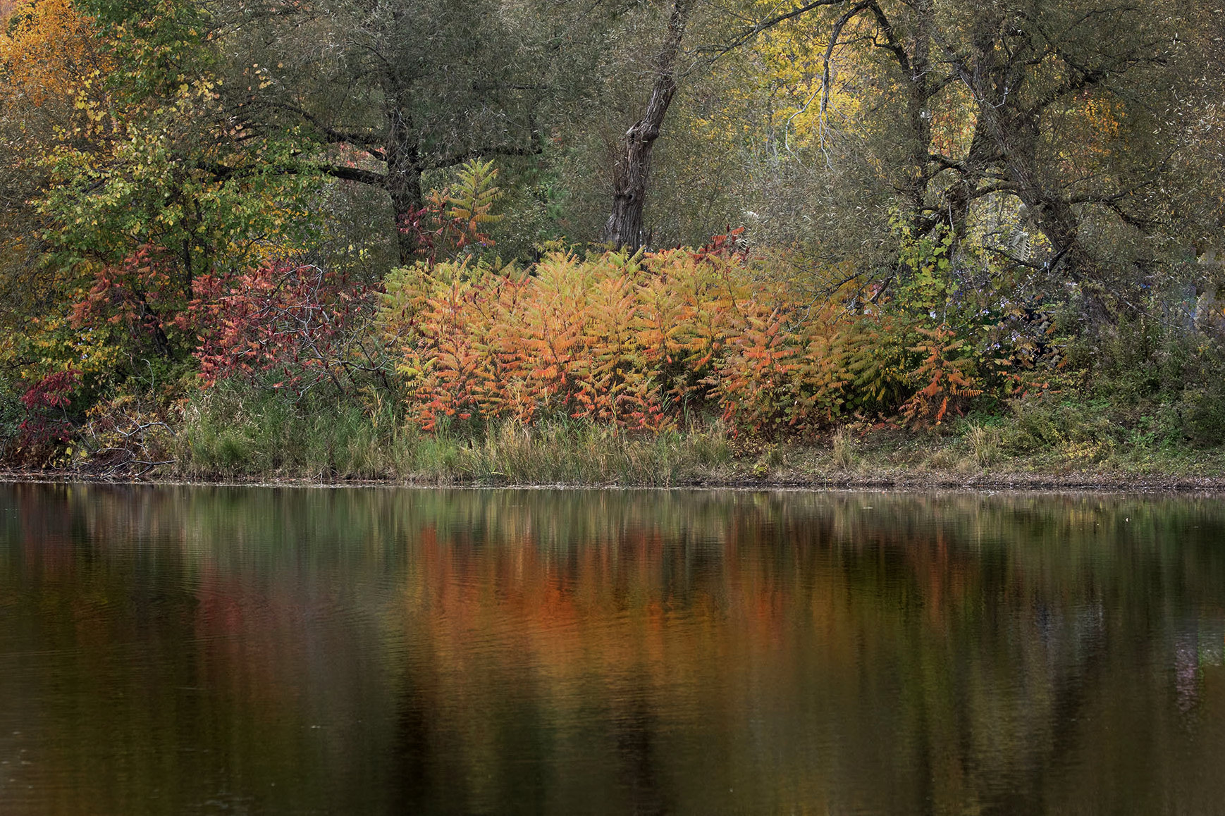
Jim, this is a nice, peaceful scene with fall colors. I really like the reflections in the lake. Your crop to remove the distractions on the right side of the frame were a good choice.
Working with your original image, I adjusted the image a bit to increase the blacks and increase the depth. I used the haze removal tool, curves, and brightness and contrast tools primarily to get these results. Not sure it is any better, I'll let you decide. |
Mar 8th |
 |
7 comments - 7 replies for Group 9
|
7 comments - 7 replies Total
|