|
| Group |
Round |
C/R |
Comment |
Date |
Image |
| 37 |
Aug 25 |
Comment |
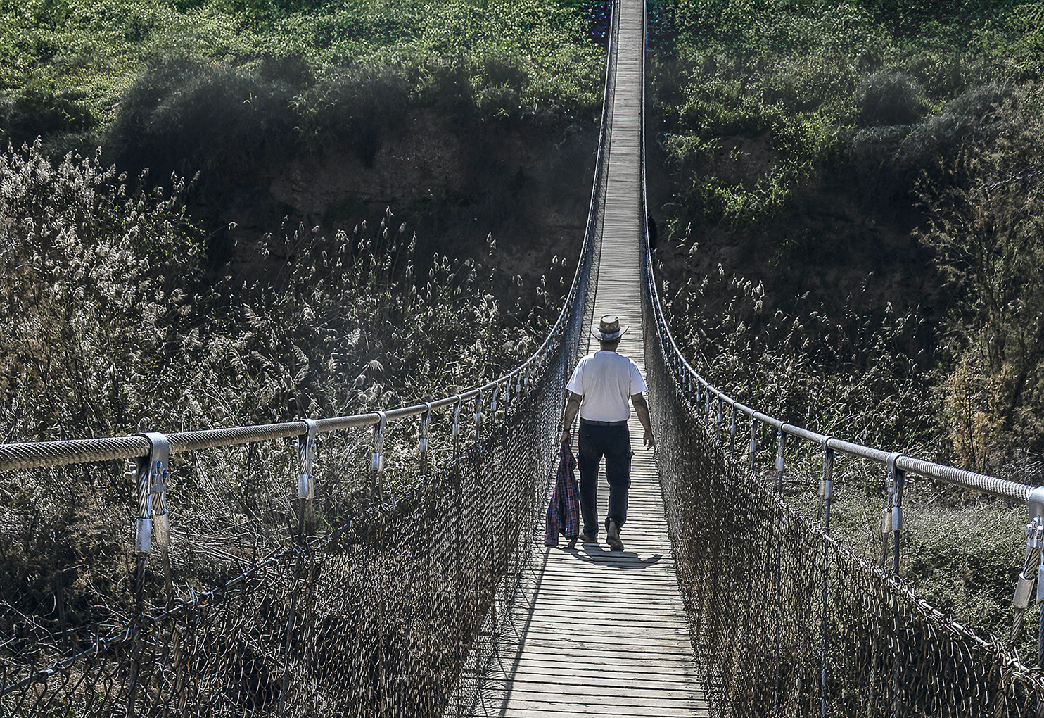
This image, with the long footbridge and the person walking on it, creates a strong sense of depth and perspective, especially because of the converging lines of the bridge and the contrast between the lighter vegetation and the more distant ones. So I would say it really doesn't look flat.
But if you want, I can emphasize the depth even more |
Aug 28th |
| 37 |
Aug 25 |
Reply |
Thank you for your in-depth review, |
Aug 23rd |
| 37 |
Aug 25 |
Comment |
This is a very successful and impressive image that achieves its main goal: capturing the energy, skill, and excitement of the trapeze act. Its strengths, most notably the masterful timing and sharp technical execution, easily outweigh its minor shortcomings. With a little attention to background cleanliness during the shooting or editing stages, it could have been perfect. |
Aug 22nd |
| 37 |
Aug 25 |
Comment |
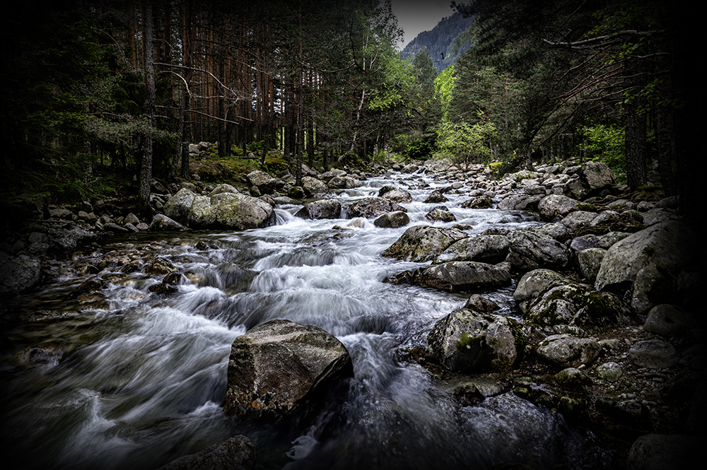
This is a phenomenal nature and wildlife image. It captures a rare moment of power and beauty in a technically perfect way. The timing, sharpness and composition make it an unforgettable image. Cons Points for improvement: The image was probably taken on a cloudy or foggy day. The result is soft and uniform lighting, known as "flat lighting". On the one hand, it allows you to see all the details on the whale's body without harsh shadows. On the other hand, it lacks the drama and contrast that could be created by direct sunlight (with shadows and highlights).
The disadvantage is negligible compared to the impressive achievement of the photographer. |
Aug 22nd |
| 37 |
Aug 25 |
Comment |
This is a powerful panoramic landscape photo, the photo was probably taken at sunrise or sunset ("golden hour"), which contributed to its high quality.
A small note, the large rock in the lower right corner is very dominant. Some would say it is a little too "heavy" and blocks part of the view. A slightly different shooting angle could have changed the photo to an excellent one |
Aug 21st |
| 37 |
Aug 25 |
Comment |
This is an excellent environmental portrait, capturing not only the man's image but also the atmosphere, culture and story of the place. The image manages to evoke emotion and tell a story, which is one of the most important elements of quality photography.
Areas for improvement:
HDR/Clarity effect: The image appears to have undergone intensive processing, perhaps by increasing Clarity or using HDR techniques. The result is a dramatic look, some would say a bit artificial and exaggerated. This can be seen in the halos of brightness around the outlines of the figures and objects. A more subtle processing could have maintained a more natural look.
Vignette: The corners of the image are noticeably darkened. While a vignette is a tool for framing the subject, here it is a bit too strong and draws attention to itself.
In conclusion, the photographer has managed to create a strong environmental portrait that tells a story and leaves a lasting impression on the viewer. |
Aug 21st |
| 37 |
Aug 25 |
Comment |
This is an exceptional landscape image, breathtaking and executed at a very high technical and artistic level. Its strengths far outweigh its weaknesses (very intense colors, some would argue that the image has been overprocessed (oversaturated) and the colors are completely unnatural). Any photographer would be proud to capture such a frame. |
Aug 21st |
| 37 |
Aug 25 |
Reply |
Hello everyone, and thank you very much for the detailed feedback and the thought you put into analyzing the photo. It's always enriching and educational to get additional perspectives, and you've definitely given me food for thought. With your permission, I'll address some of the points that were raised:
1. On Symmetry and Composition
This is an excellent point. My intention was indeed not to create a perfectly symmetrical image, which I personally sometimes find to be almost static. I wanted to create a built-in visual tension; a feeling of "almost symmetrical" that makes the eye work for a moment. The off-center placement of the bridge and the figure is meant to lead the viewer's gaze forward, along with the man, and to give a sense of movement and progress into the frame. As you noted, I did try other angles, like placing the bridge distinctly according to the "rule of thirds," but doing so introduced distracting branches and elements at the sides of the photo that I felt weakened the central message.
2. On Color vs. Black and White
The idea of converting the image to black and white is an interesting one, and I did indeed try such a version during my editing process. However, I chose to stick with color to emphasize a specific narrative. I wanted to create a deliberate contrast between the almost-monochromatic tones of the bridge and the nearby thicket (the present), and the vibrant, fresh green at the end of the path (the destination, the future). For me, the color green symbolizes hope, renewal, and the promising "unknown" towards which the figure is walking. This transition, from muted colors to living ones, is part of the story I was trying to tell.
3. On the Confusing Plants and the Tree
I appreciate the comment about the plants; I hadn't considered that they could look like swirling water, and that's important feedback that teaches me about the viewer's experience. From my perspective, the purpose of the drier vegetation in the foreground was to serve as a natural, wild frame for the journey, and to add depth and texture. Similarly, the tree on the right was intended to balance the composition against the denser foliage on the left, and to help "close" the frame so that our gaze remains focused on the figure's journey forward.
Again, thank you very much for the insightful comments. Being able to have this kind of discussion about a piece of work is exactly why I value this group so much.
|
Aug 21st |
| 37 |
Aug 25 |
Reply |
Thank you so much for this wonderful feedback! I'm so glad you connected with the color version and the metaphor behind the image.
You perfectly described what I was trying to convey: the contrast between the dryness of the present and the lush, rich background that the figure is walking towards.
I especially loved your interpretation of the asymmetry. Your analysis, that the unbalanced composition might reflect a person who is "a little off-balance and unsure on his journey," is precisely the feeling I was hoping to evoke. It adds a psychological layer to the visual tension, and I couldn't have phrased it better myself.
And of course, thank you for the comment about the leading lines; I'm happy they worked as planned. This is a truly deep and accurate analysis, thank you! |
Aug 21st |
| 37 |
Aug 25 |
Comment |
Thank You |
Aug 18th |
7 comments - 3 replies for Group 37
|
7 comments - 3 replies Total
|