|
| Group |
Round |
C/R |
Comment |
Date |
Image |
| 32 |
Dec 23 |
Reply |
Thanks |
Dec 26th |
| 32 |
Dec 23 |
Reply |
Thanks |
Dec 26th |
| 32 |
Dec 23 |
Reply |
thanks |
Dec 26th |
| 32 |
Dec 23 |
Comment |
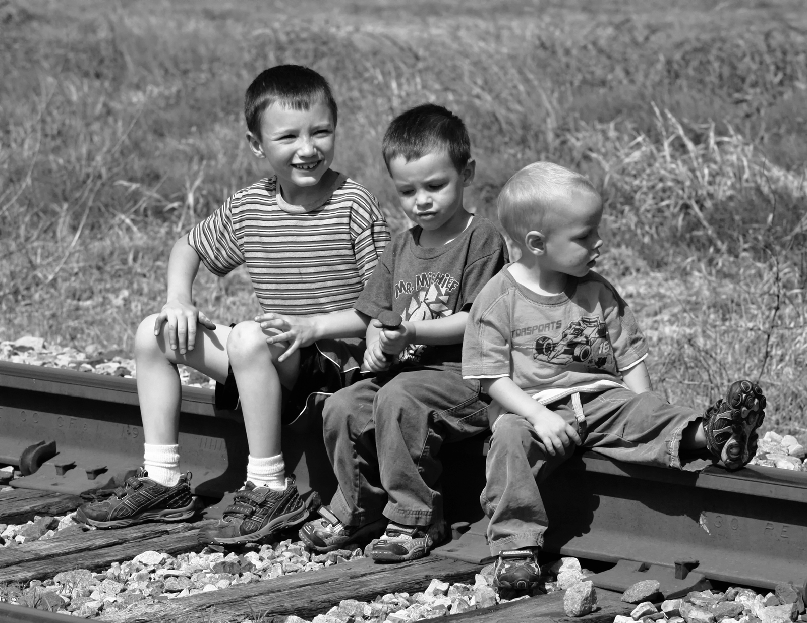
All the comments led to a very nice image. I like the final photo.
|
Dec 20th |
| 32 |
Dec 23 |
Comment |
I think Tom and Stephen made nice comments and I like the result and your compositonal decisions.
|
Dec 11th |
| 32 |
Dec 23 |
Reply |
Sharper: I agree.
I really wish he hadn't been there.
w
|
Dec 10th |
| 32 |
Dec 23 |
Reply |
Pls send me your email and I'll send you the article's url to link.
|
Dec 9th |
| 32 |
Dec 23 |
Reply |
All items work together nicely.
|
Dec 9th |
| 32 |
Dec 23 |
Reply |
I like your crop at the top.
|
Dec 9th |
| 32 |
Dec 23 |
Reply |
Your whites of the water are not as white as my Contrast edit produced. (It appears from the thumbnails)..... But we both agreed that the image could be improved with additional contrast.
|
Dec 9th |
| 32 |
Dec 23 |
Reply |
All items work together nicely.
|
Dec 9th |
| 32 |
Dec 23 |
Comment |
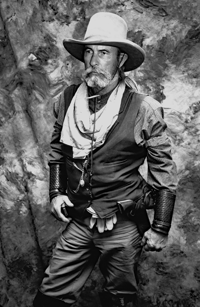
Perfection...... |
Dec 9th |
| 32 |
Dec 23 |
Comment |
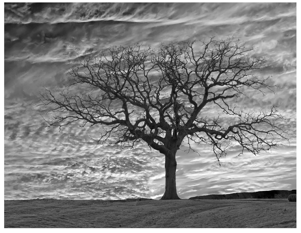
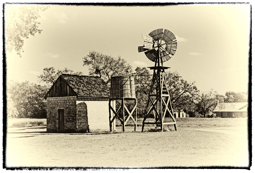
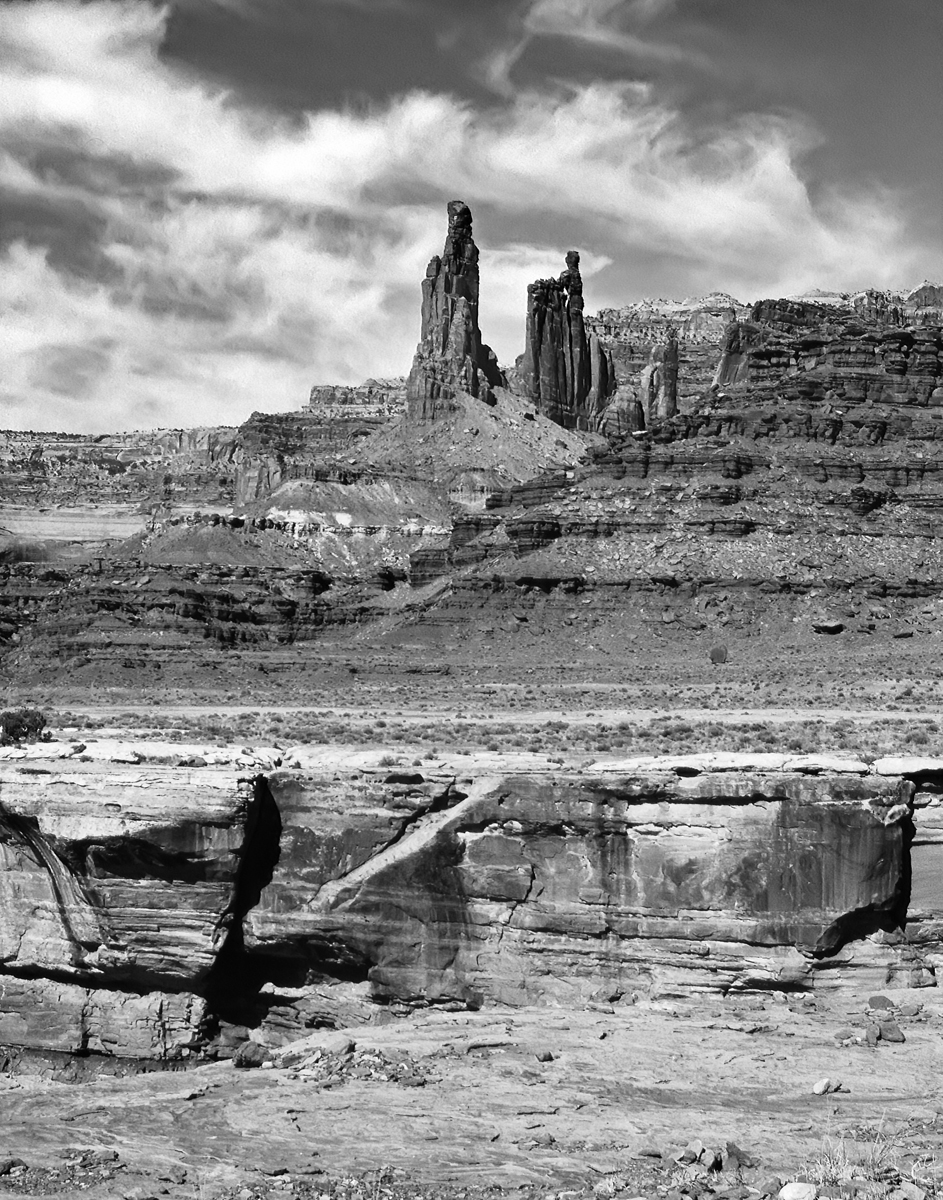
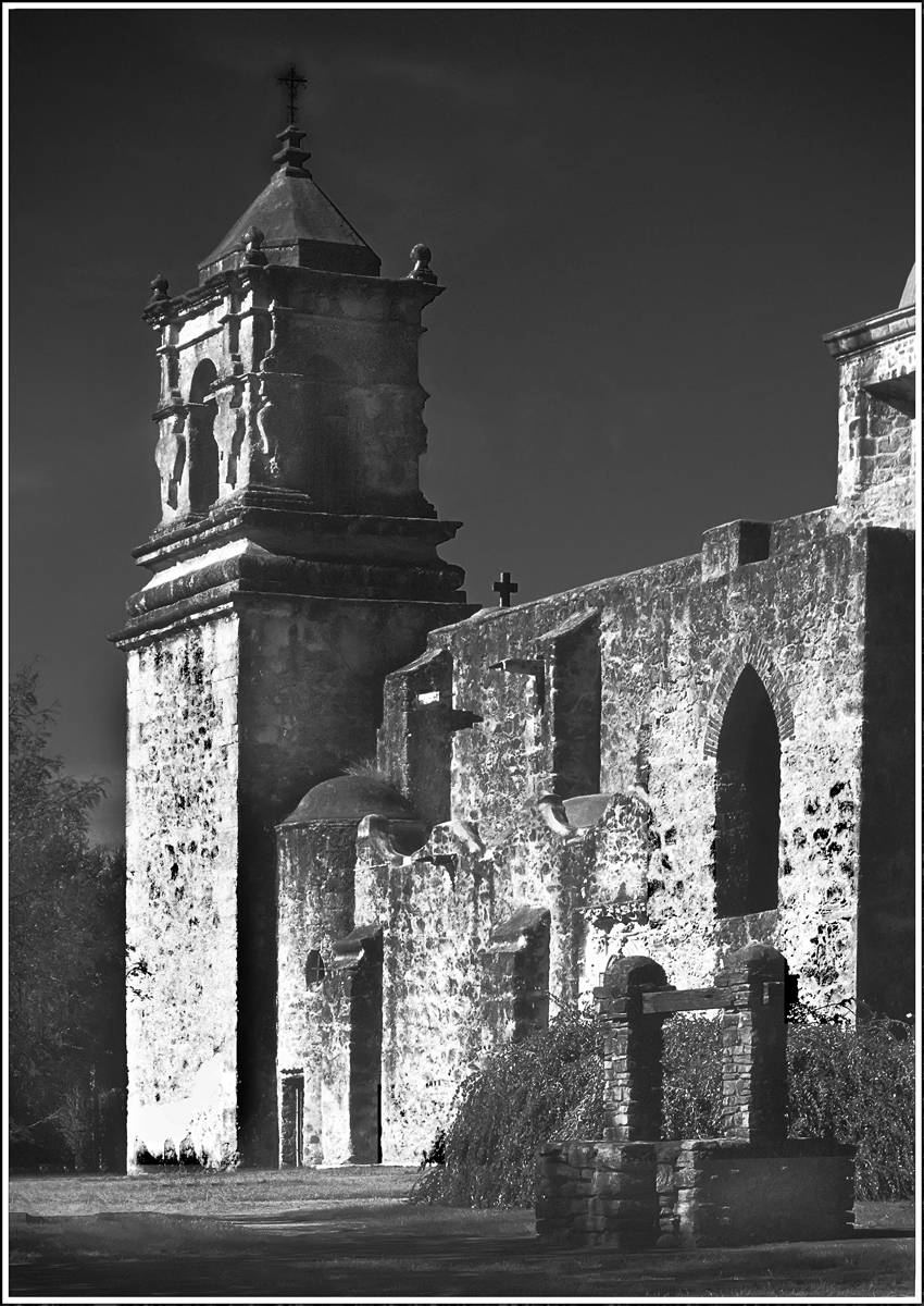
I think the amount of trees in the background is fine: satisfactory. My only suggestion is to make the blacks blacker (ie increase contrast.) In this image, I increased Contrast to +25. |
Dec 9th |
 |
| 32 |
Dec 23 |
Comment |
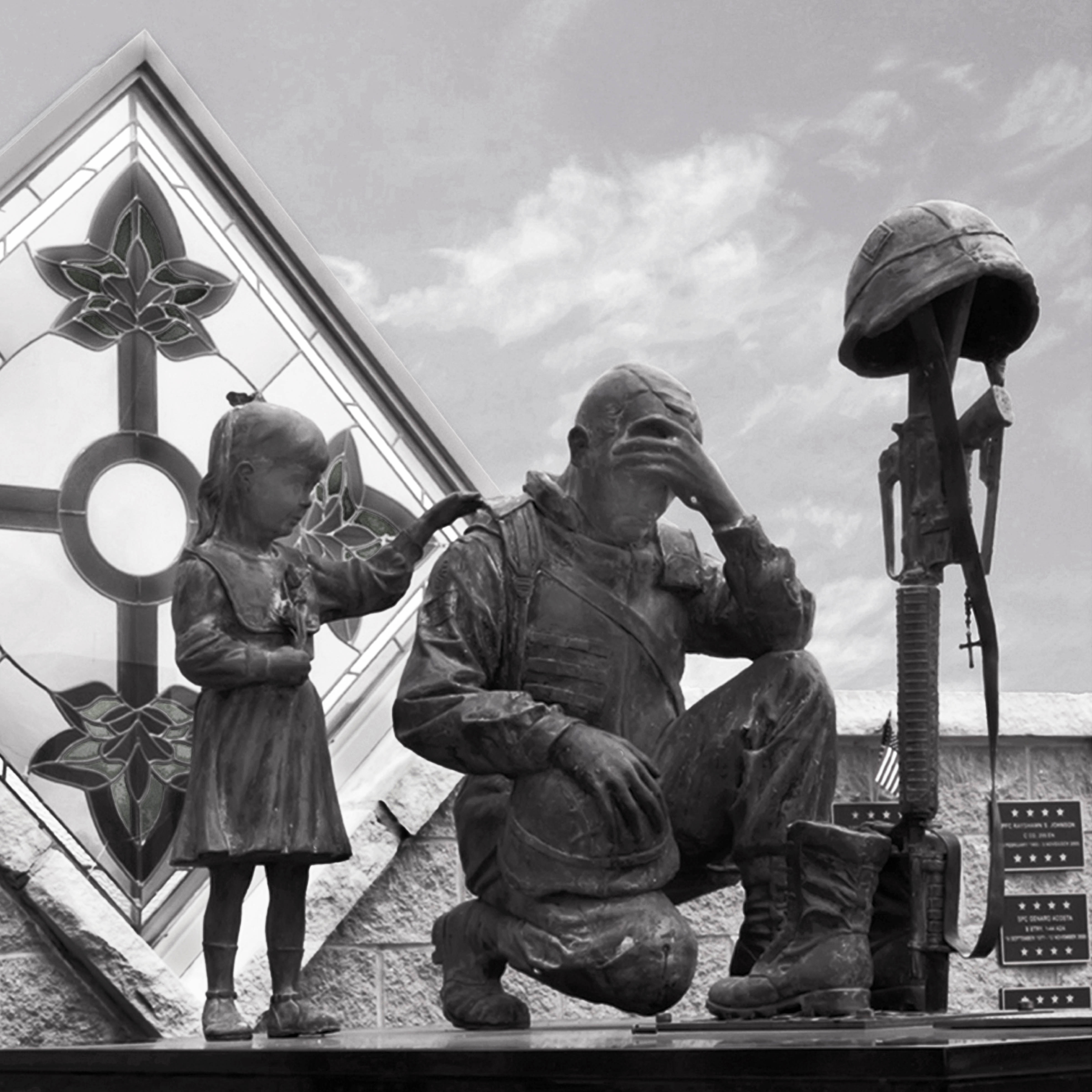
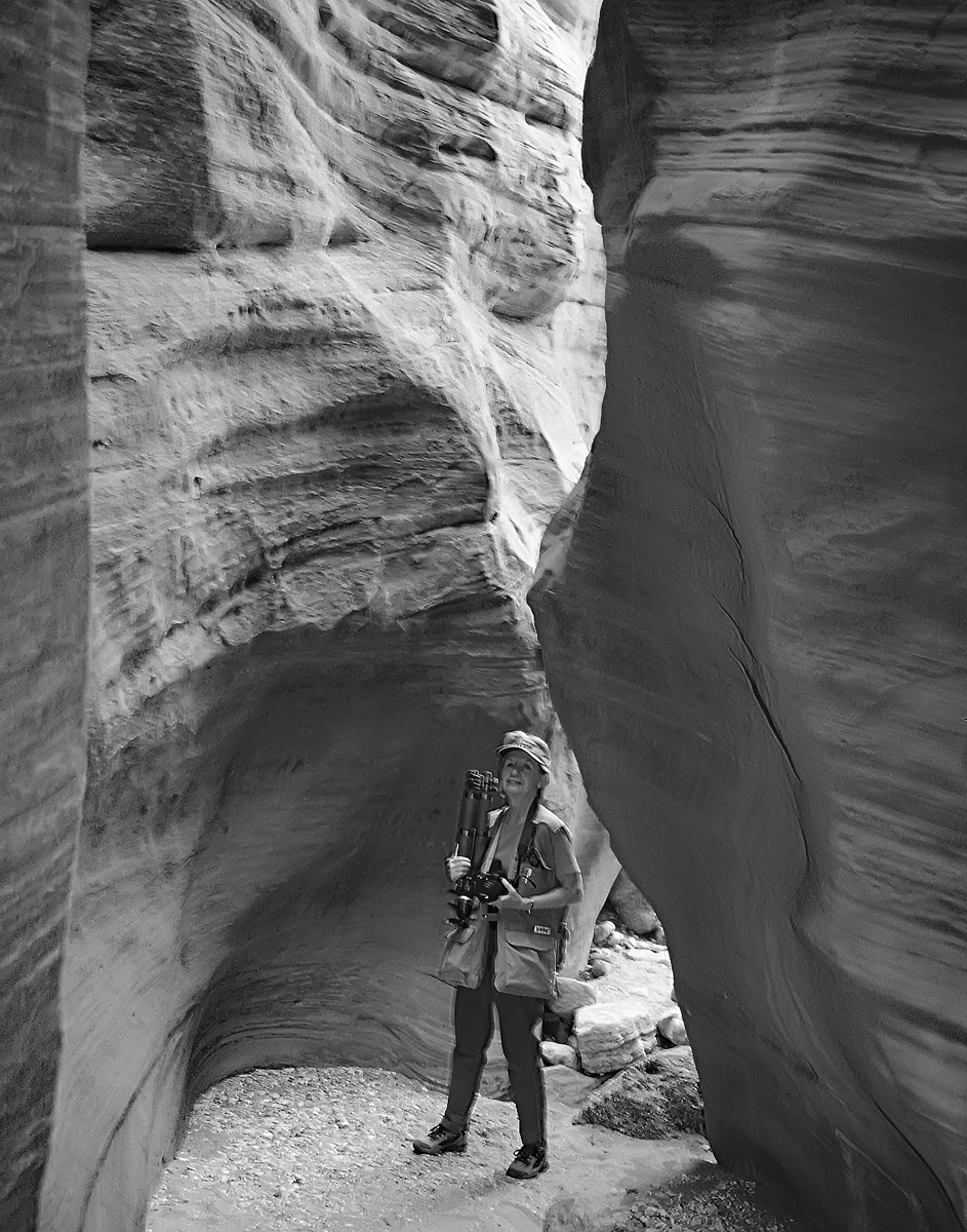
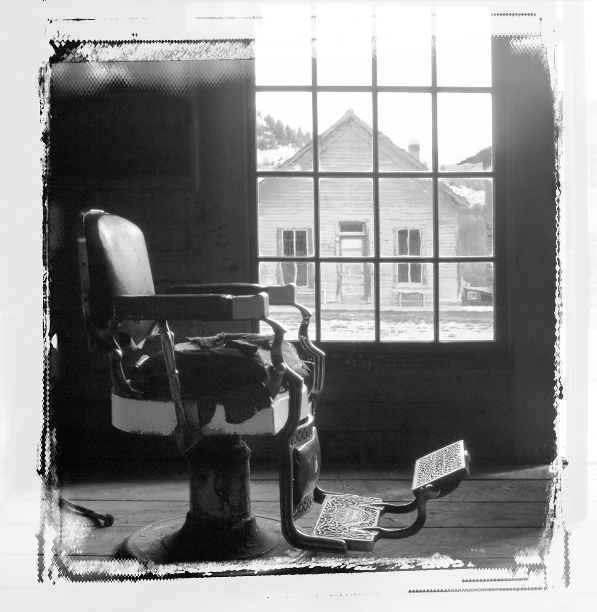
Looks just right, and without the lady looking in the window, it would have been just a storefront. This way you were able to create a story. Very nice.
|
Dec 9th |
| 32 |
Dec 23 |
Comment |
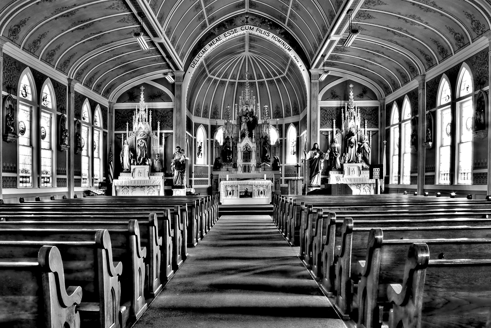
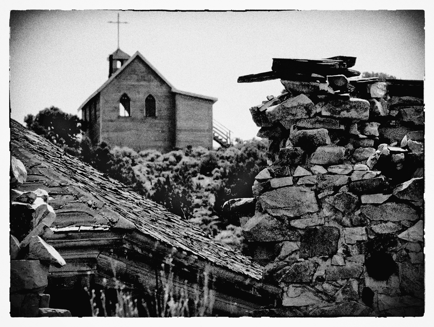
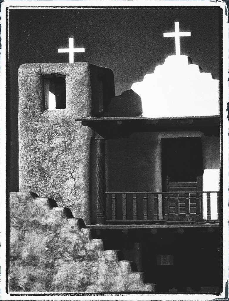
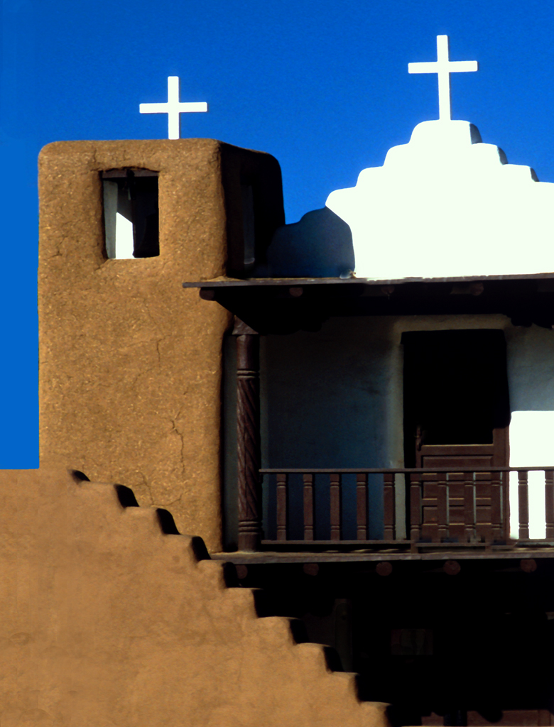
Old (vintage) buildings are favorites for photographers, me too. Well done. I tried to increase the contrast with a gentle burn brush of the surrounding vegetation to increase the contrast just a bit. Hope you like it. |
Dec 4th |
 |
| 32 |
Dec 23 |
Comment |
Bravo: "leading" lines that actually Lead to something. Very nice. Maybe increase the contrast a bit? (saying this before Diana does)... |
Dec 4th |
| 32 |
Dec 23 |
Comment |
This is a copy from "Picture Correct" and is about the importance of where one places the "black point" when in post processing. fyi.
https://mail.google.com/mail/u/0/#inbox/WhctKKZPFRpcbxhnNdLcMMvxmFFBvkpmfxlkLmkVbqPSZHzdSXTvLvnZhzcBZptdKcJCxrv
I'm sure we all do it correctly, but it might be helpful when attempting to explain the "points....B W and Grey) to a B&W novice. |
Dec 2nd |
| 32 |
Dec 23 |
Comment |
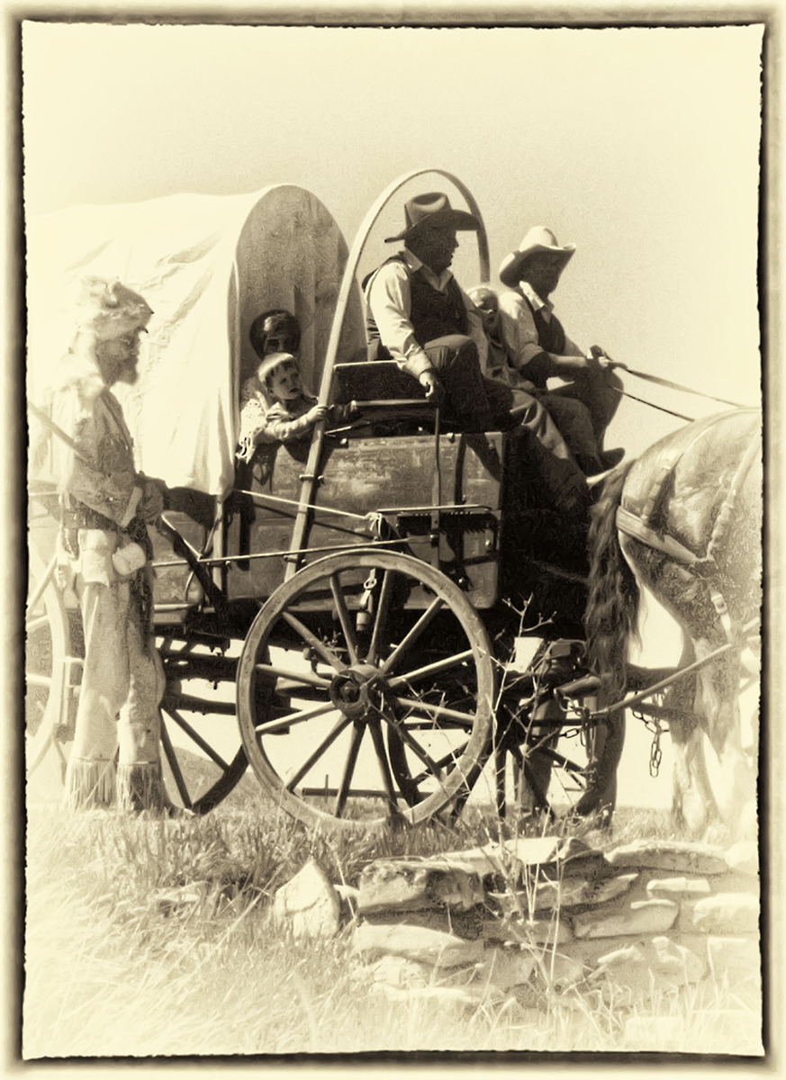
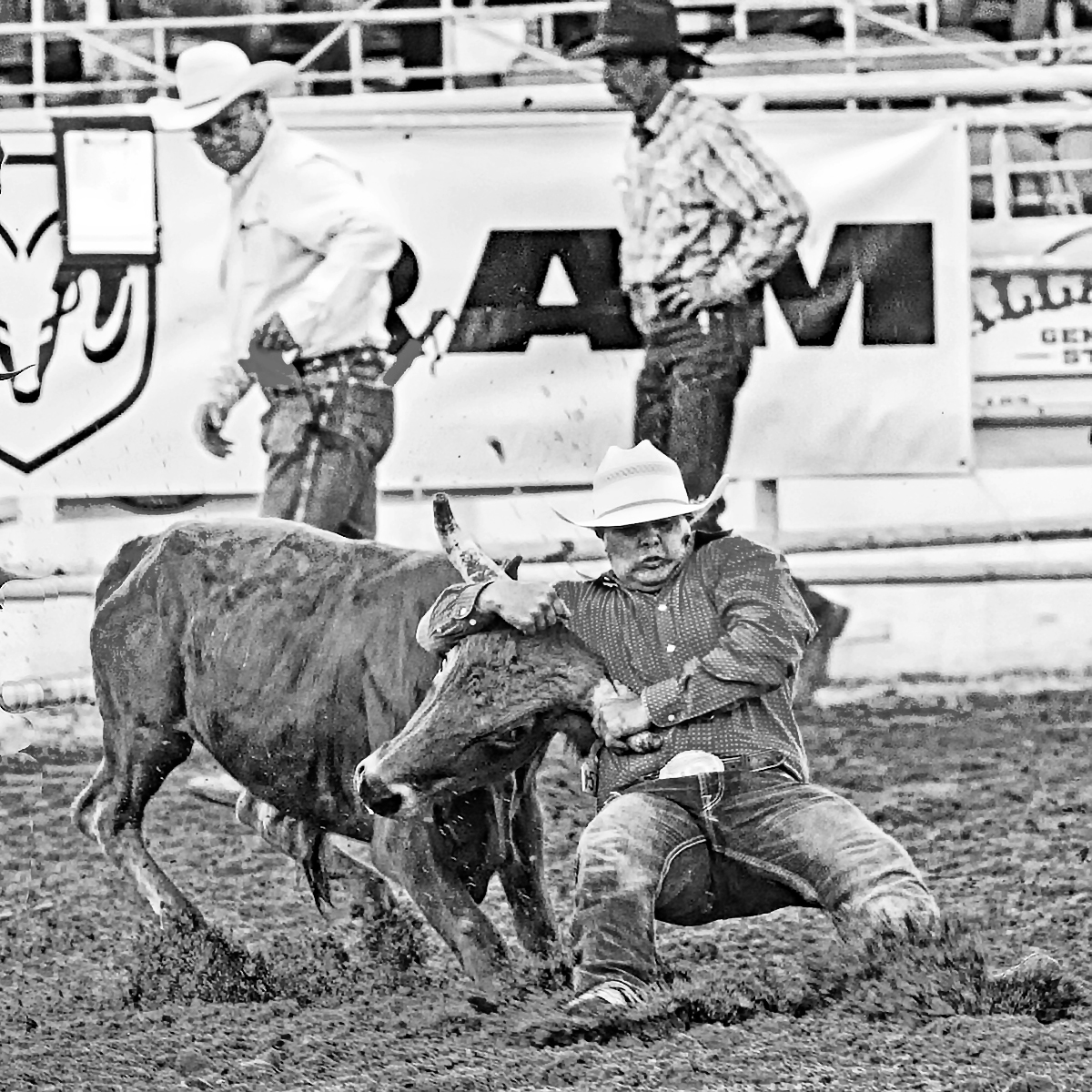
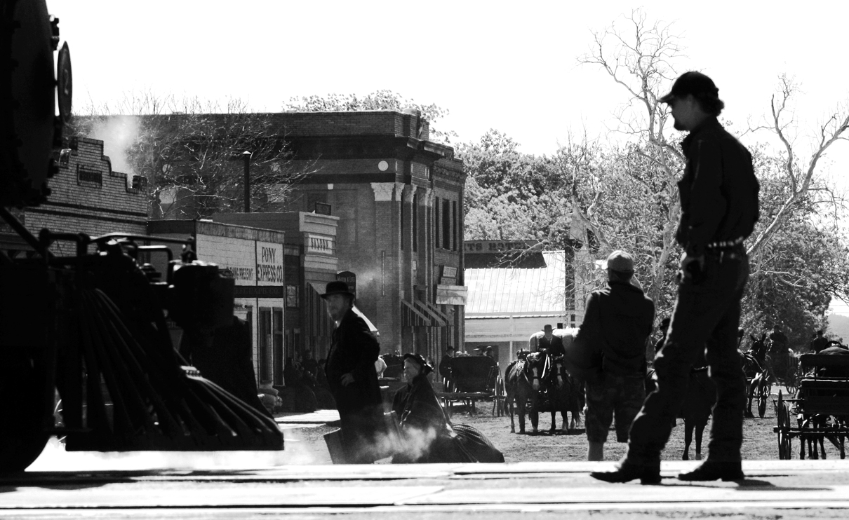
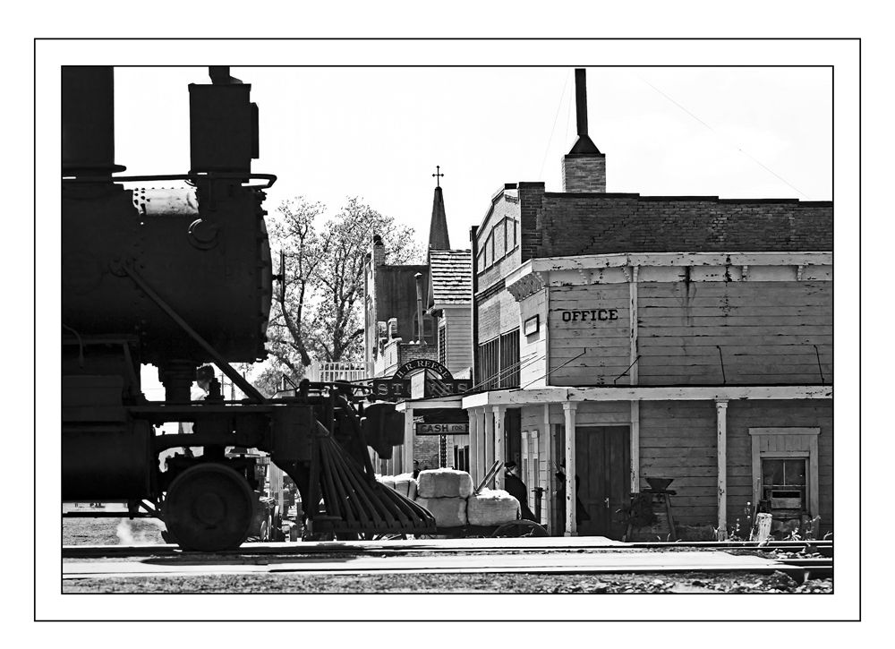
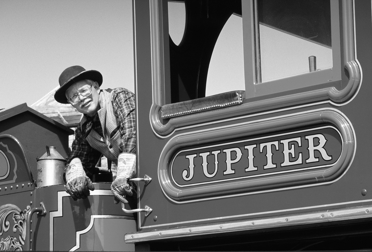
Which one? Don't know, but this was a full length Hollywood movie being filmed and there were people everywhere doing what needs to be done to make a movie. I too like the heavy dark components..... Like a Chariascu .(spelling?)
I guess one could designate this image as a PhotoJournalism shot (of real people doing real people things and caught in action doing so...... all due to the mixture of "period actors" and "administrators/directors")
Anyway, it was a fun day and in our neighboring town. Not often does one get to be right on the edge of an outdoor set during the filming of a HOllywood Movie.
|
Dec 2nd |
9 comments - 9 replies for Group 32
|
9 comments - 9 replies Total
|