|
| Group |
Round |
C/R |
Comment |
Date |
Image |
| 32 |
Apr 23 |
Reply |
I don't have an issue with "small changes......." But it would be useful to "know the why", the reasoning why such change would improve an image. (See my comment re Diana's and Jennifer's suggestions). It would be useful to know why each person made the suggestion and would articulate the benefit therefrom...... ie, it is one thing to make a suggestion, but another to say what the suggestion would accomplish. |
Apr 29th |
| 32 |
Apr 23 |
Reply |
Agree.
Thanks......wes
|
Apr 28th |
| 32 |
Apr 23 |
Reply |
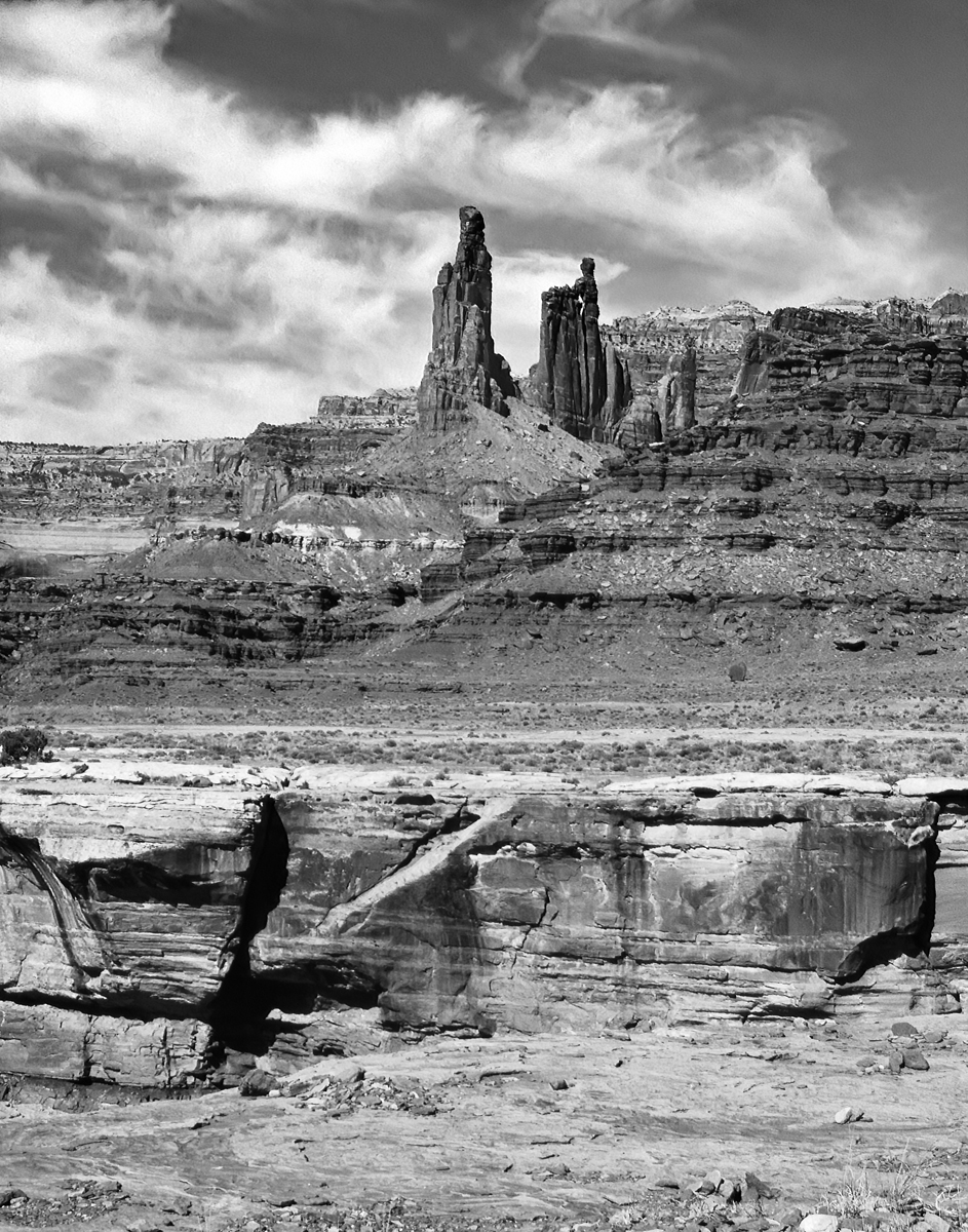
Interesting comments from Diana and Jennifer: One is to crop more and the other is to show more. OK, what is to be gained in doing either one vs. the chosen crop ....the reason "why" was given? |
Apr 28th |
| 32 |
Apr 23 |
Reply |
Interesting comments from Diana and Jennifer: One is to crop more and the other is to show more. OK, what is to be gained in doing either one vs. the chosen crop ....my reason "why" was given? |
Apr 28th |
| 32 |
Apr 23 |
Reply |
Why would you crop there? |
Apr 28th |
| 32 |
Apr 23 |
Comment |
Henri Cartier-Bresson's quote, "sharpness is a bourgeois concept," dismisses sharpness as a critical characteristic of a good photograph. |
Apr 28th |
| 32 |
Apr 23 |
Reply |
Henri Cartier-Bresson's quote, "sharpness is a bourgeois concept," dismisses sharpness as a critical characteristic of a good photograph. |
Apr 28th |
| 32 |
Apr 23 |
Reply |
Henri Cartier-Bresson's quote, "sharpness is a bourgeois concept," dismisses sharpness as a critical characteristic of a good photograph. |
Apr 28th |
| 32 |
Apr 23 |
Reply |
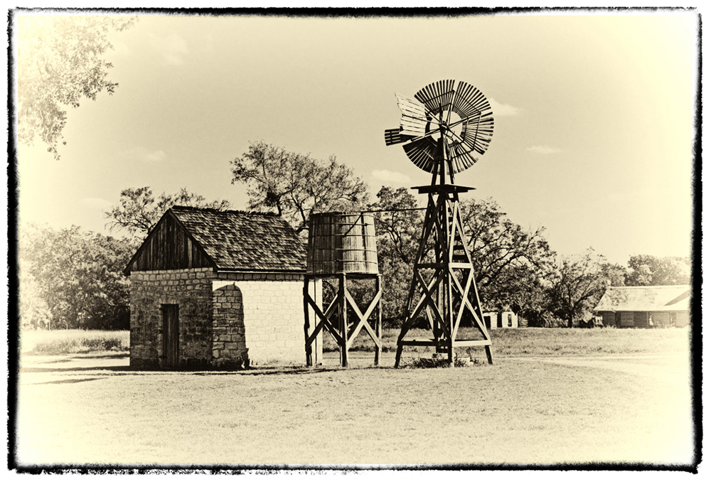
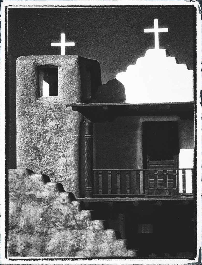
My objective was/is to make the image as close to what I think a Vintage photograph would look like, therefore the light sky and the light area at the bottom balance each other and keep it simple. What did you think of the Ambrotype version? |
Apr 25th |
| 32 |
Apr 23 |
Reply |
My objective was/is to make the image as close to what I think a Vintage photograph would look like, therefore the light sky and the light area at the bottom balance each other and keep it simple. What did you think of the Ambrotype version? |
Apr 25th |
| 32 |
Apr 23 |
Reply |
My objective was/is to make the image as close to what I think a Vintage photograph would look like, therefore the light sky and the light area at the bottom balance each other and keep it simple. What did you think of the Ambrotype version? |
Apr 25th |
| 32 |
Apr 23 |
Reply |
Next time we have a movie being filmed, I'll let you know. You'd enjoy.
w
|
Apr 15th |
| 32 |
Apr 23 |
Comment |
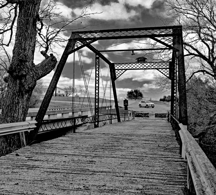
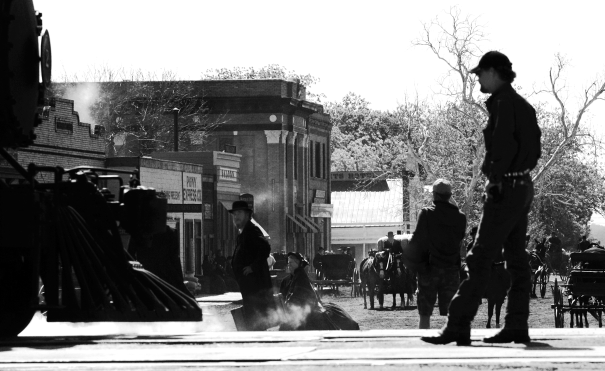
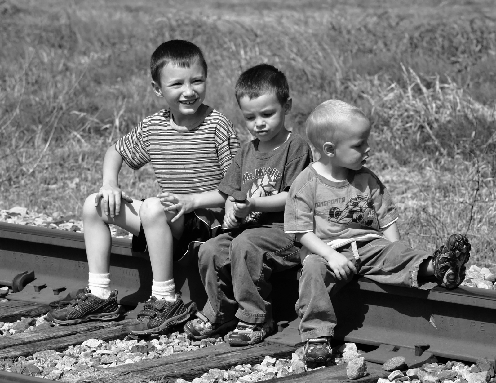
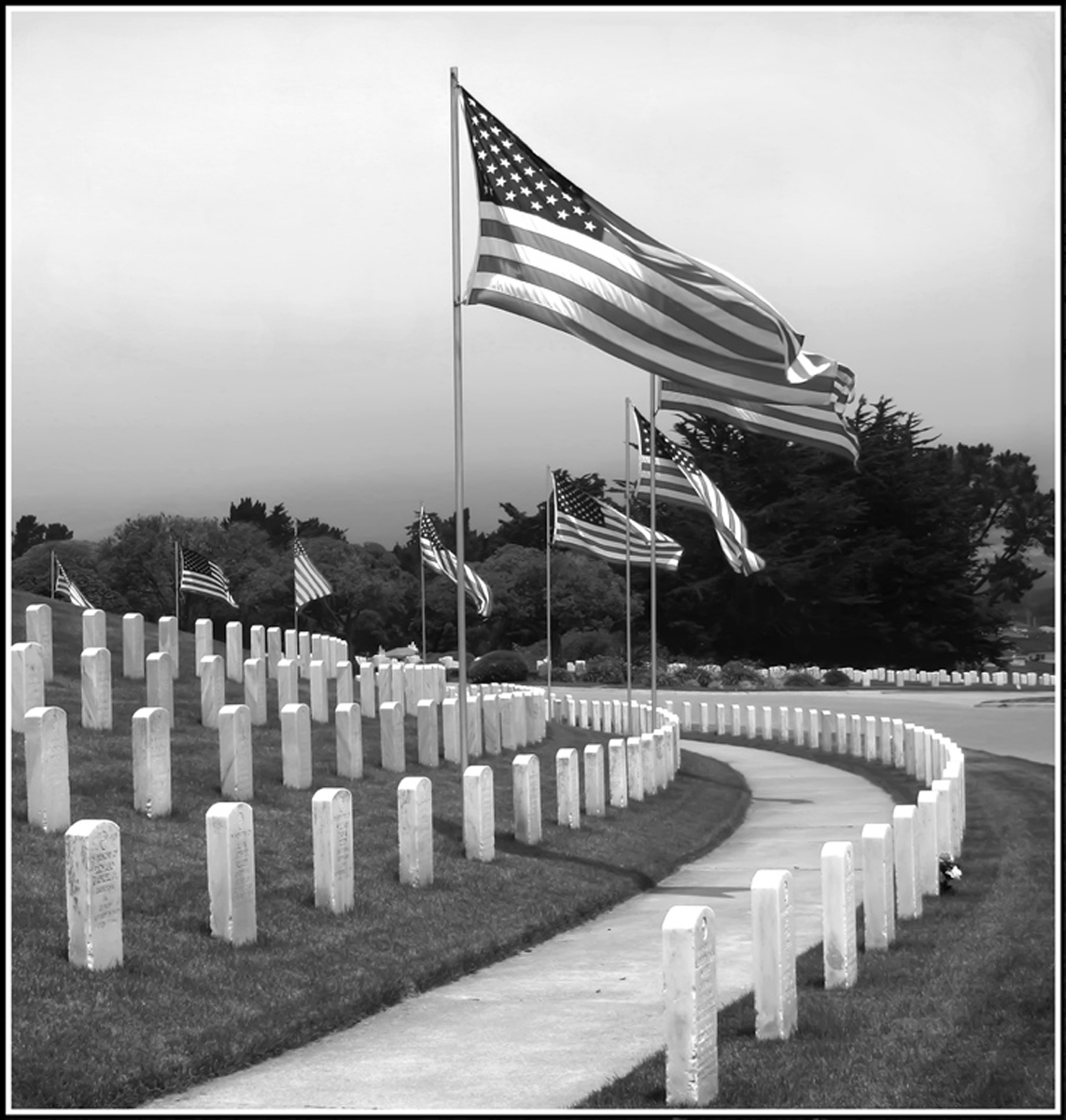
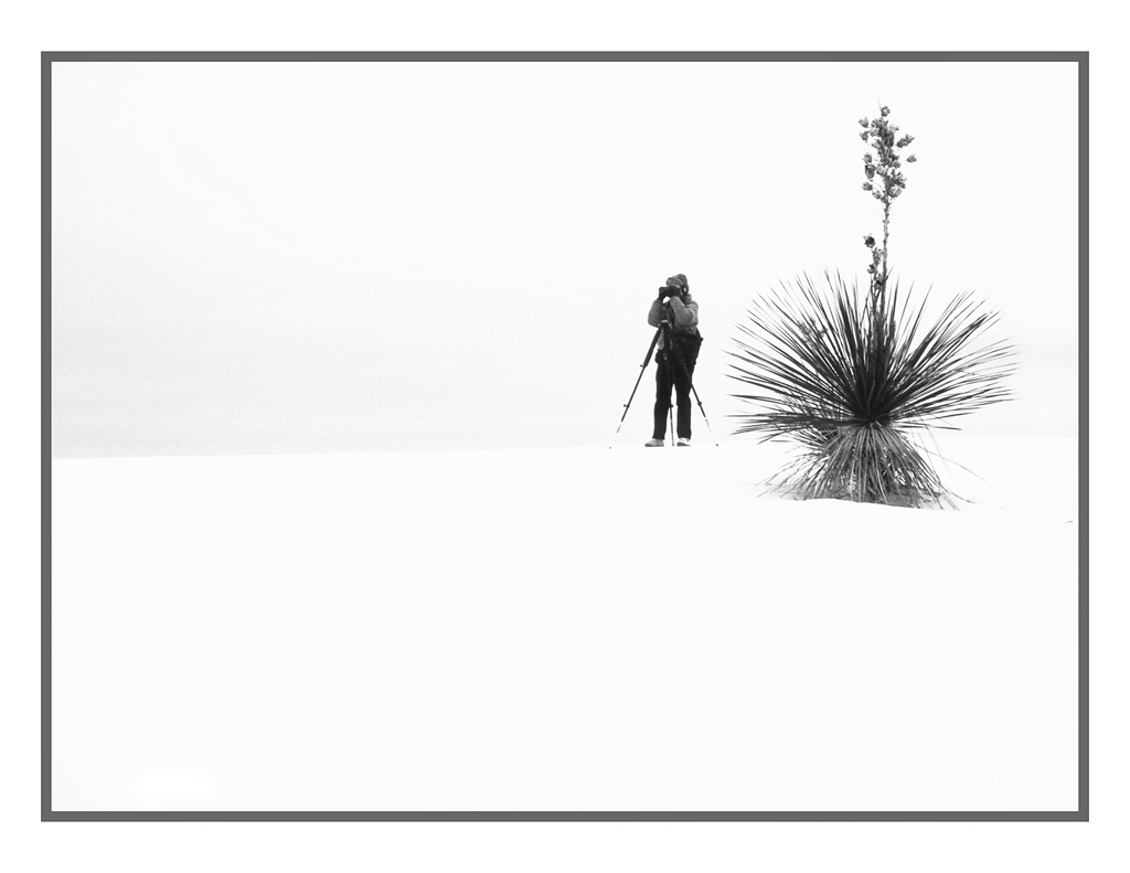
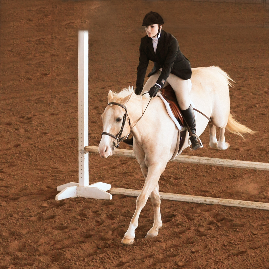
Very nice. It also qualifies as "Street Photography" in my opinion. Minor suggestion is to crop some from the top to reduce the blank white space. |
Apr 15th |
| 32 |
Apr 23 |
Comment |
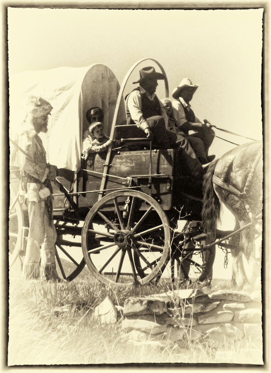
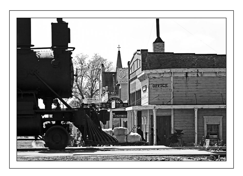
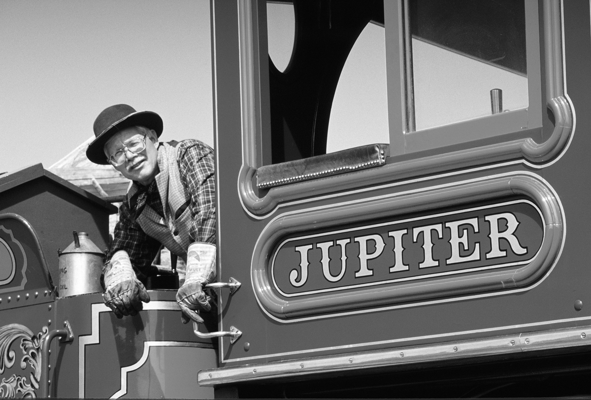
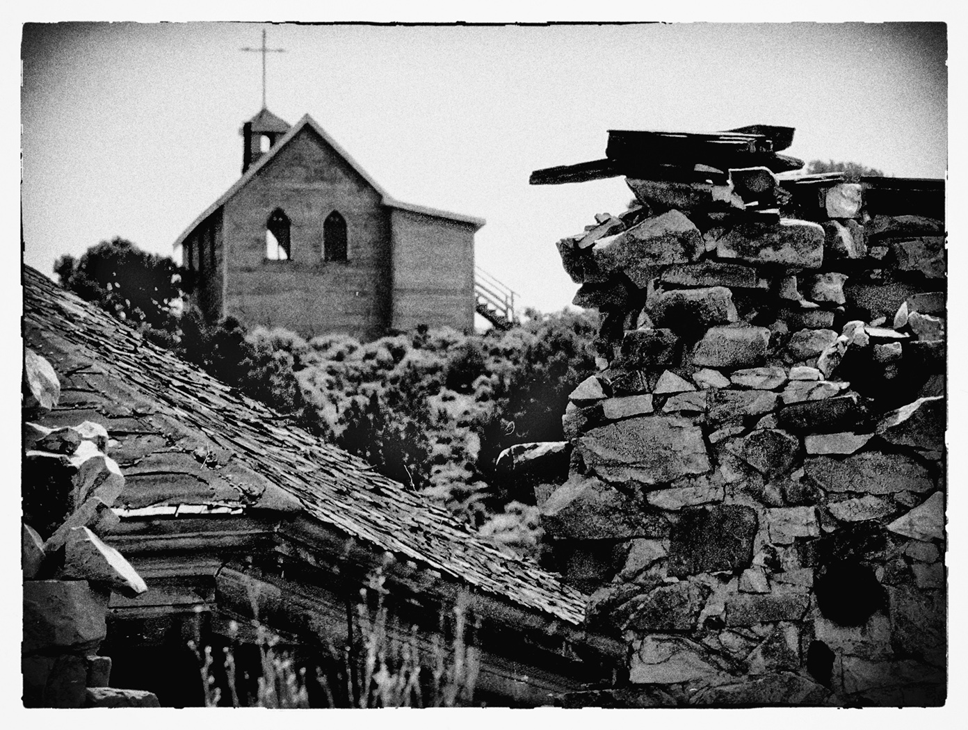
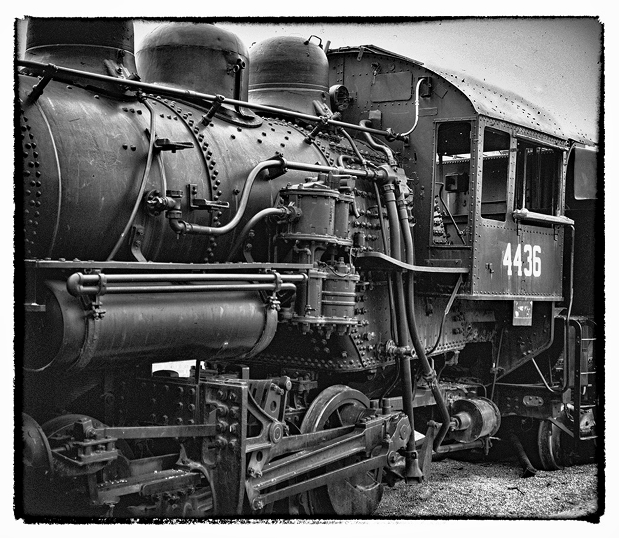
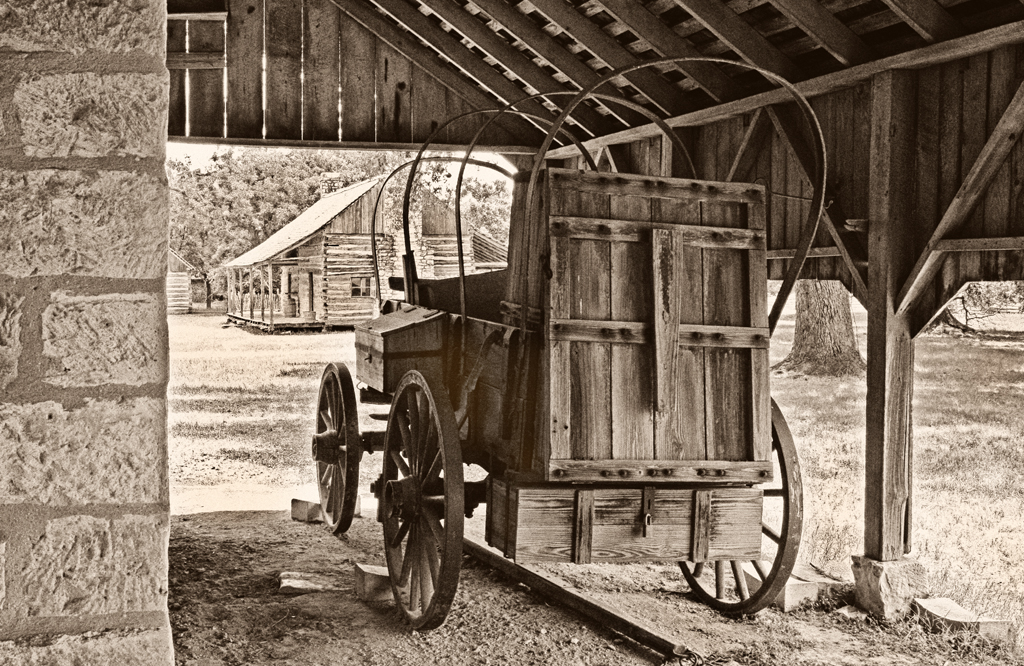
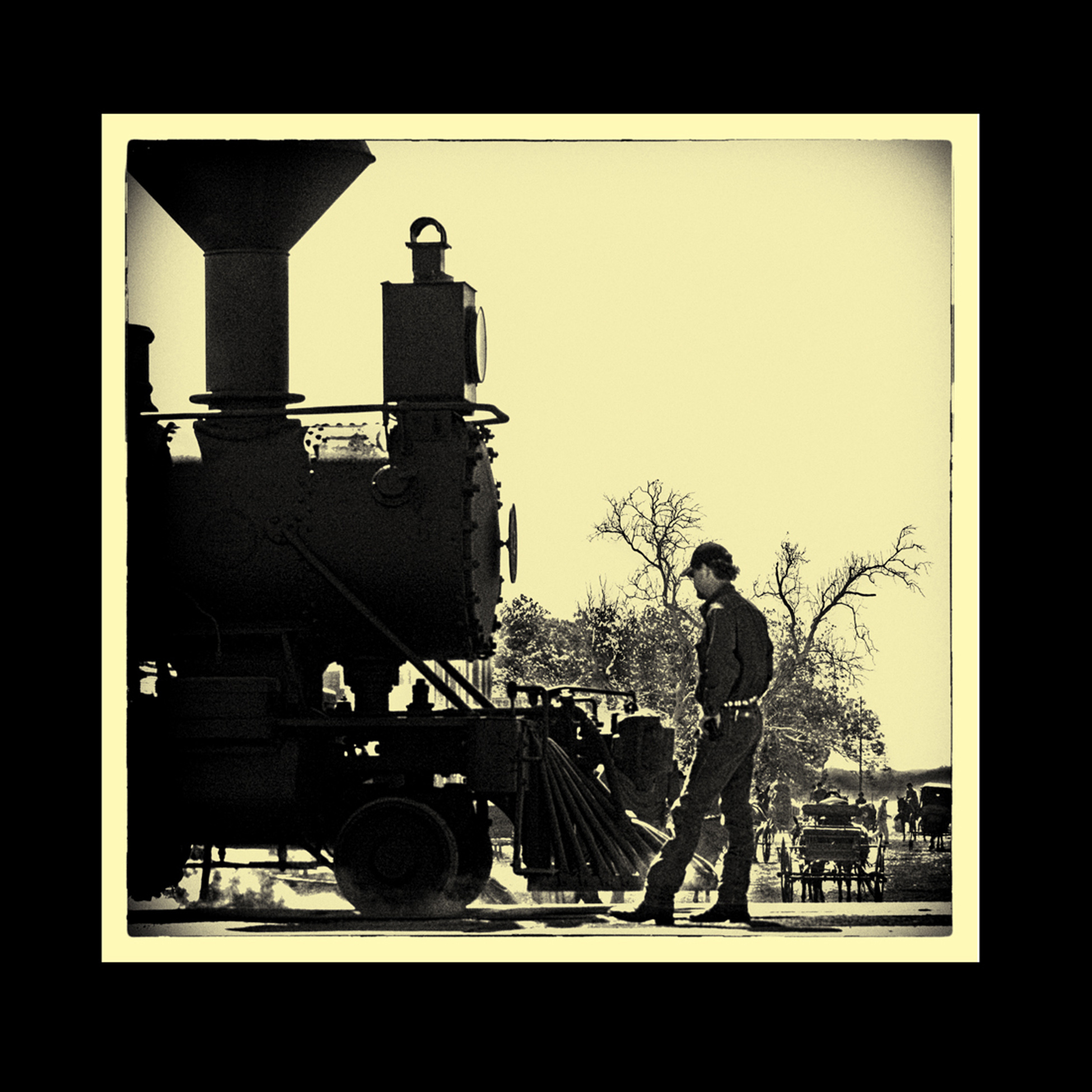
This is another view of the old Steam Train Locomotive during the filming of True Grit in Granger Texas. It is a faux "Ambrotype" |
Apr 15th |
 |
| 32 |
Apr 23 |
Comment |
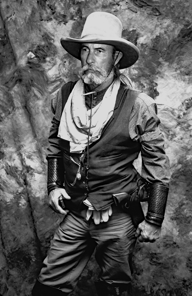
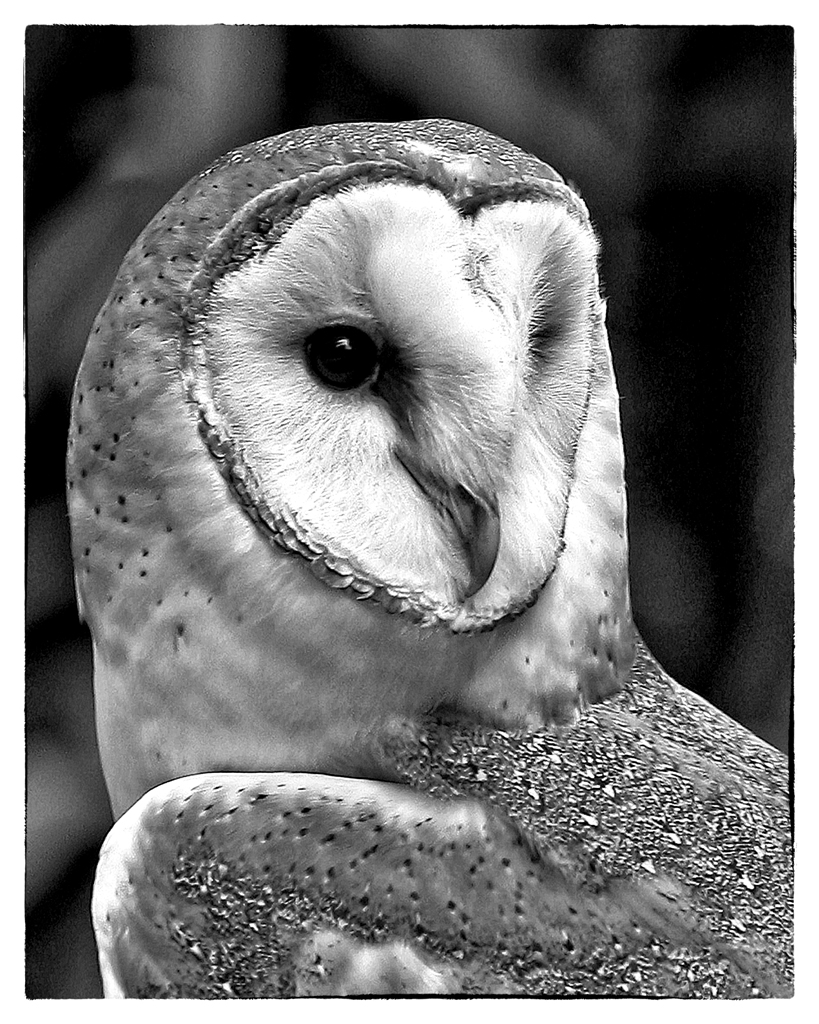
It is so difficult to create a new/unique version of an iconic photographic subject. You've accomplished that. Very nice.
|
Apr 10th |
| 32 |
Apr 23 |
Reply |
The problem: At the time, it was an active movie set, complete with the local gendarmes defining the crowd spaces. We were much more successful composing the shots in the previous few weeks while the construction of Fort Smith was changing little ol Granger into an 1880s movie set. thnx
|
Apr 4th |
| 32 |
Apr 23 |
Reply |
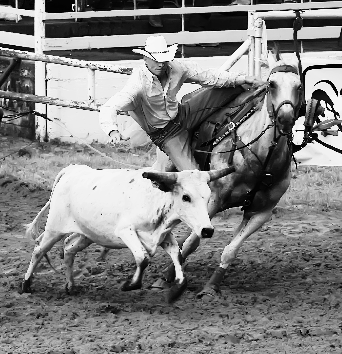
"A good photograph is one that can't be repeated." -- Harry Benson
And, this appears to me to be a one of a kind. ie, a good photograph. (You must be a good "Skeet shooter" (shotgun) to get this image.)
|
Apr 3rd |
| 32 |
Apr 23 |
Comment |
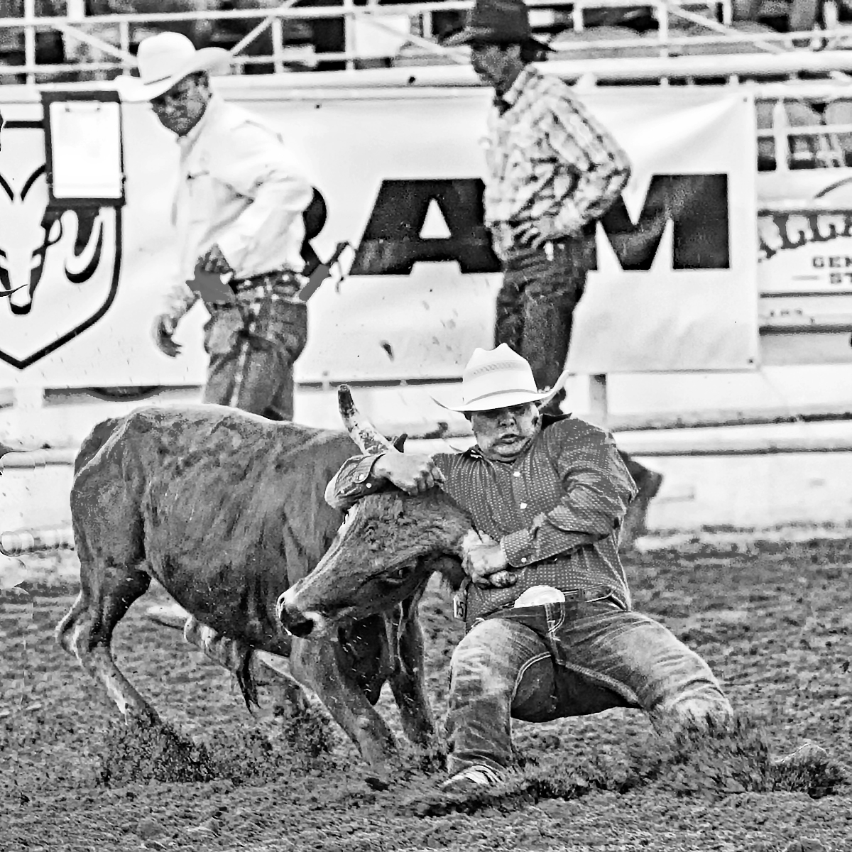
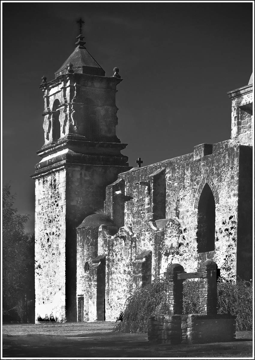
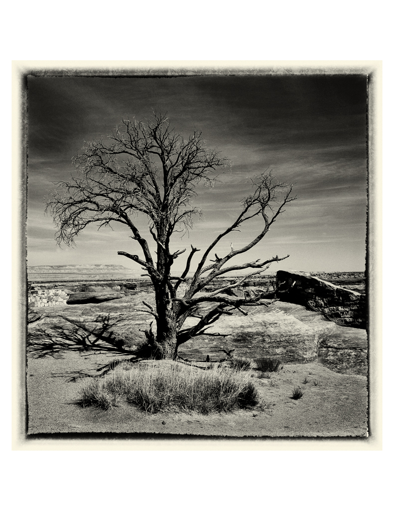
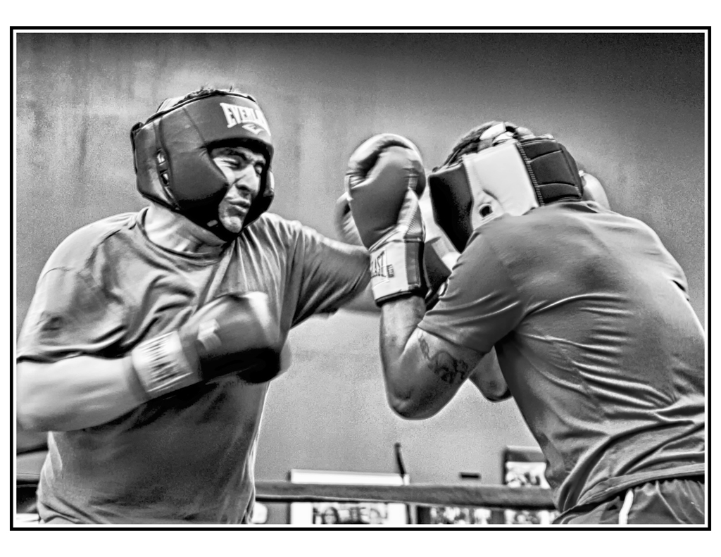
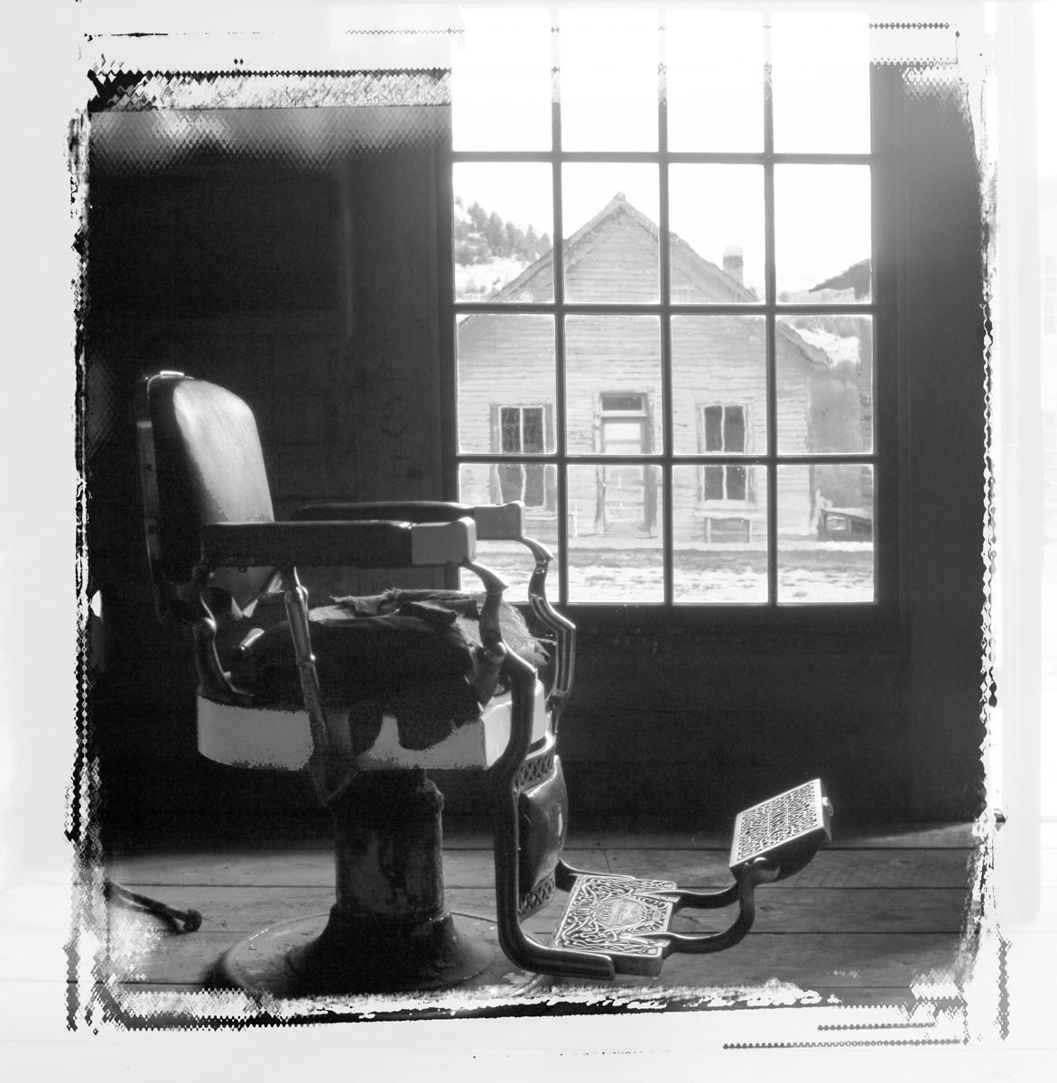
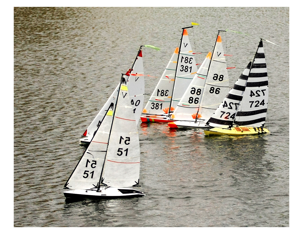
I considered a crop off of the right to create a square image, but I didn't do it. What do you think?
In-camera, I framed the locomotive to just show enough so that one can tell what it is. More of it created a too dominant black shape and the entire locomotive was vintage black iron so I didn't need more black iron to tell the story. The intent of the crop was to show a Main Street from the 1880's and that the Railroad actually ran right into town in those days....Loud, ugly-beautiful, dominant, industrial, crowd attracting. I have another similar image that includes a horse, wagon and two men driving it into the scene from the right, but then that created two many subjects and I felt it to be confusing to the eye. So: KISS (Keep It Simple, _) |
Apr 3rd |
| 32 |
Apr 23 |
Comment |
I see the entire handle and its base as your main subject and that you nailed the focus there. The rest in the background works to tell the story and where the handle is. I like how you darkened (or blurrred, can't tell) the machinery in the background, thus emphasizing the handle.
A nice "vintage image." |
Apr 3rd |
| 32 |
Apr 23 |
Comment |
The bright area (spot) and therefore where one's eye goes is on the primary subject: The artisan's head. Well done. Nice. My eye goes there first where I study the face and learn what he's doing by then moving around first to the hand with the brush and then to the paint jars and his "art products." The bright spot on the forehead indicates the selectivity of the light source and fits the overall low key construct. I think "you nailed it" just right.
|
Apr 3rd |
| 32 |
Apr 23 |
Comment |
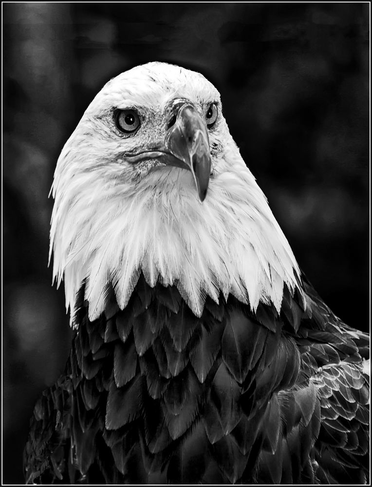
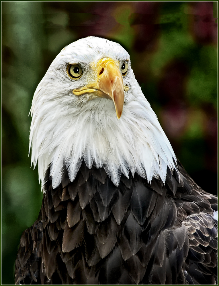
Nice (elegant) capture of a bird in flight and appearing to be looking directly into the camera's lens. The wings create a nice triangle to complete the composition; and the face (eyes especially): in sharp focus. Mono conversion preferred over the color. |
Apr 3rd |
| 32 |
Apr 23 |
Comment |
Sounds like your club's judge was over-reaching in order to find something to criticize. The reeds on each end provide a nice balance, and the line/curve of the posts creates some nice triangles.
Did you try to increase the contrast (of the posts)? Contrast is your forte, remember? |
Apr 3rd |
| 32 |
Apr 23 |
Comment |
My photos emphasize the story the photograph tells. As quoted in the Feb 23 PSA Journal by Elliott Erwitt: "All the technique in the world doesn't compensate for the inability to notice." and other similar statements.
Thanks. |
Apr 3rd |
10 comments - 13 replies for Group 32
|
10 comments - 13 replies Total
|