|
| Group |
Round |
C/R |
Comment |
Date |
Image |
| 32 |
Oct 21 |
Comment |
Good comment. I'll give that a try.
Thanks.
|
Oct 26th |
| 32 |
Oct 21 |
Reply |
thanks.
|
Oct 11th |
| 32 |
Oct 21 |
Reply |
Your bw version is better than any of my straight bw's. Thanks |
Oct 11th |
| 32 |
Oct 21 |
Reply |
Your exhibit will be a good one because it won't be a copy-cat of so many others. Enjoy doing it.
Do you use a Scanner? You said light box. There is a lot of info out on what is now called "Scanography." |
Oct 10th |
| 32 |
Oct 21 |
Reply |
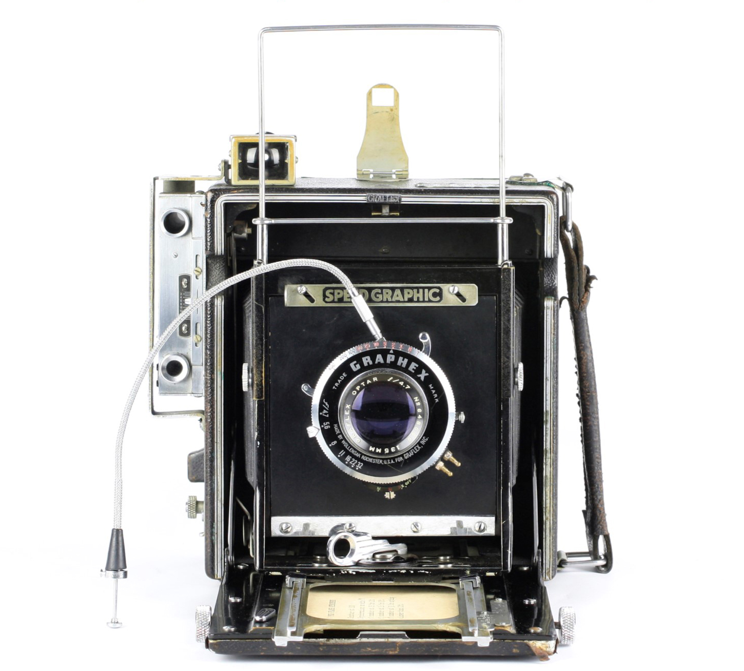
I've got the exact same camera on my bookshelf. Love it.
|
Oct 10th |
| 32 |
Oct 21 |
Reply |
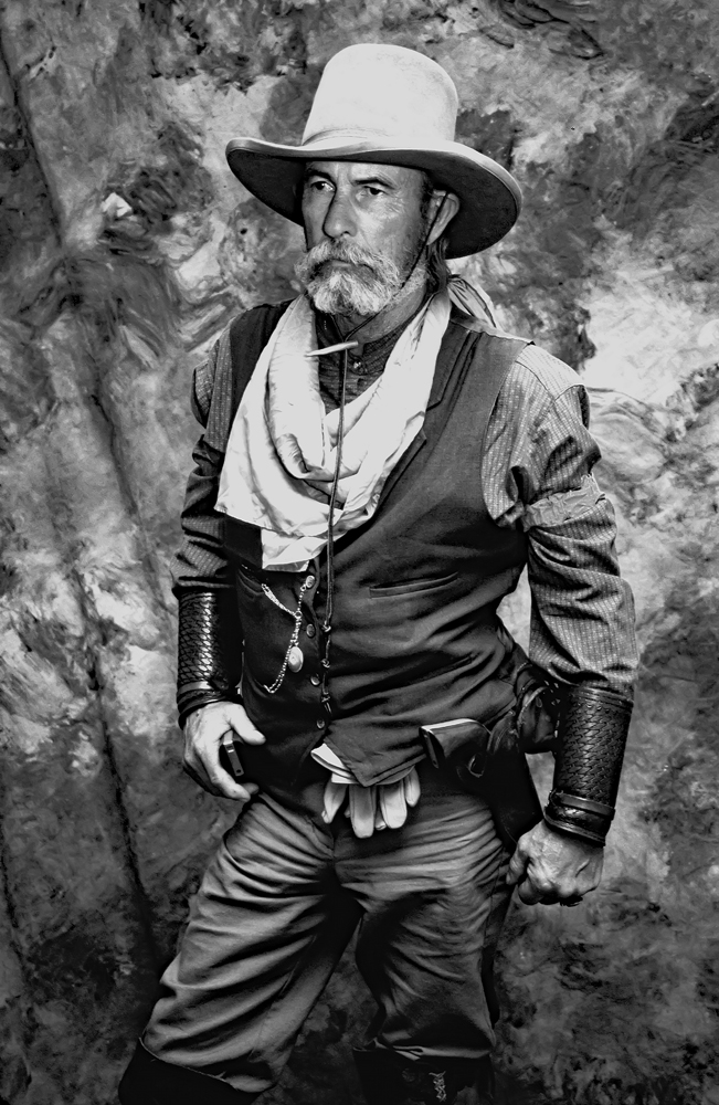
I hope you don't mind, but I'm going to try the same composition (with vintage camera superimposed on the subject. I like the way the man's portrait is faded as your eye moves left on it. Good Border: Fits the era. |
Oct 10th |
| 32 |
Oct 21 |
Reply |
I also find that the Antique Wet Plate treatment does well if there is one primary subject, and god forbid: it is centered, but then the center can be made to be very sharp and the rest faded and blurred as with a vintage setup. (If you're going to go over to the "dark side," I think you need to go all the way.) |
Oct 10th |
| 32 |
Oct 21 |
Comment |
Last month while "walking" a major Naturescapes competition's exhibit, there were two image which resembled yours. As I walked, the ones that jumped out were these because of their attractiveness but more likely, the impact that their "unique-ness" gave them. Very nice: both color and mono, but the mono has better definition to the lines and just looks "crisper." Printed, and with a large white matte, this would be stunning on a wall. (think: 24 x 36) |
Oct 10th |
| 32 |
Oct 21 |
Comment |
I like it and with Stephen's recommendations re cropping and the lower left. |
Oct 10th |
| 32 |
Oct 21 |
Comment |
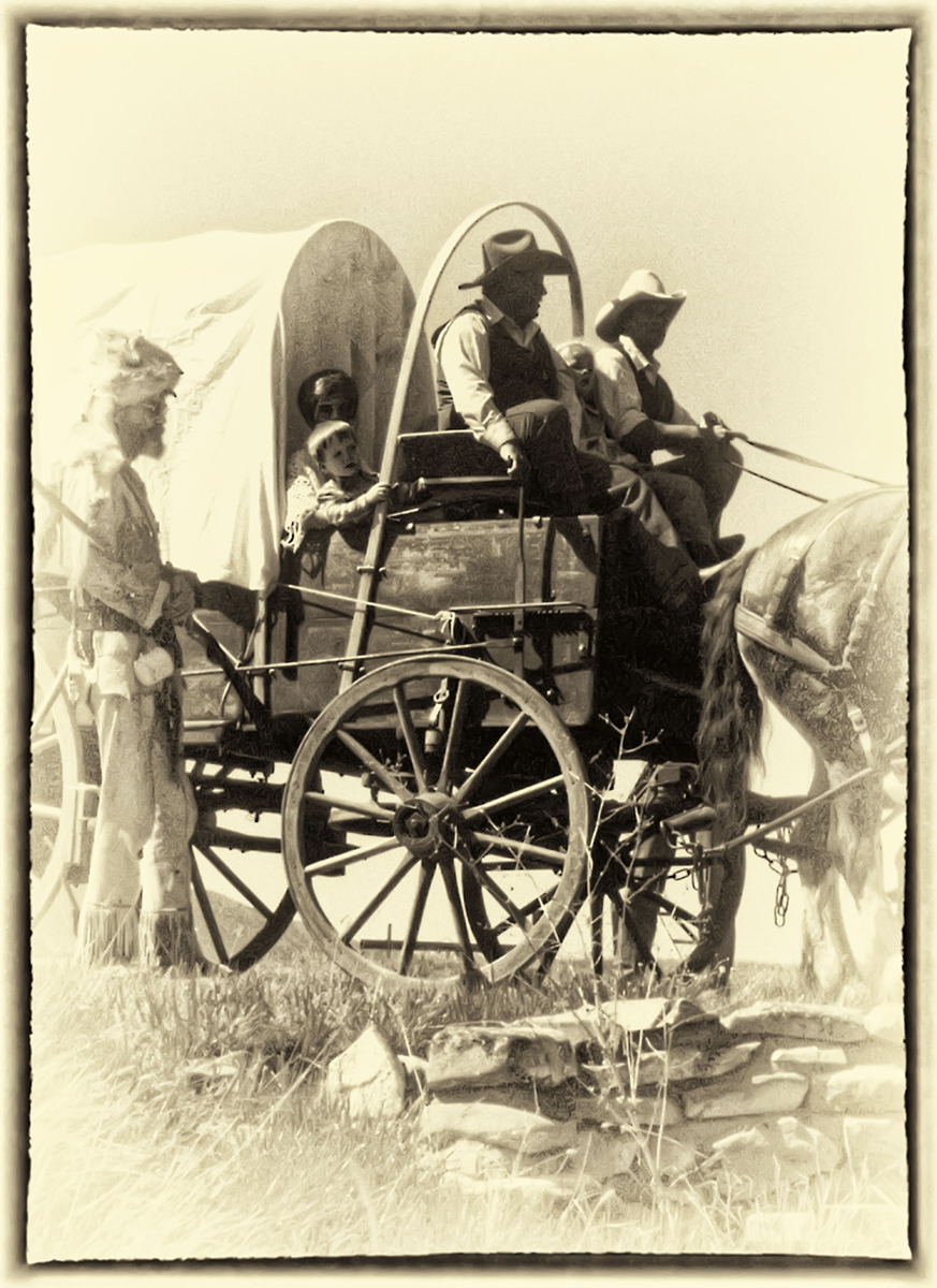
I use a Wet Plate Treatment often when attempting to create an image that appears to have been taken when the subject was a contemporary, as in a Vintage Photo. Maybe this is more "Fine Art" than "Monochrome?" In any case, I find the result is well liked and few others do it. |
Oct 10th |
| 32 |
Oct 21 |
Reply |
Thanks..... I'll attempt to clone out the halo with an Air Brush. |
Oct 10th |
| 32 |
Oct 21 |
Comment |
I love it. Great compositional idea. |
Oct 10th |
| 32 |
Oct 21 |
Comment |
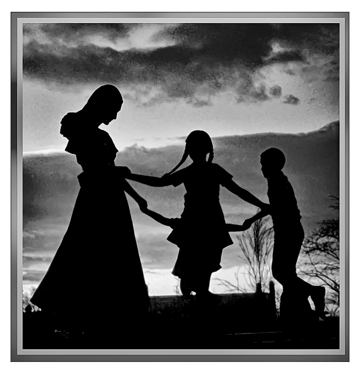
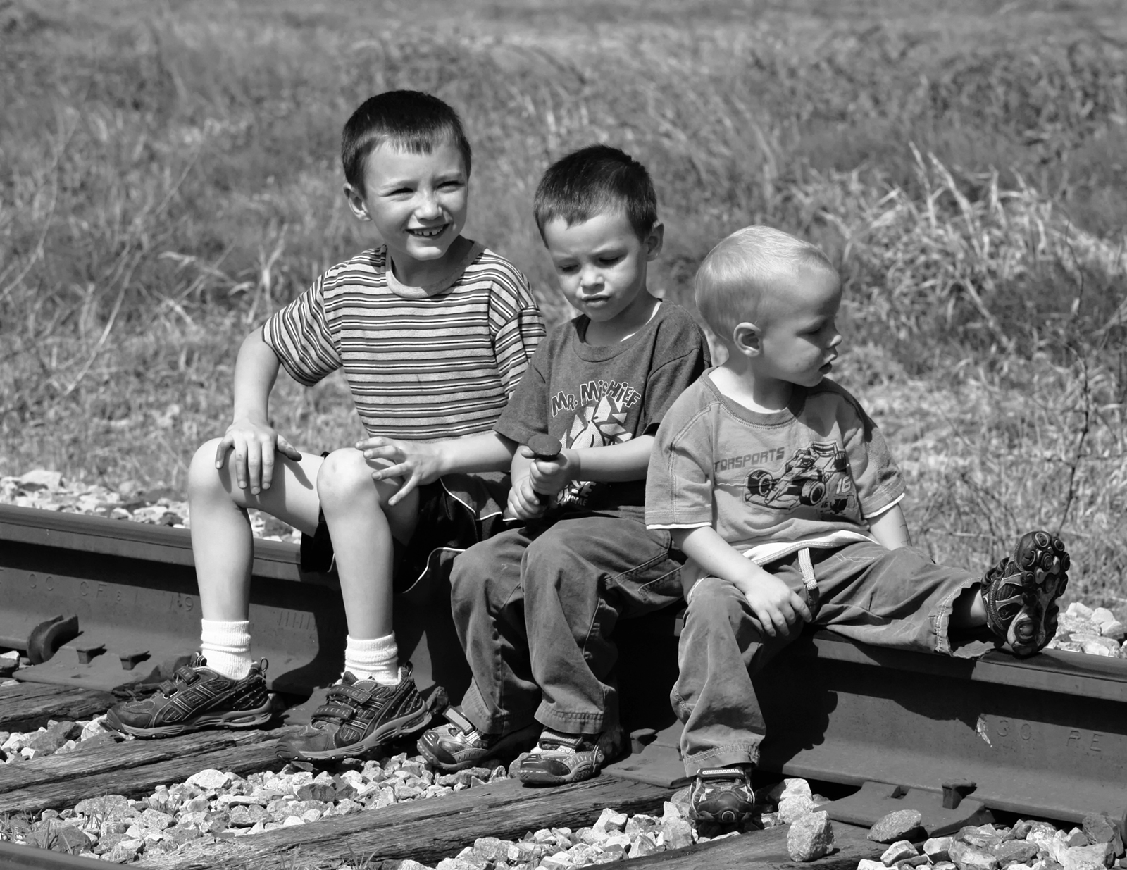
You're right, Stephen, regarding more contrast. I prefer your rendition. The black heavy line in the background does not detract, but gives some "placement" to the boy's activity...... a dance studio.
|
Oct 3rd |
| 32 |
Oct 21 |
Comment |
As some say: "Less is more" or "Less is better"
I like the tight crop better.
The detail and texture are very nice.
Nice overall.
|
Oct 3rd |
| 32 |
Oct 21 |
Reply |
Thanks. wes
|
Oct 2nd |
| 32 |
Oct 21 |
Comment |
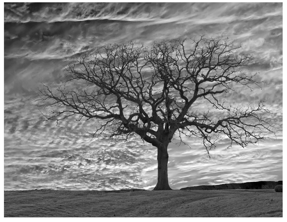
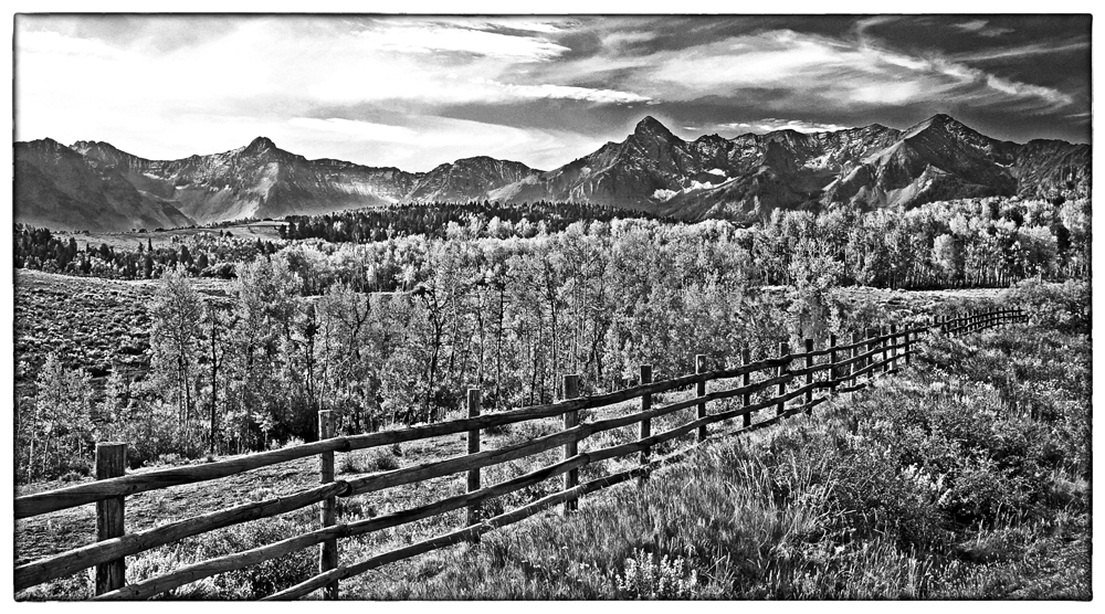
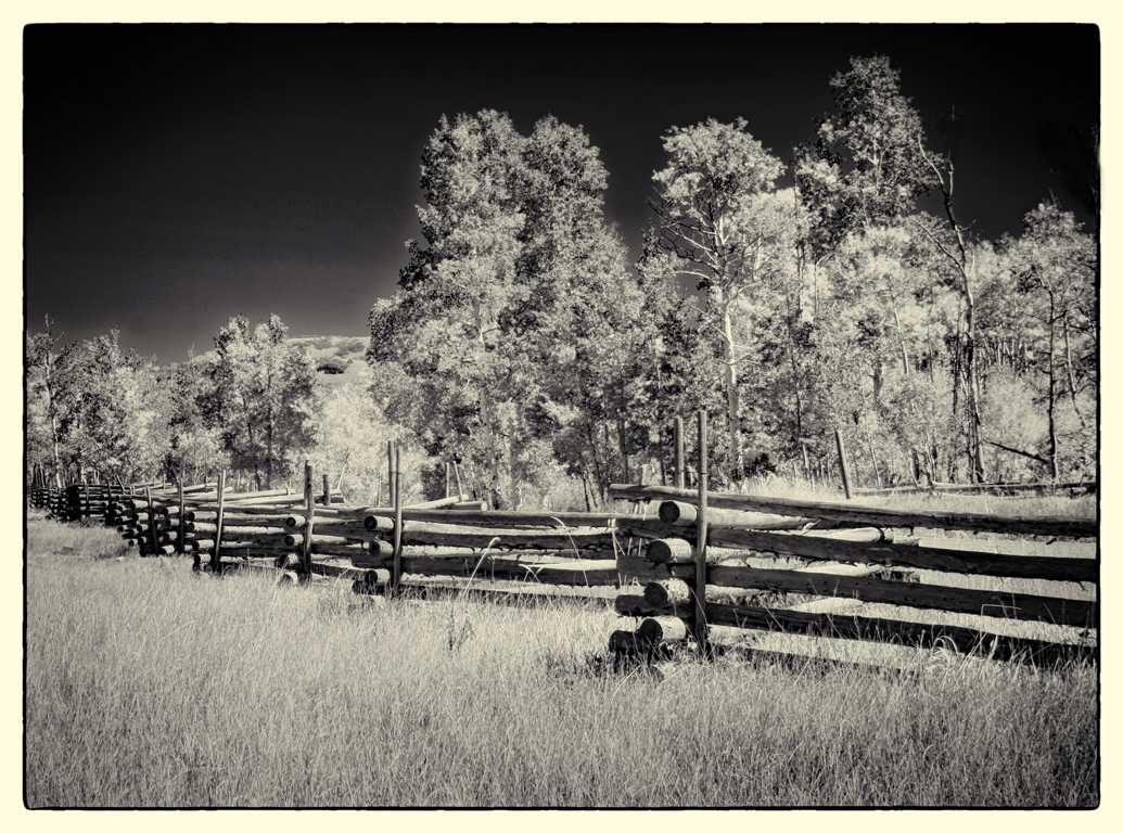
The original "show data" from the capture is Focal Length 33, spot metering, Aperture Pr, 1/10, f16, ISO 100, tripod. Canon XSi. Taken in 2010. San Juan Mountains, SW Colorado.
I worked the color version a lot before giving up and trying SilverEfex. The best I could do in color is shown here as the "original." There was a lot of Dynamic Range in the original from the light grass to the shadows on the fence rails.
But, then I didn't record the steps I took in Nik. The Nik work was done in 2021. It's one of those images that I keep returning to thinking it might be something worthwhile. The story behind the title is that a Rancher went busted several times and then claims he gave it one more effort, calling it the "Last Dollar Ranch" and obviously, the primitive road going past it was called the Last Dollar Ranch Road.
Because of the old time (historic) story behind the road, I thought/think that a monochrome version fits it best. But: It's in the "Eye of the Beholder." |
Oct 2nd |
8 comments - 8 replies for Group 32
|
8 comments - 8 replies Total
|