|
| Group |
Round |
C/R |
Comment |
Date |
Image |
| 32 |
Sep 21 |
Reply |
Thanks for all the comments. I haven't yet entered this in a competition, but will soon.
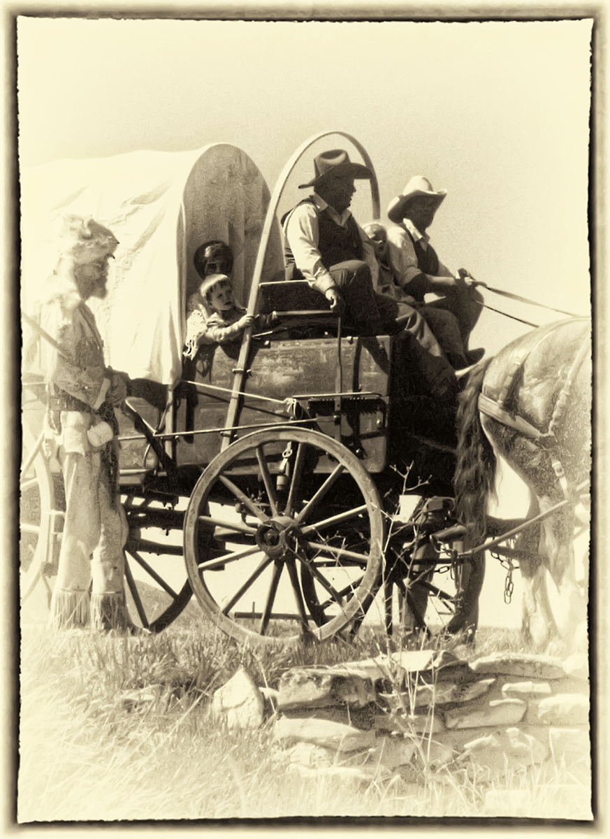
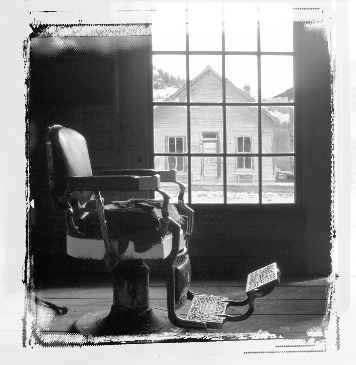
I've been printing on Baryta papers recently, but the Red River Paper Company (Dallas TX) came out with another Fine Art Paper that "wow's" them all. It's called Palo Duro Softgloss Rag. (Since this is Texas, Red River uses the names of rivers in Texas for its families of papers.) (310 gsm weight, 16.5 mil thickness, and 100% Cotton Rag.) recommended printing set at Semi Gloss.) Their website is www.redriverpaper.com |
Sep 25th |
| 32 |
Sep 21 |
Comment |
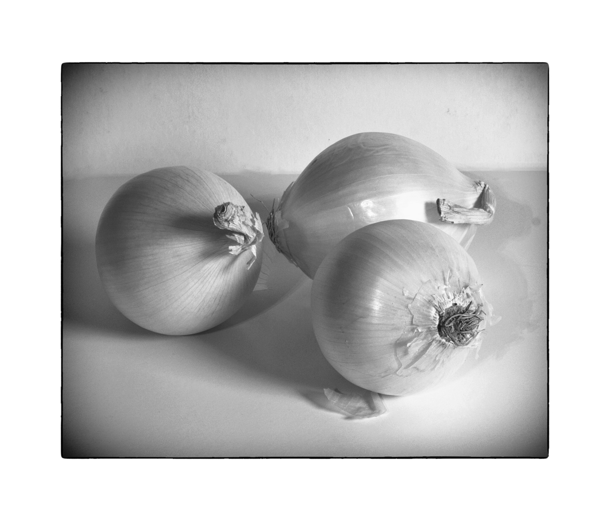
Yes, I did use Nik..... The original image was too low key and to show the detail and lighten it, I used some Nik pre-sets, can't recall which ones I settled on (Bad on me). I often use one of the Fine Art settings. But, since all photo editors essentially have the same basic modifications, (albeit there are many permutations to the combinations and the individual settings therein) I always come back to Brightness/Contrast as one of my major tools. It's a "keep it simple" idea. And since my early photography was in a wet darkroom with so few editing tools such as we have today, I learned to use and therefore, "think of editing in terms of dodging and burning" (but in the computer I do it in a non-destructive way with Layers and then brush paint at various "opacity" settings..) I've also learned to do "Air Brushing" when colors are involved and critical. i.e., one can't darken (burn) an area with no pixels, and sometimes I just need to add a little more color or soften the color as in a portrait. And, finally, yes I like noise in vintage type photos, but because in the digital era noise has such a disrepute I try not to overdo it. |
Sep 23rd |
| 32 |
Sep 21 |
Reply |
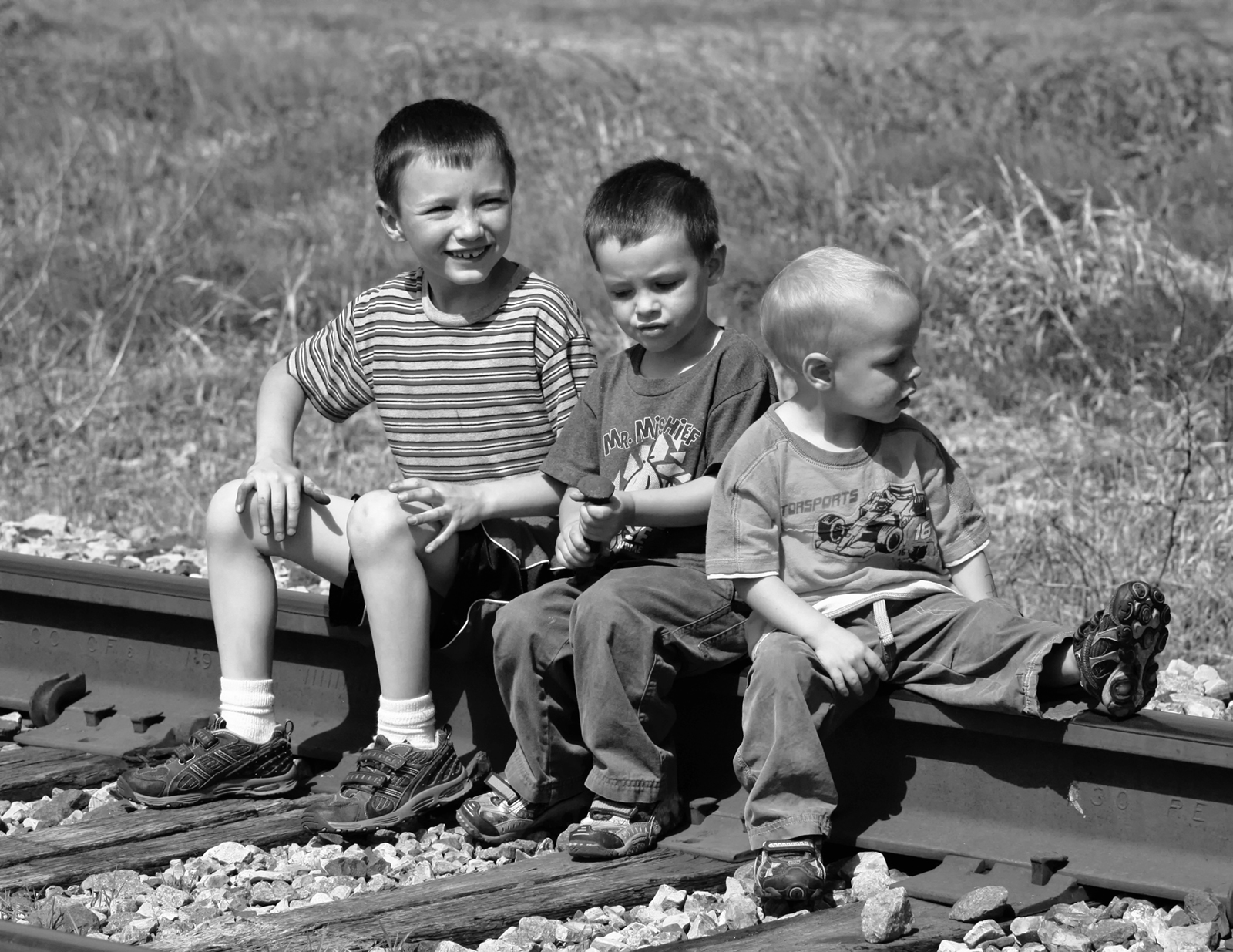
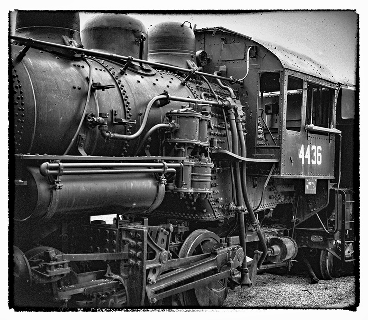
Thanks . It wasn't really planned, it was just a tight fit between the Loco and the others, so that' s what I got. And got lucky because I too think it works. |
Sep 7th |
| 32 |
Sep 21 |
Reply |
thanks. And teh border is right out of Nik Silver Efex
|
Sep 6th |
| 32 |
Sep 21 |
Reply |
Maybe white would be better, but it's in the eye of the artist as to what is appropriate. |
Sep 4th |
| 32 |
Sep 21 |
Reply |
Easy way is to just Add canvas, size it at .01" and set it to a color you like.
Image >Image Size > Canvas |
Sep 4th |
| 32 |
Sep 21 |
Comment |
Conversion approach sounds just right and the result is as it ought to be. Nice work. |
Sep 4th |
| 32 |
Sep 21 |
Comment |
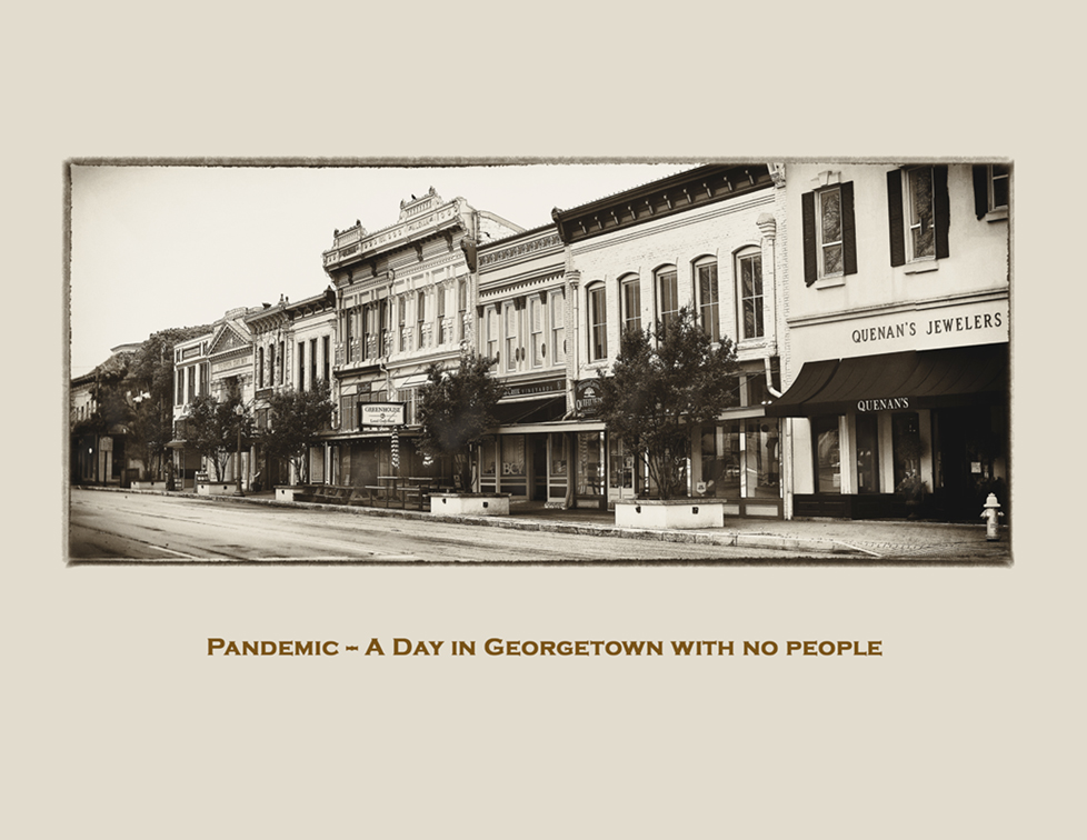
Try focus stacking to widen the focal point.
Since I've never seen a photo like this, I have to say that I like the creative approach.
nice.
|
Sep 4th |
| 32 |
Sep 21 |
Comment |
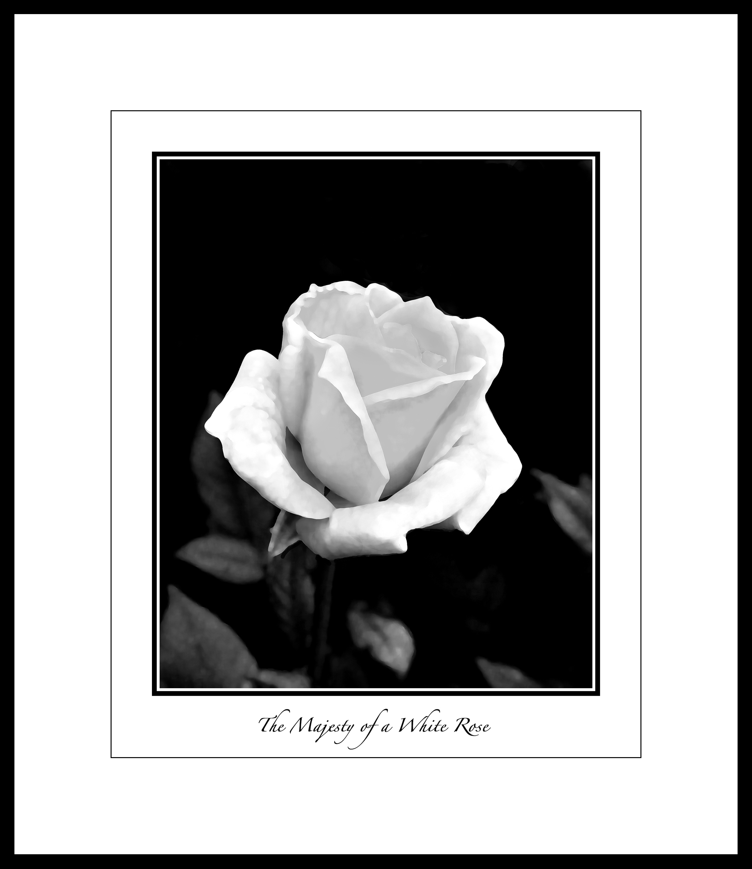
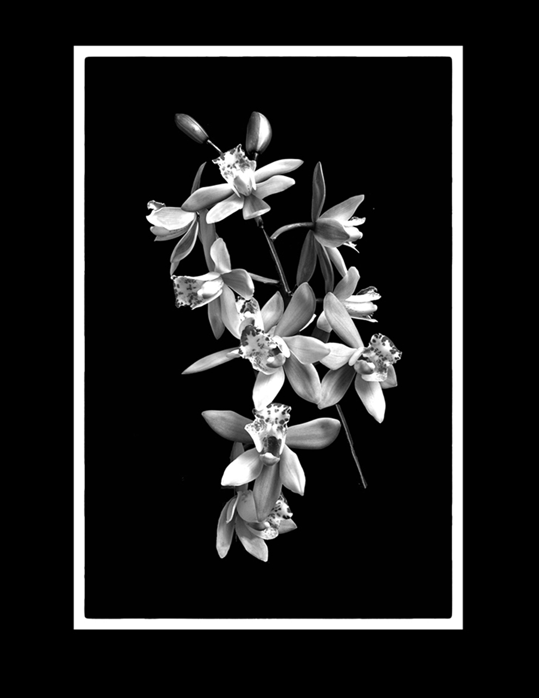
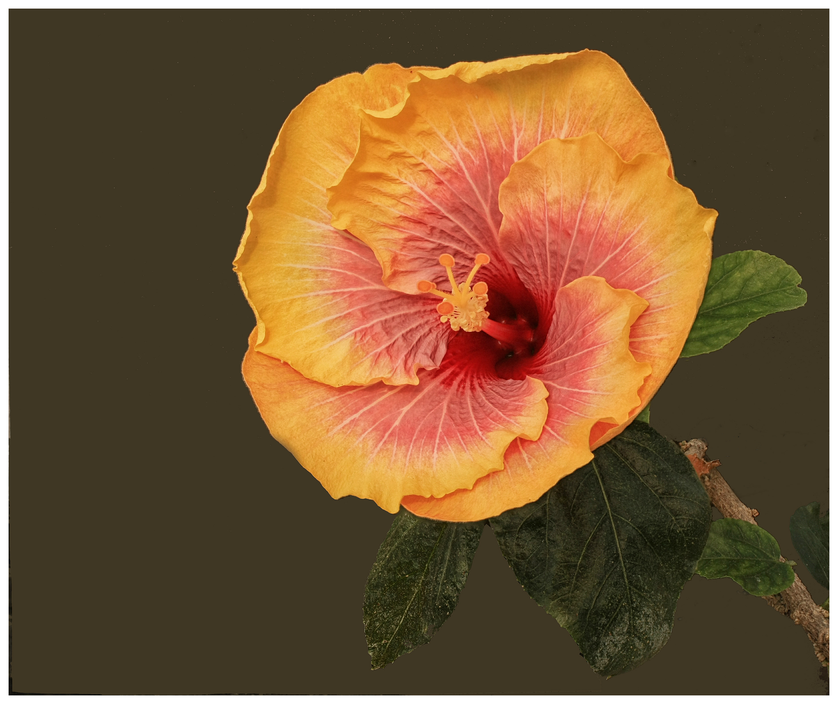
Fine Art, yes. I like the approach.
Would you consider burning the extreme top edges of the flowers? Even just a bit. If they could look like the one on the far right, I believe the image would be stronger.
|
Sep 4th |
| 32 |
Sep 21 |
Comment |
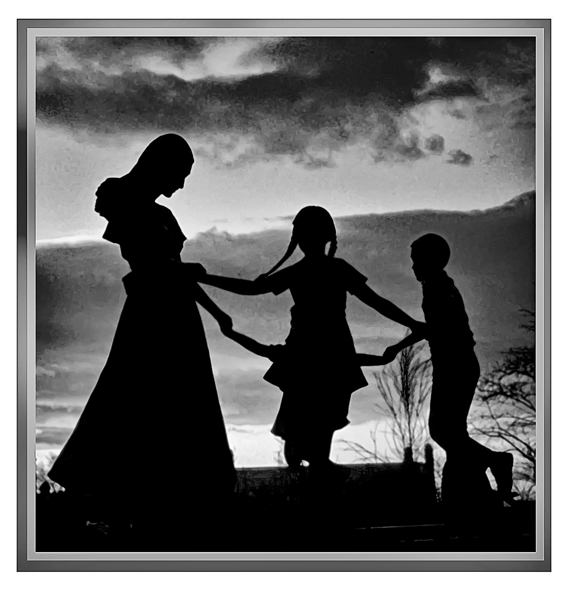
Would you consider a very fine stroke as a border/outline? Maybe in grey? |
Sep 4th |
| 32 |
Sep 21 |
Comment |
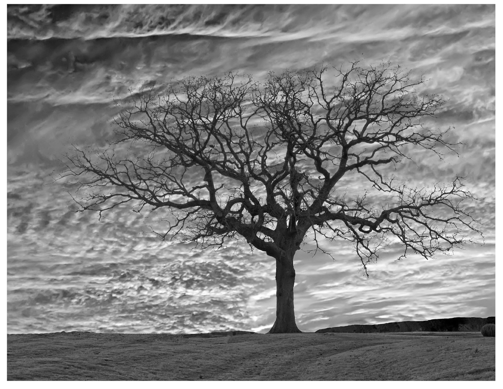
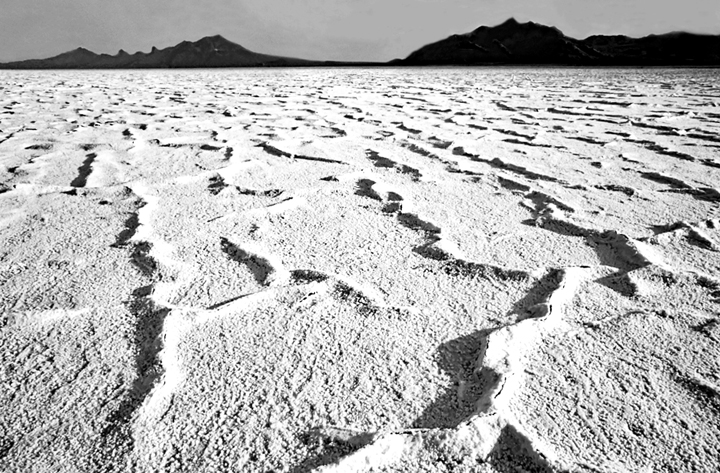
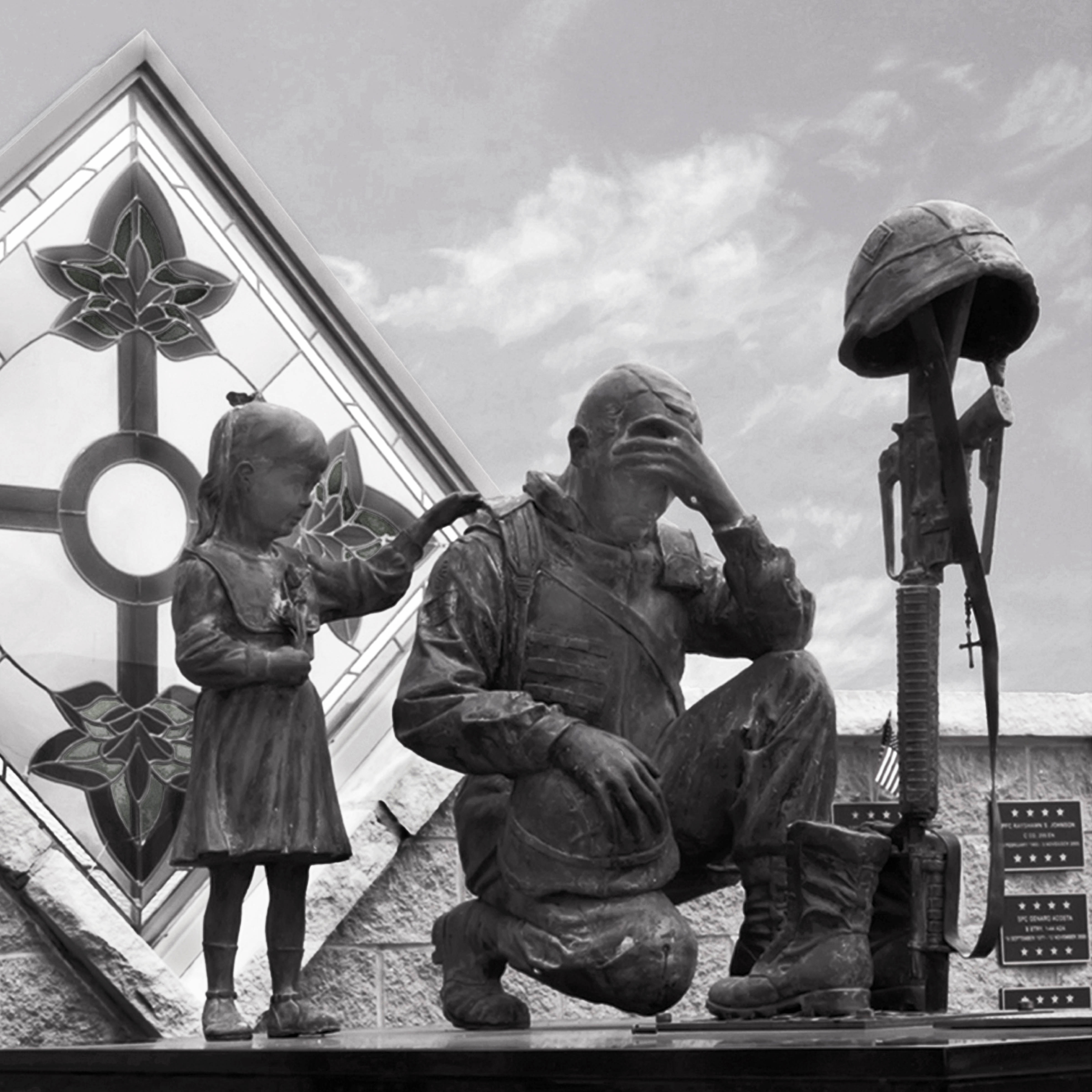
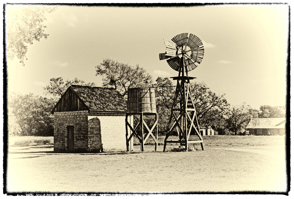
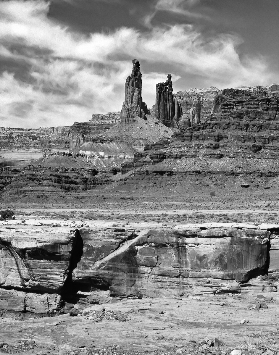
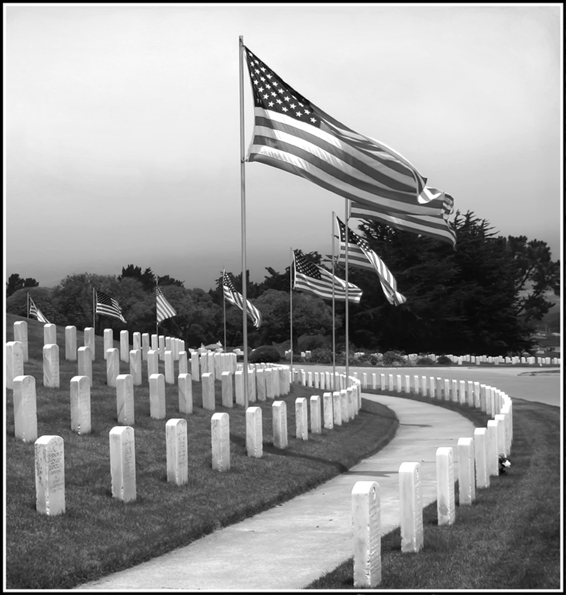
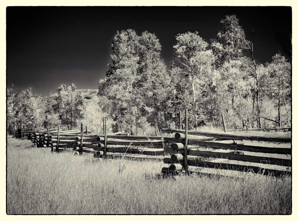
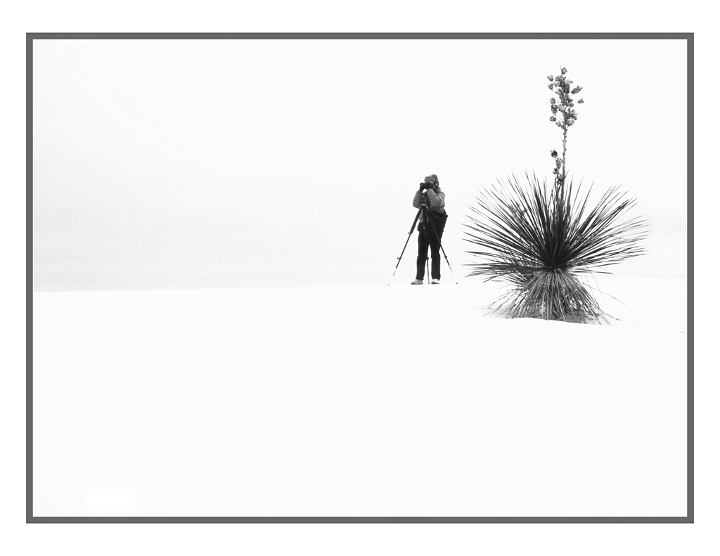
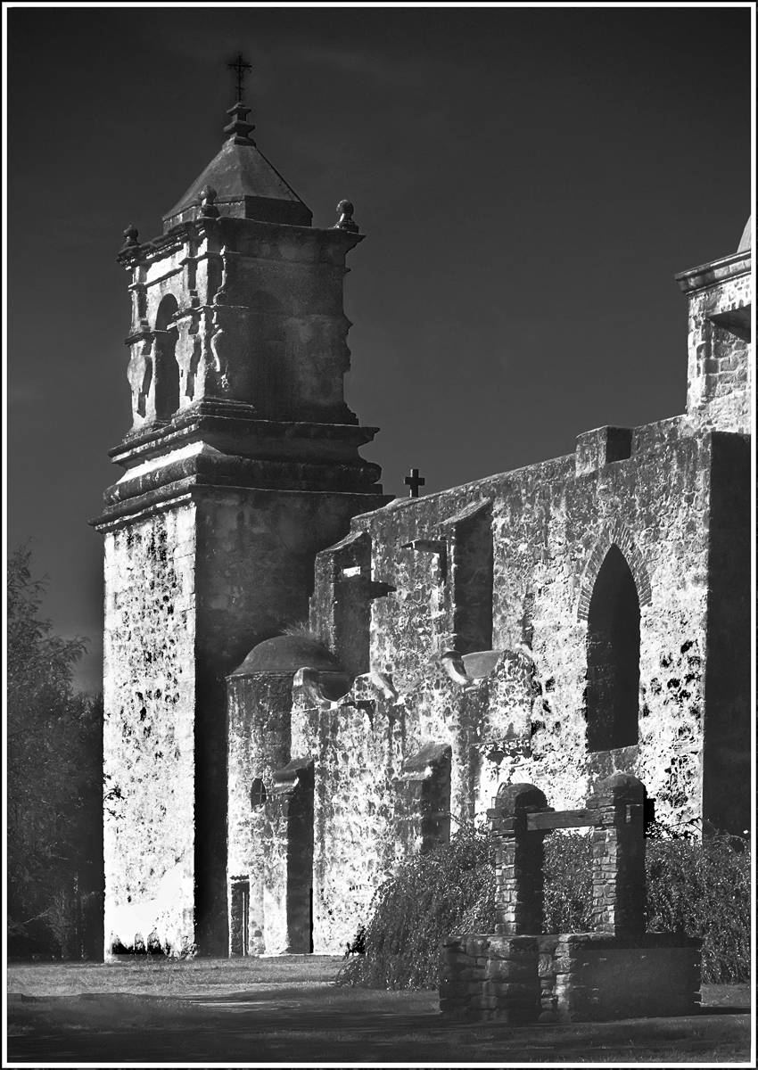
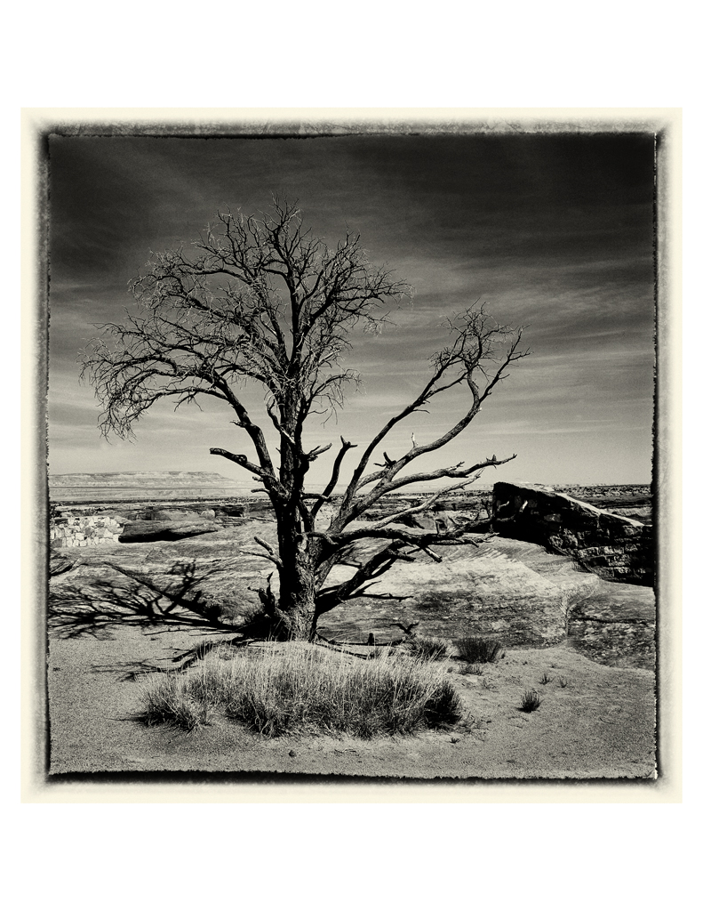
Looks like a Red Filter on BW film. I'm glad you didn't add some clouds. Simplicity......Less is more...are parts of my mantra.
Very Nice.
PS: My cousin is buried there. He was a graduate of the First Graduating Class and then flew SAC B-52s. |
Sep 4th |
| 32 |
Sep 21 |
Reply |
thanks.....w |
Sep 4th |
| 32 |
Sep 21 |
Comment |
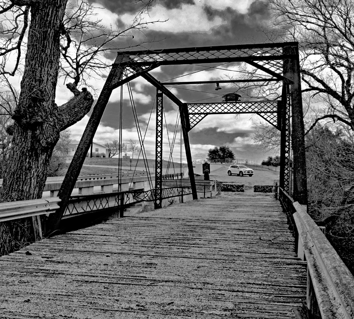
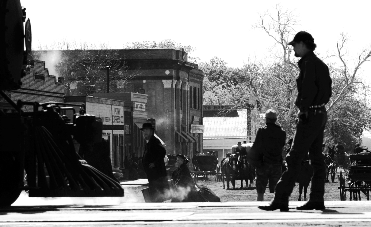
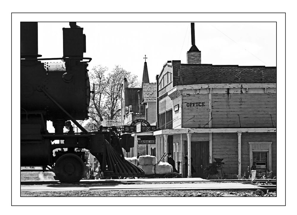
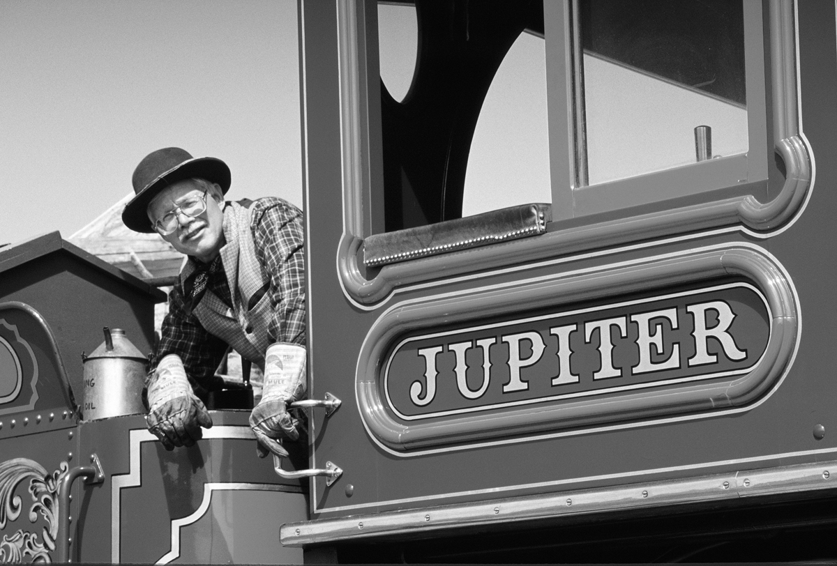
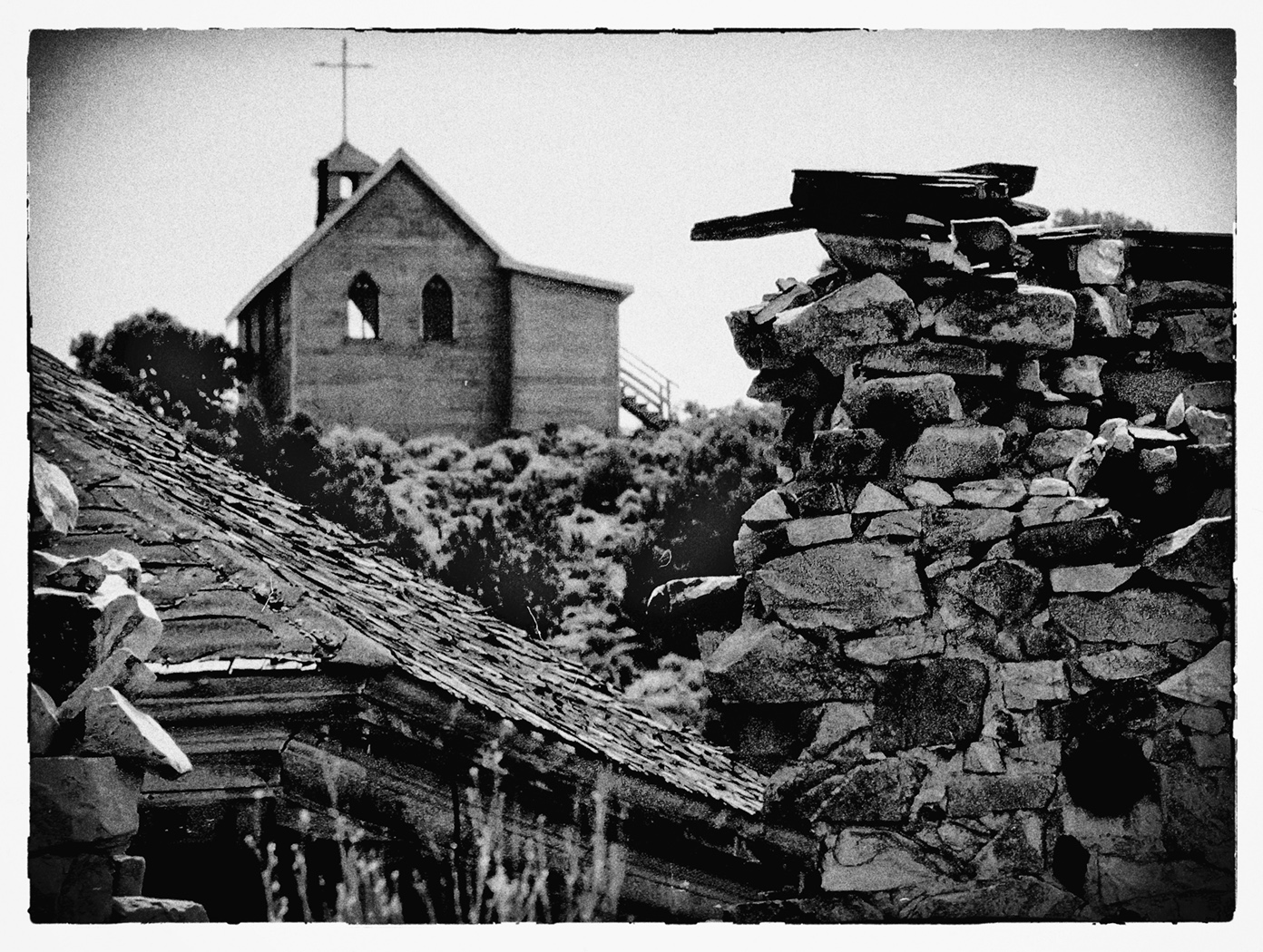
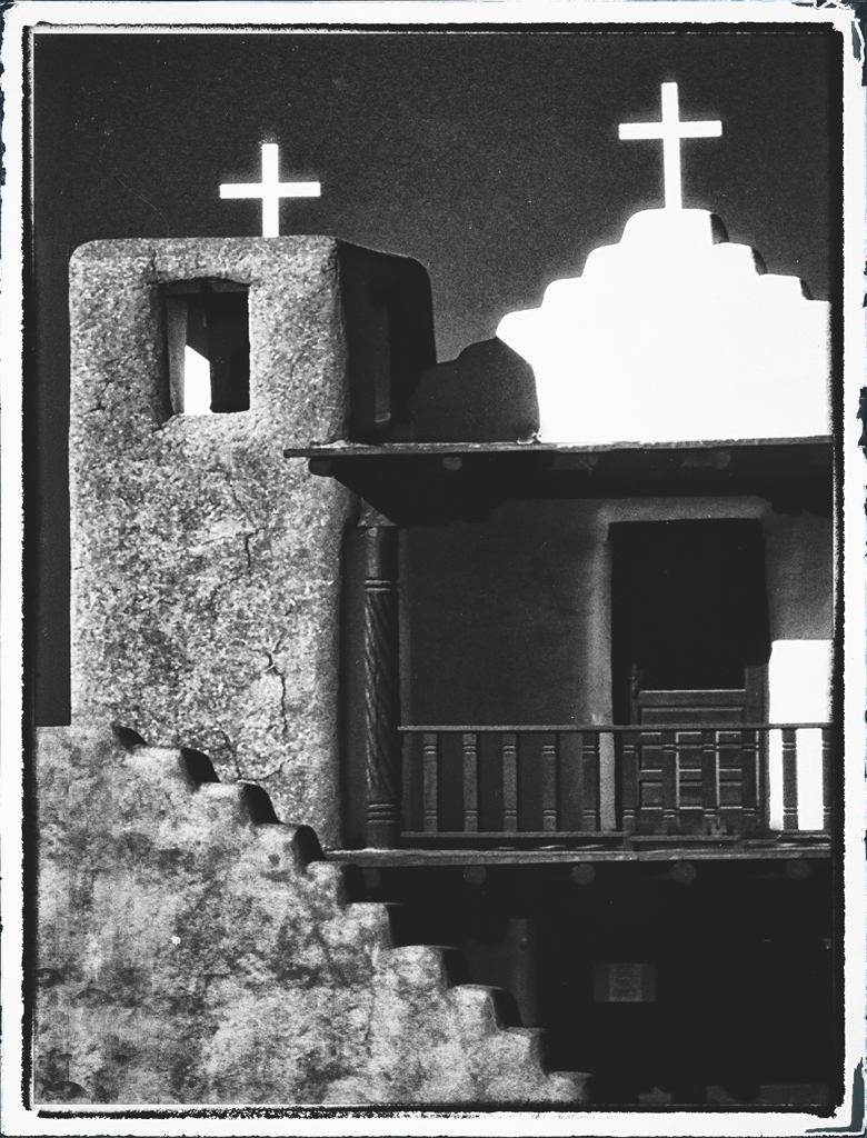
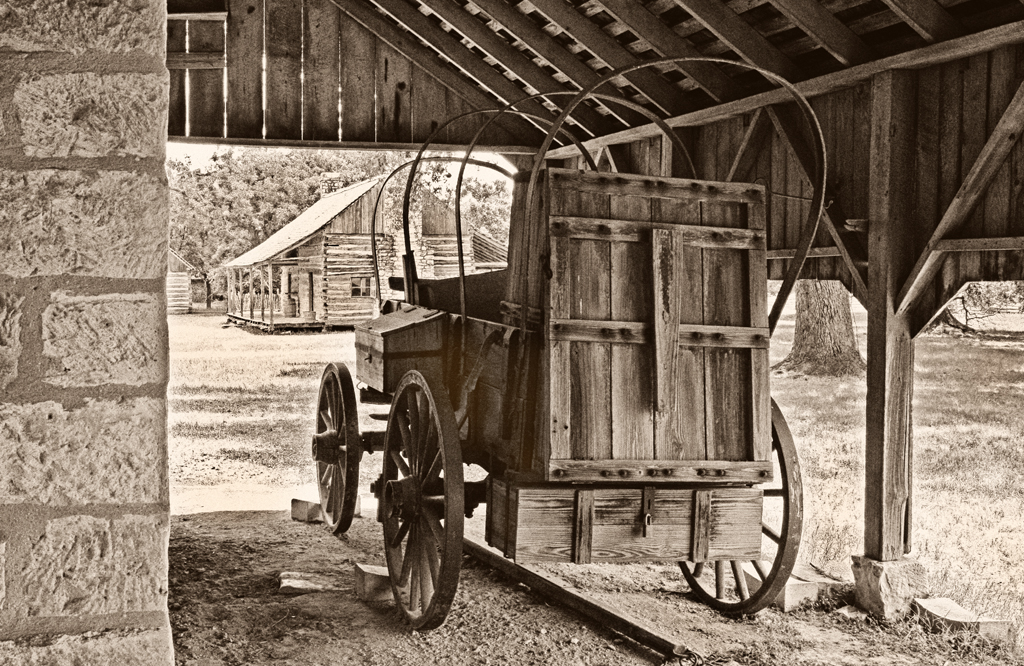
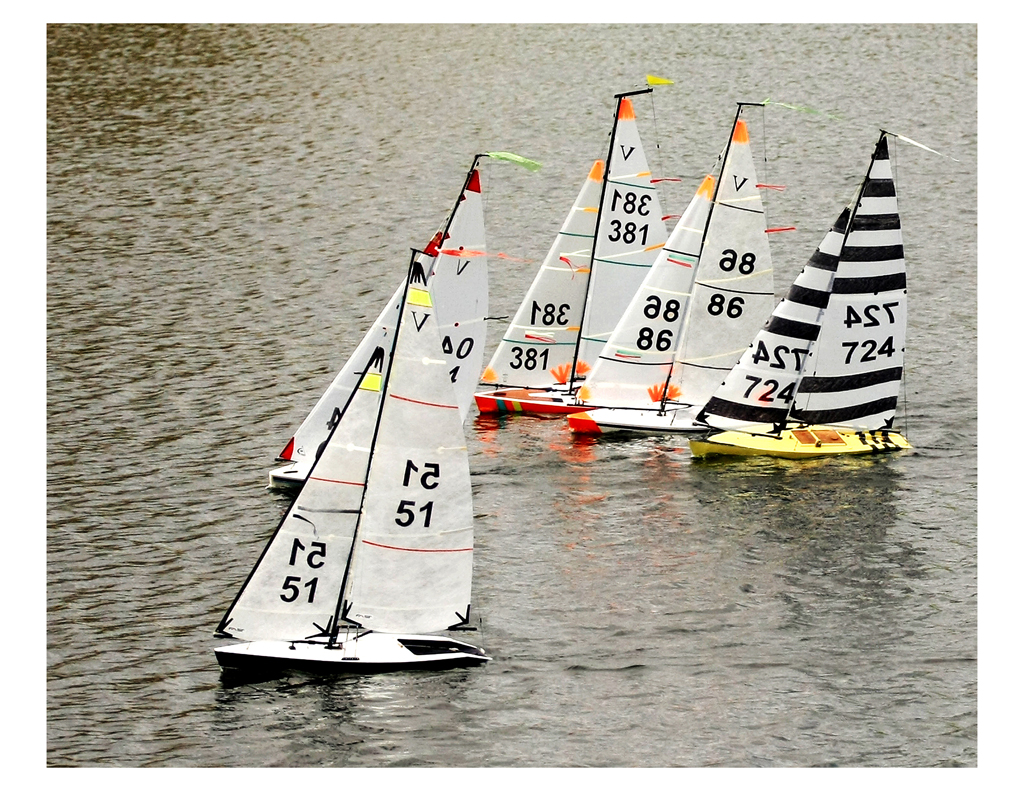
I considered titling this as " A study in Zones 0, 1 and 2....... And I thought showing just a portion of the steam engine would be more revealing in detail and interest
|
Sep 4th |
7 comments - 6 replies for Group 32
|
7 comments - 6 replies Total
|