|
| Group |
Round |
C/R |
Comment |
Date |
Image |
| 32 |
Jun 21 |
Reply |
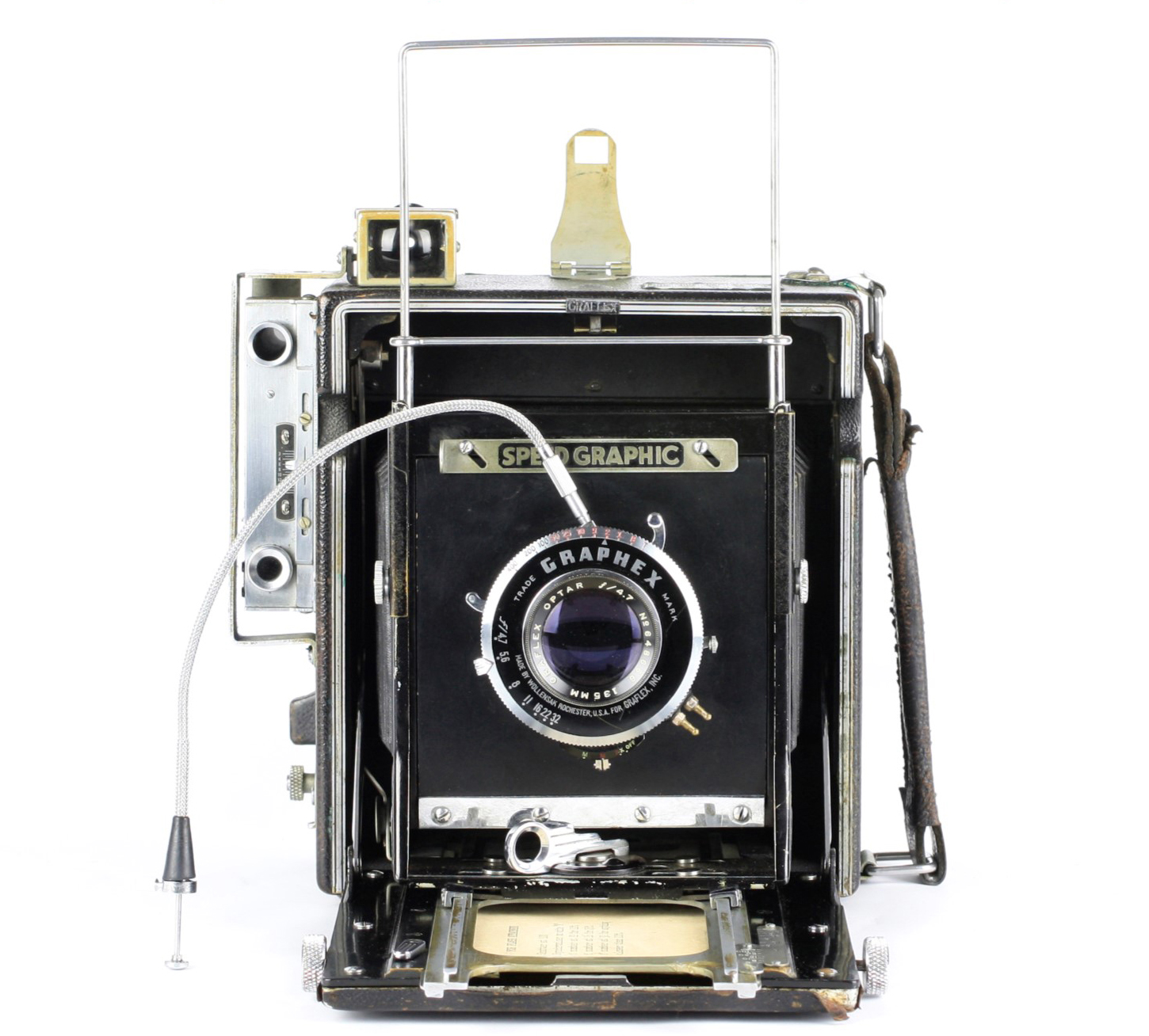
It worked, whatever. And I can't recall what pre sets I use most of the time.
thanks |
Jun 18th |
| 32 |
Jun 21 |
Reply |
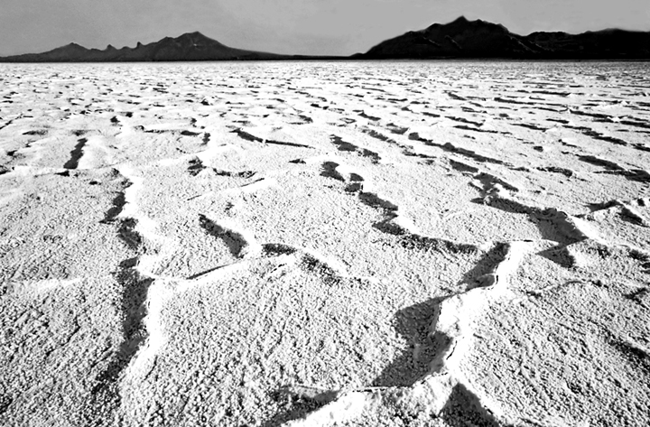
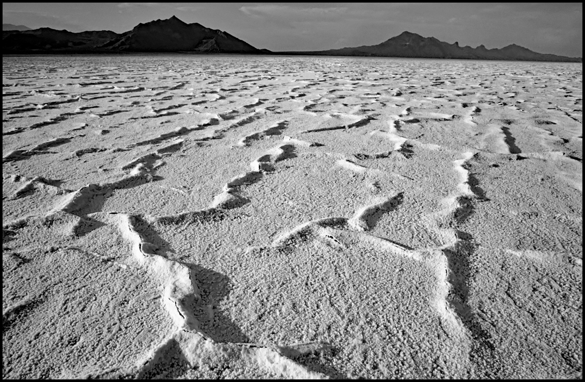
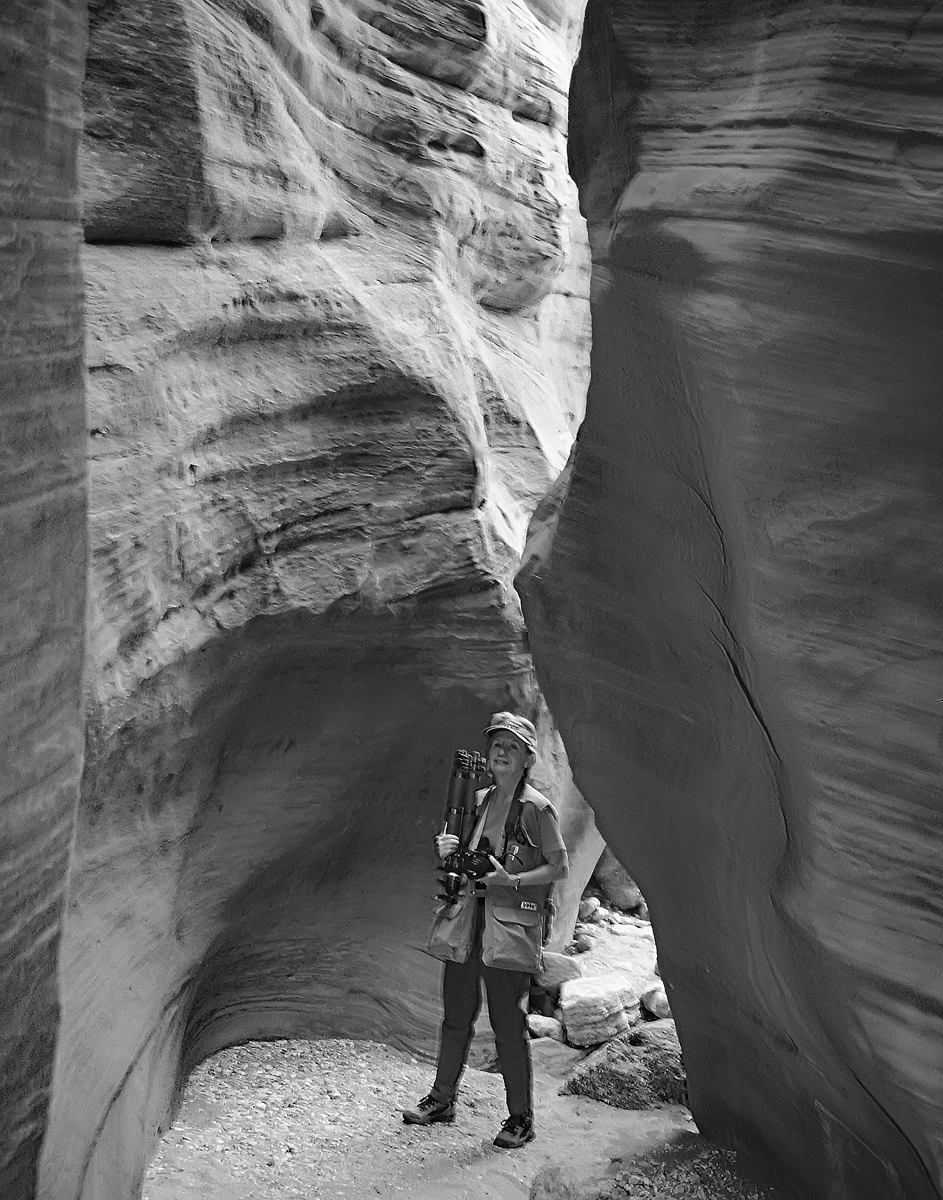
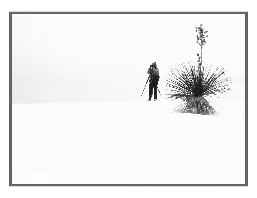
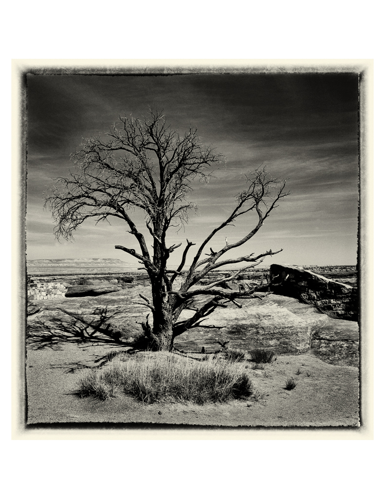
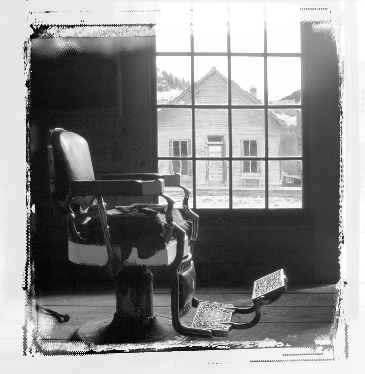
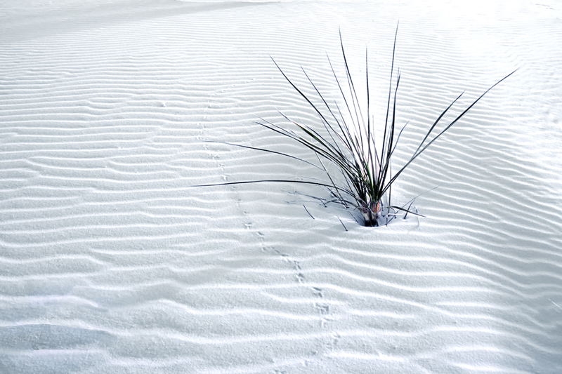
Re the upper left corner and the dune. I agree: it is problematic. But with the patterns of the sand I found it difficult to clone and I thought there was insufficient room to crop it, so there it is.
I've done a different version where I removed all the bllue and green and other tints. It's ok in my mind, but I preferred the "primarily white" version. I've printed it to 20x30 and framed it with no matte, but in a large (3") black wooden shaped frame. It seems to be a powerful photograph that way...... My thought was that the "story" created by the small critter's feet tracks was a key attribute. I titled it "Guess Who Was Here Last Night?" |
Jun 16th |
| 32 |
Jun 21 |
Comment |
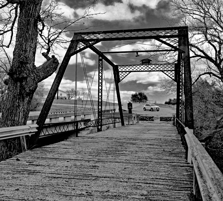
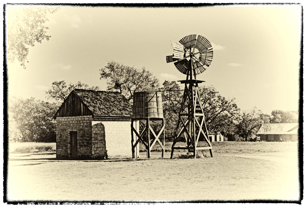
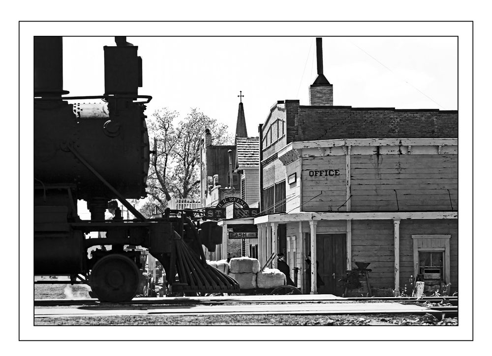
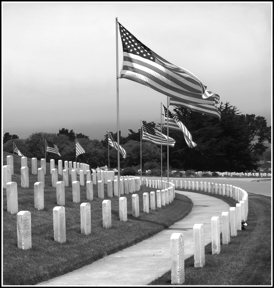
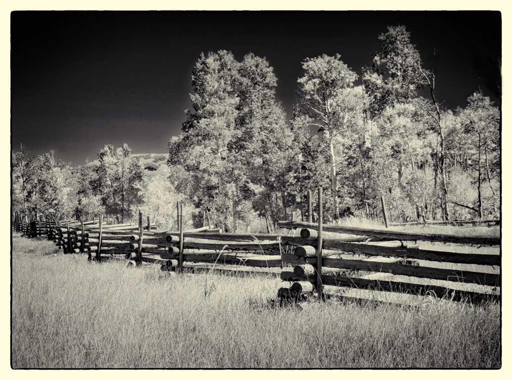
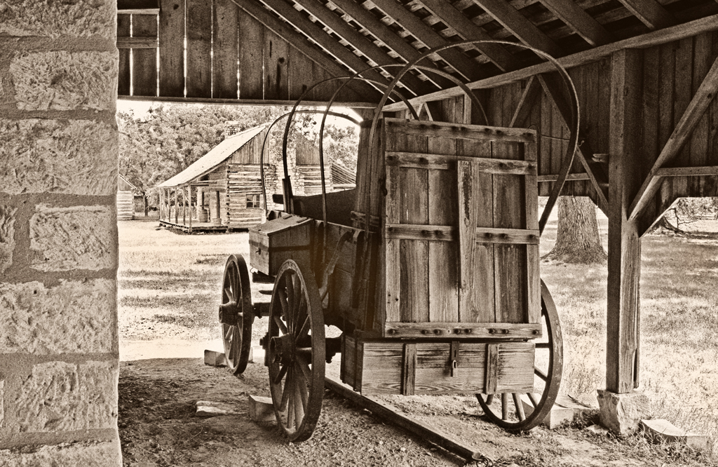
I too, like the inclusion of the fence (for the reason you stated.)
An elegant remnant of a by-gone period. (You captured the image before lightning hit or the bulldozer got it. If that is the only purpose of the image, it is well worth it to many observers.)
Well done. |
Jun 16th |
| 32 |
Jun 21 |
Comment |
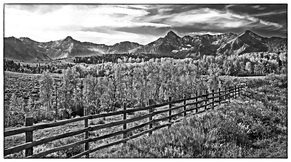
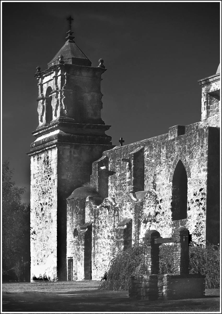
The intruding part of the architecture from the right was distracting to my eye from a composition perspective. Cropping as in Tom's comment created, I believe, a more pleasing image. If then, you could apply Diana's "contrast pixie dust" I think you would have a stronger image. |
Jun 16th |
| 32 |
Jun 21 |
Comment |
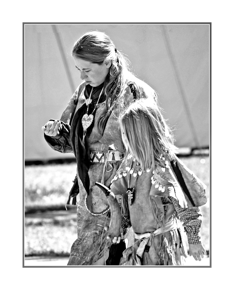
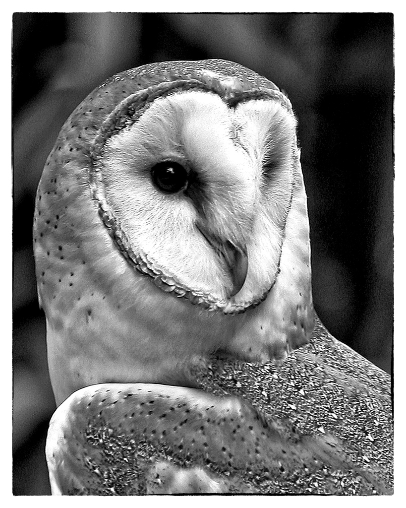
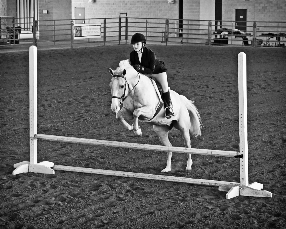
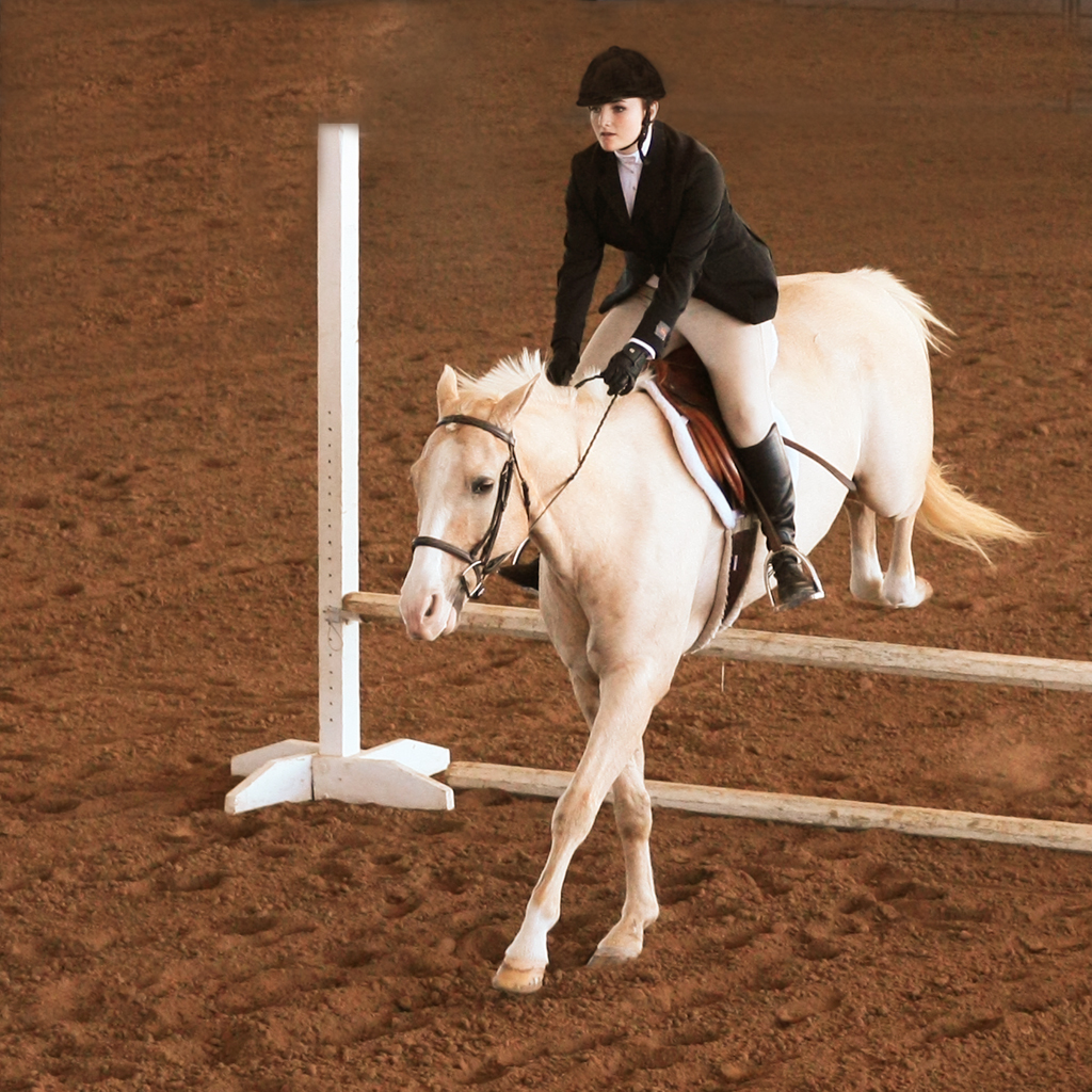
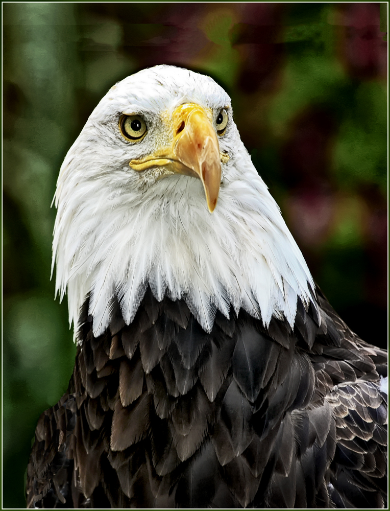
Wonderful portrait.
The comments seem to revolve around cropping and spacing. I think Diana's rendition is just what the young lady needs. I love the low key Nik.
Do you recall what pre-set you used in Nik SilverEfex? |
Jun 16th |
| 32 |
Jun 21 |
Comment |
Not all images will do well in General (Pictorial) Competitions, which I understand to be our focus in DD32. I do think it is a beautiful image that would frame nicely with a white matte and black frame and a thin stroke as Russ describes. It belongs, in my opinion, in a Fine Art venue or gallery where the FA image is meant to be studied and the message pursued, as opposed to the PSA Competitions dilemma of needing a 6 second Impact. Neither image will do well in the other venue.
Also: This image begs to be made into a 5" x 7" (A7) Greeting Card or Sympathy Card with a thin black stroke and a half inch white border all around as per Russ' comment. Sympathy Cards are difficult because the purpose of one is a difficult one. But, the "message" of this thin dead stem shouts "Sympathy" to me and is its own message all by itself. (BTW:: I am typically repulsed by some of the commercial Sympathy Card text from people like Hallmark. Living in a Seniors Community we get the "opportunity" frequently to send a Sympathy card to a survivor. ) |
Jun 16th |
| 32 |
Jun 21 |
Comment |
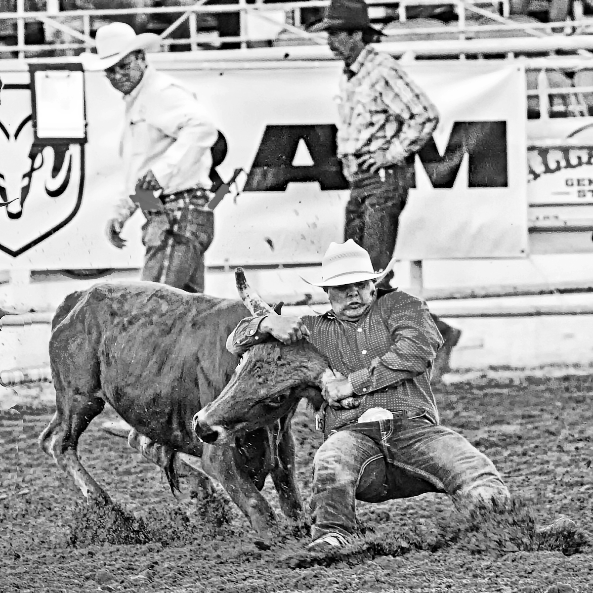
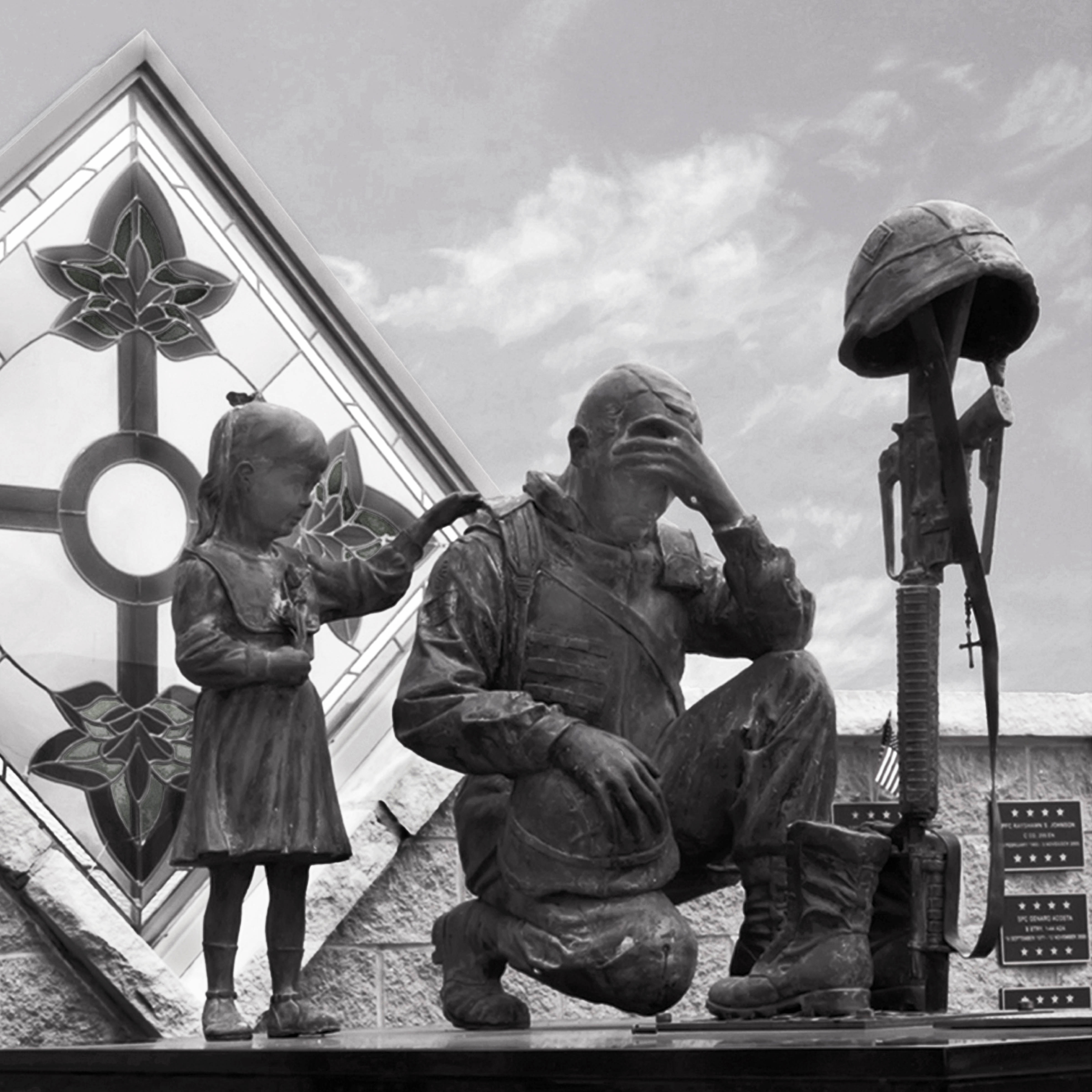
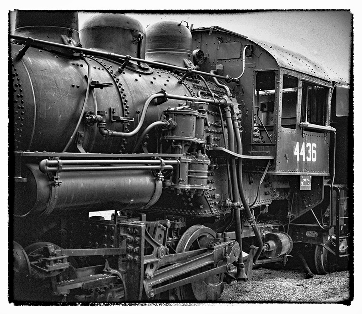
You've done a nice job blurring the tree foliage in the background. But the ragged edge of the veg is off-putting. What would you think if you were to either remove all the foliage or increase it to fill in the open space to the right? It might give the subject more isolation and less eye-snagging. Just a thought.
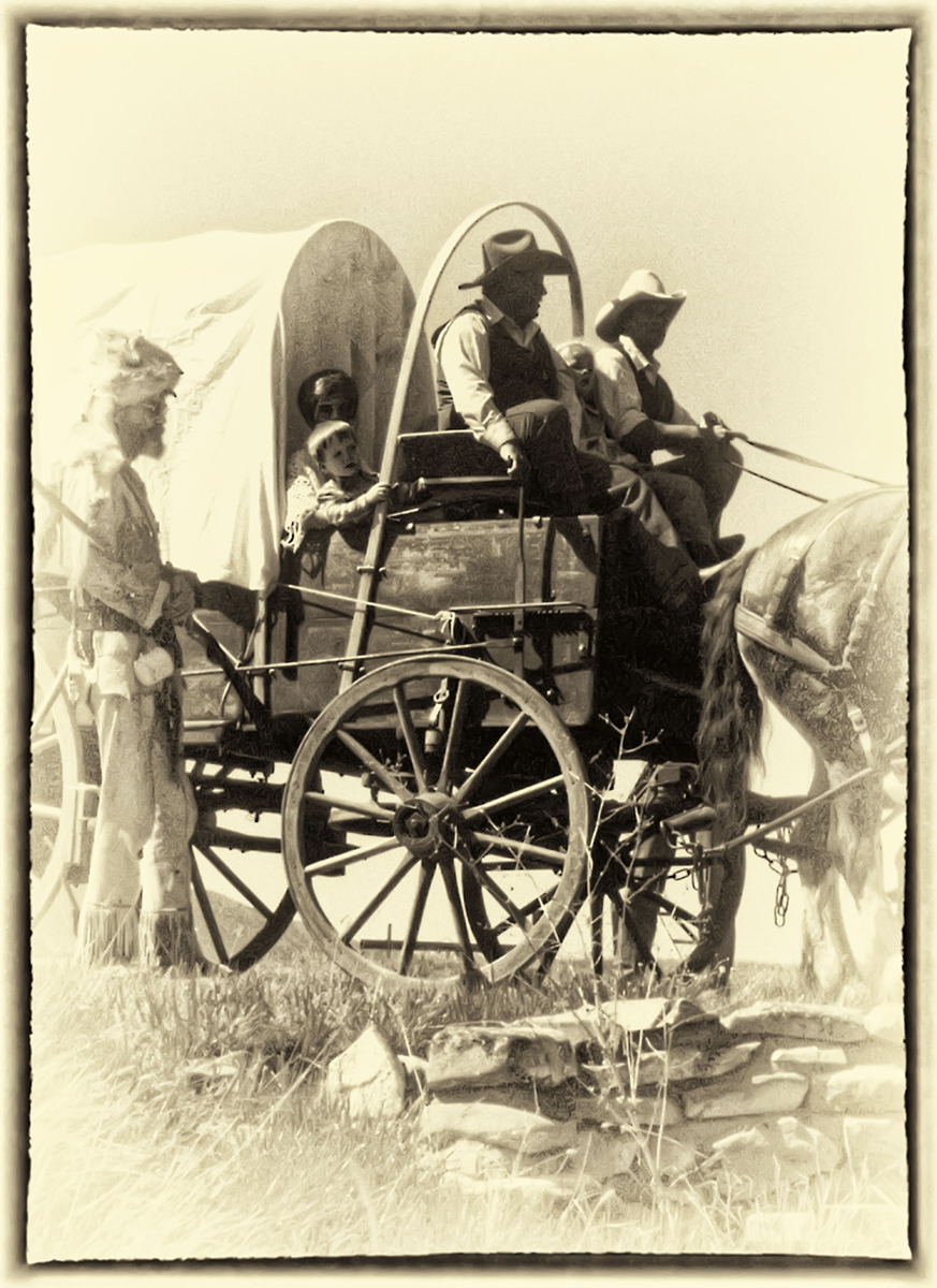
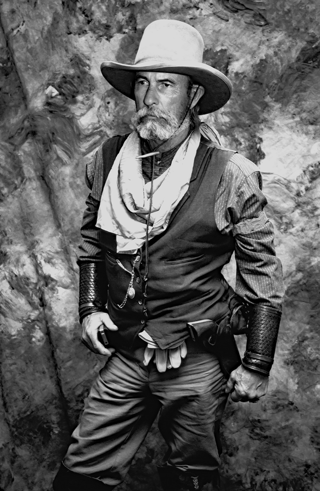
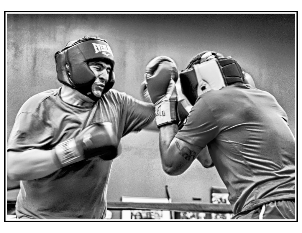
Great capture of the detail in the Pflugel and the musician.
|
Jun 16th |
| 32 |
Jun 21 |
Comment |
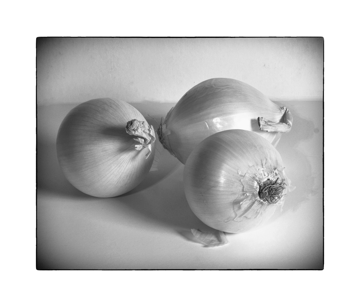
I don't see anything that I would suggest you alter. This is very nice as it is.
(PS: Sometimes people ask me how I did something or another, and I just say that "I rub it with Pixie Dust" Seems to satisfy them. You've provided the Pixie for my story) |
Jun 16th |
| 32 |
Jun 21 |
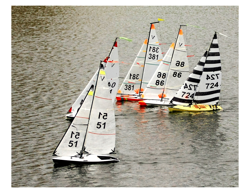
Comment |
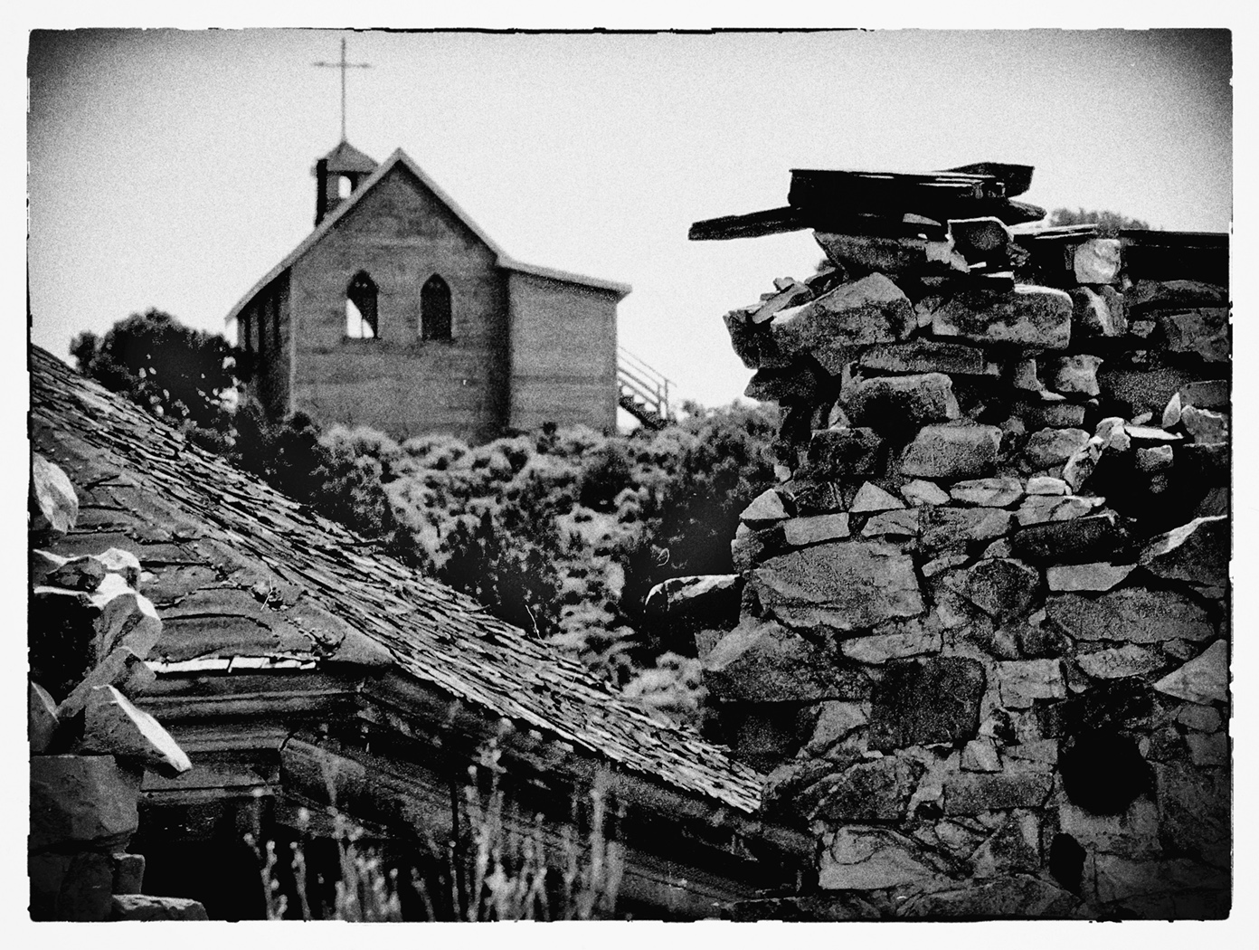
Both images wouldn't transmit, so here is the wayward one: |
Jun 12th |
 |
| 32 |
Jun 21 |
Reply |
This is the version I referred to that I submitted to White (it was not B&w).... Also shown is another image suggested by Diana of just the Dunes. The interesting attribute of it is the set of small animal tracks in the sand. |
Jun 12th |
 |
7 comments - 3 replies for Group 32
|
7 comments - 3 replies Total
|