|
| Group |
Round |
C/R |
Comment |
Date |
Image |
| 32 |
May 21 |
Comment |
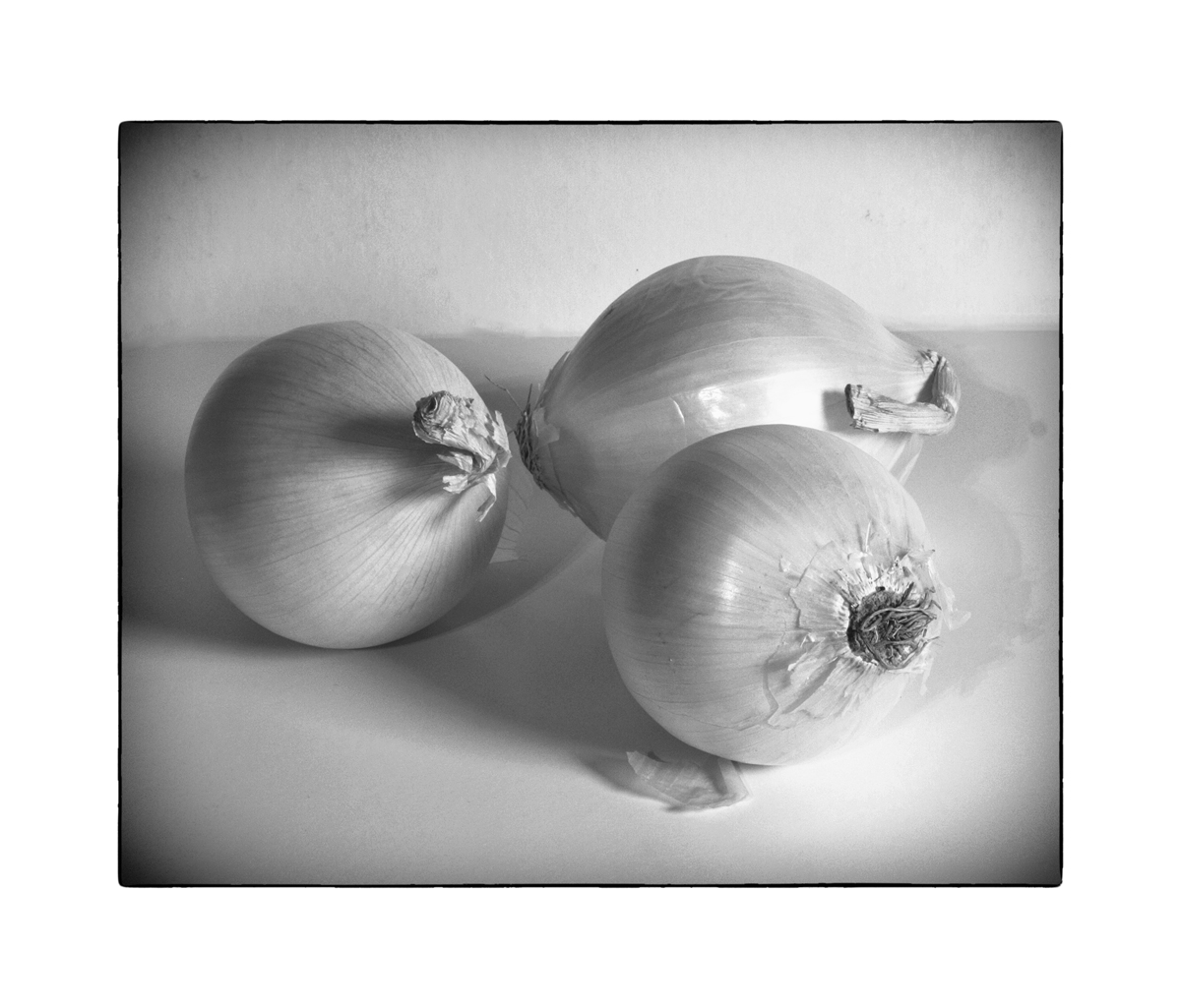
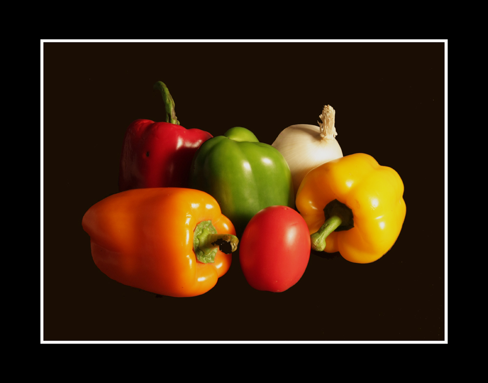
Who would want veggies that aren't shiny? I think it gives them chracter just like shadows. |
May 31st |
| 32 |
May 21 |
Reply |
Thanks.... No, didn't make Salsa. I did purchase four diff color bell peppers, some tomatoes, and I made a small portfolio of different combinations. Some with white backdrop and some with black ones. This is the only one I've attemted to make into a monochrome. Attaching one as an fyi in color with black backdrop. |
May 31st |
 |
| 32 |
May 21 |
Comment |
MANY THANKS TO ALL FOR THE GOOD COMMENTS. WES
|
May 23rd |
| 32 |
May 21 |
Comment |
Thanks for the comments, all. Here is my revised image in BW courtesy of Nik Wet Rocks and some Pixie Rubbing Oils. |
May 22nd |
 |
| 32 |
May 21 |
Comment |
Using the suggestions, I did more editing to the color version, primarily with the Airbrush and picking a color of the un-shadowed background on the right, I brush-painted over the right hand side of the shadow; and it is a nice improvement.
Thanks.
wes |
May 14th |
| 32 |
May 21 |
Reply |
I'll stay with the original color version that has some nice pastel tonalities. Thanks.
|
May 11th |
| 32 |
May 21 |
Reply |
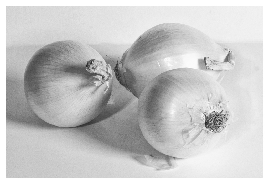
Well, they started as White Onions in the market, not Yellow Onions..... |
May 11th |
| 32 |
May 21 |
Comment |
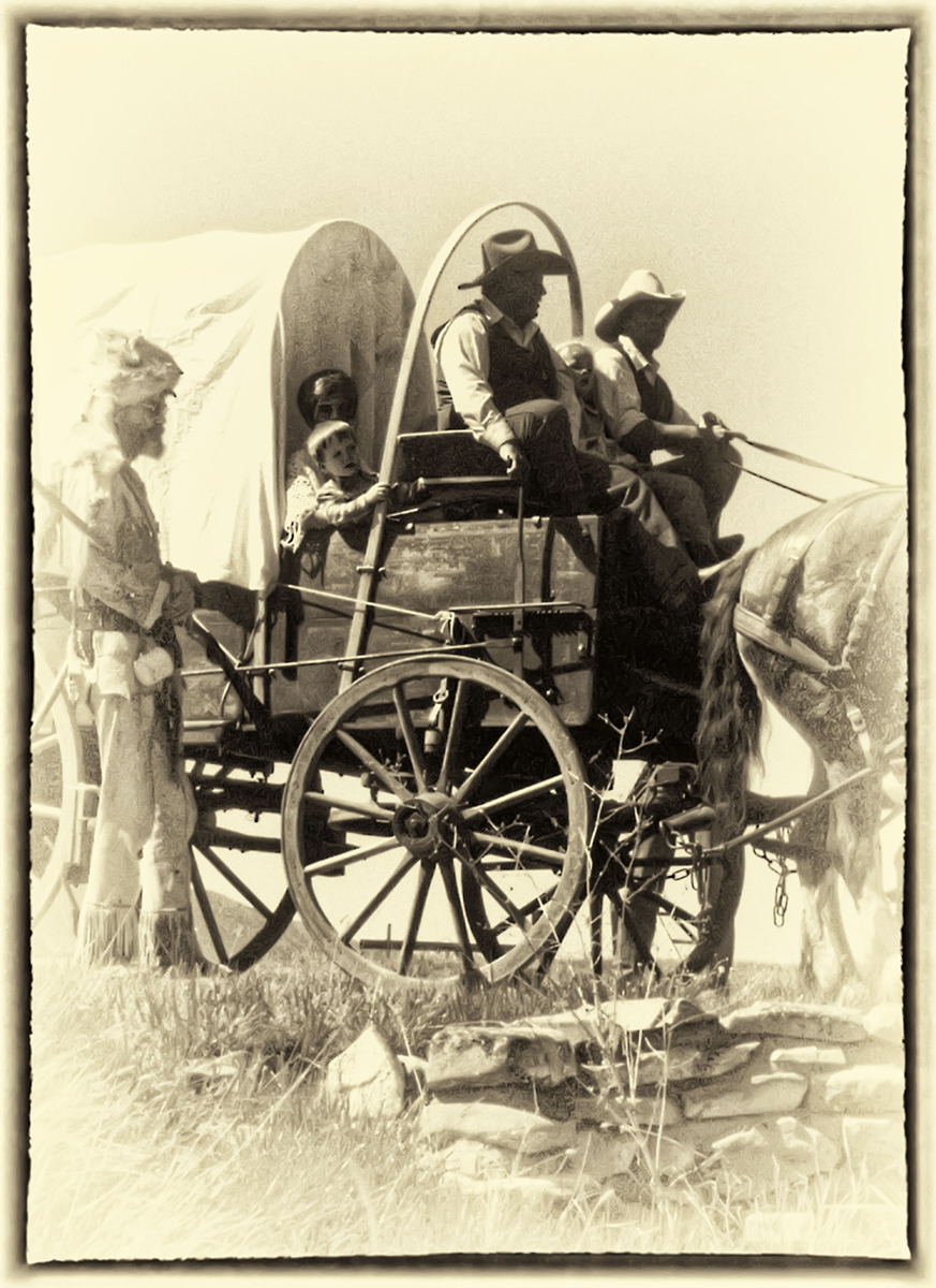
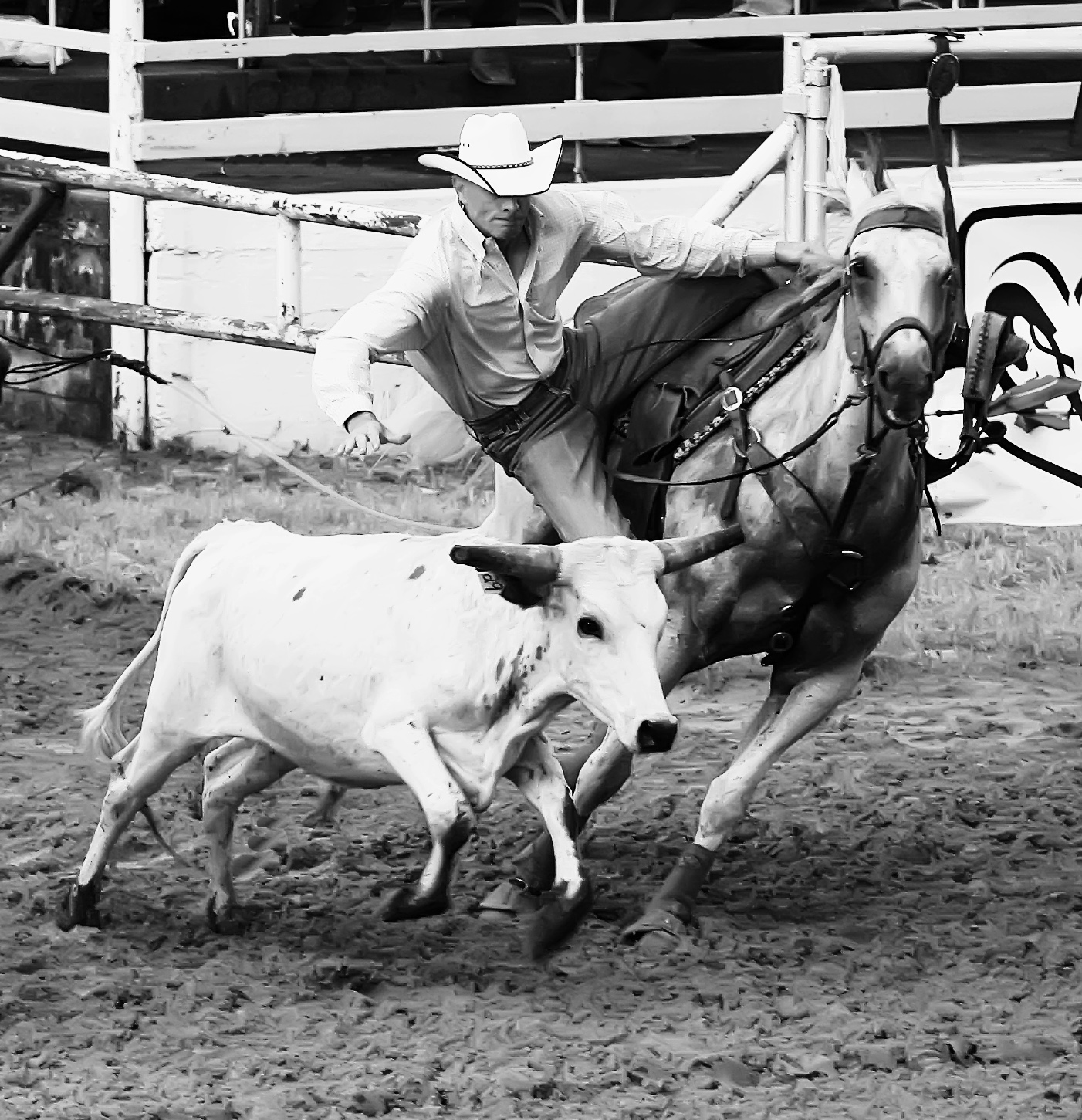
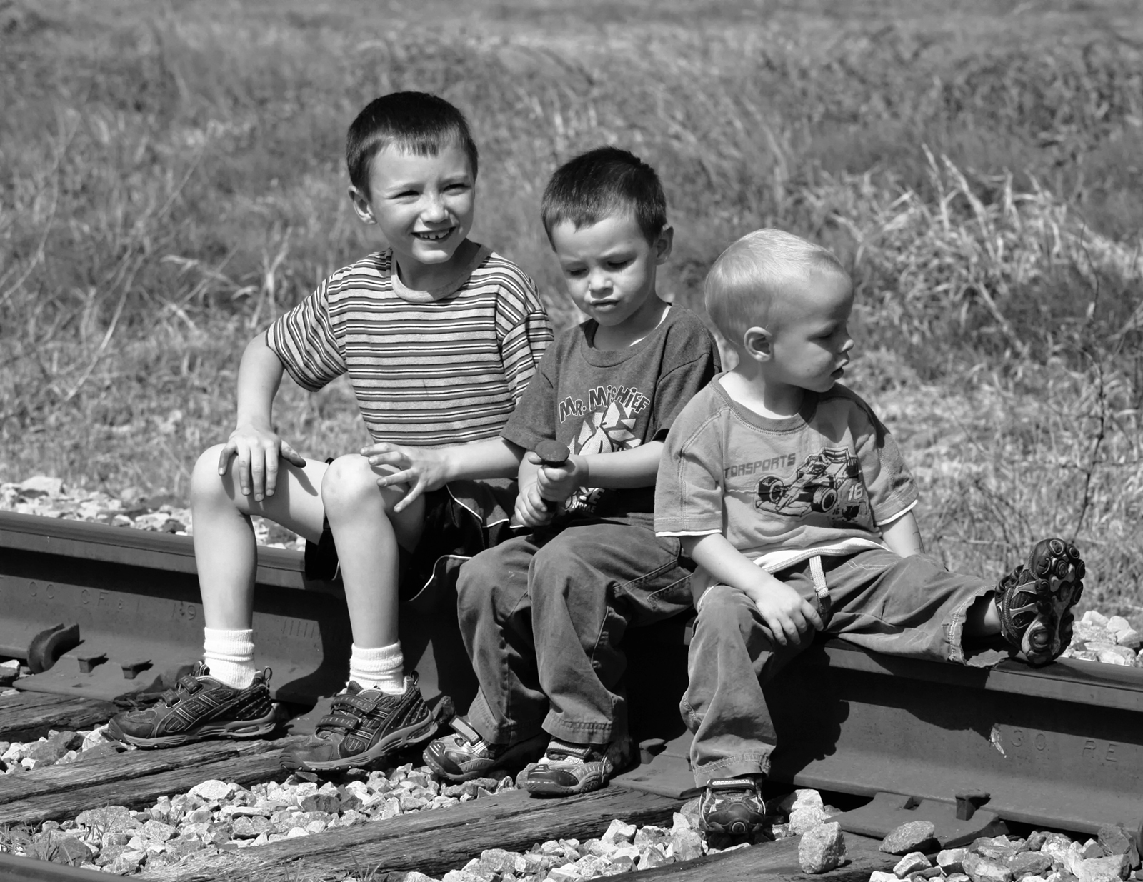
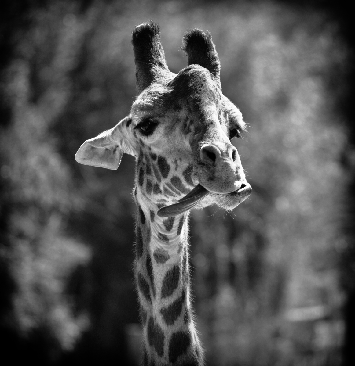
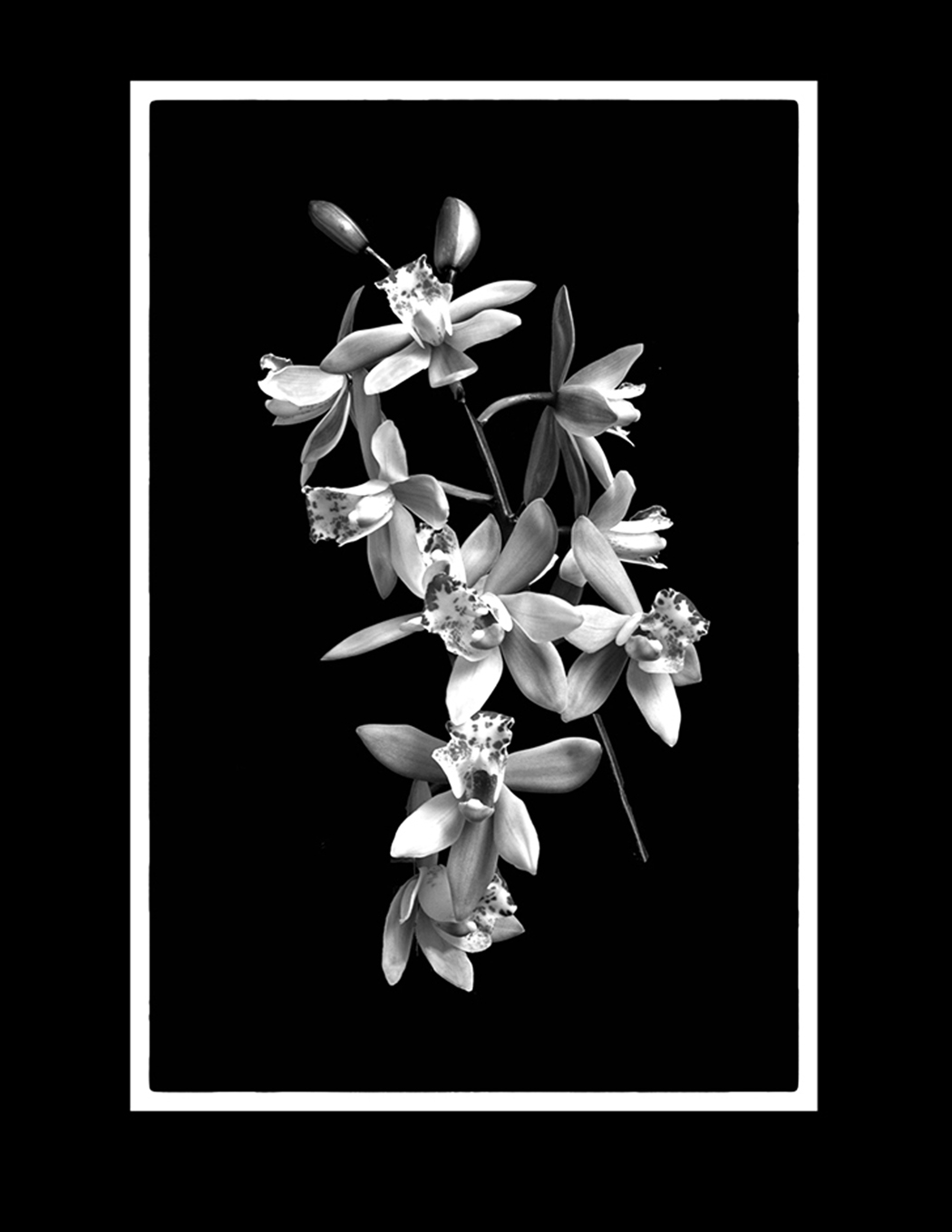
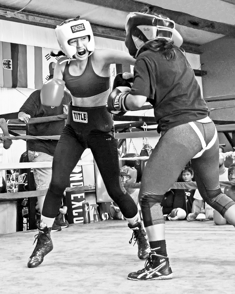
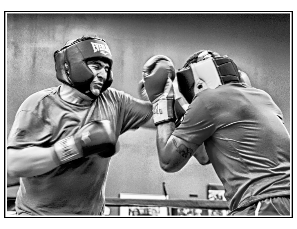
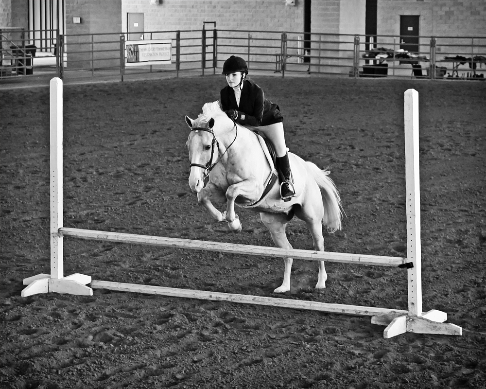
Diana knows more about abilities in competition, and she's probably correct. But I like the image. It might be better visually and in a frame if it were a Vertical. I'm happy to see someone else liking the dark vignette. If you didn't capture more of the stem, you could "create" more with a little "plastic surgery" and "fairy dust." (Or the Clone Tool.) |
May 10th |
| 32 |
May 21 |
Reply |
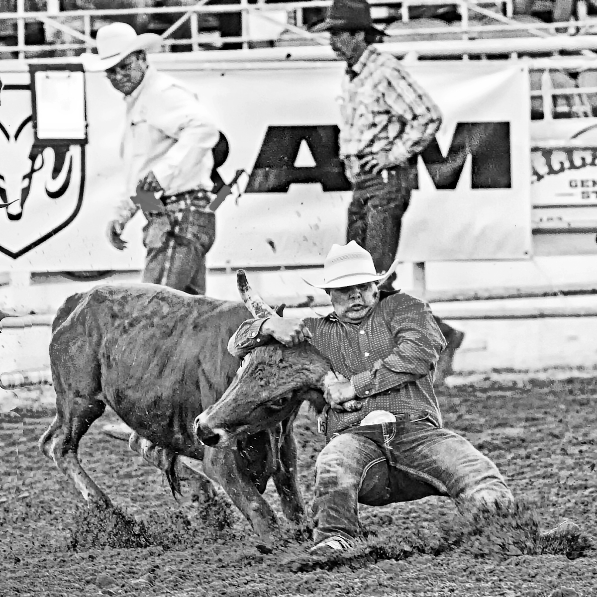
I had the same thought: Will not do well in PSA-Nature due to their requirement that nothing added and nothing subtracted. On the other hand, I'm seeing this composition with the subject on a plain white background more and more in "non nature" competitions and exhibits. It's also a favorite technique now for our brush painters. well done as is. |
May 10th |
| 32 |
May 21 |
Comment |
Very well done....congratulations |
May 10th |
| 32 |
May 21 |
Reply |
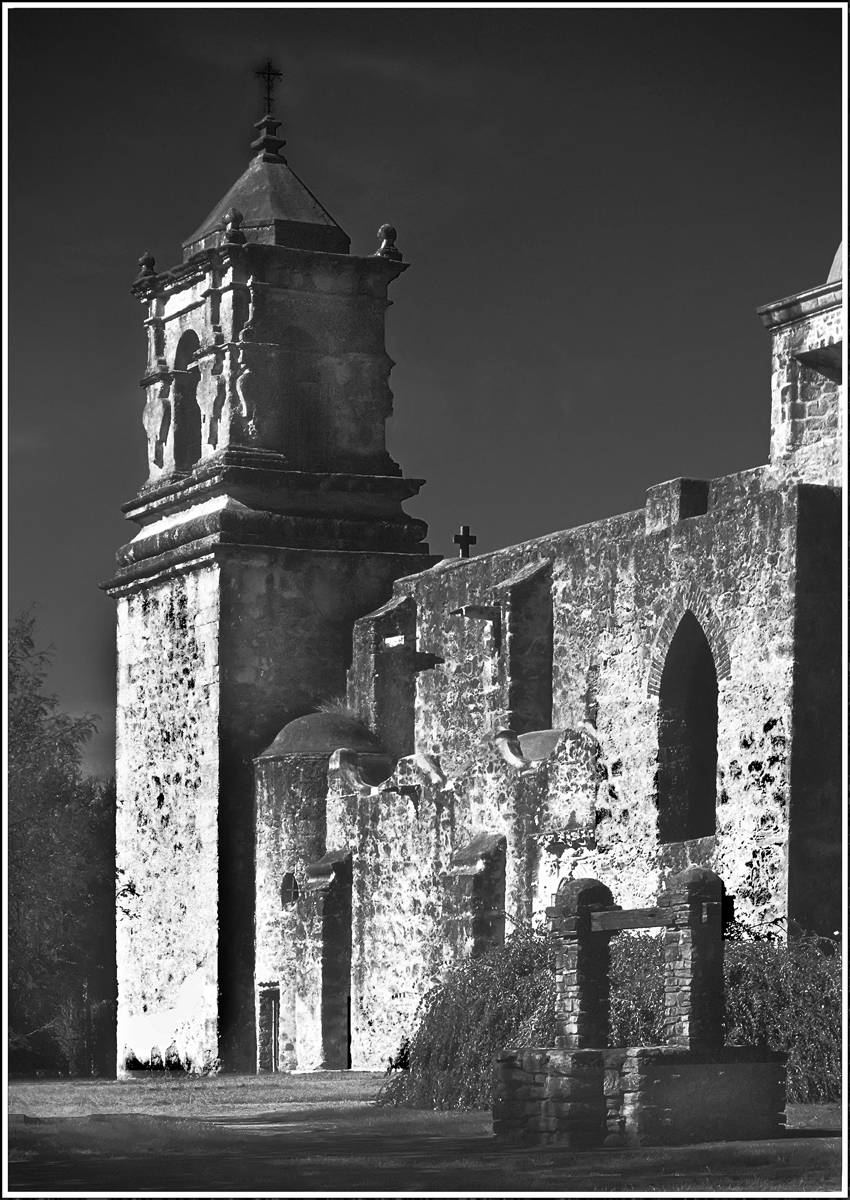
Nicely done on the clouds.
|
May 10th |
| 32 |
May 21 |
Comment |
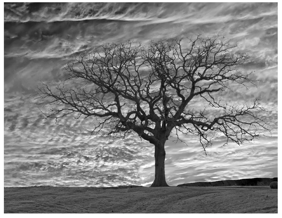
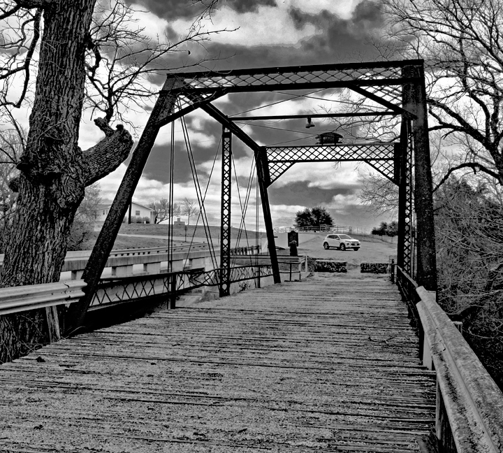
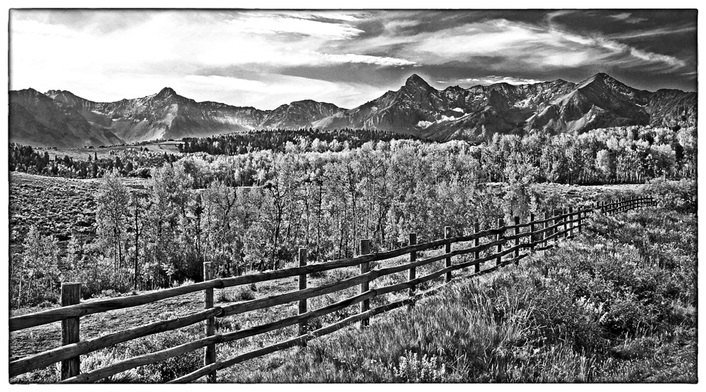
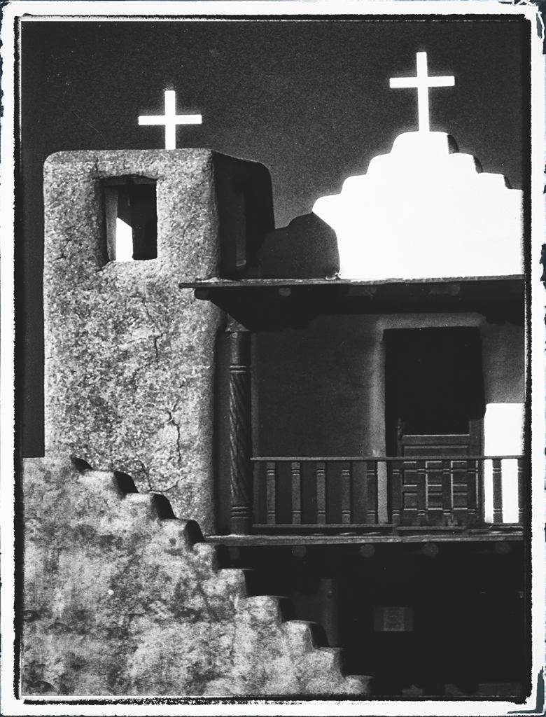
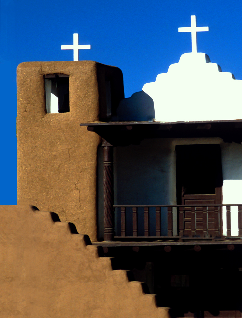
The clouds look very different between the color and mono versions. ie, there seems to be more contrast in the color that didn't carry over to the mono. Easy to fix and it will create an excellent image of the Mission. You did a nice job of making the verticals vertical..... either a tilt shift or in Lens Correction (in PS/PSE) .... too often buildings look like they'll tip over backwards, and you've done a nice job. |
May 4th |
| 32 |
May 21 |
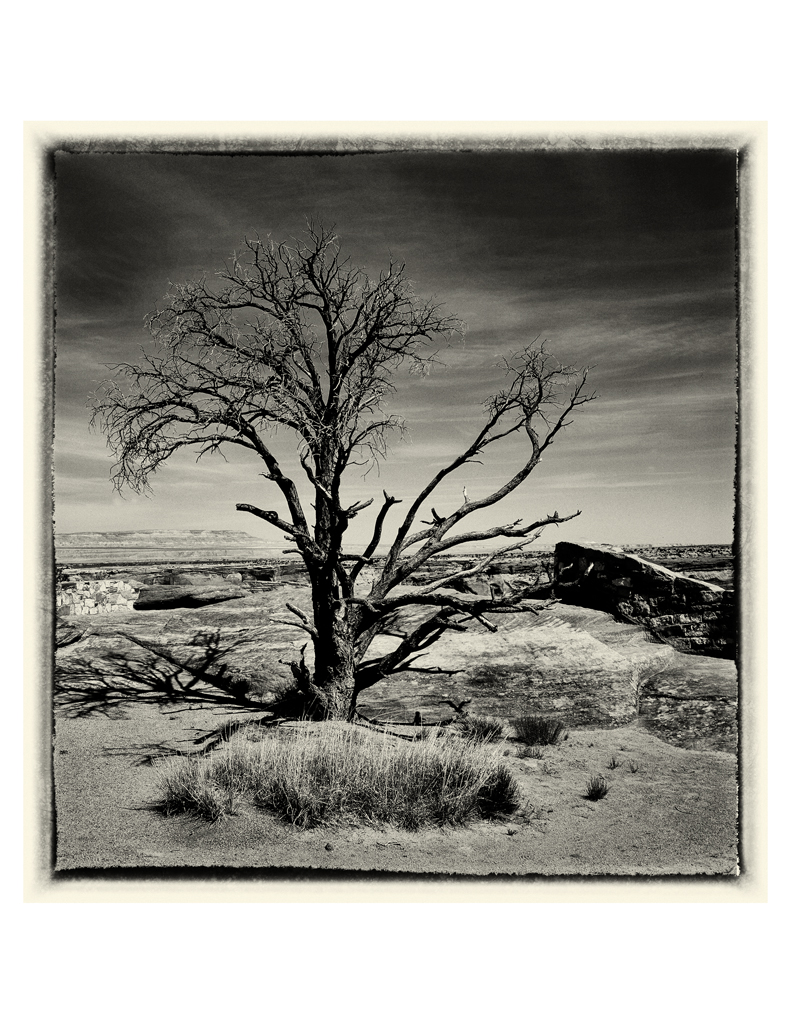
Comment |
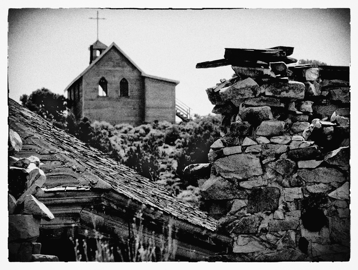
When replacing a component in one's image, such as the sky, some will say that unless the replacing component is of the maker's, then the entire image is conflicted and ought not to be entered into competition over the maker's name.
A suggestion is to create a Folder in your Documents Folder titled "Atmospherics" and place skies, moons, sunsets, and etc., in it as you find and capture them. Then it is an easy step, even in Elements, to move that component into the primary image. Just make resolutions identical and use the same jpg/psd/tif, etc for both.
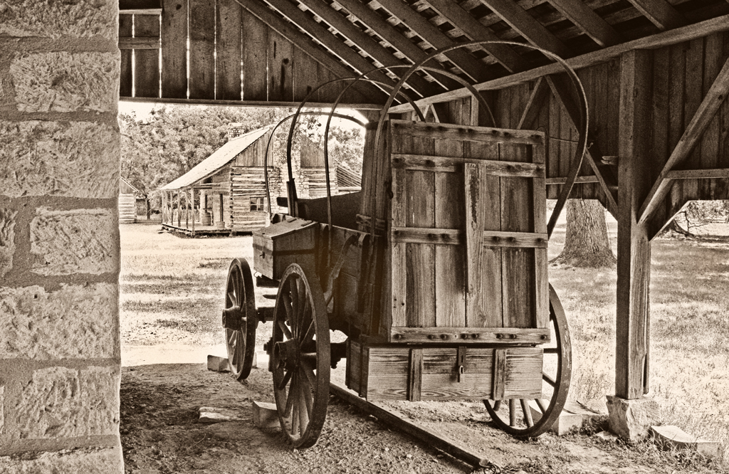
Nice image of the wall. |
May 4th |
| 32 |
May 21 |
Comment |
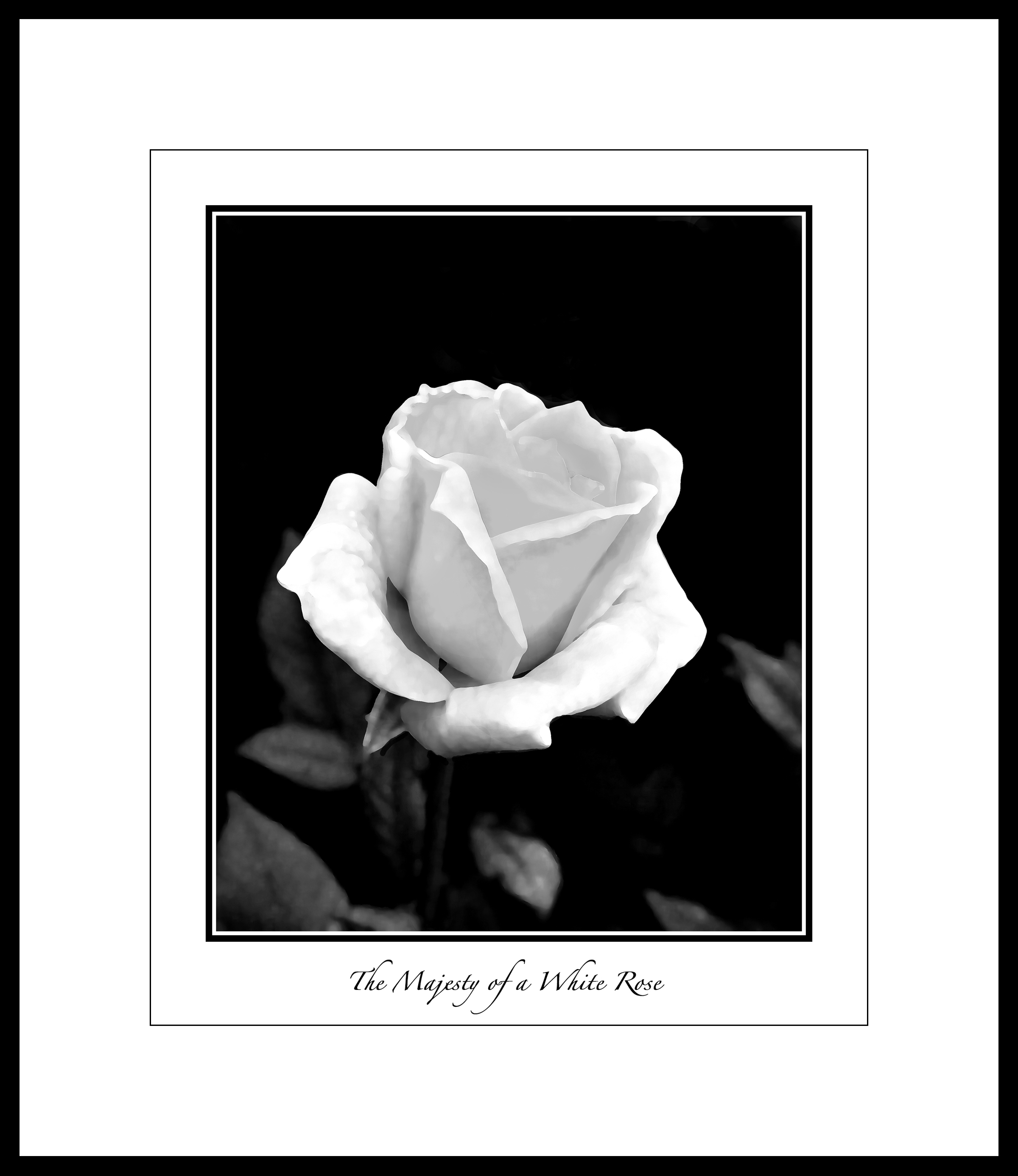
Yes, increasing contrast (with the white) shows an improved image.
I read somewhere that the comparison to the comment that "There are three important factors in Real Estate; and they are Location, location, and location," has a parallel in monochrome: Where the three important factors are Contrast, contrast, and contrast." This isn't dogma, but something to consider. |
May 4th |
| 32 |
May 21 |
Reply |
yep. |
May 4th |
| 32 |
May 21 |
Reply |
As I read your comments, I think you would prefer the color version over the NIK?
|
May 4th |
9 comments - 7 replies for Group 32
|
9 comments - 7 replies Total
|