|
| Group |
Round |
C/R |
Comment |
Date |
Image |
| 32 |
Feb 17 |
Reply |
I lean toward "Realism Photography"......except for doing BW conversions. |
Feb 9th |
| 32 |
Feb 17 |
Reply |
I agree, but are the colors a bit saturated (on the light or bright side?) Looks good, but do judges look for natural or "good?" |
Feb 9th |
| 32 |
Feb 17 |
Comment |
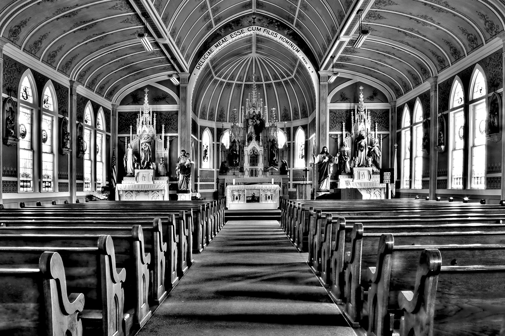
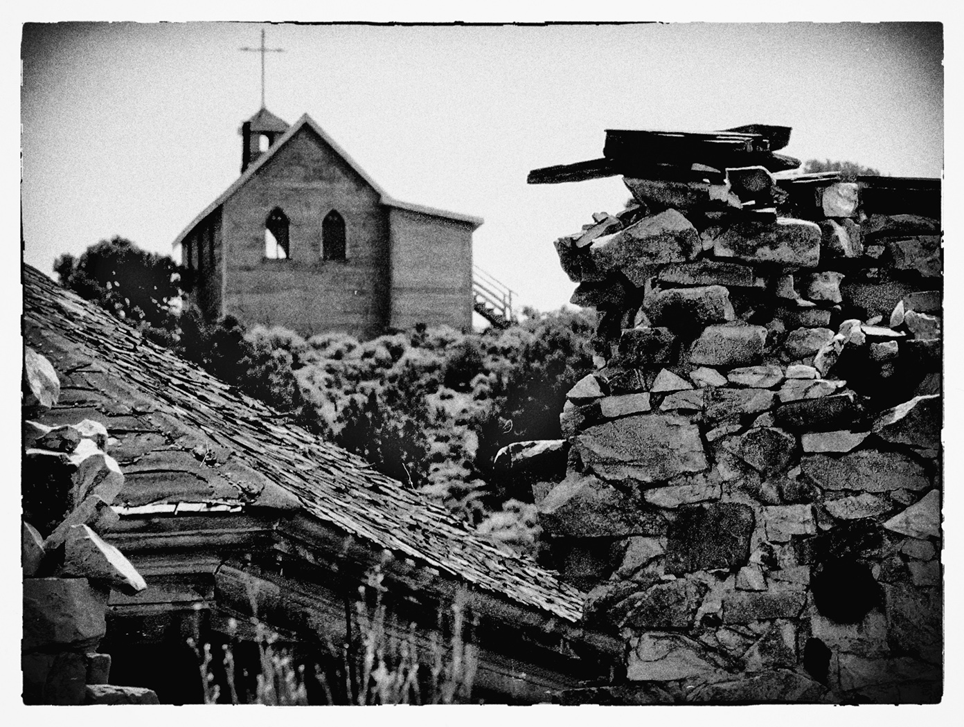
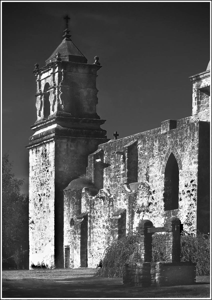
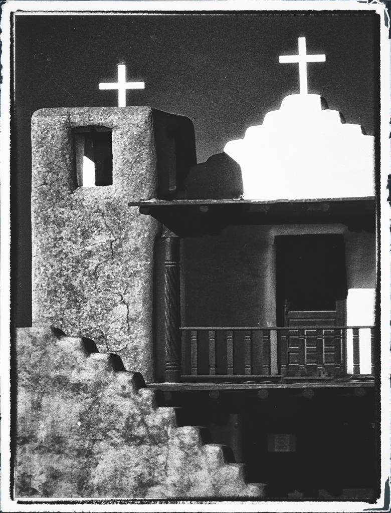
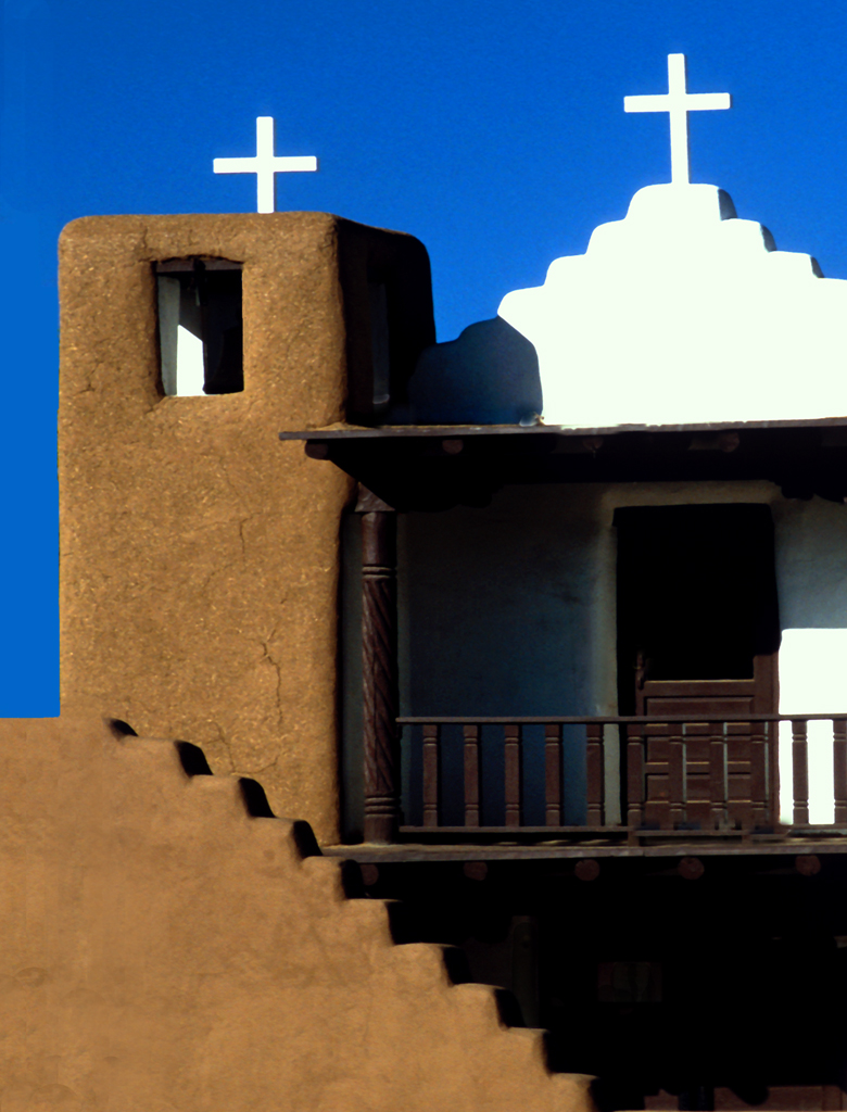
I've been there often when we lived in the Bay Area. One of the best Missions in California's Mission Road.
This is a very nice rendition of the building and surround. The sky wants to compete with the Mission as the primary subject, being as bright and contrasty as it is. However, it is a strong sky, and unusual for the coast.
I like the open door for the "story it seems to want to tell." |
Feb 9th |
| 32 |
Feb 17 |
Reply |
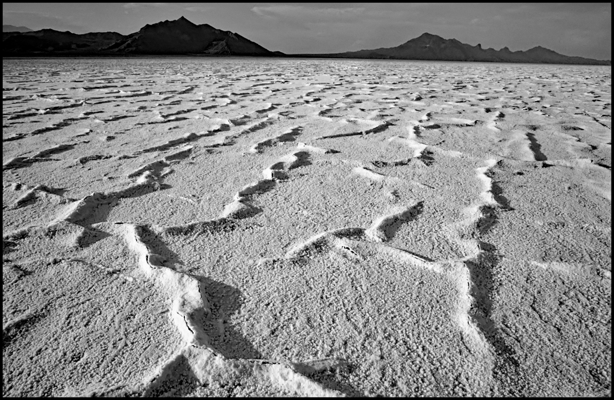
And also in the Canyonlands region of Utah. Try "Kodachrome Basin State Park" |
Feb 9th |
| 32 |
Feb 17 |
Reply |
I think Stephen hit it right on the mark. |
Feb 9th |
| 32 |
Feb 17 |
Reply |
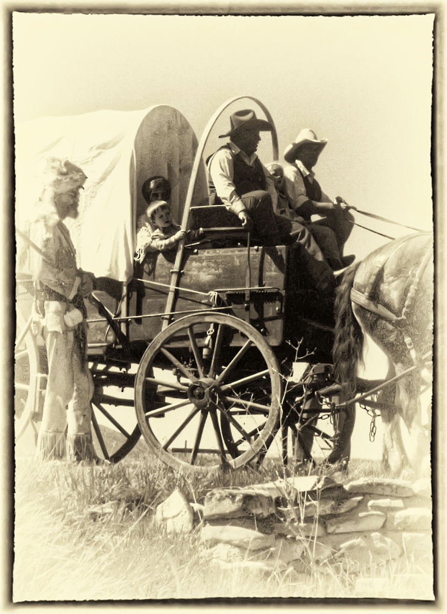
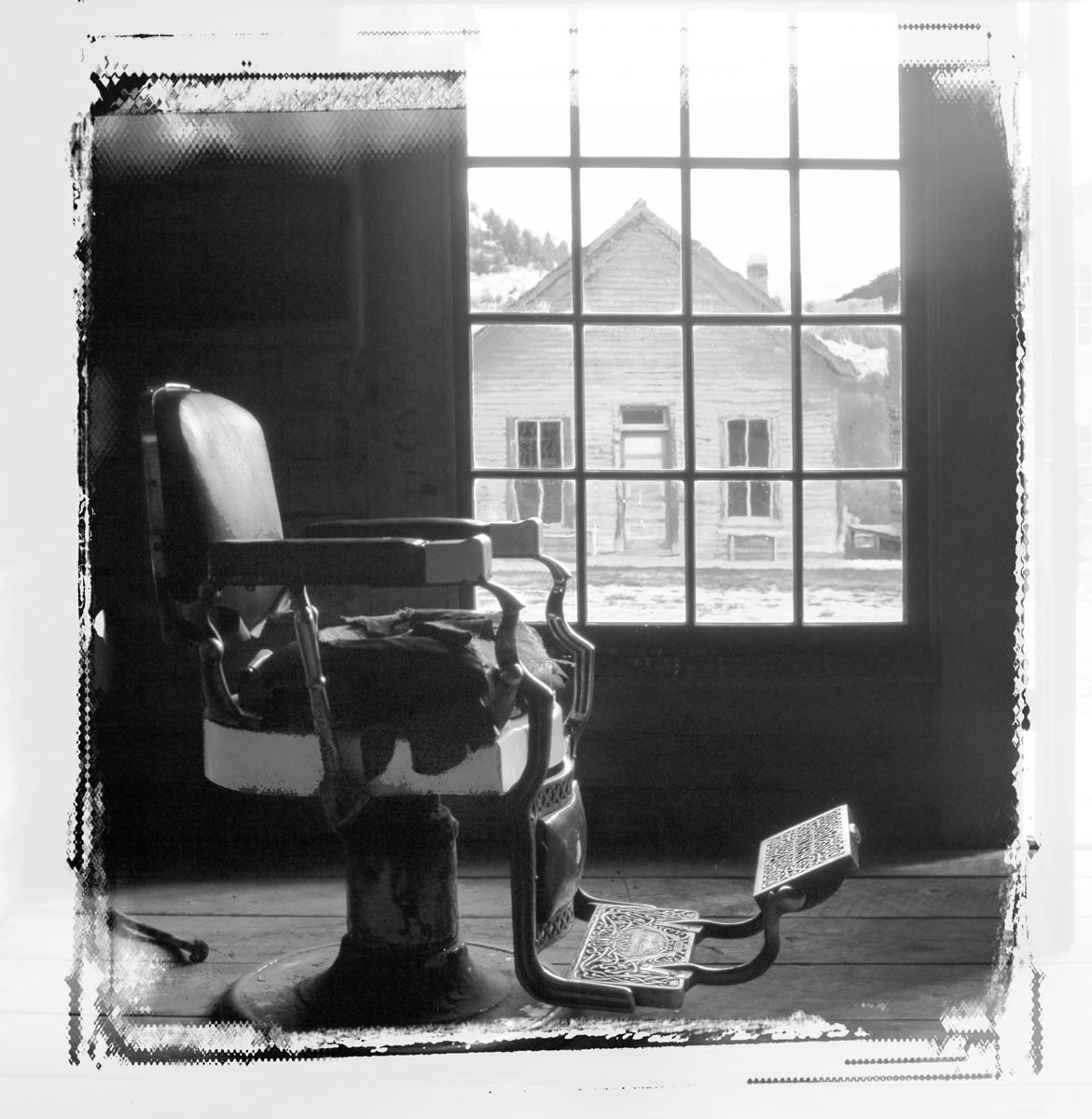
The border is from an old free plug-in from onOne Software that is called PhotoFrame. Don't know if it's still available or if it's free. There was at one time a professional version. Since I installed Nik Suite, I've been using the borders in their programs, but this is a good one, I think.
Here's a clip from the ReadMe:
onOne Software
PhotoFrame 4.6 Free
Release 4.6.5
Release Notes
May 2012
Add the perfect finishing touch to your images with PhotoFrame 4.6. It features design elements like film edges, borders, textures, backgrounds and adornments. It even has complete layouts where you just drop your image in and you are done. It's the easiest and fastest way to add an authentic darkroom touch with a film edge or to create beautiful albums or scrapbook pages. It includes all the tools you need to find the perfect design elements, add them to your image and control things like size, color and opacity. You can even stack multiple elements to create your own designs and save them as a preset you can use again and again.
For customer service and non-support issues please call 888-968-1468.
|
Feb 9th |
| 32 |
Feb 17 |
Comment |
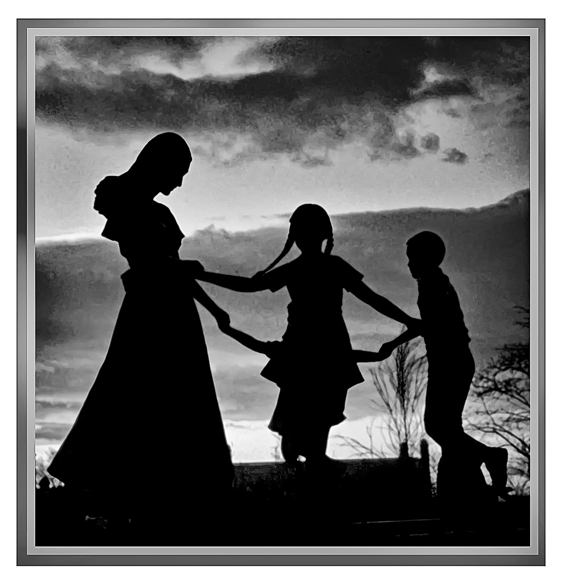
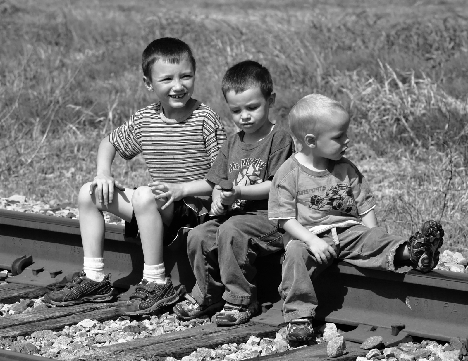
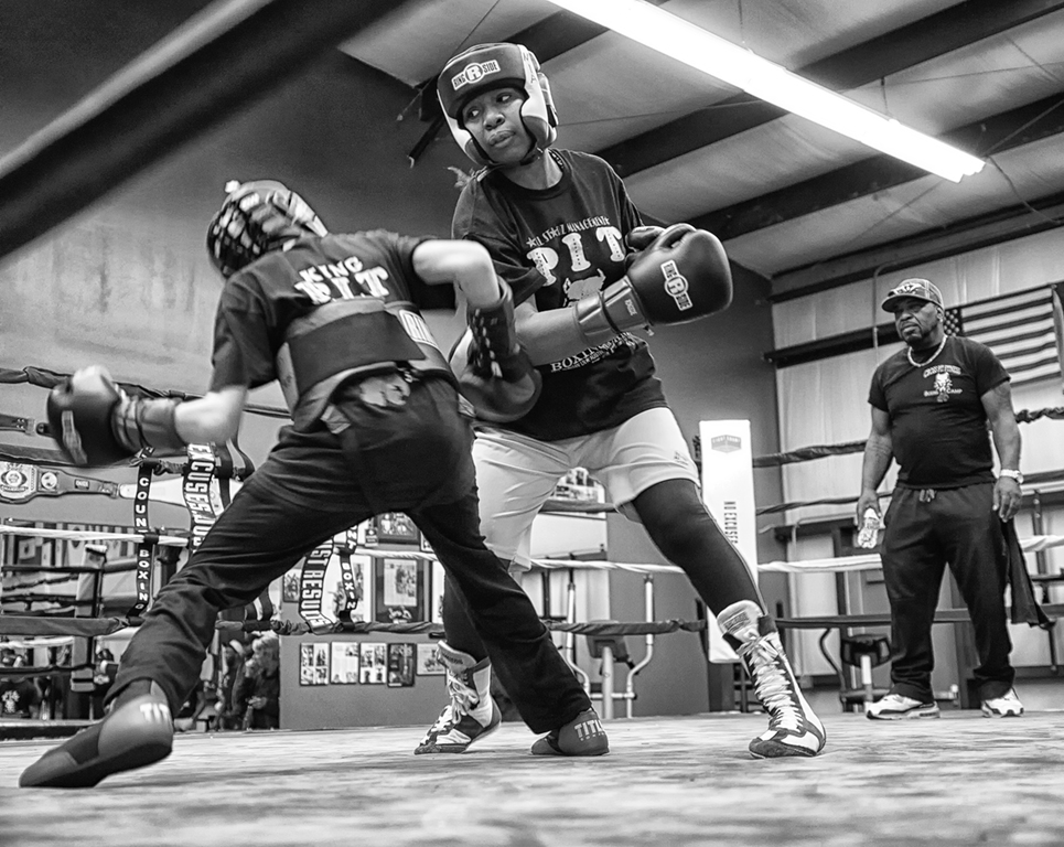
Artistically, the mono is much better than the color. You've done a very nice job separating the people visually so that they're not just a mass of people, but individuals.
Have you considered signing up Jennifer as your attorney?
Very nice that someone got a contemporary photo (and that it is of such strong current interest.) |
Feb 5th |
| 32 |
Feb 17 |
Comment |
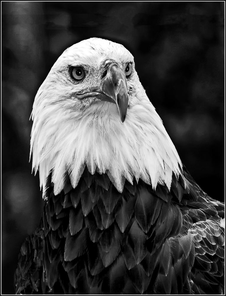
Overdone? With so many birds of all types, a favorite subject in all competitions, I think your effort to do something unusual is a good approach. I've done the poster edges approach and long ago in the film age, I converted some images to "pen and ink and/or line drawings" (that's what they were called then.) I was in an Art Guild as one of the few photographers, and you can imagine that it drove the charcoal and pen/ink people crazy. I think you could burn the background to create a stronger contrast.
Nice composition of a bold looking bird. |
Feb 5th |
| 32 |
Feb 17 |
Comment |
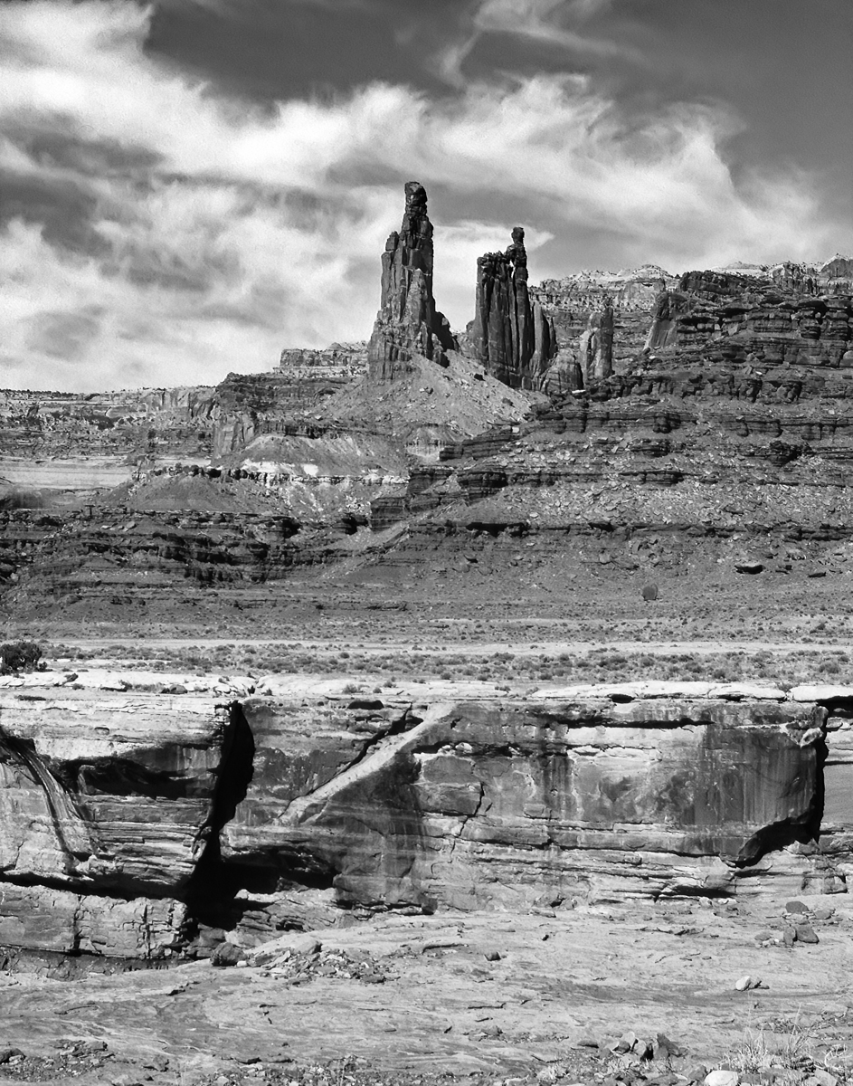
Suggestions? Have you tried to darken the sky so that the primary subject, the totems, stand out more prominently? The grass/and land in the foreground could take a bit of darkening. Looks like southern Utah. |
Feb 5th |
| 32 |
Feb 17 |
Comment |
I mistook it for Mount San Michel off the coast of France. I think you did a fine job creating what looks like a low key image, but still retains some contrast and detail. A very lasrge improvement vs the original color version. Lots of noise in the clouds on my monitor, but so what.....call it a film shot.
|
Feb 5th |
5 comments - 5 replies for Group 32
|
| 55 |
Feb 17 |
Comment |
Congrats on your street picture showing the pedestrians crossing the road..... that appears on the Digital Dialog Home Page slide show. |
Feb 22nd |
| 55 |
Feb 17 |
Reply |
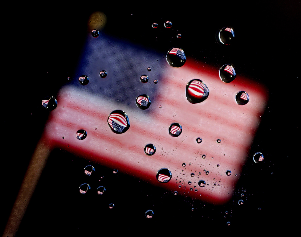
There are ten different photos in the water droplet with the flag. Several on just the tallest water drop, and a couple on the flag itself. The flag is about 10-12 inches below the droplets. I don't know that I needed ten, but in post processing, Helicon only captures and retains those parts of each shot that are sharp (in focus), so when adjusting the lens focus between shots, I start beyond where it is sharp, and then just move the dial of the lens "across" the sharp area and beyond. It seems that it's just better to capture more than needed than fewer and my eyes aren't good enough to see where sharpness begins and ends, so I just do a "spray and pray" as they say. |
Feb 22nd |
| 55 |
Feb 17 |
Reply |
thanks. good idea. I've used straight Glycerin, but never thought of corn syrup.
w |
Feb 22nd |
| 55 |
Feb 17 |
Reply |
The multiple point of interest concept is one I'd over-looked. Thanks for mentioning it.
wes |
Feb 13th |
| 55 |
Feb 17 |
Comment |
I think you live in the Oroville/Colusa area.
Thinking of you as I read the news. Be safe if you're in the flood plain of the dam that is threatened to break. Momentous!
If it does, be sure to get some photos.....and let us know you're safe. |
Feb 13th |
| 55 |
Feb 17 |
Reply |
the flag (background) is all in the degree of focus (or not in focus). The only way to get it is just shoot and then examine the result. Even to the point of taking the memory card out and putting it in the computer. |
Feb 9th |
| 55 |
Feb 17 |
Comment |
I think this would do well in PhotoJournalism competitions where the story has so much importance. The unique-ness of the subject is a strong component. |
Feb 9th |
| 55 |
Feb 17 |
Comment |
It is what it is, and the mantra associated with monochromes tends to have greater contrast. I'm of the school where there is "no right (correct) exposure" so this is fine as it is. If you were to enter it into competition, I think judges have a 'model of a perfect picture' and to get that, you might adjust your mid-tone slider in Levels. (to the left) You do have a Black Point and a White Point. The mid-tones look a bit flat for a competition entry, but it's all in what one likes and what one wants to do with the image. |
Feb 9th |
| 55 |
Feb 17 |
Comment |
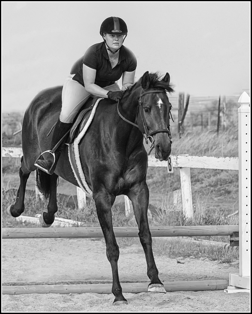
Is this in the Colusa area?
Bringing home a trophy photo is far better than having to clean some ducks, anyway.
A beautiful scene. Nice converging lines. Makes you want to go there.
To my eye, the green grass looks a little hot; and I'm wondering if you could tone it down to make it more natural, whereas right now, it seems a bit contrived (and it doesn't "need the help" in order to be a very nice pleasant scene.)
|
Feb 9th |
| 55 |
Feb 17 |
Reply |
Thanks. both seem to work well.
If you ever print it for an exhibit, it might be interesting to submit both versions. .... or one each to two different exhibits as an experiment.
(I'm certain some others in our group will have an opinion also)
w |
Feb 6th |
| 55 |
Feb 17 |
Reply |
One more comment.
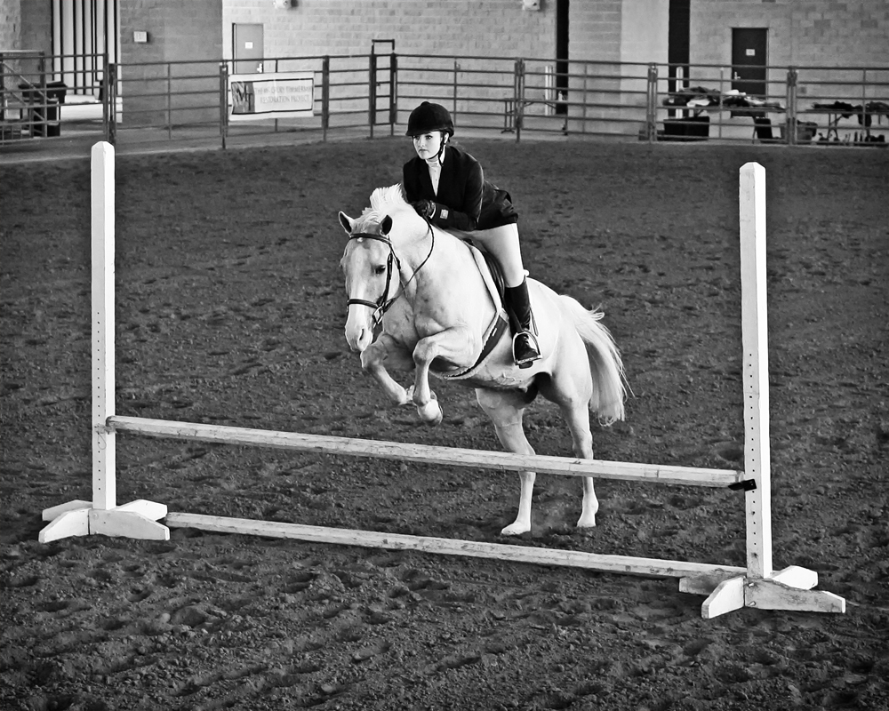
Most of the ski photos I've seen include the gates (or sticks) so these two are appropriate to the subject. Without them, the "lean" of the skier doesn't make as much sense as with them. |
Feb 5th |
| 55 |
Feb 17 |
Comment |
Street photography and PhotoJournalism. Terrific. Our little study group is branching out from its "general" orientation ..... and that's good.
Given the weather, there's nothing more you could have done. It's a keeper. I think it ought to do well in PSA Salons. |
Feb 5th |
| 55 |
Feb 17 |
Comment |
Wow, we've got a really nice batch of PJ images this month.
My first reaction was that you did a HDR series, thinking that there would be a lot of shadows and dark areas. You didn't say whether you did or not, so I'm curious how you got all the colors as clean as they are?
We live in strange times, it appears. |
Feb 5th |
| 55 |
Feb 17 |
Comment |
One question that can go either way is whether you could crop the people out at the left so the image is all about the man. The other view is as you have it which shows the "context" or "environment" the man is in. Could go either way. I'm sure you thought of this (cropping), and I'd be interested in your reason for doing it as you did. It's a super photo that ought to do well in PSA PJ.
I have a personal experience with this type of artistry: In 1973 I hired a Controller who got her educaton in Taiwan (a very smart decision on my part), and her father did this type of painting. I asked her if he would paint one for me which he did. It was the Chinese word for "Crisis" which I was told was comprised of two symbols: Danger and Opportunity. It, too, was on a red satin cloth. I had it framed and hung on my office wall. (it was appropriate to the job and the infant software industry.) Subsequently, I hired the best several other employees of my career. They were all University Graduates from Taiwan and ladies. I'd do it again. The key to success, I was told later, was that you couldn't hire only one and be successful, but if you hired a group it would be a success. |
Feb 5th |
| 55 |
Feb 17 |
Comment |
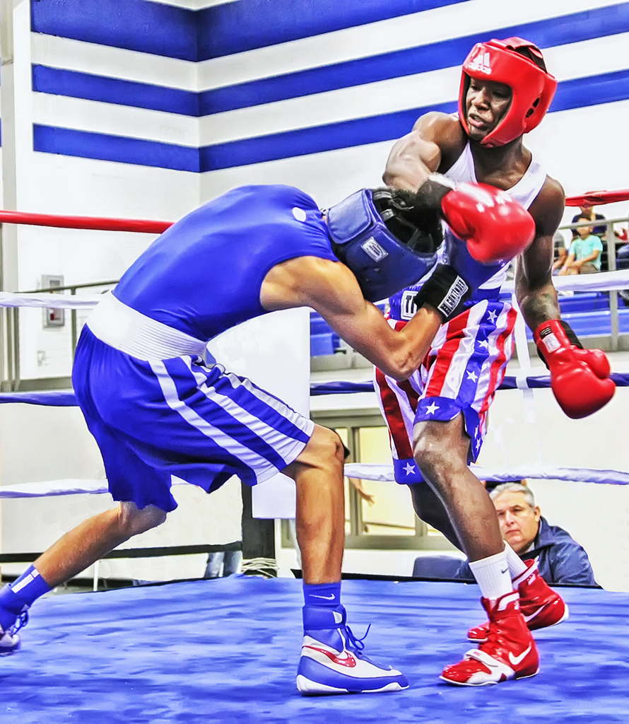
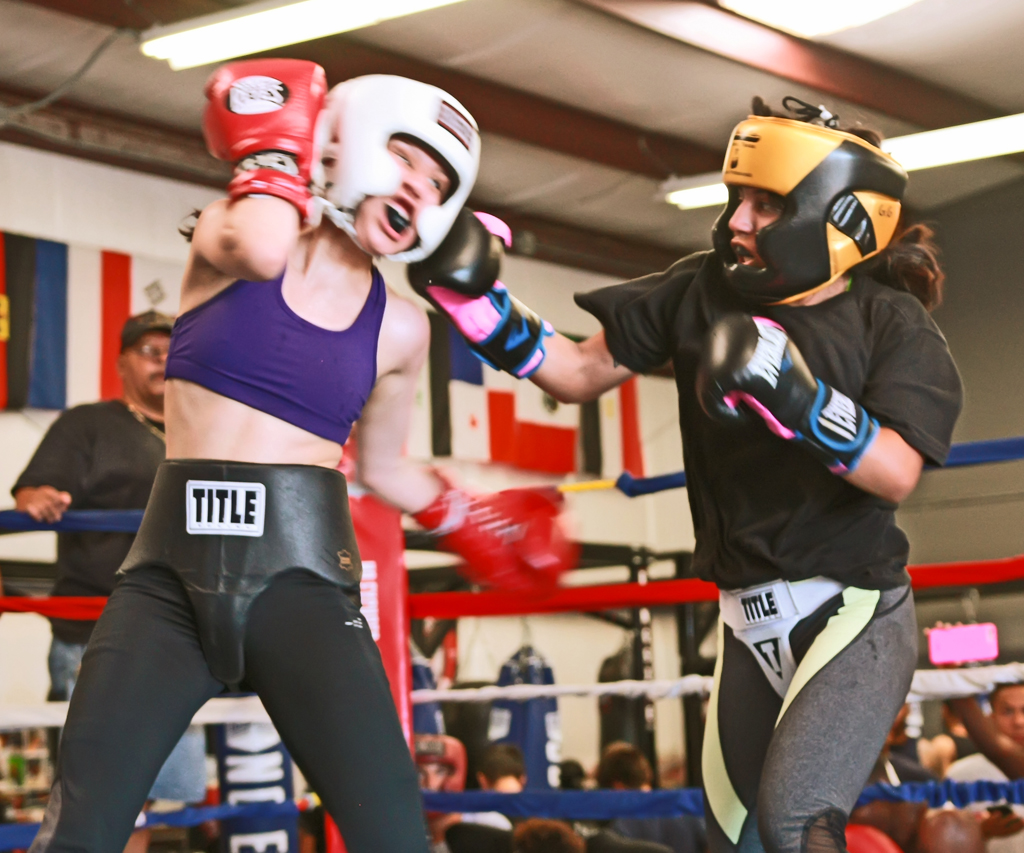
Having lived in Salt Lake and being on an Olympic Committee for the 2002 Games, I had an opportinity to take photos before the games began. Very difficult, and you've done a great job. The thing that drove me nuts was getting the colors of the athletes and their clothing right while getting "white" snow. Nice job. (We used film then, remember film?) In my opinion, and for PJ, one of the nicest things about digital is the "AI Servo" settings for focusing on moving subjects. |
Feb 5th |
9 comments - 6 replies for Group 55
|
14 comments - 11 replies Total
|