|
| Group |
Round |
C/R |
Comment |
Date |
Image |
| 32 |
Jan 17 |
Comment |
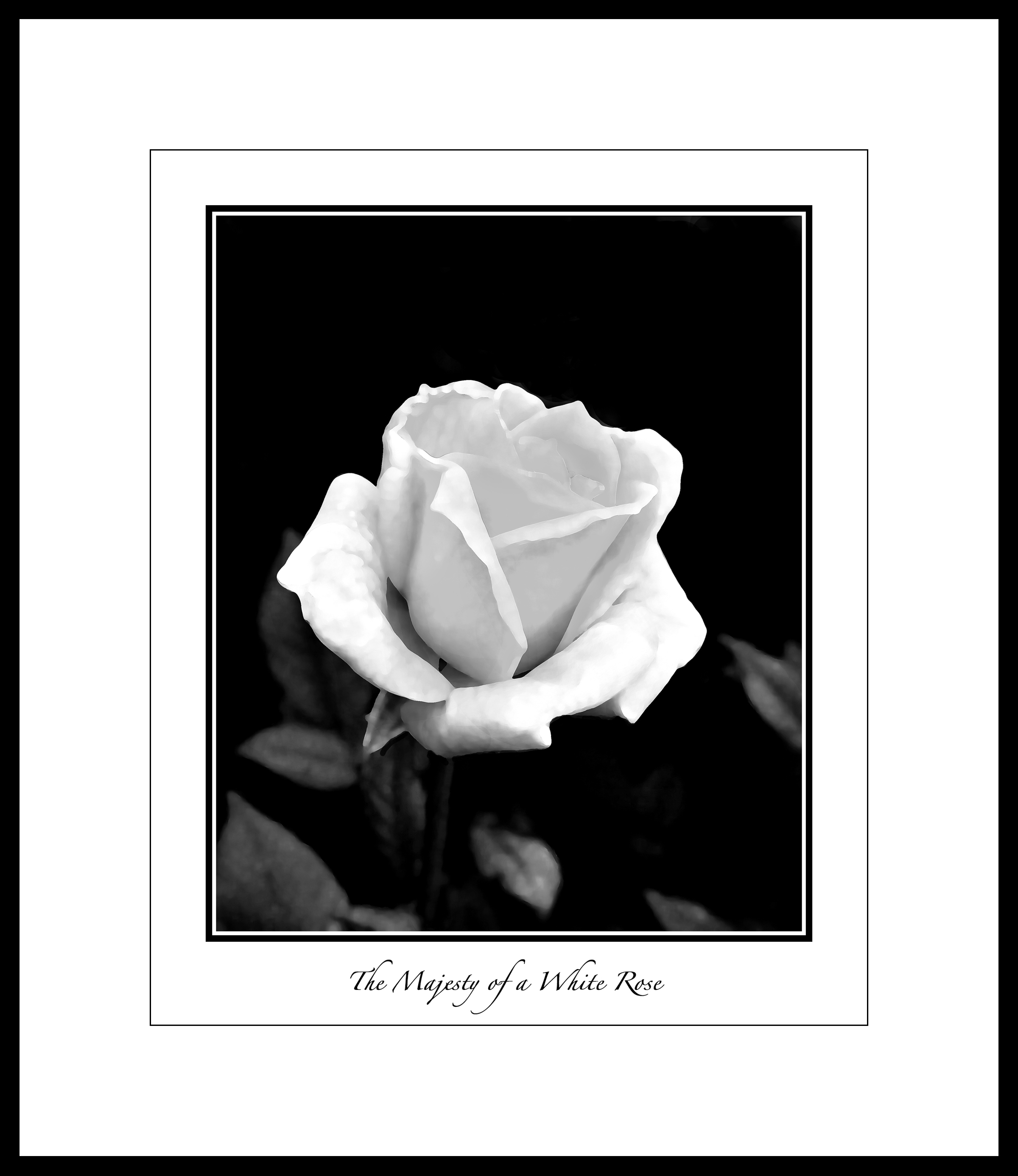
Very nice detail. Super story in the image.
The mono is preferable to the color (to me)
|
Jan 14th |
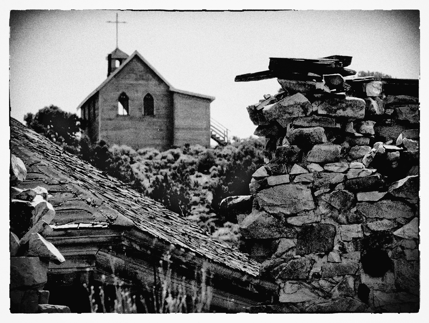
| 32 |
Jan 17 |
Comment |
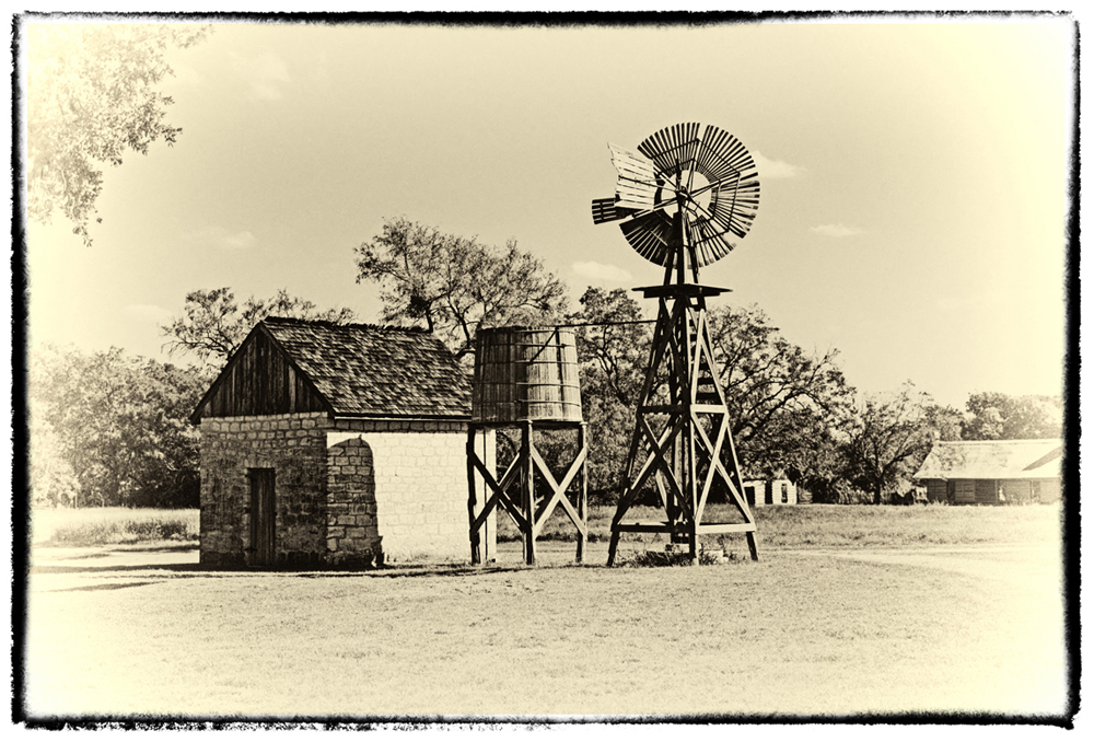
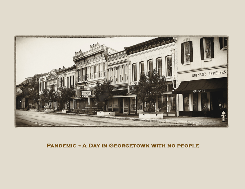
How about just a tiny white stroke around the image? The bottom is now difficult to discern.
Another very creative image.
Print it on some Fine Art Matte paper. |
Jan 14th |
| 32 |
Jan 17 |
Comment |
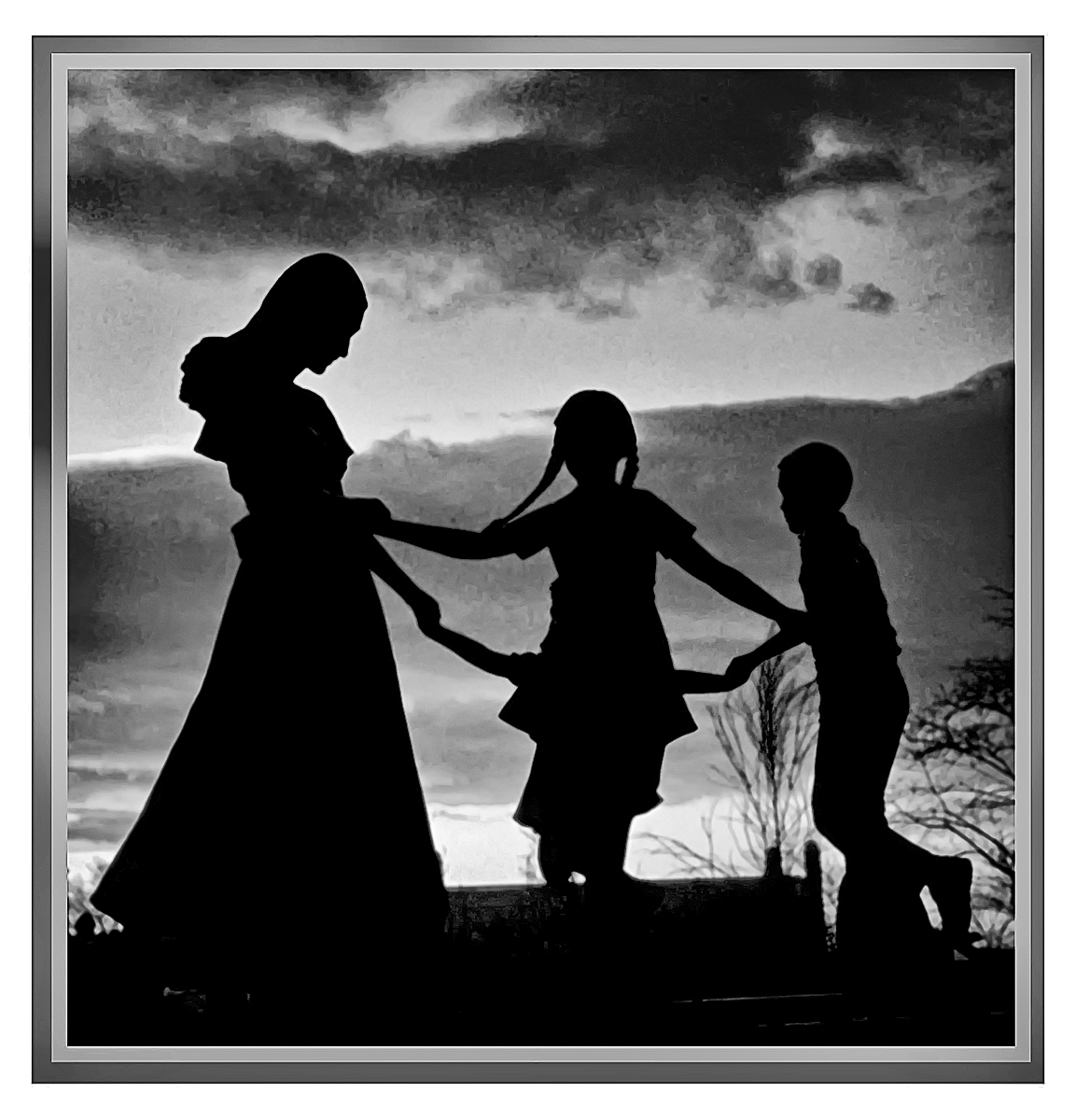
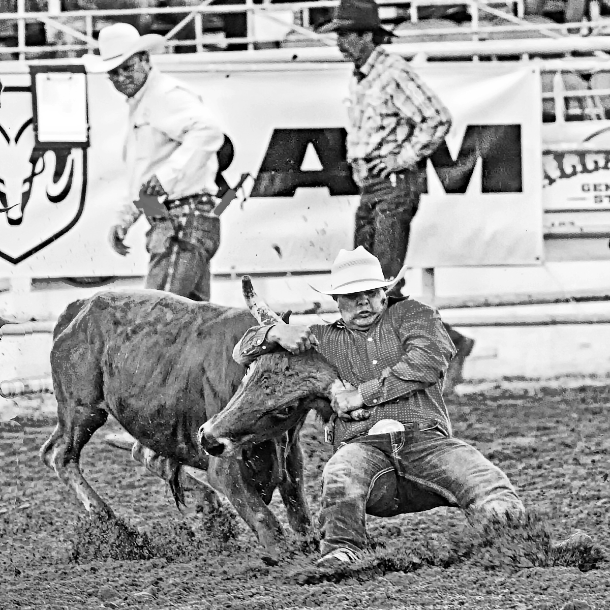
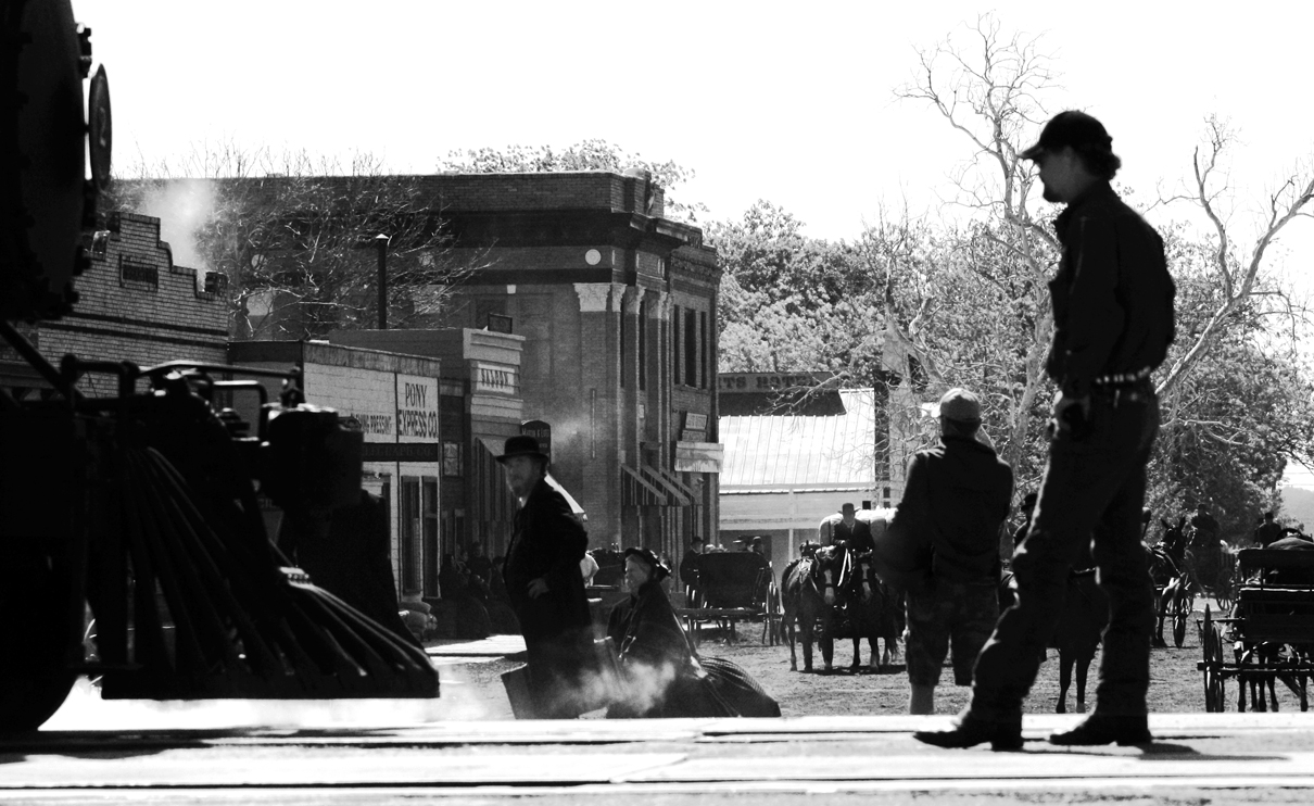
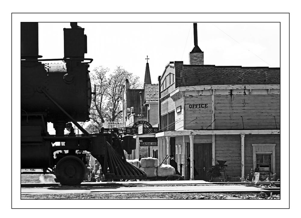
I just finished a judging gig for the youth of the County (The County Fair.) Silhouettes always do well. don't know why. Perhaps that's because we see so few good ones. This one is nice because "it tells me a story." |
Jan 14th |
| 32 |
Jan 17 |
Comment |
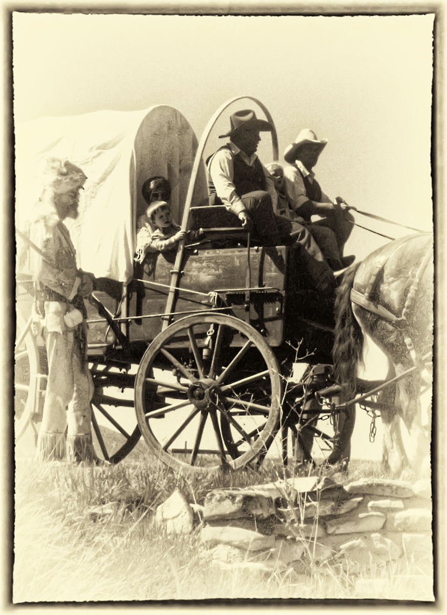
I like the nice details in the faces, especially in the Grandfather's.
It's a rare day that I prefer the color over the mono; and today is not that day.
In the color version the Green of the door and the heavy shadows behind the two are distracting.
I think you've done a very nice job......and the subjects would be delighted with a copy of the print. |
Jan 14th |
| 32 |
Jan 17 |
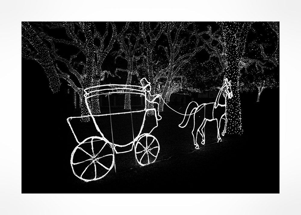
Comment |
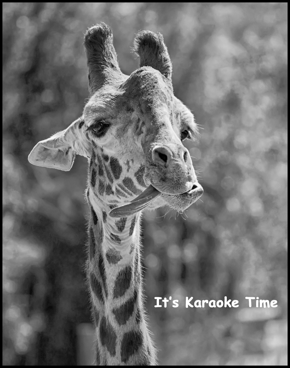
Whimsical, fun.
Nice work. When I try to do this type of thing, I find what gets me "high" that month and then do things on the computer and can't remember what I did. |
Jan 14th |
| 32 |
Jan 17 |
Reply |
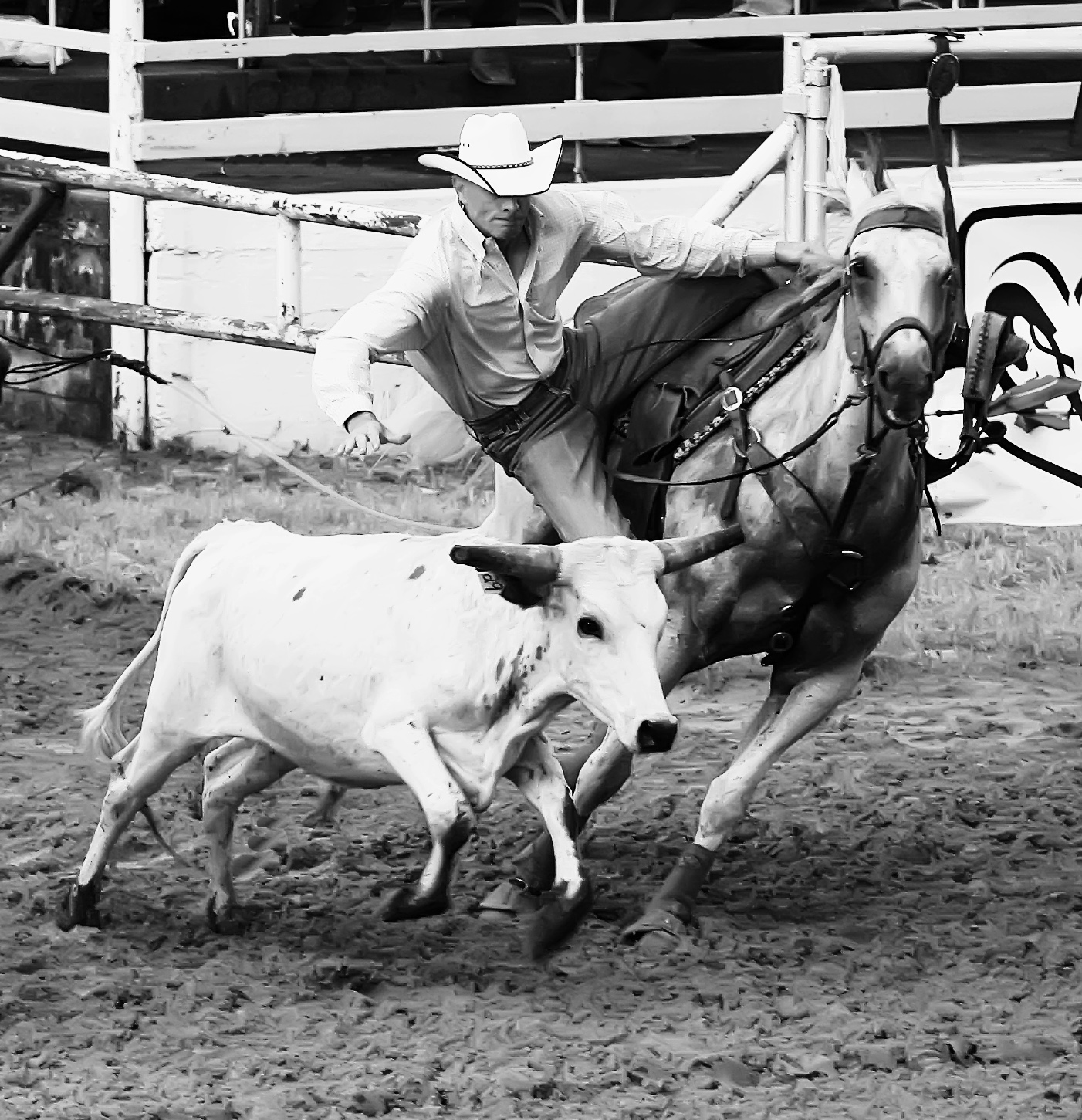
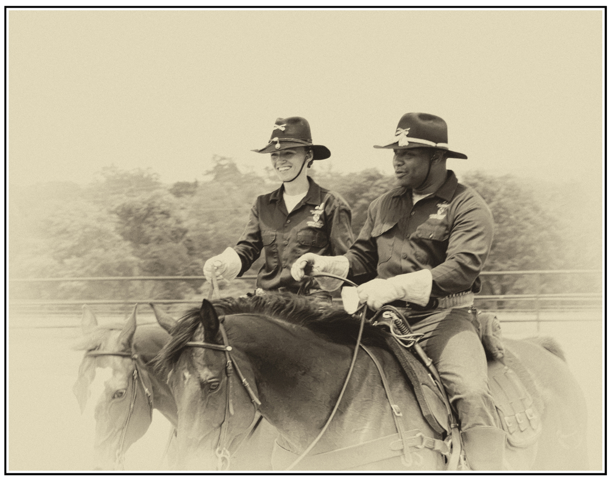
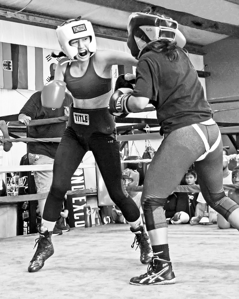
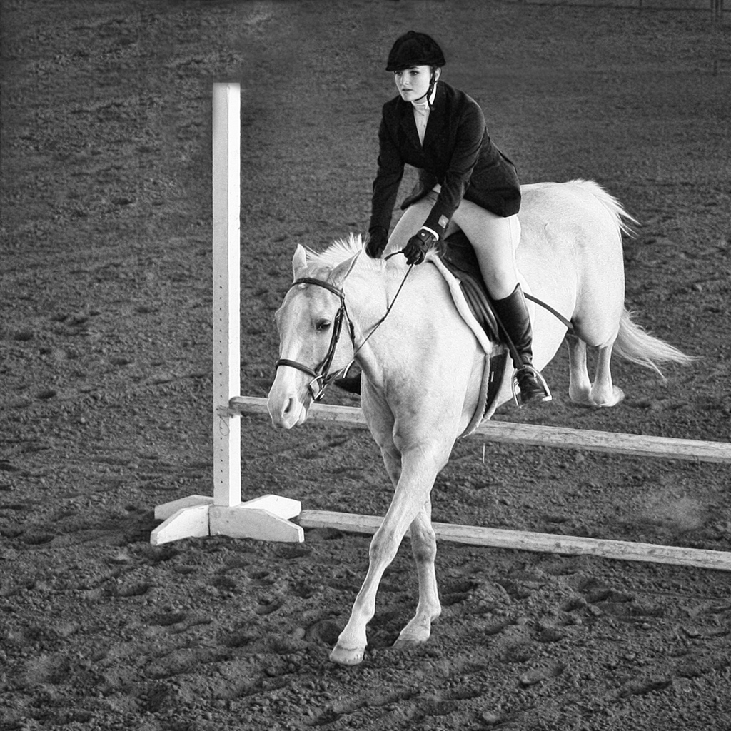
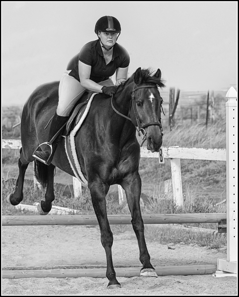
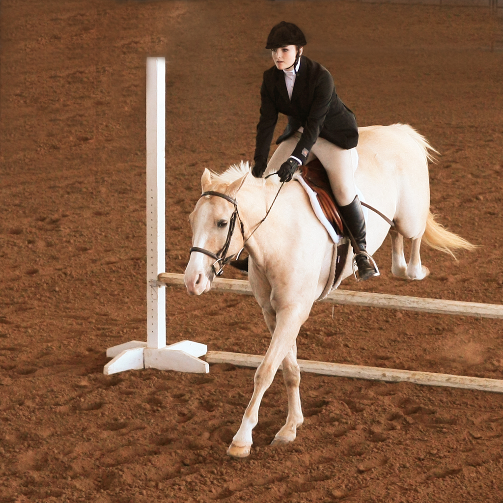
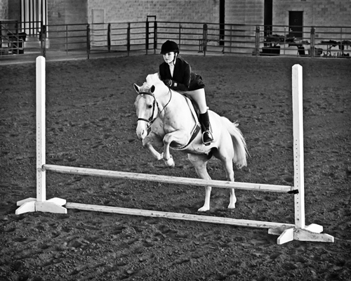
Thanks. How many shots? I was taking pics of several young ladies all circling around the arena and then jumping, so in total probably 40 or 50, but of this one rider, the camera was on rapid shutter and Canon's AI Servo (continuous or tracking focusing). But it's an old camera and the shutter sequences were limited to three at one click. I had a good vantage point, sitting on the "Scorer's Platform", and it wasn't crowded, so that made the effort very easy. I believe I shot about 8 or 10 of her.
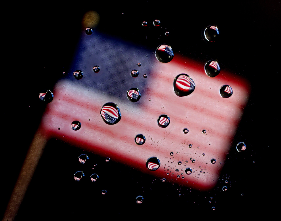
I just got back this and the color version from the Pict Print Division Print of the MOnth. No score on mono, but the color gota 3rd. The Judge's comment on the mono was the walll at the background could be darkened to good advantage. I agree. See attached file. Posted: 01/14/2017 06:32:00 |
Jan 14th |
| 32 |
Jan 17 |
Comment |
|
Jan 14th |
 |
6 comments - 1 reply for Group 32
|
| 55 |
Jan 17 |
Reply |
10-4 |
Jan 25th |
| 55 |
Jan 17 |
Reply |
Hang in there, kid. |
Jan 22nd |
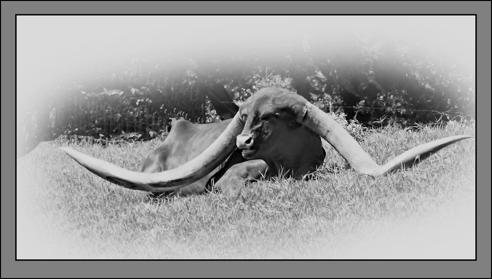
| 55 |
Jan 17 |
Reply |
And you're lucky that you can discern this on a monitor with an image of this few pixels. |
Jan 22nd |
| 55 |
Jan 17 |
Reply |
"Most people" don't like the horizon at the middle. However, "most people" usually do like it when it involves a reflection.
I'm of the opinion that "there are no rules" ..... even when the title includes the word "rule" as in rule of thirds. Try using this: "Suggestion of thirds" and then state what benefit will accrue if the suggestion is followed.
Again: What is the artist's intent? And "Rules were made to be broken" |
Jan 22nd |
| 55 |
Jan 17 |
Reply |
I've been through this discussion before, and where it leads.....
As an example, the word "overly" would refer to some sort of rule or written convention as to what "overly" means? and where it begins. Can you refer to a rule? Absent such a rule, it would seem that the "artist's intent" is the key. Similarly: John Hedgcoe, guru author, states that "there is no correct exposure."
What it boils down to is something like this: Does "it" work for you the viewer, or you the maker? |
Jan 22nd |
| 55 |
Jan 17 |
Reply |
OK, but pray tell: What does "oversharpened" mean?...... especially when using an L lens on a tripod? |
Jan 22nd |
| 55 |
Jan 17 |
Reply |
Thanks.
Yes, I did and I tried several different things.
Have to admit that the suggestion to make it a portrait view wasn't my idea, but after doing it, I'm happy with it.
I guess it falls into the Composition category of "Less is More." |
Jan 15th |
| 55 |
Jan 17 |
Comment |
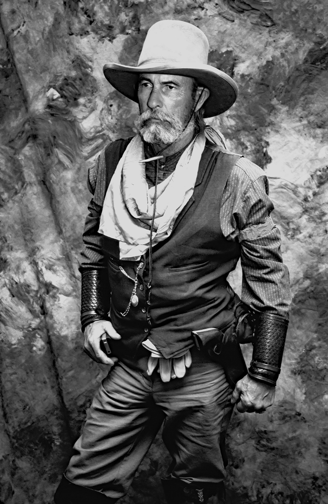
This is now my Facebook's Home Page "personal portrait." |
Jan 14th |
| 55 |
Jan 17 |
Comment |
Your comments about trials and errors are right on the mark.
It shows that you are not just doing "happy snappies," but have a good idea of what you want to end up with . The sign of a serious photographer.
I always enjoy your work. Very creative. I'm going to be teaching a 16 week class soon and will be using some of your images to illustrate panning and creativity. |
Jan 14th |
| 55 |
Jan 17 |
Comment |
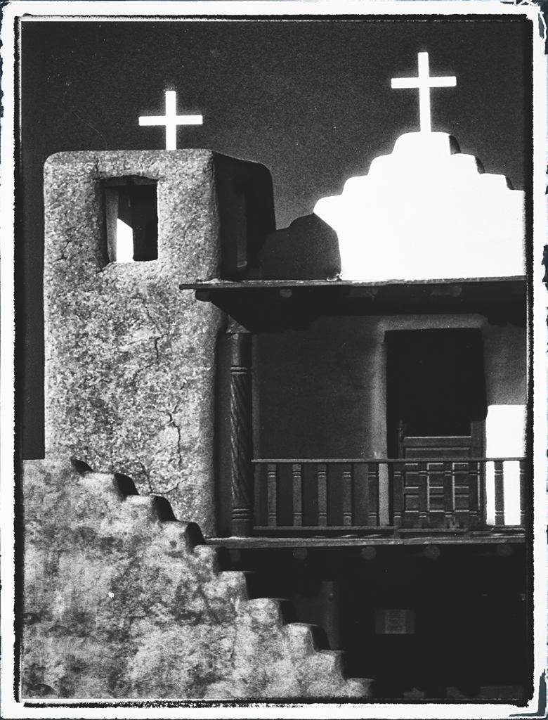
A well-captured hazy morning scene. Just enough detail in the boat-house so it's not blocked up.
I can see this successfully printed and framed on a heavy fine art paper with a simple matt and frame. Perhaps a Watercolor paper? You ought to have a lot of fun working on the print and getting something unique. |
Jan 14th |
| 55 |
Jan 17 |
Comment |
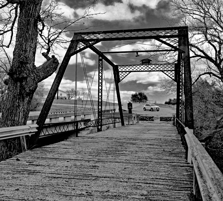
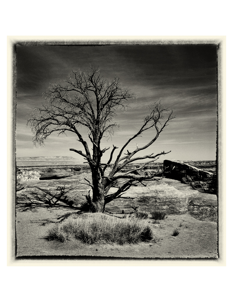
All I can say is:
"Wow"
A great shot.
PS: This image successfully breaks the admonition to not run the horizon down the middle. |
Jan 14th |
| 55 |
Jan 17 |
Comment |
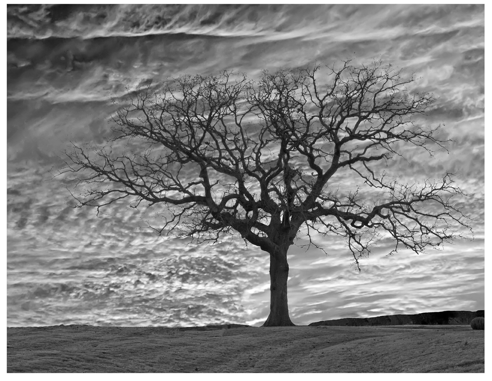
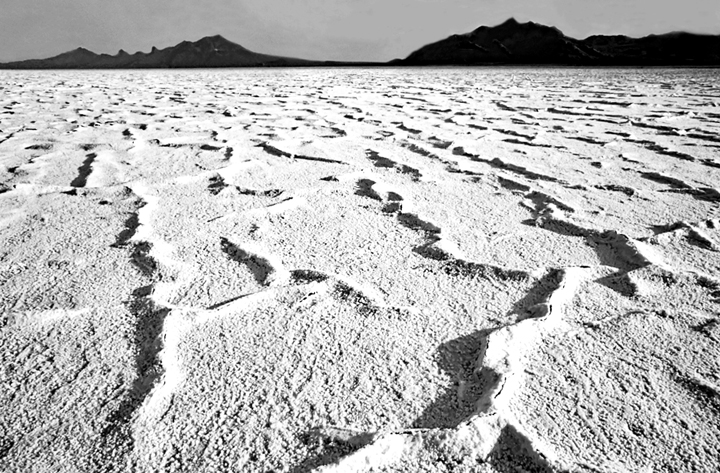
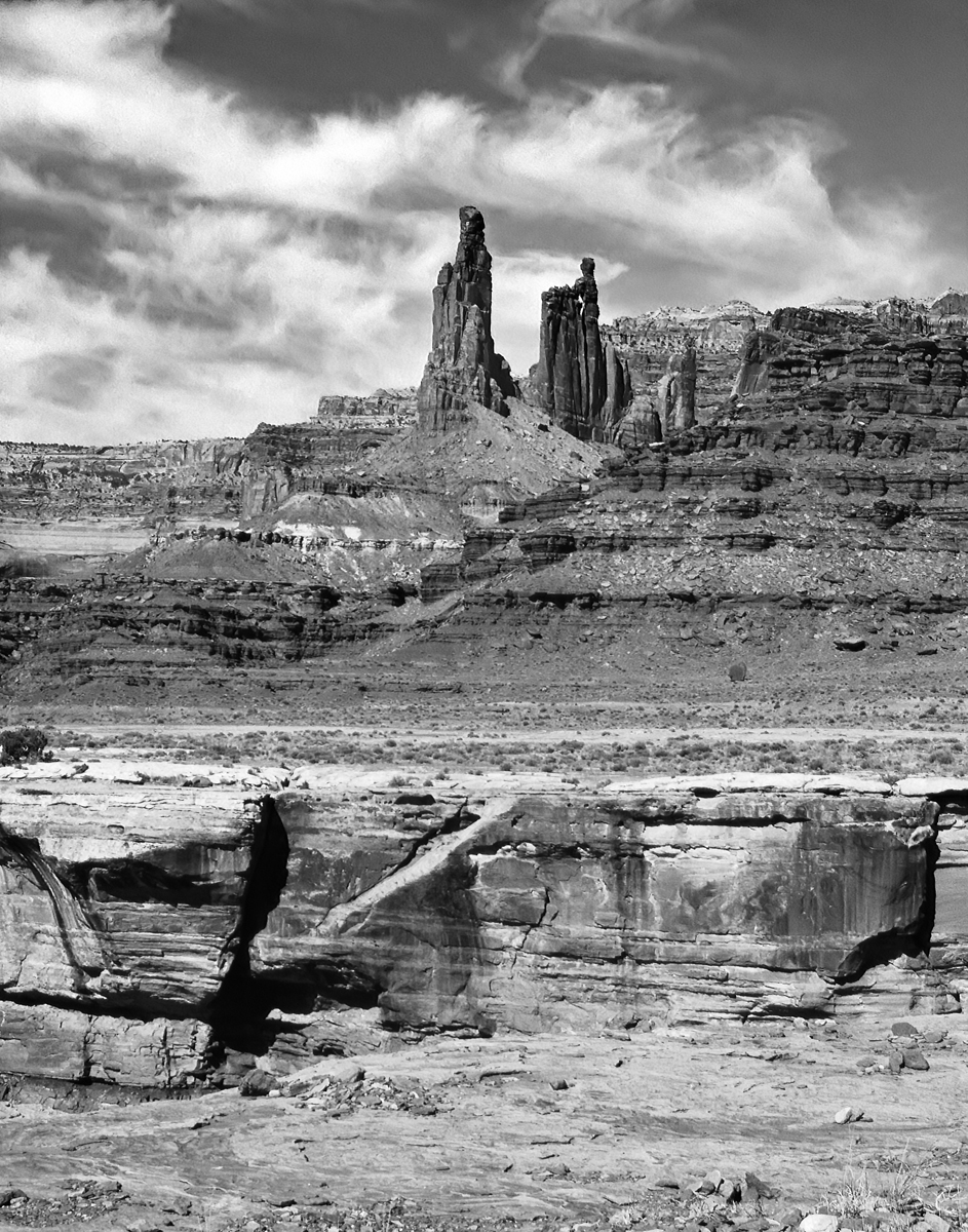
A very nice composition, sharp and nice depth of field.
Could you try to get more darks (blacks) in the image? I think that would improve it, ..... maybe try to pop one of the clouds with some brighter white?
Looks like a super "work in process" that can print well. |
Jan 14th |
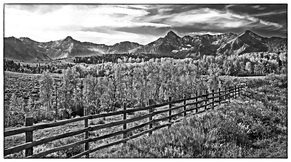
| 55 |
Jan 17 |
Comment |
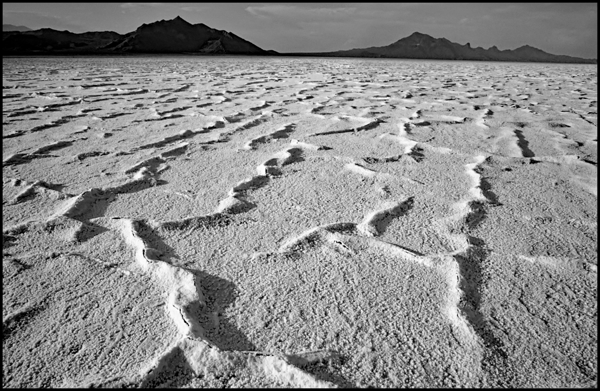
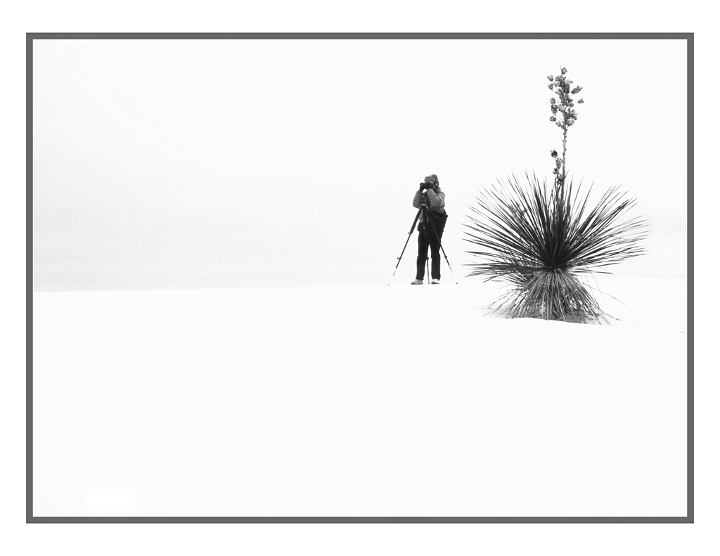
Looks very cold.
Do you need all of the empty sky at the top?
I think just a bit less and then try to get more contrast and detail in the cloud, if you can.
Cold: We're now sufferring through nights down into the 50s and 60s. |
Jan 14th |
6 comments - 7 replies for Group 55
|
12 comments - 8 replies Total
|