|
| Group |
Round |
C/R |
Comment |
Date |
Image |
| 49 |
Jan 25 |
Comment |
Wow. I never would have guessed about the stick that you removed. Great job. I love the colors on this bird. I struggle with birds because there is such a variation in colors and textures due to the feathers, sticks/trees, etc. but I enjoy what you have done here. I especially like that you kept the bird center and focused while melded the background together and darkened so the bird really stands out, but not so much that's it's distracting, if that makes sense. |
Jan 29th |
| 49 |
Jan 25 |
Comment |
This is an interesting photograph and one I would not have thought to take honestly. I like how you focused on the center of the flower and the flame like center. I do find that the angle of the center draws my attention to the top of the photograph and away from the center and I have to intentionally keep going back to the center. For me, it's probably the obvious difference between what's in focus and what's not, but I also have an eye that tends to "float up" to see the "rest" of the photograph. I like the thought that went into this. |
Jan 29th |
| 49 |
Jan 25 |
Comment |
I love taking photographs of the interior of church's and capital buildings, especially the rotunda's. You are correct, the normal instinct is to go wider because they usually have so much detail in them that to show the wide photo gives the "whole story."
I like what you did here with the composition as I can "feel" the height of the rotunda in the pic for the most part, and can imagine the full rotunda if I'm so inclined. I also like the level of detail you were able to get around the lights, even though, as mentioned above, the lights look to be blown out (most likely due to the image quality required for these). |
Jan 29th |
| 49 |
Jan 25 |
Comment |
I like the light that you have here with the model. I don't know anything about portrait photography, but I like what you did in regard to the skin tones and pores, but I feel that the photograph is a little too soft in regard to the model's hair and how it softened her hand in her hair. It almost makes it look a little blurry in some areas, but not in others, but also a little unrealistic for how up-close the portrait is. |
Jan 29th |
| 49 |
Jan 25 |
Reply |
If you were to darken this, how would you do it? |
Jan 29th |
| 49 |
Jan 25 |
Reply |
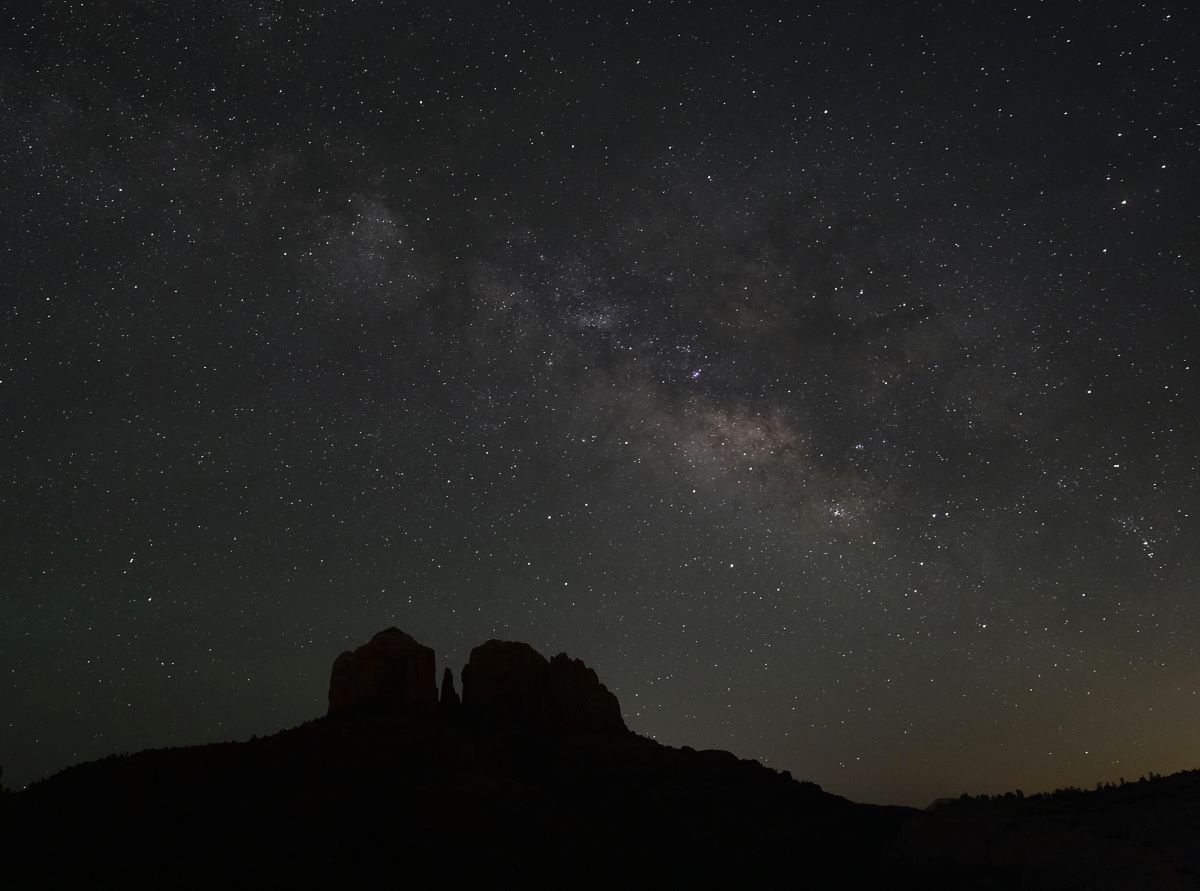
I see what you mean about cropping on the right to the high point, kind of gives it a better spot than the dip that is right after that. For the gradient in the sky, the original photo is not like that at all so I'm going to assume that it's due to the low image quality that we have to go to. In some ways I feel that I could have cropped more of the sky out, but also feel that it works this way as well. |
Jan 29th |
4 comments - 2 replies for Group 49
|
4 comments - 2 replies Total
|


