|
| Group |
Round |
C/R |
Comment |
Date |
Image |
| 96 |
Jul 24 |
Comment |
Hi Gloria,
Thanks for your thoughtful comments.
I appreciate your notion of cropping on the left side to eliminate the half building.
|
Jul 23rd |
| 96 |
Jul 24 |
Reply |
Hello Haru,
Thanks for your considered comments. I appreciate your thoughts.
It is great to hear what other photographers think about composition.
I look forward to possibly interacting with you in the future. |
Jul 15th |
| 96 |
Jul 24 |
Comment |
Hi again, Bob,
In reviewing my response to you, above, I realize that I forgot to mention that your improvements to my image are much appreciated. I actually never thought of removing anything from my images. Your suggested edit definitely improves the overall scene!
Cheers, Rick |
Jul 15th |
| 96 |
Jul 24 |
Reply |
Hi Robert (unless you prefer Bob),
Thanks for your cogent response to my image.
Honestly, it is among the most perceptive comments I have received over the past many years. Thanks for your observations!
I enjoy scenes embodying high dynamic ranges of light. While I don't expect to see the surface of the sun or any detail within a specular highlight reflected off a chrome car bumper, I nevertheless would ideally want to start with a RAW data file that is as bright as possible without blowing any highlights. The reason for that desire is to maximize the amount of data collected. When am faced with a data file that expands beyond what the histogram can record, I find that a Linear Profile most often is my best bet.
A linear image profile (tone curve) is for images containing a dynamic range of data beyond what your sensor can record. The conventional profile is non-linear (not a straight line).
The main drawback of the linear profile is that, at least initially, the image
looks worse onscreen . . . usually more dull. The big advantage for me is that I can preserve all the data and be able to control the Tone and Color to my desired preference.
The "Auto" button in Lightroom or Photoshops ACR filter generally does a very good job of restoring the image to a more "normal" appearance after applying the linear profile.
In fact, the "Auto" option with a linear profile often looks better than the
"Auto" option combined with one of the standard Adobe Raw profiles. After optionally clicking on the Auto Button, you can just go through your editing workflow as usual.
You can download the linear profile for your specific camera model from Tony Kuyper's website. Every camera model requires its own specific Linear Profile.
Once you have it on your computer, it will always show up as an editing option in the profiles section of your RAW editing software.
https://goodlight.us/Installing_and_Using_Linear_Profiles.pdf
|
Jul 15th |
| 96 |
Jul 24 |
Comment |
Hi Bruce,
I love the contrast in your image.
In an architectural image, it would be best to maintain the verticality of the building even though it appears you had to slightly tilt your camera upwards which results in the impression that the building is slightly tilting backwards. You might also have had the chance to use a wider aperture focused on the building itself. That would have resulted in a more purposeful "out of focus" plant in the foreground, giving more prominence to the building itself. |
Jul 10th |
| 96 |
Jul 24 |
Comment |
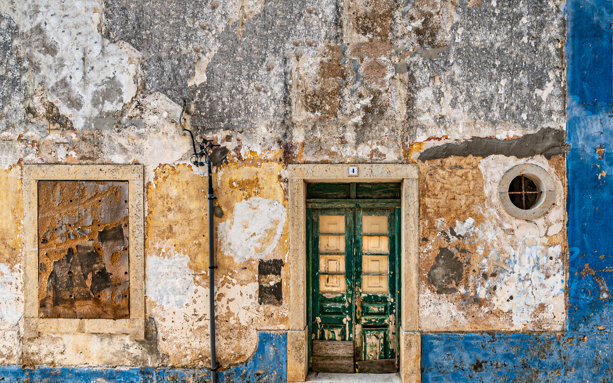
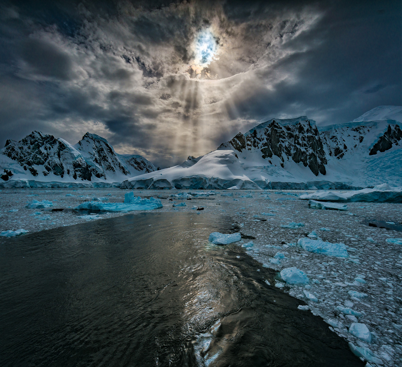
Hello Gloria,
Thanks for sharing your image.
The rock and water reflection colour is beautiful.
I would have suggested to employ a faster shutter speed at a wider aperture, but assuming the ship was moving, using a tripod appears to have worked. A wide aperture would facilitate a shallow depth of field making the rock formation "pop" a bit more. You might consider a bit of a gradual "light fall-off" in the sky towards the top of the image which would focus the viewer's attention on the rock even more.
I could also see cropping a bit off of the left side of the image for an overall balance, but that may just be a personal thought. |
Jul 10th |
| 96 |
Jul 24 |
Comment |
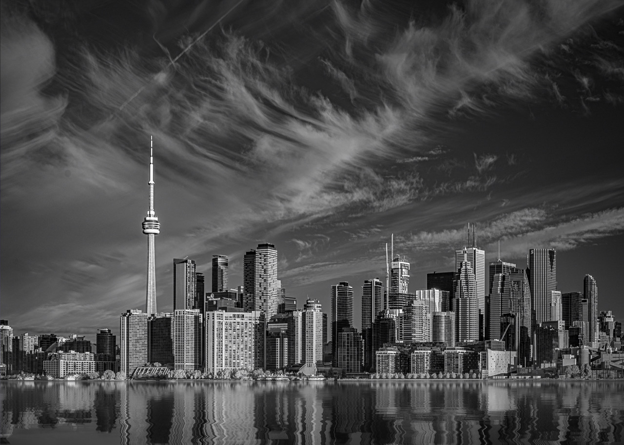
Hello Viren,
I enjoy Architectural Photography and your image is no exception.
You recorded an excellent "orthogonal" view of the facade.
One thing that is important in a clarity of imaging is to try to avoid objects or elements from sharing the exact same edge, including the edge of the image itself.
So . . . I appreciate the fact that the flag on the roof of the building in the distant right side of the image does not touch that frame edge.
I appreciate the fact that the left image crop cuts through the window glass as opposed to lining up exactly with one of the window mullions.
I appreciate the "breathing room" at the top of the image.
I appreciate the fact that the heads of the 3 seated people do not line up exactly with the building base.
I would be happier if the tires of the vehicle in the lower right also enjoyed a bit of breathing room at the base of the image.
Part of me wishes the the tone in the sky was more in contrast with the building face. I know my comments may seem trivial, but your image is worth the analysis.
Finally, the fact that the vertical edges in the scene are all portrayed as vertical is wonderful!
|
Jul 10th |
| 96 |
Jul 24 |
Comment |
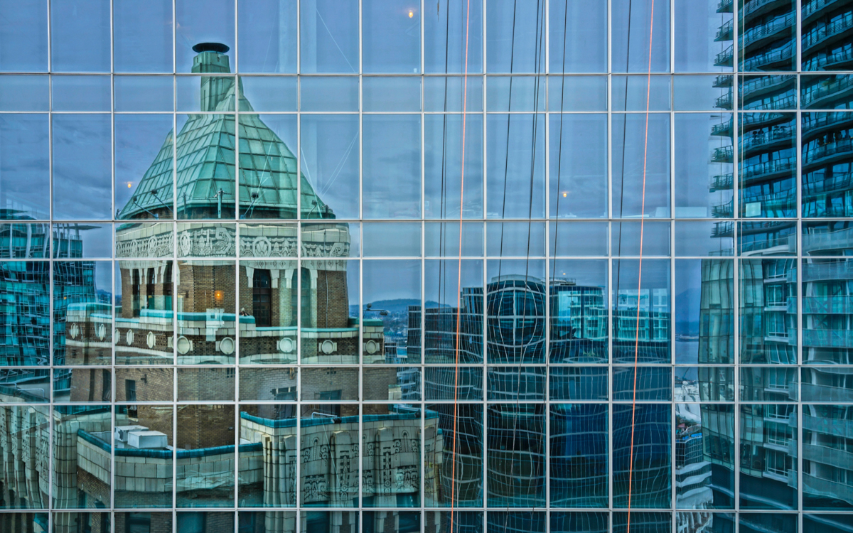
Hi Bob,
Wonderful scene!
I think you did a great job in conveying the sense of depth.
The image beckons the viewer to explore the scene in search of any sense of detail in the distant context . . . and that exploration would be successful!
This is the kind of image on a gallery wall that would encourage a beholder to have a seat and contemplate the subject over time.
|
Jul 10th |
| 96 |
Jul 24 |
Comment |
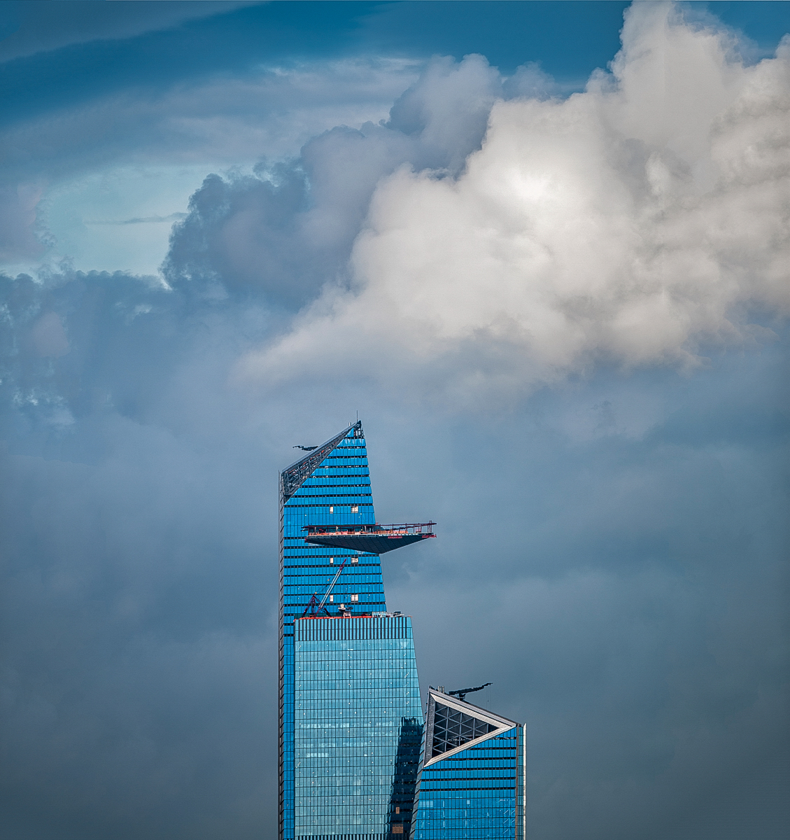
Hello Howard,
Wonderful light!
The distant fog makes it hard to see if the horizon is level.
Thanks for sharing your image |
Jul 10th |
| 96 |
Jul 24 |
Comment |
Hello Haru,
Great Graphic!
I love the complex geometry.
Part of me wishes that the top edge of your image had a bit more "breathing room".
It appears that your digital silver frame has a slightly reduced opacity, which is a very creative idea. |
Jul 10th |
8 comments - 2 replies for Group 96
|
8 comments - 2 replies Total
|