|
| Group |
Round |
C/R |
Comment |
Date |
Image |
| 32 |
Aug 24 |
Reply |
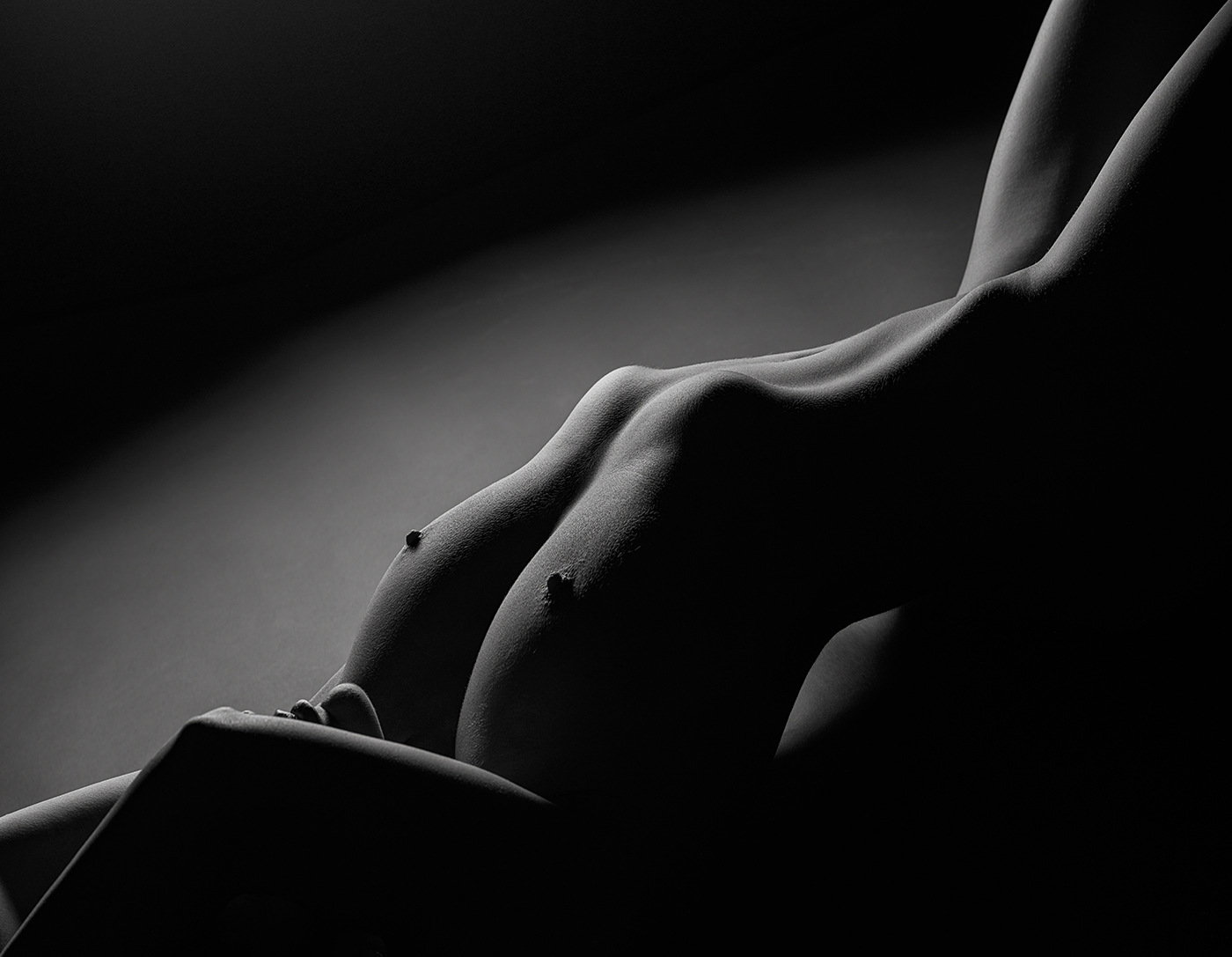
Diana, my idea is to slightly change her shape, as I do not feel uncomfortable with the current shape as you do; it is just an issue of proportions :-) |
Aug 16th |
| 32 |
Aug 24 |
Comment |
You have perfectly captured the moment, Wes, and this is not easy!
I think the image could be improved by reducing the excessive brightness of the cowboy arms and of some parts of the calf, together with the white fence. Let me insist in using luminosity masks to selectively reduce such excessive brightness, and sorry for my insistence :-)
|
Aug 15th |
| 32 |
Aug 24 |
Comment |
Congratulations for your image, Tom! I find it very well resolved, with vertical lines which are really vertical and horizontal ones almost perfect. I would not touch anything... |
Aug 15th |
| 32 |
Aug 24 |
Comment |
Nice image, Stephen, especially bearing in mind that it was taken around fifty years ago!
At first, before reading your text, I saw a lot of grain in the sky and I thought that the spots we can see were dust in the sensor!!! After reading your text, I guess these are the ballons you mention.
I agree with Somdutt, probably a selective treatment of the shadows would improve the image. |
Aug 15th |
| 32 |
Aug 24 |
Comment |
I think the high-key treatment of the image is a very original idea. The result is spectacular and very delicate. However, with my calibrated monitor I hardly see details on the right side of the bear, which blends with the snow. Perhaps a selective reduction in brightness could further improve an image that I consider fantastic. Congratulations! |
Aug 15th |
| 32 |
Aug 24 |
Comment |
To begin with, congratulations for this sharpened image of a butterfly!
I agree with Stephen, it is a bit difficult to separate the butterfly from the flower, and surely monochrome version does not help in that sense. I think Diana is right and perhaps this kind of images work better in colours. And, as suggests Somdutt, the full leaf might improve the image. |
Aug 15th |
| 32 |
Aug 24 |
Comment |
Nice image, Diana. Personally, I like very much the combination of lines and curves, together with the angles. The black and white version is almost perfect, maybe some few pixels of the lights are a bit excessive, but this is a minor detail, absolutely acceptable.
I agree with Somdutt, perhaps a slightly lower focal length would help to improve this excellent image. |
Aug 15th |
| 32 |
Aug 24 |
Reply |
Thank you very much for your note of criticism. I am afraid there is nothing I can do: this is the normal shape of the model in this position and, to be honest, I do not dislike it al all. From my point of view, head downwards is important in this kind of positions, and I know it because I have taken photos with the head in a regular position and I did not like the results.
I find useful to know that a person with a high photographic experience like you does not like this shape, because it has been a criticism I really did not expect. So I had a second look at the image and the only thing I would change would be to reduce the size of her thorax, which seems to be bigger that the real one. I will try it! |
Aug 15th |
| 32 |
Aug 24 |
Reply |
Thank you very much for your comment, Somdutt. What you suggest with regard to the face could probably work well, but that would be another image. I this case, as I have told to Stephen, I wanted an anonymous image, but just showing lips and chin... |
Aug 15th |
| 32 |
Aug 24 |
Reply |
Thank you very much, Wes!! |
Aug 15th |
| 32 |
Aug 24 |
Reply |
Thank you very much for your kind comment, Stephen! In this image I wanted to hide the face of the model, but lips and chin, to give a touch of mystery.
I like very much diagonals when composing a photo, as I think you like it! |
Aug 15th |
6 comments - 5 replies for Group 32
|
6 comments - 5 replies Total
|