|
| Group |
Round |
C/R |
Comment |
Date |
Image |
| 32 |
Jul 24 |
Reply |
Hi again, Jennifer. Thank you very much for your comment!
Personally, I dislike those extremely softened skins which seem more plastic than real ones. And as regards to necklace position, I don't know which one is better, I'll try next time and we could compare both possibilities! |
Jul 29th |
| 32 |
Jul 24 |
Reply |
Hi Jennifer, sorry for the delay in my reply. I have been some days in the Pyrenees...
And yes, the luminosity mask plugin I recommend to you is the one mentioned with my image this month. I hope it may be very useful for you!
All the best.
|
Jul 29th |
| 32 |
Jul 24 |
Reply |
Okis! |
Jul 21st |
| 32 |
Jul 24 |
Reply |
Thank you very much, Sombdutt, for your welcome and for your comment. I agree with you, the tattoo is a distraction, but that was what I got. |
Jul 21st |
| 32 |
Jul 24 |
Reply |
Tom, it may look monochrome, but it isn't. That may happen with this kind of lighting. |
Jul 21st |
| 32 |
Jul 24 |
Reply |
Thank you very much, Wes! |
Jul 17th |
| 32 |
Jul 24 |
Reply |
Thank you very much for your welcome and for your comments, Tom!
With regard to curves issue, I obviously prefer B&W version. But, of course, this is a matter of opinion :-). |
Jul 17th |
| 32 |
Jul 24 |
Reply |
Stephen, I'm biologist and I admire mathematicians :-) |
Jul 17th |
| 32 |
Jul 24 |
Reply |
Steven, thank you again for your kind comment. I was professor at the University of Barcelona (Spain), but I'm retired since December 2019 and I need to reactivate my rusty English. I'm living in Barcelona and I speak Spanish (my native language), Catalan (my second native language), English (or, more precisely, Globish) and French. |
Jul 16th |
| 32 |
Jul 24 |
Reply |
Thank you for your welcome, Tom! Good job in this second attempt!!! |
Jul 16th |
| 32 |
Jul 24 |
Reply |
Diana, I don't know if I can talk about brands in here. But there is a well-known and cheap panel which allows us to use luminosity masks in a very simple, fast and efficient way. I'm amazed of how can you do surgical selections of pixels on the basis of its luminosity or colour. Really impressive! |
Jul 16th |
| 32 |
Jul 24 |
Reply |
At first, I didn't notice about the bright areas of the banisters, so I think they don't need to be toned down. At a second glance, maybe I would tone down the upper part of the banister located at the right side of the photo. But this is a small detail, almost irrelevant. |
Jul 16th |
| 32 |
Jul 24 |
Reply |
Thank you very much for your welcome and for your comment, Stephen. I was a bit afraid of being too critical with my comments; my intention was and always will be to give positive comments to, from my humble point of view, help to improve the photo. But this is my first round in this group and I still have to learn the general tone used by the members. So my apologies if I haven't got the right tone and, of course, for all the English mistakes I'm surely making. |
Jul 16th |
| 32 |
Jul 24 |
Reply |
Diana, nude photos of nothing else but heels is definitively another style, which is not mine :-)
And yes, I have taken photos to nude males, but I do believe that woman body, with volumes and curves, is more photogenic. |
Jul 16th |
| 32 |
Jul 24 |
Comment |
Hi Wes, nice to meet you!
Sometimes, magic remains in the details, and you have captured a nice photo, very simple but extremely effective! So congratulations!
I find the B&W is very balanced, most pixels are well exposed and, in general, we find very harmonic greyscale tones.
I agree with Diana with regard to slight aberration in the sharpening overall. Is it a problem of the capture or a processing aberration? Anyway, I would cut the lower part of the photo at the level of the first acorn to erase the white part of the leaf close to the right bottom corner of the photo. From my point of view, it improves the photo, but this is only my humble opinion.
All the best
Manel
|
Jul 15th |
| 32 |
Jul 24 |
Comment |
Hi Tom, nice to meet you!
I also use to find IR photos pretty odd, but at the same time they can give you interesting surprises, so I'm sure you'll enjoy your new toy!!
I like very much the composition of the photo and I agree with you that grave markers ara an added value.
A suggestion to improve the photo: some vertical lines of the church are falling, but you can easily correct it with perspective tools of Camera Raw, Lightroom or Capture One software. Besides, you could selectively darken the sky with the aid of luminosity masks, together with those too white clouds close to the trees, to give them more contrast.
All the best
Manel |
Jul 15th |
| 32 |
Jul 24 |
Comment |
Hi Stephen, nice to meet you!
I'm also curious to know how did you convert the slide to digi. Anyway, once you have a digital file, you can apply some corrections. Perhaps luminosity masks might improve these areas of overdark shadows and overexposed lights, especially of the big rock in the right part of the photo. Moreover, the small spots of the sky may be easily removed with Photoshop (PS); even more, you can add more sky to the photo with filling according to content PS tools.
All the best
Manel |
Jul 15th |
| 32 |
Jul 24 |
Comment |
Hi Jennifer, nice to meet you!
Personally, I don't find the wind blowing the water quite a bit makes the image feel too off balance, so it's OK for me.
All the tones of the photo look nice, without underexposed areas; however some areas of the waterfall are overexposed, as the histogram shows. I can reccommend you to use luminosity masks to reduce just these overexposed pixels.
And perhaps a bit more contrast could improve the photo, especially in the right rock wall. Again you can easily try it with luminosity masks.
I hope I have been useful to you with my comments! |
Jul 15th |
| 32 |
Jul 24 |
Comment |
Dear Diana, I was waiting for comments from other members of the group to follow the same line. But since no one except you has left their comments, I'm going to dare to leave my opinions. I hope I get the tone of my interventions right!
From my point of view, this is a nice B&W photo, with black areas with the righ tonal density and without overexposed areas. All in all, the whole photo has harmonic grey scales.
I understand your intention to alter the crop angle to make the square at the bottom line up horizontally. However, when doing it you cut the upper corner of the stairs; in fact, you still cut it a little bit in the original photo, but it's more visible in the B&W version. I know, I'm very strict with symmetry issues, so probably that's my problem. Anyway, I agree that this is also a matter of opinion. Besides, you had no other option when capturing the photo :-)
|
Jul 15th |
| 32 |
Jul 24 |
Reply |
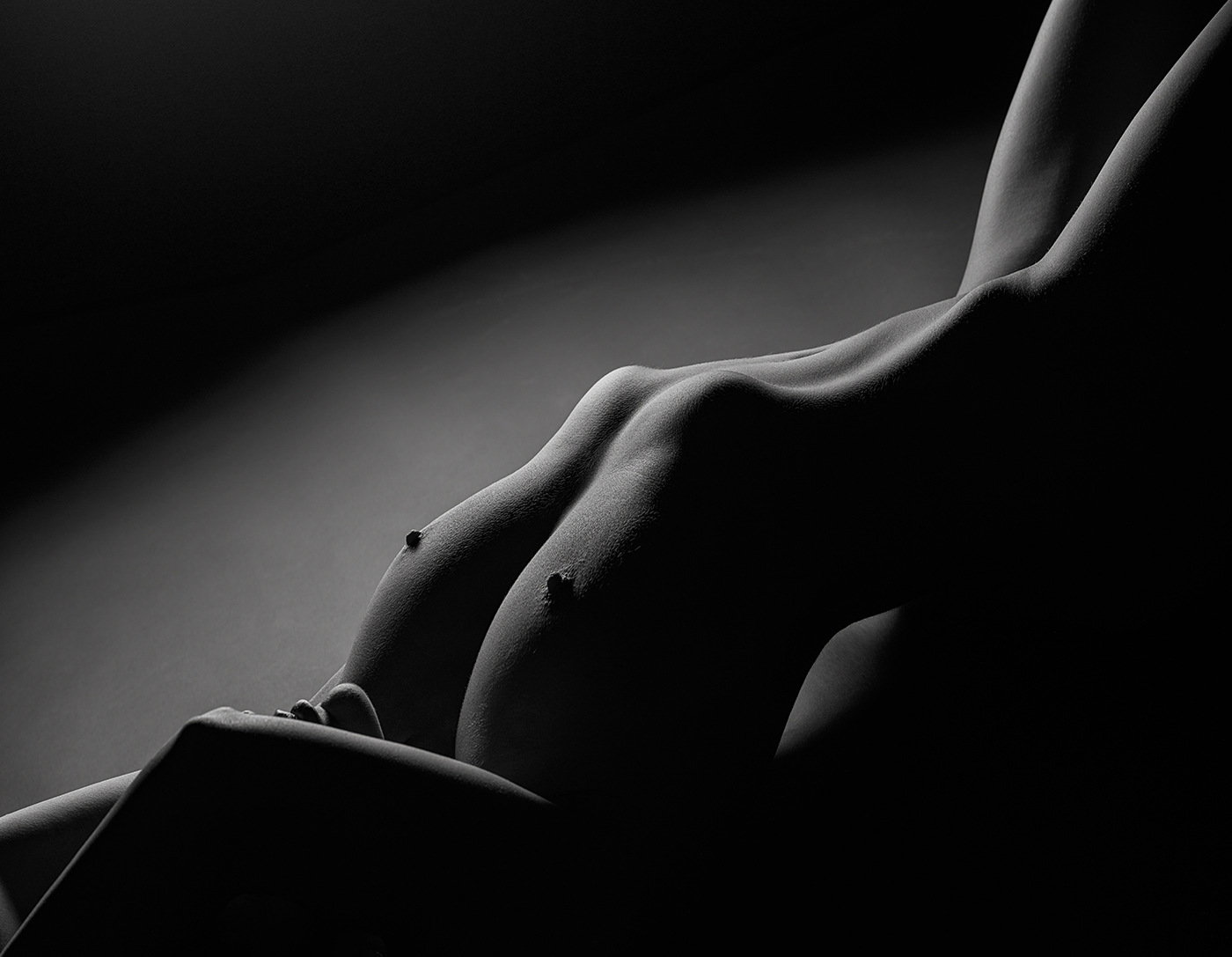
Thank you very much for your welcome, Diana! I'm glad to see you are open-minded with regard nude photos; my experience shows that not everyone accepts this photographic theme.
Coming to your comments, I used a flash with a softbox of 30x120 cm (strip). So I didn't use a reflector.
I have taken a lot of photos in low key with nothing but the body of the model, and in this case I preferred to use a necklace running the back of the model because, from my point of view, it reinforces the natural body curves; I understand that this issue is a matter of opinion, so I'm curious to know the opinion of the other group members :-)
I agree with you: a white line around the whole photo will be very useful to delimite the edges. This practice is not allowed in most competitions, so I never do it; however, I promise to follow your advice for the next photo.
As regards to processing techniques, I agree with you that low key pictures don't need very sophisticated processing, but I'm very careful and I try to be as much perfectionist as I can, so I prefer to follow my work flow even though no big differences might be observed. Notice, however, that the exist :-)
And last, I suspect the odd dark curving line you refer is a tattoo, which I respected. Certainly, in this kind of photos I prefer to work with bodies without tattoos, but currently it is not easy to find them, especially when you carry out TFP sessions and you can't be too demanding.
Again, thank you very much, Diana, not only for your welcome but also for your comments! |
Jul 15th |
5 comments - 15 replies for Group 32
|
5 comments - 15 replies Total
|


