|
| Group |
Round |
C/R |
Comment |
Date |
Image |
| 1 |
Nov 23 |
Comment |
This is a great shot of tall buildings soaring upwards in converging lines and a great example of why such convergence should often be left alone. Just imagine how bad this would look if one tried to make the verticals parallel. May I please use this image (with credit) in other of our digital dialog comment groups in the future when there are perspective discussions? |
Nov 14th |
1 comment - 0 replies for Group 1
|
| 8 |
Nov 23 |
Comment |
The colors of these lines are very attractive.
I shoot a lot of images of ropes, as I am a knotting hobbyist. You might like to try shots of knots or ends of lines. |
Nov 14th |
1 comment - 0 replies for Group 8
|
| 32 |
Nov 23 |
Reply |
Tom, that's a very good point about perhaps NOT separating the tractor from the background! |
Nov 14th |
| 32 |
Nov 23 |
Comment |
I do not care for that pose with that dress. The pose is contrapposto and somewhat informal, but the dress suggests formality and decorum. Although this model put an effort into acting out her fireman rescue, I don't see much facial expression in this shot. |
Nov 12th |
| 32 |
Nov 23 |
Comment |
I had the exact same reaction that Tom had.
I also loved your narrative, especially since my wife and I have walked down the streets in India where these statues were being crafted and seen this very activity.
I only suggest to use the full image with a tiny bit cropped off the right so the viewer's eye is not pulled to the right by the in-focus extra arms. Here is my cropping suggestion. |
Nov 12th |
 |
| 32 |
Nov 23 |
Comment |
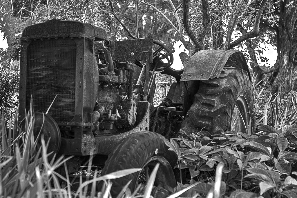
This is a good subject, but the problem is to separate the tractor from the background. I converted to monochrome using one of my PS Elements presets, then used Darken Highlights to reduce the brightness in the sky and trees, but I found that still left them fairly bright, but fortunately left the tractor still dark, separating it from the background. Then I sharpened this a bit. I am not sure if I achieved anything, but see how it looks to you. |
Nov 8th |
 |
| 32 |
Nov 23 |
Comment |
Of course the color shot is fantastic, but so is the monochrome. I love shots with so much black in them, which is a favorite of mine. |
Nov 8th |
| 32 |
Nov 23 |
Comment |
Very unique shot of a lighthouse, not showing the full tower, but instead the keeper's house and car. Great opportunity you had to get the old Ford in the shot.
Perhaps darken the sky a bit? |
Nov 8th |
| 32 |
Nov 23 |
Comment |
Great shot to include the foreground flowers. One test of a good photo is that the viewer wants to see it again and again, and I feel that way about this shot.
See the current New Yorker, 11/6/2023, for a fine article on light houses. |
Nov 7th |
6 comments - 1 reply for Group 32
|
| 40 |
Nov 23 |
Comment |
You are both fortunate and skilled to have gotten this shot. Congratulations.
Lance has already given a great analysis, and I totally agree with his suggestion to pull back and only crop out that tiny lamp head shadow.
For my part, I would like to share the many associations that spring up in my mind as I look at this image.
1. Two of the walkers are striding wide-legged. If it had been all four, I think you would have been reinterpreting the Beatles Abby Road Album cover concept.
2. The early 20th century photographer Ruth Orkin (a Photo League founder) often shot from above, right out of her NYC apartment window.
3. I find the long pole shadow a fascinating symbol, perhaps of travel, as it literally points the way for the walkers. It is full of mystery and makes me oddly think of the rectilinear slab in 2001: A Space Odyssey. |
Nov 13th |
1 comment - 0 replies for Group 40
|
9 comments - 1 reply Total
|


