|
| Group |
Round |
C/R |
Comment |
Date |
Image |
| 25 |
Aug 23 |
Comment |
I love market shots like this, showing a display of interesting products in a pattern. I shoot a lot of the same, but I prefer disordered stacks of products.
I would have preferred to see the top edge of the cabinet. |
Aug 11th |
1 comment - 0 replies for Group 25
|
| 30 |
Aug 23 |
Comment |
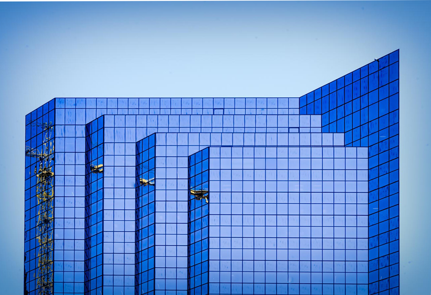
You spotted an interesting subject of geometry and color. Those new buildings with sharp angles are tantalizing to the eye.
I want to comment about perspective. Just as receding parallel lines on the ground (e.g., streets, railroad tracks) appear to converge, so do vertical parallel lines. And that is the correct and natural perspective. For tall buildings, it gives a sense of soaring upwards. In your image, that is not so important, so you may choose to alter the perspective in the style of architectural photographers preparing sales brochures. Here is my alteration, using PS image alter skew. |
Aug 11th |
 |
1 comment - 0 replies for Group 30
|
| 32 |
Aug 23 |
Reply |
If any shot deserves red eyes, it is my ex-President's new portrait! |
Aug 30th |
| 32 |
Aug 23 |
Reply |
Oooh, that makes him look menacing, indeed. |
Aug 19th |
| 32 |
Aug 23 |
Comment |
It's a lovely shot. To answer your question, I would go with 2/3 mountain, 1/3 water, and not worry about losing a portion of the reflection. |
Aug 11th |
| 32 |
Aug 23 |
Comment |
This is a good catch. I am fine either way with which direction the child looks.
Too bad that the highlights were blown out, but it was only a little direct sun on their backs.
I prefer slightly different brightness and contrast. What do you think? |
Aug 7th |
 |
| 32 |
Aug 23 |
Comment |
Good job choosing your shooting location, well off center. It makes an interesting composition.
This shot is a good candidate for an image flip and combine. I like to play with this sometimes humorous trick. |
Aug 7th |
 |
| 32 |
Aug 23 |
Comment |
Like this? |
Aug 7th |
 |
| 32 |
Aug 23 |
Comment |
Looks like a good shot, but I would crop out the trees in the distance, and maybe a little from each side.
I think the race shot is great. Of course, it would be good to remove the one spectator. |
Aug 7th |
| 32 |
Aug 23 |
Comment |
You tell a very poignant story of watching the mourning doves. We have had the same experience on our upstairs windowsill. We watched the fledgling grow to almost 3/4 the size of the adult before it left the nest.
As to this image, the eggs are sharply focused, and the blur of the nest foreground is fine, but I suggest cropping out the black area of your image below the nest. And I suggest cropping out 1/3 of the nest material below the eggs. This is entirely a personal suggestion, for no reason I can cite, just how I would do it if it were my image. What do you think? |
Aug 5th |
| 32 |
Aug 23 |
Comment |
I have so many reactions to this.
Of course I don't know the TV show, but I like the idea of meeting professional actors and them being so agreeable. They are totally in character, so that makes for a very good shot.
On the other hand, I can't decipher the gestures and the eye contact, even if the actors are balanced in a nice triangular composition.
About the triangular composition. It is a compositional form of great heritage, going back into centuries of painting and sculpture. It keeps your eye travelling around and in the composition. |
Aug 4th |
7 comments - 2 replies for Group 32
|
| 67 |
Aug 23 |
Reply |
This is a great shot, Larry. I want to comment about the idea of space you just mentioned. In much Asian art, the focal figure is very small, placed in a vast natural setting, so that is another instance where not only is space the story, but the *relationship* between a figure and the surrounding natural space is the story. Of course it tells the story of our small place in the vast natural world. |
Aug 9th |
0 comments - 1 reply for Group 67
|
| 93 |
Aug 23 |
Reply |
Oh yes, if you go that direction, I agree with your choice very much. |
Aug 11th |
| 93 |
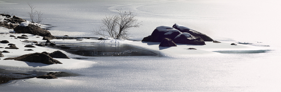
Aug 23 |
Comment |
You shoot to please yourself. You were there. You loved what you saw. And you have an image of it. Keep it as it is, of course.
However, compositionally, your friends are right to suggest getting rid of the dark area across the pond. I would also crop out the left a bit to just barely remove the rock and tree. The result would be a more Zen composition. |
Aug 7th |
 |
1 comment - 1 reply for Group 93
|
10 comments - 4 replies Total
|


