|
| Group |
Round |
C/R |
Comment |
Date |
Image |
| 32 |
Mar 23 |
Reply |
Everyone has much the same ideas. Sometime in the future, I will repost another try at this, and use your suggestion to show a family of hedgehogs. It takes an hour or so to make one, spread out over a longer time--I get a backache if I bend over it for more that 10 minutes at a stretch. I have tried the hedgehog about six times, and mess it up about half the time--always on the face, which is the only hard part--it requires shaping, not just folding. (There is a branch of origami that even does wet shaping.) |
Mar 26th |
| 32 |
Mar 23 |
Reply |
Thanks, Tom, I like the tone changes you tried. |
Mar 26th |
| 32 |
Mar 23 |
Reply |
I looked it up on Google. Rope burns. I had guessed right. |
Mar 13th |
| 32 |
Mar 23 |
Comment |
So interesting, this entire discussion.
I like the garb and the pose very much, and a good idea to flip it. But I find the highlights of the background confusing my eye when they are near the highlights of the subject.
What is the function of wrist leathers? Protection from rope or reins friction? |
Mar 13th |
| 32 |
Mar 23 |
Comment |
Yes, I can understand the importance in many images for a center of interest, but I don't think that is a rule that must be followed in all images. Just as Wes pointed out that the lighting angle rule does not always have to be followed.
So to assess this, setting aside common rules, I find it completely charming in conveying the charm of the Smokies. I am particularly excited that it shows those shafts of light. |
Mar 13th |
| 32 |
Mar 23 |
Reply |
I did not really do "lighting." I just set the hedgehog on a tabletop with the indirect light from a window on it. I am going to try to actually do "lighting" since everyone is recommending I try it. Good idea. |
Mar 13th |
| 32 |
Mar 23 |
Comment |
I also think the stem should be lighter, and Som's suggestion looks good to me. |
Mar 12th |
| 32 |
Mar 23 |
Comment |
Diana has nailed the crop. I agree. I also like the monochrome. |
Mar 12th |
| 32 |
Mar 23 |
Comment |
Hello Dr. Somdutt Prasad,
How would you like to be addressed in our discussion group? We are very informal and use first names, or sometimes skip names entirely as if we were in each others' presence. But please let us know what is your preference.
Compositionally, I like the arrangement of rectangles in this image, with the single great diagonal line actually being a miniature series of right angles. There is a faint echo of the diagonal in the element in the upper left, which I also like.
I differ from your idea of adding a figure, as I am a strong advocate of architectural shots empty of people, so I prefer this image as it is.
My wife and I have made many trips to India (me 3 and she 4) and other parts of Asia. We lived in Taipei in 1988-89, and our summer home is near Izmir, Turkey. |
Mar 12th |
| 32 |
Mar 23 |
Comment |
Nothing from me but praise. I see your slight crop of the foreground, the dark sky as you usually do. Great subject, and the old truck is a good addition. Oddly, I find that tower on the left horizon good, as it echoes the rods on the roof of the barn. |
Mar 10th |
| 32 |
Mar 23 |
Reply |
That's a really good idea, Diana. I will try to find time to try different lighting angles. |
Mar 10th |
| 32 |
Mar 23 |
Reply |
Thank you, Lance, you are so supportive.
I will wait for more comments and then post another image later this month that incorporates more suggestions. |
Mar 7th |
6 comments - 6 replies for Group 32
|
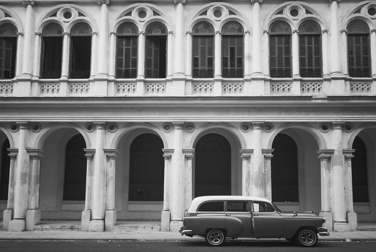
| 66 |
Mar 23 |
Comment |
This is an attractive composition. I very much like architectural shots free of people.
The single car is an interesting offset to the building.
I like the shadows, so I don't think you should bring out more detail there.
As to the perspective, I have a lot of ideas about perspective. First, your turned up camera records a true perspective, but most people don't like it. Architectural photographers will completely alter it to make the verticals parallel. I don't care for that because it loses the sense of the building soaring upwards. For my sample, I have left a bit of the upward soaring to show that you are looking upwards.
There is another, more subtle, reason not to make the vertical completely parallel. If you did that, you would be faking a straight-on view of the building, but accidentally showing the undersides of the arches, which is only possible with an upward view--a contradiction in perspectives that I think should be avoided. |
Mar 1st |
 |
1 comment - 0 replies for Group 66
|
| 67 |
Mar 23 |
Comment |
Your original image is more "photographic", whereas your original 2 image is more instructive, as if it were meant to be one in a series of Muybridge images.
I am curious about the deep-water fishing technique from an evolutionary point of view. Do you think it was always a technique of this wader, or are we witnessing an actual evolutionary change, where a change of environment makes for a rapid change of behavior, according to Stephen Jay Gould's theory of punctuated equilibrium. |
Mar 14th |
1 comment - 0 replies for Group 67
|
8 comments - 6 replies Total
|


