|
| Group |
Round |
C/R |
Comment |
Date |
Image |
| 17 |
Sep 22 |
Comment |
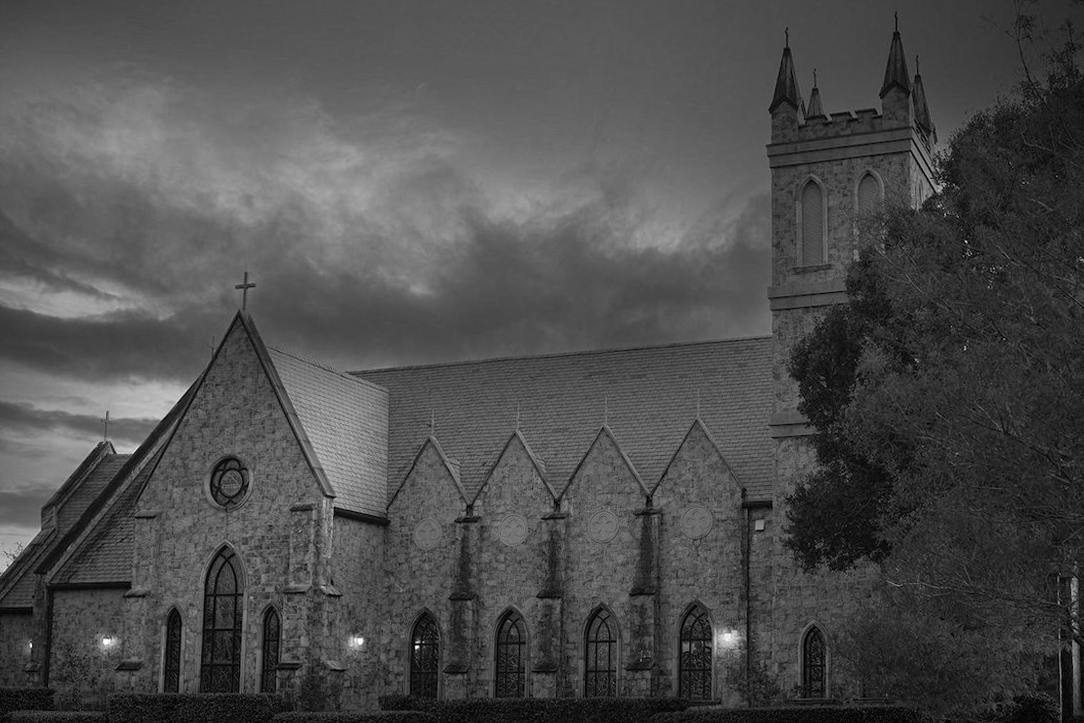
I grew up in Albany in the late 50s and early 60s. It's fun to see this image. There was no plaza or new buildings then, but I remember the grand façade of the capitol building. Thanks for showing this. |
Sep 6th |
1 comment - 0 replies for Group 17
|
| 32 |
Sep 22 |
Comment |
I agree with comments so far, and I think the vignette is a good idea, but a bit too strong. |
Sep 19th |
| 32 |
Sep 22 |
Comment |
As usual, this is much better in monochrome, with all the lines and contrasts showing much better.
Did you brighten the eye, or did it just come out like that? |
Sep 19th |
| 32 |
Sep 22 |
Comment |
About the perspective, this is subtle.
1. Your point of view is looking upward (vertical axis) and looking to the left (horizontal axis).
2. The perspective effect of both is actually what you saw with your eye, and the camera captures that accurately.
3. But we are uncomfortable with it, I accept that. I just recommend to keeps SOME of the true perspective.
4. Here is my suggestion. Just a bit (not all) of vertical un-tilting on the right, because you still are looking up and should not lose that. Then even less tilting on the left to balance that and tell your eye you are equally looking up at the left side.
5. For the horizontal perspective, I think the roof line plunges too much to the left. Again, that is correct perspective, but our eye wants a bit (but not complete) relief from that.
See how this looks. I used "skew". On the right I pulled the top right handle of the image a bit to the right. On the left, I pulled the top left handle a tiny bit to the right for the vertical perspective change, and the same handle a bit upward to change the roof line. What do you think? |
Sep 15th |
 |
| 32 |
Sep 22 |
Comment |
I think you shot this at just the right angle, so the rear column is centered in the open space between two foreground columns.
I have never done sky replacement, but I can see this with some light wispy high clouds.
I like the direction Wes took this for contrast. |
Sep 10th |
| 32 |
Sep 22 |
Comment |
I was immediately impressed that the bright sunlight was NOT a problem in this shot.
The gents are in a good pose, and the array of their equipment is interesting.
Too bad their sign is partly obscured.
I like the tones on this--I am guessing I would not care for sepia.
I took our grandkids to much the same thing here a few years ago. It was the same period--first half of the 20th century.
|
Sep 9th |
5 comments - 0 replies for Group 32
|
| 58 |
Sep 22 |
Comment |
Hello Isaac,
Nice grab shot. It takes me back to 1988-89, when I took my family to live in Taipei for a couple of years. We regularly saw families of 5 on the scooters. Our record was 7. |
Sep 5th |
1 comment - 0 replies for Group 58
|
| 62 |
Sep 22 |
Comment |
I love all the copying and flipping and reflecting you all are doing with this image. Your inspired experiments are really fun. Won't one of you please do an infinite regress of Pete's grandson down the lighted corridor? |
Sep 5th |
1 comment - 0 replies for Group 62
|
| 83 |
Sep 22 |
Comment |
Nicely done portrait. You made great use of the morning light. Was it diffuse from a large window? |
Sep 4th |
1 comment - 0 replies for Group 83
|
| 96 |
Sep 22 |
Comment |
This is a beautiful scene you have captured. Congratulations.
I think I prefer the color version.
But the b/w seems to have a different purpose--I think I would like to see the b/w even more high-key, as an experiment. |
Sep 4th |
| 96 |
Sep 22 |
Comment |
Hello Bob,
My wife and I have been flying past Mt. Rainier for about 15 years, even since two of our children moved to Seattle. We have never seen anything like this from the air, nor from our distant views on the ground. Congratulation on being in the right spot and acting quickly--I read your bio--your experience prepared you. This is truly an AAAH image. I have no suggestions for improvement. |
Sep 4th |
2 comments - 0 replies for Group 96
|
| 99 |
Sep 22 |
Comment |
Hello Peter,
I very much like your composite concept. (I well remember you used these dancers recently in another composition.) I think it's just fine that they are floating in front of the poster--in fact, I think that is quite creative.
I have another kind of comment, however. I know you have to work with the models you have, and I like the shot you took of these two. But I don't find them striking in their poses. They are graceful and correct, but not striking, and for me that affects your finished image a little. (Jerome Robbins would have coached them not to just pose, but to be deeply in love.) |
Sep 4th |
1 comment - 0 replies for Group 99
|
12 comments - 0 replies Total
|


