|
| Group |
Round |
C/R |
Comment |
Date |
Image |
| 1 |
Jul 22 |
Comment |
Diagonals and rectangles. A great combination. Have you tried this in monochrome as well? |
Jul 18th |
1 comment - 0 replies for Group 1
|
| 2 |
Jul 22 |
Comment |
You have good comments from your colleagues. I am just coming in from another group because my grown daughter is a semi-pro equestrienne. So I also have shot a lot of such images. If you have a choice (maybe you took a 100 shots), I like it better if the forelegs are off the ground. In a canter, you might get all four legs off the ground. |
Jul 18th |
1 comment - 0 replies for Group 2
|
| 21 |
Jul 22 |
Comment |
Good image, especially with the fog effect.
Not mentioned, as I believe, is that a Roman sculpture workshop would make up one or more generic heroic bodies, but customize the head to be the portrait of the customer. |
Jul 17th |
1 comment - 0 replies for Group 21
|
| 26 |
Jul 22 |
Comment |
Tea time in the tea fields--how both charming and clever as an image! Those tea glasses look just like the ones my wife and I use every afternoon. Somewhere there must be a tea thermos, or perhaps someone bringing tea round to all the pickers? |
Jul 6th |
1 comment - 0 replies for Group 26
|
| 28 |
Jul 22 |
Comment |
Both shots are great and invite me to keep looking at them.
Question: you said you have dramatic skies in your part of the world, but I am from another group and you don't say what part of the world you are from, nor is it in your bio. |
Jul 16th |
| 28 |
Jul 22 |
Comment |
Very successful portrait lighting, especially the highlights!
Good model also. |
Jul 16th |
2 comments - 0 replies for Group 28
|
| 31 |
Jul 22 |
Comment |
I love shots like this that show "three worlds": sky, water surface, and subsurface. The phrase is from an MC Escher print by the same title, and of the same subject. But it is harder to do with photography, because Escher was not limited by reality.
I also love tranquil shots like this that communicate solitude or the quietness of nature. |
Jul 16th |
1 comment - 0 replies for Group 31
|
| 32 |
Jul 22 |
Reply |
I think you made only a slight change to the perspective, and both images' perspectives look fine to me. Certainly there is no "distortion" in your altered perspective in your finished image. |
Jul 21st |
| 32 |
Jul 22 |
Comment |
Thanks to everyone. I feel a bit like I am going in the right direction, as I initially felt I had too much sky, and you all went further to say even less sky. |
Jul 21st |
| 32 |
Jul 22 |
Comment |
So interesting! Thanks for the ideas. |
Jul 16th |
| 32 |
Jul 22 |
Reply |
Good ideas. Thanks. |
Jul 16th |
| 32 |
Jul 22 |
Reply |
Given your original shot, I think you did a GREAT job choosing a final image! Now that you have told more about your model, those are definitely story-telling hands. |
Jul 13th |
| 32 |
Jul 22 |
Comment |
Tom flipped my image this month, to great advantage, so I agree with his idea on that.
I also tried cropping. How do you like this? |
Jul 11th |
 |
| 32 |
Jul 22 |
Comment |
It looks almost perfect to me, with that great fence line and sky. It comes across well in monochrome.
Comments:
It may be a bit over-sharpened. And the clouds on the upper left are somewhat blown out, but perhaps the original had salvageable detail? |
Jul 11th |
| 32 |
Jul 22 |
Comment |
I agree with Tom about cropping out the snow. Or at least nearly all of it. You might keep in just a bit to ground the eye, so to speak.
As to the perspective, I think you hit it right, keeping some sense of the towering mountain perspective, but let's see your original and discuss more--you know I am a perspective freak. |
Jul 11th |
| 32 |
Jul 22 |
Reply |
Thank you, Tom. I have no sense about reversing an image, but you are so right about this. |
Jul 11th |
| 32 |
Jul 22 |
Reply |
That's incredible! I mean I believe it, it's just a wow. |
Jul 10th |
| 32 |
Jul 22 |
Comment |
So sharp! And this subject needs to be sharp. I love the snout hair.
Here is a bit of relevant trivia: "Greg Barsh, MD, PhD, is the resident expert on animal morphology at the HudsonAlpha Institute for Biotechnology, and he has a definitive answer. 'Zebras are black with white stripes.'" Apparently, this question has only been answered in recent times. |
Jul 10th |
| 32 |
Jul 22 |
Reply |
Good idea asking her to stand in the alley. I often shoot street portraits indirectly lit like that. For me, I prefer the person deeper into the covered area so they get diffuse directional light on their face and therefore some shadow on one side of their face. |
Jul 10th |
| 32 |
Jul 22 |
Comment |
Very good model and good pose. Although her eyes are not engaging me--I am not sure if that is a minus or a plus.
Can we see your original? I particularly want to see if there were any shadows on her face in the original. My reason is that your finished image has her face fully lit, and I personally prefer a half-shadowed face, or at least some shadow on one side. |
Jul 9th |
| 32 |
Jul 22 |
Comment |
I will jump right in. This is a great idea, and this image looks very good. It makes my mind wander to all sorts of ideas, and I think that means the image has a lot of impact for me.
Technically, tones, exposure, and lighting look great. I think you are just beyond the limit of the depth of field with the middle finger of the hand on the left, but that does not matter much.
I am wondering (my wandering mind, referenced above) how this would look with the right side hand in the same pose as the left side hand, or at last with the pinky set out the same way.
As far as conveying emotion or an idea, the right hand is open in prayer or invitation. The left hand is suggestive of an idea or an action, so I would not mix those. The hands might convey flight (in any of its senses) (right), or engagement with others or an activity (left).
I don't know what to say about the single arm; it looks good to me, but I wonder how two arms would look. |
Jul 9th |
8 comments - 6 replies for Group 32
|
| 37 |
Jul 22 |
Comment |
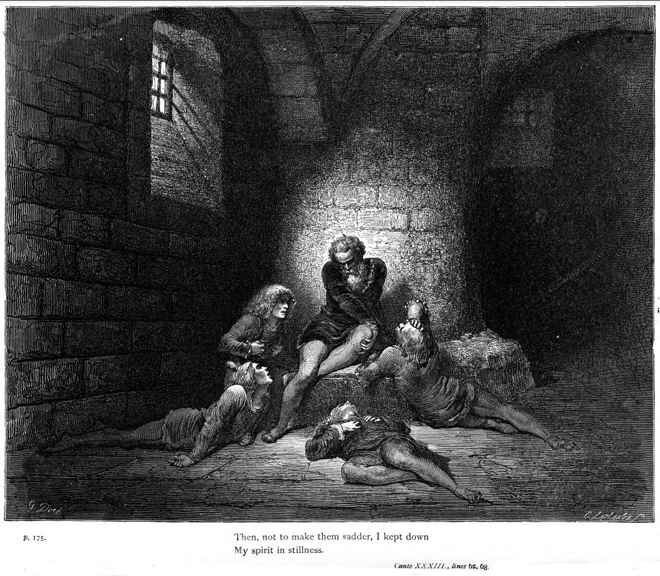
Artists or art students, and very good ones at that, copying a classic is always a good story. It's hard to make a good composition when you can't direct anyone to "sit her", "move to the left a bit," "lift your work six inches." I very much enjoyed the visit to the Met through your camera. Here is a Doré version of the same scene from Dante. |
Jul 5th |
 |
1 comment - 0 replies for Group 37
|
| 45 |
Jul 22 |
Reply |
Haha! Of course I was not close enough to tell. But I sure hope he was, since what he was doing required some coordination. Then again, he looked casually like he was used to it.
I have seen some other interesting driving when abroad. In some places, even though they have lane markings and traffic lights, I have seen drivers ignore both, filling all lanes of a road in one direction until a car comes along in the opposite direction.
Just to be fair, drivers in some parts of the U.S. show unusual ignorance of how to drive on snow or ice. |
Jul 27th |
| 45 |
Jul 22 |
Comment |
Wonder wide-angle shot. Such a good use of the wide-angle lens.
I also like your original shot. There is a sort of conversation going between the sections of the image, as like an orchestra whose different sections converse with each other in a symphony. |
Jul 4th |
| 45 |
Jul 22 |
Comment |
This is a successful final image, with great rhythmic light curves.
As I have mentioned before, I lived in Taipei for a couple of years in the late 80s, so many of your images bring back memories, or update me on changes.
This one in particular brings back a striking memory. We were returning by taxi from a dinner with friends at their home on the road up to Yangmingshan. It was all downhill to go home, and our taxi at one point passed another taxi "deadheading" down the hill, that is going down with no passenger. The driver wanted some air, so he did more than open his window and stick his head out. He was out of the car, sitting on the roof of his moving vehicle, legs sticking in through the open window, and steering with his bare feet on the wheel! |
Jul 4th |
2 comments - 1 reply for Group 45
|
| 47 |
Jul 22 |
Comment |
Great shot.
Another vote for keeping that sliver of brick wall on the right. I think it's essential. |
Jul 15th |
1 comment - 0 replies for Group 47
|
| 49 |
Jul 22 |
Comment |
We never ate there, but I remember seeing it I think 35 years ago on one of our visits to Hong Kong, visiting from Taipei, where we lived in 1988-89. |
Jul 15th |
1 comment - 0 replies for Group 49
|
| 59 |
Jul 22 |
Comment |
I like the pose of "original" because it shows the racers with their hands in different positions. But, as noted, the backgrounds are a problem. In this one, if you crop off the woman and child, their colored clothing would be hardly noticeable through the fence, and the fence has a nice line. |
Jul 4th |
1 comment - 0 replies for Group 59
|
| 81 |
Jul 22 |
Comment |
I prefer the asymmetry, personally.
Please tell more about where this is, and why this bridge has such a unique name. |
Jul 14th |
1 comment - 0 replies for Group 81
|
| 87 |
Jul 22 |
Comment |
Hello Lance,
This is the start of a long discussion, I suspect, about this sort of street shot.
I like very much how you caught this man doing just what the sign said, including a play on words.
I also like such shots that are ironic.
Now I see that my image in my group last month lacked a human actor putting themselves back together after passing through TSA security. |
Jul 2nd |
 |
1 comment - 0 replies for Group 87
|
| 92 |
Jul 22 |
Reply |
Lance, I write "famous photographer" articles for my local club's monthly newsletter. Next month, by coincidence, it will be a five-pager on Garry Winogrand. Do you want to see it, or arrange to post it somewhere so DD members can link to it? |
Jul 13th |
| 92 |
Jul 22 |
Comment |
I am responding to Lance's comments in Group 87 and here, not to mention my own image this month in Group 32.
To quote Lance above, "there are as many interpretations of a piece of art as those looking at it." I would, for this conversation, transmute this into a discussion of styles and purposes. I see three ways of approaching this, and similar, images:
1. A formal photograph of an empty architectural space. Interpretations can be a) a record photograph, b) a study of geometry, c) an evocation of feelings of spaciousness, emptiness, loneliness, separation, or even despair. (I personally pursue 1.c in many of my images.)
2. A space with a focal action, like a single person at the end of a corridor. I think Lance has this in mind when he talks about a "supporting element." I agree with Lance that this is a good way to evoke an emotional response from a viewer.
3. In this image, and mine in Group 32 this month, the "supporting element", so to speak, is not the usual figure at the end of a corridor, but a few words on a sign, centrally placed. These literally, very literally, SAY something. In your image, the play is on the word "welcome" when there is no welcome showing. My image in Group 32 is less skilled--it was a humorous display of the recently coined word, recombobulation. It stands in the place of people tiredly putting their belts and shoes back on after a TSA check at an airport.
Just as you can make many classes of things from wood (paper, buildings, pencils). So you can make many classes of things from photographs. Hence, my 1, 2, 3, above.
I greatly enjoy these discussions with Lance and all of you. Thanks for the opportunity to participate. |
Jul 12th |
1 comment - 1 reply for Group 92
|
24 comments - 8 replies Total
|


