|
| Group |
Round |
C/R |
Comment |
Date |
Image |
| 4 |
Apr 22 |
Reply |
I looked at your excellent discussion in this group and enjoyed it, and learned from it.
I don't know what you two are talking about "fourth," but it reminds me of this famous quote:
"Come forth Lazarus! And he came fifth and lost the job." - James Joyce, Ulysses (via greatliteraryquotations) |
Apr 16th |
0 comments - 1 reply for Group 4
|
| 7 |
Apr 22 |
Comment |
The lovely house tourism continues. Thanks, Tom. |
Apr 15th |
1 comment - 0 replies for Group 7
|
| 8 |
Apr 22 |
Comment |
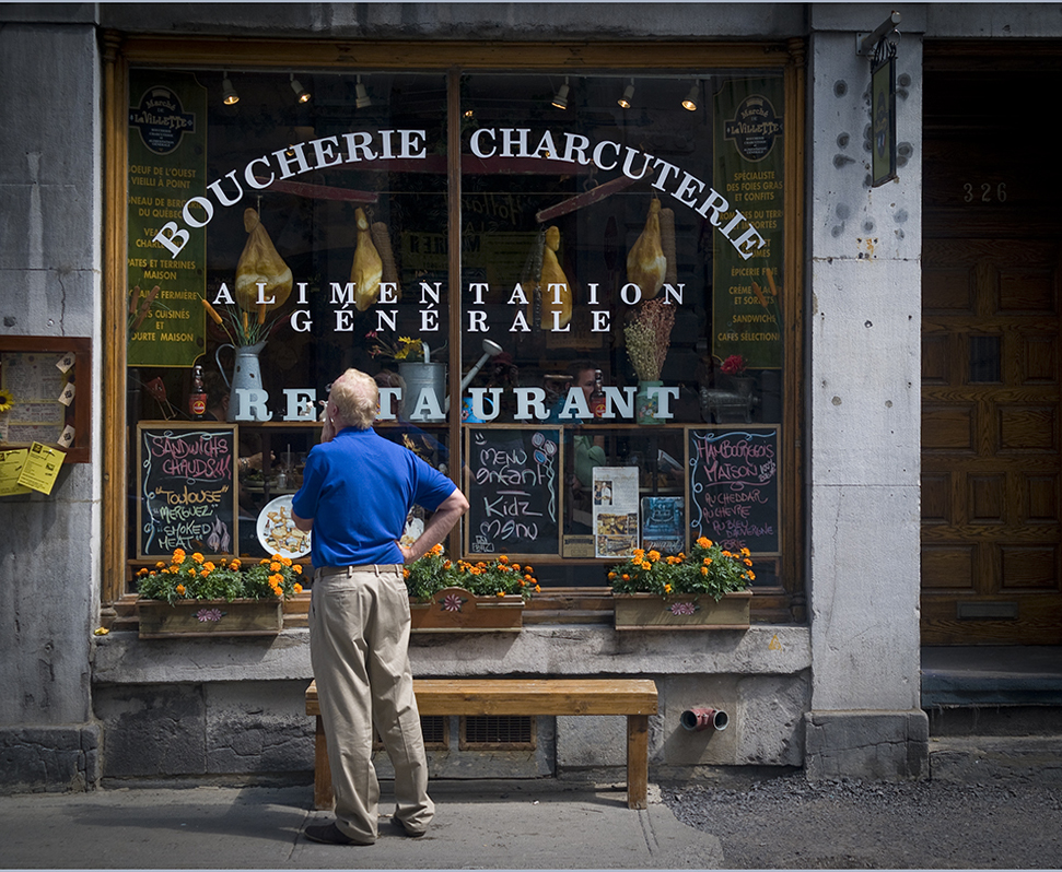
I am very curious about your image. First, it is a charming street shot. I love travel shots like this.
Here is my question. Your image has vertical parallel lines that diverge as they rise. Normally, when a camera is tilted up to take a shot, the vertical parallel lines converge upwards. So unless the building in the shot is very strange, I conclude you shot this from an elevated angle? Is that right, or am I way off base about how parallel lines should render?
I tried a bit of straightening in PS. |
Apr 9th |
 |
1 comment - 0 replies for Group 8
|
| 10 |
Apr 22 |
Reply |
I did two things. In the conversion to monochrome, I used PS and chose one of the preset conversions that had very little differentiation in monochrome between the red and yellow. One may choose other conversions that have a stronger differentiation.
For the lines, I almost always use PS "skew," which allows straightening on only one side at a time, to any degree you want. |
Apr 15th |
| 10 |
Apr 22 |
Comment |
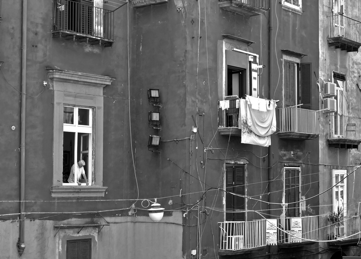
Yes, this is a good reminder of that famous film.
You caught an interesting situation, with that man looking out in a possibly moody pose.
The colors are great, so here is an alternative only in monochrome, since I am in Monochrome Group 32. I also did a bit of straightening of the vertical lines. |
Apr 9th |
 |
1 comment - 1 reply for Group 10
|
| 11 |
Apr 22 |
Comment |
We frequently visit our children and grandchildren in Seattle and know of this famous park. You chose great light to show off these interesting structures. |
Apr 9th |
| 11 |
Apr 22 |
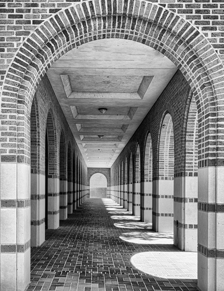
Comment |
I love shots like this of empty corridors with side lighting. They are calm, tranquil, and geometrically interesting. I just suggest a tiny bit of straightening (I used PS "skew"). |
Apr 3rd |
 |
2 comments - 0 replies for Group 11
|
| 16 |
Apr 22 |
Comment |
Your original has really great portrait lighting on your subject. I suggest keeping it, as in this suggestion. |
Apr 3rd |
 |
1 comment - 0 replies for Group 16
|
| 17 |
Apr 22 |
Comment |
I love this sort of discovered geometric images. This one is really great.
You said you straightened the converging vertical lines "somewhat." I applaud you for not straightening them completely, because that would not be true to the point of view from which you shot. |
Apr 8th |
1 comment - 0 replies for Group 17
|
| 18 |
Apr 22 |
Comment |
This is a WOW! Nice job with the camera motion. Did you have to make many tries at this? |
Apr 3rd |
1 comment - 0 replies for Group 18
|
| 19 |
Apr 22 |
Comment |
Very attractive finished product. How about showing us what you started with? Thanks. |
Apr 3rd |
1 comment - 0 replies for Group 19
|
| 22 |
Apr 22 |
Comment |
I very much like your door shot just as it is, without adding any other elements.
I have a question. What is the design? It looks like it could be derived from Frank Lloyd Wright or Charles Rennie Mackintosh? |
Apr 3rd |
1 comment - 0 replies for Group 22
|
| 26 |
Apr 22 |
Comment |
I think this is a great wide-angle shot, but I have a very personal and subjective comment. I like the Freedom Tower in the background, but I don't like it growing out of the top of the Oculus. Forget my comment if you DO like it there. |
Apr 8th |
1 comment - 0 replies for Group 26
|
| 32 |
Apr 22 |
Reply |
Oh, I like the apothecary bottles! |
Apr 12th |
| 32 |
Apr 22 |
Reply |
Perfectly explained! I will remember that. |
Apr 12th |
| 32 |
Apr 22 |
Comment |
Fascinating reaction I had to this discussion of flipping: just before I came back to this image tonight, I was recalling it in my mind, but in the flipped position! It is so right to be flipped as Tom suggested, and you did, Wes. |
Apr 12th |
| 32 |
Apr 22 |
Reply |
Well, I never will get this Group 32 contrast thing right, but I trust Diana about contrast judgements. |
Apr 12th |
| 32 |
Apr 22 |
Comment |
Yes, Tom is right about the "Lady Bugs." Haha! |
Apr 12th |
| 32 |
Apr 22 |
Reply |
Thanks for the comments, Diana. I had not even noticed that the "extra" people were a distraction.
The summer sky in Turkey is filled with brilliant sunshine for three or four solid months. I often shoot the monuments with the sun behind a structure like this.
Great idea for me to go back next time and make the same shot. I will try with both my camera and my phone, of which the latter has a very wide angle of view available. |
Apr 10th |
| 32 |
Apr 22 |
Reply |
Thank you, Wes, good idea about the extra people. In Turkey, I often shoot the brilliant sun like this. |
Apr 10th |
| 32 |
Apr 22 |
Comment |
Taking a small segment of your original image is a workable idea for this image. The cars and structure are very interesting in monochrome.
But I recommend the lower right of your original rather than this lower left, for two reasons:
1. The arcade lights draw the eye away from the cars and structure. If you use the lower right, there is only a single spotlight needing to be dimmed or cropped out.
2. Your image has the structure blocking the view a a car. From the lower right you would see two or three cars clear of the structure. |
Apr 8th |
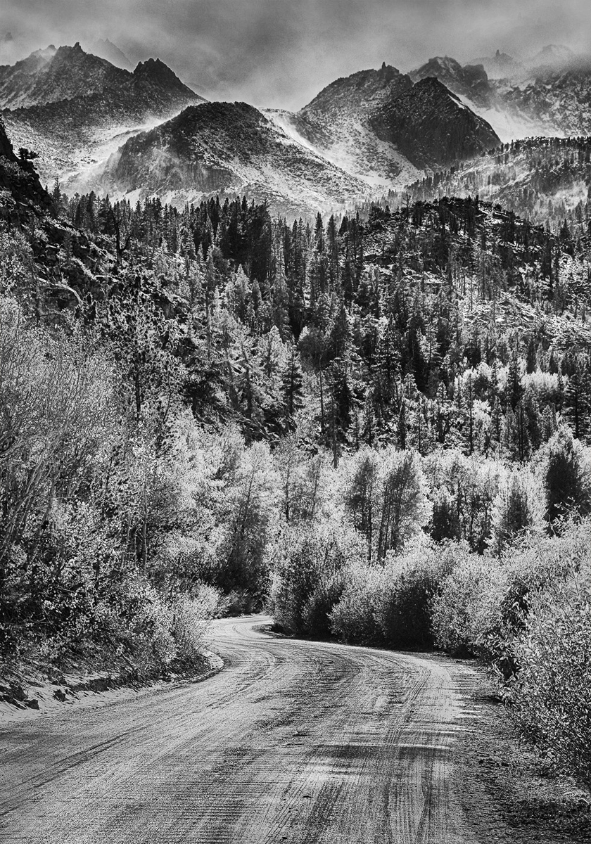
| 32 |
Apr 22 |
Comment |
That's a good question, and you are right that there are several pictures within this picture. You could easily, as you say, use just the top or bottom.
But I like this just fine as it is. The serpentine road is a winner, and so are the rough peaks.
I think it might benefit from a little more Group 32 contrast, so how about this? |
Apr 7th |
 |
| 32 |
Apr 22 |
Comment |
I quite like the monochrome version over the color, even if mentally taking out the reflection of the Christmas light.
This is not a negative: I can't tell if there is one ball and a reflection or two balls, just from the image. I find it extra interesting that I can see it either way, now that I know that you had one ball on a reflective surface.
I am not sure about the table edge line on the right, although placing the ball off center is, I think, a good idea. |
Apr 7th |
| 32 |
Apr 22 |
Reply |
Keith, thanks for your comments.
I prefer you not to share this image elsewhere, but please tell you friends to simply Google "Ephesus" or "Ephesus Temple of Hadrian" to see lots of fine images. |
Apr 5th |
| 32 |
Apr 22 |
Comment |
Everything in ruins. Wow. You have a good contrast between the fully standing church and the foreground ruins. This could even be symbolic of the steadfastness of the Church, in the larger sense. I like the way you used the grain, and the border is suitable to this subject. |
Apr 4th |
| 32 |
Apr 22 |
Comment |
Nice composition and good lighting on the skull. I think the round print works well.
Very small details. How about corks in the bottles; perhaps remove the partial container lines at the sides and top since they are not fully shown; it would be great to see the book titles (and relevant ones) (one book title is upside down). |
Apr 4th |
| 32 |
Apr 22 |
Comment |
Tom, I love the way you are taking us on historic home tours. It is a great pleasure to see these homes through your camera lens. The border is very attractive. You really controlled the difficult lighting situation. I also think you made a good compositional choice to hint at the doorway by showing only the right side doorframe.
If I were there, I might have asked if the rocking chair could be moved aside, but of course one could say it is a plus for context. |
Apr 3rd |
| 32 |
Apr 22 |
Reply |
Hello Lance. Thanks for visiting and giving your suggestions and very positive comments.
I like very much your improvements, and especially the idea to show the tourists. The man in front, with arms akimbo, always struck me as amazed that he was seeing this famous place in person.
The heavy vignette was an artifact of using a 2X extender on my first digital camera, a very modest little thing, but I liked the perspective that it yielded for this image. You did good work on reducing that effect. |
Apr 1st |
8 comments - 7 replies for Group 32
|
| 38 |
Apr 22 |
Reply |
Ah, so you did. Well done. How does Marge like it? |
Apr 14th |
| 38 |
Apr 22 |
Comment |
Great shot, with classic lighting. Please tell us the lighting setup.
Can you add a catchlight to the dark side eye? What do you think of doing that? |
Apr 14th |
| 38 |
Apr 22 |
Comment |
This is a great shot, and everything looks to me to be in focus. But if you had trouble at f/16, here is a thought. You do not need to focus at infinity for this kind of shot. You can focus at an intermediate point, say about 50 feet out, and that will get you everything in satisfactory focus from a few feet to infinity. Some lenses have marking on them showing this. Look up "hyperfocal distance" on Google for more information. |
Apr 3rd |
2 comments - 1 reply for Group 38
|
| 40 |
Apr 22 |
Comment |
My wife and I had a boat cruise through Russia about six years ago, and St. Petersburg was the end point, but we did not see this church. I am so glad to see this wonderful image. You did very well to get the right-side-up painting at the bottom. I don't have any problem with the lines. I think the vertical convergence is natural and expresses the soaring space. |
Apr 3rd |
1 comment - 0 replies for Group 40
|
| 42 |
Apr 22 |
Comment |
You worked very hard, and very successfully, with the arrangement of your fruits and vegetables. I like the upward rise of the tall items, and the rightward run of the greens, making this still life actually very dynamic. I also like the bed of nuts underlying everything.
I agree with Robert that the combinations are a little discordant. Also, I would not put a bottle of wine in this image, and not rose, and not with condensation on it. |
Apr 3rd |
1 comment - 0 replies for Group 42
|
| 45 |
Apr 22 |
Reply |
Thank you so much for the map. It is wonderful, as always, to see your pictures of Taipei. My whole family has such great memories of our two years there. I still love to eat stinky tofu whenever we go to our favorite Taiwanese restaurant here in the Washington, DC area. |
Apr 11th |
| 45 |
Apr 22 |
Comment |
This is a beautiful shot, and I can see the Taipei Tower.
As you know, I lived in Taipei in 1988-89, a km past the National Palace Museum, and my memories are very strong and very fond. Would you mind telling me what district is in the foreground and showing me a map of where you shot from? Thank you. |
Apr 3rd |
1 comment - 1 reply for Group 45
|
| 49 |
Apr 22 |
Reply |
Thank you. Is this the bridge that goes to the new airport, or is that yet another bridge? |
Apr 15th |
| 49 |
Apr 22 |
Comment |
Very nice angle for this shot.
Do please tell us more about this famous bridge, and about where you were standing to plan and take this shot. Thanks. |
Apr 14th |
1 comment - 1 reply for Group 49
|
| 58 |
Apr 22 |
Reply |
Isaac, thanks for the information. I might add that the official DR government position about persons of Haitian descent, and the DR immigration policies, are regarded by most everyone else as human rights violations. |
Apr 15th |
| 58 |
Apr 22 |
Comment |
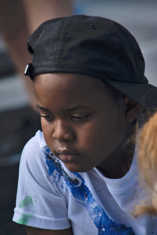
This is a fine street shot, and either way you look at the comments above makes for a good discussion.
There is a racial (not racist) overtone to your image, reflecting social conditions. As I understand it, the DR population is very light-skinned, so this dark-skinned boy in the DR might be Haitian, working a lower-class job. |
Apr 14th |
| 58 |
Apr 22 |
Comment |
This is a great shot of a parent and child, universal in its nature.
Thank you for taking us all over the world with your photographs! |
Apr 6th |
2 comments - 1 reply for Group 58
|
| 60 |
Apr 22 |
Comment |
The light pole is just fine, as it is old style, and it adds to this charming "local color" composition, but I would get rid of the car on the left. I don't use PS much, but I think there is a "content aware" feature that can take out the car if you choose. See if others can advise about that if you are interested. |
Apr 14th |
1 comment - 0 replies for Group 60
|
| 64 |
Apr 22 |
Comment |
This is a lovely shot just as it is.
The technical discussion about shooting the moon is interesting. The left edge is shot at twilight, and the right edge at high noon, in the same image. This is a tough problem for anyone. I suggest exposing for the high noon side to get some detail there. Then the twilight side would be very dark, but the data would not be lost, and you can bring up that detail a little in PS. |
Apr 13th |
1 comment - 0 replies for Group 64
|
| 73 |
Apr 22 |
Reply |
So kind of you to send this map. Thanks! |
Apr 19th |
| 73 |
Apr 22 |
Comment |
Great overview shot. I love to see the world in the images by folks in these Digital Dialogue Groups. Would you be willing to show a map of where you shot from and explain the direction of your view? Are any of the famous tourist attractions visible in your shot? |
Apr 13th |
1 comment - 1 reply for Group 73
|
| 75 |
Apr 22 |
Comment |
This is a stunning and unique shot. At first, I thought it was deliberate camera motion blur, but then I saw you shot at 1/250, so I looked closer. So interesting! |
Apr 13th |
1 comment - 0 replies for Group 75
|
| 78 |
Apr 22 |
Comment |
Nice subject matter, and a good choice of how you cropped the final image.
My only suggestion is to consider leaving just a hint of the vertical convergence, which is the natural perspective. Both the horizontal streets converge in the distance, so it is natural that vertical parallel lines would also. I know that it is conventional to make vertical line parallel, but that is not how they actually appear in real life. |
Apr 6th |
1 comment - 0 replies for Group 78
|
| 87 |
Apr 22 |
Comment |
What a wonderful project, to put into print a record of this beautiful art. |
Apr 2nd |
| 87 |
Apr 22 |
Comment |
I always learn something from your photographs, Lance. Shooting at f/1.4 ("for effect") blurs the foreground, which is quite a surprise, and hard for me to get used to, since I rarely see this approach to a floral foreground. I can see that if the foreground were in focus, one's eye would go there. You always talk about "place" and I can see that you are going for the larger "place," not just the foreground flowers. I will certainly keep this idea in mind as I take my own shots. |
Apr 2nd |
| 87 |
Apr 22 |
Comment |
I think this is a very successful shot of towering skyscrapers. The receding perspective really communicates the height of the buildings.
One note. I would not call this distortion, only perspective, and it is the same perspective your eye sees. After all, as you look down a street, you see the same convergence of lines as you see in this vertical view. |
Apr 1st |
3 comments - 0 replies for Group 87
|
| 88 |
Apr 22 |
Comment |
On the other hand, that little branch of blossoms at the very top tells you that the blossoms go on and on and on. I tried cropping that out, and suddenly the shot became very ordinary to me. Just a thought. Lovely composition of a familiar place. |
Apr 13th |
1 comment - 0 replies for Group 88
|
| 96 |
Apr 22 |
Comment |
Hello, you all have had a fantastic discussion about this image. It has been so very interesting. I very much like the original, as well as Haru's first suggestion for more contrast.
I want to comment about my personal, minority, view about subject in compositions. I think some compositions don't need a central subject, and this is one of them. A view of nature without a central subject expresses to me the grandeur of nature. I think your composition is just great. |
Apr 13th |
1 comment - 0 replies for Group 96
|
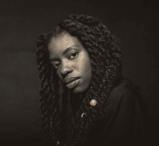
| 99 |
Apr 22 |
Comment |
Peter, I am not a portrait expert, so here are my amateur comments. This is a fine portrait: good pose and good expression from the model. You captured a good exposure; there is detail in all areas, light or dark.
You raised the question of being too dark; yes, perhaps it could be a bit lighter; see my try at this, attached.
We have had portrait discussions in other groups. What focal length did you use for this shot? Did you use a mild telephoto?
When I looked at your image, I immediately thought of the portraits by Yousuf Karsh. Please Google him and have a look at his famous portraits. Based on my understanding of Karsh's work, I might only suggest for you to get very slightly more highlights on your model's face. |
Apr 1st |
 |
1 comment - 0 replies for Group 99
|
38 comments - 14 replies Total
|


