|
| Group |
Round |
C/R |
Comment |
Date |
Image |
| 32 |
Mar 22 |
Comment |
Good safety suggestions from Wes. AND when you tell someone where you are going, don't vary from that itinerary. |
Mar 29th |
| 32 |
Mar 22 |
Comment |
Tom shows his considerable experience with his comment about using a mild telephoto for portraits. I have not practiced that, but only read about that in instructional articles, suggesting to shoot anywhere from 75mm to 200mm. |
Mar 29th |
| 32 |
Mar 22 |
Reply |
Also an interesting idea. Thanks. I will try something later this month or next month if I run out of time. |
Mar 8th |
| 32 |
Mar 22 |
Comment |
This building looks in terrible condition, the windows, the roof. It is abandoned, or is that just how your view of it shows it? The total effect is good, photographically, especially of course with the leaning steeple. |
Mar 7th |
| 32 |
Mar 22 |
Comment |
Yes, colored chalk painting looks better in color.
I like very much the angle from which you shot. The slant gives this image drama. You have a good view of both the artist and the art.
I am not sure about including fragments of other art, although that does give the context. But I don't see how you could have avoided that, unless you remove it in post-processing.
I think the monochrome could be a touch brighter. |
Mar 7th |
| 32 |
Mar 22 |
Comment |
Congrats to all the judges.
Interesting image, so completely different from "straight" photography. |
Mar 7th |
| 32 |
Mar 22 |
Comment |
Great view, and I especially like your placement of the horizon line to give an impression of the immensity of the canyon.
I have a little trouble with separating the foreground bushes from the canyon view.
As to the contrast, like Wes I sought to brighten the snow; I used my limited curve control in PS elements. Here is my result. |
Mar 7th |
 |
| 32 |
Mar 22 |
Reply |
Yes, that's a really good idea. I could make it a statement about waste and pollution. I could put in various products and symbols and artifacts of things we unnecessarily throw away. The toilet paper cores would clearly refer to human waste, and might obliquely refer to cow/pig waste and its danger to our waterways. I could arrange non-nested cores in a "house of cards" structure to suggest the dangers of waste pollution. |
Mar 7th |
| 32 |
Mar 22 |
Reply |
Wes, thanks for your comment. Your raise a really interesting and useful question. I do recall that some of the tabletop images in the various groups have messages or stories to give those images extra richness. This one does not, but your idea stimulates me to think about what I might have done differently or will think about in the future. |
Mar 7th |
| 32 |
Mar 22 |
Comment |
Looks like the images are a bit jumbled. The "Original" does not display for me. From your text, I assume your finished image is the one with sheet music in the background. I think it's an effective combination of images. The vignette is very suitable in this situation, and the inset image of the longhorn is offset to good effect. I looked up longhorns on the Internet. You have a real doozy in this image. |
Mar 5th |
| 32 |
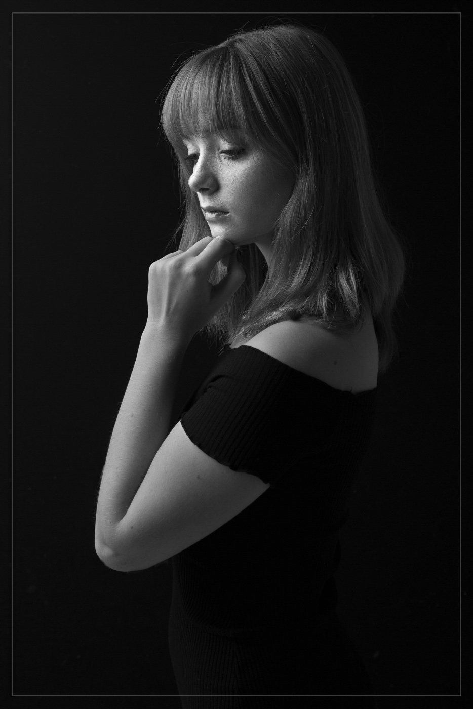
Mar 22 |
Comment |
Great composition and good pose by the model. The angle of the light on her face gives a good Rembrandt effect. Since you used a single light source, I think it's a bit too bright on the nearest part of her to the light--her forearm--at the cost of light on her face. I tried to reduce the bright forearm using PS Elements "Darken Highlights" applied overall. Then, I selected just her face and slightly increased brightness and mid-tone contrast--to simulate the effect of a slight spotlight on her face. What do you think of my suggestions and execution? Also, a rear spot highlighting her hair might have been nice. |
Mar 5th |
 |
8 comments - 3 replies for Group 32
|
| 39 |
Mar 22 |
Comment |
This is a wonderful shot of the architecture of the crossing. You had a very clever idea to rotate it 45 degrees; this is so unique that it takes some getting used to, but I think it is a very valid presentation, so that the columns are orthogonal, instead of the nave and transept. |
Mar 2nd |
1 comment - 0 replies for Group 39
|
| 78 |
Mar 22 |
Comment |
Jim, this is a charming shot, and you chose a good crop to capture the main subject matter. Good job of including the work environment of the hat maker.
About exposure, the dark areas of your original contain ample image data (unlike blown-out bright areas, which cannot be salvaged). I used PS Elements "Lighten Shadows" twice applied, and then a bit of "Darken Highlights". Here is the result of this 5-second process. |
Mar 1st |
 |
1 comment - 0 replies for Group 78
|
10 comments - 3 replies Total
|


