|
| Group |
Round |
C/R |
Comment |
Date |
Image |
| 3 |
Feb 22 |
Comment |
Nice shot contrasting the old and the new. I think I have seen similar shots before--is there by any chance a cemetary in the not seen foreground? |
Feb 4th |
1 comment - 0 replies for Group 3
|
| 5 |
Feb 22 |
Comment |
Pete, I much prefer this severely angled shot to the other one you are showing this month in another group. The lines of the steps are the best part of the composition. 30mm and f/10 does the job--I will remember that. |
Feb 3rd |
1 comment - 0 replies for Group 5
|
| 11 |
Feb 22 |
Comment |
It is admirable that you keep coming back to this monument, to shoot it again and again. Keep at it; you are compiling a fascinating body of work. This image looks very good, with sufficient light on the statues.
You might try an off-camera flash fill to lighten up the statues, or bring a large reflector to cast light on them. I don't shoot HDR, but you might try that. |
Feb 17th |
1 comment - 0 replies for Group 11
|
| 16 |
Feb 22 |
Comment |
Good job on punching up the colors and replacing the sky, but not overdoing it--a definite danger you avoided.
But this does not look like your home in Coral Springs, FL, for sure. How about telling us about your trip and how you got this shot? Part of the pleasure of PSA is hearing travel stories, and personal stories about getting the shot. |
Feb 3rd |
1 comment - 0 replies for Group 16
|
| 19 |
Feb 22 |
Comment |
The combination of a live subject and its shadow in the same image is fascinating, and this is well-done and pleasing.
Can you arrange this so that the shadows are not partially blocked by the live plants? |
Feb 4th |
1 comment - 0 replies for Group 19
|
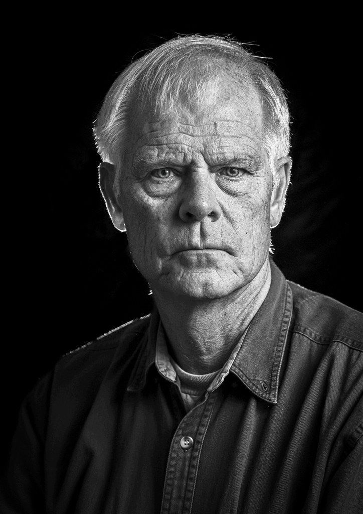
| 27 |
Feb 22 |
Comment |
This is dramatic lighting, and very successful. I am not sure either if you satisfy your club's criteria.
My only suggestion is to try this again with your husband turned a little more towards the light so a triangle of light forms under his left eye. This is called The Rembrandt Triangle. You might also find this makes his left eye a bit better out of the camera. |
Feb 4th |
1 comment - 0 replies for Group 27
|
| 30 |
Feb 22 |
Comment |
The subject matter is really beautiful. It is sharp, exposure perfect, and the sky colors are great.
My only comment, and this is quite personal, is that my eye bounces back and forth between the city-scape and the reflection, which competes for my attention. To my surprise, I am suggesting to not include the reflection, just a bit of water before the reflection starts. I do not normally have this reaction to reflections. |
Feb 4th |
1 comment - 0 replies for Group 30
|
| 32 |
Feb 22 |
Comment |
I agree with Tom's comments, especially about the upper left orb, the white line, and the good lighting.
I think you could take an idea from Diana this month and make a composition with a series of the upper left orbs in various sizes and locations. Also, that orb on the lower right looks to me like a living thing--it might be interesting to add it in color into a fantasy jungle landscape. |
Feb 11th |
| 32 |
Feb 22 |
Reply |
I am looking forward to you taking us on your visit to the interior of this stunning home. |
Feb 8th |
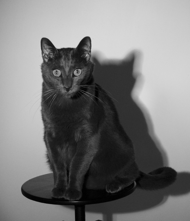
| 32 |
Feb 22 |
Comment |
I like Tom's idea to move your cat further away from the background (white) because then the shadow would be separated from the cat. His comment about rim lighting is very sharp (the idea is sharp, but so I suppose would be the rim lighting). |
Feb 8th |
| 32 |
Feb 22 |
Reply |
Oh yes, totally agree, especially your great idea to dodge the mosque stripes. Thanks. |
Feb 6th |
| 32 |
Feb 22 |
Reply |
Thank you, Lance, I am never sure I am on the right track.
We have a pretty vigorous continuing discussion in Group 32 about contrast, so you may see us sometimes displaying quite a bit more. I would be interested in your comments when we do that. |
Feb 5th |
| 32 |
Feb 22 |
Comment |
I like everything about this. I like the vignette effect for this subject, as well as the sepia tone. You did a good job shooting faces of such different complexions and making each of them clear.
My only suggestion is that maybe the torn paper, or some other antique style, border might work well here. |
Feb 4th |
| 32 |
Feb 22 |
Comment |
This could not be better, Tom. It's a perfect capture. I like how you got the entry stairs in right to the bottom step.
This shot is nostalgic for me because our oldest daughter got married in Michigan in a very similar repurposed private mansion, complete with a similar balcony, the Cartier Mansion in Ludington, MI. It had been built by a lumber baron, so every room was finished in a different fine wood. |
Feb 3rd |
 |
| 32 |
Feb 22 |
Comment |
This is certainly noir, both figuratively and literally.
I am not sure about suggestions, but I think the circle of the spotlight is distracting, as well as the partial structure of the stool base. I am just offering the following crop for discussion. |
Feb 3rd |
 |
| 32 |
Feb 22 |
Comment |
I like everything about the color version:
1. The colors.
2. The spirals.
3. The background.
4. The flooded base, with its straight line.
5. The interaction between the colored spirals and the background.
As to the monochrome version, I like the spirals and background just fine, but I preferred the straight horizon line of the colored version, so I don't care for the softened line of the monochrome version. I really liked the full view of the colored version, so having seen that, I don't care for the cropped monochrome version.
These are strictly personal reactions, coming from my eye as I look at each version. |
Feb 3rd |
6 comments - 3 replies for Group 32
|
| 41 |
Feb 22 |
Comment |
Absolutely splendid. Great finished effect. Good use of flipping the image to get an image of a great space. |
Feb 15th |
1 comment - 0 replies for Group 41
|
| 42 |
Feb 22 |
Reply |
Another thought. It is different from all other prison shots I have seen in that it is immaculately clean and in good condition. Looks like a space almost good enough in which to hold a wedding reception--although I don't think anyone would choose it. But those heating units would make great buffet serving stations. |
Feb 16th |
| 42 |
Feb 22 |
Comment |
Respectfully, I take the other point of view, and prefer architectural and urban shots to be empty of people. I like this as it is, a study in architecture and light. The pipes and heating fixtures (?) on the left are a nice counterpoint to the cell bars. The slanting shadows connect the windows directly to the cells, repeating the multiple-small-rectangle patterns three times--in the windows, on the floor, and in the cell bars--perfect. The full view of the window at the end is almost like a regal personage reigning over the entire composition. |
Feb 15th |
1 comment - 1 reply for Group 42
|
| 45 |
Feb 22 |
Comment |
What a great shot. I have no suggestions for changes. I just want to say that the "converging verticals" project is a great idea. In my view, converging verticals should often be left to converge to give a sense of upward soaring, clearly demonstrated here. Too often, folks think the convergence should be altered. |
Feb 3rd |
1 comment - 0 replies for Group 45
|
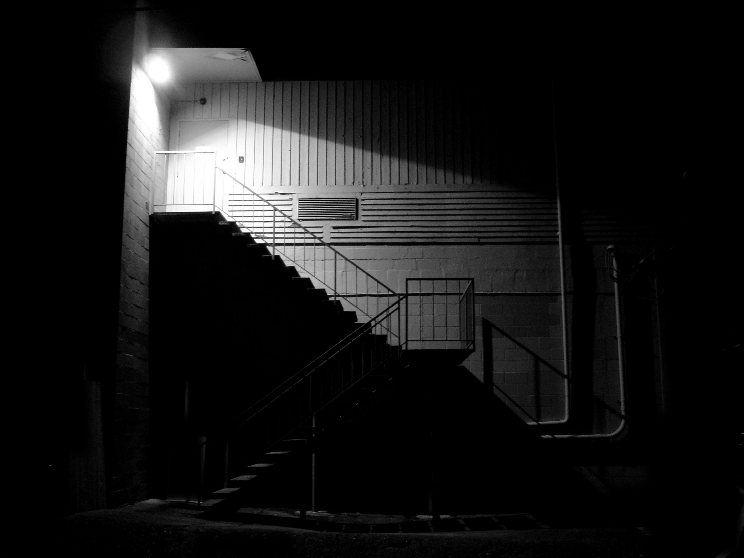
| 47 |
Feb 22 |
Comment |
Hi Jeff, I love your laundromat shot, because I shot something similar a few years ago, that I call "The Night Warehouse." I find these night shots very interesting with their intense illumination in limited areas of the image. I only shot an exterior, whereas you went further with a long exposure and captured that very interesting interior. Good idea to keep it empty of people. |
Feb 15th |
 |
1 comment - 0 replies for Group 47
|
| 54 |
Feb 22 |
Comment |
I think this is a lovely scenic shot, and the door is a good idea and well done. I suggest that the view through the door might be of a different place, and with a vanishing perspective. |
Feb 3rd |
1 comment - 0 replies for Group 54
|
| 60 |
Feb 22 |
Reply |
Oh yes, Damon, there are lots of approaches, and all are valid, especially to the photographers themselves. Great to discuss alternatives with you. |
Feb 4th |
| 60 |
Feb 22 |
Reply |
I think your contrast is fine. You might experiment with deeping the Rembrandt shadow, even to the point that the dark side of Phil's face is almost black. But keep the Rembrandt Triangle under his eye, and make sure the dark side eye has a glint in it. I can't create different lighting, but I fiddled with brightness and contrast to suggest the change. What do you think? |
Feb 4th |
 |
| 60 |
Feb 22 |
Comment |
Good job on capturing Phil's intense expression. The Rembrandt lighting looks great. I do not see it used enough in portraiture throughout these discussion groups.
We have a son living on Beacon Hill with his family, and a daughter in West Seattle. You are very fortunate with your location. |
Feb 3rd |
1 comment - 2 replies for Group 60
|
| 64 |
Feb 22 |
Reply |
Oh, I see now. Sorry. Good choice. |
Feb 4th |
| 64 |
Feb 22 |
Comment |
You are part of a very active discussion of "shadows" going on lately, and all the images are very interesting and creative.
For your image, I recommend you keep it entirely in the realm of "shadows" and take out the fragment of the outside window, but keep in the mysterious circular shadow. |
Feb 4th |
1 comment - 1 reply for Group 64
|
| 71 |
Feb 22 |
Comment |
You and your group are advancing this beautifully. It is great, and I really like it. No suggestions for improvement, but a question. I like the blue, but have you tried it in b/w to see how that looks? Full disclosure: my home group is a b/w group. |
Feb 15th |
1 comment - 0 replies for Group 71
|
| 74 |
Feb 22 |
Comment |
Your model certainly has struck a dramatic pose. Congratulations on getting this shot.
I have so many questions that you were silent about:
1. Is your model a professional, or someone you know?
2. Did you set up (or use) studio lighting, and what was the lighting arrangement?
3. Could you control the lighting and model, or did you just have to shoot what was presented to you?
4. I personally favor one side of the face at least somewhat in shadow. How do you like that approach, and was it an option for you in this situation?
Thanks. |
Feb 2nd |
1 comment - 0 replies for Group 74
|
| 80 |
Feb 22 |
Comment |
Hi Beth,
The side-lighting on this architectural shot is great. Also good is the view of the architecturally consistent Postal Museum in the distance.
My personal preference (may not be yours at all) is to shoot these architectural shots empty of people. Also to get off center a bit--in this case a couple of steps to the left. Just thoughts from my own approach. |
Feb 15th |
1 comment - 0 replies for Group 80
|
| 86 |
Feb 22 |
Comment |
This is quite a dramatic architectural shot. I remember passing through there a few years ago.
I prefer the original shot, before any perspective alteration:
1. The subject matter does not suffer with no perspective alteration.
2. Your eye actually sees the same as the camera, so your original is true to what you saw, even if your brain likes to straighten out converging verticals.
3. You have only one prominent figure in the picture, and he is fattened by the perspective alteration--you can always pretend it is Winston Churchill on the people mover--or remove the figure. |
Feb 15th |
1 comment - 0 replies for Group 86
|
| 99 |
Feb 22 |
Reply |
Ah, excellent. I see what you mean and agree. Thanks. |
Feb 7th |
| 99 |
Feb 22 |
Reply |
Oh gosh, I didn't want to do that; I just wanted to suggest lightening the skin tone a bit. How can that be done? |
Feb 6th |
| 99 |
Feb 22 |
Comment |
This is a great personality shot, showing your cook's life experience and immediate exhaustion.
My only suggestion is to slightly lighten his complexion, and darken the highlights in the scene. I worked from your original. |
Feb 4th |
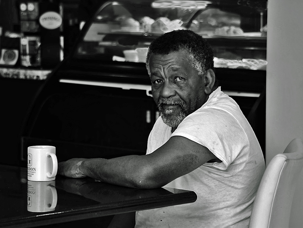 |
1 comment - 2 replies for Group 99
|
25 comments - 9 replies Total
|


