|
| Group |
Round |
C/R |
Comment |
Date |
Image |
| 5 |
Jan 22 |
Comment |
I am a big advocate of tranquil images with no focal point. I like this very much. I feel like I am standing right there at the edge of the mossy area. |
Jan 7th |
| 5 |
Jan 22 |
Comment |
I really like what you did with this portrait. I like the gentleman's expression, enhanced by his ruddy complexion. The shadow of his hat shows on his garments, so should not mysteriously disappear from his face. If you can't get the whole hand in, then you are right to take Mark's advice to crop out the partial hand. |
Jan 7th |
2 comments - 0 replies for Group 5
|
| 21 |
Jan 22 |
Comment |
This is really interesting, and highly original. I very much like the final arrangements.
What is the original you started from--it looks like poster art. |
Jan 7th |
1 comment - 0 replies for Group 21
|
| 26 |
Jan 22 |
Comment |
A lot of comments here mention a "lack of connection" because Bill's eyes are not visible. But as a end-of-life story, I think this portrait makes the exact point that "connection" is slipping away. Difficult as this image is, I think it expresses both the end of life, the loss of connection, and perhaps pain or despair. |
Jan 28th |
| 26 |
Jan 22 |
Comment |
I think at least the one you made a portrait of might be a male cross-dresser.
Aside from that, this is a fine portrait, and you caught your model at a good moment. |
Jan 7th |
2 comments - 0 replies for Group 26
|
| 28 |
Jan 22 |
Reply |
Wanda, thanks for the settings. I would really like to try some moon shots. Yours looked so great. |
Jan 11th |
| 28 |
Jan 22 |
Reply |
Yes, I totally agree with you about shooting at 1/250th.
About the f stop, however:
1. Depth of field is a property of a lens; it has nothing to do with the size of objects you are photographing.
2. For a 50mm lens focused at infinity, the depth of field is approximately from 30 feet out to infinity. For a longer lens, it might be around 150 feet to infinity. This is the general concept, and will vary a little from lens to lens, and at different f stops.
3. This means that when shooting very distant objects, you can focus your lens on infinity and be unconcerned about depth of field. This further means that you can open your aperture to f/2 or wider to admit more light when shooting distant objects, and be sure they will be sharp.
4. You can conduct an experiment to test this discussion. Try to shoot an image of the full moon with the center sharp and the edge out of focus (or the reverse). That should not be possible since both the center and edge of the moon are optically at infinity.
5. I can of course see using f/16 if you also want to include some earthbound trees in the lunar composition.
I consulted an astrophotographer friend and he further suggested: "to reach the best focus ... use a star and [focus to] make it a pinpoint. Then swing over to the moon."
|
Jan 10th |
| 28 |
Jan 22 |
Comment |
This is a great result. Please explain why you shot at f11 to f16 for an object at infinity with no practical depth of field. Is there something I don't understand? |
Jan 7th |
1 comment - 2 replies for Group 28
|
| 30 |
Jan 22 |
Comment |
I don't know much about this subject, but I am pretty sure that the moon, being at a great distance, can be focused at infinity, and has no practical depth of field, so you can open up your aperture a few f-stops and then reduce the ISO or increase the shutter speed. |
Jan 7th |
1 comment - 0 replies for Group 30
|
| 32 |
Jan 22 |
Reply |
Lynne, good idea. How is this? |
Jan 15th |
 |
| 32 |
Jan 22 |
Reply |
Tom, thanks for the detailed story. Doing armchair (or rather computer desk chair) travel is one of the pleasures of these Digital Dialogue groups. |
Jan 11th |
| 32 |
Jan 22 |
Reply |
I like the suggestions from Diana--they address the areas that I commented on. |
Jan 11th |
| 32 |
Jan 22 |
Comment |
Nothing to add. Like everyone is already saying, this is just great. |
Jan 9th |
| 32 |
Jan 22 |
Comment |
I like very much this overall view, and I like what Wes suggested.
On my part, I can't (on my screen) quite see sufficient sharpness of the mountains. I suspect a problem with where you focused. At f/8, I think the focus should have been a bit short of infinity so the depth of field would cover the mountains. I liked the old lenses of my youth that had the depth of field ranges marked right on the lens barrel. |
Jan 9th |
| 32 |
Jan 22 |
Reply |
Wes and Tom,
Thanks for your comments. This shot in the Gobi Desert is against a cloudless sky, as one might expect from the Gobi. And that line in the sky is a huge sand dune. I don't know what to do about the sky or dune without being untrue to the actual situation. Any suggestions? |
Jan 9th |
| 32 |
Jan 22 |
Comment |
I think your torn paper border is a lot better than some of the border effects I have seen elsewhere. Also, it reminds me of old books with torn edges. I think this is tasteful and artistically understated. Good choice.
I did not comment on the rest because you only asked about the border, and I see that Diana has addressed that. |
Jan 8th |
| 32 |
Jan 22 |
Comment |
Although many images in our group look better in monochrome that color, I would not have thought this picturesque shot of an historic mansion would be one of them. But it is quite good in monochrome: the architectural details stand out better, and the white fence in the foreground has separated better from the middle ground behind it, especially on the right side where the ground behind it is sunlit. |
Jan 7th |
| 32 |
Jan 22 |
Comment |
I like both images very much. You evidently worked hard and well at them.
For the color, I can only mention that my eye pulls downward towards the lighter background coloring. Perhaps it could be a bit more subtle.
For the monochrome, Perhaps it could be a bit brighter, especially the highlighted leaf on the bottom right, and the tiny stem that shoots up the highest. |
Jan 7th |
| 32 |
Jan 22 |
Comment |
The color image is fine, but I think it can do well as a b/w. I tried it using my PS Elements preset, "Infrared Effect," to convert to b/w, then did overall adjustments to "Lighten Shadows" and "Darken Highlights" until I felt there was detail in both the shadows and the highlights. I finished with increasing the overall contrast.
As to the cropping, I saw interesting triangular slivers in the roof and the ground shadow--echoing each other, so left them in. The great success of this image is that the triangular slivers are echoed everywhere in the composition.
What do you think of how I approached your image? |
Jan 3rd |
 |
6 comments - 5 replies for Group 32
|
| 34 |
Jan 22 |
Comment |
Hello Fran,
This is a creative and adventurous effort. In the ten years I have been in these Digital Dialogs, this is the first time that I have seen an image accompanied by a full explanation of its symbolism. So this is quite a departure, and I do accept that the image together with its narrative is a single artistic entity. You successfully explain each element of the image. |
Jan 7th |
1 comment - 0 replies for Group 34
|
| 42 |
Jan 22 |
Comment |
This is a beautiful building in its architecture and illumination, and a good shot, with no problem that you hand-held it.
The lights in your original are very delicate, but somewhat overwhelmed with brightness in your finished version, which announces "I am postprocessed." I agree with Michael that you might consider backing off the brightness a little. |
Jan 6th |
1 comment - 0 replies for Group 42
|
| 43 |
Jan 22 |
Comment |
I also like the original more, simply because the line is longer. But I would just add two women, and leave off the one in the background with her back turned. That upraised fist is indeed interesting! |
Jan 6th |
1 comment - 0 replies for Group 43
|
| 44 |
Jan 22 |
Comment |
This is a very interesting composition, and it raises a lot of questions in my mind.
First, old classrooms are from a time in which the teacher was up front and the students in regular rows. So a circular arrangement of a small number of chairs is surprising. Also, the chairs are in excellent condition compared to the room. Was this space repurposed for current small meetings? Did you arrange the chairs to symbolize the absent students?
Your interior lighting is excellent. Maybe, based on Rick's comment about the bright window, you could shoot from the left corner and not show the window, but still get the same interesting chair arrangement. |
Jan 6th |
1 comment - 0 replies for Group 44
|
| 49 |
Jan 22 |
Reply |
David, good luck with your entry. I would love to hear the result. You can come over to my group 32, and let me know there. |
Jan 28th |
| 49 |
Jan 22 |
Comment |
Wow, I am all for the abstract image you shot. The mystery of what one is looking at (first a game board, and then on closer inspection a building emerges) is really captivating. As our PSA instructor, Lance Lewin, says, this "pricks" the imagination of the viewer.
Craig makes a good point about shooting at around f8, a good general setting.
Also, consider going back and shooting at a different time of day to experiment with effects of slanting sunlight on the building façade. You could make an entire show of different presentations of this exact same composition in different lights. |
Jan 28th |
1 comment - 1 reply for Group 49
|
| 57 |
Jan 22 |
Comment |
Lovely subject, obviously a child you love, and a great finished effect. Can we see the original so we understand from where you started? |
Jan 28th |
1 comment - 0 replies for Group 57
|
| 58 |
Jan 22 |
Comment |
Great shot, for all the reasons your group has discussed. I also think it would look good as b/w, and although it is tempting to keep the red shirt, I find that effect in general a bit too cliché. |
Jan 28th |
1 comment - 0 replies for Group 58
|
| 59 |
Jan 22 |
Comment |
Good shot. I think you are on the right track here (intentional). A panning shot is a great way to blur the background to indicate the speed of the runners, and that works very well here. I agree with others that there might be a little too much arm and head blur, but you can take care of that next time by upping your shutter speed one step at a time until you find the speed you like. Myself, I would have liked to see the figures clearly and see motion blur in the hands and feet only. So you might try shutter speeds of 1/125 or 1/250. |
Jan 28th |
1 comment - 0 replies for Group 59
|
| 62 |
Jan 22 |
Comment |
Given the history you gave of Saladin, it is so appropriate that this man should pose before an "open door," which has deep symbolism about universal acceptance of each other. Either you or he, or both of you, appear very aware of this concept in this excellent image. |
Jan 6th |
| 62 |
Jan 22 |
Reply |
Pete, those are not circular scratches on the floor; they are metal tracks for the wheels at the bottom of each door to travel on. This is standard on such old structures. Yes, the fragment on the left can go out, for compositional reasons, but the door fully showing should keep the circular track in view. |
Jan 6th |
| 62 |
Jan 22 |
Comment |
Pete, great shot. How many times I have driven around Dupont Circle and seen the chess players there! I have heard that it is an intense crowd of very good players.
The angle of the late afternoon sun and position of your subject did not allow for good portrait lighting, but his intense expression of concentration makes the image. I tried to preserve some of the lighting contrast from the side and not brighten up his dark side too much. What do you think of this? |
Jan 6th |
 |
| 62 |
Jan 22 |
Comment |
Diagonal rays of sunlight on a rectilinear surface are a sure winner. Pete (Oliver) has nailed the right emphasis for your image. It does not matter much that some of the scene is out of focus, although when you go back you can improve that. Just be sure to get that play of sunlight again! |
Jan 6th |
3 comments - 1 reply for Group 62
|
| 67 |
Jan 22 |
Reply |
I thought over this moody shot. How about rendering it in monochrome, like this? Only an alternative. |
Jan 24th |
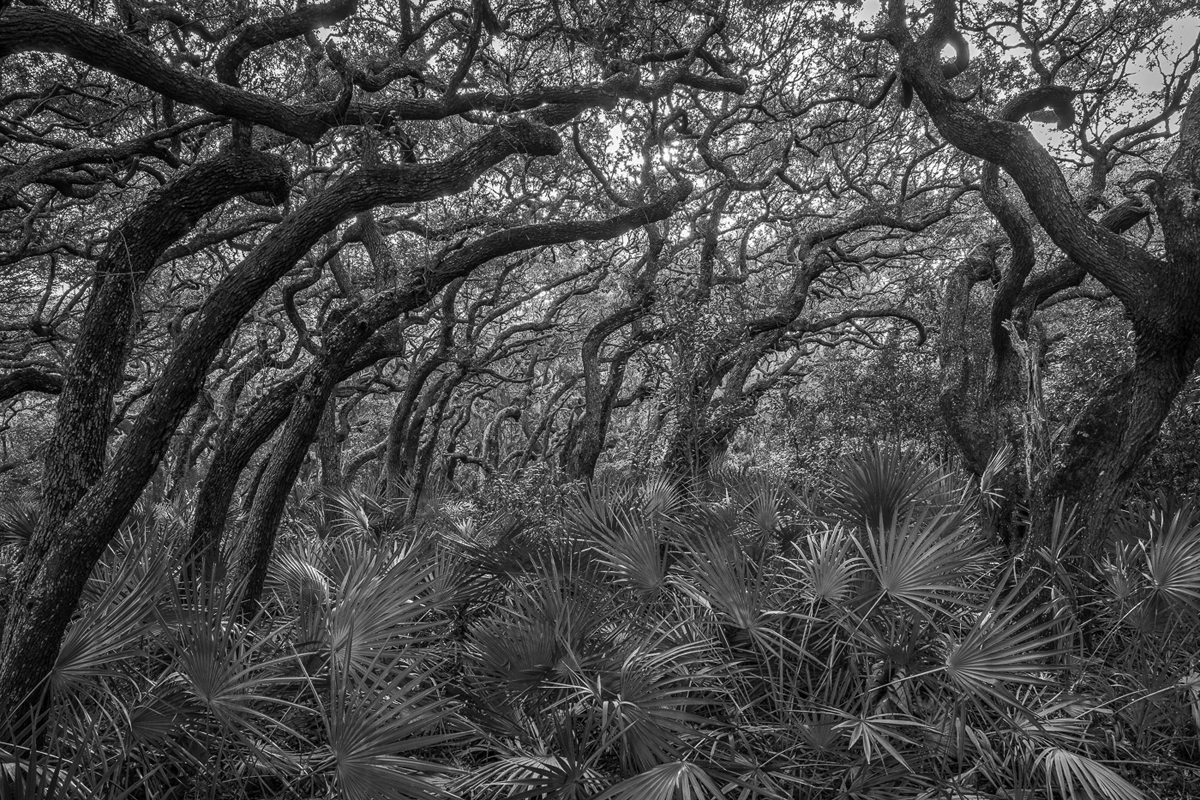 |
| 67 |
Jan 22 |
Comment |
Wonderful shot. It is truly the "tulgey wood." |
Jan 6th |
1 comment - 1 reply for Group 67
|
| 76 |
Jan 22 |
Comment |
Your group has had a good discussion of your excellent shot, but please tell the story of the place you visited to see this musician. Was in in France, or elsewhere? |
Jan 28th |
1 comment - 0 replies for Group 76
|
| 79 |
Jan 22 |
Reply |
Your had open eyes for this one, and I am sure you will be sensitive to great scenes in the future. What a pleasure it is to come before such a scene and capture it. |
Jan 6th |
| 79 |
Jan 22 |
Comment |
This is fantastic, how you have captured the drenching sunlight. It reminds me of the sunlit scenes by the painter Edward Hopper, but your photo shows the sunlight even more intensely than in his paintings.
The shapes are great also. |
Jan 5th |
1 comment - 1 reply for Group 79
|
| 81 |
Jan 22 |
Comment |
This is a well-done portrait, making use of the single light source to shadow one side.
Have you tried shooting this model with deeper shadows on her face, going as far as introducing a Rembrandt Triangle under the shadow side eye. If so, please show us your results. Thanks. |
Jan 5th |
1 comment - 0 replies for Group 81
|
| 82 |
Jan 22 |
Comment |
I love shots that express tranquility, and this does so very well. If you have now shot two seasons of this scene, will you also shoot the next two seasons so you have a full set of four seasons? |
Jan 5th |
1 comment - 0 replies for Group 82
|
| 86 |
Jan 22 |
Reply |
Thanks so much, Belinda, for the invitation. I am content for now to stay with my one Monochrome Group 32. I don't shoot enough to participate in a second group, and I actually find my greatest interests in photography to be history and criticism. So I visit all the groups and comment where something strikes my interest. I will pop up again for sure. |
Jan 8th |
| 86 |
Jan 22 |
Comment |
Hi Gene, this is pretty good looking, but won't you please tell us what and where it is, and some story of how you got the shot and your travels to this fascinating location.
I read your bio and noted how happy you were to get rid of the heavy gear and switch to a phone only. I also dumped my heavy gear, but I shoot with both my phone and a Canon G-10 (most recent version is G-16 I think). I chose it because it is a full-function camera, but the lens fully retracts so the camera is flat and can go in my pocket. |
Jan 5th |
1 comment - 1 reply for Group 86
|
| 87 |
Jan 22 |
Comment |
Hello Lance,
Your work is always adventurous. I see here shadows of natural plant leaves, maybe bamboo, cast upon a wood surface, another natural material. This is a well-planned juxtaposition.
Contrast is introduced by the shadows being blurry--an optical necessity--but the wood surface being sharp.
Your light source is a tall rectangle, the same shape as your Hashira-e diptych, but canted over a bit so it reaches from the lower left to the upper right of the composition, uniting the opposite corners. This is all very well-thought out.
My only comment to consider is that you have simply split a composition down the middle, but have not composed each side of the diptych as an independent composition that of course relates to the other diptych side to make a unified set. For reference to other Japanese art forms, see the work of kimono artist Itchiku Kubota, where each kimono is an independent composition, but adjacent kimonos make a larger composition. |
Jan 5th |
 |
1 comment - 0 replies for Group 87
|
31 comments - 12 replies Total
|


