|
| Group |
Round |
C/R |
Comment |
Date |
Image |
| 2 |
Dec 21 |
Comment |
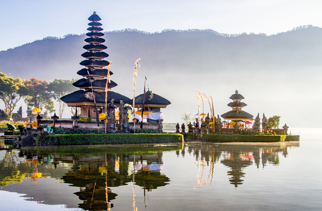
I took my family to Bali in 1988. It is wonderful to see this lovely shot. I used a "skew" adjustment in PS Elements on the left side to slightly straighten the pagoda. |
Dec 19th |
 |
1 comment - 0 replies for Group 2
|
| 7 |
Dec 21 |
Comment |
This is a fascinating shot. It makes me think of M.C. Escher paintings of impossible stairs. |
Dec 19th |
| 7 |
Dec 21 |
Comment |
You are quite right that this scene has wonderful highlights and patterns.
Please tell us more about this place and how you came to visit this temple. I lack the knowledge to tell from the studying and the artifacts if it is Buddhist or other. Thank you.
Also can you tell us the camera technical data.
My only photographic suggestion is to lighten a little bit some (not overall because the light patterns are perfect) of the darker areas. Here is a rough suggestion. |
Dec 6th |
 |
2 comments - 0 replies for Group 7
|
| 9 |
Dec 21 |
Reply |
About not carrying a heavy camera, I chose as my primary camera a Canon G-10 (up to G-16 now, I think). It has full manual controls, but only four f-stops, so there is some compromise. I chose it because of all the small cameras on the market similar to it, when the lens retracts, the camera is completely flat, and it can slip into my jacket, or even loose pants, pocket. The flash is very good in the 7-12 ft. range, and can take a lot of shots. However, the refresh time for the next shot is slow. |
Dec 19th |
| 9 |
Dec 21 |
Comment |
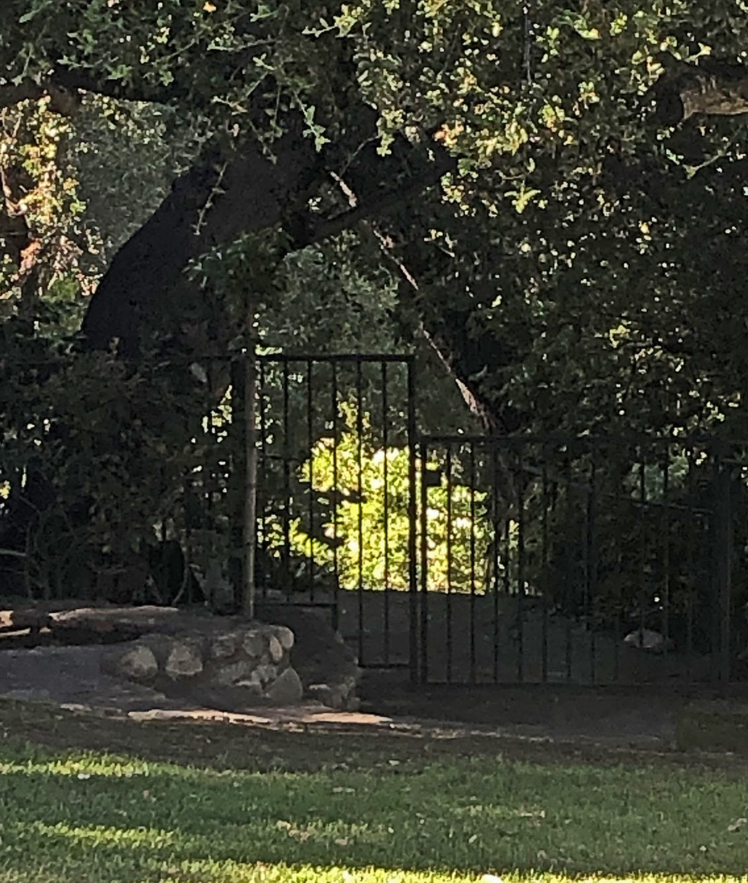
Here is the cropped version. |
Dec 6th |
 |
| 9 |
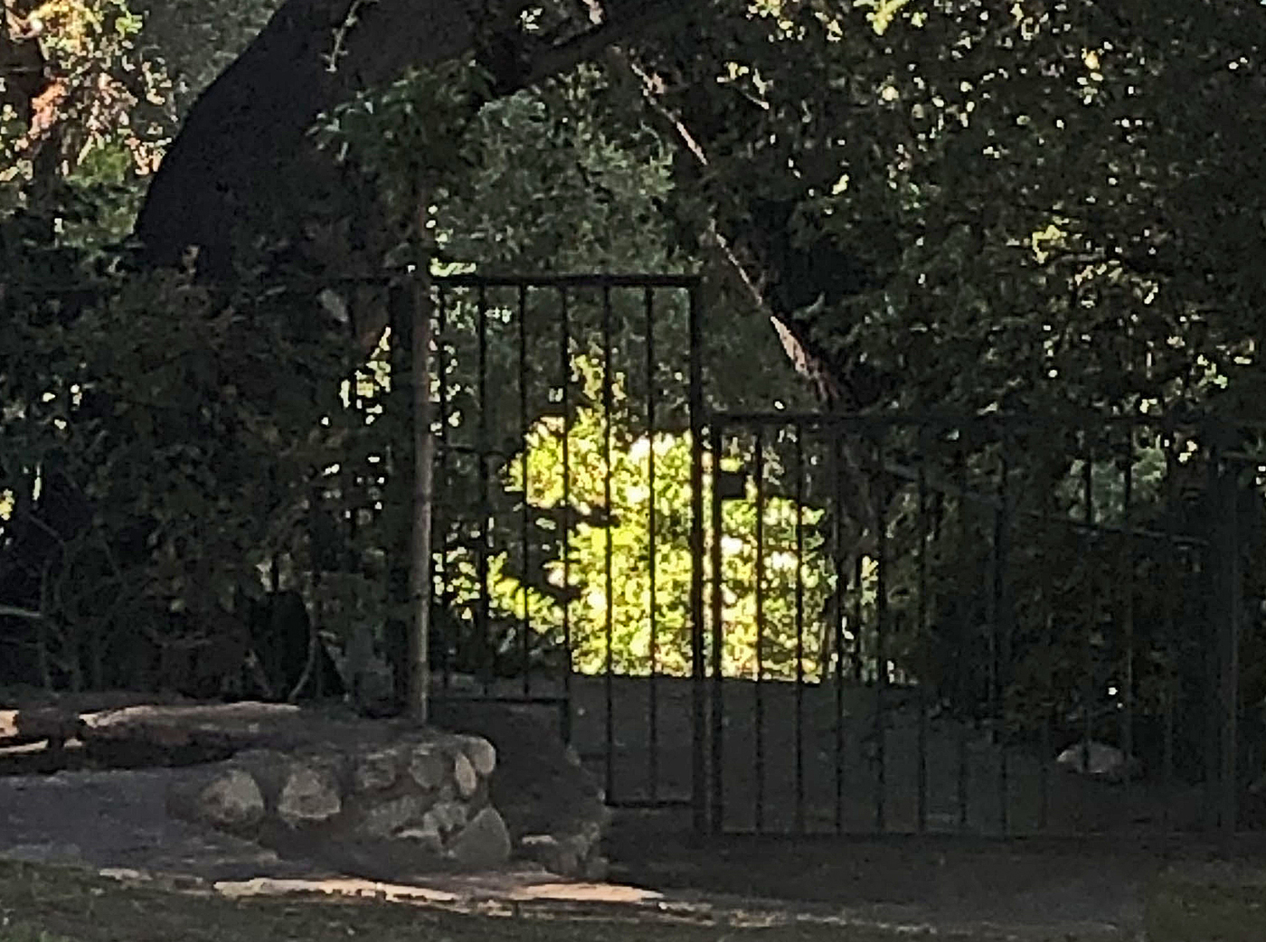
Dec 21 |
Comment |
You have a good idea here, the gate with a bright scene beyond, but I don't think it quite comes through.
The shot is not too sharp and I think it takes in too much. Although you may not agree with my suggestions, I lightened the shadows, darkened the highlights, increased contrast, and sharpened. Here is my suggestion, and a cropped version that I prefer, to limit the scene. All my interpretations, and maybe not what you wanted. |
Dec 6th |
 |
2 comments - 1 reply for Group 9
|
| 19 |
Dec 21 |
Comment |
I particularly like the play of sunlight on your subject. It reminds me of Edward Hopper paintings. |
Dec 19th |
1 comment - 0 replies for Group 19
|
| 25 |
Dec 21 |
Reply |
Yes, thanks, I think I have seen that trail when I used to ride the Metro. Perhaps the wall art was below me and not visible from the Metro car. |
Dec 21st |
| 25 |
Dec 21 |
Comment |
This is a great shot of the DC wall art scene. Your color capture is right on.
I live in Bethesda--I have not seen this--where is it? |
Dec 19th |
1 comment - 1 reply for Group 25
|
| 28 |
Dec 21 |
Comment |
This is an excellent composition of a valley with a serpentine river in it, backed by mountains reaching into the clouds. The diagonals of the near tree line and pipeline add to the composition.
But I have questions about your intent:
1. Is this a scenic shot only? Is there a message or opinion expressed about the pipeline? Do you admire the technology, or do you find it invades nature? I can't tell if you intend either.
2. Since the pipeline is the title, perhaps a pipeline shot might be stronger if you were closer to the pipeline, using a wide-angle lens, and the pipeline dominated the shot. |
Dec 5th |
1 comment - 0 replies for Group 28
|
| 32 |
Dec 21 |
Reply |
I respect your choice, and it is well done the way you chose. |
Dec 11th |
| 32 |
Dec 21 |
Reply |
I totally agree that this is a good midpoint. Good discussions. |
Dec 11th |
| 32 |
Dec 21 |
Reply |
Yes, you are quite right, it would be up to the reviewers. |
Dec 9th |
| 32 |
Dec 21 |
Reply |
So I am concluding that if "white, sepia, and black" is OK as monochrome, then so is "white, brownish, and black," with the one tint just being more intense? |
Dec 9th |
| 32 |
Dec 21 |
Reply |
Right you are. You made a quote without comment: "appears to be a grayscale print that has been toned in once color across the entire image." I started with the grayscale image and then added the tone across the entire image, as specified. I think this qualifies. Do you agree?
Our DD Categories definition of monochrome is the following: "Monochrome photographs are usually images in black and white but it also includes single toned pictures." I think this amounts to the same, but perhaps a bit less precisely stated. |
Dec 9th |
| 32 |
Dec 21 |
Comment |
I like very much this sort of car detail close-up. The exposure and sharpness throughout are very pleasing.
I do not care for the color original. It is very busy in the background.
I like the full view, but prefer your primary half-view shot the best. I might only suggest that the upper left corner (which you apparently blurred) be completely eliminated and made a solid tone. |
Dec 7th |
| 32 |
Dec 21 |
Reply |
Agree! I just found it interesting to explore the PS possibilities. |
Dec 4th |
| 32 |
Dec 21 |
Reply |
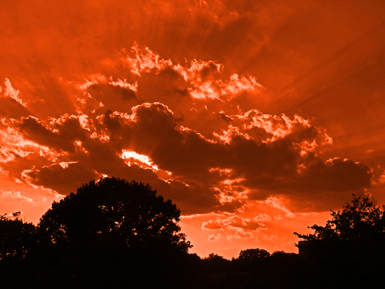
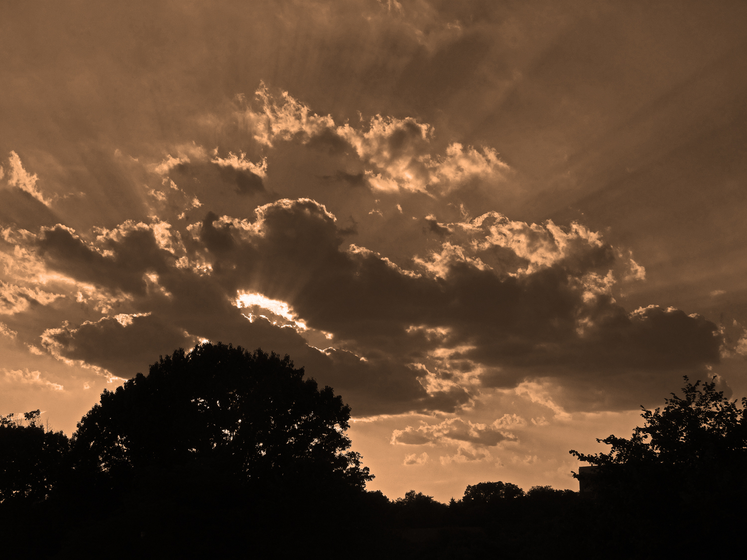
Here is one more go-around. The effect is slowing down. What do you think of all this intensity? |
Dec 4th |
 |
| 32 |
Dec 21 |
Reply |
Well now, this is getting interesting. Yes, I think so also, that intensity might be appropriate here. This is all experimentation, so I ran my intense image back into the editor and AGAIN slid the temperature control all the way to the right. Here is the result. I am finding this exercise very curious. I suppose I could run an infinite regress of this and see where it goes. |
Dec 4th |
 |
| 32 |
Dec 21 |
Reply |
Yes, exactly. Much better to get rid of the sign, even if the tail is a tiny bit cut off. I like the rough wood post. |
Dec 4th |
| 32 |
Dec 21 |
Reply |
Mark, thanks for visiting. In response to Jennifer, I tried a lighter tone. What do you think? |
Dec 4th |
| 32 |
Dec 21 |
Reply |
Thanks, I like the idea of a lighter tone. How is this? |
Dec 4th |
 |
| 32 |
Dec 21 |
Comment |
You got a good surprise. Such a well-posed and sharp shot.
I would try cropping out only the sign; I think the post is fine. |
Dec 4th |
| 32 |
Dec 21 |
Comment |
I love a good word play. This is great. You are right that you need a starting idea.
I quite like the color as well and the monochrome.
I suppose there are minor details that could be improved: the house does not quite fit on the truck, and has grass blades showing.
How about putting a driver in the truck signaling with their left arm out the window (this would have to be an American driver on the left, unless you flip this and then you could have a UK driver). Could you add light to the truck, especially headlight beams. Just playing with ideas.
|
Dec 4th |
| 32 |
Dec 21 |
Comment |
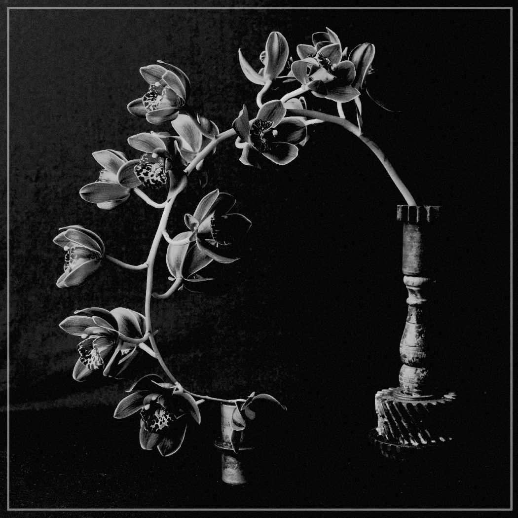
I love the candle holder and the arc of the flowers.
I think it's overall a bit too dark and could use a bit more contrast. I worked with it quite a bit, but could not satisfy my personal taste. Here is the closest to my idea that I could get, but it only suggests what I was thinking. What do you think? |
Dec 3rd |
 |
| 32 |
Dec 21 |
Comment |
First off, it's a great classic shot, both the view, and the far tower rising out of the fog bank. Both the color and monochrome shots are so impressive.
The etching effect is very attractive for the bridge towers and roadbed, but I don't find it expresses the fog very well. I wonder how it would look if you restricted the etching effect only to the visible bridge structure. |
Dec 3rd |
| 32 |
Dec 21 |
Comment |
Great subject matter, and you caught it at the right time.
But I much prefer the composition in your original frame--I like the layers of hills and valleys so typical of the Smokies. |
Dec 2nd |
6 comments - 11 replies for Group 32
|
| 33 |
Dec 21 |
Reply |
Perhaps the Indonesian climate has plentiful rainfall, and you are seeing rain runoff gullies on the side of the cone. |
Dec 27th |
| 33 |
Dec 21 |
Comment |
I also love this gorgeous shot, with such great subject matter.
I am going to guess about Lin Sun's question about the texture of the land. I believe the Indonesian climate has plentiful rainfall, and you are seeing rain runoff gullies on the side of the cone. Is that right?
|
Dec 27th |
1 comment - 1 reply for Group 33
|
| 34 |
Dec 21 |
Reply |
Mastering the Knight, in chess, I have heard is very difficult. Myself, I try to pay attention to pawn chains, gain a pawn or two advantage, then trade frantically to the endgame. Aside from finding this a bit easier for me, I recall a famous Bobby Fisher game in which Fisher's first dozen or so moves were ALL pawn moves, and at that point he had a solid advantage to win the game. |
Dec 21st |
| 34 |
Dec 21 |
Comment |
This is an impressive result. As a chess player myself, I note with amusement that the only piece that has normal contact with the board is the knight, which is a "magic" piece, in that it can fly over other pieces without being blocked by them and without capturing them. |
Dec 19th |
1 comment - 1 reply for Group 34
|
| 39 |
Dec 21 |
Comment |
I really like this shot, with its play of light and shadow. You also got the shadow detail clearly visible.
I am suggesting an alternative composition, not an improvement to this excellent image that shows the entire window and niche below. How about another composition consisting of only the top square of the window and its incoming light on the shutter? This would be a narrower discussion of window light and shadow only. What do you think? |
Dec 27th |
1 comment - 0 replies for Group 39
|
| 40 |
Dec 21 |
Comment |
This is so much fun. Nice job! Compositionally, how about moving the bowl of the spoon a bit further away from its neighbor cookie, about as far as the handle is from the butter. AND putting a little pyramid of the colored sprinkles somewhere, maybe even in the bowl of the spoon. Just playing with ideas. |
Dec 19th |
1 comment - 0 replies for Group 40
|
| 43 |
Dec 21 |
Reply |
I very much like those long shadows. They are as much the composition as the bullets. |
Dec 27th |
| 43 |
Dec 21 |
Comment |
If you don't mind me saying so, I think the shadow is brilliant, but the actual doll completely unnecessary to the composition. Can I promote my opinion to you and suggest you shoot this again and show us just some shadow studies. I think they would be fantastic. |
Dec 2nd |
1 comment - 1 reply for Group 43
|
| 48 |
Dec 21 |
Comment |
My daughter is an equestrienne and her daughter is just starting to learn hunt seat now. This is a fine shot. Consider alternatively shooting at 1/500 and getting some blur in the horse's feet and kicked up dust to give a sense of motion. |
Dec 19th |
1 comment - 0 replies for Group 48
|
| 67 |
Dec 21 |
Reply |
You could always do this, for fun. Lots of problems with an obvious reflection, including the lighting, and I usually do this only for streets and architecture, but I could not resist playing around with your image. |
Dec 18th |
 |
0 comments - 1 reply for Group 67
|
| 70 |
Dec 21 |
Comment |
Hi Frans,
How lucky you were to travel to China. We saw similarly dramatic scenery on a Li River cruise back in the late 80s.
This is a beautiful shot, and I have one question (not quite a suggestion, because I am not sure). I think the rise of the mountain on the left is the main subject, and it is slightly diminished by including the small mountain on the right. What do you think about cropping off the right 30% or so? I am really not sure about this, but just exploring the idea. What about flipping the image right-to-left? Again, I am not sure, just exploring. |
Dec 26th |
1 comment - 0 replies for Group 70
|
| 71 |
Dec 21 |
Reply |
I am so pleased that you like the idea. Of course, it is yours to use, that being the purpose of these groups. |
Dec 8th |
| 71 |
Dec 21 |
Comment |
This is great source material. You make a very astute observation about the effect of cropping and losing purpose. How about cropping all the way and making this a completely abstract image of ONLY diagonal lines? Sort of a diagonal Mondrian. What do you think of this? |
Dec 2nd |
 |
| 71 |
Dec 21 |
Comment |
This is a charming shot.
Won't you please tell us the place, and is there a story to how you took the picture, either to get/find the place, or how you planned and executed the shot. Thanks. |
Dec 2nd |
2 comments - 1 reply for Group 71
|
| 74 |
Dec 21 |
Comment |
Great detail and excellent composition. Good job.
As far as I can tell, this is a shot of a man holding a cigarette behind his back, hence I suppose it is "secret." This is an interesting play on the camera and the print seeing and showing something that was hidden in real life. But of course, it was posed in the studio, so what is actually hidden(?), except the thoughts of the photographer, and perhaps they too are not hidden, because here they are displayed in the image in front of us. This regress of thoughts about shooting something with a camera can go on forever. |
Dec 4th |
1 comment - 0 replies for Group 74
|
| 76 |
Dec 21 |
Reply |
That is fascinating that this is technically a color image. Is there any difference if you convert it to b/w? |
Dec 26th |
| 76 |
Dec 21 |
Comment |
I think your b/w image is brilliantly successful. It is minimalist yet detailed--an interesting combination. There is a full range of tones, even though the image is mostly black or near black. I greatly admire images that choose mostly black.
I am going to compare this (favorably) to a quite famous image, Wynn Bullock's "Let There be Light," attached, which was one of the prime images in the great 1955 "The Family of Man" show at the Museum of Modern Art in New York. |
Dec 17th |
 |
1 comment - 1 reply for Group 76
|
| 83 |
Dec 21 |
Comment |
This is a fine image. I have a question about it--how did you control the light, with the man in the shade and the bright sun behind? I would have used flash fill in the foreground, but it does not look like to me like you did that??? |
Dec 17th |
1 comment - 0 replies for Group 83
|
| 86 |
Dec 21 |
Comment |
Lovely image. Have you also tried how it would look in b/w? Full disclosure--my Group 32 is a monochrome group. |
Dec 17th |
1 comment - 0 replies for Group 86
|
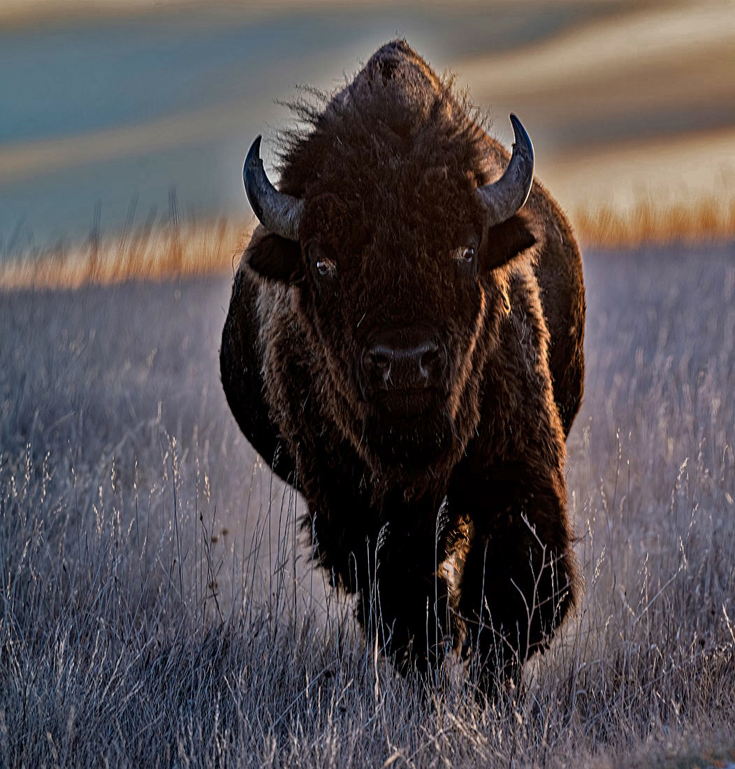
| 90 |
Dec 21 |
Comment |
Nice shot of this huge animal. I have no idea if the changes I made to the suggested version attached are any good, but please tell me or comment if you like/dislike them and why, if you don't mind. Thanks. |
Dec 3rd |
 |
1 comment - 0 replies for Group 90
|
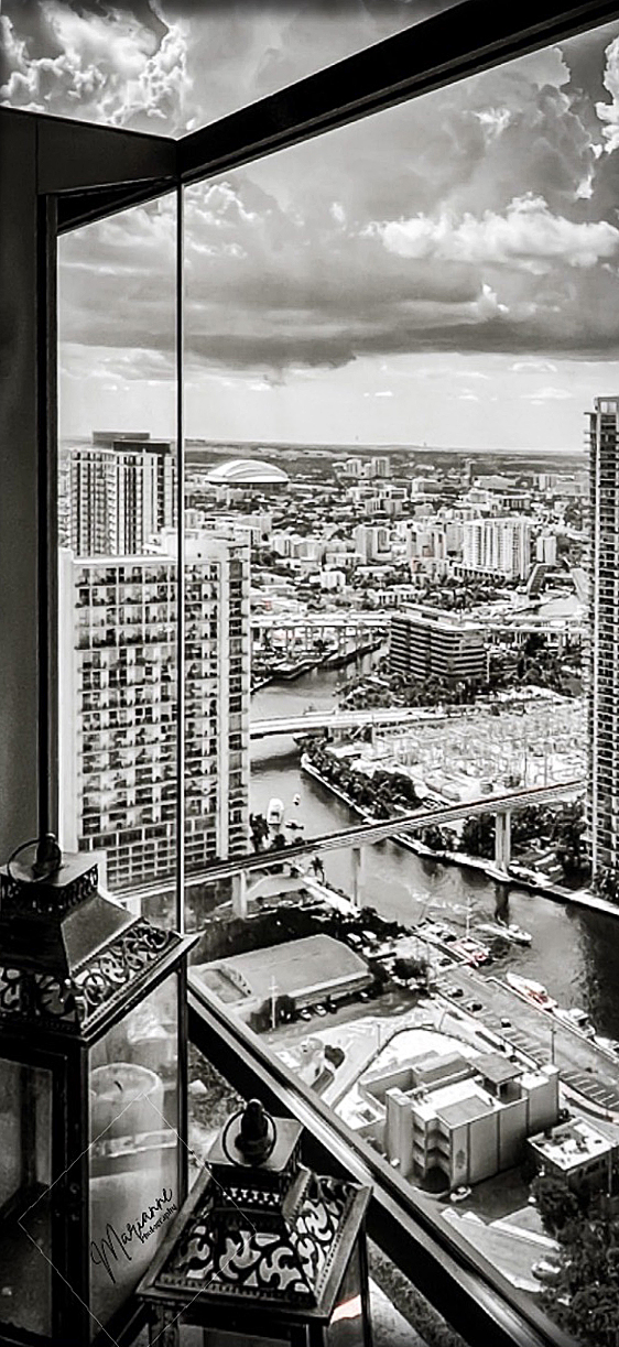
| 92 |
Dec 21 |
Comment |
Oops, Isaac is right. I added a tiny "skew" to lift the horizon level. |
Dec 16th |
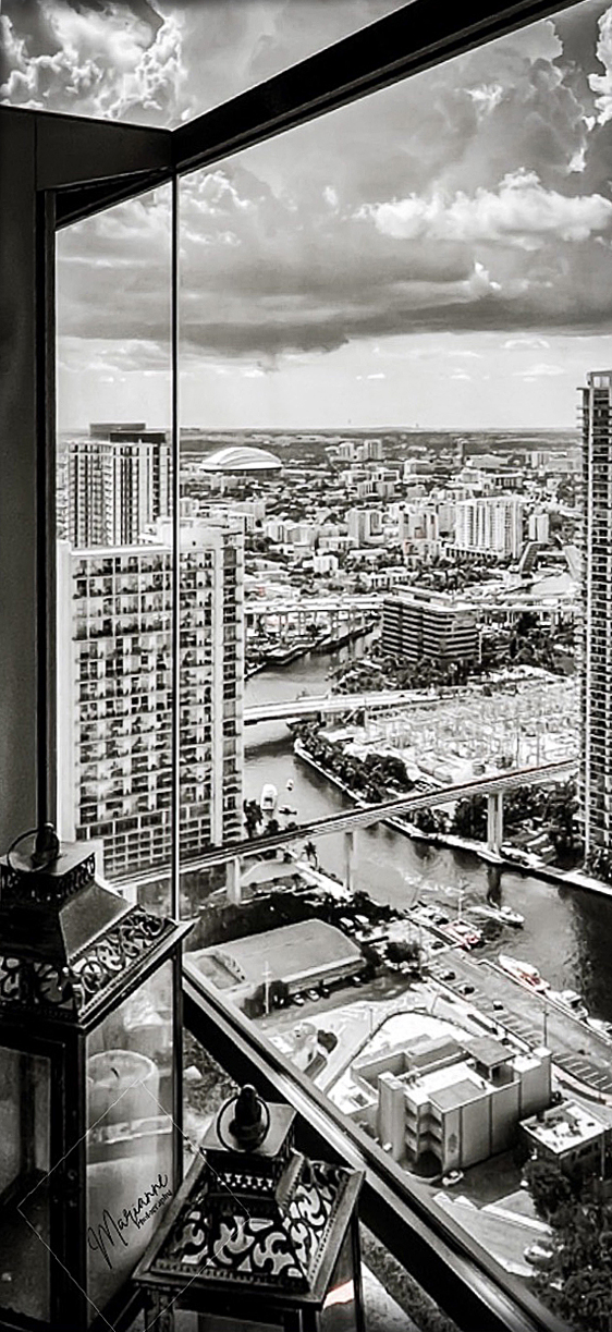 |
| 92 |
Dec 21 |
Comment |
I agree that this is worth loving. The inside/outside dynamic is great. Here are some suggestions, as I see it:
1. Straighten the architecture. Unfortunately that makes the image even taller and thinner. I don't see any way to avoid that if you straighten the architecture.
2. Increase the contrast.
3. Sharpen a bit.
Here is my try at it. What do you think?
4. My eye gets pulled constantly to the candle inside the candle lantern. You might remove just the candle in an editor. |
Dec 2nd |
 |
2 comments - 0 replies for Group 92
|
| 93 |
Dec 21 |
Comment |
What a nice tribute you have presented of your friend's works. I very much enjoyed what you did. |
Dec 2nd |
1 comment - 0 replies for Group 93
|
| 99 |
Dec 21 |
Reply |
You are so right that that the N would normally appear backwards from half the viewpoints, so my comment is not necessary. Yes, I agree that the flip is an overall compositional improvement. |
Dec 3rd |
| 99 |
Dec 21 |
Comment |
You have made quite a lot out of this image, with the sky replacement and the increased contrast.
But I would not flip it, as the letter "N" on the subject matter is now backwards. You could probably micro-flip it around. The "S" is not clear, so that does not matter. |
Dec 2nd |
1 comment - 1 reply for Group 99
|
32 comments - 20 replies Total
|


