|
| Group |
Round |
C/R |
Comment |
Date |
Image |
| 8 |
Oct 21 |
Reply |
So true about politicians (and marketers of false commercial products). So that makes your image extremely accurate, as well as creative. |
Oct 17th |
| 8 |
Oct 21 |
Comment |
Excellent texture! |
Oct 4th |
1 comment - 1 reply for Group 8
|
| 9 |
Oct 21 |
Comment |
All the elements you are working with (tree, house, field, sunrise, birds) are great to use, and I think you have combined them fairly well. Your group has a lot of very detailed comments, joining you in working on this composition.
My comment is that I don't find the sky colors convincing, because as you said you "helped" the sky, but I think it was to the point of the sky announcing "I am post-processed." So I suggest toning down the sky colors a bit to avoid that. |
Oct 17th |
1 comment - 0 replies for Group 9
|
| 11 |
Oct 21 |
Comment |
Allan raises an interesting point, but I think it is an advantage that you were able to shoot this with no visible people. It is rare to be able to do a study of just the architecture, water, and boats.
I actually prefer your original image, with its great expanse of water, and suggesting loneliness very well.
How about getting rid of those boarding steps--my eye gets stuck on them? |
Oct 4th |
| 11 |
Oct 21 |
Comment |
I am not sure I know what I am talking about here, but here goes.
This is an interesting arrangement of shapes (the shadow) on top of a textured background. The strongest element of the shadow shape (to me) is where the shadow on the bottom and right abuts the edge of the frame. But this does not occur on the left or top. So how does this crop look to you? |
Oct 4th |
 |
2 comments - 0 replies for Group 11
|
| 14 |
Oct 21 |
Comment |
This is a very interesting travel and cultural shot for most of us who come from other parts of the world.
Although you struggled for you point of view, please also consider the alternative view from very low to the ground--shooting from a squat a half meter in front of the fish baskets. |
Oct 28th |
1 comment - 0 replies for Group 14
|
| 17 |
Oct 21 |
Comment |
I think this is an interesting shot. How does it look to you in monochrome? I also cropped out the two partial beams. |
Oct 4th |
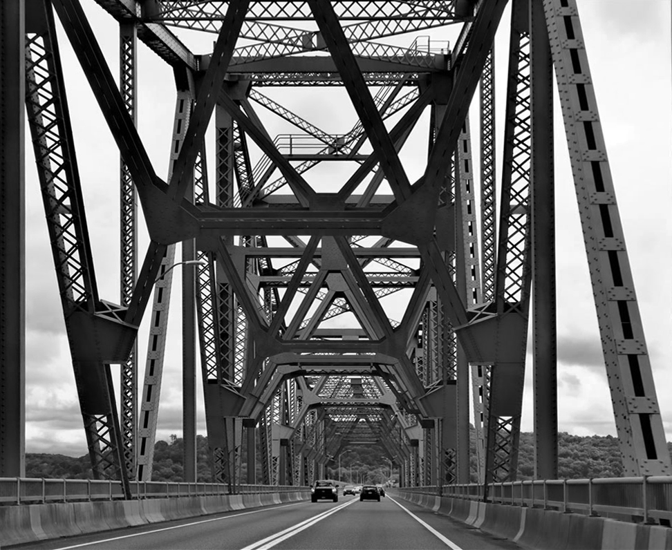 |
1 comment - 0 replies for Group 17
|
| 30 |
Oct 21 |
Comment |
This is quite interesting, and an original effort. Well done.
I note that one member of your group, Jon, commented that this awakens memories from one's suppressed past. He is so right on--I feel like dangerous suggestions are all over this image. I sense references to childhood fears, horror films, violence, and personal hygiene neglected. |
Oct 17th |
1 comment - 0 replies for Group 30
|
| 32 |
Oct 21 |
Reply |
Good idea. Face a little bit brighter. How is this? |
Oct 26th |
 |
| 32 |
Oct 21 |
Reply |
Thank you, Bev. |
Oct 18th |
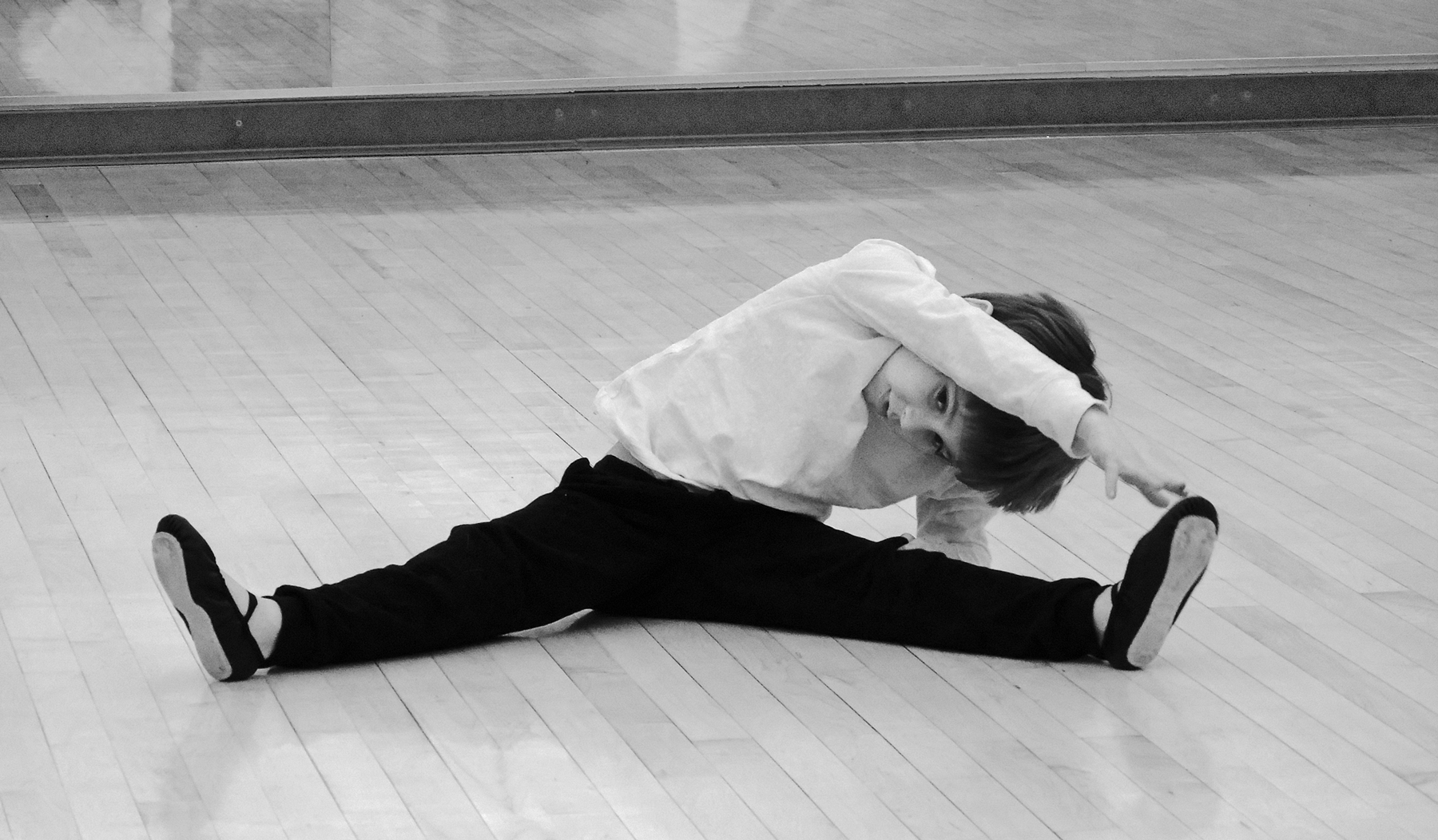
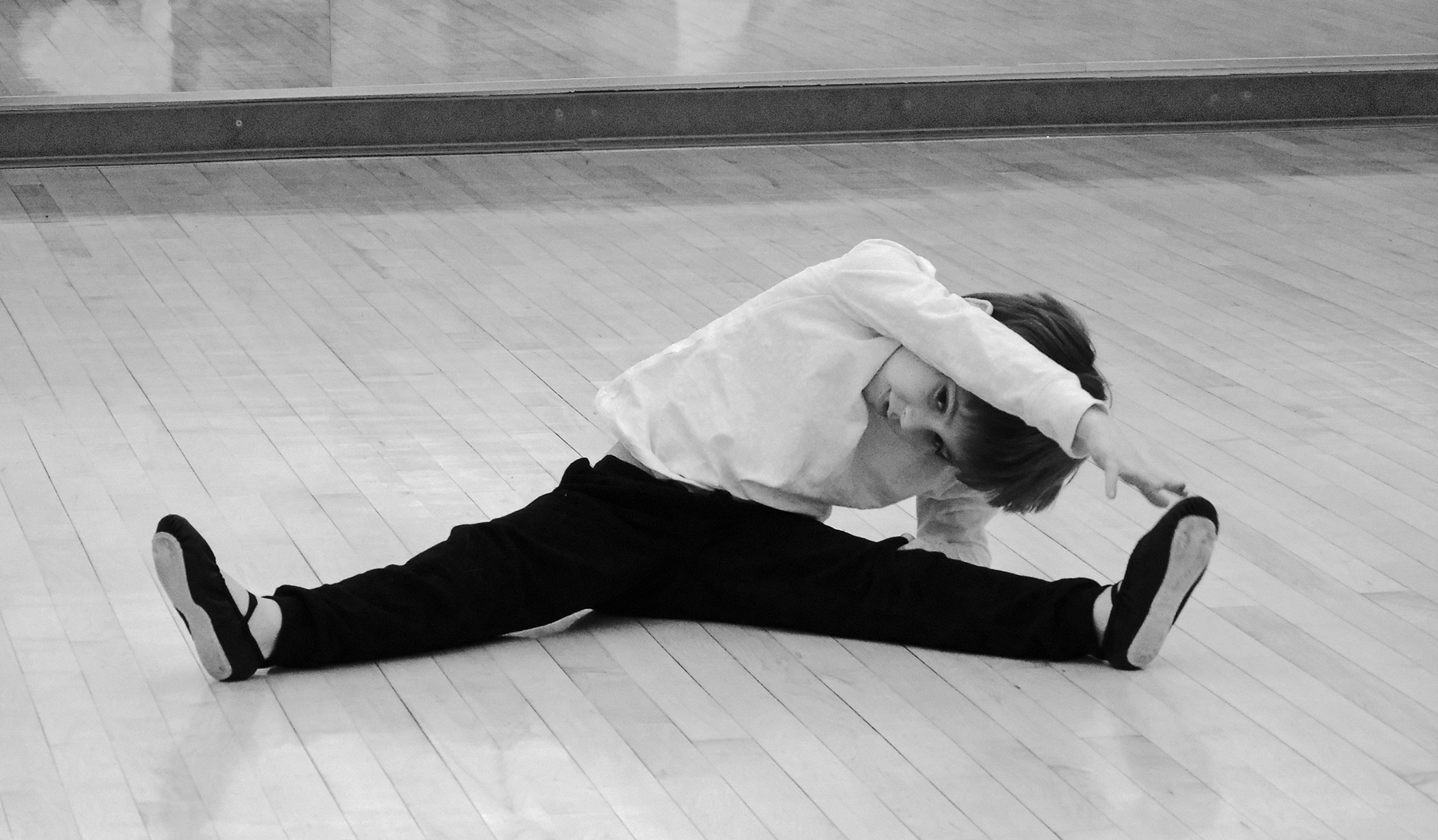
| 32 |
Oct 21 |
Comment |
I think it's so important for all kids to take lessons for swimming and some kind of movement--dance or gymnastics--one lets them move safely in the water, and the other lets them move better on the earth.
Of the 30 shots I took, this is the only one with a good view of his face, so I selected it.
I tried toning down the line. How is this?
|
Oct 16th |
 |
| 32 |
Oct 21 |
Reply |
Tom, thank you so much for that good idea about the shooting angle--I will certainly keep that in mind next time! |
Oct 11th |
| 32 |
Oct 21 |
Reply |
Thank you, Lynne, I tried, but was not sure I escaped cliché level. It's nice to hear your assessment. |
Oct 10th |
| 32 |
Oct 21 |
Reply |
Oh, that is better. The inner edges of the two bottom leaves stand out better with the colored background. |
Oct 10th |
| 32 |
Oct 21 |
Reply |
Yes, I specifically wanted to get rid of the cotter pin (and the bolt head below it). I thought they drew attention away from the two gears meshing. |
Oct 9th |
| 32 |
Oct 21 |
Comment |
I like both versions, of course, but I somewhat prefer the color. These images are quite beautiful
Choosing a single cluster, and giving it some room in the frame, works out very well.
I think there is a bit of glare around some of the leaves, especially the bottom two, that tends to partly obliterate the edges of the leaves nearby? |
Oct 7th |
| 32 |
Oct 21 |
Comment |
Looks pretty good to me; I would just like to see a bit of detail in the bellows. I selected just that area and applied "lighten shadows." What do you think? |
Oct 7th |
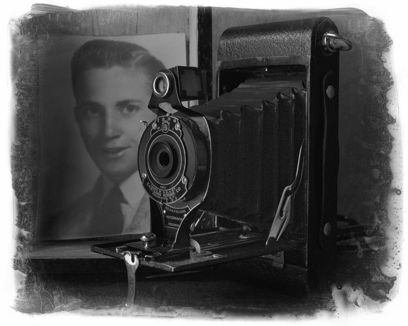 |
| 32 |
Oct 21 |
Comment |
Jennifer, you asked a lot of questions. Here are my reactions.
1. I like the road in the picture. It has a great diminishing curve.
2. I advocate the bend of the road exactly touching the edge of the frame, so yes I think you cut off a bit too much.
3. Contrast looks fine to me.
4. Is the subject compelling--not quite "compelling enough."
5. I think the large patch of roadside dirt in the lower left distracts from the natural plant life on the other side.
6. Alternatively, I might have gone to the curve in the road and shot straight down the road. That is somewhat of a cliché and has been done by many photographers, but it might work. |
Oct 7th |
| 32 |
Oct 21 |
Reply |
Yes, but if you go high key, I think a simpler subject would be best. I am not sure. Maybe the outlines of the buildings, dock, and boats would work. You can only try. |
Oct 7th |
| 32 |
Oct 21 |
Comment |
You chose a charming scene and rendered it well. But therein lies a problem. While I do not compete, I read others commenting about competing, and I often hear people urging others to make their images "pop." This is certainly not an image that "pops," and I wonder if you and Tom and others who have judging experience expect images to "pop." Also, your own preference for "more contrast, more contrast" is not present here, and maybe you are at your best in that world. If you are going to go for misty shots, I have seen good stuff that works with a minimalist approach--a single sailboat or fragments of a broken pier, barely discernable as such, on an unending sea of nearly pure white. |
Oct 7th |
| 32 |
Oct 21 |
Reply |
Lance, thanks for visiting and commenting so extensively. I will keep shooting, and thinking of what I am seeing in the viewfinder. |
Oct 4th |
| 32 |
Oct 21 |
Reply |
Thank you, Wes. |
Oct 4th |
| 32 |
Oct 21 |
Comment |
I like everything about this. It looks much better in mono, as we have all often noted.
I tried a closer crop, but just submit it for discussion--I am not sure about it. |
Oct 1st |
 |
| 32 |
Oct 21 |
Comment |
I love it.
That black sky is fantastic for this scene. Yes, it looks a lot like Infrared. Do you recall your exact settings?
I tried converting from your original, using PS Elements "Vivid Landscape" setting, but I like your black sky version best. |
Oct 1st |
 |
| 32 |
Oct 21 |
Reply |
It is always a pleasure to hear from you on the first of every month, my friend.
Thanks for your suggestions. I did not think to make the juncture of the wall and floor disappear--the result is very good.
As to brightness and contrast (smile), we have very active discussions in my Group 32 about that. I anticipated my Group's reaction, and upped the contrast. I am interested to see what everyone has to say about that. |
Oct 1st |
7 comments - 10 replies for Group 32
|
| 34 |
Oct 21 |
Comment |
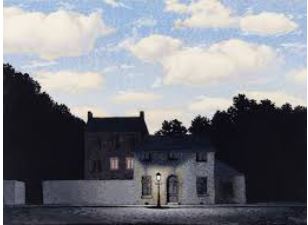
I will come in again in support of Alan's handling of the sky. I mentioned, and he verified, his admiration for the painter René Magritte, whose surrealistic paintings include the very concept that Alan is using here: an unnatural brightness in the sky juxtaposed with an inconsistent ground illumination. As he states, Alan is trying to create discomfort, not only in the woman in the image, but with us, who may find something disturbingly out of whack in this image. Alan, I presume I have this right? If I may, here is a sample of a Magritte painting using this lighting concept. Alan has admirably transferred the concept to his photography. |
Oct 16th |
 |
| 34 |
Oct 21 |
Reply |
It's just a suggestion for another element of surrealism. Glad to hear you might consider it in the future. |
Oct 6th |
| 34 |
Oct 21 |
Comment |
Ha! Classic Magritte-esque. Very good job.
But why not go further and have the woman illuminated AS IF she were under the lamp? |
Oct 4th |
2 comments - 1 reply for Group 34
|
| 37 |
Oct 21 |
Comment |
This has everything going for it: composition, sunset, lift bridge up for the boat. Can we see the original? I think this is a touch over-processed because it announces itself as such, and I suggest being a bit more subtle. |
Oct 4th |
1 comment - 0 replies for Group 37
|
| 39 |
Oct 21 |
Comment |
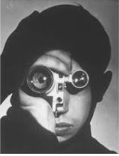
Here is the Feininger image. |
Oct 16th |
 |
| 39 |
Oct 21 |
Comment |
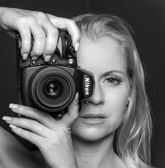
You have a lot going on here: a fine model, a prestige camera, and an interesting human/camera/eye concept. I take it from your comment and the composition itself that the main point is the human/camera/eye concept. If so, I think the model draws attention away from that because she is nude, blonde, and engaging more as a person that a photographer. I suggest cropping down to the most basic elements of the human/camera/eye composition, as attached. What do you think?
I have attached a second image, a famous shot by Andreas Feininger (of photographer Dennis Stock for Life Magazine). |
Oct 16th |
 |
2 comments - 0 replies for Group 39
|
| 40 |
Oct 21 |
Comment |
I feel that shots like this of statures are very fair game for photographers, as we must manage light, angle, DOF, focal length just to get a good record shot. Then, if you are working on interpretation, perhaps there is even more to do.
I think from the shadows you might have taken this in the mid-afternoon. Perhaps an hour before sunset might have worked better to show off the interesting geometric reliefs on the body and bench. What do you think? |
Oct 16th |
1 comment - 0 replies for Group 40
|
| 48 |
Oct 21 |
Comment |
Good idea to crop down to the center of the flower. You created an impressionistic result that does not require sharp focus. |
Oct 18th |
| 48 |
Oct 21 |
Reply |
Hello Lloyd,
I like your shot and I think it is very successful. I am very into appropriate titles. I suggest this one should be "Pacific Park in the Time of COVID-19." |
Oct 16th |
1 comment - 1 reply for Group 48
|
| 56 |
Oct 21 |
Comment |
I will come back in here. Excellent comments about the appropriateness of ballet shoes on a barn door, both compositionally and realistically. I really enjoyed hearing all your comments about this. |
Oct 27th |
| 56 |
Oct 21 |
Comment |
Your formal composition is charming: hanging the shoes on a doorknob, the postprocessing, the colors. The total pictorial effect works.
But the shoes and barn tell different stories--you may consider hanging the shoes from the back of a chair at the side of a ballet practice area or stage. It would not be necessary to include dancers, as your story of the shoes alone is excellent. |
Oct 15th |
2 comments - 0 replies for Group 56
|
| 57 |
Oct 21 |
Comment |
Good choice to frame just the central working parts. Was this a motor drive or manual? Was this a museum object? If so, please tell a little about the museum. Your explanation of how eight songs are coded on one cylinder is fascinating. |
Oct 15th |
1 comment - 0 replies for Group 57
|
| 58 |
Oct 21 |
Comment |
This is a charming shot, however you choose to crop or alter the perspective.
But the title must be "Worms." |
Oct 15th |
| 58 |
Oct 21 |
Comment |
Excellent documentation of street art (with a good cause in mind). Like Isaac said, you added a suitable human frame to it. Do you have a whole project documenting the street art in Montclair? If you do, it might eventually be of great interest to the local historical society. |
Oct 15th |
2 comments - 0 replies for Group 58
|
| 62 |
Oct 21 |
Reply |
Thank you, Bob. I always learn something when I stop in to visit other groups. |
Oct 28th |
| 62 |
Oct 21 |
Reply |
Yes, I understand the distinction you are making, and I agree completely. |
Oct 28th |
| 62 |
Oct 21 |
Reply |
LuAnn, do you mind if I point out that it's "you're"? |
Oct 27th |
| 62 |
Oct 21 |
Reply |
Hello Bob, I like your quote about what the viewer sees. My version of that is to suggest that an image should not announce "I am post-processed." |
Oct 27th |
0 comments - 4 replies for Group 62
|
| 64 |
Oct 21 |
Comment |
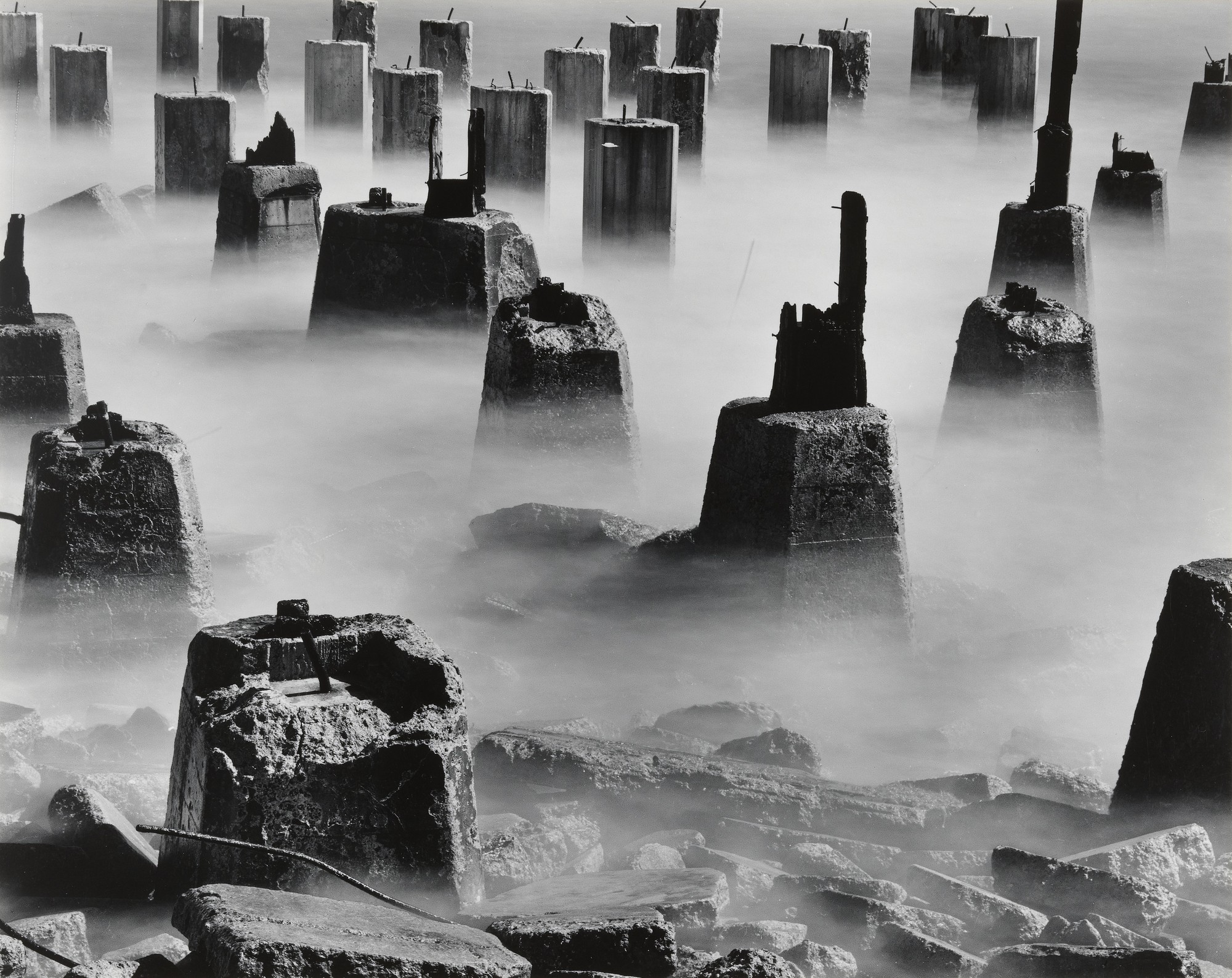
I like very much the contrast between the modern bridge and the old pilings. Your image has a similar angle of view in both the bridge and the pilings, making a nice compositional resonance.
Although it is not about old vs. modern, the attached famous image by Wynn Bullock (The Pilings), comes to my mind when looking at your pilings. |
Oct 27th |
 |
1 comment - 0 replies for Group 64
|
| 67 |
Oct 21 |
Comment |
I am totally with you in this discussion between "expressing calm" and "having a center of attention." Folks often take shots of tranquil streets or scenes and ask if they should perhaps add a cat or a person at, say, the end of an alley. I always say no, the scenes expresses calm, serenity, or even depression, but they do not need a focal point to complete that expression. I very much like your layers of light.
In my own visit to the Bay of Fundy years back, I noted that the tiny lapping incoming tidal waves would roll in, but never roll back, only to be succeeded by the next tiny wave, and so they came, one after another, advancing at about the speed of my slow walking retreat. Can you lie down on the wet sand and capture that? |
Oct 4th |
1 comment - 0 replies for Group 67
|
| 74 |
Oct 21 |
Reply |
Here is number 2. |
Oct 3rd |
 |
| 74 |
Oct 21 |
Comment |
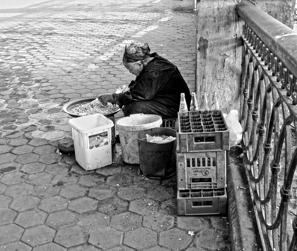
Hello Ata,
When we made our trip to Egypt a few years ago (just before the change of government), my wife remarked that it looked to her like Turkey 50 years ago.
I like everything about this, including your assessment of the nutritional value of the beans from the street. This is an excellent character-and-place shot. You always show sensitivity to the situation of poor folk you see in the streets.
Critically, I can only suggest lightening the woman's face. I tried two methods: 1) overall "lighten shadows," and 2) selected only her face and then applied "lighten shadows," images attached in that order. |
Oct 3rd |
 |
1 comment - 1 reply for Group 74
|
| 75 |
Oct 21 |
Comment |
You got a great original shot. I rather like its natural colors better than your finished image--I think the latter is a bit too color-enhanced, and tends to announce "I am post-processed." |
Oct 26th |
1 comment - 0 replies for Group 75
|
| 76 |
Oct 21 |
Reply |
Trey's image (and the fungi itself) are much more attractive than mine, as mine grows on a root and bulges upwards, rather than hangs down like Trey's. |
Oct 18th |
| 76 |
Oct 21 |
Comment |
Lovely shot. You got a good sample, hanging in waves from the side of the tree. I get this every fall in my yard growing on the base of one of my oak trees--I am told they like to grow on oaks. |
Oct 15th |
1 comment - 1 reply for Group 76
|
| 78 |
Oct 21 |
Comment |
Brenda, you and your group colleagues have taken this image on a long and successful path of improvement to reach the final version. You have all had an impressive discussion (as your group always does) about making the final version with a lot of good Photoshop work.
I tend to view images compositionally, and I think you did not have a strong starting composition--although you did a great job with it. The horse has only one leg in the air; the rider is wearing an ordinary short-sleeved business shirt; despite the title the image does not tell a story of going anywhere except around in the ring. I suggest trying for a closer shot of the horse in a canter, and the rider dressed more stylishly, with face visible. |
Oct 26th |
| 78 |
Oct 21 |
Comment |
I like very much shadow studies such as this. Why not go all the way and crop everything out except the shadows?
Also, if you edited the original (with two other people) to remove three humans and one dog, they you might have an interesting surrealistic study of all their shadows. |
Oct 15th |
 |
2 comments - 0 replies for Group 78
|
| 80 |
Oct 21 |
Comment |
It's hard to get a good shot on the fly, but this subject is captivating, showing everyday activity and telling the story of the preparations for going out for a catch.
I think Victor's changes are to the good. My suggestion is to get rid of the non-contributing man on the right, and get a little closer to the action. Here is my suggested crop. By the way, in the history of art and photography, showing three people in an image works, but I think four is more difficult. |
Oct 26th |
 |
1 comment - 0 replies for Group 80
|
| 82 |
Oct 21 |
Comment |
This is a lovely shot of a clearly recognizable (therefore not abstract) sail. The sky is a great background.
If you want it to go all the way to "abstract," you could remove all the lines and hardware, and perhaps apply a post-processing filter of your choice to "abstract" it a bit more.
I think the composition of shape and color is perfect for your project.
It reminds me of this famous abstract sculpture by Brancusi, "Bird in Space," in which the shape is abstract, but the feeling of the subject is captured. |
Oct 15th |
 |
1 comment - 0 replies for Group 82
|
| 83 |
Oct 21 |
Comment |
This is very original and quite interesting. The great variety of object types and textures (reflected) keeps my eye interested in continuously looking all over the image.
How about telling us how you produced the shimmer effect in the reflection of the bridge. |
Oct 3rd |
1 comment - 0 replies for Group 83
|
| 86 |
Oct 21 |
Comment |
This is a very interesting shot. I think it communicates a sense of loneliness--just a man, his personal struggle, and his products. Expressing such, I think that large empty wall above him speaks a great deal about loneliness--I would not crop it out. |
Oct 14th |
| 86 |
Oct 21 |
Comment |
This is a fine shot of a heart-wrenching display.
My wife and I were there twice in the final week. My shot in Monochrome Group 32 will appear next month. I also straightened the Washington Monument, but I judged the horizon line to actually rise slightly, so mine appears exactly as yours and I don't think it needs any alteration. |
Oct 14th |
2 comments - 0 replies for Group 86
|
| 89 |
Oct 21 |
Comment |
This is an impressive moment you caught--sharp, well framed, and no doubt you had to stop the action as I am sure the grasshopper was wiggling.
Please share with us a bit of a narrative story of how you came to get this shot. And also the technical shooting details: shutter speed, f-stop, lens, ASA. Thanks. |
Oct 14th |
1 comment - 0 replies for Group 89
|
| 98 |
Oct 21 |
Comment |
Hello Bob, I really like your final composition, and I think you are right about taking the people out. They are not needed to understand the scale of the view, and the composition empty of people is interesting, historical, and tranquil. |
Oct 26th |
1 comment - 0 replies for Group 98
|
40 comments - 19 replies Total
|


