|
| Group |
Round |
C/R |
Comment |
Date |
Image |
| 1 |
Sep 21 |
Comment |
This is a stunning shot of a skyscraper. I am so glad you did not try to alter the convergence of the vertical parallel lines. That would have looked terrible. I would like to request your permission to use this image elsewhere in these PSA Digital Dialogue conversations when discussing vertical perspective--I would always credit you. |
Sep 4th |
1 comment - 0 replies for Group 1
|
| 4 |
Sep 21 |
Comment |
Yay, what a great shot. Your found profile even has Hitchcock's elevated nose. |
Sep 7th |
1 comment - 0 replies for Group 4
|
| 5 |
Sep 21 |
Comment |
Hi Pete,
Your posted image is a good challenge for "making" a photograph. My concern is that it not announce "I am post-processed," and your group colleagues are sort of pointing that out. Then your colleague Richard has proposed another "make" of this image that keeps away from announcing post-processing. I think you and your group colleagues are working this one out with great success. |
Sep 7th |
1 comment - 0 replies for Group 5
|
| 10 |
Sep 21 |
Comment |
Pleasant shot.
What is it? Where is it? How did you get there? How did you feel visiting this place? |
Sep 7th |
1 comment - 0 replies for Group 10
|
| 11 |
Sep 21 |
Comment |
The composition of your scene is lovely, and you did a wise and clever job of reducing the lamp post.
Did you apply sharpening to this in the post-processing? If so, I think I see it over-sharpened. Pardon me if I am mistaken. |
Sep 7th |
1 comment - 0 replies for Group 11
|
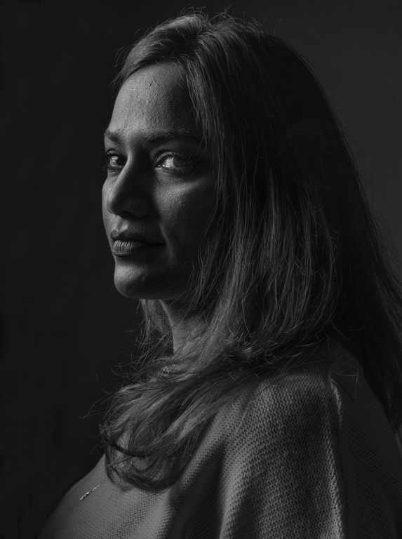
| 17 |
Sep 21 |
Comment |
Your image is quite dark, but that gives you considerable effect with the well-setup studio lighting. The Rembrandt Triangle under her left eye is classic, and all the rest of the highlights on her face are pleasing. Her direct gaze is engaging. Her skin is not great, but I would not try to smooth it out, as I find that insincere. I think this is essentially a monochrome shot, and here is why I prefer it that way. What do you think? |
Sep 7th |
 |
1 comment - 0 replies for Group 17
|
| 32 |
Sep 21 |
Reply |
Yes, I hope to try this one again next month, and submit it the month after. Thanks for the ideas. |
Sep 26th |
| 32 |
Sep 21 |
Reply |
Thanks, Jennifer, next month I will have a chance to try this composition again, with a tripod, and I will follow your and Tom's suggestions. |
Sep 23rd |
| 32 |
Sep 21 |
Reply |
Sure, I like this compromise just fine (but Diana will prefer the darker sky (actually, I like the darker sky just as well as this one)). |
Sep 7th |
| 32 |
Sep 21 |
Comment |
Yes, although surprising to me, showing only a portion of the engine works very well. |
Sep 7th |
| 32 |
Sep 21 |
Comment |
I see what you did with the roof underhang; it makes a difference. Good job. |
Sep 7th |
| 32 |
Sep 21 |
Comment |
This is very delicate. I like the composition. But those tiny translucent flowers are hard to see. I really like the stem and leaves--I would be interested in a composition of just stems and leaves. |
Sep 7th |
| 32 |
Sep 21 |
Comment |
This is a fine landscape, but the problem you pose--could you not just compromise, and darken the sky a little? I think the image would benefit. |
Sep 7th |
| 32 |
Sep 21 |
Comment |
Very pleasing shot!
I agree with ALL comments so far (my, we are all such good critics): removing the leaf, adding a border, making it a bit lighter, and especially running the stem to the edge of the frame.
|
Sep 7th |
| 32 |
Sep 21 |
Comment |
Excellent contrast and black sky. I agree with Tom's good point about the shadow area under the roof.
Since this is a well-known building, I somewhat miss seeing the rest of it in this image, even though it is a fine image as it stands. I don't know what to do with this reaction--you can ignore it. Maybe this image would fit well into a photo story about the building with 4 to 8 images? |
Sep 7th |
| 32 |
Sep 21 |
Reply |
Thanks, Tom, good point about the harsh white from the overhead light. We are again dog-sitting at our daughter's house soon, so I will have a lot of time to clean that pot and work on the lighting. |
Sep 6th |
| 32 |
Sep 21 |
Reply |
Thank you, Wes. |
Sep 4th |
| 32 |
Sep 21 |
Reply |
Oooh, those are great ideas. Thanks. |
Sep 4th |
| 32 |
Sep 21 |
Reply |
You are quite right, Ata, about considering the focus point. Since this is a repeatable shot, I think I will go back, polish the pot, and try various focus points. |
Sep 1st |
6 comments - 7 replies for Group 32
|
| 41 |
Sep 21 |
Comment |
This is a great concept and very successful. I have lots of thoughts about it. I like that you made the door very large compared to your figure. The light and shadow look good.
Critically, you might have put a horizon line in the area outside the door, but lacking one makes the scene more disturbing--a plus. The title might have been "The Unknown" because nothing in this image suggests the religious judgement day. Your shoes have a slight green tinge carried over from your setup. |
Sep 7th |
1 comment - 0 replies for Group 41
|
| 42 |
Sep 21 |
Comment |
Wow, what a trip you must have had. You were very fortunate to get this shot. How I want a hat like that! |
Sep 7th |
1 comment - 0 replies for Group 42
|
| 44 |
Sep 21 |
Reply |
Hi Lisa,
Haha, I did not need to suggest this to you. I very much like your samples of both what I might call "inner flip" and "outer flip." Thanks. |
Sep 29th |
| 44 |
Sep 21 |
Comment |
I just want to mention that you can have fun with shots like this with long receding interior walls by flipping and doubling, although it's not quite appropriate to double the red sofa. |
Sep 4th |
 |
1 comment - 1 reply for Group 44
|
| 45 |
Sep 21 |
Comment |
I so enjoy seeing your pictures of Taipei. This reminds me of our visits to the Lungshan Temple when we lived in Taipei in 1988-89.
The color is great, and I like the detailed view, but I think the vignette is a bit too dark on the right side. |
Sep 4th |
1 comment - 0 replies for Group 45
|
| 48 |
Sep 21 |
Comment |
Great subject matter, and good light, Margaret.
Can we see your original? I am thinking that the original vertical convergence might not be so bad. |
Sep 7th |
1 comment - 0 replies for Group 48
|
| 62 |
Sep 21 |
Comment |
Pete, like Group 5, your colleagues here are doing a great job working with you on this image "making" problem.
On my part, I find all the sky replacements too cloudy to be compatible with a sunlit barn (sure, it's possible to have clearing from one side--I just find it compositionally incompatible). But LuAnn's sky replacement solves the problem, in my view. |
Sep 7th |
1 comment - 0 replies for Group 62
|
| 70 |
Sep 21 |
Reply |
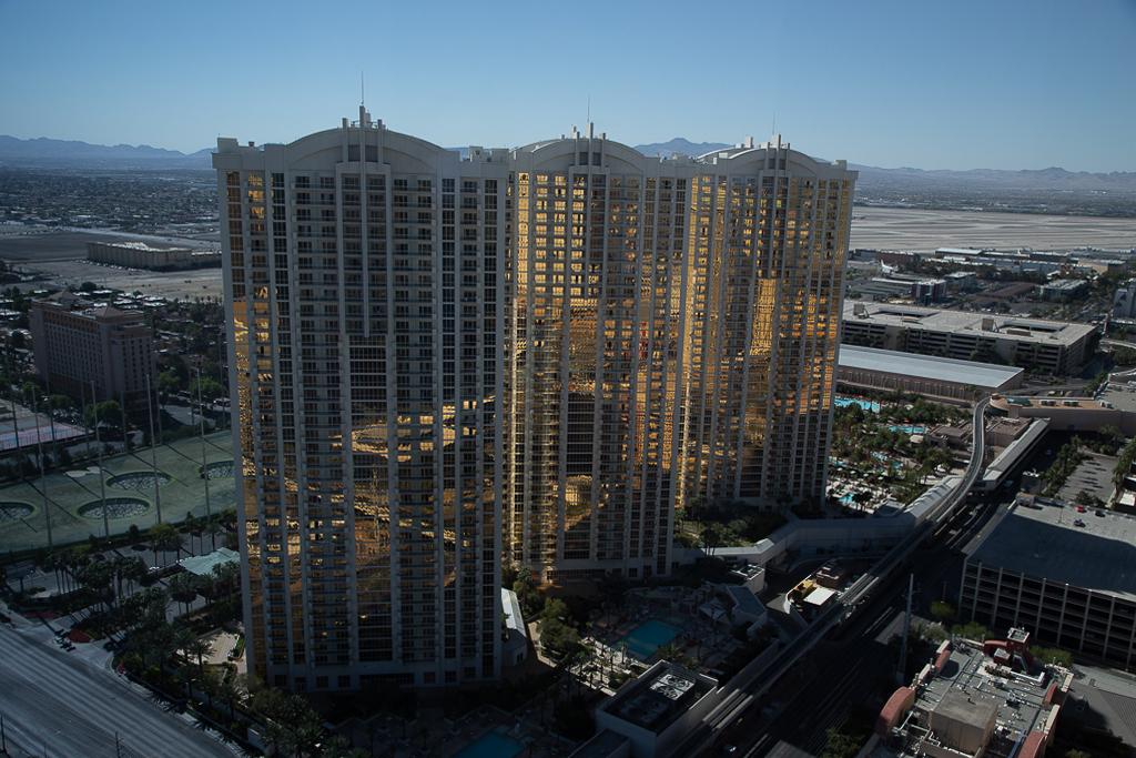
Frans,
Yes, your PSA mentor represents the most popular point of view about building perspectives. Architectural photographers will universally make the verticals exactly parallel. For the rest of us, it's a matter of taste or expression. In a case like yours, the image will look good either way.
But if you are shooting a tall building (usually from the ground) with the intention to show it soaring upwards, leaving the perspective as seen works better. See this month the image by Sharon Moir in Group 01. If she had tried to make the verticals parallel, it would have ruined her image. |
Sep 13th |
| 70 |
Sep 21 |
Comment |
Hello Frans, quite a shot, and interesting to learn about how much the light varied what you saw. Congrats on your acceptance.
I am a perspective freak; so in this image you have the fairly unique situation of looking down on a vertical perspective situation. And correctly, the parallel vertical lines converge downward, as in your original. This is correct perspective, both what your eye and the camera see. I suggest leaving that alone, and not altering the perspective. In your original, I even strengthened it on the left to balance the right. But this is just my personal view of the matter (reasons stated). |
Sep 6th |
 |
1 comment - 1 reply for Group 70
|
| 74 |
Sep 21 |
Reply |
Oh yes, that gaze is so intense, it makes the picture. Good job. |
Sep 4th |
| 74 |
Sep 21 |
Comment |
Merhaba Ata, I am sure you are right that "Indian Culture is the most complex and soul-oriented culture on the planet." I have made three trips there and my wife four. We have been north and south.
Your image is very intense, catching the moment when a stranger at a distance engages you directly--and it does not look kindly. I can see the cropping either way: close in to focus on the subject; far back to show the city context.
The woman's eyes are most intense in the color version. Can you strengthen her gaze in the monochrome in any way? |
Sep 3rd |
1 comment - 1 reply for Group 74
|
| 79 |
Sep 21 |
Comment |
Great shot, Karl. And so instructive for me, because I have some partial-sail shots from a tall ship cruise on Lake Washington in Seattle from June, and I have been struggling to crop a final image. |
Sep 3rd |
1 comment - 0 replies for Group 79
|
| 81 |
Sep 21 |
Comment |
I think you have a great idea here. You have made that green fantastic. But I suggest the window is too close on the right. Consider googling articles on "the golden mean in photography" that discuss where to locate the center of interest in an image. |
Sep 3rd |
| 81 |
Sep 21 |
Reply |
This is a great variation. I love images that are split cleanly in two, down the middle. And you have related the halves by the presence of similar windows on each side. |
Sep 3rd |
1 comment - 1 reply for Group 81
|
| 83 |
Sep 21 |
Reply |
Thanks for the extra story. We know folks from the DR, and we are aware of the great differences between the two countries, as well as all the terrible news from Haiti over the years. |
Sep 6th |
| 83 |
Sep 21 |
Comment |
This is a very striking shot. Congratulations. I can believe the difficulty of getting the shot. You have handled the skin tones very well--all are clear, with highlights, and everyone's eyes are visible. Facial expressions are intense and genuine. No one seems aware of your nearby presence.
By giving the title "Believers," as opposed to, say, "Procession," are you suggestion your view of the people in the shot or the belief system they practice? Living in the DR, how did you come to be visiting a Haitian event? |
Sep 3rd |
1 comment - 1 reply for Group 83
|
| 87 |
Sep 21 |
Reply |
Will,
I am a big advocate of some images being without focal points, but rather being images of tranquility or calm. Even though you have the evidence of the active wind in this image, I still find it about overall natural calm. Hence, I would not recommend a bird being added. Give it a try, of course, and see how you like it, and you still have a week and a half to show the variation in your group. |
Sep 18th |
| 87 |
Sep 21 |
Comment |
Hello Will,
This is quite stunning, especially the way you spotted the arching composition.
You said you enhanced the sky color, and congratulations for not overdoing that, as is often the case. This looks just right, and does not look show-off enhanced.
My only suggestion is to consider cropping out the top 5% because my eye keeps going to the dark streak of clouds in the upper right. Alternatively, you could post-process that streak away. What do you think? |
Sep 6th |
1 comment - 1 reply for Group 87
|
| 96 |
Sep 21 |
Comment |
I like both element of this (landscape, model), but I have suggestions about the combination. I don't expect a woman in a nice dress to go wading--of course breaking rules makes for an interesting image. I would have placed her on a promontory of land looking out over the scene. Or, in the water like this, pulling up her dress clear of the water, or in suitable bathing attire or nude. |
Sep 6th |
| 96 |
Sep 21 |
Comment |
I think all your compositional efforts are highly successful. I especially like your choice to make the gap in the canyon walls reach all the way to the top of the frame. I also appreciate your detailed story of going to the place and experiencing it--all too often folks leave this out in these Digital Dialogues--it makes me feel a little like I was there.
My only comment follows up on what you said about "gone too far." I think you did pump up the color a bit too much. My own view is that an image should never announce "I am post-processed," so I suggest you consider cutting back a bit on the bright yellow and orange. What do you think? |
Sep 5th |
2 comments - 0 replies for Group 96
|
| 99 |
Sep 21 |
Reply |
Yes, I agree with your group colleague Randy that the background is a bit busy and distracts somewhat from the main subject. Can you go back and shoot at f/2.8, since your subject is mostly in one plane? |
Sep 5th |
| 99 |
Sep 21 |
Comment |
It's true that the background is busy, as your colleague Randy points out, but I like the various meanings suggested: bananas as a metaphor for bombs, which those cylinders resemble; and the suggestion that bombs are ironically referred to as bananas by the users of bombs. |
Sep 2nd |
1 comment - 1 reply for Group 99
|
27 comments - 14 replies Total
|


