|
| Group |
Round |
C/R |
Comment |
Date |
Image |
| 2 |
Jul 21 |
Comment |
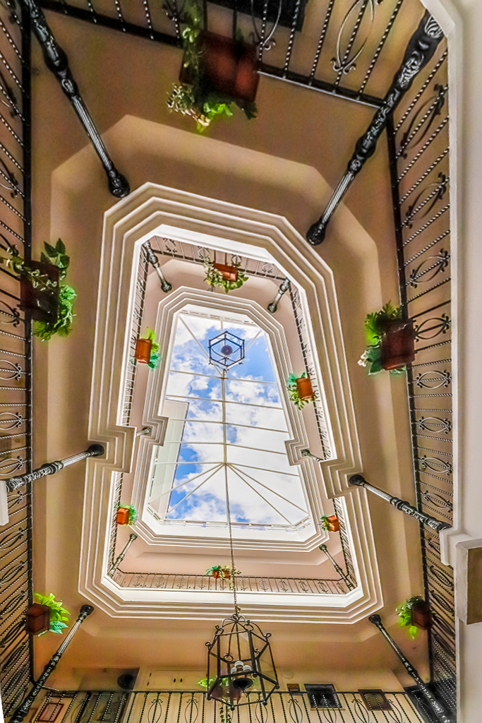
Great conception and interesting final shot.
I agree that the wide angle eliminates the possibility of parallel lines, but that does not matter in such a shot. You might consider making three sides somewhat orthogonal, like this. |
Jul 3rd |
 |
1 comment - 0 replies for Group 2
|
| 16 |
Jul 21 |
Comment |
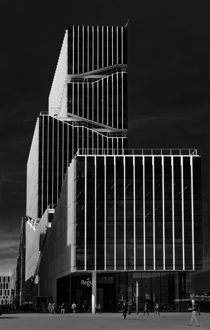
This is a fine shot of a classic Chicago scene.
I would like to say a few things about perspective, and altering it.
1. Your eye sees vertical convergence, as does the camera, but your brain thinks it away. So if you make a change to the perspective, you are not "correcting it," you are altering it for an aesthetic objective.
2. Professional architectural photographers almost always alter the vertical perspective to make the lines parallel.
3. I think this is inconsistent, since no one alters the horizontal perspectives (both evident in this image).
(Art instructors teaching perspective will show their students how to use three-point perspective--which includes the vertical perspective.)
4. What is lost by this alteration is the feeling that you are staring upward from a low point of view at soaring buildings.
5. Therefore, please consider leaving at least some vertical convergence in some of your images of soaring tall buildings.
I have attached an image by Peter Cheung in Group 73 (with his permission to use in these discussions) showing an unaltered vertical perspective. I note with great interest that due to his point of view the convergence is downward. Altering that perspective renders the image (IMO) less lively.
|
Jul 22nd |
 |
1 comment - 0 replies for Group 16
|
| 20 |
Jul 21 |
Comment |
It's very beautiful.
Did you use Japanese or Korean letters? |
Jul 22nd |
1 comment - 0 replies for Group 20
|
| 22 |
Jul 21 |
Comment |
Nicely done image.
Please clear up a mystery for me. Toward the right (more evident in your original), some of the individual strips on the wall are "L" shaped and curved. Since you were there to take the picture, was the wall curved, or is this trompe l'oeil art? I suspect the wall was curved because of a slight highlight on the short leg of the "L" segments, but you must tell me. Thanks. |
Jul 22nd |
1 comment - 0 replies for Group 22
|
| 25 |
Jul 21 |
Comment |
I like both the original and your finished color versions.
But I prefer the wider format of the original--can't give a reason--it just appeals more to me. Maybe a compromise format something like this: |
Jul 21st |
 |
1 comment - 0 replies for Group 25
|
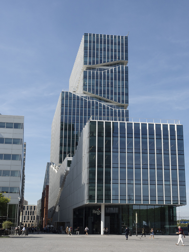
| 26 |
Jul 21 |
Comment |
You made a very clever use of the wide-angle lens to emphasize the tapered façade of this famous building. Well composed! |
Jul 21st |
1 comment - 0 replies for Group 26
|
| 29 |
Jul 21 |
Reply |
Oh, that is a good idea. I see what you are aiming at. Well done. |
Jul 3rd |
| 29 |
Jul 21 |
Comment |
I also like doing mirroring, and I think you chose a good subject. You did a good job with the contrast.
My only suggestion (if I had done this one) would be to eliminate the horizontal center line, since you did not have a vertical one. |
Jul 2nd |
1 comment - 1 reply for Group 29
|
| 31 |
Jul 21 |
Comment |
This is a great shot.
I just suggest it like this. What do you think? |
Jul 21st |
 |
1 comment - 0 replies for Group 31
|
| 32 |
Jul 21 |
Reply |
That's great. Do let me know how they stand up to the test! |
Jul 15th |
| 32 |
Jul 21 |
Reply |
Thank you, Jennifer, I like the idea that there are several compositions here. |
Jul 14th |
| 32 |
Jul 21 |
Comment |
Now that this has settled down very well, I still want to suggest a tiny, tiny bit of vertical convergence. Of course I am in a minority in liking this. But, what do you think of this? |
Jul 14th |
 |
| 32 |
Jul 21 |
Reply |
I have no idea if this is any better or not, but I will toss it into the mix for discussion. I somehow managed to lose the catch light in the eye :( |
Jul 10th |
 |
| 32 |
Jul 21 |
Comment |
I slightly favor Tom's flip because upwards is the direction that plants grow. Of course leaves will droop down like that, but without the context of the whole plant, I prefer upwards.
No suggestions for an excellent composition and a sharp image. |
Jul 10th |
| 32 |
Jul 21 |
Reply |
Thanks Diana,
Your fix looks better, and the instructions give me a lot to work on and learn. |
Jul 9th |
| 32 |
Jul 21 |
Reply |
Hello Ata,
I think you are right. I confess to shooting on automatic a lot, and I think the near focus is a bit off. |
Jul 9th |
| 32 |
Jul 21 |
Comment |
Let's see your original. I would like to take a crack at conversion also, since I have been doing a lot of that with my PS Elements presets. |
Jul 7th |
| 32 |
Jul 21 |
Reply |
No, no, I think you misunderstand me. I LIKE the convergence on the right, and think there should be some of the left. My personal preference is to KEEP some slight vertical convergence in images of tall buildings, to tell the viewer's brain that the building is soaring upwards. Here is how I like it, on your original. |
Jul 6th |
 |
| 32 |
Jul 21 |
Comment |
This is great. Good eye to see this, although it still would have been a good shot without the horse.
The snowy area is blown-out white and I think might benefit from darker trees. Just my take on this. What do you think? |
Jul 5th |
 |
| 32 |
Jul 21 |
Reply |
Yes, your finished version has developed a slight slant, but the perspective problems are minor. If you want to correct them:
1. Level the slight horizontal slant you noted.
2. The slight vertical convergence, which I like very much, is absent on the left side of the building. I suggest you do a bit more with the perspective alteration to make the left side convergence the same as the right.
Otherwise, nicely done, and your contrast choice, although strong for me, is right on for your style. |
Jul 5th |
| 32 |
Jul 21 |
Comment |
I very much agree with the perspective changes: straightening up the building on the left (of course you could crop it out entirely, but I am not sure of that); but keeping a slight vertical convergence to the main building to show it soaring upwards.
But I think the contrast is just too far on this one. I know you love it, but how about this? |
Jul 4th |
 |
| 32 |
Jul 21 |
Comment |
The exposed springs, the "closed" sign, and the "slouch couch" (I had to say that) make this a clever shot. Good eye. |
Jul 4th |
| 32 |
Jul 21 |
Reply |
Russ, thanks for your comment. I totally agree that it would be nice to boost the impact of the clouds, but I don't know how to do that. Can you give me some coaching? Do I do something overall, or select the clouds and alter just them? |
Jul 3rd |
| 32 |
Jul 21 |
Comment |
Nice catch, Russ. I think it is a little hard to separate the owlet from the background. I tried this using my PS Elements presets for conversion to monochrome, but I am not sure it is an improvement. What do you think? |
Jul 3rd |
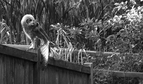 |
7 comments - 8 replies for Group 32
|
| 33 |
Jul 21 |
Comment |
This is a fine travel shot, and a complex problem, as you have been discussing with your group colleagues.
It resonates a great deal with me because I went to Taipei with my wife and three children in 1988-89. There, we visited the Dr. Sun Yat-sen Memorial Hall, so saw a different memorial to Dr. Sun Yat-sen. |
Jul 20th |
1 comment - 0 replies for Group 33
|
| 40 |
Jul 21 |
Comment |
I love shots of shadows. This is great.
Consider the color, but inverted, like this. |
Jul 2nd |
 |
1 comment - 0 replies for Group 40
|
| 43 |
Jul 21 |
Comment |
Fine, original composition. To follow Mark's comment about "three sections," your composition has a hinted reference to the interior of the church, which might have a triptych inside, and of course to the Trinity. The look upward to the sky in both reality and reflection is a reference to heaven, and the birds suggest doves, even if they are not actual doves. |
Jul 19th |
1 comment - 0 replies for Group 43
|
| 54 |
Jul 21 |
Comment |
Great composition, as usual.
A similar quote is attributed to Whistler in a court dialogue as follows, at this site: https://quoteinvestigator.com/2018/01/12/lifetime/
"Oh, two days! The labour of two days, then, is that for which you ask two hundred guineas!"
"No;-I ask it for the knowledge of a lifetime." (Applause.)
Unfortunately, according to that site, Whistler lost the case and was not paid his requested price. |
Jul 2nd |
1 comment - 0 replies for Group 54
|
| 55 |
Jul 21 |
Comment |
What a beautiful shot, with great color and exposure.
I hope I am not repeating a suggestion I have given before. When there is limited space to capture an image of such an interior, you can flip and double the image to give an idea of the entire space. Of course there are limitations with perspective and, in this case with obviously duplicating the paintings on the wall. |
Jul 19th |
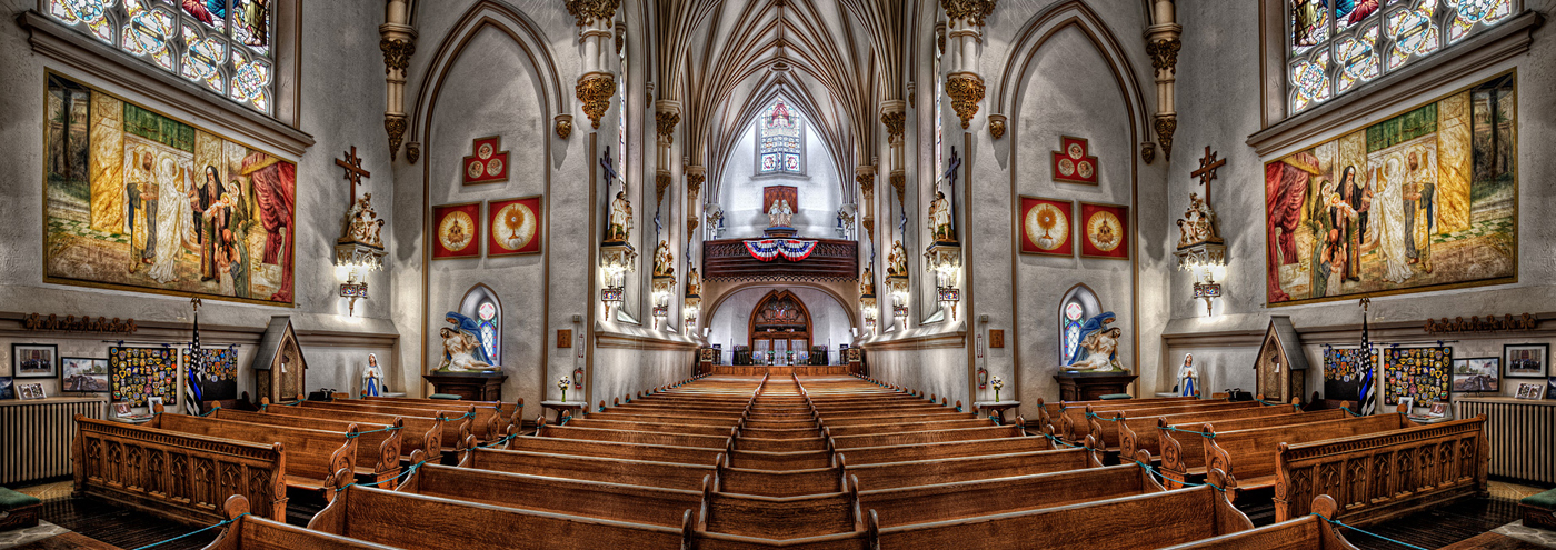 |
1 comment - 0 replies for Group 55
|
| 67 |
Jul 21 |
Comment |
This is really striking, and a very pleasing fine art rendition of a nature shot--great that you bridged the two areas.
You can google "Chinese fish paintings" to see how truly close your image is to centuries of fine art. |
Jul 18th |
1 comment - 0 replies for Group 67
|
| 71 |
Jul 21 |
Comment |
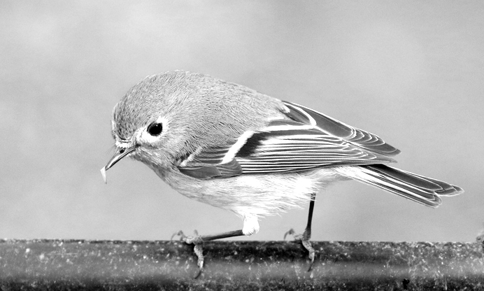
Great shot. I did not know that a Red-Winged Blackbird had those dashes of orange/yellow at the tip of the wing color.
I am very fond of this bird for a personal reason. When I was in high school, my good friend Richard, a birder, once pointed to one and asked me, "Steve, do you see that black bird with red wings?" I replied I did. "Do you know its name?" I replied that I did not. "It's called a Red-Winged Blackbird." What a set-up. But we remained friends. |
Jul 18th |
1 comment - 0 replies for Group 71
|
| 74 |
Jul 21 |
Comment |
Hello Ata,
How well you document the people of Istanbul! Is halk the right word?
The background is nicely blurred out, and removing the color eliminates distractions.
Compositionally, I suggest a bit more light on his face (like the original). Also, the well-dressed and well-groomed man in black draws my attention away. However, if you intend him as contrast, then I have no comment about him. |
Jul 2nd |
1 comment - 0 replies for Group 74
|
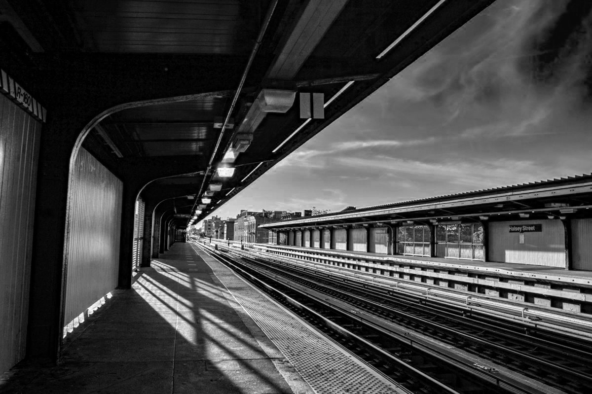
| 80 |
Jul 21 |
Comment |
You have a very fine scene here. I like the sunlight. It is very like the work of the artist Edward Hopper. |
Jul 2nd |
1 comment - 0 replies for Group 80
|
| 81 |
Jul 21 |
Comment |
Your model engages very well with you the photographer--that is a great success in this image.
I would very much like to see how you would convert this to black and white (I am in Monochrome Group 32, and always interested in candidates for b/w.). |
Jul 17th |
1 comment - 0 replies for Group 81
|
| 96 |
Jul 21 |
Comment |
Great composition in perspective and light/dark. Since there is little color interest (IMO), here it is in black/white. What do you think? |
Jul 17th |
 |
1 comment - 0 replies for Group 96
|
| 99 |
Jul 21 |
Comment |
This is a great subject, well-framed, and a good discussion with your group colleagues--very interesting to read.
My only comment is to suggest you get rid of the tiny tuft of grass in the left foreground of your original composition--I can't stop shifting my eye to it. |
Jul 16th |
1 comment - 0 replies for Group 99
|
27 comments - 9 replies Total
|


