|
| Group |
Round |
C/R |
Comment |
Date |
Image |
| 4 |
Jun 21 |
Comment |
This is fantastic. I have a friend in the Baltimore area who shoots a lot of Wabi Sabi, always against a black background. This is so interesting that you used a white background! |
Jun 28th |
1 comment - 0 replies for Group 4
|
| 7 |
Jun 21 |
Comment |
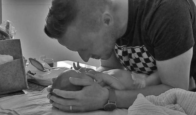
Oh, just right, you were indeed lucky, but you took skilled advantage of the situation.
Here, for reference, is Alfred Eisenstadt's famous "Drum Major Practice" on the grounds of the University of Michigan in 1951. This image was included in the great "Family of Man" photo exhibition in 1955 at the NY Museum of Modern Art, curated by Edward Steichen. I think your shot compares very well to Eisenstadt because you took a creative approach with the placement of the children, both scale and location in the frame. |
Jun 5th |
 |
| 7 |
Jun 21 |
Comment |
Charming shot of old times. When I was a boy, gas was about 29 cents a gallon. |
Jun 5th |
2 comments - 0 replies for Group 7
|
| 8 |
Jun 21 |
Comment |
Thank you for telling your story and taking us to Bengal. Such story-telling is often neglected in these Digital Dialogue groups. |
Jun 5th |
1 comment - 0 replies for Group 8
|
| 14 |
Jun 21 |
Reply |
Wow, yes, great study in diagonals and lights and darks. |
Jun 8th |
| 14 |
Jun 21 |
Comment |
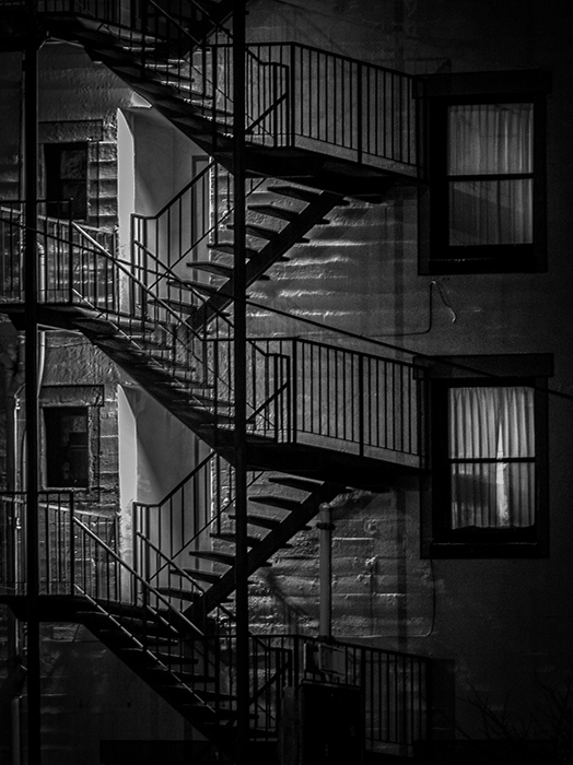
This is a great architectural shot. The diagonals of the fire escape can't be beat as urban subject matter.
I belong to Monochrome Group 32 and am always looking out for good candidates for conversion to monochrome. In the sample below, I converted with PS Elements, using the preset called "Urban/Snapshots." What do you think? |
Jun 5th |
 |
| 14 |
Jun 21 |
Comment |
This is a highly successful portrait, with a great model and a dramatic pose. It is openly sexual, not only with the model's bare chest, but also suggestively showing the start of his hip lines. I find it direct, honest, and not inappropriate.
I have two comments:
1. I think the pose could be better. I find the foot on the wall a relaxed gesture, inconsistent with the tension of the model's musculature. Similarly, his hands are relaxed, also inconsistent with the muscular display of his torso. I think a contrapposto pose would have worked better.
2. The shadow of the ring on the wall forms as a shaft entering a hole. Did you intend this openly erotic symbolism? |
Jun 5th |
2 comments - 1 reply for Group 14
|
| 25 |
Jun 21 |
Comment |
Your triple composition of living tree, dead wood holder, and shadows is very compelling. Have you tried this in monochrome as well? |
Jun 28th |
1 comment - 0 replies for Group 25
|
| 27 |
Jun 21 |
Comment |
Becca, how is this? I used PS "lighten shadows." |
Jun 28th |
 |
1 comment - 0 replies for Group 27
|
| 32 |
Jun 21 |
Comment |
I very much like that your dead plant is offset to one side. All that space on the right is an essential part of the composition. As others have said, the slight detail in the snow is a plus.
I have had many discussions (mostly with Diana) about where the stem of a plant should originate in the frame, and I generally feel that it ought to come right out of the lower left corner, BUT I think you chose wisely in this case, and my personal rule would not work.
Now if you could place this plant in the lower left corner of Wes's image this month...
|
Jun 25th |
| 32 |
Jun 21 |
Reply |
Yes, between Diana and Tom, I have some good suggestions.
I was really struggling on this trip for composition, and was never much satisfied with anything I shot. Since you prompted me, here is a wide-angle shot of the same site. Thanks for asking. |
Jun 23rd |
 |
| 32 |
Jun 21 |
Comment |
Here is a sample of what I mean--my younger daughter practicing to play the music at her older sisters wedding. |
Jun 6th |
 |
| 32 |
Jun 21 |
Comment |
Great choice of a minimalist composition. I agree that the vast expanse of nature should be shown like this, with the lone person/plant being small in the composition. |
Jun 5th |
| 32 |
Jun 21 |
Comment |
Much better than the color. Getting rid of the red was a good idea. Color touches are usually advantageous, but you were right in this case to go monochrome.
The texture of the house siding shows up much better in monochrome, and so does the fence. |
Jun 5th |
| 32 |
Jun 21 |
Comment |
Russ, you make it very clear that this is a portrait of the horn, and not the man. That is a challenging composition, but I think it works. I must say that the color shot shows off the horn better than b/w, but the b/w looks very good. Is that a picnic scene I see reflected in the end of the horn? |
Jun 5th |
| 32 |
Jun 21 |
Comment |
You are so creative, always experimenting.
This is fairly successful, with so much put together to make the final image.
While I don't think your customary high contrast technique would be appropriate for this subject, I think a tiny bit more contrast might work for this. |
Jun 5th |
 |
| 32 |
Jun 21 |
Comment |
I presume your light source is a large open doorway or window, casting fairly diffuse light. This is a great source of light for portraiture.
Your model seems very comfortable with herself, and with you being present, and that makes the image.
I have no suggestions for improvement, but one for further experimentation. Consider turning your model a little more away from the light source, so as to deepen the shadow on the dark side of her nose. That would slightly sharpen the Rembrandt Triangle of light on the right side. |
Jun 4th |
7 comments - 1 reply for Group 32
|
| 34 |
Jun 21 |
Comment |
I am excited by your composition. I like the way you established a perspective context with a few converging lines, and implied an invisible horizon line at the apex--reinforced by the gradient color change. Well done.
I like that the mysterious window violates all the perspective rules just established--shamelessly, if I may say so.
I think the shadows are very well done, and true tributes to de Chirico, but I want to make a shadow note. Your shadows are sharp throughout, hence otherworldly, and that supports the surrealism of your composition--for real world shadows are not sharp throughout. See this link for a good explanation: https://blog.demofox.org/2017/07/01/why-are-some-shadows-soft-and-other-shadows-hard/. Basically, the disk of the sun casts ragged-edged shadows. Sharp shadows are unnatural and perfect for surrealism--the brain senses this and reacts with unease--and could only be cast by a distant point-light-source, not a sun-like disk. |
Jun 4th |
1 comment - 0 replies for Group 34
|
| 37 |
Jun 21 |
Comment |
This is a fabulous shot of the Open Hand. I remember very well when my entire family visited Chandigarh in 1989 and toured the city and The Rock Garden of Mr. Nek Chand. It was an experience of a lifetime. |
Jun 27th |
1 comment - 0 replies for Group 37
|
| 45 |
Jun 21 |
Comment |
This is beautiful. Congratulations. It is personal to me because these are the very vegetables that my wife and I use most often in our Mediterranean cooking: onions first in olive oil, then the tomato, and sometimes carrots later. Did you choose these vegetables for their cooking compatibility? Perhaps you can add a bottle of olive oil to one of your lovely photos? |
Jun 4th |
1 comment - 0 replies for Group 45
|
| 48 |
Jun 21 |
Reply |
Yes, the weight shift from back foot to front foot is essential in all sports that strike at a ball. The more one does this, the more solid shots one gets. |
Jun 27th |
| 48 |
Jun 21 |
Comment |
You intensified the color of this shot very well--rich color, but not overdone.
I suggest a different title, "Rescued Shot," because your player is near the sideline, going for a difficult shot and getting it, but at the cost of being off balance and not being able to shift weight from the back foot to the front foot to put force into his shot. His opponent is lifting his left foot and likely to advance to the net, anticipating a weak return. |
Jun 27th |
1 comment - 1 reply for Group 48
|
| 49 |
Jun 21 |
Comment |
Hi JoAnne, I shoot exactly the same thing when I travel to my wife's country, Turkey--the bright entrance to Mosques with people silhouetted in the doorway. I agree with the concept and composition. |
Jun 27th |
| 49 |
Jun 21 |
Comment |
David, fantastic shot. I live in Bethesda, so have often visited Great Falls. It's fun to see local shots.
My comment is about the lighting. The image labeled "original" pops with brilliant light--to me heightening the action. Either the images are reversed, or I just plain prefer the brighter image. |
Jun 27th |
2 comments - 0 replies for Group 49
|
| 59 |
Jun 21 |
Reply |
I LIKE the harsh contrasts. I think they add tension to the mechanical tension of the vaulting action. |
Jun 26th |
0 comments - 1 reply for Group 59
|
| 60 |
Jun 21 |
Reply |
Damon, thanks for the tip about the basketball player who covers a greater percentage of the distance to you as they near you. That is perfect math. I have always thought of getting a single shot at a preplanned location, so I have learned from you about the dynamics of repeated fast shooting. |
Jun 4th |
| 60 |
Jun 21 |
Comment |
Everything well done on this shot, especially the athlete's face.
It sounds like you are in control of everything, based on your very thorough discussion. I might add a couple of thoughts:
1. Sometimes, sometimes, you might try panning at a lower shutter speed from the side to get a runner sharp and the background blurred, to convey a sense of motion. This requires a lot of practice. Many people in these Digital Dialogs try that, with mixed results.
2. If a runner is coming straight at you, there is relatively little motion blur compared to shooting from the side. You did that in this case, so 1/2000 was not necessary. In fact, if you had shot at maybe 1/250, you probably still would have the face sharp, but a foot or hand a little blurred, again conveying a sense of motion, should you want to try that. |
Jun 4th |
1 comment - 1 reply for Group 60
|
| 64 |
Jun 21 |
Reply |
Yes, you are right. Perhaps someone grabbed the bale to move it around and their grip naturally squeezed the near side into alignment? |
Jun 27th |
| 64 |
Jun 21 |
Reply |
Jerry, they can't line up on both sides because the diameter of each circle is smaller and smaller. Helen wisely shot from the side where they did line up. |
Jun 26th |
| 64 |
Jun 21 |
Comment |
This is really great, and very personal for me because I am very fond of night shots of small commercial buildings. There is so much to explore in the varied lighting. Perfectly done! |
Jun 4th |
1 comment - 2 replies for Group 64
|
| 74 |
Jun 21 |
Comment |
A very good street scene. So much to see on the streets of Istanbul. I especially like that the old gentleman is at work on a shoe--is that his customer? I also like the jumble of equipment on the table top. (I need to visit this man, or his equivalent in Cesme, to fix some of my shoes--you can't get this service in the USA any more.) |
Jun 4th |
1 comment - 0 replies for Group 74
|
| 78 |
Jun 21 |
Comment |
"The path up to the light," definitely going up, but the end not in sight. Great metaphor. The path also is rough and difficult--more metaphor. A clear reference to an ascent to heaven out of ordinary life or Purgatory, depending on your personal views. Good job on the exposure. |
Jun 4th |
| 78 |
Jun 21 |
Comment |
Yes, I agree that this is a perfect backdrop. I have two suggestions. First, get rid of the fragment of the "G" so "OLD" stands alone. Second, you might add a very aged person into the composition, but now being old myself, I have changed feelings about that as ageism. How about a broken down piece of furniture, or an urban abandoned car mostly stripped of useful parts by thieves? |
Jun 4th |
2 comments - 0 replies for Group 78
|
| 83 |
Jun 21 |
Comment |
This is a fine shot. I am very fond of shots of empty corridors, so this resonates with me. I have never seen a Gaudi building in person, but love seeing images of them.
One question, is the overhead light from skylights or electric lights? Same question about the sidelight at the end of the corridor. |
Jun 26th |
1 comment - 0 replies for Group 83
|
| 87 |
Jun 21 |
Reply |
Hi Lance, it was almost trembling exciting when Maier's works came to light, out of nowhere, posthumously. What a story her life was, and there she is in all her idiosyncratic self-portraits and shadows, shooting evidently only for herself! |
Jun 25th |
| 87 |
Jun 21 |
Reply |
Hi Steven,
I have been very happy with my Canon G10, and the line is now up to the G16, I think. After my model, the light sensitivity increased a lot, so that would be good for you if you choose a G.
I also shoot with my phone, which has two lenses, wide-angle and super-wide-angle. The latter is great.
The Canon G is very flat when the lens is closed, so it can fit in any jacket pocket, and because of its flat closed profile, I can also slip in into my pants pocket. That was one of the reasons I chose it. It has complete manual controls and can focus down to 4 inches. It has an excellent flash, which a phone can't supply.
Disadvantage of the G are time to save and recharge for the next shot is not instantaneous. Shooting also has a slight delay if you are shooting action, so you have to anticipate about a half second. Only 4 f-stops, so depth of field control is limited.
I am very happy with my choice of the G. It is the only camera I shoot with, and I will never go back to body/lens/lens stuff, even though I miss a few opportunities that a "real" camera (as my friend once said) would supply. |
Jun 8th |
| 87 |
Jun 21 |
Comment |
This is nicely done. I very much like shadow images, and especially those, like this, with the photographer present. See the work of photographer Vivian Maier, who included her own shadow in a great number of her images. |
Jun 3rd |
1 comment - 2 replies for Group 87
|
| 98 |
Jun 21 |
Reply |
I am sorry if I was not clear, Bob. By "evening color" I meant the reddish glow typical of images shot at the sunset hour. About the post-processing, yes many images are post-processed of course, but I advocate that it be subtle, so that a viewer does not think, "Oh, this was pumped up in post-processing." Just my personal approach--consider if useful. |
Jun 3rd |
| 98 |
Jun 21 |
Comment |
This tranquil shot, devoid of human activity, is very successful. I like both your original composition and the shot without the cave--the latter has an interesting pattern of ground vegetation.
One comment--for a midday shot, I think the "evening" color is pumped up a bit too much. I suggest backing off the post-processed color 25% or more, so this does not announce "I am post-processed." |
Jun 3rd |
| 98 |
Jun 21 |
Comment |
What a beautiful interior, and a good shot of it. The post-processing looks great.
Was this 1/6 sec. (Wow, what a steady hand you had.) or 1/60?
I know my image below is not true to the interior, but I am showing it as a suggested tool to help with shots of interiors where you can't get everything in. This is a flipped and combined image. |
Jun 3rd |
 |
2 comments - 1 reply for Group 98
|
30 comments - 10 replies Total
|


