|
| Group |
Round |
C/R |
Comment |
Date |
Image |
| 1 |
May 21 |
Comment |
You were very alert to get this. And you have the secondary rainbow as well--did you get a shot showing all of the secondary? |
May 17th |
1 comment - 0 replies for Group 1
|
| 5 |
May 21 |
Reply |
Just Google "antique boiled egg cutter" to see lots. If you Google just "boiled egg cutter" you will see modern ones--quite inexpensive. I had never heard about "soldiers"--fascinating--the learning about places and things and adventures in these Groups is wonderful. |
May 2nd |
| 5 |
May 21 |
Comment |
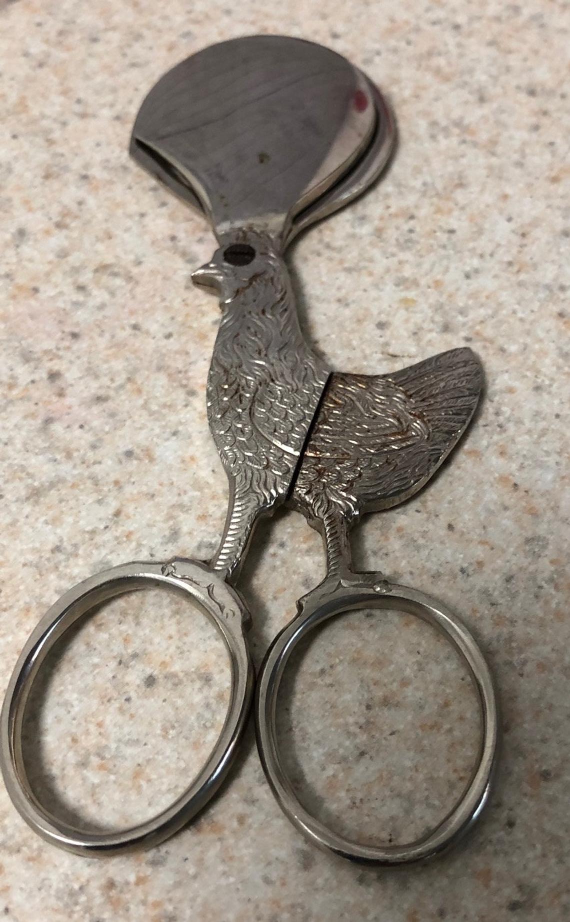
Great suggestions so far for a very creative shot. But how about putting in a pair of vintage egg scissors? I copied this image off of an eBay item. |
May 1st |
 |
1 comment - 1 reply for Group 5
|
| 24 |
May 21 |
Reply |
How interesting. Those are indeed big rocks. I went to school in Binghamton, NY. According to my geology major friend, the moraine that ran for 20 miles along the banks of the Susquehanna River was the longest in the world (I just thought it was a hillside). It was all small stones. One of the professors mapped it used well-drilling data, as the drillers recorded what they brought up foot-by-foot. |
May 30th |
| 24 |
May 21 |
Comment |
This is a beautiful shot. Does everyone know the geological meaning of "moraine"? (accumulation of rock debris (till) carried or deposited by a glacier). I presume the lake is named for nearby moraines? Is that what is showing in your image? |
May 29th |
1 comment - 1 reply for Group 24
|
| 26 |
May 21 |
Comment |
I live hardly more that walking distance from this outdoor location in downtown Bethesda, and I remember this statue well. I think you did a good job of making the statue "swim" through the abstracted pattern. |
May 5th |
| 26 |
May 21 |
Comment |
I love pictures of boat lines--their flow and intertwining always interests me. You punched up the color on this very nicely, without overdoing it. Well done. |
May 5th |
2 comments - 0 replies for Group 26
|
| 32 |
May 21 |
Reply |
Yum! |
May 31st |
| 32 |
May 21 |
Reply |
Yes, your are right, I did that to darken the clouds. Good point. I could have selected just the clouds to darken. I am lazy about post-processing and generally use "overall" changes. This is a good example where I should have been a bit less lazy--it would not have been much trouble. |
May 31st |
| 32 |
May 21 |
Comment |
Thanks to everyone for their comments! |
May 22nd |
| 32 |
May 21 |
Comment |
Also, compare Cecilia Clark's image in Group 83 this month. |
May 15th |
| 32 |
May 21 |
Comment |
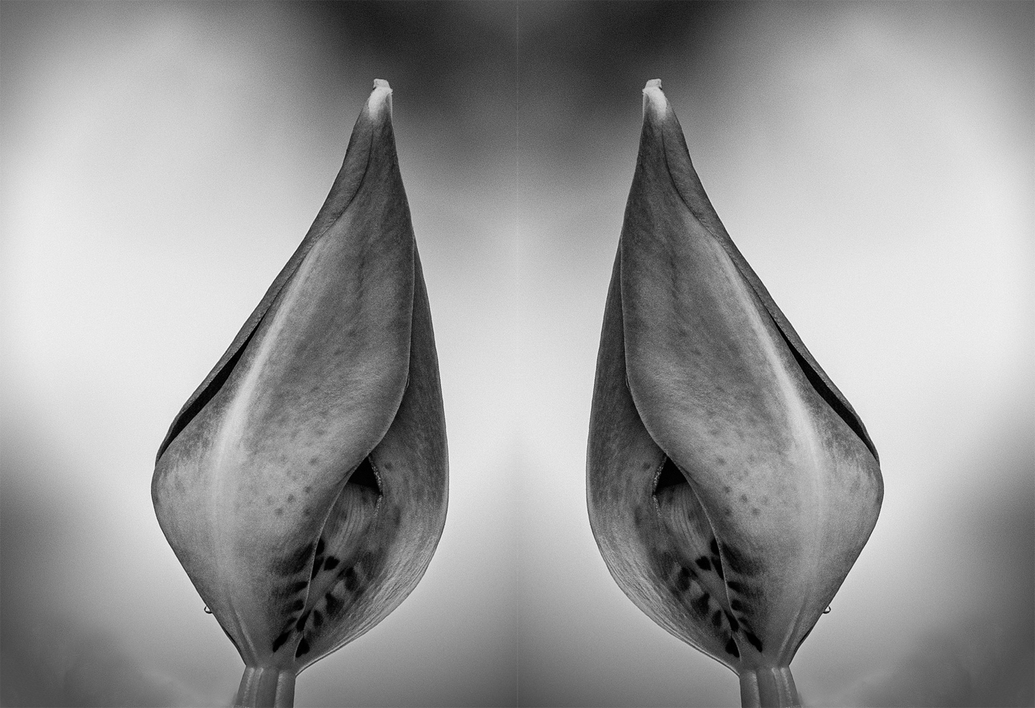
I have nothing to add, but to agree with some of the comments already made. More stem would be good, tilt would be good, water spray would be good. I like the tightly closed bud.
How about playing with this by multiplying it. You could put together a dozen buds in diminishing sizes. |
May 14th |
 |
| 32 |
May 21 |
Comment |
I am very fond of "portrait" shots of animals and objects against a pure black or pure white background, so I quite like the black raven against a white background. Richard Avedon shot portraits for The New Yorker and they were almost exclusively against a pure white background. Also, is no one going to say, "Quoth the Raven 'Nevermore.'" |
May 14th |
| 32 |
May 21 |
Reply |
Yes, of course, the original does have very gentle tonal variations. Don't mind us going off on tangents. |
May 11th |
| 32 |
May 21 |
Comment |
Diana, I did not expect you to go high key, being so strong on contrast, but I do know you are very versatile.
So I tried contrast, based on the original. What does anyone think about this? |
May 10th |
 |
| 32 |
May 21 |
Comment |
Well done, Diana. This worked out very impressively. While "tired" might fit the original, you have done so well with the finished image you might leave off "tired."
I was wondering if this could be rotated to a level position, but I don't think you have room in your original for the inevitable image loss. If you like that idea, I guess you could create additional background. |
May 10th |
| 32 |
May 21 |
Reply |
Actually no. I prefer the tones and contrast in the b/w. I don't think there is anything essentially color in the color version. The more I look at this, the more strongly I come down on my comment about reducing the vignette--but that can just be the taste of each person.
|
May 4th |
| 32 |
May 21 |
Comment |
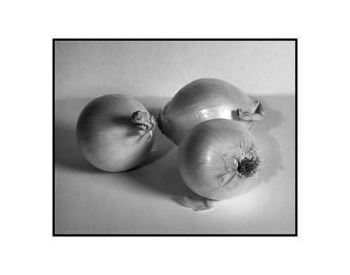
I like the composition very much. Here are several comments.
1. You evidently chose one onion to have its bottom end showing, but I think I would prefer to see its top end, just like the other two.
2. I think the several shadows are a bit discordant--the left onion has a strong shadow, but the two on the right have very faint shadows. Can you pull your left light further back so there is not so much difference--would that work?
3. I find the vignette very strong--I suggest just hinting at it. |
May 3rd |
| 32 |
May 21 |
Comment |
Everything good: straightening, cropping, tonal range, clouds. How is the interior? Anything interesting to show us? |
May 3rd |
| 32 |
May 21 |
Comment |
Nicely done. I particularly like the reflections of the cards in the glasses. Maybe the white of the cards could be a touch brighter? |
May 3rd |
| 32 |
May 21 |
Reply |
Thanks, Ata. (By the way, we will probably not go to Turkey this summer. Perhaps we can meet up in Istanbul the following year.) |
May 2nd |
9 comments - 5 replies for Group 32
|
| 37 |
May 21 |
Comment |
Excuse me, friends, but this is an old house ready to fall down. Straightening it would go against the concept of the assignment and this successful find. |
May 29th |
| 37 |
May 21 |
Comment |
Hi Helen,
Per our other discussion on perspective and using the "skew" transformation, you can step back further from your subject, and not tilt the camera upwards, then crop to your subject. This should reduce the perspective convergence somewhat. This particular subject might work out with this technique. I would be very interested to see the result if you try this. (I looked on Google for other images of this, and many of them did not have a perspective problem, and were mostly taken from further away.) Yes, one approach is to simply accept the perspective of looking upwards, as it is exactly what your eye sees. |
May 5th |
2 comments - 0 replies for Group 37
|
| 38 |
May 21 |
Comment |
This is a most interesting composition, combining nature with a statue in a garden.
Please tell us who or what the statue represents, and if the pose has a special significance (the relaxed pose, the tilted head, and the hands on the knee are, I think, quite unique). Thank you. |
May 5th |
1 comment - 0 replies for Group 38
|
| 43 |
May 21 |
Reply |
Oh yes, the blue barrel is great, and demands to be in color. I just tried out the b/w for interest. |
May 5th |
| 43 |
May 21 |
Comment |
This is an interesting subject, and a really great perspective study. The blue barrel is a highlight. In spite of that, I tried converting to monochrome, using a number of steps. How does this look to you. |
May 5th |
 |
1 comment - 1 reply for Group 43
|
| 45 |
May 21 |
Comment |
This is a charming collection of objects and a very pleasing finished image. I have no suggestions for improvement. But as a rope and knot hobbyist, I want to know if you tied the monkey fist yourself--it looks great. See my images in my Group 32 back in December 2020 of a bowline, and in October 2020 of lines on the railing of a Chesapeake Bay tour boat. |
May 1st |
1 comment - 0 replies for Group 45
|
| 47 |
May 21 |
Comment |
You have a strong concept here, and your group colleagues have commented thoroughly about brightness.
I also think that depth of field needs to be worked with. If you cannot get all the statues in focus, then I think the second one should be the point of sharpest focus. This would make the chain of statues behind that one a bit less out of focus. But it would also compositionally imply that the chain of Buddha images is infinite in both directions--a meaningful concept when shooting the great teacher's image. |
May 15th |
1 comment - 0 replies for Group 47
|
| 48 |
May 21 |
Reply |
Beverly, I shopped for PS online and could not find that price. Please reply where I can get it for $9.99/month. Thanks. |
May 15th |
0 comments - 1 reply for Group 48
|
| 49 |
May 21 |
Comment |
This is a great travel picture. You were very lucky to get to travel to central China. About a decade ago, my wife and I toured in northwestern China, around Urumchi.
Comments:
1. I think this could be a bit brighter. I increased saturation a bit, employed a small "smart fix" in PS Elements, and increased brightness a bit.
2. Another shot at this sort of situation might be offset to one side, so the building recedes on a diagonal. |
May 15th |
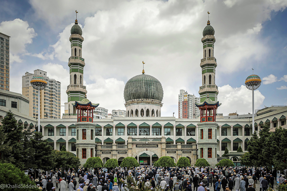 |
1 comment - 0 replies for Group 49
|
| 50 |
May 21 |
Comment |
Pretty much all of Japanese art and design is exquisitely tasteful. You captured this detail perfectly. The knots alone are like miniature floral arrangements. |
May 15th |
1 comment - 0 replies for Group 50
|
| 54 |
May 21 |
Reply |
We must continue this a bit. Yes, SOME of us may be becoming Eloi, but others, I fear, have become Morlocks. |
May 17th |
| 54 |
May 21 |
Reply |
I went back and read your comments in Oct. 2020. I can see two approaches to your surrealism: 1) to present "disequilibrium" before the viewer, to surprise, challenge, or even entertain; or 2) to freely present ideas, unbounded by the limits of realism. Perhaps both can be present in the same image. Certainly Dali did both in The Persistence of Time and other works--as they were full of symbolism and ideas about both dreams and modern math and physics. In your current image, of course we see the sky unbounded by walls and the picture frame--I find this to be type 1. But then you have a Queen, and a plastic (hence artificial) one at that, sitting not on a throne, but in an unsuitable seat (and unstable at that, as all rockers are). Is this a symbol of the emptiness of royalty--this would fall into type 2. Would you care to comment on my interpretations, and add your own??? |
May 17th |
| 54 |
May 21 |
Comment |
This is nicely done, and it appears to owe a lot to René Magritte, whom you have no doubt studied.
I don't work in compositing, so I don't know how to improve this image, but I don't think the chair and easel are not quite firmly planted on the floor.
The perspective looks great and I really like that the clouds are both on the walls and through the window. Likewise that the canvas has the same clouds as the walls. |
May 5th |
1 comment - 2 replies for Group 54
|
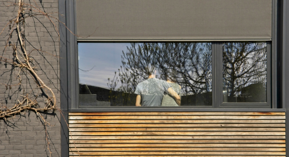
| 58 |
May 21 |
Comment |
Your experience is evident in this composition. Including the leafless vine on the left is brilliant, and something I would never have thought to do. It makes me think of Japanese flower arrangements.
There is a very slight lens distortion showing in the wood slats at the bottom. Here it is removed using PS Elements, Filter/Correct Camera Distortion. |
May 15th |
 |
1 comment - 0 replies for Group 58
|
| 60 |
May 21 |
Comment |
I love this pattern. You were eyes-alert to see it.
On the discussion of focal point of a subject, I would take the other position, that none is needed. My reason is a variation on Marshall McLuhan's famous quote, "The medium is the message." That is, in my words, "The pattern is the message." |
May 15th |
1 comment - 0 replies for Group 60
|
| 74 |
May 21 |
Comment |
This is a great character shot, and very sharp. I like the choice of background.
You always make a social comment. This man is a street picker, keeping alive gathering other people's trash. What will he do when he is not physically capable to continue that work?
My wife's cousin has a flat in Antalya, and his life is much different from this man's. |
May 3rd |
1 comment - 0 replies for Group 74
|
| 77 |
May 21 |
Comment |
This is a great composite concept, and well-executed.
My only comments are that the moon might be a bit too big. Also, a rising or setting full moon viewed through the earth's atmosphere would have a redder tint, which you might consider altering--your moon has the color and clarity of an overhead moon. |
May 4th |
1 comment - 0 replies for Group 77
|
| 78 |
May 21 |
Reply |
You are always so positive, Brenda. That makes you a great group participant and administrator. Carry on! |
May 19th |
| 78 |
May 21 |
Reply |
Hi Brenda,
I am an outlier here. I like everything about your original, and do not see the 5/19 as better. Yes, the 5/19 solves all the problems you mention, as well as placing the child at a 1/3 point. Here are my reasons.
1. I liked the completed arch of the tree carrying over to the left.
2. The foreground brush on the left completed the circle of protection against predators.
3. Most of all, the child was smaller in the original, and I am a very strong proponent of keeping humans small (almost lost--get the feeling, lost) when surrounded by nature, the great force which, while we can damage it, we cannot overcome it, and may (in this case) fear. |
May 19th |
| 78 |
May 21 |
Comment |
I so frequently see great shots (like this one) of children walking away from the camera. Everything about their feelings and character is implied by their posture (very well in this shot--perhaps the child is afraid to go alone to her task). The setting is great, of course. Good job. |
May 15th |
1 comment - 2 replies for Group 78
|
| 79 |
May 21 |
Comment |
You have made this into a remarkable human torso, complete with upraised arms, chest, abdomen, and even a hippie necklace. Wow!
Of course I can't avoid the word play that we also call a human torso a trunk. |
May 15th |
| 79 |
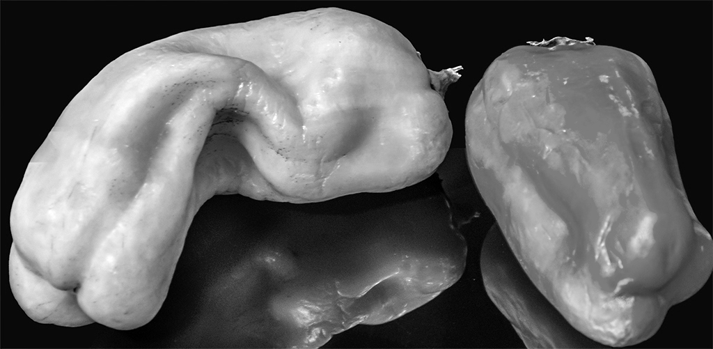
May 21 |
Comment |
You can't beat peppers as models (although to disagree with Karl, they lack ears like corn, so I don't think they take direction well at all), and I think Weston is the master of masters to emulate.
I tried converting to monochrome, playing with the red and green sliders, to lessen the tonal difference between the two peppers. I don't care for the reflection--Weston put his most famous pepper in a large aluminum funnel.
I do like very much that the left pepper especially shows imperfections, also present in Weston's work.
Great subject matter, and seriously done. |
May 15th |
 |
2 comments - 0 replies for Group 79
|
| 80 |
May 21 |
Comment |
Hi Bev, I know you are well traveled, and I like this shot.
Of course, the curiosity in the situation was you, not these three. It is often a rare thing for rural workers in other parts of the world to meet foreigners. I think their smiles indicate excitement at seeing you. |
May 15th |
1 comment - 0 replies for Group 80
|
| 82 |
May 21 |
Comment |
I agree completely with Kathleen, but suggest keeping the tall stems on the edges, and rather getting rid of the two green plants in the center, especially the one almost growing out of the man's thumb. |
May 15th |
1 comment - 0 replies for Group 82
|
| 83 |
May 21 |
Comment |
Lance has covered it all here. I have a single thought to add. I like that the road disappears vertically and with increased illumination as it recedes into the distance. There is a very slight implication of a heavenly ascent, especially since the vanishing point cannot be seen. |
May 15th |
1 comment - 0 replies for Group 83
|
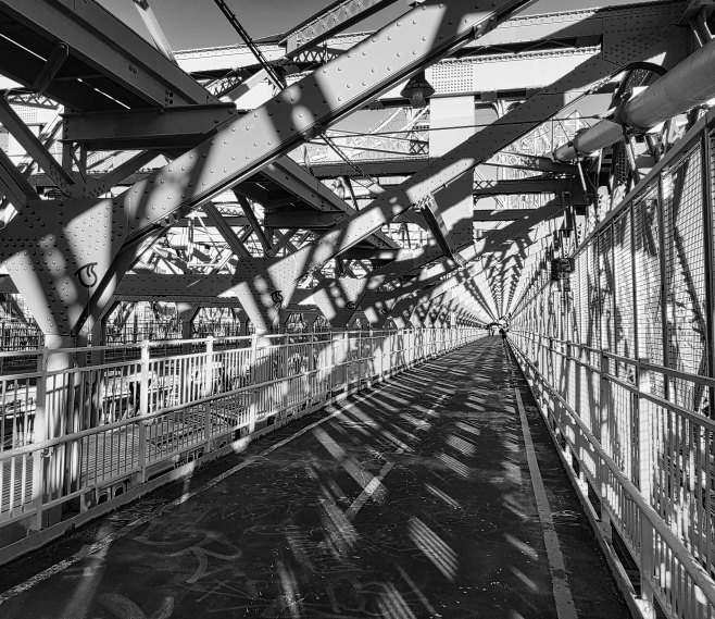
| 87 |
May 21 |
Comment |
Lance's images in your group this month provoke thought about focusing on shadows. Your image of the bench is captivating, and as Lance points out, the shadows support the bench image.
I wonder how a study of only the shadows would work out. |
May 15th |
| 87 |
May 21 |
Comment |
Diagonal shadows against rectilinear objects--a sure winner, and well-done in these two examples.
I would consider another shot of the shadow of the lamp, entirely without the lamp. While you are at it, see if you can squeeze in the shadow of a murderous assault, a la Hitchcock. No, just kidding about this last. |
May 15th |
| 87 |
May 21 |
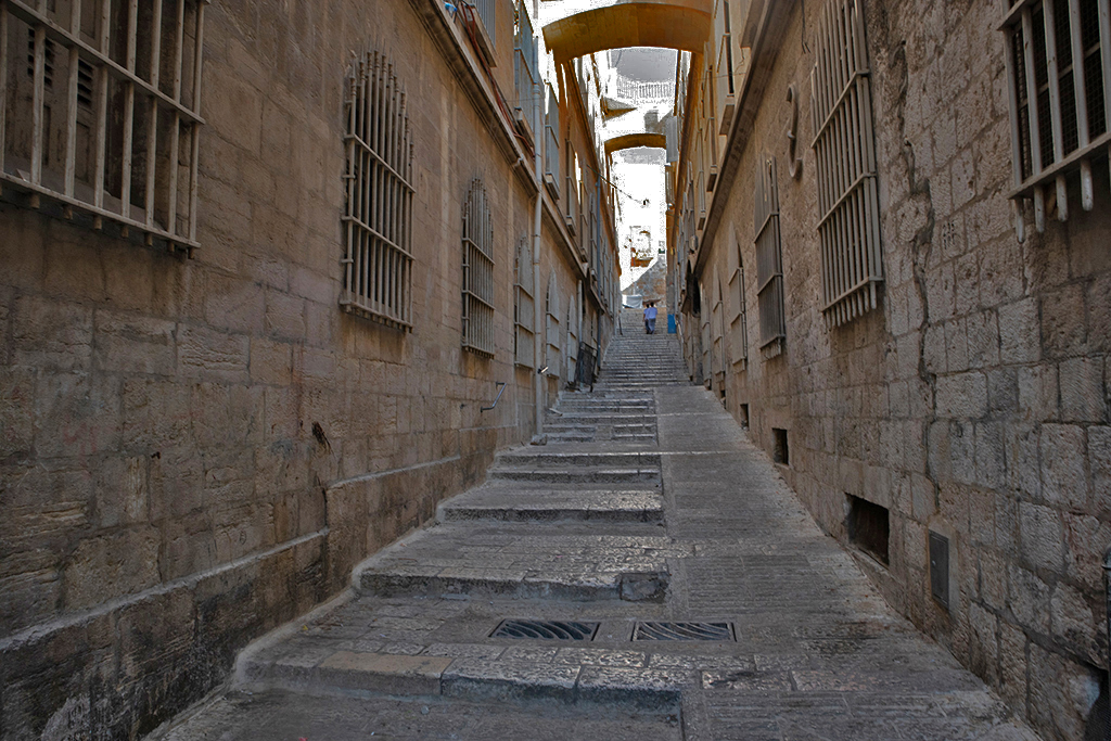
Comment |
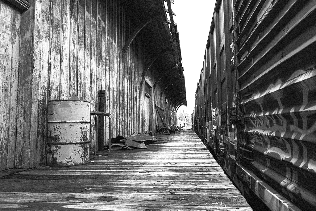
Hello Chan,
I have read your group's excellent discussion about your image. I agree with Lance's comments about the foreground brightness and the verticals. I am a strong proponent of keeping original perspective, because it is what your eye sees, and it help communicate the soaring nature of a tall building, or in this case the receding alley. About the blown out top of the alley, I tried a crude fix--I repeatedly maxed out my PS Elements "Darken Highlights" option three times. Not sure this helped. What do you think? I also made my try at the level of brightness (per Lance) that I liked for the dark alley. |
May 15th |
 |
3 comments - 0 replies for Group 87
|
| 88 |
May 21 |
Reply |
Hello Louis,
If your travel to your homeland takes your through Hong Kong, the view from Victoria Peak is similar--the vertical tapering of the downtown buildings is downward. |
May 28th |
| 88 |
May 21 |
Reply |
Rich, I certainly will give you credit--I have saved your image with you name, group number, and date, so I can always give full credit and reference. I will only do this in these PSA Digital Dialogues. When I do, I will drop you a note that I have done so. |
May 15th |
| 88 |
May 21 |
Comment |
What a great shot this is. Good job. Great idea.
Back in 1974, an artist in Washington, DC had been waiting several years for a snowfall to blanket the grounds of the Washington Monument. When it happened, he assembled a team to mark the grounds of the Monument with hour indicators. Here is a link to a story and photograph about it: https://sculpture.org/blogpost/1860266/349818/The-Missing-Archive-of-Yuri-Schwebler
The photograph appeared on the front page of the Washington Post newspaper.
Your image has a very special perspective property. It has a view from above of tall buildings tapering away downwards in vertical perspective. It is a very good study in perspective. I often comment in these groups about perspective. May I have your permission to copy this image and show it only in such discussions in these groups?
|
May 14th |
1 comment - 2 replies for Group 88
|
| 96 |
May 21 |
Reply |
Good job on that. Looks great. |
May 17th |
| 96 |
May 21 |
Comment |
Hi Emily, I am in monochrome group 32, and always looking out for candidates for conversion to monochrome. You have some great color here, but monochrome is also a choice because of the patterns and shadows you have in this excellent shot. |
May 14th |
 |
1 comment - 1 reply for Group 96
|
| 98 |
May 21 |
Comment |
I love a mystery. I can't explain this at all, but I am sure your charming result will get a lot of comments. |
May 4th |
1 comment - 0 replies for Group 98
|
39 comments - 16 replies Total
|


