|
| Group |
Round |
C/R |
Comment |
Date |
Image |
| 4 |
Apr 21 |
Reply |
Yes, we use the term breakwater also--lots of names for the same thing, and all the differences are very interesting. |
Apr 5th |
| 4 |
Apr 21 |
Comment |
You have a lovely shot here. Congratulation on being admirably restrained not to overdo the post-processing. Your result looks perfectly natural.
A jetty can also be built for the purpose of breaking wave action to prevent erosion, but it does not look like this situation warrants that. In the eastern USA, it is very common along the open Atlantic coast. |
Apr 4th |
1 comment - 1 reply for Group 4
|
| 8 |
Apr 21 |
Comment |
Hello Snehendu, this is very cleverly done. It looks like your Apsara dancer is a many-armed deity. |
Apr 7th |
| 8 |
Apr 21 |
Comment |
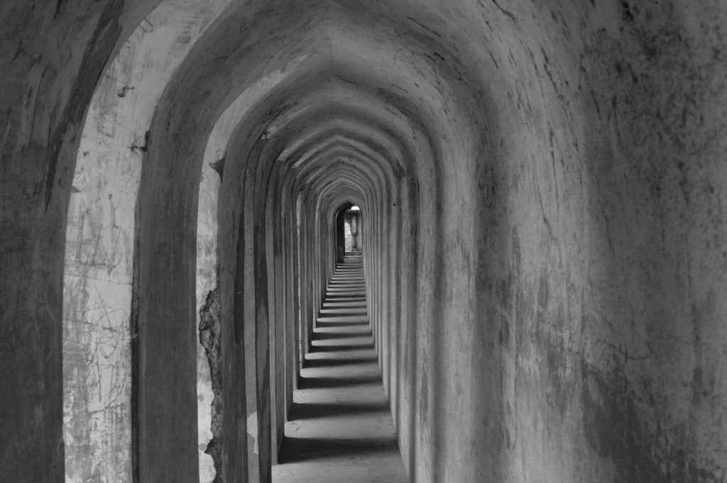
I am very fond of shots like this of long empty corridors. I especially prefer to see the image empty of people.
Since there is very little color, I converted to monochrome. I don't mind the loss of that touch of green, but you may prefer it as a highlight. |
Apr 4th |
 |
2 comments - 0 replies for Group 8
|
| 15 |
Apr 21 |
Comment |
This is a very captivating image. I have two comments.
1. Sun shadows will always be blurry because (physics and optics here) the sun is not a point source of light, but a disk.
2. I LOVE the little alien. |
Apr 29th |
1 comment - 0 replies for Group 15
|
| 31 |
Apr 21 |
Comment |
Perfect portrait, for all the reasons your group colleagues have mentioned.
I see an undercurrent of social commentary in this image. I think the boy has rotten teeth, a common problem among less advantaged peoples. |
Apr 8th |
1 comment - 0 replies for Group 31
|
| 32 |
Apr 21 |
Comment |
See Group 64 this month, Jerry Funk! |
Apr 27th |
| 32 |
Apr 21 |
Reply |
Yes, yes, yes. Love it. You cropped down even more than I had in mind, and that is so right. |
Apr 22nd |
| 32 |
Apr 21 |
Reply |
Thanks for the comment. I am divided between the two large views that I presented and Ata suggested. I think both are valid, but up to each to choose which they like. |
Apr 17th |
| 32 |
Apr 21 |
Comment |
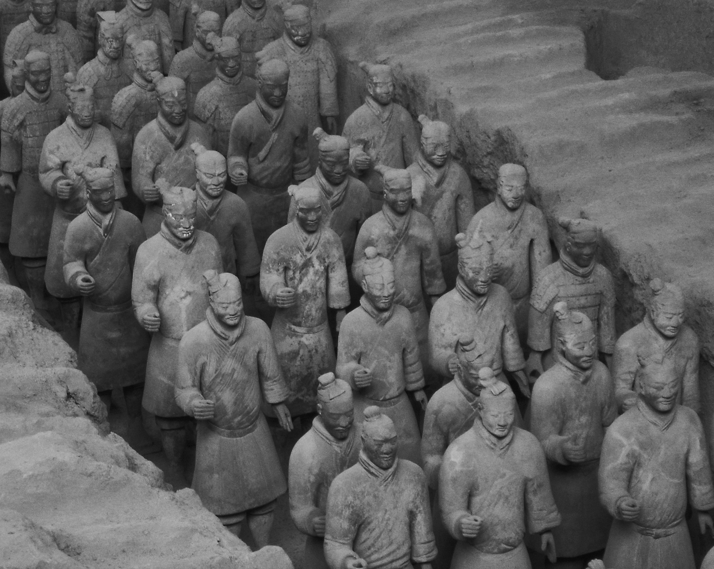
Added note about the Terra Cotta Figures. Every face is that of an individual, different from every other one of the 6000 or so faces. |
Apr 10th |
| 32 |
Apr 21 |
Reply |
Hi Larry, thanks for coming by with your good idea. Unfortunately, while I took about 20 shots there, I did not get quite what you suggested. How is this? |
Apr 10th |
 |
| 32 |
Apr 21 |
Comment |
Your contrast and light management in monochrome is as good as it gets and this is a fine image. The more I look at it the more I like it. It is very unique to see this famous canyon in monochrome. |
Apr 7th |
| 32 |
Apr 21 |
Comment |
Top crop, bottom crop, ha ha. Tom and I were just chatting about opposite advice about my image this month. I vote for cropping off your top 25%, so only water is at the top. This would invert the apparent location of the open water, but who would know? |
Apr 7th |
| 32 |
Apr 21 |
Reply |
Thanks, Tom.
Ha ha, no matter what I do to choose a cropping, people like the opposite. Yes, I agree now that the great roof view is an asset. |
Apr 6th |
| 32 |
Apr 21 |
Comment |
Diana, I have mixed reactions to this.
First off, your subject is well chosen. What a great idea for the architect of that cathedral to express the crown of thorns concept in the structure of the building--this might be common, but I have never seen that before.
Next, I like very much your repetition of that structure twice on the right side of the image. I would not have minded seeing it more throughout the image.
But I have trouble with the spiral effect on the left--it is fine alone, but I can't relate it to the right side of the image. I can't identify what part are being repeated in the spiral. |
Apr 5th |
| 32 |
Apr 21 |
Comment |
This is nicely done: the geometry of the architectural elements, the diagonals, the full range of tones.
What was the source of illumination: the moon? |
Apr 5th |
| 32 |
Apr 21 |
Comment |
Hi Russ, I like both images equally, but on the monochrome, I find the bright underside of the rightmost leaf a bit too bright--funny I don't have that response to the color version.
Very clever technique and pleasing images. |
Apr 5th |
| 32 |
Apr 21 |
Reply |
Thanks for dropping in, Guy. Yes, more contrast would have been better. Thanks. |
Apr 5th |
| 32 |
Apr 21 |
Reply |
Quite a good job, Ata, I did not think it could be so much sharper without looking over-processed. Thanks. |
Apr 5th |
7 comments - 6 replies for Group 32
|
| 34 |
Apr 21 |
Comment |
Yum, fresh lychee fruit! I hope you enjoyed them afterwards. I lived in Taipei for a while in the 80s, and ate them every morning for breakfast fruit in season.
You did a lot of work for this shot and it paid off well. Of course one always thinks of eyeballs when eating lychee. |
Apr 7th |
1 comment - 0 replies for Group 34
|
| 40 |
Apr 21 |
Comment |
I think the diagonal shadows are the touch that makes this interesting architecture even more interesting. |
Apr 3rd |
1 comment - 0 replies for Group 40
|
| 58 |
Apr 21 |
Comment |
You have a great shot of this man at just the right moment, but I think it's the framing of the scaffolding that gives this image its final touch of quality. Such great rectangles and diagonals. |
Apr 3rd |
| 58 |
Apr 21 |
Comment |
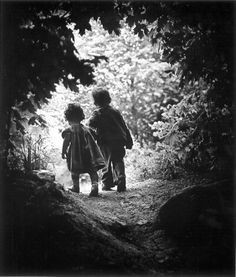
I like that you shot this from an offset angle. I also like images of people, especially children, walking away from the camera. Isaac makes a very good point about reading right to left. I agree with him about the blown-out background, and suggest you try showing us how it would look as it was originally. I would add that the attached image by W. Eugene Smith (commonly called The Walk to Paradise Garden) shows children walking away into brightness, and your image reminds me of it. |
Apr 2nd |
 |
2 comments - 0 replies for Group 58
|
| 59 |
Apr 21 |
Comment |
This is a very exciting shot, and you are clearly an expert at these. Your capture of Hawaii 1's facial expression makes the image. I am only guessing that not having number 24's right hand visible in the shot might be a minor criticism. |
Apr 2nd |
1 comment - 0 replies for Group 59
|
| 64 |
Apr 21 |
Reply |
I would like to have a look. I will do so tomorrow when the new month starts and I can see your next month in Group 37. I can't seem to see it just yet on my computer. |
Apr 30th |
| 64 |
Apr 21 |
Reply |
You are welcome. The lens distortion shows up when parallel lines are near the edges of the image. This is only the second time in several years of commenting in these groups that I found it useful. It is not the same as perspective. |
Apr 28th |
| 64 |
Apr 21 |
Comment |
See my group 32 this month, Jennifer Doerrie! |
Apr 27th |
| 64 |
Apr 21 |
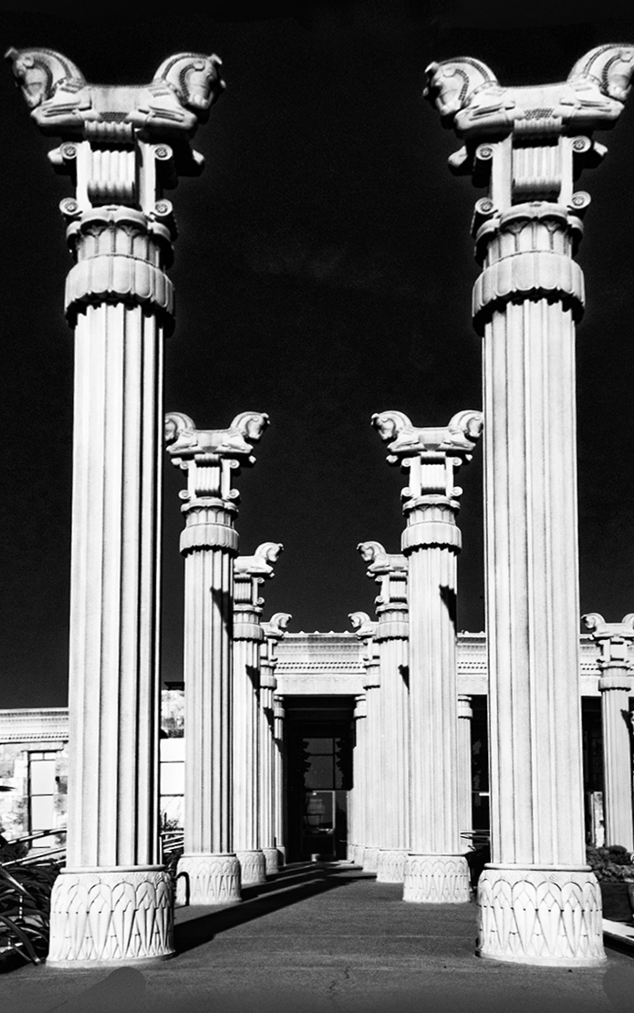
Comment |
Excellent shot. I would not straighten the columns because that slight lean is what your eye actually sees from the low vantage point. To me, it emphasizes the upward soaring of the columns. However, if you want them straightened, here it is. First I used PS "skew" to pull the tops of the columns outward. Then, noting there was visible lens distortion in the parallel flutings of the columns, I used "lens correction" to correct that. What do you think? |
Apr 27th |
 |
2 comments - 2 replies for Group 64
|
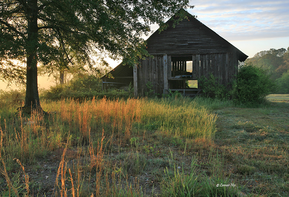
| 70 |
Apr 21 |
Comment |
This is a charming scene. I don't know your intent, but I suggest to lighten the barn just a bit, because the detail is all there. I used PS Elements "Lighten Shadows." How does this look to you? |
Apr 7th |
 |
| 70 |
Apr 21 |
Reply |
Hmm, I might have rotated it a hair too much :) You get the idea. Glad to meet up with you again. |
Apr 2nd |
| 70 |
Apr 21 |
Comment |
Hello Frans,
You have done a great job of post-processing this classical image (I have been there twice and my shots cannot match this).
But this building is such a work of symmetric art, it must be perfectly level. I have rotated your image .6 degree to the right. Does this look a bit better? I agree with Larry's cropping suggestion. |
Apr 2nd |
 |
2 comments - 1 reply for Group 70
|
| 74 |
Apr 21 |
Comment |
Like Ying Shi, I prefer the framing in the original. He likes the shadows, but I think it shows the receding road better. Also, in harmony with the title, "The Long Walk Home," making the child a bit smaller in the frame places them smaller in nature and emphasizes the "Long Walk." |
Apr 7th |
| 74 |
Apr 21 |
Comment |
Panning is hard. You did a good job with this, leaving space in front of the biker, as Haru mentioned.
My only suggestion is to choose a viewing spot where there is no tree (or pole?) in the background to inject a vertical line in an otherwise horizontal composition. |
Apr 6th |
2 comments - 0 replies for Group 74
|
| 78 |
Apr 21 |
Reply |
Eh, a horses anus is a horses anus, and every horse has one, and everyone at the rodeo saw a number of them. Do nothing about it, just like the horse does nothing about it. |
Apr 27th |
| 78 |
Apr 21 |
Comment |
Great discussion and great improvements, especially about leaving in the rider's shadow! Lucky you had all that in your original. |
Apr 7th |
1 comment - 1 reply for Group 78
|
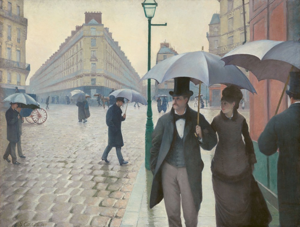
| 80 |
Apr 21 |
Comment |
Nice interaction, but I will be the exception. I LOVE your original shot--minus the awning of course. I am very fond of images split in half by a vertical line. Here is perhaps the artistic origin of that compositional technique, in Gustave Caillebotte's painting, Paris Street Rainy Day. |
Apr 27th |
 |
| 80 |
Apr 21 |
Comment |
Asking folks to jump while being photographed is a great idea. Also try asking them to turn to their companions with a loving glance.
See Philippe Halsman's "Jump Book" for a professional's very successful collection of jumping photographs. |
Apr 27th |
2 comments - 0 replies for Group 80
|
| 81 |
Apr 21 |
Comment |
This is a lovely scene and great post-processing.
Your discussion about a main subject of interest leads me to comment about images that may legitimately lack such--as in images conveying peace, tranquility, or loneliness, which class I think this belongs to. |
Apr 6th |
1 comment - 0 replies for Group 81
|
| 83 |
Apr 21 |
Reply |
Well then, excellent job panning! |
Apr 27th |
| 83 |
Apr 21 |
Comment |
This is a fine and exciting shot of a horse and rider in motion, but at 1/1600 sec I would have expected the motion to be stopped--this looks more like 1/160 sec. Am I mistaken?
Suggestion: try shooting barrel racing as the horse goes round a barrel, and you might get head-on shots of the horse and rider faces, plus a lot of dirt kicked up from the power of the turn. |
Apr 6th |
1 comment - 1 reply for Group 83
|
| 88 |
Apr 21 |
Comment |
I am very charmed by the subject here, and your image is well done, because I took my family to Taipei in 1988-89, and saw many sights like this. In particular, we stayed our first month at the Grand Hotel, built in this traditional style. |
Apr 27th |
| 88 |
Apr 21 |
Comment |
Hello Charles, you worked very hard on creating this finished images, and had some success. I would suggest toning down the sky, because as it is, it announces "I am post-processed," which I think should be avoided. I think your lightening of the bridge is good, and I like the suggestion to bring out a bit more detail in the trees. |
Apr 27th |
2 comments - 0 replies for Group 88
|
| 96 |
Apr 21 |
Comment |
Hello Emily,
I saw your group's discussion about your interesting image, about straightening and b/w conversion.
Here is my suggestion for straightening. I used "skew" in PS, which allows pulling each side out individually to taste. I did more on the right. I left a little lean--my preference.
As to b/w conversion, I used the "vivid landscape" preset, then adjusted brightness and contrast to taste.
How do you like this? |
Apr 27th |
 |
1 comment - 0 replies for Group 96
|
| 98 |
Apr 21 |
Reply |
Oops, you are so right about the lettering.
Yes, I was trying for atmosphere with my crop, but not too far back because you wanted to have the pair of people showing in clear detail. |
Apr 7th |
| 98 |
Apr 21 |
Comment |
Hello Robert, this is a charming shot. I have four grandkids myself, so this resonates with me.
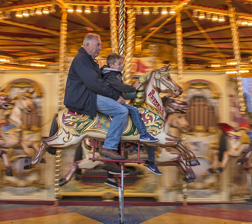
You chose to get quite close in on the subject, as you intended, but alternatively you could show a bit more context, as the lights are quite stunning in your original.
Here is my suggestion. I pulled back a bit to show the lights and more blurred other horses. I flipped left for right so the direction of motion is the left-to-right way we read European languages. I also used "Lighten Shadows" in my PS Elements program to lighten up the faces. What do you think? |
Apr 6th |
 |
1 comment - 1 reply for Group 98
|
32 comments - 13 replies Total
|


