|
| Group |
Round |
C/R |
Comment |
Date |
Image |
| 19 |
Mar 21 |
Comment |
Not only is the pose dramatic and exuberant, but the obvious whistle-stop campaigning platform of the rail car gently portends the future for these young women, who might one day seek elective office. |
Mar 17th |
1 comment - 0 replies for Group 19
|
| 20 |
Mar 21 |
Comment |
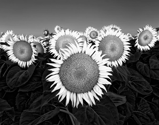
This is very creative, that you did not make this three equal vertical panels. You give emphasis to the fully developed flower. |
Mar 17th |
1 comment - 0 replies for Group 20
|
| 23 |
Mar 21 |
Comment |
Sorry not to be clear.
I was suggesting only that our comments leave off discussing free speech. I have no concern at all about your excellent photograph. |
Mar 18th |
| 23 |
Mar 21 |
Comment |
How lucky you were to find this model. What a stance this man has! He is definitely a professional. Look at his fist, his eyes, his contrapposto. Using the lambskin shows his modeling skill--it is definitely better than bare-chested. The lambskin implies kingliness, and is often used in dramatic productions as such. I have seen Shakespeare's King Lear acted in such a skin.
I respectfully suggest that issues of free speech be left out of these discussions, as calling someone else's free speech by a bad name is not an area we ought to venture into. |
Mar 17th |
2 comments - 0 replies for Group 23
|
| 30 |
Mar 21 |
Reply |
You said it was "at the evening time" in your "About the Image" section. |
Mar 3rd |
| 30 |
Mar 21 |
Comment |
Picky, picky, I will be picky. This is a clever and fun composite, but a moon rising at sunset must always be a full moon. At sunset, a half-moon like this would be directly overhead. |
Mar 3rd |
1 comment - 1 reply for Group 30
|
| 31 |
Mar 21 |
Comment |
This is a fascinating composition.
1. The fruit on the tray on the cloth (on a tabletop?) is a conventional and pleasing composition.
2. The two renegade cherries off to the right inject a note of discordance.
3. Suddenly, the table top drops away to a vertical with no indication of the edge between top and side. Now I have a touch of vertigo coming on.
4. Below are more rebellious fruits unsupported by anything visible, making my vertigo complete. How this stands in opposition to the tabletop composition! It is as if a Picasso cubist figure were inserted into a DaVinci painting.
5. The torn open orange speaks of violence, violation, and human appetites. The only apple in the image references original sin.
I don't know if you intended any of this, but it's all there in the image. Fascinating to analyze! |
Mar 3rd |
1 comment - 0 replies for Group 31
|
| 32 |
Mar 21 |
Reply |
Great success with both the virus molecules, and the model (who is that?), both makeup and expression. He seems to be the personification of the virus, throwing the deadly viruses at us with a vicious thrust. |
Mar 17th |
| 32 |
Mar 21 |
Comment |
I tried out the vignette capability I have in PS Elements. It looks complicated, as the controls are very detailed. But here is my first shot at it. I also cut out the upper edge, and tightened the shot. Not sure if this is an improvement, but I gained some experience with my PS program. |
Mar 15th |
 |
| 32 |
Mar 21 |
Reply |
Thanks, Steve. That looks very good. I will remember your suggestion for the 16:9 ratio. |
Mar 15th |
| 32 |
Mar 21 |
Reply |
Thank you. Everyone says try a vignette. I will do so. |
Mar 15th |
| 32 |
Mar 21 |
Reply |
I have not used vignette capabilities, but controls are quite extensive in the version of PS Elements I have. I must give it a try.
|
Mar 15th |
| 32 |
Mar 21 |
Reply |
That's a good point about cropping out the top row, and I agree it is a personal choice. I think I prefer it with the top row in, to sort of limit the infinite array of seated worshippers. But I don't know what I prefer that. |
Mar 5th |
| 32 |
Mar 21 |
Reply |
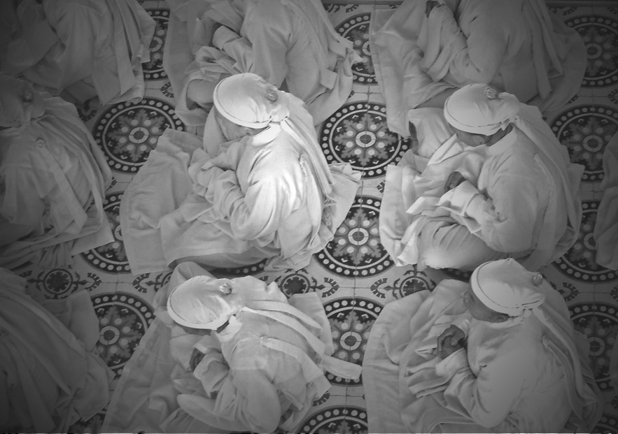
Thanks, Tom. It was unfortunate that observers could only shoot from the visitors' balcony. So I went for patterns. Good point about the variation of one worshipper having their head up. |
Mar 4th |
| 32 |
Mar 21 |
Reply |
Thanks, Diana. I have never done vignetting, but I should try it on some of my images. |
Mar 4th |
| 32 |
Mar 21 |
Reply |
Well, since you ask...
--Make the moon brighter (and the boat, as you said).
--Level the building a bit by rotating about .5 degree to the right. It is off-level only a bit. Try empirical rotations until it's level.
--Add an explosion where the defensive beam makes a square hit on the alien craft.
--Carry the lower defensive beam past the bottom of the alien craft and out of the frame.
--Add tiny explosions where two of the attacking beams hit the water near the bow of the defensive ship.
How's that? |
Mar 4th |
| 32 |
Mar 21 |
Comment |
Wow, so imaginative. I have no criticisms of this, just interest in the fun. Let me get this right. The alien craft is firing from its tines? And the defense is firing the intense beams from a canon on the ground? It surely looks like the defense will win. |
Mar 3rd |
| 32 |
Mar 21 |
Comment |
You did really well on this to catch the white seed parachutes against a darker background. I like that you left in that one seed on the right. I also observe that the stem springs out of the frame (reference Wes's image this month).
Critically, I am not so sure about so much space on the left, especially with that diagonal. But counter-critically, I think a uniform background would make a less interesting image. In summary, I have no idea. |
Mar 3rd |
| 32 |
Mar 21 |
Comment |
I quite agree with Russ. When this was in color, I remarked that the monochrome takes it out of the ordinary. I don't often care for infrared effects, but this one is really successful, and takes this image another step forward in excellence. |
Mar 3rd |
| 32 |
Mar 21 |
Comment |
Your idea to use only the right side seems good, as the orginal does take in a lot. I like Russ's suggestion. |
Mar 3rd |
| 32 |
Mar 21 |
Reply |
Thanks, Russ. We visited their mother temple. If you just google Cao Dai, you can see the temple in its fantastic color. |
Mar 3rd |
| 32 |
Mar 21 |
Reply |
Thank you, Ata, that does look good! |
Mar 3rd |
| 32 |
Mar 21 |
Comment |
Wes, during the time you were absent from the group, Diana and I have had several discussions in the group about where floral stems should enter the frame. This excellent shot and Russ's suggestion take me right back to those discussions with Diana. I do like Russ's suggestion. What about you? Did you have an intention that the stem should not touch the frame? |
Mar 3rd |
6 comments - 10 replies for Group 32
|
| 37 |
Mar 21 |
Reply |
Of course--you were looking though a window pane. Ha. Very clever. |
Mar 31st |
| 37 |
Mar 21 |
Comment |
Is it a mirror wall reflecting what is out to the left?
Are you going to tell the answer today or tomorrow? |
Mar 30th |
| 37 |
Mar 21 |
Comment |
This is a rare event. We should all post more mystery images with "how was it done" questions.
I have no idea, but I love the idea. |
Mar 14th |
2 comments - 1 reply for Group 37
|
| 40 |
Mar 21 |
Comment |
I am very fond of the US Postal Service, so this is a wonderful image for me to see. I am pretty sure from the image that mail sorting took place while the train was on the move. Good job on the exposure and fixing up the perspective. |
Mar 2nd |
| 40 |
Mar 21 |
Comment |
This is a fine shot, AND JUST THE CLEVEREST TITLE EVER! |
Mar 2nd |
2 comments - 0 replies for Group 40
|
| 43 |
Mar 21 |
Comment |
You gave this old barn lots of space around it, and placed it well to one side, making a fine composition.
As Bruce said, I think the color alteration should be muted a bit--so it does not announce "I am post-processed." |
Mar 13th |
1 comment - 0 replies for Group 43
|
| 44 |
Mar 21 |
Comment |
This is a fine shot of the church interior, with an evenly lit result.
I am wondering about the perspective alteration you had to do. Is that why the right side shows more of the church, or was that a deliberate choice for the composition to be a bit asymmetric. |
Mar 13th |
1 comment - 0 replies for Group 44
|
| 46 |
Mar 21 |
Reply |
This also is a fine image. I rotated it right .25 degree, straightened it very slightly, and cropped the left to match the right. The rotation and straightening lost a bit of the image. If you had shot this a bit further back, that would have left room for these minor adjustment. |
Mar 4th |
 |
| 46 |
Mar 21 |
Comment |
This is a good shot of a handsome old building. I recommend partly altering the perspective, but being careful to retain a little of the convergence of the vertical perspective lines, so you retain the feeling of looking up at a soaring structure. How do you like this?
Depending on what you want to do with this, you might consider removing the person with a stand and umbrella from the left side. |
Mar 2nd |
1 comment - 1 reply for Group 46
|
| 47 |
Mar 21 |
Comment |
I love long dramatic corridors like this, with side-lighting. Well done. Do tell us where this is. Thank you. |
Mar 2nd |
1 comment - 0 replies for Group 47
|
| 55 |
Mar 21 |
Comment |
Hello Samuel,
This is a lovely shot of an area we know well, living in Bethesda, and having dined many times over the years at the Comus Inn. What direction are we looking towards in your image, and is the Comus Inn visible?
|
Mar 29th |
| 55 |
Mar 21 |
Comment |
This is a captivating study in geometry and sunlight. I expect to see an Edward Hopper woman step out at any second into the summer sun. |
Mar 12th |
2 comments - 0 replies for Group 55
|
| 57 |
Mar 21 |
Comment |
I know this is a bit strange, but how about a monochrome conversion? I did this with PS Elements, using a preset conversion called "Vivid Landscape." Full disclosure: my home group is a monochrome group. |
Mar 29th |
 |
1 comment - 0 replies for Group 57
|
| 64 |
Mar 21 |
Reply |
Yes, I understand better now. I do agree that the different surfaces provide separation. Thanks. |
Mar 14th |
| 64 |
Mar 21 |
Comment |
Well Jerry, I don't think I accomplished anything, but here is my result. I got a little more difference between the pitcher and the wall, but it was at the cost of the brightness of the wall--which was your greatest interest. |
Mar 13th |
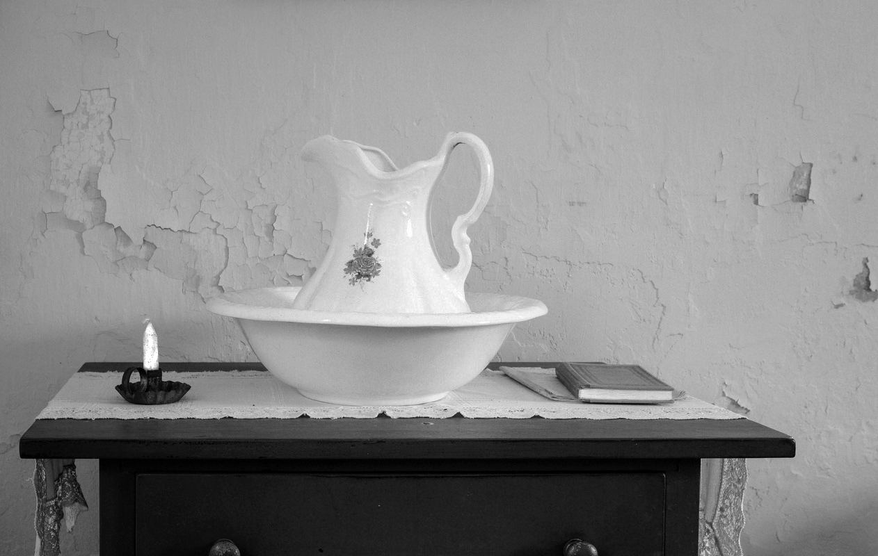 |
| 64 |
Mar 21 |
Comment |
I like everything about this composition, but I think the pitcher and wall behind it too much the same tone. Did you shoot the original in color? Can you reconvert the b/w to get more tonal separation between the pitcher and wall? In PS Elements, I use "Enhance/Convert to Black and White" to emphasize different colors in conversion to b/w. How about showing us the original image? |
Mar 12th |
| 64 |
Mar 21 |
Comment |
This grabs my attention and does not let go. I like the tonal range, from nearly pure black to nearly pure white (is that a result of your b/w shooting mode?). The two old house/shops fill up the frame almost with personalities. I like the little pile of old snow in the alley. There is a sense of tranquil observation about this image.
I have no suggestions, except that you might reshoot these same two buildings as lighting conditions change, to make a project of this, especially when sunlight falls across them and makes diagonal shadows. |
Mar 12th |
3 comments - 1 reply for Group 64
|
| 71 |
Mar 21 |
Comment |
This is a great shot, and "not a strong focal point" is an asset in this sort of image. As John says, it can be a meditative object, with one's mind excluding other thoughts as it travels around the "various layers" you noted. Very successful! |
Mar 28th |
1 comment - 0 replies for Group 71
|
| 72 |
Mar 21 |
Comment |
This shot is so great, I would have thought it impossible to get something this good. Congratulations.
I tried converting Isaac's crop to monochrome using PS Elements preset "Vivid Landscape." What do you think? |
Mar 28th |
 |
1 comment - 0 replies for Group 72
|
| 78 |
Mar 21 |
Comment |
Great juxtaposition for this shot.
I like to relate photography to other arts. This reminds me of the following sonnet, which many will know:
Ozymandias
BY PERCY BYSSHE SHELLEY
I met a traveller from an antique land,
Who said-"Two vast and trunkless legs of stone
Stand in the desert. . . . Near them, on the sand,
Half sunk a shattered visage lies, whose frown,
And wrinkled lip, and sneer of cold command,
Tell that its sculptor well those passions read
Which yet survive, stamped on these lifeless things,
The hand that mocked them, and the heart that fed;
And on the pedestal, these words appear:
My name is Ozymandias, King of Kings;
Look on my Works, ye Mighty, and despair!
Nothing beside remains. Round the decay
Of that colossal Wreck, boundless and bare
The lone and level sands stretch far away." |
Mar 28th |
1 comment - 0 replies for Group 78
|
| 82 |
Mar 21 |
Comment |
Hello Prasad,
Your colleagues have said it all. I agree this is a fine glamour shot, and you had an excellent model.
Questions: do you want or not want the blemish between her lip and nose--could go either way, I am sure. Also, what about showing the tattoos on her arm--do you want them in or out--also could go either way. What is your thinking behind this? Thanks. |
Mar 28th |
1 comment - 0 replies for Group 82
|
| 86 |
Mar 21 |
Reply |
Yes, I use Skew all the time. Your point about the total effect of the image is well made. It's a great shot! |
Mar 13th |
| 86 |
Mar 21 |
Reply |
I totally agree. Your composition is very striking and successful! |
Mar 13th |
| 86 |
Mar 21 |
Reply |
Belinda,
This is a strikingly clear example of the limits of perspective alteration. I often discuss this in these Digital Dialogue groups. May I have your permission to reproduce and discuss these two images of yours in the future?
--Steve |
Mar 12th |
| 86 |
Mar 21 |
Comment |
Unlike the problem of perspective alteration in Belinda's shot this month, your slightly converging vertical lines in this shot add to the sense that the building soars upwards. I would never try to alter the verticals on a shot like this.
What a fortunate touch to have that reflection! Good eye! |
Mar 12th |
| 86 |
Mar 21 |
Reply |
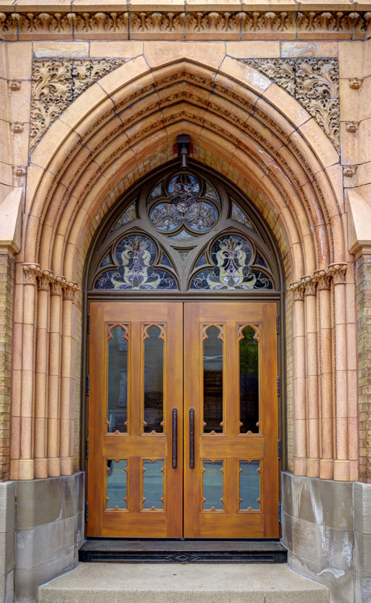
The perspective of viewing from below covers the entire image, of course, even single bricks, but it is only noticeable on the landings. The problem cannot be escaped when perspective is altered. Although very useful for shots like this, and essential for professional architectural photographers, the perspective alteration is actually a distortion. The converging vertical lines of the original is what your eye actually sees, even thought your brain corrects it. Note that horizontal parallel lines, like streets, buildings, or railroad tracks, always converge--and so do vertical lines. In drawing classes, art students always learn perspective in all three dimensions. That said, I still like the result here because of the great mix of rectangles and diagonals. |
Mar 12th |
| 86 |
Mar 21 |
Comment |
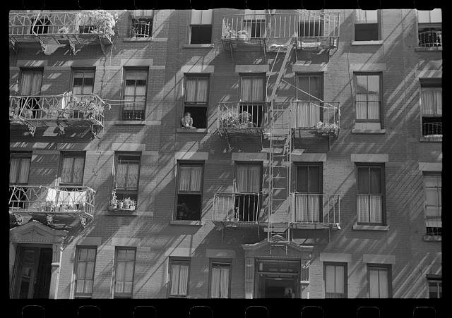
This is a great building facade shot, and you were really successful with the lighting and the alteration of the perspective. The diagonal pattern of the fire escapes works really well in contrast to the orthogonal architecture and brickwork.
Two suggestions to consider:
1. Can you go back when sunlight falls across the facade? It would make diagonal shadows of great interest. See the attached Walker Evans image for a sample.
2. The perspective alteration makes the facade appear to be viewed straight on, as if from the middle floor of a similarly tall building across the street. But the fire escape landings are clearly viewed from below, as from the street. This is an unfortunate and inevitable result of extreme perspective alteration, and its contradictory views are very obvious in this image. Nevertheless, the shot is so good, I think this problem can be accepted. |
Mar 9th |
 |
2 comments - 4 replies for Group 86
|
| 87 |
Mar 21 |
Comment |
Hello Lance,
This is an interesting and challenging format. I like your finished product, recognizing your colleagues' comments about the exact look of the separate borders.
I looked up the Hashira-e history on Wikipedia, and noted that that form generally presented only a single "column print." You are undertaking a greater challenge, to relate four images placed in your highly original orientation. I think you succeed very well to show the original image in four segments. Where there is a secondary challenge is to find an original image such that each of the four smaller images is individually a coherent composition.
I will tell you about such an artistic production. Many years ago the Smithsonian Museum of Natural History had an exhibit of hand painted Landscape Kimonos by Itchiku Kubota
November 16, 1995 - April 14, 1996. Each Kimono was an individual composition, but 45 of them hanging in a row formed a unified composition of the four seasons.
If you can find a suitable image that also entails four coherent mini-images, then that would be great. In this case, I find the rightmost image very good as a composition unto itself, but the other three less so.
I hope this interests you. |
Mar 9th |
1 comment - 0 replies for Group 87
|
| 92 |
Mar 21 |
Comment |
Here is the monochrome. |
Mar 2nd |
 |
| 92 |
Mar 21 |
Comment |
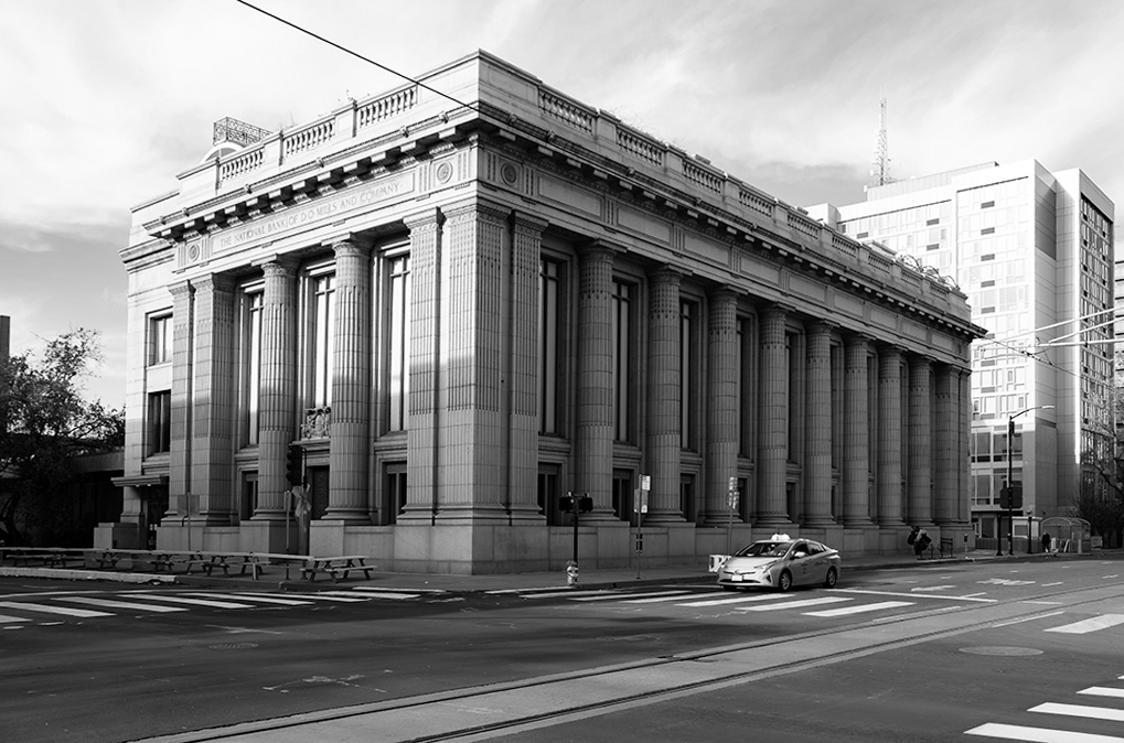
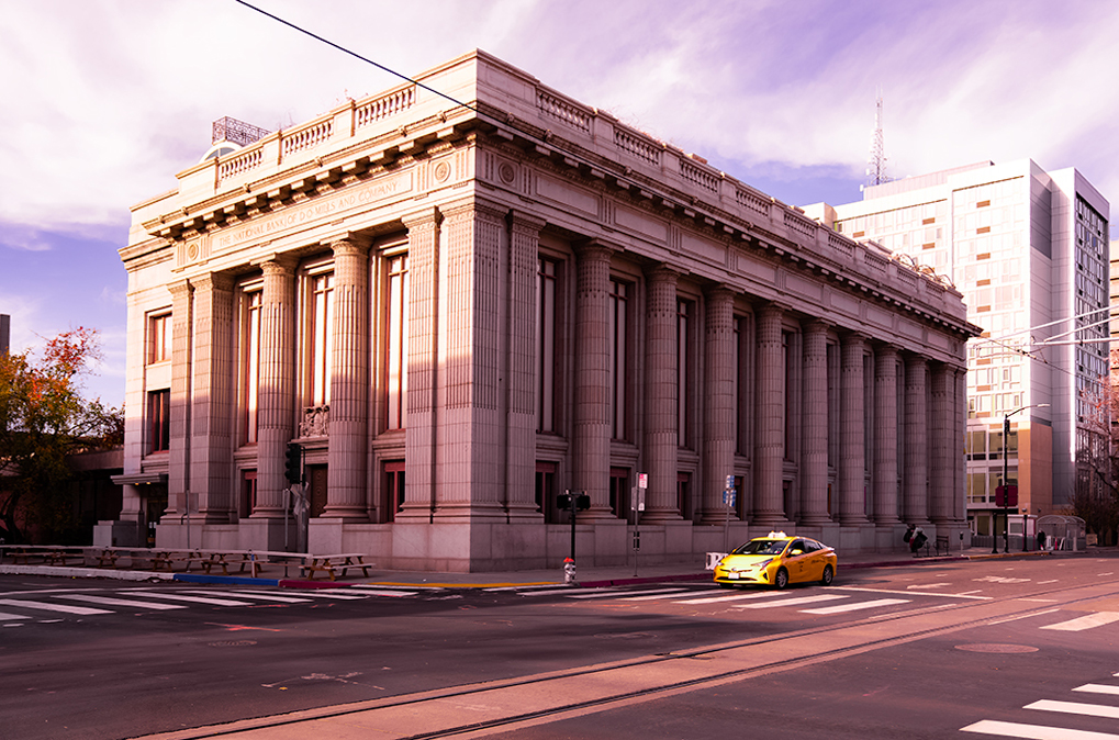
I like the idea of the lone vehicle in front of this stately building.
I am suggesting altering the perspective not quite completely, so as to leave a hint of the vertical line convergence, to convey the feeling of the building rising upwards. See my version B, attached.
I also converted to monochrome. See version C below.
How do you like either of these?
Also, perhaps get rid of the telephone wire in the upper left. |
Mar 2nd |
 |
2 comments - 0 replies for Group 92
|
| 96 |
Mar 21 |
Comment |
This is a great example of the importance of a good title to add impact to the image. It dots the "I"s on what should be clear to most viewers.
This is a fine shot of the old steel town "stages of life." I personally might have pulled back a bit to show more of the factory, but it must depend on what vantage point you were able to reach. On the other hand, as taken, the factory forms a "frame" for all of life and death in the town--a very clear metaphor.
Did you try this in monochrome? Here is one possible conversion using PS "vivid landscape" conversion. |
Mar 2nd |
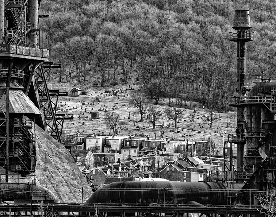 |
1 comment - 0 replies for Group 96
|
| 98 |
Mar 21 |
Reply |
You touch upon a critical question when shooting streets: people or no people. It's entirely up to you, and your expressive purpose. For me, I almost always prefer no people because I like the sense of tranquility or loneliness of an empty street. I also think that enhances the geometric/architectural study. Of course if you are shooting a traditional "street scene" then you want lots of people interacting. |
Mar 28th |
| 98 |
Mar 21 |
Comment |
Just visiting from Group 32. I agree with Ms. Mirsky. I love the original with its array of blossoms. Can you apply the same changes you made, but to the original? |
Mar 8th |
1 comment - 1 reply for Group 98
|
37 comments - 19 replies Total
|


