|
| Group |
Round |
C/R |
Comment |
Date |
Image |
| 1 |
Jan 21 |
Comment |
Great play of shadows.
I am wondering if cropping out the sky and tops of the posts would work, just to focus on the fence and shadows. Or if only the right half might concentrate on the relationship between the fence and shadows. Finally, I tried this, but the light source is screwy. |
Jan 27th |
 |
1 comment - 0 replies for Group 1
|
| 14 |
Jan 21 |
Comment |
"handheld at 0.3 sec"
Wow!
This is a great picture, and you must be a rock. How did you set yourself up to handhold for such a sharp image at .3 sec? |
Jan 26th |
1 comment - 0 replies for Group 14
|
| 18 |
Jan 21 |
Comment |
Great job. I love it that you used the "woody" broccoli stalk for the "wood" of the tree.
Can you do this again with just the veggies that you then use to make a soup? |
Jan 26th |
| 18 |
Jan 21 |
Comment |
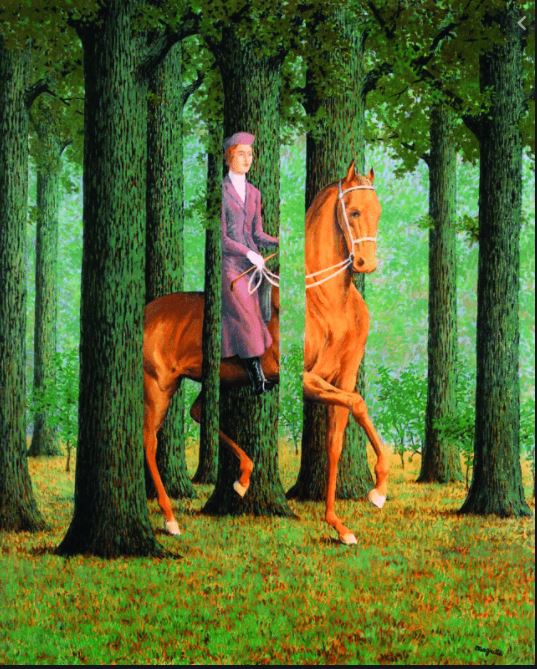
I think this is a fantastic experiment. It reminds me of this surrealistic painting by René Magritte. |
Jan 9th |
 |
2 comments - 0 replies for Group 18
|
| 20 |
Jan 21 |
Comment |
Super creative!
I suggest a few more of them with the caps facing, although that does not make much difference under glass. |
Jan 26th |
1 comment - 0 replies for Group 20
|
| 22 |
Jan 21 |
Comment |
This is a fine effort, and great comments from your colleagues.
An idea I have seen is to make a portrait of a person "without the person" through their tools. You can consider adding a hat, gloves, boots, etc. to such a composition to suggest the person who uses them.
Of course for a formal minimalist composition, the approach you are taking is the best. |
Jan 26th |
1 comment - 0 replies for Group 22
|
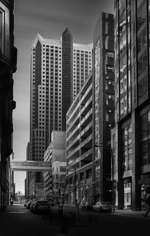
| 25 |
Jan 21 |
Reply |
I have a renegade view about perspective. We have no problem accepting that horizontal parallel lines converge, so I advocate a bit of convergence for vertical lines. I think it adds a touch of action to the vertical lines, and emphasizes the soaring nature of tall buildings. What do you think of this? |
Jan 22nd |
 |
| 25 |
Jan 21 |
Comment |
This is a nice shot of a classic view.
Were your originals showing vertical convergence of the tall building lines, and did you alter the perspective? This particular famous view would normally have the unusual property of the vertical lines converging downwards. |
Jan 9th |
1 comment - 1 reply for Group 25
|
| 27 |
Jan 21 |
Comment |
I think this is ambitiously successful to include both the near view of the street scene and the distant view of the former prison. One must think of the life pulsing (in different ways) on the street and in the once-prison. Then you have to think that the former prisoners came from streets very like the one in the foreground. In many cases their lives ended in that prison--but now the life of the prison has ended. |
Jan 26th |
1 comment - 0 replies for Group 27
|
| 30 |
Jan 21 |
Comment |
Motion blur is so much fun and has such great results. This is very successful.
Starting with your image, I cropped to the half I liked, made a flipped copy of it, combined the two, and here it is. There is no limit to the variations you can do with such a great source image. You could easily make a dozen variations, all very different from each other. |
Jan 26th |
 |
| 30 |
Jan 21 |
Comment |
Robert, I rise to defend pots and pouring:
Tea pots are short and stout. Coffee pots are tall and stout. This is correctly a coffee pot. I looked it up with Google to verify.
Considering the rapid pouring rate and the short distance to fall, the slight arc of the coffee stream looks OK to me.
Leonid, this is quite impressive. Can you add the silver bullet that is shattering the coffee pot? |
Jan 8th |
2 comments - 0 replies for Group 30
|
| 32 |
Jan 21 |
Comment |
I tried a conversion with "Vivid Landscape," then increased both overall brightness and contrast, and a touch of sharpening. |
Jan 13th |
 |
| 32 |
Jan 21 |
Reply |
I have complete control of ISO and shutter speed, but only four f-stops. And I can shoot manual. The Canon G is really a good camera, and pocket size. So I accepted the limitations. But it has poor low-light sensitivity, and only a newer camera will cure that--sooner or later it will break and I will replace it.
I like your ideas of choosing motion blur for this kind of shot, or abstracting the image. Thanks. |
Jan 13th |
| 32 |
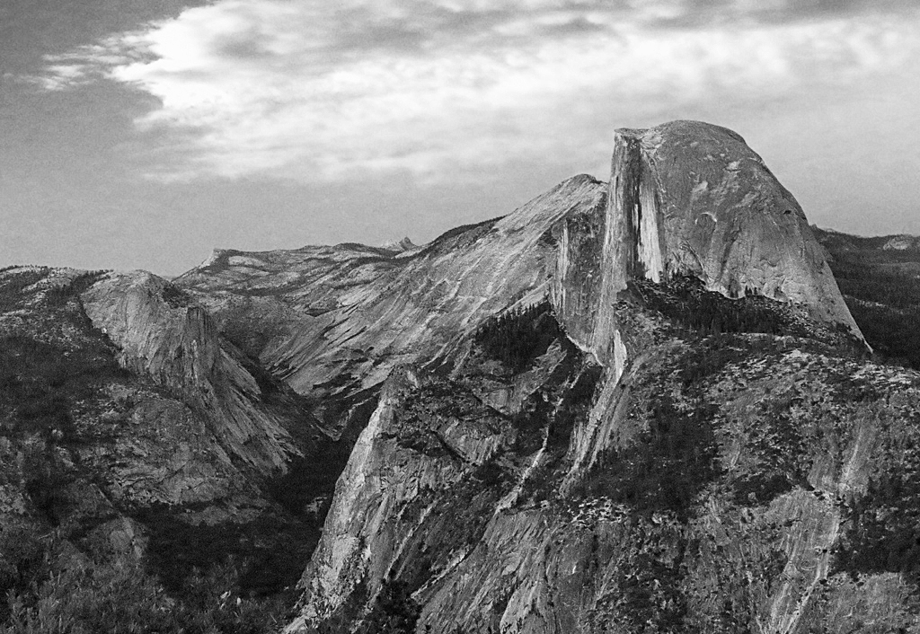
Jan 21 |
Comment |
Also, thanks for taking us on a tour of Yosemite. I have never visited, but seen many photographs. This is the first time I have seen the "half dome" view clearly. Thanks. |
Jan 12th |
| 32 |
Jan 21 |
Comment |
This looks like a great location, and I like your second version. Can you show the original? I would like to take a shot at the monochrome conversion, as I have been doing many of those recently using the conversion controls in PS Elements. |
Jan 12th |
| 32 |
Jan 21 |
Reply |
Hi Larry, thanks for the advice. You always have good solutions. I have been trying to keep my equipment baggage to a radical minimum (one camera that can fit in my pocket). I used to have a full kit and also did my own B/W development and printing. I still have my Minolta SRT-101 in a closet and my Bogen enlarger in the attic. I just can't get some shots with my limited equipment, due to the compromise I made to be compact and light. When my Canon G10 finally dies (it's doing great), I might move up to a G16, which has better low light sensitivity. |
Jan 11th |
| 32 |
Jan 21 |
Reply |
True enough. I have been studying Barbara Morgan's dance photographs. She was very careful to pose her dance photos in special sessions with controlled lighting, seeing that performance photos were not satisfactory. I have never had a successful shot of a dance or dramatic performance, but of course my camera is poor in low light, lacking both sensitivity and a large lens. |
Jan 10th |
| 32 |
Jan 21 |
Comment |
Lynne, I think I do prefer the extra petals. Great shot. |
Jan 9th |
| 32 |
Jan 21 |
Comment |
I have never tried high key effects, but this is really very nicely done. The gently increasing contrast going into the interior of the rose looks great. I also note that you did an offset cropping--very interesting, and I think quite successful.
Perhaps, just perhaps, I might have wanted to see the rest of the last petal fold at the bottom, but I would have to see that to say if I liked it better. |
Jan 9th |
| 32 |
Jan 21 |
Reply |
I much prefer the mono: as Russ said, it gives attention to the meerkats, and also seems clearer. Also, the color version does not speak to the beauty or delicate variations of color--just not that sort of image--so there is no loss setting aside the color version. |
Jan 9th |
| 32 |
Jan 21 |
Comment |
"What are these strange little creatures doing in this location, and how did Diana every capture this image?"
This is a very convincing composite. I really like the peeling paint and the threaded bolts. |
Jan 8th |
| 32 |
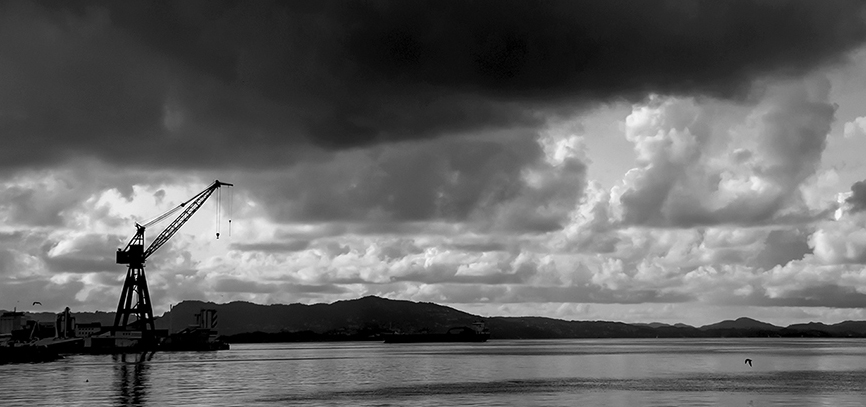
Jan 21 |
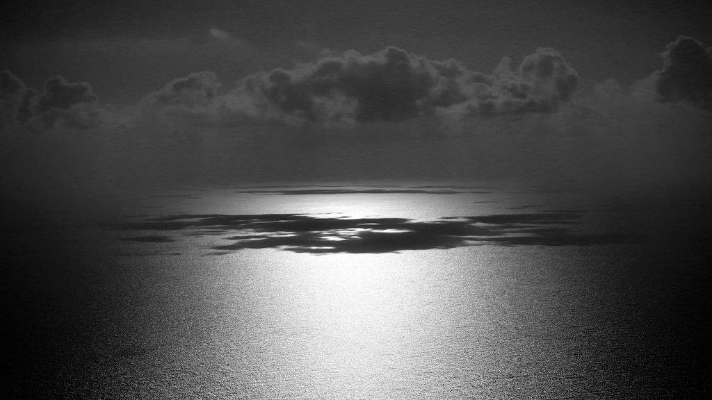
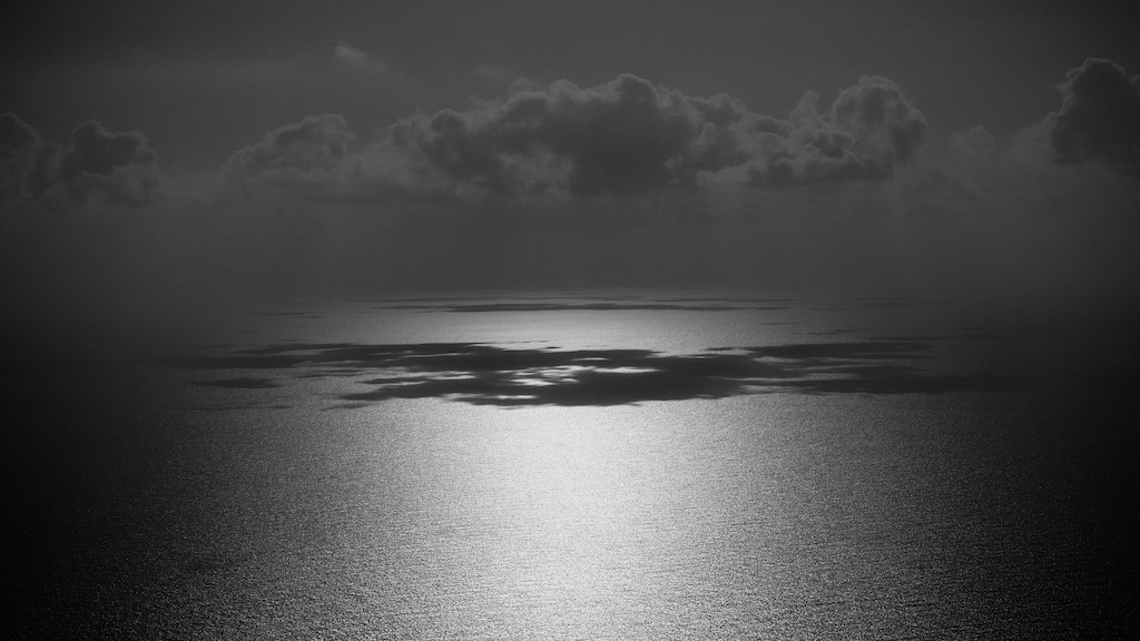
Reply |
Wow, I really like that pitch black sky. So often we hear advice to crop out extra sky or water, but in this case I think that huge section of black sky is like a special effect in a movie of an approaching surreal monster. |
Jan 8th |
| 32 |
Jan 21 |
Reply |
Why of course a border is a good idea. I never think of that when I submit for this group. Yes, it would improve the image. Thanks. |
Jan 6th |
| 32 |
Jan 21 |
Comment |
I am also fascinated by the decorative filament. The image has come through very well in monochrome. The several layers of reflections are great. |
Jan 5th |
| 32 |
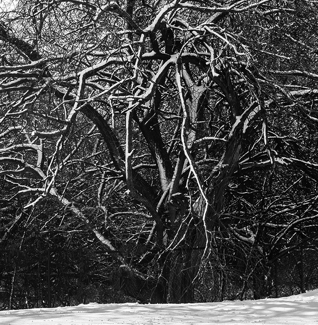
Jan 21 |
Comment |
I think you adjusted this nicely to bring out the snowy highlights on the tree.
Critically, I find it a bit too busy with branches for the intent of this image. How about if you cropped in on a smaller area of this image, like this.
Eh! I am not sure I am helping here! Forget this if you don't care for it. |
Jan 4th |
 |
| 32 |
Jan 21 |
Comment |
Here is another. |
Jan 4th |
 |
| 32 |
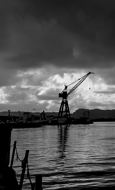
Jan 21 |
Comment |
Great subject matter and a good shot of the old crane against a brighter section of the sky. The composition is very satisfying just like this.
But for fun, there are possibilities for cropping out smaller pictures that give a different result. Here's the first that comes to my mind. |
Jan 4th |
 |
| 32 |
Jan 21 |
Reply |
Hello and Happy New Year, Ata.
Yes, the conditions of this shot were poor. I had no tripod, and my Canon G10 was the last "G" before the light sensitivity was increased in newer models. |
Jan 1st |
10 comments - 7 replies for Group 32
|
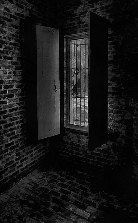
| 35 |
Jan 21 |
Comment |
I love shots like this, with the light coming in through a window, dramatically.
How about a bit of wide-angle perspective straightening? |
Jan 7th |
 |
1 comment - 0 replies for Group 35
|
| 37 |
Jan 21 |
Comment |
Great shot at an opportune moment.
I agree that the huge expanse of sky should stay, not only compositionally, but spiritually. Although the Buddhist idea of heaven may not correspond well to the Christian tradition of heaven being "above," nevertheless that great expanse of sky in this image speaks to me of the spiritual. |
Jan 26th |
1 comment - 0 replies for Group 37
|
| 39 |
Jan 21 |
Comment |
I am fascinated how rendering this in monochrome and increasing some brightness gives some leaves a metallic look (to me). I find this a big plus in the interest of the image. |
Jan 26th |
1 comment - 0 replies for Group 39
|
| 40 |
Jan 21 |
Comment |
I really like the simplicity of this. It is a very pleasing composition.
I have a question. How did you choose the proportions and position for the window? Did you follow any rules or conventions? Did you use the photographer's "rule of thirds"? Did you place the window using a "golden mean" proportion? Or was it a personal sense of taste? |
Jan 26th |
1 comment - 0 replies for Group 40
|
| 42 |
Jan 21 |
Comment |
I think you had great success with the lighting.
How about doing a whole series of grater shots to make a body of work? Series title, of course, "My great grater." If you have an old one, it could be your great great grater. |
Jan 26th |
| 42 |
Jan 21 |
Comment |
Lovely shot.
Forgive me. What building is it and where is it? |
Jan 26th |
| 42 |
Jan 21 |
Comment |
Nice image. I immediately thought this looks very like the nave of a cathedral, down to the green beams resembling a cross or crucifix. Water imagery supports the religious interpretation. |
Jan 26th |
3 comments - 0 replies for Group 42
|
| 48 |
Jan 21 |
Comment |
Nicely done, Beverly. I really like this, especially your restraint in not quite straightening the verticals--I much prefer a little bit of vertical convergence to give the feeling of a building soaring upwards.
I like both skies--the original deep blue is quite attractive.
|
Jan 3rd |
1 comment - 0 replies for Group 48
|
| 49 |
Jan 21 |
Comment |
You did remarkably well with a flashlight for a light source, and showed a serene expression on your face despite all the hubbub you were engaged in--well done.
You also got a good angle on the lighting, showing a classic "Rembrandt Triangle" of light under the eye on your dark side. |
Jan 26th |
1 comment - 0 replies for Group 49
|
| 53 |
Jan 21 |
Comment |
This is a nice concept to show foreground and background, each illuminated with entirely different types of light.
I had a look at your original and because of all the busy extra stuff in it, it looks more realistic than your finished image, and the original does not announce "too photoshopped" at all. How about inserting the railing of a deck into your finished image to suggest that this is the view of Mt. Rainier from someone's back deck? |
Jan 7th |
1 comment - 0 replies for Group 53
|
| 62 |
Jan 21 |
Comment |
Hello Emil,
I very much like your formal cityscape composition, especially including a building to stop the viewer's eye from wandering out of the frame on the left.
I just have one comment about altering vertical perspective. I like to leave just a hint of vertical convergence in my tall building images to help the viewer see them soar upwards. Here is a sample. What do you think? |
Jan 2nd |
 |
1 comment - 0 replies for Group 62
|
| 64 |
Jan 21 |
Comment |
This great image made me do a hard stop when I saw it.
I think this is a highly successful formal composition of shapes. It has an admirably wide tonal range. I think all your personal experience and photographic learning (I read your bio) are showing in this excellent composition. |
Jan 2nd |
1 comment - 0 replies for Group 64
|
| 67 |
Jan 21 |
Reply |
Larry, please see my question below--I asked about the sharpness question. Thanks. |
Jan 26th |
| 67 |
Jan 21 |
Comment |
This is a wonderful shot and I want to follow up on the discussion about the focal point. My question is for everyone who has commented on the focal point.
Am I wrong to think that the focal distance to the mountain and to its reflection are about the same? The reflection is not an object in the water 50 feet from the camera--it's light and image comes from the mountain. So focal point does not explain the apparent sharpness of the reflection. I blew up the image and see no difference in sharpness between mountain and reflection. Rather, I see the reflection as "easier to view," perhaps because its brightness range is somewhat darker than the mountain. |
Jan 25th |
| 67 |
Jan 21 |
Comment |
Larry,
Excellent explanation of how to shoot this type of scene. Thanks.
Your suggested 8x10 crop would also look as good as this composition. I vote for both. |
Jan 2nd |
2 comments - 1 reply for Group 67
|
| 69 |
Jan 21 |
Comment |
Hello Dean, I am from Monochrome Group 32, and it is most interesting to see you present this in monochrome. I see many successes in your doing it.
First, the extremes of brightness in the color have been reduced, and both lights and darks in the monochrome are more discenable, especially the delicate leaves floating on the water in the foreground. Did you do some post-processing to achieve that--what?
Second, while "color" is lovely in a photograph--and you have lots of it in our original--I don't find the original really a successful color subject, the way an autumn sunset might be, with a myriad of color tones. Hence the monochrome is a good choice.
Constructively, I might suggest a slight reduction in the brightness of the reflected clouds in the water to keep the view below consistently darker that the view above. |
Jan 25th |
1 comment - 0 replies for Group 69
|
| 70 |
Jan 21 |
Comment |
Hello Frans, how lucky you were to see the Northern Lights--it is the one sky phenomenon that I have not seen, even though I have lived in Minnesota and New York States, and travelled to Canada and Russia.
This is a beautiful shot. I have no suggestions for improvement. |
Jan 2nd |
1 comment - 0 replies for Group 70
|
| 71 |
Jan 21 |
Comment |
It's hard to get this shot: up close would crop out the rhythmic rows of the tea gardens; far back like this makes the elephants small. But your written story nicely accompanies the photograph, filling out the the story. |
Jan 24th |
1 comment - 0 replies for Group 71
|
| 74 |
Jan 21 |
Reply |
My wife and I are getting our first COVID-19 vaccinations in two days. Maybe--just maybe--we will be in Turkey in September. It's been hard to skip a year after 20 regular summers in Alacati. |
Jan 24th |
| 74 |
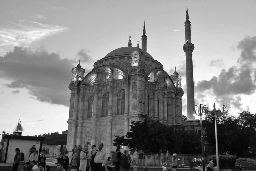
Jan 21 |
Comment |
Hello Ata, this is such a great place to photograph. We have been in this area several times, at the nearby cafes, drinking tea, eating snacks, and listening to the click-click of the Backgammon dice at neighboring tables (along with the slaps of the pieces and the moans of the passionate players).
I like very much your original, with its beautiful sky and lights shining from the upper windows of the mosque. But I don't think these quite come through in the conversion. I tried to convert to monochrome in PS Elements using a setting called "Vivid Landscapes," then did overall brighting of dark areas and darkening of bright areas. What do you think?
Also, I very much like the slight convergence of the verticals, showing the soaring of the tall building.
I like that you placed the setting sun right at the edge of the minaret.
Some people might want to get rid of some of the people in front, or de-emphasized them by darkening them a bit. I only would suggest getting rid of the prominent couple in light clothing (perhaps the man is taking a selfie of him and his wife with the mosque behind). |
Jan 1st |
 |
1 comment - 1 reply for Group 74
|
| 76 |
Jan 21 |
Comment |
I don't know anything about light painting, but your result is beautiful. Congratulations on your successful self-study.
I also am really impressed with the your radically offset composition. It fixes my attention. Although the bowl has no visible support, that does not matter--it has a perfect home where it is. |
Jan 24th |
1 comment - 0 replies for Group 76
|
| 97 |
Jan 21 |
Reply |
Yes, I agree with you. That tinge of color is special. |
Jan 5th |
| 97 |
Jan 21 |
Comment |
Here is "Infrared Effect." |
Jan 5th |
 |
| 97 |
Jan 21 |
Comment |
This is an exciting and successful attempt at your minimalist image, and very interesting discussion about your approach.
I am surprised you were not satisfied with a conversion to monochrome. Here are two conversions I did in Photoshop Elements using options called "Vivid Landscape" and "Infrared Effect." What do you think? |
Jan 5th |
 |
2 comments - 1 reply for Group 97
|
41 comments - 11 replies Total
|


