|
| Group |
Round |
C/R |
Comment |
Date |
Image |
| 3 |
Dec 20 |
Comment |
Hello Lisa,
I really like split screen compositions because they are so daring. But something must relate the two parts. Perhaps if the couple were looking at the window and lit up by its glow. This is something you could try again. I really like that shop window as the right side. |
Dec 4th |
| 3 |
Dec 20 |
Comment |
Ruth, this is a charming shot. I am not bothered by the shirt color. Your image makes me think of two Robert Frost poems about "the road not taken" and "you come too."
LuAnn, is this what you wanted to do with straightening the trees? I used PS "skew" and pulled the top left handle a little to the left and the top right handle a really tiny bit to the right. This does not pull up the bottom at all. |
Dec 4th |
 |
2 comments - 0 replies for Group 3
|
| 4 |
Dec 20 |
Comment |
Great sequence. I like your Original 1 as a single shot.
Our daughter has been an equestrienne for many decades, and we have seen her come off like this a few times. She would set her jaw, and make the horse go back and do it right, or else (she explained) the horse would get the idea that this was OK to do. |
Dec 4th |
1 comment - 0 replies for Group 4
|
| 11 |
Dec 20 |
Comment |
You really hit on a fine composition with this shot, as your colleague Allen has said. I like everything about it, but could you have kept a bit of that pavement glare in the distance, which I think was very dramatic? |
Dec 4th |
1 comment - 0 replies for Group 11
|
| 13 |
Dec 20 |
Reply |
Well, your choice of a see-through window is right on to capture negative space. You are in good company. I think Brett Weston originated this, and Beaumont Newhall credited him with being the first photographer to capture negative space. |
Dec 5th |
| 13 |
Dec 20 |
Comment |
I really like your cropping on this. The lower right corner of the window defines a rectangle of the same proportions as the entire frame. Well done!
Random question: what was the monthly assignment in your group--everyone else has shot birds (smile). |
Dec 4th |
1 comment - 1 reply for Group 13
|
| 17 |
Dec 20 |
Comment |
This is a fine architectural shot. I like a lot of things about it:
1. The side lighting from the open arches.
2. Thank goodness you did not put in a "focal point." I so much prefer the empty and tranquil architecture.
3. Glad you tried both color and monochrome. Interesting that you preferred the color.
Suggestion:
1. I prefer long corridor shots to be a bit more off center, creating I think a hint of tension.
Final commentary on Brutalism:
1. It was very popular all over about 40-50 years ago, in Boston, many cities, and here in DC, where we have the Humphrey Building, the FBI HQ, L'Enfant Plaza, the HUD Building, the Hirshhorn Museum, the Watergate Complex, and the infamous Third Church of Christ, Scientist, which fought the city to tear down their church and eventually succeeded.
2. There have been lots of works of art that have had their popular and their unpopular periods. Right now, Brutalism is OUT, OUT, OUT. But that does not mean it is bad, or even ugly, or may not come back into popularity. It does mean that it is VERY unpopular right now. BUT both Shakespeare and Dickens almost faded out at different times, but had revivals, so check back with me in 50 years and let's see how Brutalism is regarded them. |
Dec 4th |
1 comment - 0 replies for Group 17
|
| 32 |
Dec 20 |
Reply |
Great. I like this close-up. I accept the challenge. Four close-ups of knots. Each must express an emotional or symbolic concept. I will work on that. One is easy--the figure of eight knot is similar to the infinity symbol. |
Dec 25th |
| 32 |
Dec 20 |
Reply |
How interesting what you say, Jennifer. I saw that the original background (on my monitor) displayed moire patterns, but my monochrome (being a bit tighter in) did not.
By a tight crop on the know itself, do you mean just the turns around what we call the "standing part" of the line? Yes, good idea, I will try some shots like that with different knots. For this one, it would not do because the display of the bowline requires to see the large loop--forming and holding that large loop is what the bowline knot is all about. |
Dec 24th |
| 32 |
Dec 20 |
Reply |
Hello Lynne,
If you ever find your knot board, please send an image of it.
Thanks for the comment about the background--I was quite divided about whether to use what I had at hand or something else. I often see people use reflective glass under their still lifes. |
Dec 22nd |
| 32 |
Dec 20 |
Reply |
Victor,
How exciting that you replied to this--as a Goldline climber! I am honored by your visit.
I forgot to mention that Goldline was made by Plymouth Cordage, an historic rope company, and there is still a Plymouth Cordage Company Museum in Plymouth, MA.
Your suggestions for improving the image look just great. Thanks for working up a sample. |
Dec 17th |
| 32 |
Dec 20 |
Reply |
John, thanks so much for visiting. |
Dec 17th |
| 32 |
Dec 20 |
Reply |
I like what you did here. There is still a good tonal range, and everything is clear. The ice looks better in this version. |
Dec 14th |
| 32 |
Dec 20 |
Comment |
Oh, those judges! |
Dec 14th |
| 32 |
Dec 20 |
Reply |
Very good comments, Diana.
I also prefer the color, because of the beautiful tint of the famous Goldline rope.
For a knotting instructional photo, this will not do, as the turns of the rope that go under itself are not demonstrably clear--line drawings are often best for showing how to tie a knot.
I was trying for a pictorial shot, so your comments about angle and lighting apply very well. |
Dec 11th |
| 32 |
Dec 20 |
Reply |
Diana, of course you should like your memory images. |
Dec 11th |
| 32 |
Dec 20 |
Comment |
Yes, Apollo's pose is very good. I can't advise about the frisbee--but over the years folks have said that it's hard to do anything with blown-out whites. Tom recently fixed a problem like this by cloning in another object. As to the ears getting lost in the fence, how about selecting just the fence area and then blurring it a bit? I like the incredibly sharp field of grass. |
Dec 10th |
| 32 |
Dec 20 |
Comment |
I like it very much as is, with the conversion to monochrome, and the mid-line composition. But I also like Tom's suggestion to not crop at all. Now that I have seen the full image, I prefer it uncropped and less crowded. If I have to give words to it, your first image is "intimate" and the uncropped version is "tranquil." |
Dec 8th |
| 32 |
Dec 20 |
Reply |
Asbj�rn, so glad this resonated with you. Thanks for your comments. Those are good ideas. |
Dec 7th |
| 32 |
Dec 20 |
Reply |
Hi Larry, thanks for visiting.
I shot this in my 1/5 acre suburban front yard, where there was substantial danger of squirrels. So no story about large mammals, but I like the lore of ropes, so told that story. |
Dec 7th |
| 32 |
Dec 20 |
Reply |
Thank you, Tom. Glad you like the background texture. I was not sure. |
Dec 7th |
| 32 |
Dec 20 |
Comment |
Russ's post-processing preserved the glare of the ice. I like that. Good job. |
Dec 6th |
| 32 |
Dec 20 |
Comment |
Lots of thoughts:
1. The border seems to have added artifacts on all sides?
2. What about contrast, contrast, contrast (as you might possibly say)? Especially for the building. Maybe a bit of sharpening also?
3. How about tinting this a little to pay respect to the old building?
4. The reflective ice comes through in the original, but not in the finished monochrome image, at least not on my monitor.
Lovely to travel around the world with you. We have never been there. Thanks. |
Dec 4th |
| 32 |
Dec 20 |
Comment |
I like Russ's suggestions. I also like how the cables vanish into the mists.
Perhaps you were limited by the terrain, but I would have preferred a point of view close to the base of a tower, looking downhill at the converging cables. |
Dec 4th |
| 32 |
Dec 20 |
Reply |
Thank you, Russ. |
Dec 2nd |
| 32 |
Dec 20 |
Reply |
Thanks for your comment, Ata. I had no depth of field problem here, so left the aperture at f/2.8 and shot at 1/800 just to manage the bright sunlight. |
Dec 2nd |
| 32 |
Dec 20 |
Comment |
Hi Russ, this looks much better in monochrome in my view. But I have lots of questions and comments.
1. The Corvette reflection is a clever idea. But I think it's a bit out of focus. Could you have focused on the Corvette? Would that have ruined the shot? Maybe f/8 would have rendered both cars in sharp focus? Related to this, f/2 does not get all of the Ford in sharp focus.
2. How about the other reflections in the Ford? I see you took out the rear bumper reflections, but I find the reflections around the gas filler door a bit distracting. What do you think?
3. The Ford's rear wheel looks great, especially as you rendered it in monochrome. |
Dec 2nd |
| 32 |
Dec 20 |
Comment |
I think Russ has a good idea with the background.
I have a question about flipping. So often we flip just the other way--why does this flip work?
Great story about the terrible ice storm. I love to travel the world with all of you through these stories, both good and bad. It reminds me of the Great Ice Storm of 1998 in Eastern Canada; here is the Wikipedia link: https://en.wikipedia.org/wiki/January_1998_North_American_ice_storm#:~:text=The%20North%20American%20Ice%20Storm,and%20bordering%20areas%20from%20northern
|
Dec 1st |
8 comments - 13 replies for Group 32
|
| 40 |
Dec 20 |
Comment |
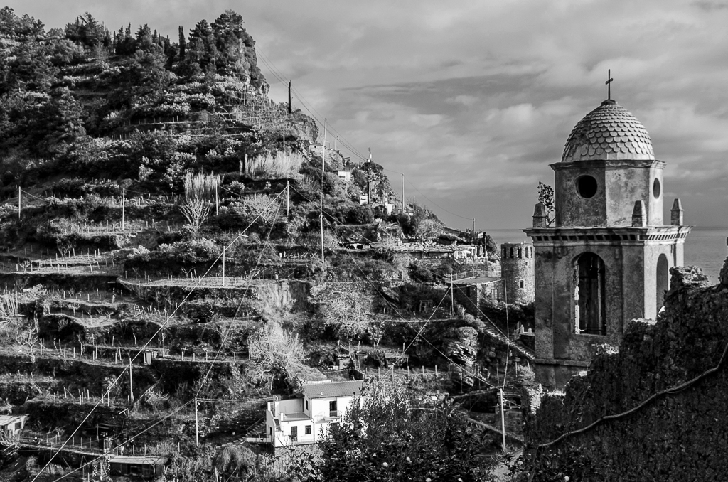
I like very much that you have not shot the usual Cinque Terre scene of the crowded (but charming) towns and harbors. This is a very unique view. Here are my comments:
1. Great job taking out the power lines. Much improved.
2. I like the shadows in your original much better than in your post-processed image.
3. Consequently, the considerable shadows and contrast in the original and absence of colorful houses or shops make it a candidate for monochrome, although I don't necessarily prefer the monochrome to your color shot--just a thought. |
Dec 4th |
 |
1 comment - 0 replies for Group 40
|
| 41 |
Dec 20 |
Comment |
This is very creative. My only suggestion for a variation would be for the three underlying images to have varying degrees of painterly modification, so that the fourth and lowest layer is strict reality. Just a thought. |
Dec 4th |
1 comment - 0 replies for Group 41
|
| 43 |
Dec 20 |
Comment |
We have made many visits to Arlington National Cemetery in the DC area, so this is a familiar scene. You shot on a cold and grey day and that makes the shot even better. Well done with the double symmetry.
I am not sure you intended it, but I can see one stone with the mark of Islam on it, and a couple in the distance with no religious marks. I feel like you are making a gentle statement in respect of diversity. |
Dec 4th |
| 43 |
Dec 20 |
Comment |
This is a great shot with a very clever use of a mirrored image. I use mirroring a lot, but your idea here is very original. Well done. |
Dec 4th |
2 comments - 0 replies for Group 43
|
| 62 |
Dec 20 |
Comment |
I, too, am impressed with how you brought out the security screen details, as well as the dark area at the top of the stairs. I do not know how to do such stuff.
But I really liked the directional effect of the window light in your original, especially shining on the underside of the next stair segment. |
Dec 3rd |
1 comment - 0 replies for Group 62
|
| 64 |
Dec 20 |
Comment |
I love the way our Digital Dialogue groups take us all over the world and treat of all subjects. Thanks for this great image. Good idea to merge the two images, and good to tone it sepia to set the time period. |
Dec 3rd |
1 comment - 0 replies for Group 64
|
| 67 |
Dec 20 |
Comment |
Hi Larry,
What a well-planned expedition. I always learn a lot about planning from your stories.
This is a beautiful scene.
You asked about cropping, so I went wild. What do you think? |
Dec 3rd |
 |
1 comment - 0 replies for Group 67
|
| 70 |
Dec 20 |
Reply |
Thanks, Frans, and a Happy New Year to you and yours. --Steve |
Dec 27th |
| 70 |
Dec 20 |
Reply |
Hi Frans, I am so glad to hear you had success with the church ceiling shot. It is so interesting to see the interior. I love traveling the world with you and everyone else.
About the perspective thing, this is just my personal approach to perspective. Everyone must work out their own style on this. I see that Pierre mentions the tilt-shift lens, as another tool for working with perspective. |
Dec 10th |
| 70 |
Dec 20 |
Comment |
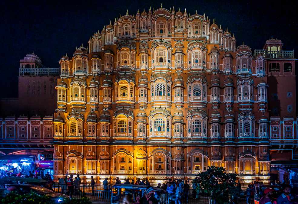
I think your original and finished images are accidentally swapped.
Nevertheless, I love your finished image. We were fortunate to go there in 1989, so it's great to see this unique night image, so different from the way we saw it then.
I am going to make a very esoteric suggestion. When altering the perspective of a tall building, leave just a hint of the vertical convergence, to get into the brain of the viewer that the building soars upwards. Here is a sample. What do you think? |
Dec 3rd |
 |
1 comment - 2 replies for Group 70
|
| 71 |
Dec 20 |
Comment |
Hello Venkat, since 3/4 of the frame is filled with small houses crowded together, with no evidence of motor vehicle ownership, I take your image to be a social commentary on the living conditions of tea estate workers. Also, I see that the tea estate fields are pressed into the background, making their apparent beauty of secondary importance. Do I read this right? |
Dec 3rd |
1 comment - 0 replies for Group 71
|
| 74 |
Dec 20 |
Reply |
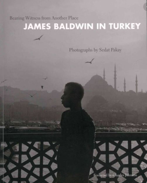
Our son took us to Sedat Bey's exhibit of James Baldwin photos in Seattle some years ago. I contacted Sedat Bey and bought two images from him, one for our son, and one for us to hang in Cesme. We never met Sedat Bey, but were hoping to meet one day when we might vacation in upstate New York, where he lived. Later, I learned from our son that during his half-year at Koc high school in Istanbul, his classmate and friend was Sedat Bey's son, but our son did not know who his friend's father was until after Sedat Bey had passed away. |
Dec 2nd |
| 74 |
Dec 20 |
Comment |
Hello Ata, this is a fine quality panning shot--very sharp on the action. You have a lot of speed on the bike, so the background is a very complete blur. The conversion to monochrome got rid of the slightly distracting red colors of the original.
I so enjoy that I have been in some of the places you shoot, especially this one. Have you ever seen the image of the American author, James Baldwin, standing on the Galata bridge, shot by the Turkish photographer Sedat Pakay? Here is the cover of Sedat's book, showing Baldwin on the bridge. |
Dec 1st |
 |
1 comment - 1 reply for Group 74
|
| 78 |
Dec 20 |
Comment |
I very much like architectural shots that are largely empty of people or "focal points." I prefer the empty, calm shot to be the subject. I like that you are off-center in your perspective on this shot. You have very good side-light and no problem with the lighting in the corridor and out in the green area.
As to a title, I suggest just the place name, or perhaps "Meditative Walk."
Have you considered converting this to monochrome to see how it looks? |
Dec 3rd |
1 comment - 0 replies for Group 78
|
| 80 |
Dec 20 |
Reply |
Yes, indeed, there are a lot of ideas to explore. I enjoyed your discussion--it is very thoughtful. And of course, it all comes down to how each of us views our own images. Good job on this one. |
Dec 10th |
| 80 |
Dec 20 |
Comment |
Hello Victor, I am visiting from Monochrome Group 32, and this shot looks like a good candidate for monochrome.
You have a great overall subject, the young man's face is clear and has good light on it, and the rail patterns are excellent.
But I think your cropping loses the context, and the bright blue announces too much that it is post-processed, and anyway the shot is not about color, hence my suggestion to go to monochrome.
Here is a rough suggestion, converted to monochrome, increased contrast, lightened shadows, darkened highlights, bit of sharpening, slight cropping, bit of skew straightening. |
Dec 2nd |
 |
1 comment - 1 reply for Group 80
|
| 92 |
Dec 20 |
Comment |
Great shot of a famous neighborhood.
I think this is the locale for Tennessee Williams' play "A Streetcar Named Desire." Here is an Internet quote about it:
"The Streetcar Symbol Analysis. Williams called the streetcar the "ideal metaphor for the human condition." The play's title refers not only to a real streetcar line in New Orleans but also symbolically to the power of desire as the driving force behind the characters' actions."
In this vein, your image is a metaphor for where we are all going in the "streetcar of life." |
Dec 2nd |
1 comment - 0 replies for Group 92
|
| 98 |
Dec 20 |
Comment |
Do please tell us the story of this exciting expedition. It must have been quite an adventure. What kind of clothing were you wearing to protect against the danger of falling into such cold water? |
Dec 2nd |
1 comment - 0 replies for Group 98
|
28 comments - 18 replies Total
|


