|
| Group |
Round |
C/R |
Comment |
Date |
Image |
| 2 |
Nov 20 |
Reply |
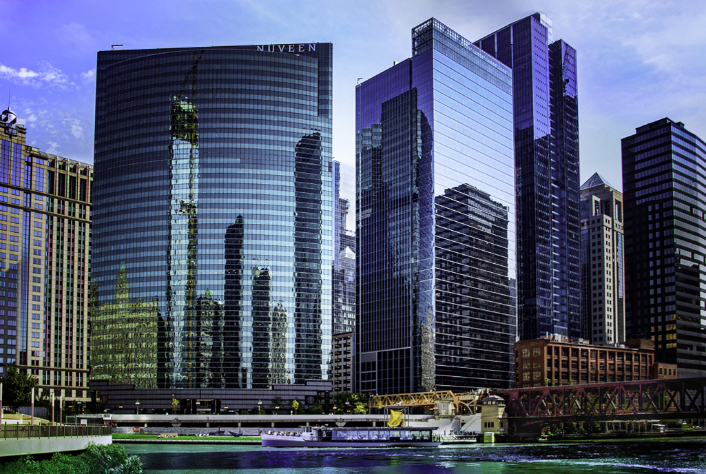
Glad you like it. This is my personal view of perspective problems (word play intended again). I want to point out that the columns of the Parthenon are not perfectly straight-sided, but slightly rounded to inject a touch of energy into the viewer's brain. So here, I think the slight soaring approach to perspective adds energy to the image. |
Nov 5th |
| 2 |
Nov 20 |
Comment |
I also think this is a wonderful image, because of the great subject matter, and those reflections, not to mention the sharpness and color.
About the perspective alteration, I have another point of view, pun intended.
1. Both your eye and the lens see the same "tilt back" effect when looking up. This is not distortion, but an the actual perspective of looking at receding parallel lines (We have no problem with this if it is horizontal, like a receding street--why are we bothered by it if it's vertical?)
2. Nevertheless, I accept that we are not comfortable with the vertical perspective, and I agree that the finished image is often more effective if the perspective is altered.
3. Architectural photographers (and your judge) will pull those parallel lines perfectly parallel in the finished images.
4. Sometimes, the verticals look better if they are left converging, for example to emphasize the soaring height of a skyscraper.
5. Your image, to me, falls between the two approaches--short enough to render parallel, but tall enough to want a bit of soaring suggested. Hence I am suggesting to leave just a trace of converging lines to suggest the soaring nature of the tall buildings. |
Nov 1st |
 |
1 comment - 1 reply for Group 2
|
| 8 |
Nov 20 |
Comment |
Hello Snehendu,
This is terribly clever, and very successful.
In the USA, all such side-view mirrors have engraved messages saying, "Objects in this mirror are closer than they appear," and thinking about that and this image amused me to think what a close crowd of kids must have been around you. When we have traveled in India, we would always have pencils and pens for the school kid, as well as candy. Pandemonium! |
Nov 14th |
| 8 |
Nov 20 |
Comment |
This is a very clever idea.
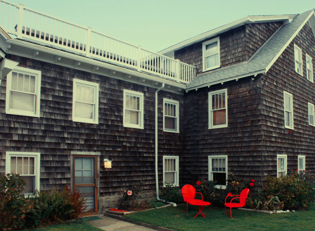
I am local to DC, but did not recognize the Arlington Cemetery scene. However, the statues at the Korean War Memorial are so distinctive, I immediately recognized that. |
Nov 14th |
2 comments - 0 replies for Group 8
|
| 11 |
Nov 20 |
Comment |
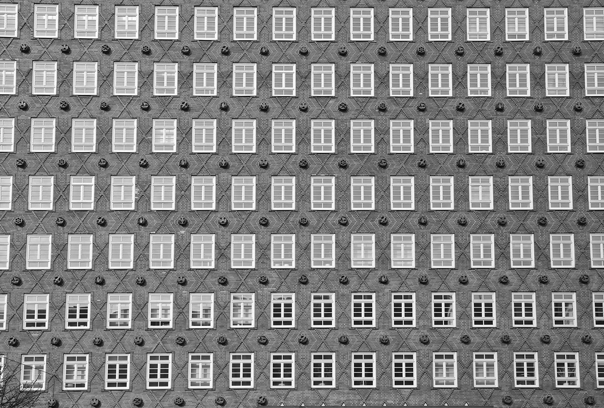
This is a fascinating facade of a historical building. I have two suggestions:
1. Can you shoot it at a time of day when the sun makes diagonal shadows across the facade? I think that would give an interesting result.
2. Something about your processing has taken away clarity of the fine texture of the brickwork. I reprocessed and suggest the attachment. Note that I left a slight convergence of the vertical lines to suggest that you are looking up at a tall building. |
Nov 4th |
 |
1 comment - 0 replies for Group 11
|
| 12 |
Nov 20 |
Comment |
I think this is a stunning architectural image. Congratulations.
I like that the vertical perspective converges because it give a sense of the building rising above the observer.
You might consider any of the changes I made in this suggestion, but it's up to your taste:
Blacked out the window, darkened highlight overall, lightened shadows overall, touch of sharpening overall.
I an not sure about the vegetation--let's see what your group colleagues say about that. |
Nov 18th |
 |
1 comment - 0 replies for Group 12
|
| 16 |
Nov 20 |
Reply |
This also reminds me of the type of drama that is sometimes seen in traditional Japanese flower arranging. Were you influenced by that? |
Nov 14th |
| 16 |
Nov 20 |
Comment |
Good job to include the reflection, and very little sky, so as to fill up the frame with the subject matter.
We were there about a dozen or so years ago, so this is a nice memory to see. Did you get to see other local temple remains? |
Nov 4th |
| 16 |
Nov 20 |
Comment |
Yes the crop works--it is very creative, with all that empty space on the right--I like that. It is also creative to cut off the vase--I like that also.
The lighting is fine by me. Maybe others can comment.
But I don't see any signs of ageing in these tulips. Had that been more evident, I would very much praise that, since I think showing ageing (and even outright decay) of flowers is an important genre in floral photography. Many famous photographers were careful to include ageing and plain old rot in their images. |
Nov 4th |
2 comments - 1 reply for Group 16
|
| 17 |
Nov 20 |
Comment |
Good job lighting this shot, and catching the motion of the sparks. I am learning that 1/500 still leaves just the right amount of motion in the sparks.
Did your blacksmith normally wear goggles and take them off for this shot, or did he always work without goggles--or gloves for that matter, or long sleeves?
Countless shots? About how many shots did you take to get this one? |
Nov 4th |
| 17 |
Nov 20 |
Comment |
This is a wonderful shot of the bridge structure. I have only praise for the shot, no suggestions for improvement.
Your story of the bridge "falling up" is fascinating. What happened after that? Was there damage, or did they just move the crane back? |
Nov 4th |
| 17 |
Nov 20 |
Comment |
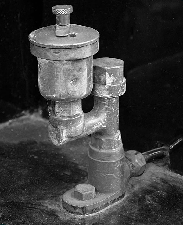
This is great subject matter. I love images of old hardware.
Here are my suggestions for editing. Desaturate to b/w since it is almost b/w already; darken highlights; rotate right 2.5 degrees; slight sharpening. What do you think? |
Nov 4th |
 |
3 comments - 0 replies for Group 17
|
| 28 |
Nov 20 |
Comment |
Wow, this is some shot! What a place!
Please tell us about your post-processing, particularly if you applied any adjustment to color or sharpness--or was this fantastic view "as taken"? Thanks. |
Nov 4th |
1 comment - 0 replies for Group 28
|
| 32 |
Nov 20 |
Comment |
One last thought. Now that Diana has suggested this last image, it occurred to me that if you take out the dog, then it looks like a climber having just made their ascent. |
Nov 27th |
| 32 |
Nov 20 |
Reply |
I totally agree. I just tried it, and was not satisfied. But Larry did do a pretty good job with his try at it. Some subjects are just essentially color shot. |
Nov 16th |
| 32 |
Nov 20 |
Comment |
Russ made exactly the comments I had in mind. Thanks, Russ.
Visitor Rick's suggestion is really interesting. |
Nov 13th |
| 32 |
Nov 20 |
Comment |
Not enough contrast? Who was that judge? Sounds like someone whose name is Diana! You have tons of contrast, as Tom points out.
As to Jennifer's suggested image, I am fascinated by her and your images. They are quite different, even though they show the same thing. Yours is full of emotion and hidden things. Hers is a model of clear documentation. I am stunned by the difference in emotional content. |
Nov 13th |
| 32 |
Nov 20 |
Reply |
I like what Jennifer did overall, but I find it a bit too strong in the eyes. Maybe tamp the eyes down a bit to be consistent with the rest? |
Nov 13th |
| 32 |
Nov 20 |
Reply |
Hi Larry,
Thanks for this so much. Please tell me about those few clicks--I did a general desaturation to convert to b/w. What did you do? I want to learn that. |
Nov 8th |
| 32 |
Nov 20 |
Reply |
Good idea, Tom, to remove the wood water-break on the lower right. There is also a stone one on the lower left. I did not think to take them out becauses this was a vacation memory shot, but I think you are right that for a formal composition they might better be gone. |
Nov 5th |
| 32 |
Nov 20 |
Comment |
Hi Tom, this is a great job. I liked and learned from all your choices: switch to monochrome, rotation, removed the one line. The detail is great and is part of the story. How about telling us about the exact place and situation of this piece of hardware. |
Nov 4th |
| 32 |
Nov 20 |
Comment |
Russ says it all--I have the same comments. Fine shot, and you made a special effort to get to the location at the right time. I think the partial view of the cable car machinery does not help. It might have worked if you were directly under the cables and had a leading line going down the mountain. |
Nov 4th |
| 32 |
Nov 20 |
Comment |
Russ,
I have never tried high-key, so I can't comment, except to say that it looks very nice. Cleaning up the background was a must, and well done. Asking your granddaughter to turn her head at the moment of shooting is very clever, and it looks like it worked well. How many shots did you take in the session? |
Nov 4th |
| 32 |
Nov 20 |
Reply |
Merhaba Ata,
Thanks for the edit. It looks very good. Please give me an outline of your steps, so I can try the same thing myself in the future.
Our family and friends in Izmir were unaffected by the earthquake, and our friend is still occupying our summer house in Cesme. I hope no one you know was affected.
--Steve |
Nov 2nd |
6 comments - 5 replies for Group 32
|
| 35 |
Nov 20 |
Comment |
This is a nicely done image, Julie.
Do you mind if I ask about the subject, as I am very interested in historic windmills? Is it a working windmill, and what does it do? Pump water? What about the machinery inside? Wood or metal gears? Belts? Pumps? |
Nov 5th |
1 comment - 0 replies for Group 35
|
| 36 |
Nov 20 |
Reply |
OR...you can go to group 14 this month to see Quang Phan's shot of Ithaca Falls! |
Nov 6th |
| 36 |
Nov 20 |
Comment |
Larry, nice going to be able to reveal the rocks under the water--a great touch.
I am especially fascinated by the layered strata. I am from all over upstate NY, and I have traveled this region a few times. Seeing this scene resonates with me. |
Nov 3rd |
1 comment - 1 reply for Group 36
|
| 37 |
Nov 20 |
Comment |
I recall many visits to Bethany Beach in past years as our favorite Eastern Shore family location. You are engaged in a great project. Thanks for showing this.
One suggestion. Since your are formally documenting small buildings, I suggest you remove most, but not quite all, of the vertical perspective. I used the "skew" adjustment in PS. What do you think? |
Nov 13th |
 |
1 comment - 0 replies for Group 37
|
| 49 |
Nov 20 |
Comment |
I love to see the undersides of bridges and other architecture. Great shot. Lots of triangles for strength. |
Nov 16th |
1 comment - 0 replies for Group 49
|
| 61 |
Nov 20 |
Comment |
You have fortunately captured a model with an interesting face, and gotten a good shot of her. Most interesting to me is that she is highly individualistic, and her face shows signs of considerable personality and life experience. I like that her face show both beauty and slight marks of experience (not ageing). You have not hidden blemishes or variations. Well done.
I would like to know if your model is a professional, a personal contact, or a stranger, if you don't mind saying. Thanks. |
Nov 12th |
1 comment - 0 replies for Group 61
|
| 62 |
Nov 20 |
Comment |
Hi Pete, this is really interesting. I am always learning something from you. I find the diagonal stem on the right truly unique. What a fascinating idea to add that in. Also, great sharpness of the central subject, against a light background. The lack of sharpness of the petals is not so prominent in the b/w, compared to the color--interesting. |
Nov 3rd |
1 comment - 0 replies for Group 62
|
| 64 |
Nov 20 |
Comment |
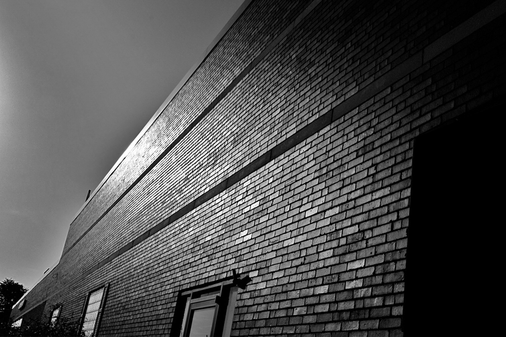
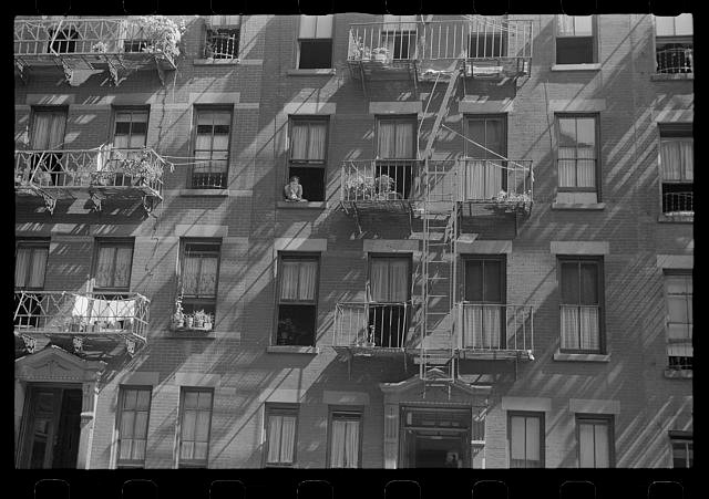
Here is another Evans shot, from his street scene work. Notice his strong use of diagonal shadows on a rectilinear facade. |
Nov 13th |
 |
| 64 |
Nov 20 |
Comment |
This is a fantastically interesting project you are engaged in.
1. I agree that it is essential to see the original Walker Evans shot as part of this project.
2. Evans shot in bright sunlight, yielding bright whites and dark shadows, especially casting the side street into deep shade. Can you go back and try to shoot in that kind of light and at that time of day? That would hide those three cars on the side street to the left of the Stop sign.
3. I think Evans shot with a long lens, to compress together the cemetery, the houses, and the factories. I think you shot with a shorter lens, and do not have the same sense of compression--which incidentally I have seen in lots of cemetery/city shots to bring the contrasting areas of the dead the living closer together. If I am right about this and you agree, can you go back and shoot with a longer lens?
Again, this is a highly original project, and I hope you keep on with it. You may not agree with my comments, but I would love to see you continue this wonderful work, and I hope to see more of it. |
Nov 12th |
2 comments - 0 replies for Group 64
|
| 65 |
Nov 20 |
Comment |
Lots of colors to enjoy. Looks great. I have several questions about how you planned this shot:
1. Did you arrange the strands, a little, a lot, or not at all?
2. There are no ends showing. Is that deliberate? What do you think about including ends, or even making them a main feature of such shots?
Thanks for your explanations and ideas. |
Nov 15th |
| 65 |
Nov 20 |
Comment |
You made a great try at a Weston-esque shot, and got a fine result. Tonal range is good, and I like the tight crop. It's hard to comment, since this is a very complicated project you are working on. It might be a little over-sharp in the leaf folds area.
Weston often shot his still lifes at very long exposures. Have you tried any of that? If so, can you show some more images here in this discussion? |
Nov 12th |
2 comments - 0 replies for Group 65
|
| 66 |
Nov 20 |
Comment |
I really like architectural or landscape shots looking out of windows like this, but I have never seen such a clever angle as this. Congratulations on you excellent eye. |
Nov 12th |
1 comment - 0 replies for Group 66
|
| 69 |
Nov 20 |
Comment |
Very clever choice of subject--good eye! I have to remember this lesson for my own use in the future.
Good exposure, good color, very sharp, nicely blurred background. Everything well done. |
Nov 3rd |
1 comment - 0 replies for Group 69
|
| 74 |
Nov 20 |
Comment |
Hi Ata,
I like this very much for its uniqueness. It is very unusual to see a man playing the drum dressed in a white shirt and necktie. As you say, it suggests his fall in status. And he looks very unhappy, instead of being happy to be making music. You are very sensitive to people.
Technically, I think you did very well to shoot at 1/100 and capture his right hand in a little blurred motion.
My only suggestion would be to remove the legs (of a statue I think) from behind him and fill in with a copy of the brickwork.
Was this gentleman part of a musical group, or playing alone? Was music being made for an event, or on the street to make money? Did he have a basket out collecting money donations? |
Nov 3rd |
1 comment - 0 replies for Group 74
|
| 76 |
Nov 20 |
Comment |
I think your subject matter is a wonderful piece of architecture, and your image of it elevates it considerably. Your black and white rendition of the building and curved wall are perfect: a complete range of tones, very sharp, great angle.
However, everything else in the image (personal opinion here) detracts from that perfect architectural image: the clouds that you like (sorry!), the flag poles, the trees, the other buildings. If you are taking my idea, and approve, can you go back and stand somewhat into the frame and shoot only this fine building and process a final image in the same way?
What do you think? Ignore my analysis if you don't agree. |
Nov 4th |
1 comment - 0 replies for Group 76
|
| 77 |
Nov 20 |
Comment |
This is a beautiful composition. The gentle color palette is also great.
It is almost monochrome, so I tried switching it to b/w, but did not like it. But in that process, I did like the attached, which was about 25% desaturated. For discussion only, I am attaching it. |
Nov 3rd |
 |
1 comment - 0 replies for Group 77
|
| 78 |
Nov 20 |
Comment |
Your experiment led to a fascinating result. It strangely reminds me of shots of the northern lights! |
Nov 4th |
1 comment - 0 replies for Group 78
|
| 87 |
Nov 20 |
Comment |
This is really great work. Congratulations.
Was your model a professional, an amateur, a friend or relative? |
Nov 2nd |
1 comment - 0 replies for Group 87
|
| 88 |
Nov 20 |
Reply |
Oh yes, agree. IMHO this is better. Thanks for responding to my comment. |
Nov 6th |
| 88 |
Nov 20 |
Comment |
This is a charming finished image.
What is the location and name of the building? From what vantage point were you shooting? |
Nov 2nd |
| 88 |
Nov 20 |
Comment |
I am from upstate NY, although not this area, have been to this region several times, and sailed on Keuka Lake. So this resonates with me.
I like the way the road/lake combination marks out a serpentine curve for the eye to follow.
One suggestion--I find the finished colors a bit too bright, tending to announce that they are post-processed. |
Nov 2nd |
2 comments - 1 reply for Group 88
|
| 92 |
Nov 20 |
Comment |
Wow, this is really great street photography. It is sharp and well-composed. You might consider lightening up the faces of the group of group of three sign-holders. |
Nov 2nd |
| 92 |
Nov 20 |
Comment |
Thanks for telling us a great story of how you took this wonderful photograph.
I think the monk is gesturing a blessing on you.
Technically, you did a great job to black out all background and make this a perfectly centered image--this has some resonance with religious portraits in western traditions. |
Nov 2nd |
2 comments - 0 replies for Group 92
|
| 96 |
Nov 20 |
Comment |
Hi Dan, I am visiting.
Your finished image is filled with warm colors, but they seem inviting to me, not indicative of a title using the word isolation. Can we see your original, and can you say more about how you wanted it to change for your final image? |
Nov 7th |
1 comment - 0 replies for Group 96
|
39 comments - 9 replies Total
|


